Designing a Clear and Trustworthy

Oseh Favour

Designing a Clear and Trustworthy Investment Redemption Experience
When users are moving money out of an investment portfolio, the last thing they should feel is uncertainty.
Before confirming a transaction, users need to clearly understand:
-How much money they are redeeming
-Where the money is going
-Which portfolio the transaction is connected to
-Which assets are involved
-What action they are about to take
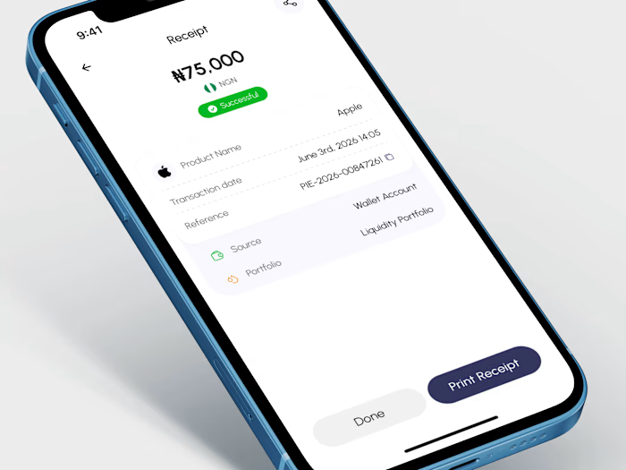
For this fintech product, I designed a Confirm Redemption experience that brings all of this information together in one simple, focused screen.
The goal was to create a confirmation step that feels clear, trustworthy, and easy to understand without overwhelming the user with unnecessary information.
The Challenge: Financial transactions require confidence.
When a user is redeeming money from an investment portfolio, the confirmation screen needs to do more than simply display a large amount and a button. It needs to help the user verify the details of the transaction before proceeding.
The challenge was to present multiple pieces of financial information in a way that feels:
-Simple
-Scannable
-Transparent
-Reassuring
-Easy to confirm
The Solution: I designed the experience around a strong visual hierarchy.
The screen begins with the primary action users need to understand: the redemption amount.
₦75,000
This immediately gives the user clarity on the value of the transaction.
Below that, the supporting details are grouped into a single structured card. This allows users to quickly review the important information without having to navigate through multiple screens.
The confirmation summary includes:
-Destination: GTBank account ending in 5242
-Portfolio: Growth Portfolio
Amount: ₦75,000
Assets: Apple
Each row uses a simple icon to make the information easier to scan and create a visual distinction between the different types of data.
Design Decisions: The interface uses a soft lavender background to create a calm and modern fintech experience.
Instead of using a harsh white interface, the subtle tinted background helps the confirmation card and primary action stand out while keeping the overall experience light.
The rounded container creates a clear visual grouping for the transaction details.
The primary CTA, Confirm Payment, uses a deep indigo color to create strong contrast and communicate the importance of the action.
The close button is positioned in the top-right corner, giving users an easy way to exit the confirmation flow without accidentally confirming the transaction.
Why This Flow Matters
A good confirmation screen should reduce hesitation.
The user should not have to ask:
“Where is my money going?”
“Which portfolio am I redeeming from?”
“What asset is involved?”
“How much am I redeeming?”
All of these questions are answered before the user confirms the transaction.
The result is a simple, focused experience that gives users the information they need at the exact moment they need it.
My Focus
For this design, I focused on:
• Clear financial information hierarchy
• Reducing cognitive load
• Creating a trustworthy transaction experience
• Making important details easy to scan
• Using visual grouping to organize complex information
• Designing a strong and clear confirmation action
• Maintaining a clean, modern fintech visual language
This is one of the many small moments in a financial product where thoughtful UX can make a significant difference.
Because when money is involved, clarity is not just a visual design choice.
It is part of the user experience.
Like this project
Posted Jul 25, 2026
Designing a Clear and Trustworthy Investment Redemption Experience When users are moving money out of an investment portfolio, the last thing they should fee...
Likes
0
Views
4