True North Supplements
Magenda Konutse
True North blends natural ingredients with cutting-edge science to create supplements that are as effective as they are transparent.
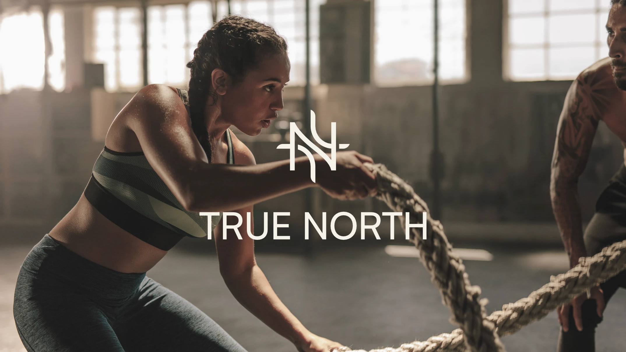
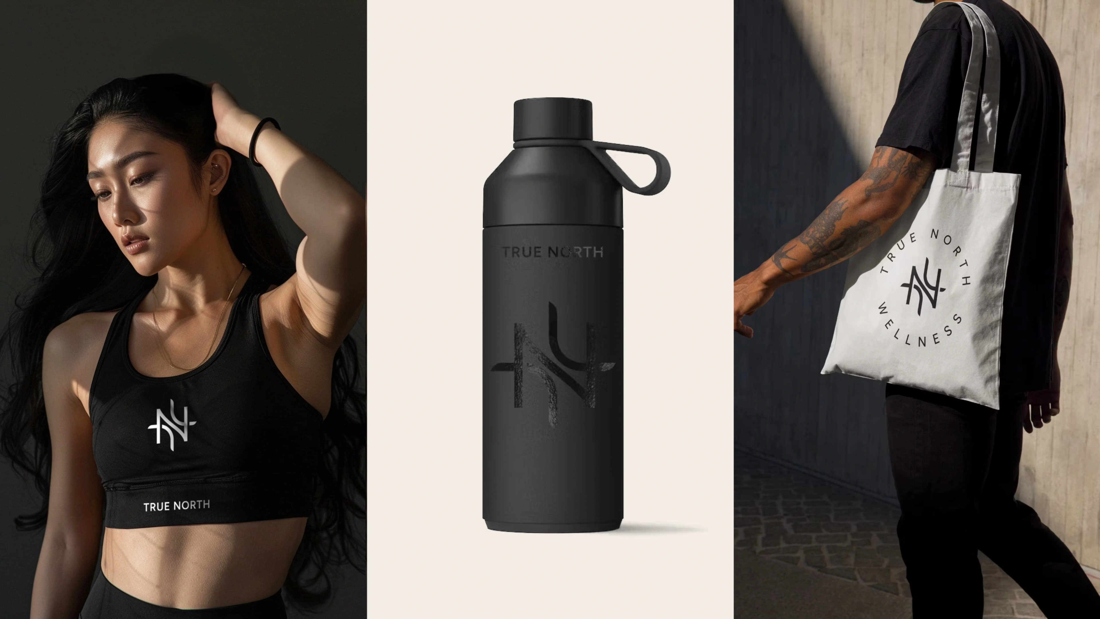
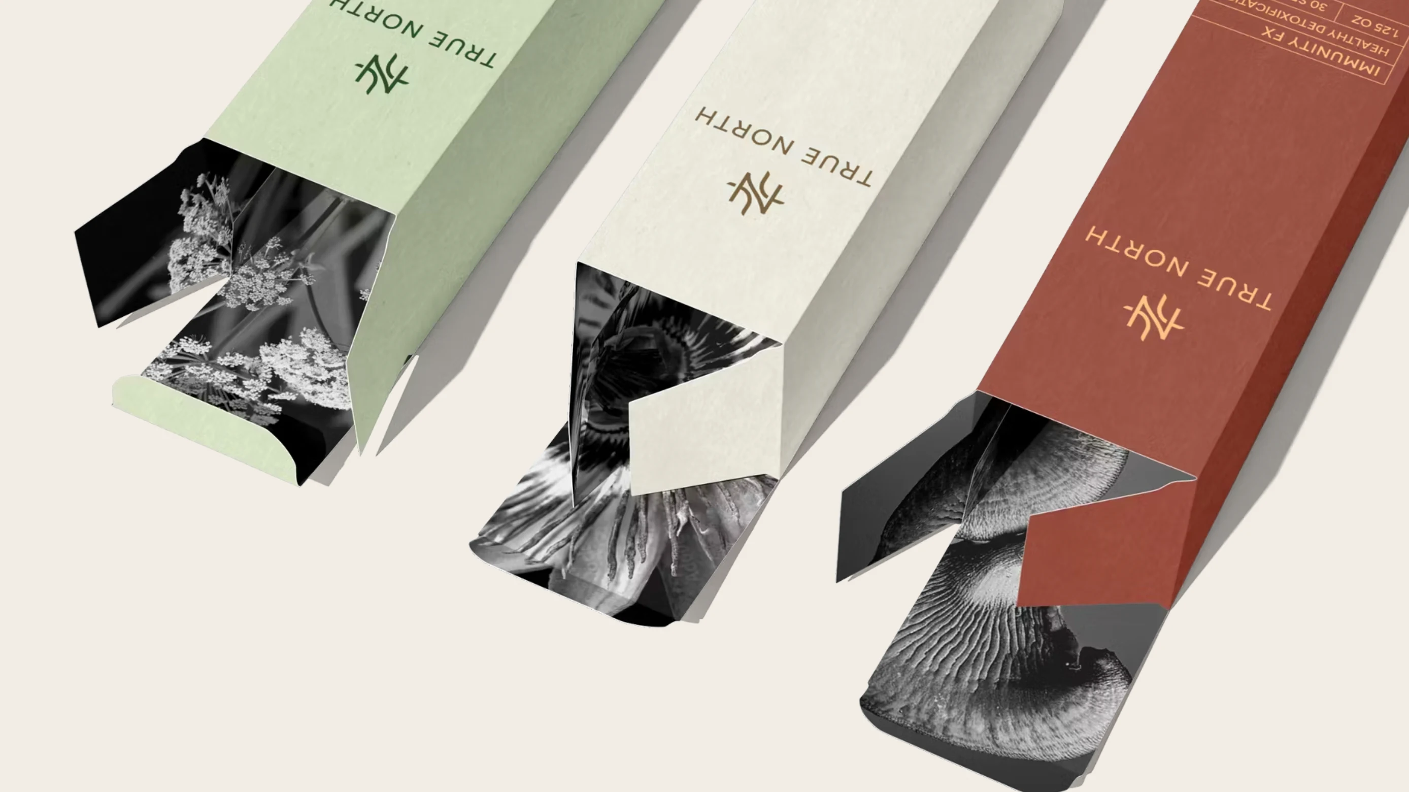
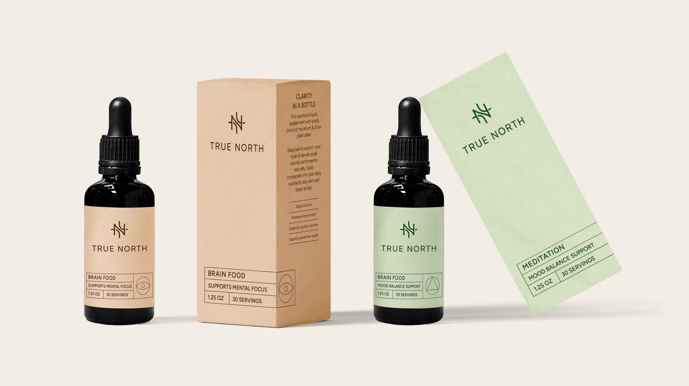
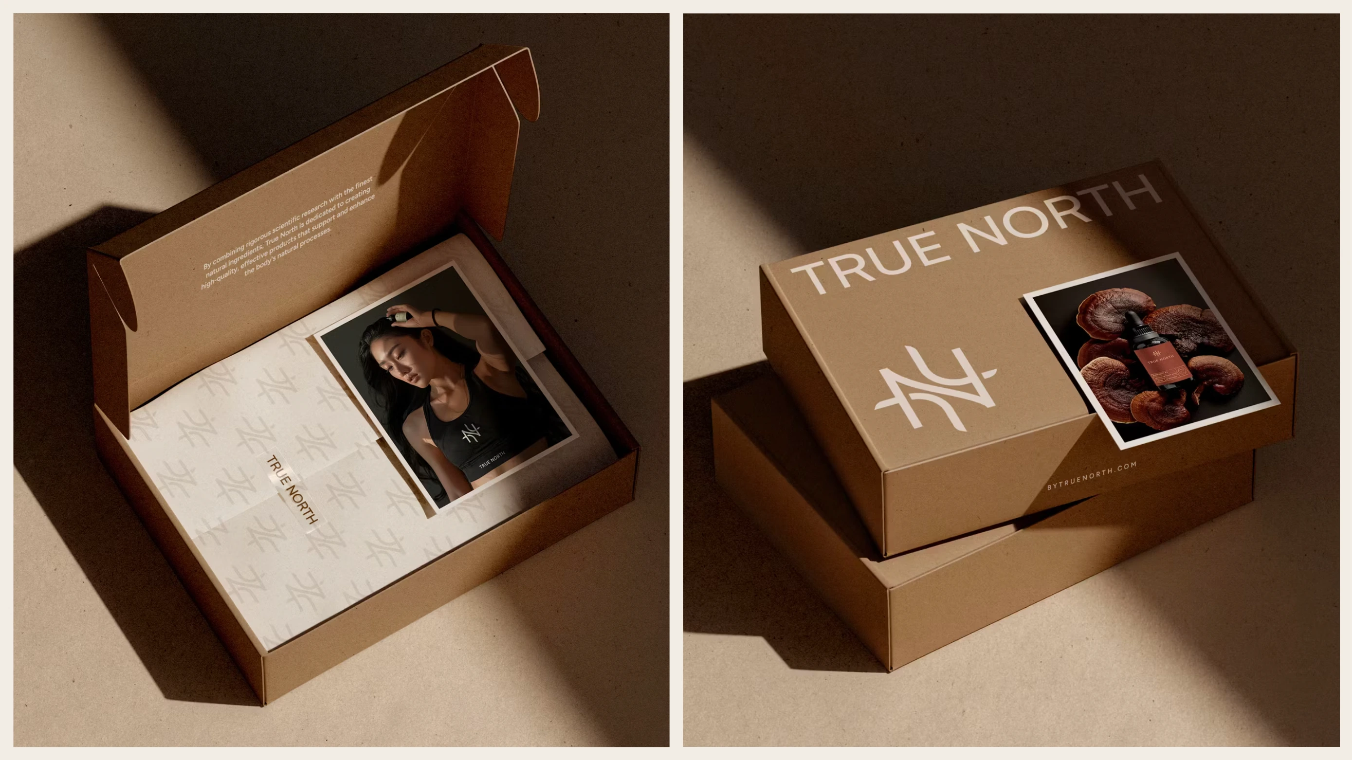
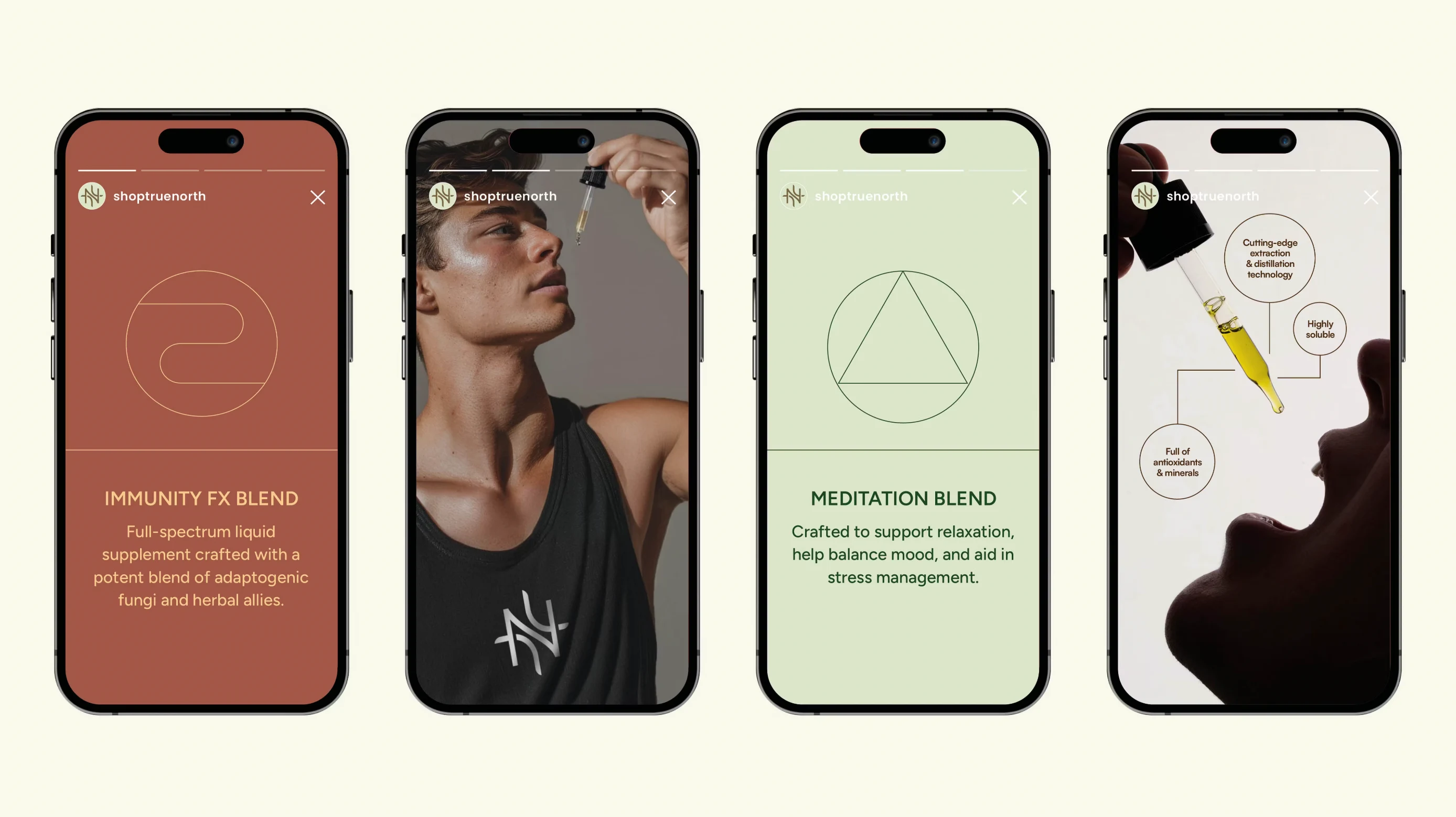
The identity takes inspiration from navigation and nature. The compass-inspired logo mark combines the ‘T’ and ‘N’ and serves as a symbol of guidance, resilience, and direction in the pursuit of optimal health. Fine key lines help organise information with ease, while the clean and simple typeface brings a balance of expertise and approachability. Iconography is used sparingly and purposefully, enhancing functionality without clutter. The overall tone is one of quiet confidence, natural, thoughtful, and designed to build trust at every touchpoint.

Like this project
Posted Jun 6, 2025
True North blends natural ingredients with cutting-edge science to create supplements that are as effective as they are transparent.