Ruby Red Realty Brand Identity
/ROLE
/ VISUAL IDENTITY / CREATIVE DIRECTION / COLLATERAL
/DELIVERABLES
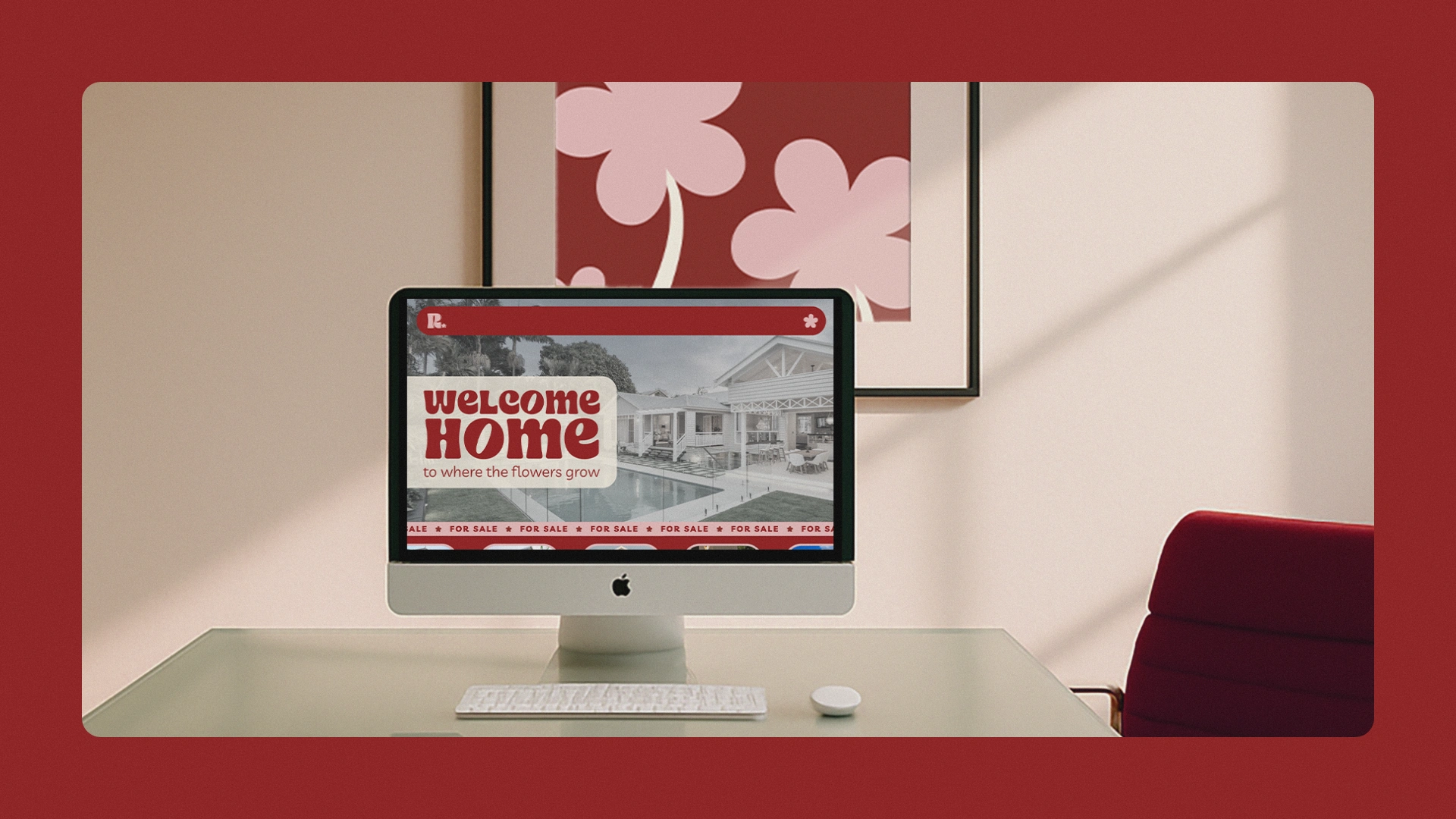
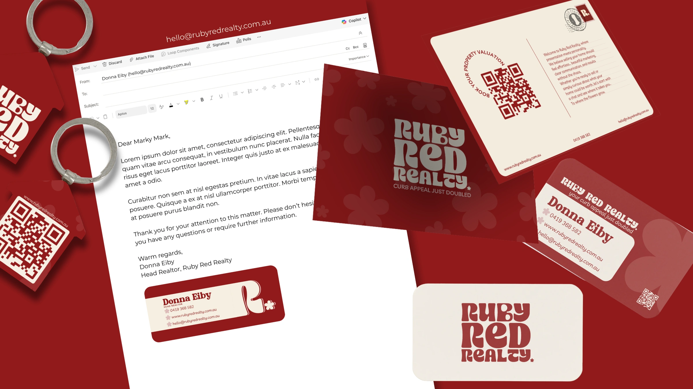
/ MOODBOARD / LOGO SUITE / COLOUR SYSTEM / TYPOGRAPHY/ MOCKUPS
/OVERVIEW
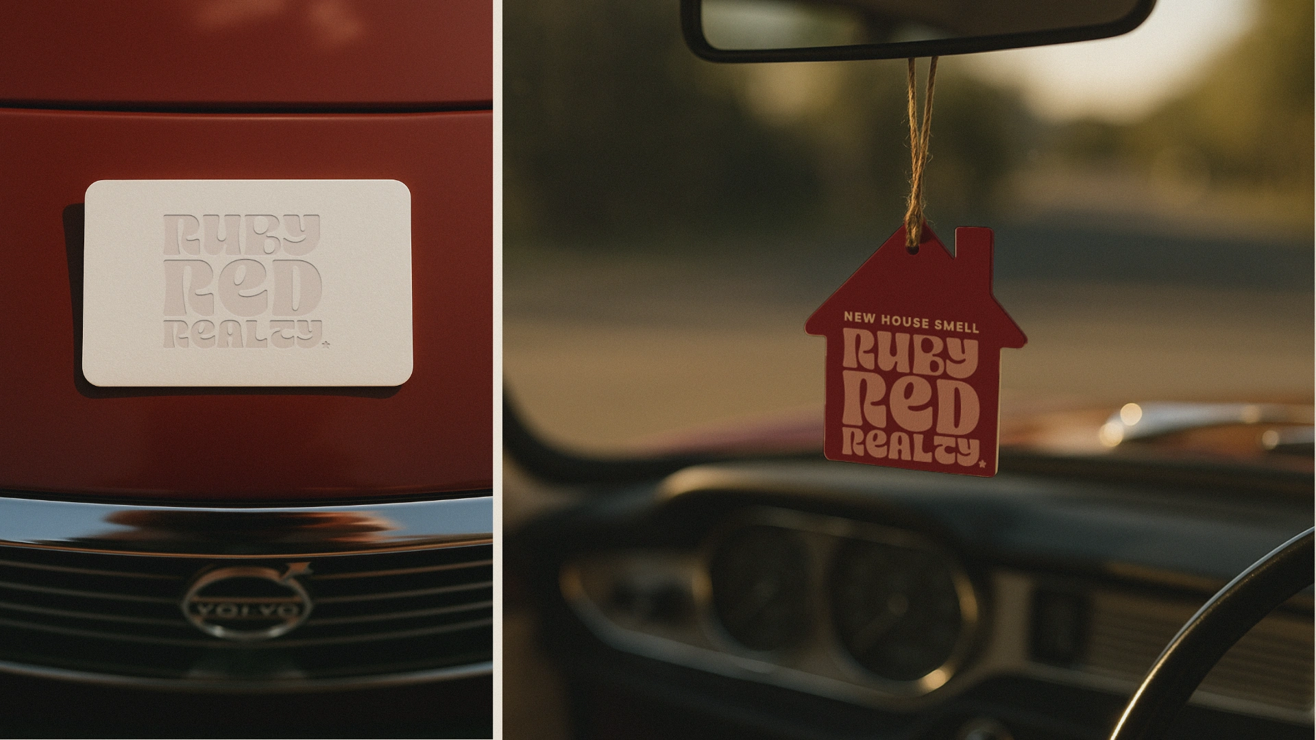
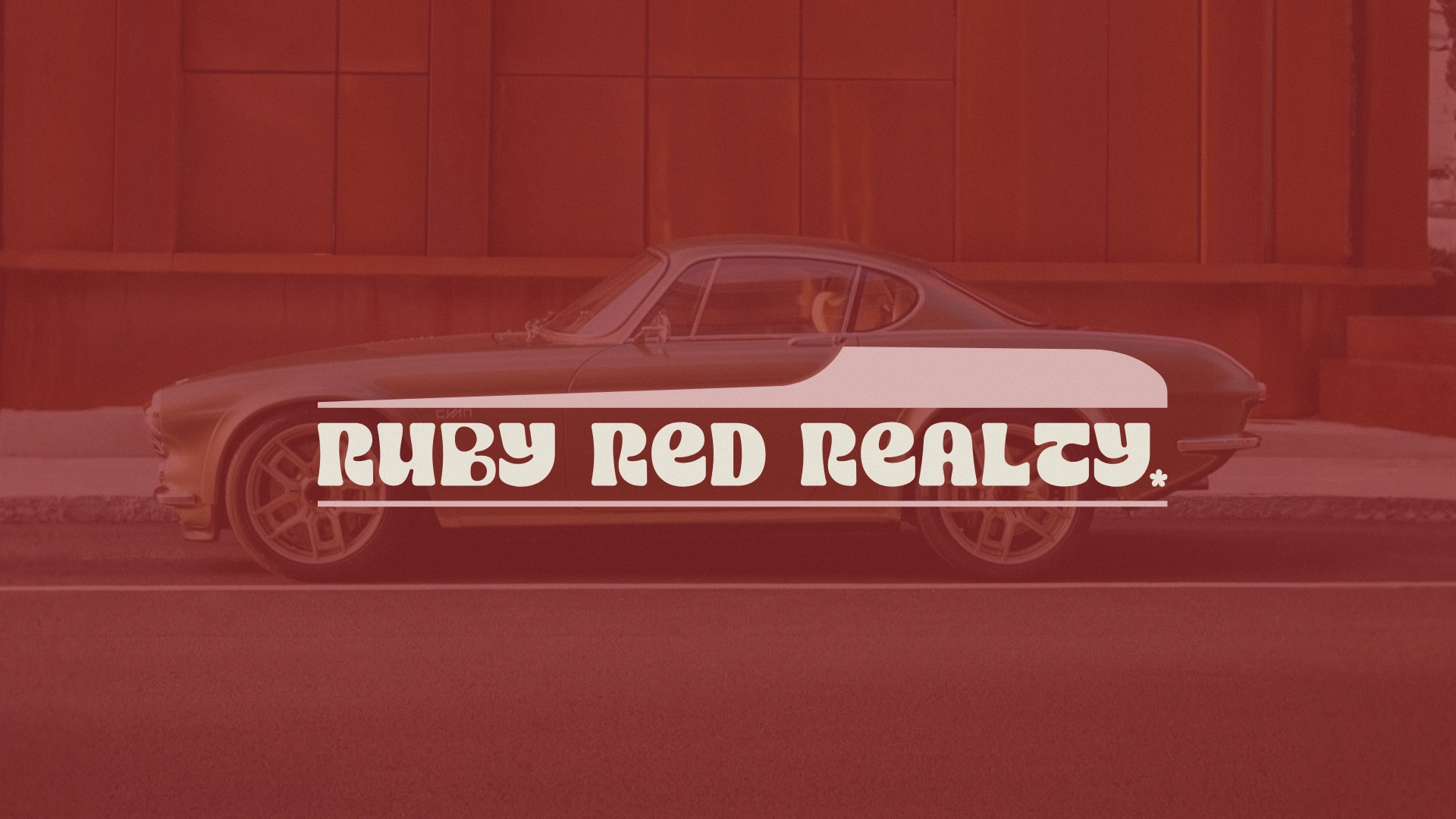
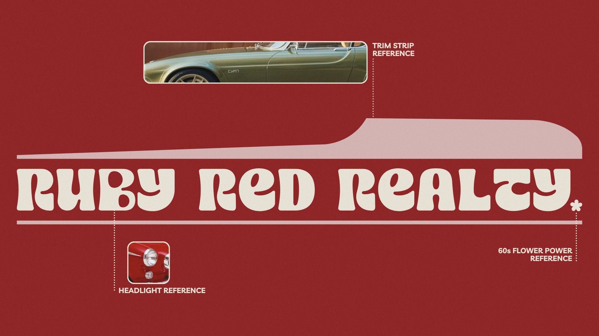
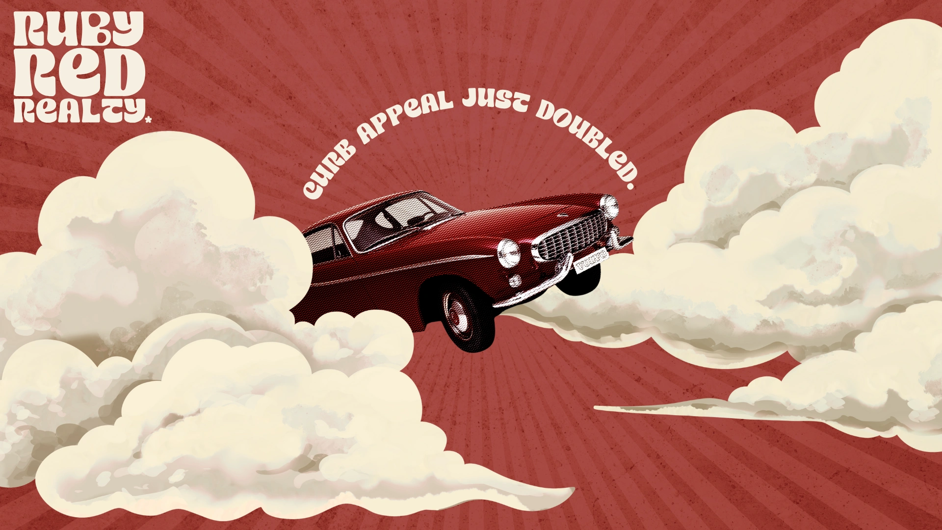
Ruby Red Realty began with nostalgia, not noise… an idea rooted in the charm of the 1960s and the unmistakable silhouette of the Volvo P1800. The brief was simple but risky… capture the spirit of flower power without falling into kitsch. Instead of leaning into clichés, the brand takes its cues from the car’s elegant design language… the trim line that sweeps across its body, the twin headlights that gleam like confident punctuation marks, the perfect balance of power and poise.
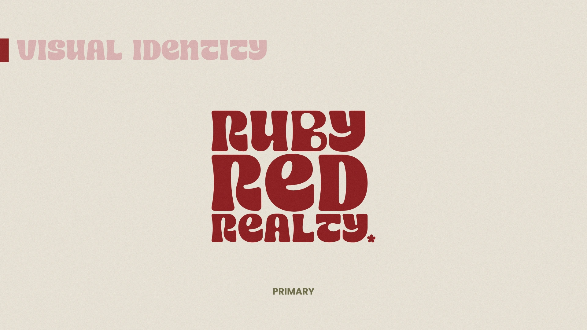
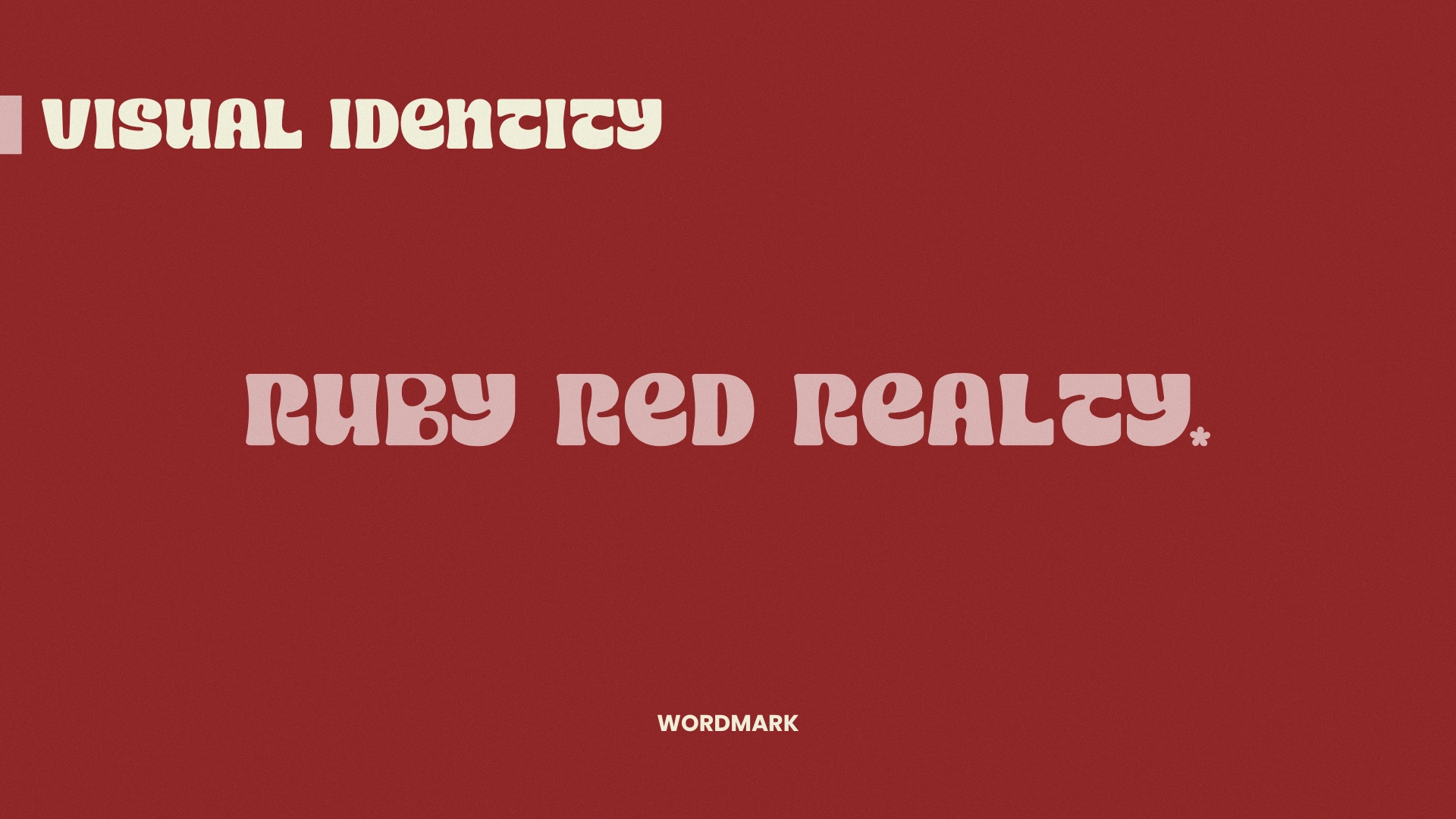
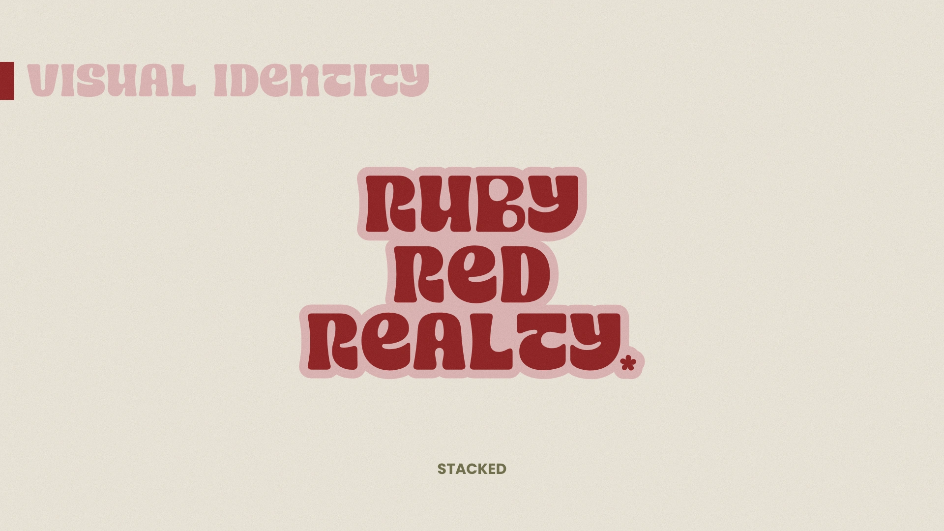
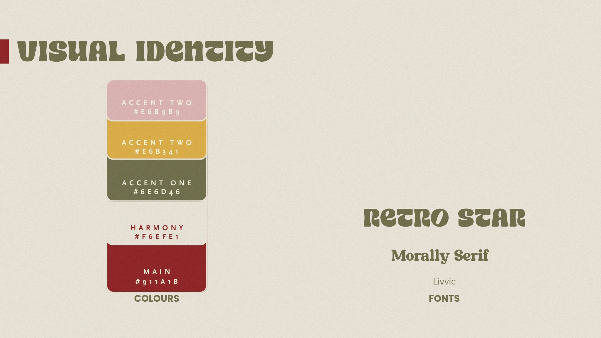
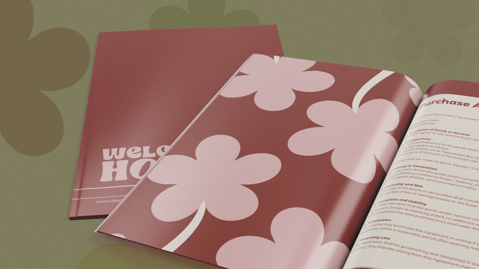
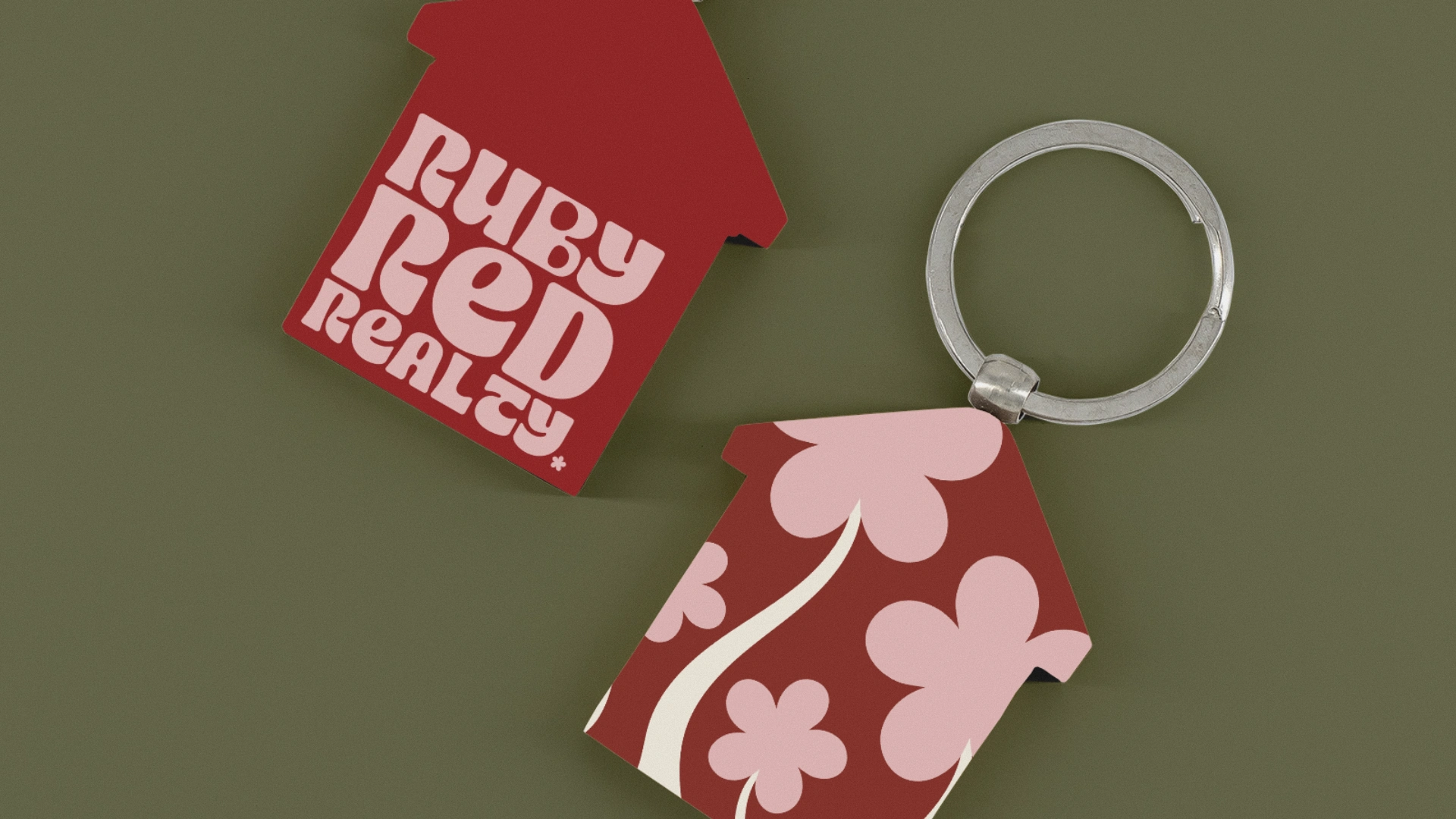
Each visual choice pays quiet tribute to that era’s optimism while keeping its feet firmly in the present. The colour palette draws from the original factory finishes of the P1800, paired with gentle floral undertones that nod to the decade’s free spirit. The letterforms carry subtle modification, most notably in the B of Ruby, where the negative space mirrors the car’s headlights, creating recognition without shouting for it.
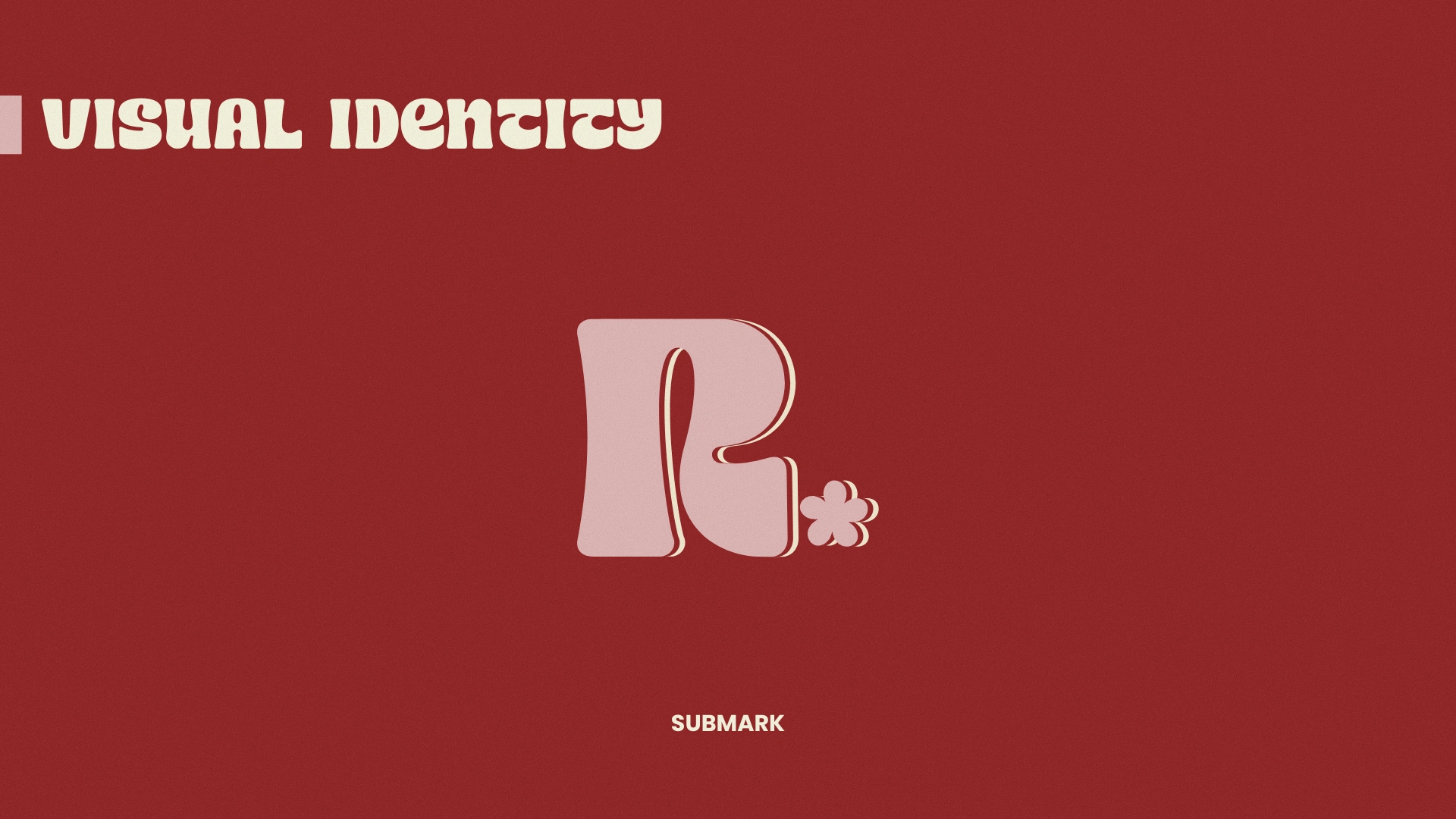
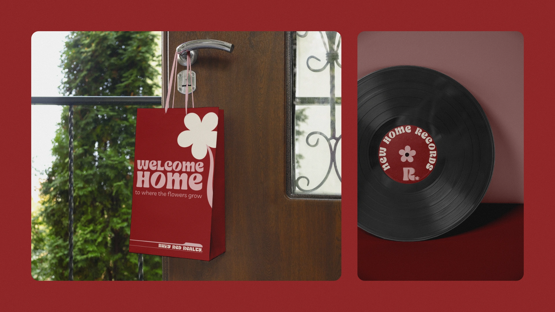
Retro Star type provides the right rhythm… retro enough to evoke the 60s, refined enough to hold its own in a modern market. The layered RRR monogram adds a final touch of polish, versatile and understated, ready for signage, stamps, or the bonnet of a red Volvo.
Ruby Red Realty is where vintage soul meets contemporary sophistication… a brand that sells more than homes, it sells the feeling of cruising toward something new, top down, sunlight glinting off the chrome, confidence humming under every beep beep.

Like this project
Posted Oct 22, 2025
Retro 1960s Inspired branding for Real Estate company... Powerful and Bold without looking gimmicky or kitsch... that was the brief and we delivered.
