NFNO — LGBTQ+ Podcast & Unconventional Greeting cards
Eva Van der Borght
Neither Funny Nor Original
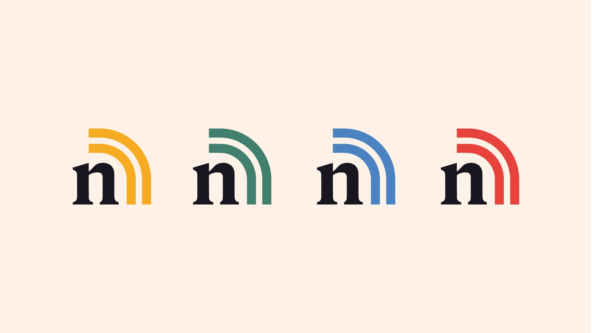
NFNO Logomark
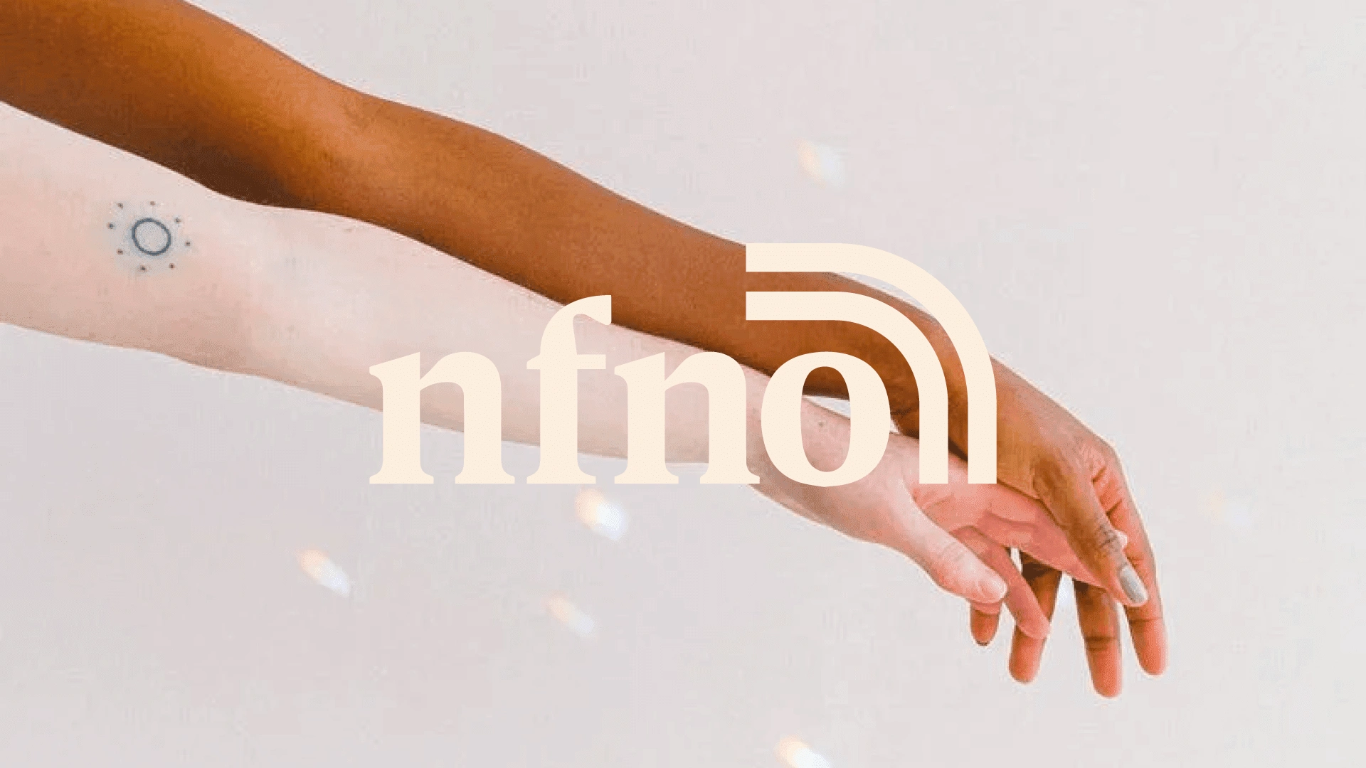
While in the throes of Sunday worship and bible study, Bridget and Brittney (now married) spent a good five years looking for a handbook on coming out, and when they turned up nothing, they launched NFNO, Neither Funny Not Original, a podcast and virtual gathering place for like-minded people. So when they turned to us to overhaul their brand identity, we jumped at the challenge to create a design language that embodies the warmth and creativity of this welcoming and creative community. Our concept, expressed with collage imagery and simple, dynamic shapes, expresses the idea of NFNO helping contain the chaos of revealing one’s true self.
The NFNO podcast has been around for a bit already, but the branding they had in place felt childish and did not represent the quirky, authentic, and empowering community they had in mind when they launched, so they were ready for an upgrade. It was also created quickly by a Fiverr designer when they were still seeing their podcast as a hobby. When they shifted their mindset and decided to go for the podcast and unconventional greeting cards they wanted to upgrade the brand.
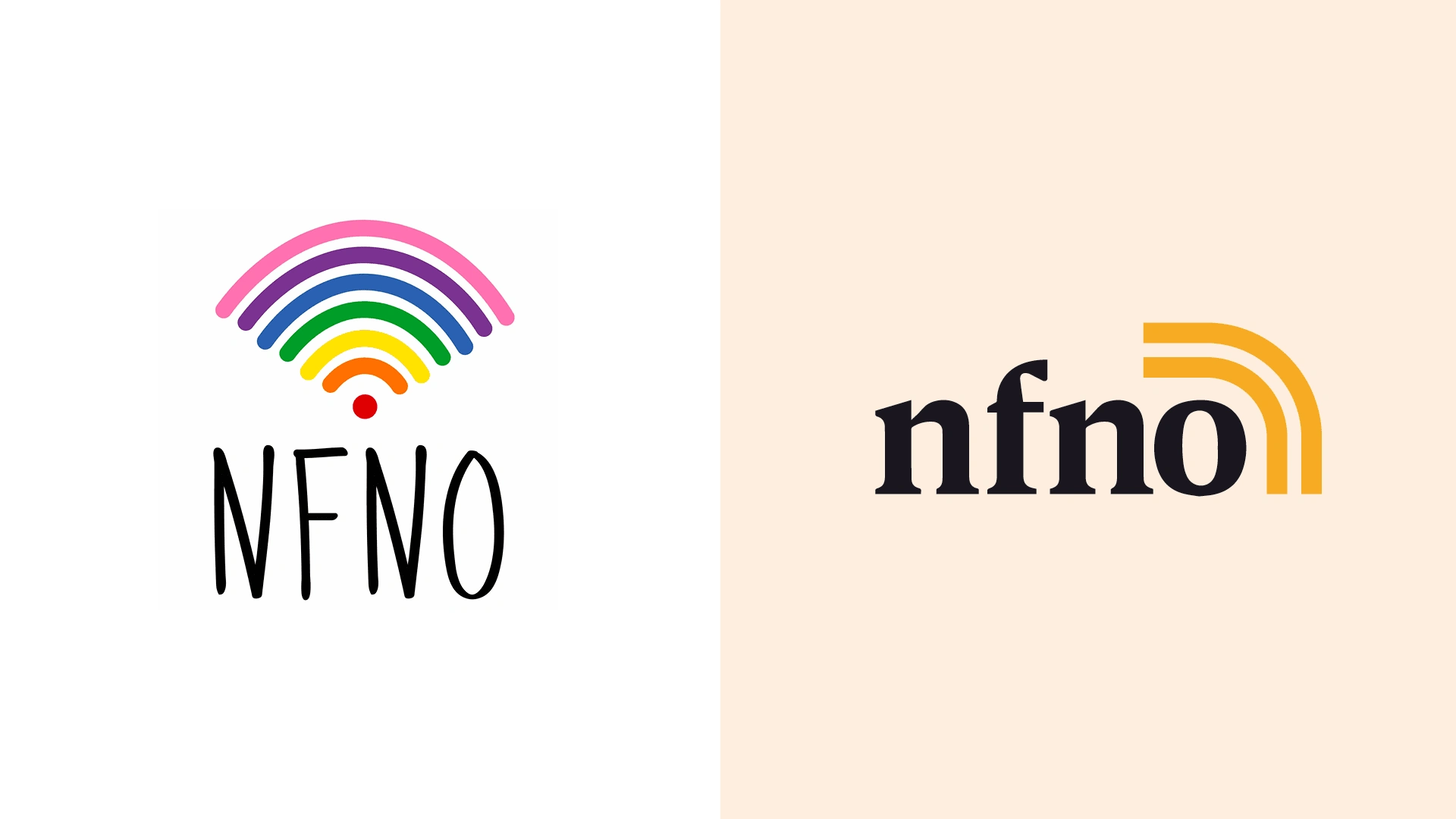
Before & After
Some considerations:
Podcast, podcast, podcast - everywhere you look, someone is coming out with a new podcast daily - so how do you make sure you stand out from the competition that might talk about the exact same things? How do you bring across your sparkling personality and your authentic community in podcast visuals?
At the same time, they needed a place to sell their unconventional greeting cards, posters, pins & stickers. Everyone needs to start their empire some way right? They needed a website where they could upload their podcasts, a place where they could showcase and sell their products, and a place that in the future could become a digital community for like-minded spirits.
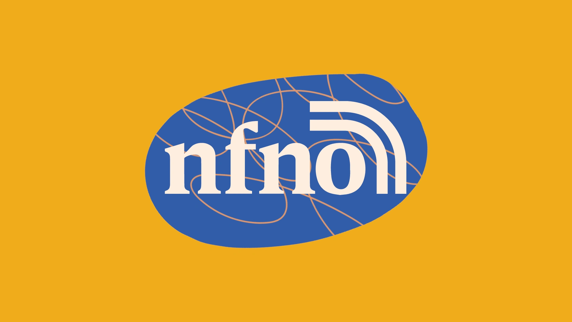
NFNO Logomark with visuals
What we created:
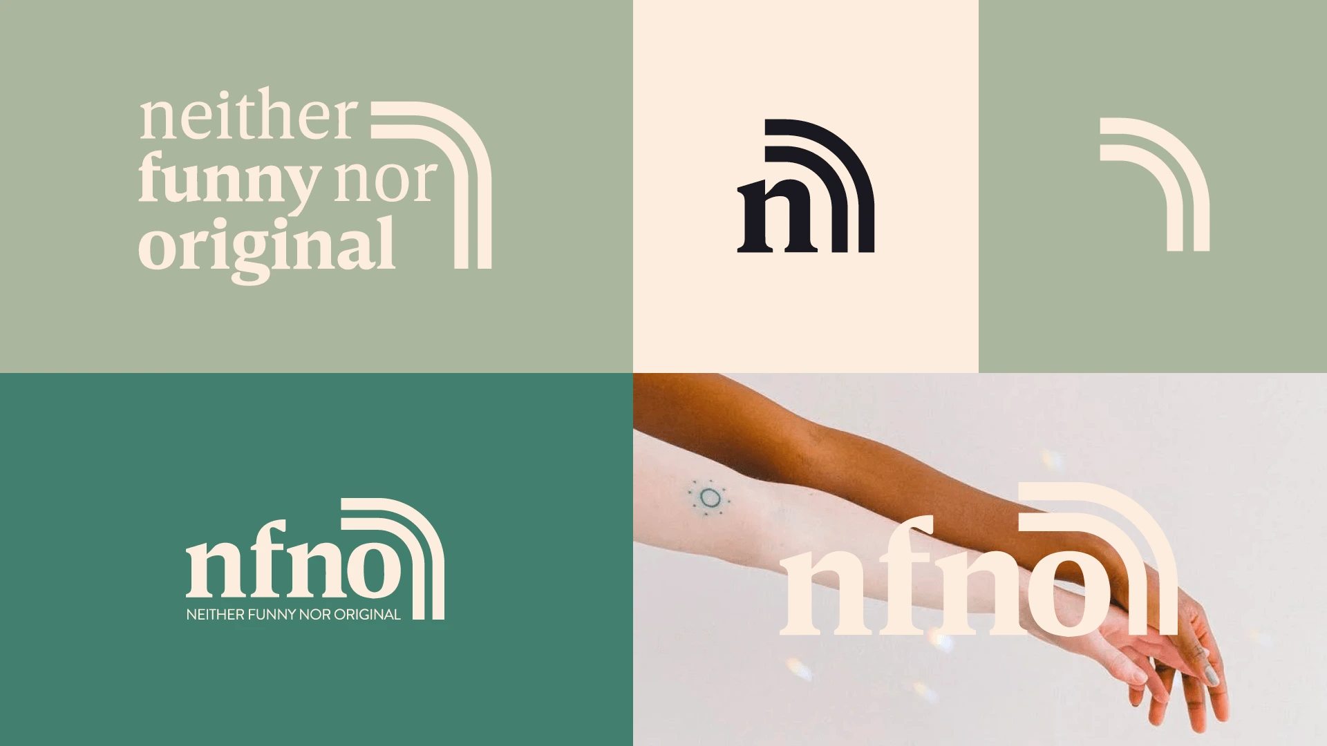
As NFNO has a couple of creative outlets, we needed to make sure the logo and logomark had different variations to use on different platforms and in different sizes. Therefore we created 3 different versions of the new logo. The old logo had a rainbow incorporated into the design, and when talking to Brittney & Bridget they often said: “the colors of a rainbow are many, but we celebrate that the colors of people are infinite.” - with that in mind I wanted to try and incorporate a rainbow in the new design as well. Not only is the rainbow a reference to the LGBTQ+ community, but it also symbolizes that they are more than just a fun and happy podcast — they’re a community trying to figure out life, ups, and downs included. Because how do rainbows come to be? A combination of rain and sun together creates something so wonderful, new, and colorful.
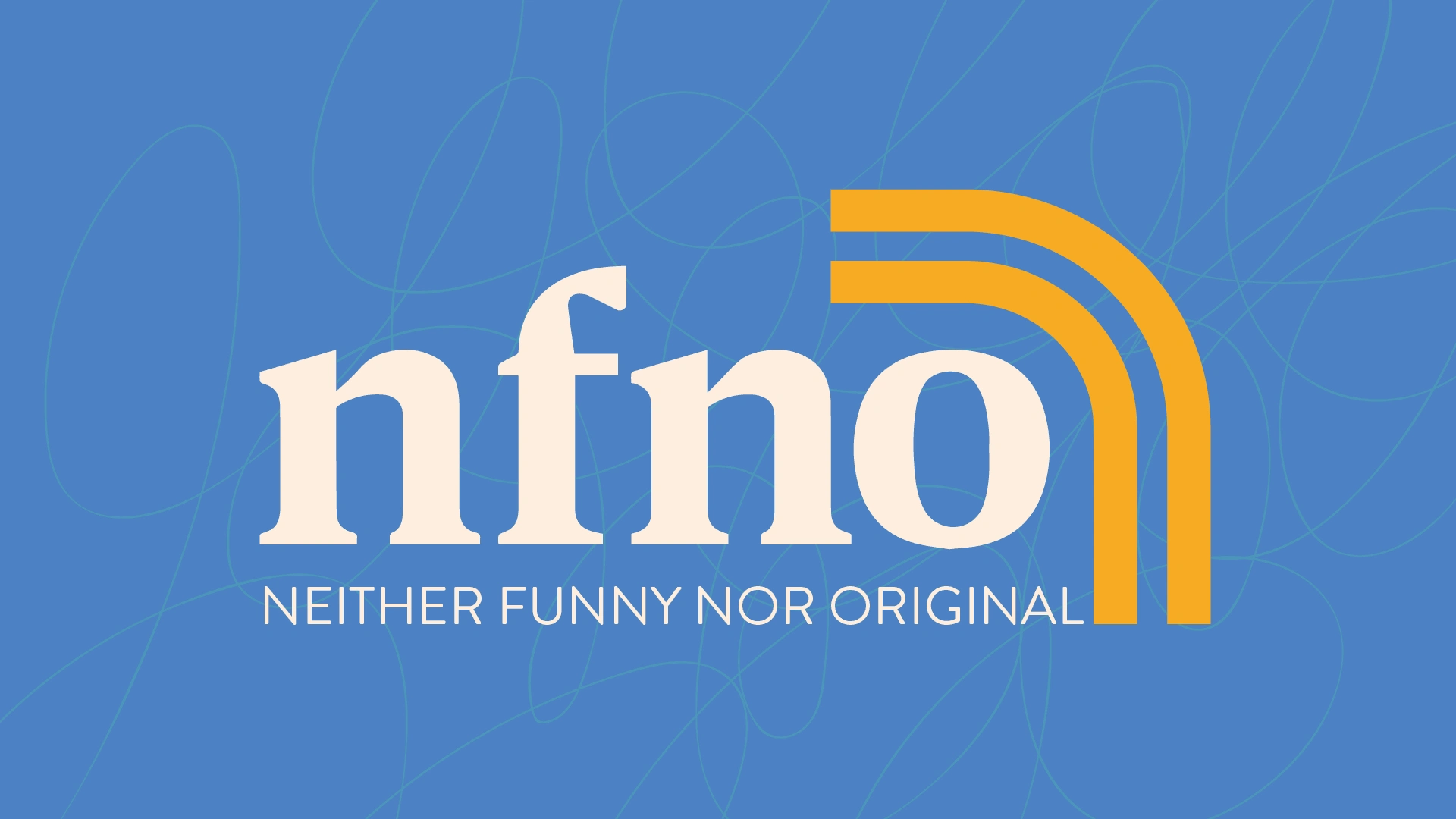
NFNO Full logo in blue
NFNO small logomarks
NFNO condensed logo
NFNO styletiles
For visual assets - as they would work with an illustrator to bring their ideas to life for the unconventional greeting cards, we wanted to make sure any visual elements or illustrations in the brand did not interfere with the products. Therefore we kept it simple and used illustrations and organic shapes. The design language of simple, dynamic shapes and scribbles visualizes the idea of contained chaos and how NFNO can be a guide trying to help you navigate those situations. The dynamic shapes integrate well with the brand photography and guest speakers’ imagery to create warm and lively collages, creating the feeling of a new home, a welcoming community or family - while respecting the quirkiness that comes with individual freedom of expression
The entirely new brand plays well with its brand values, Brittney & Bridget's personalities, and their personal motto: “To live as authentically and unapologetically as Moira Rose and Roland Shitt.”
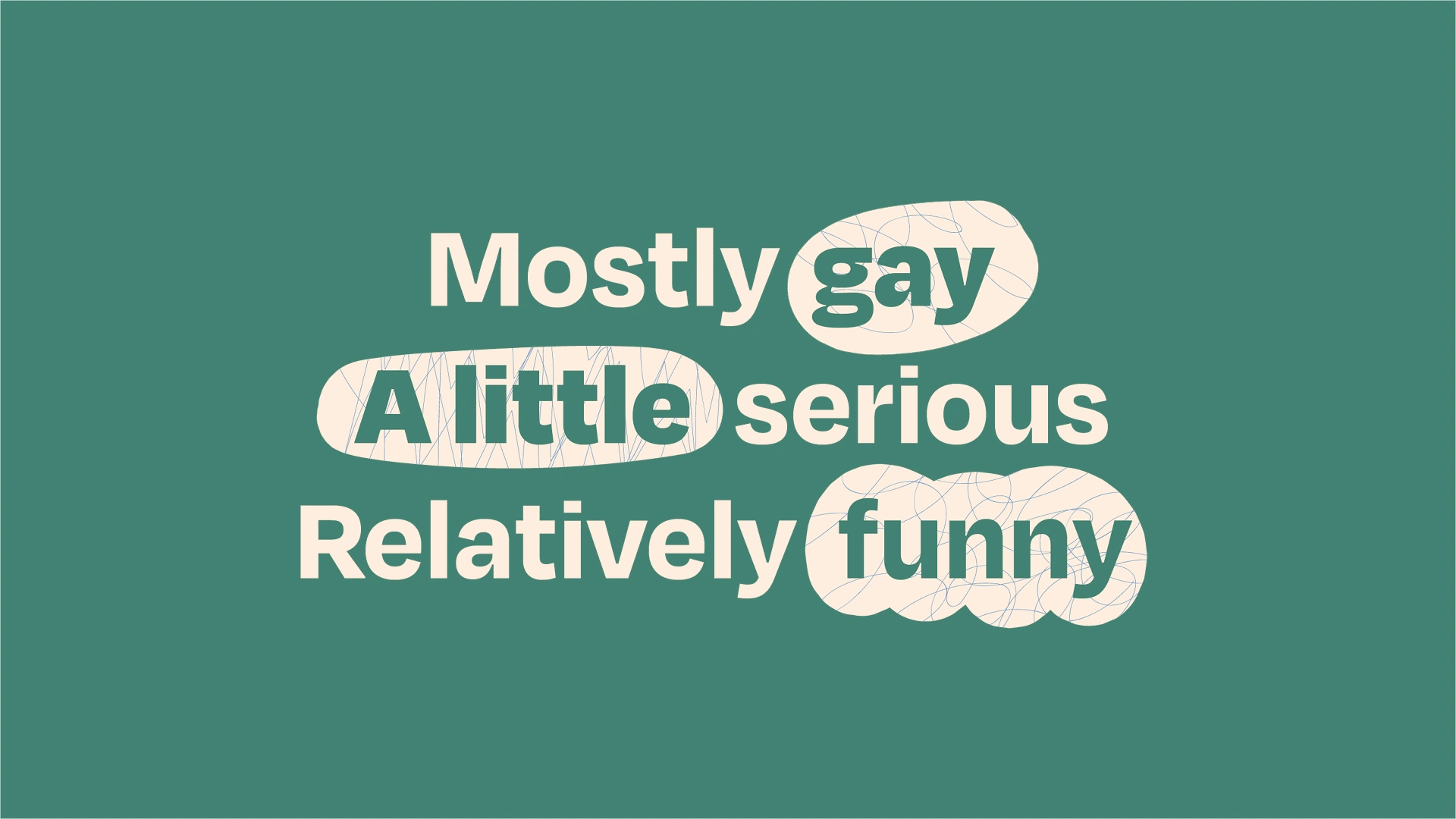
Mostly gay, a little serious, relatively funny
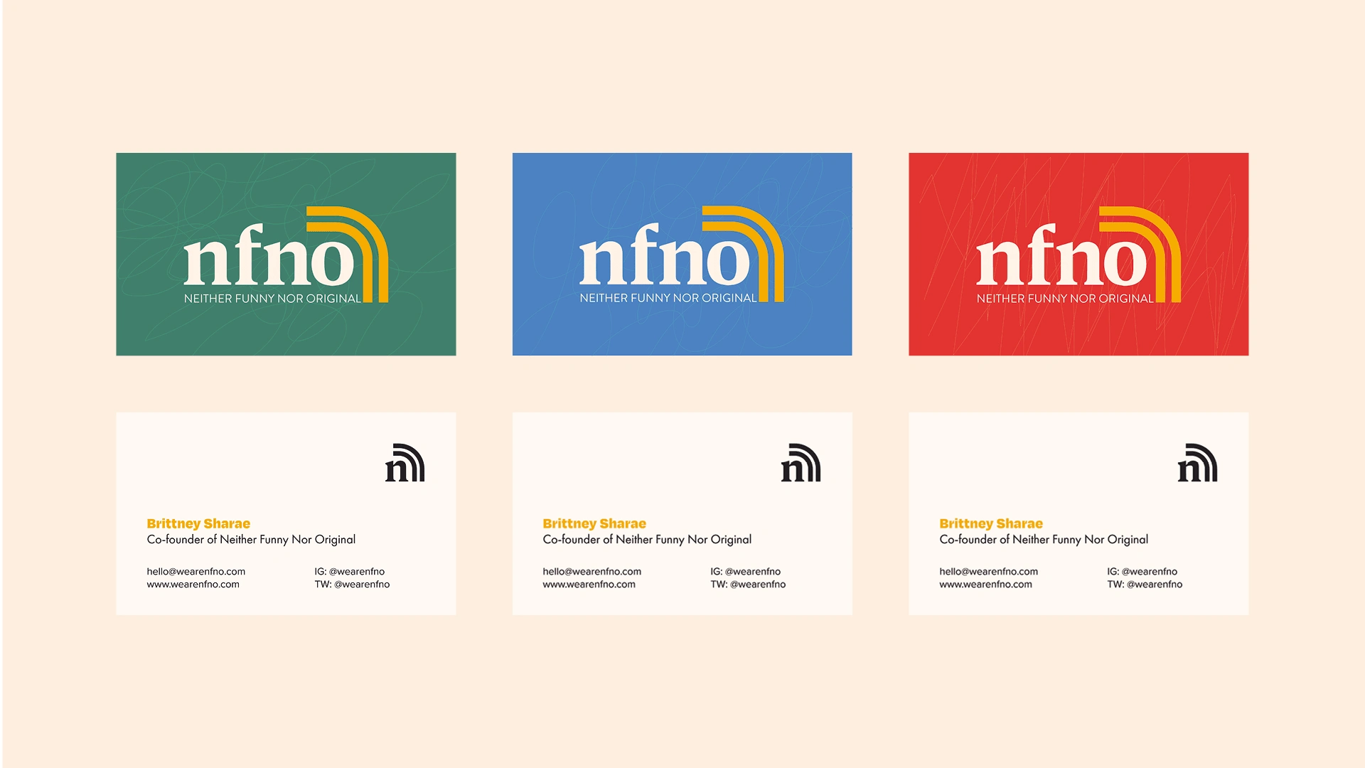
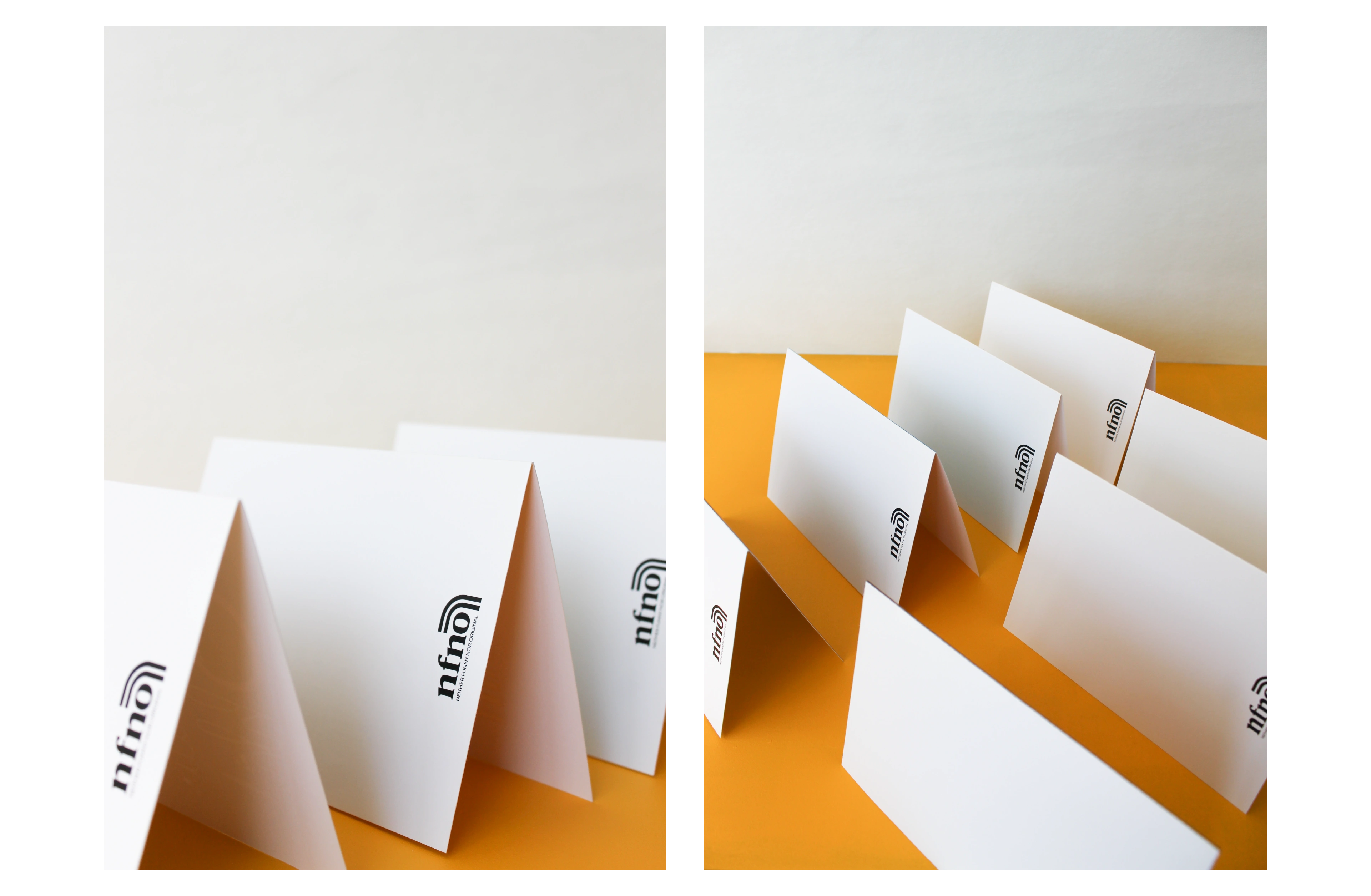
NFNO Business Cards
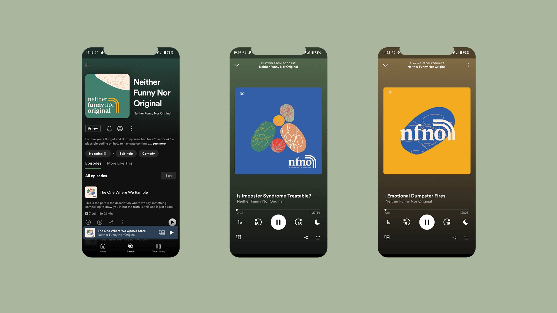
NFNO Podcast covers
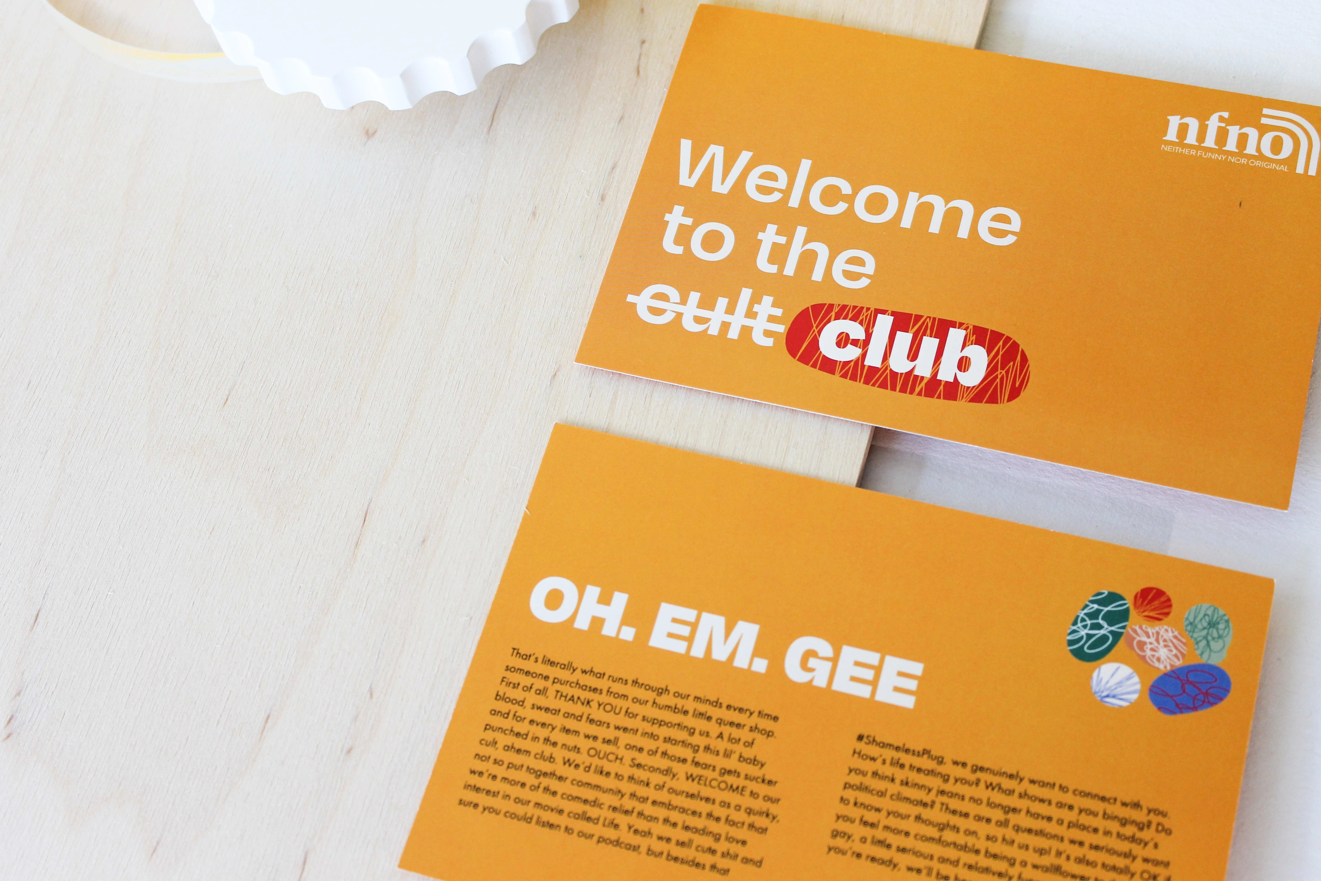
NFNO Thank you cards
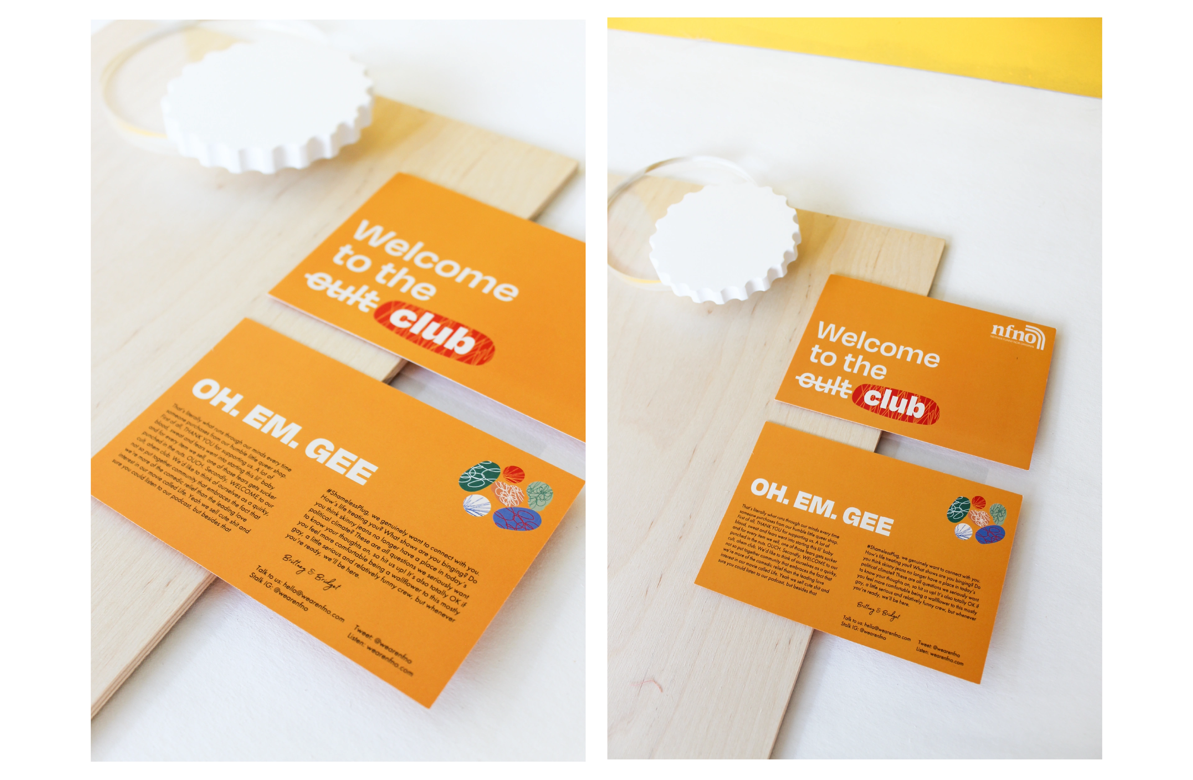
NFNO Thank you for your order cards
NFNO back of unconventional greeting cards
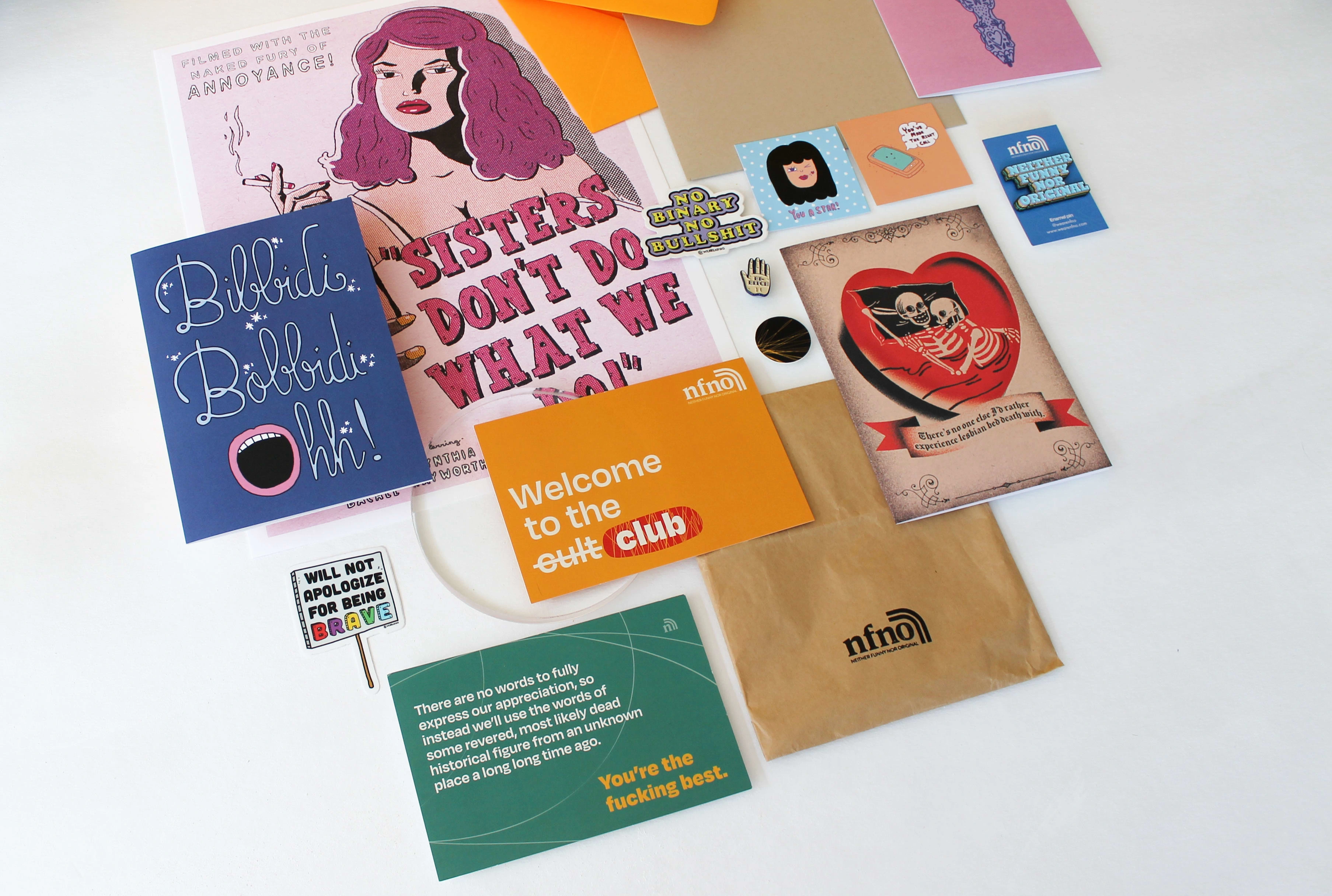
NFNO all of the printed assets
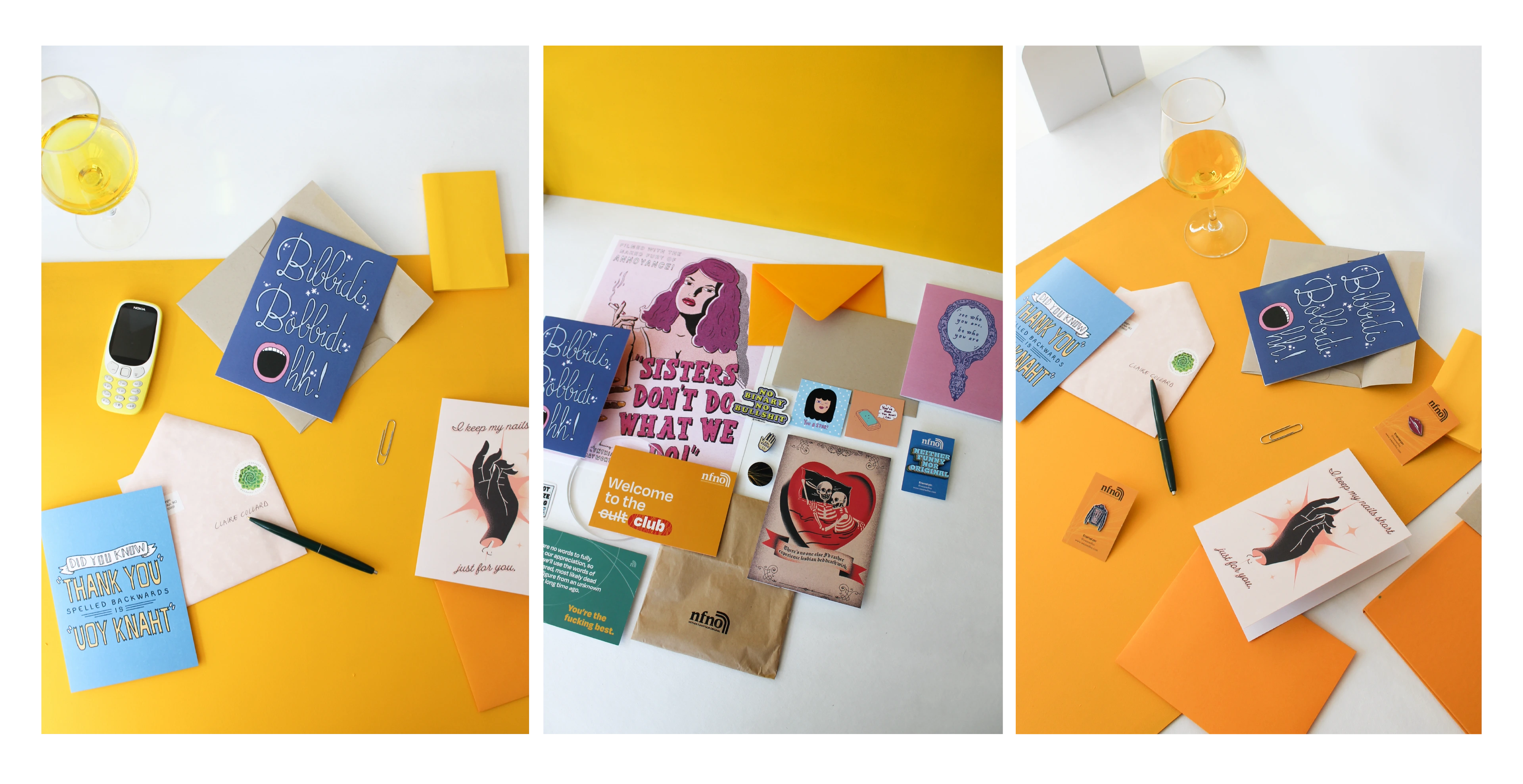
NFNO - selection of items they sell
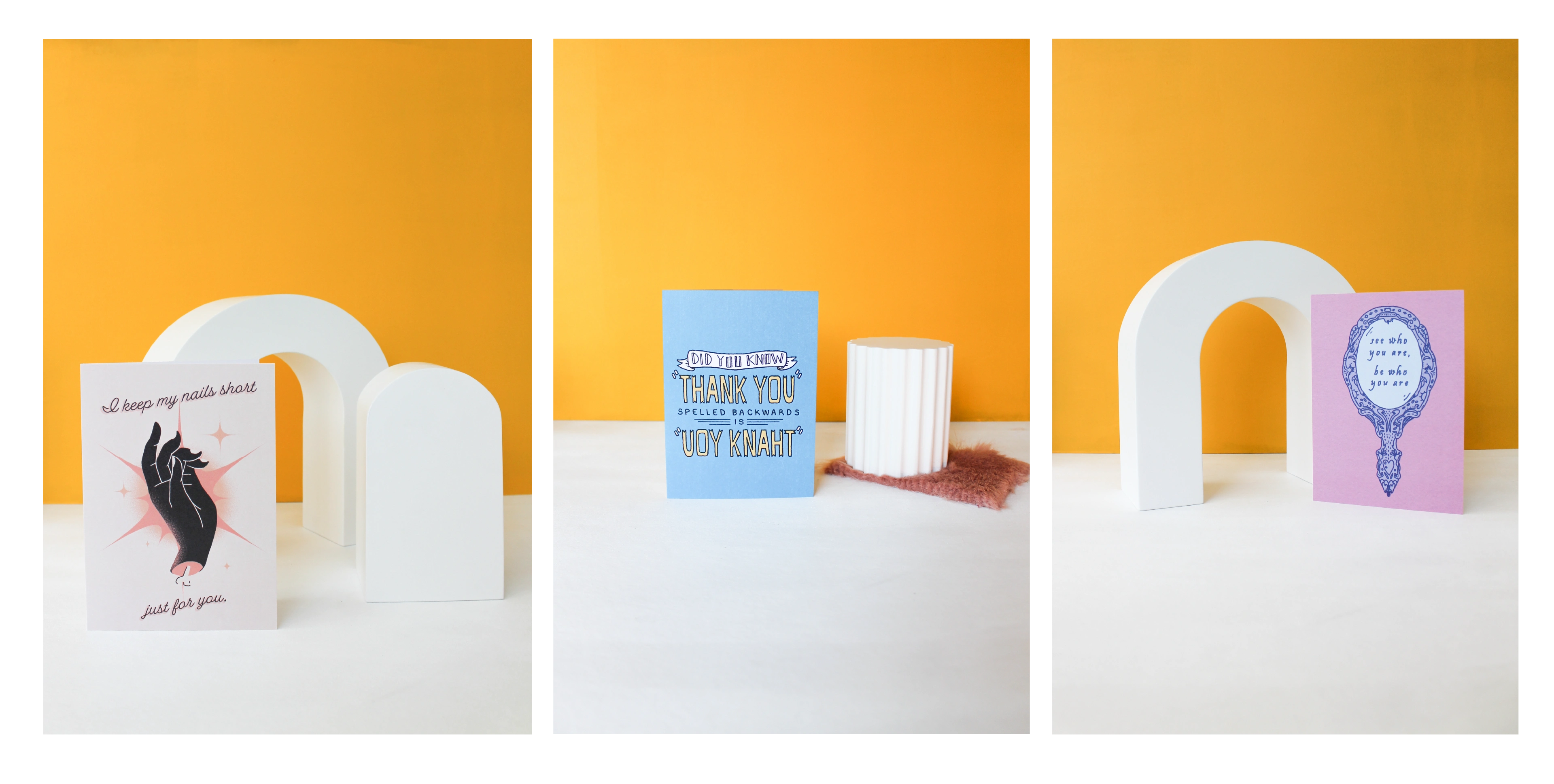
NFNO - selection of unconventional greeting cards
Like this project
Posted Jun 8, 2023
Branding for Neither Funny Nor Original queer podcast & online store for unconventional greeting cards.