Communi - Mobile Product Design
Dominik Mészáros
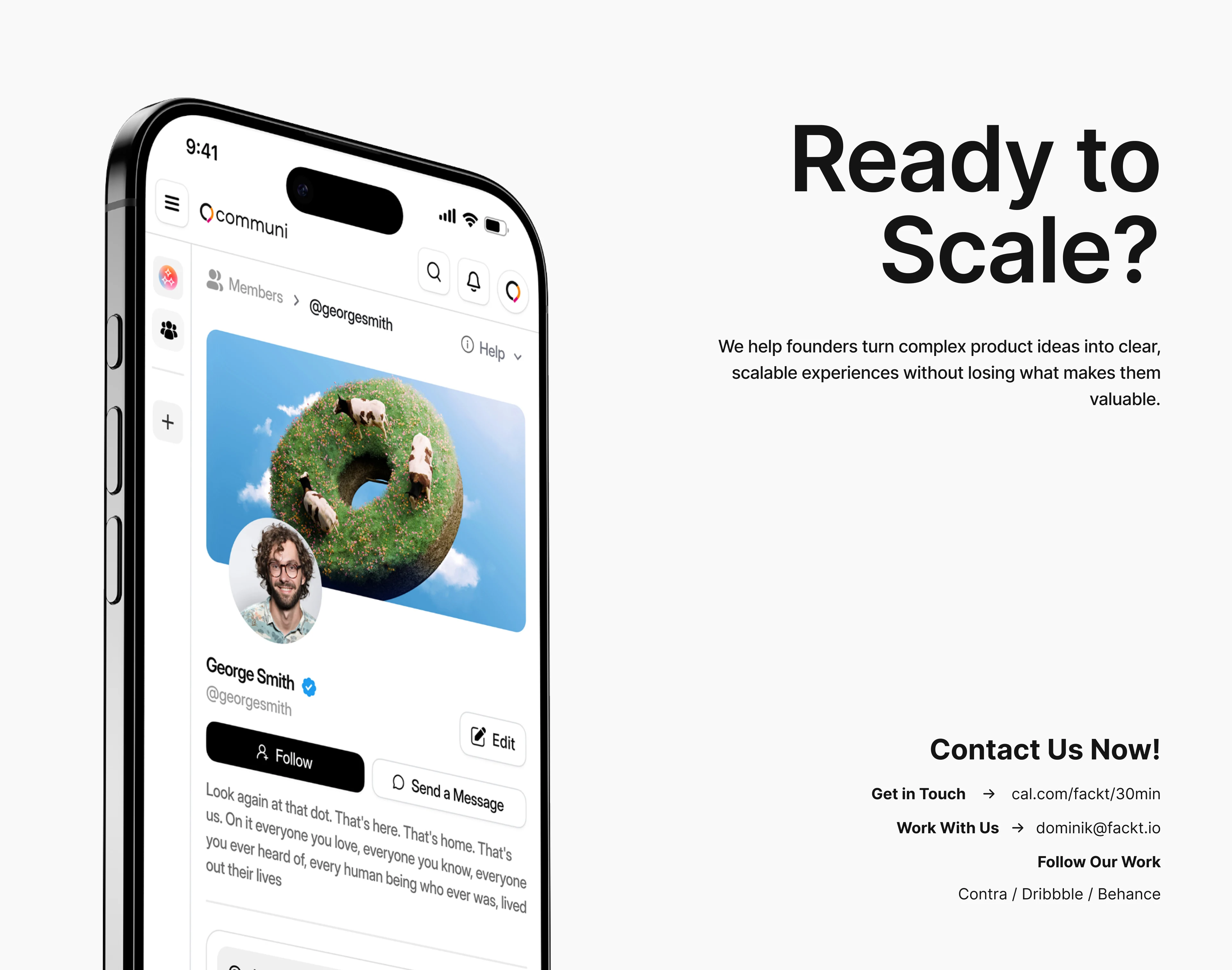
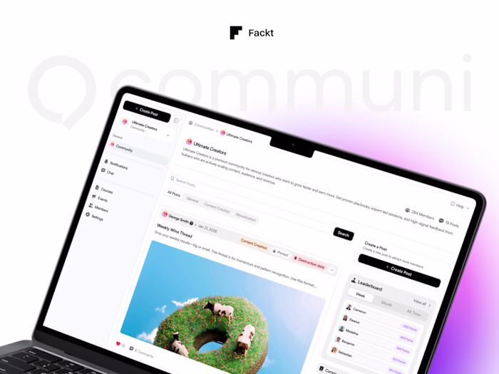
Communi – Mobile Product Design
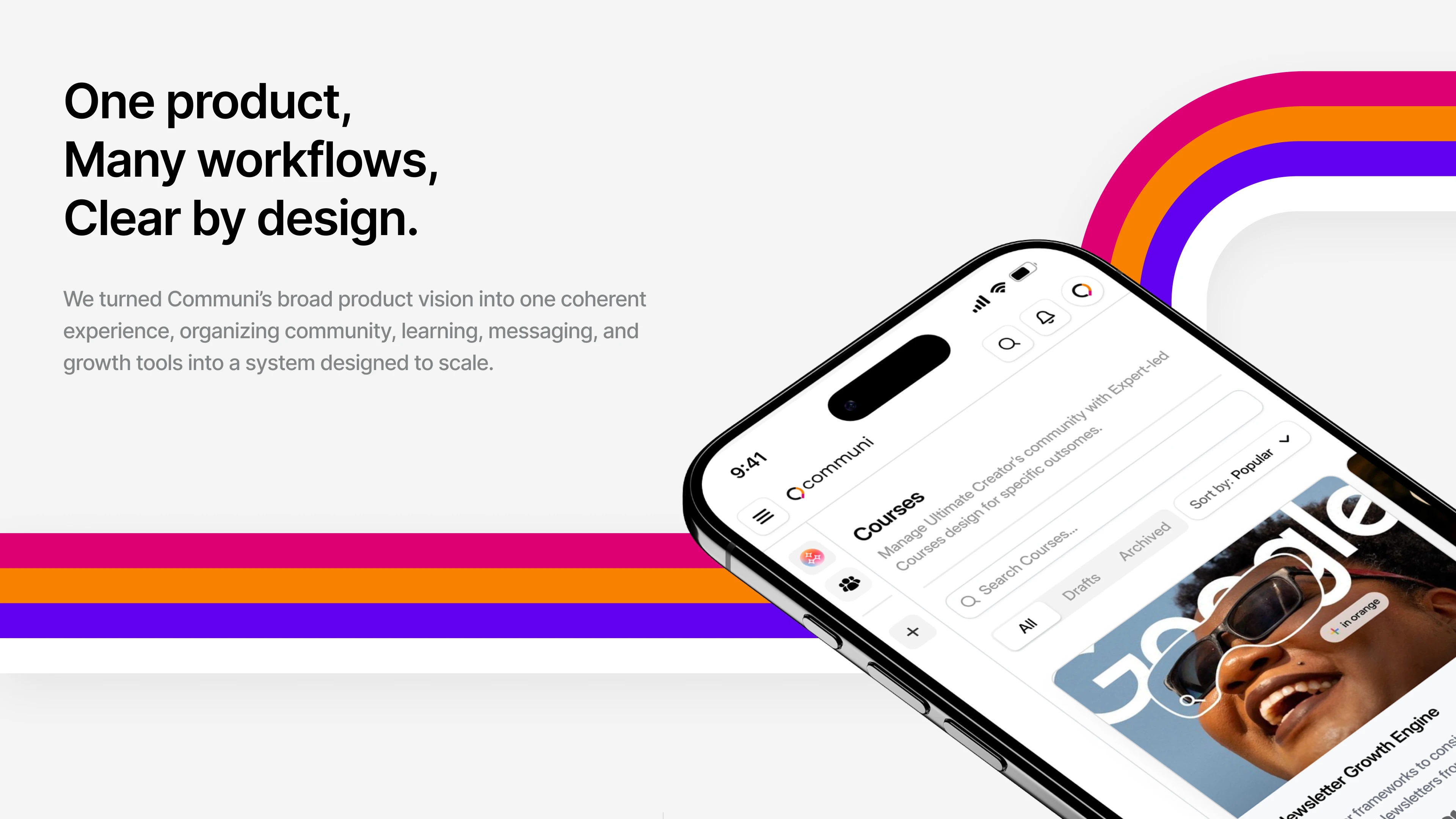
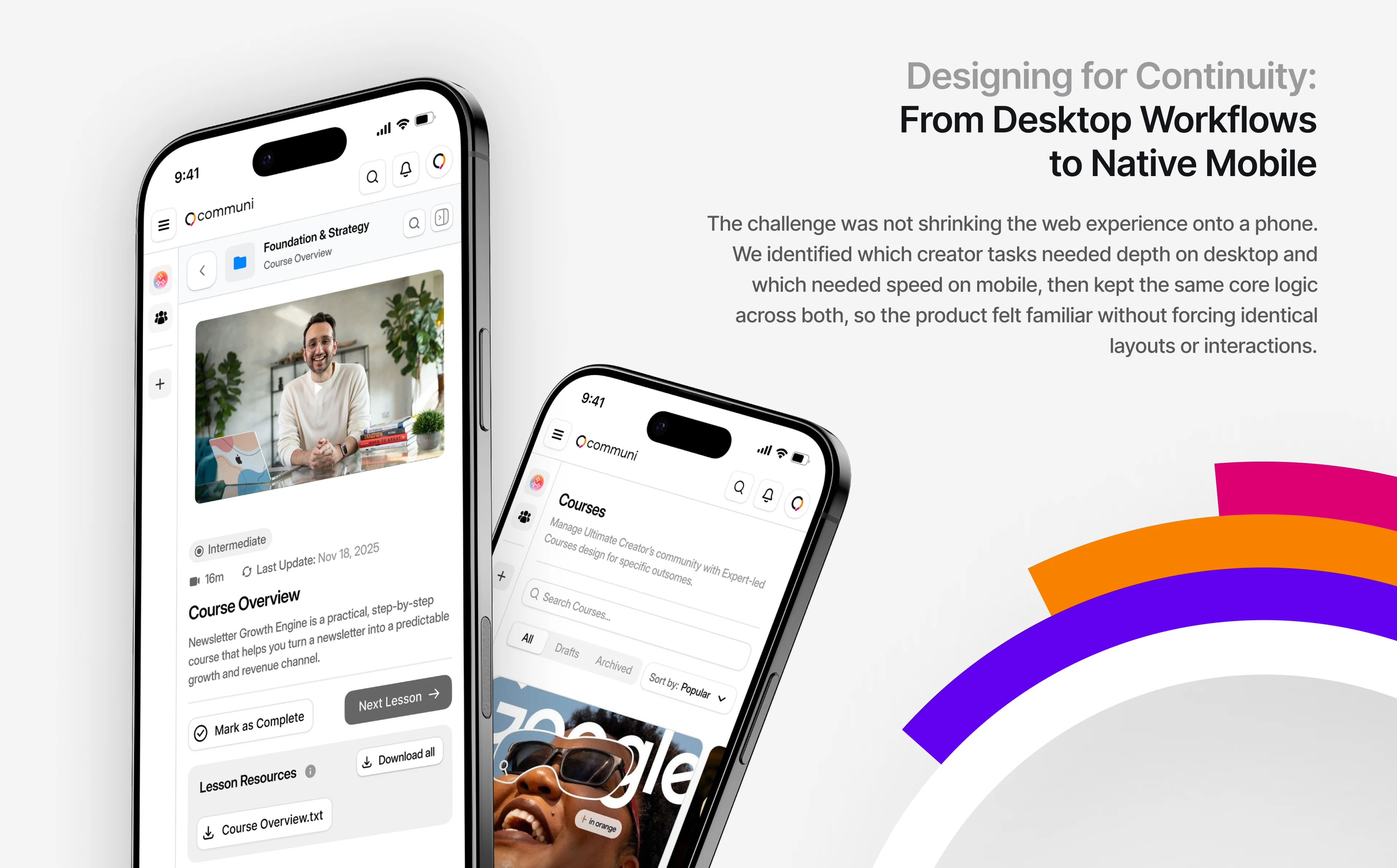
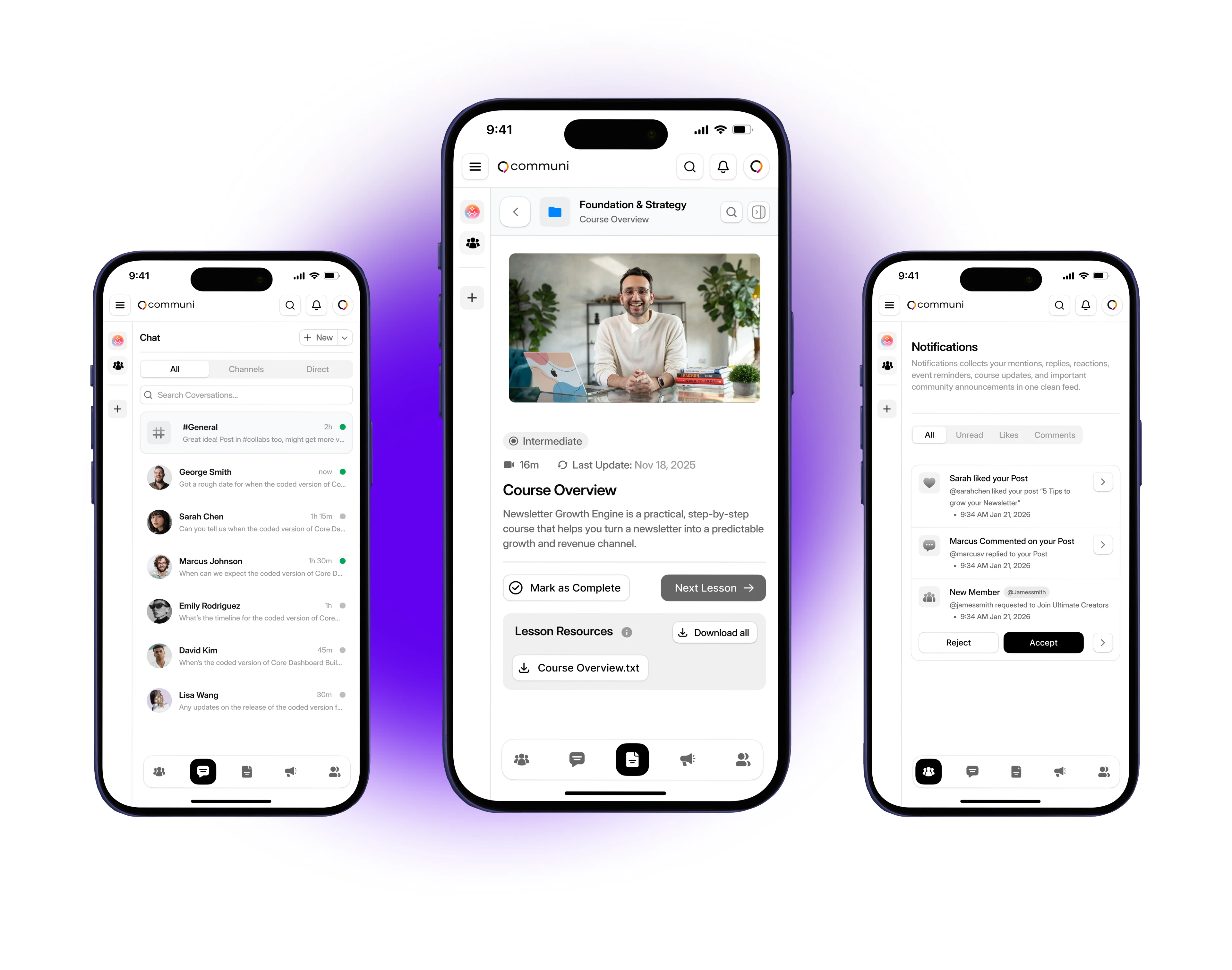
Mobile-first product design and design system for a creator economy platform. The challenge: fit community, courses, messaging, and monetization into a phone without sacrificing clarity or depth.
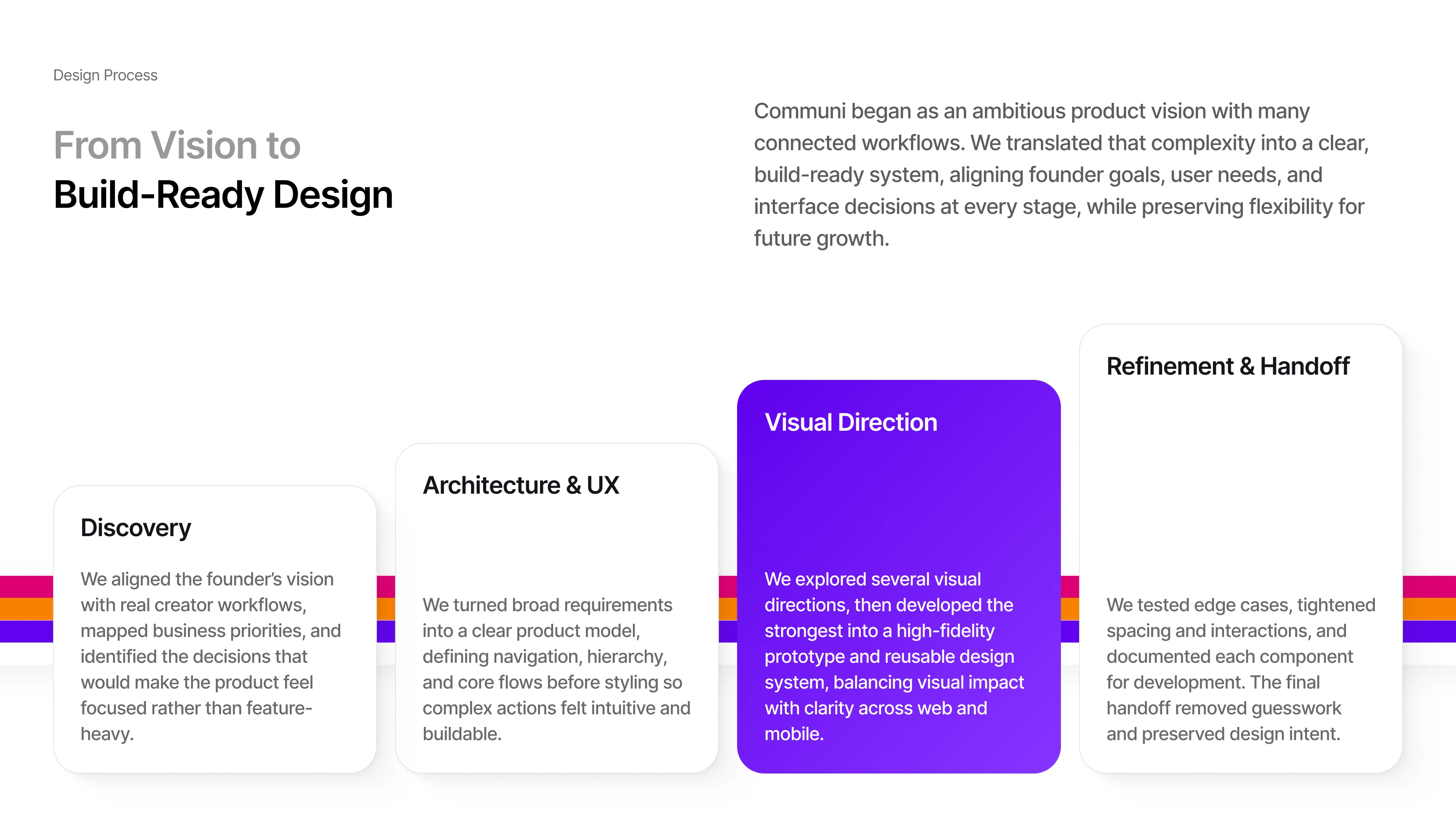
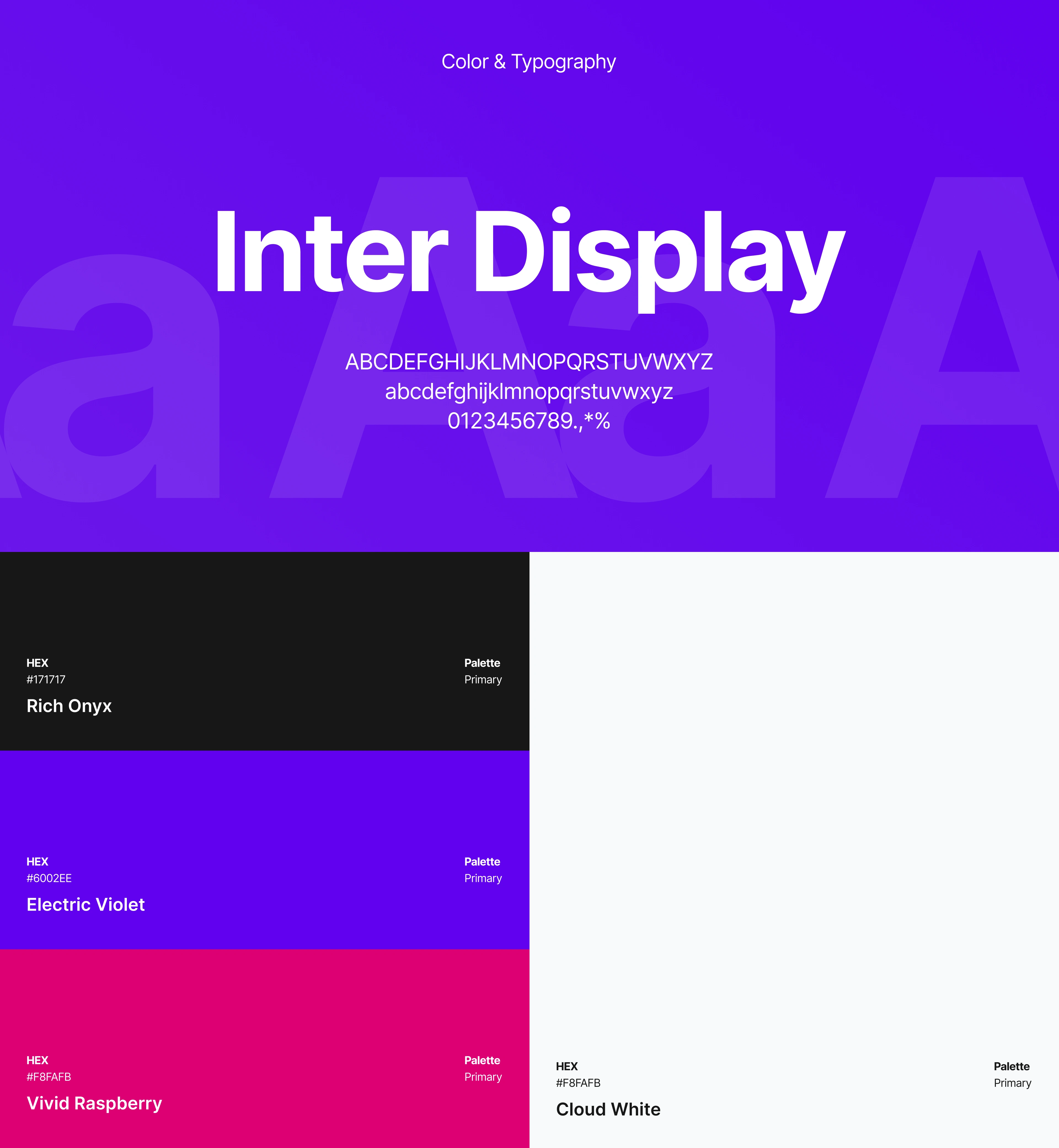
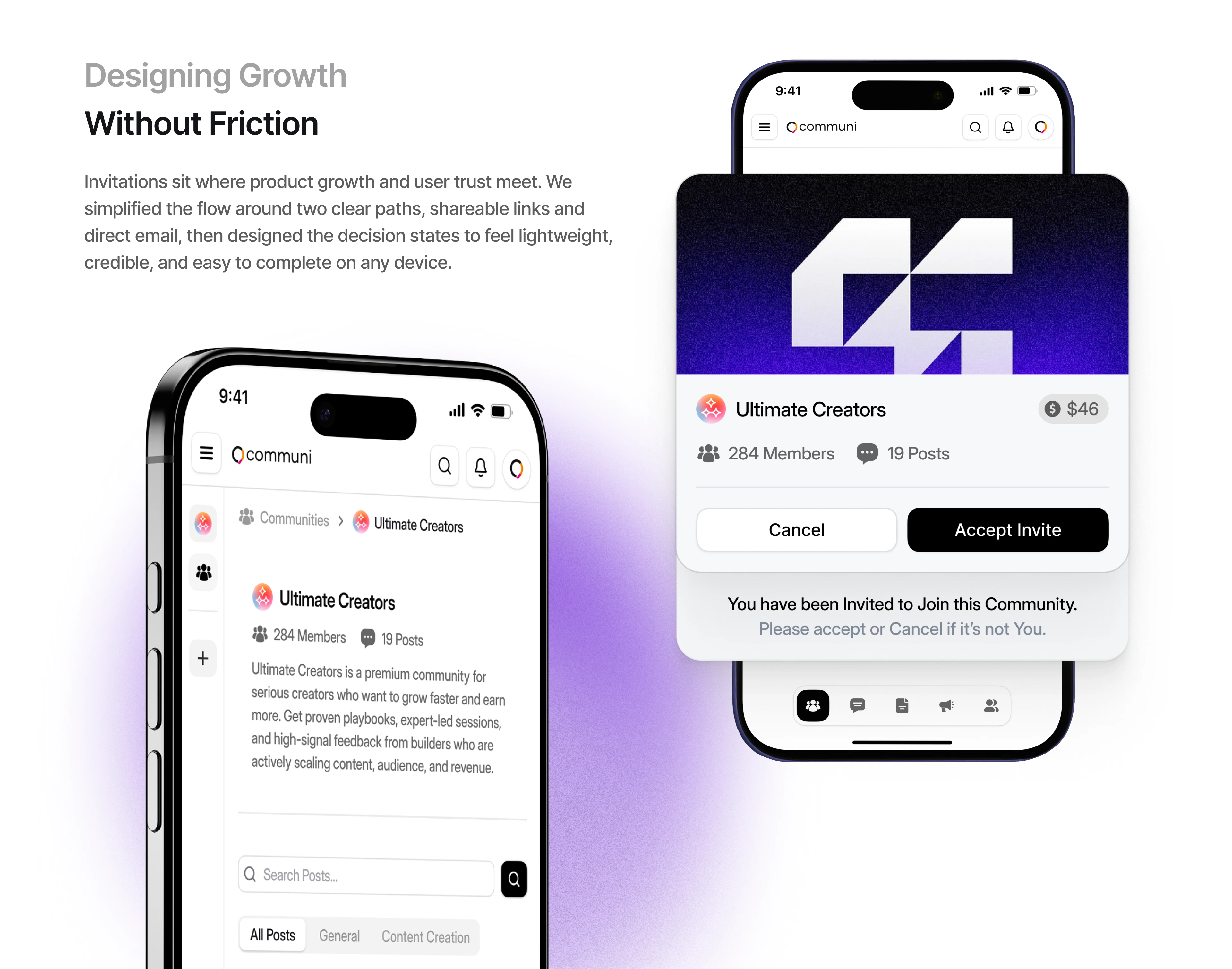
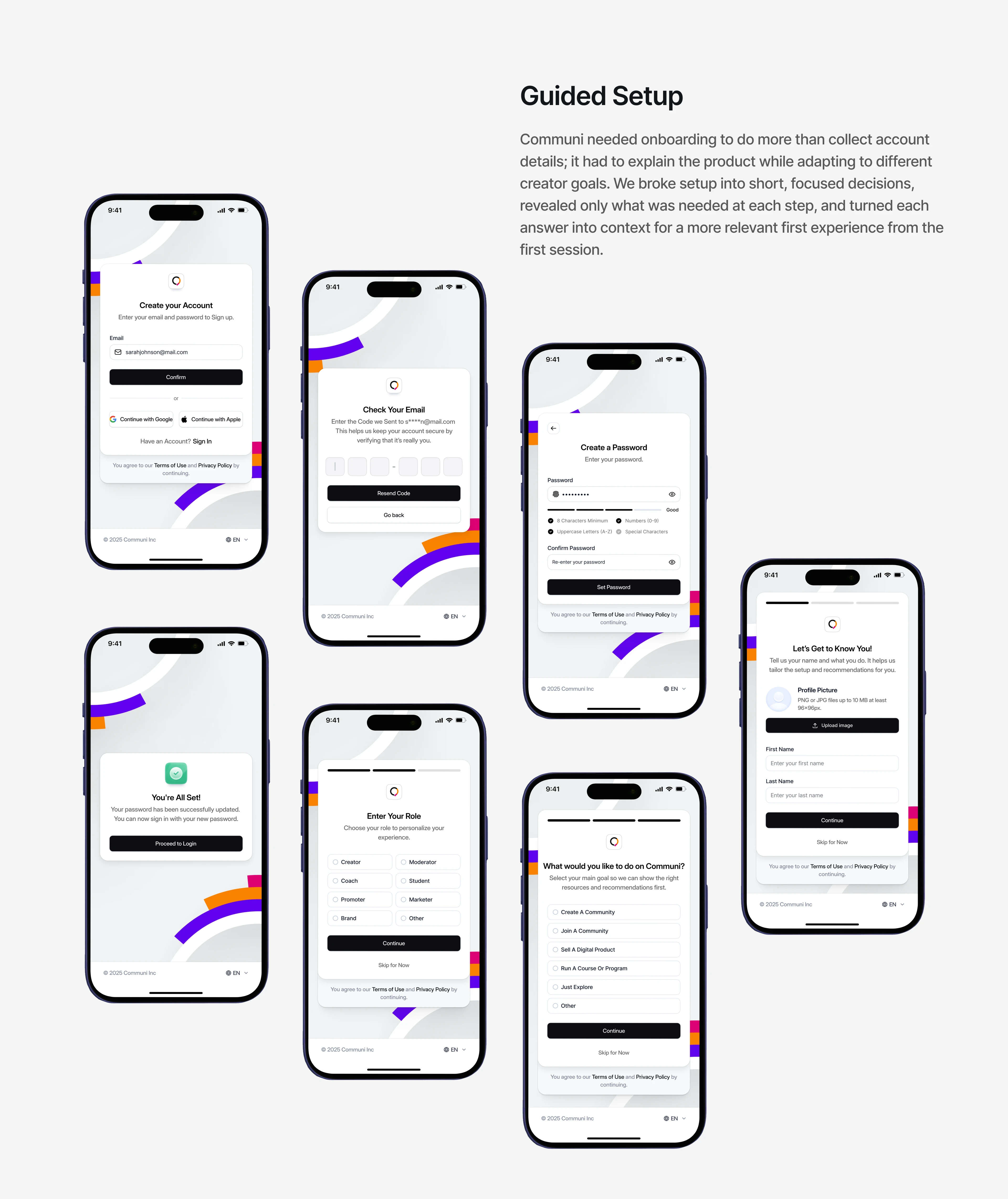
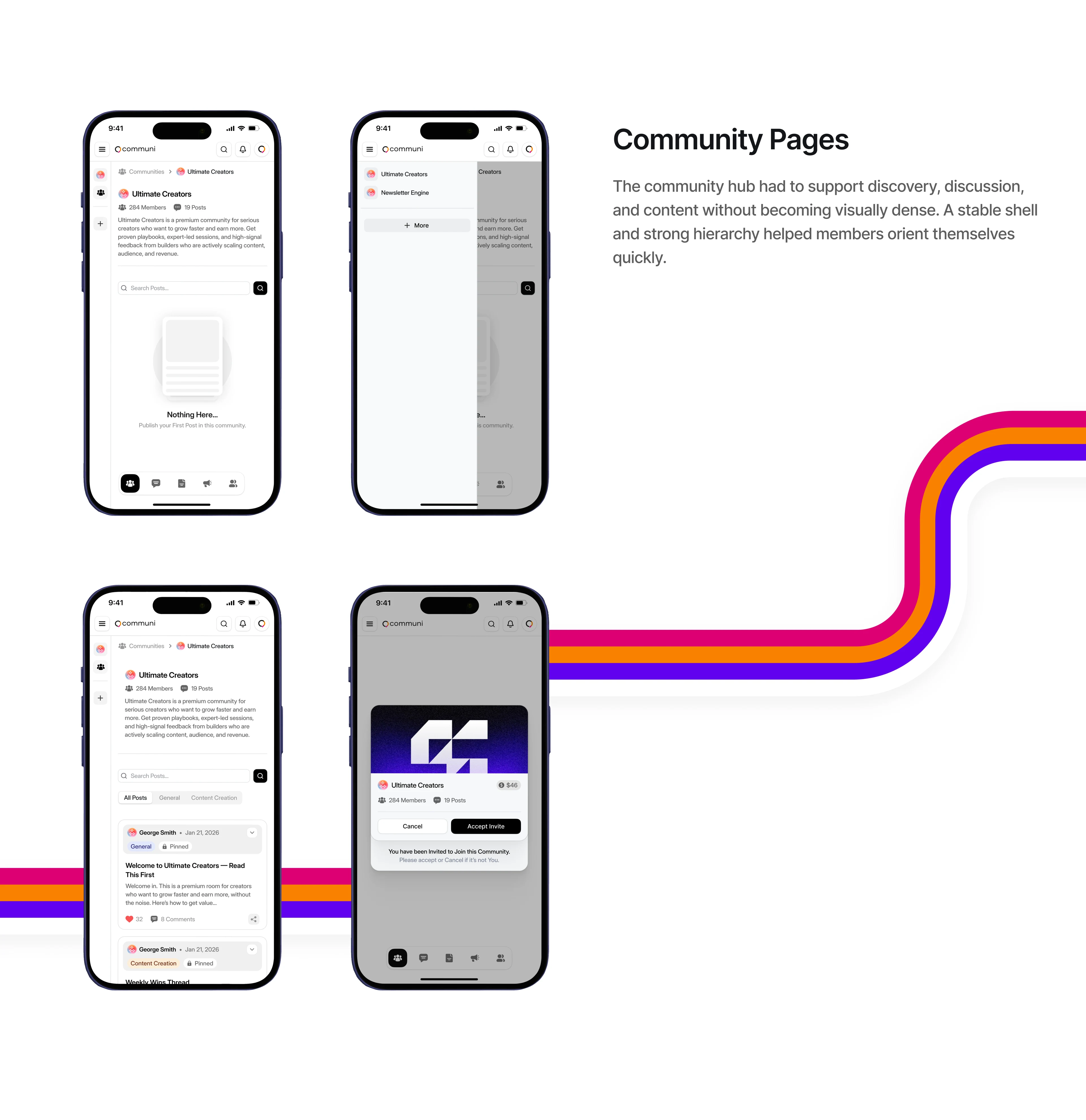
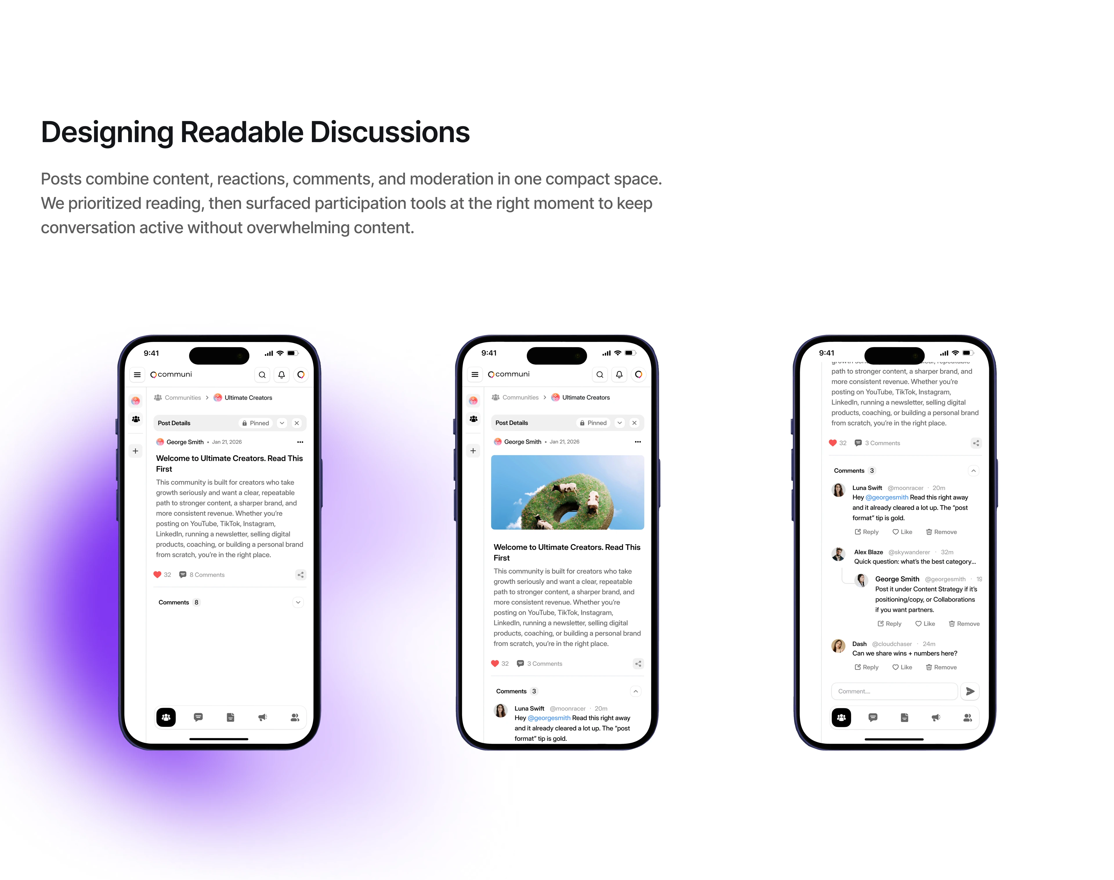
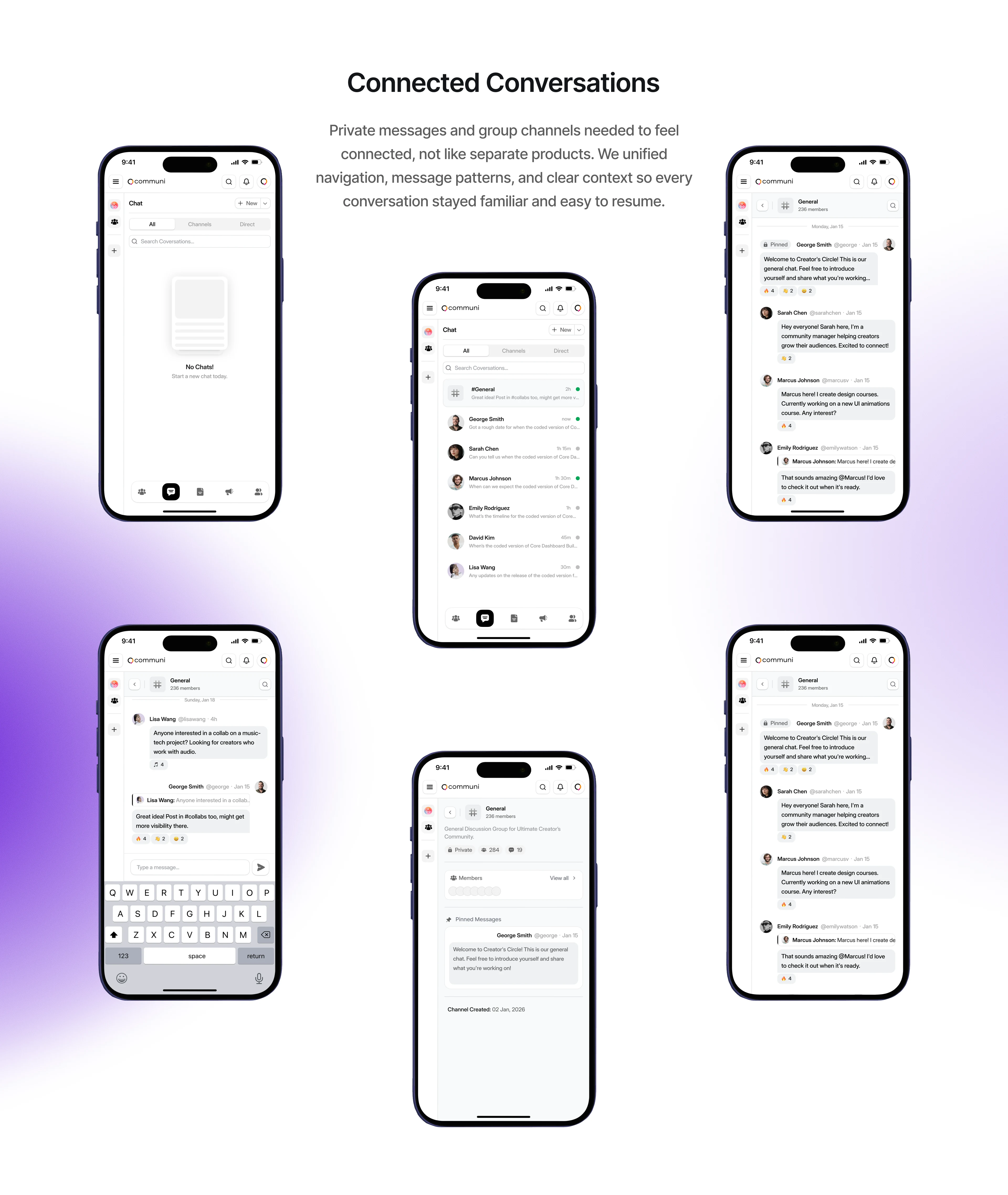
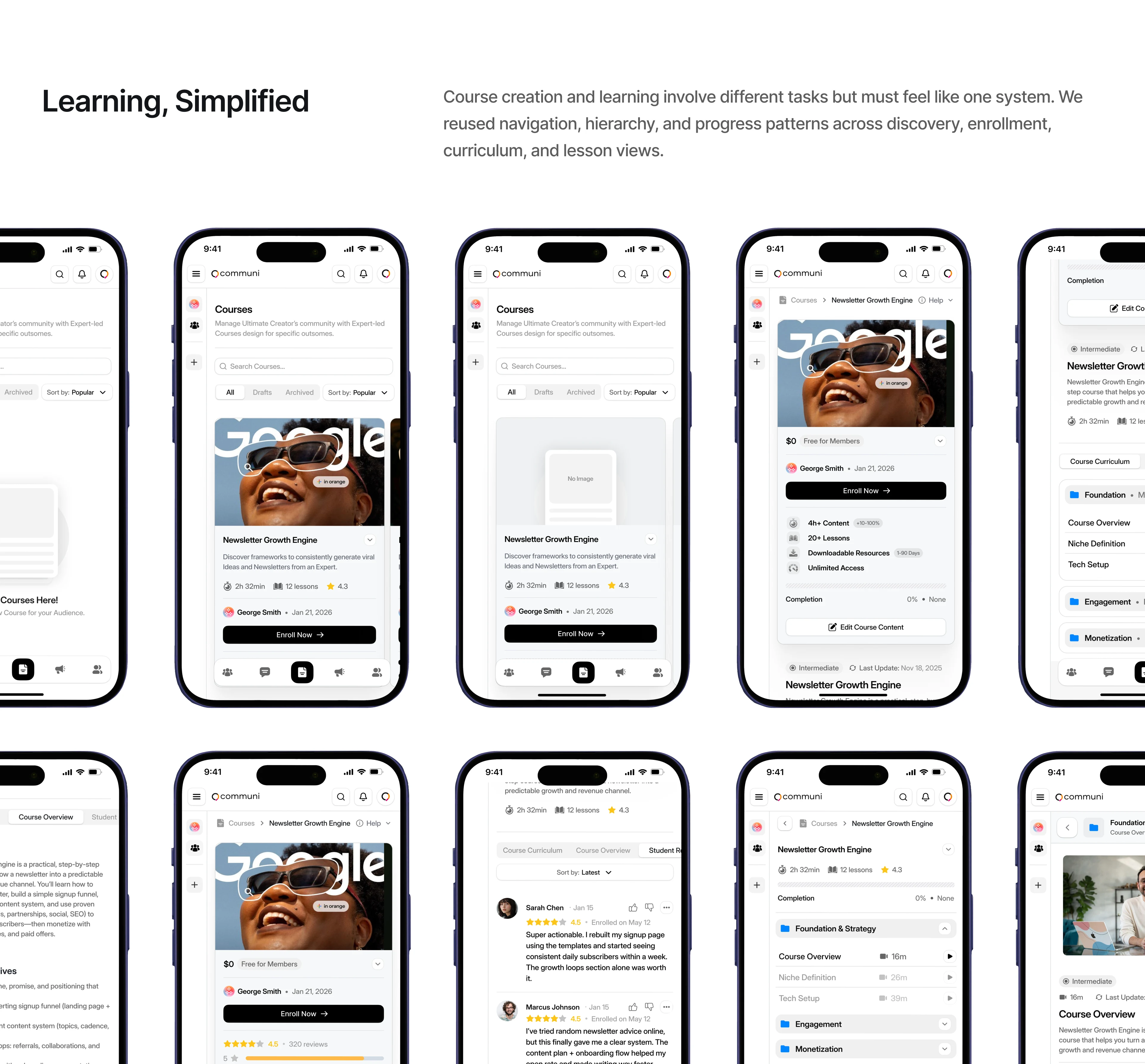
We prioritized reading over decoration, used clear task hierarchy to avoid feature overload, and designed guided onboarding that adapted to different creator goals. Navigation stayed consistent across messaging, community pages, and learning, so switching between workflows felt natural. The design system used one accent color (electric violet) to highlight actions and key moments, keeping the rest clean.
Scope: Mobile UX, onboarding flows, community pages, messaging design, design system
Team: Fackt (Design)
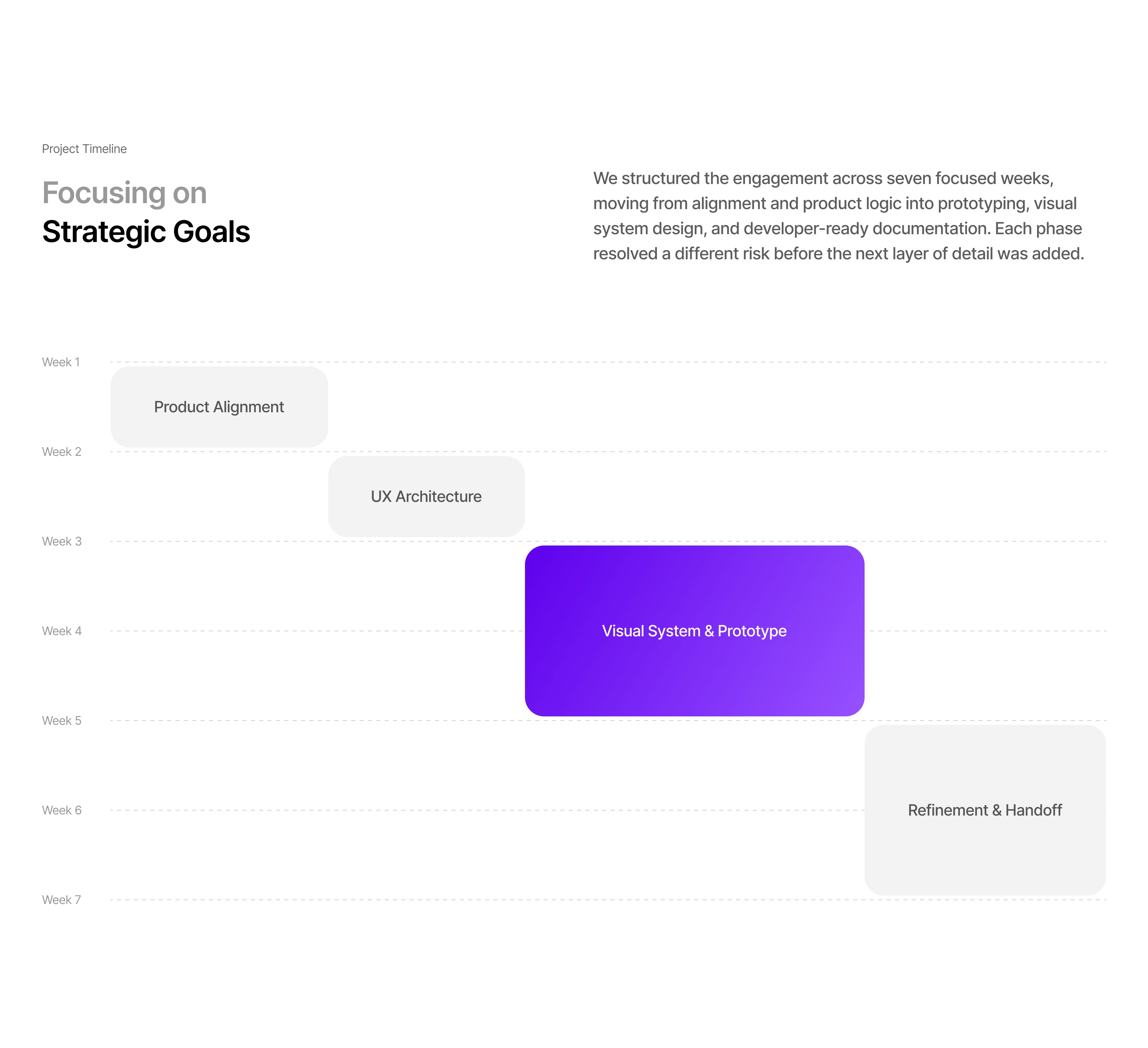
Tools: Figma, design system, 7-week timeline
Like this project
Posted Jun 23, 2026
Designed a mobile-first product and system for a creator economy platform.