Bucharest National Opera | Rebrand
Ioana Păcurar
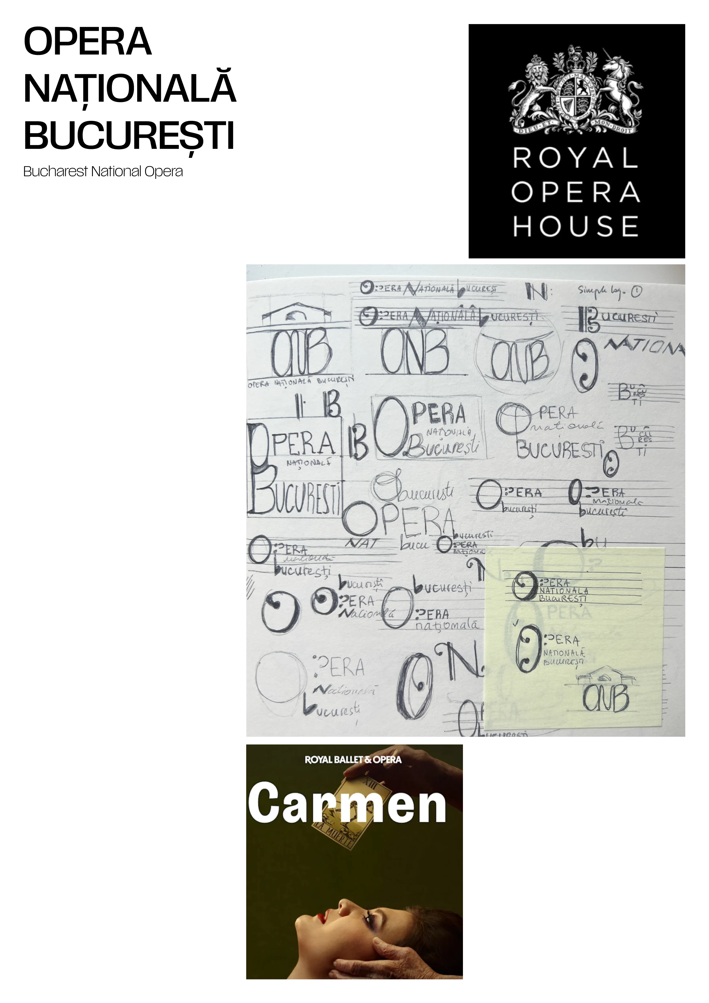
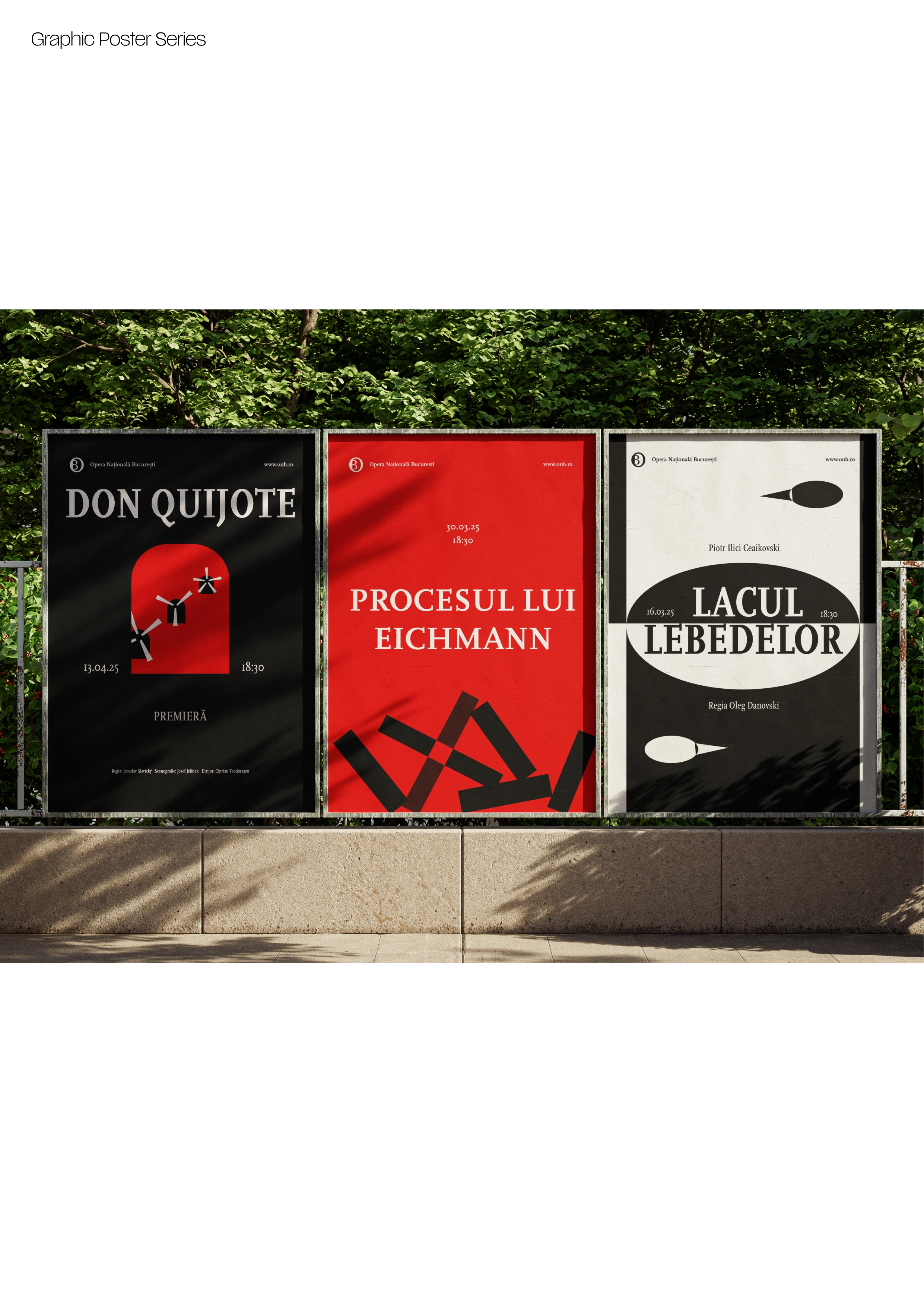
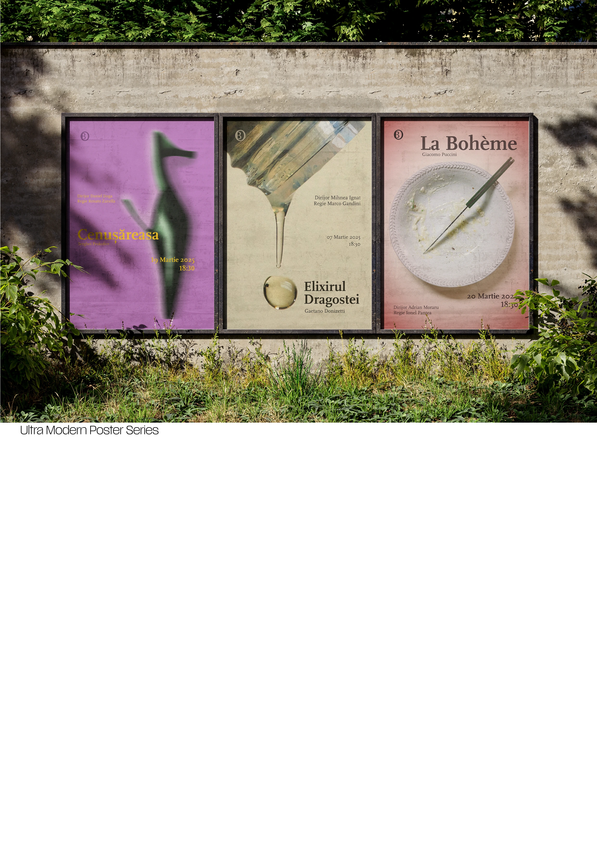
Introducing the rebrand for Bucharest Opera House
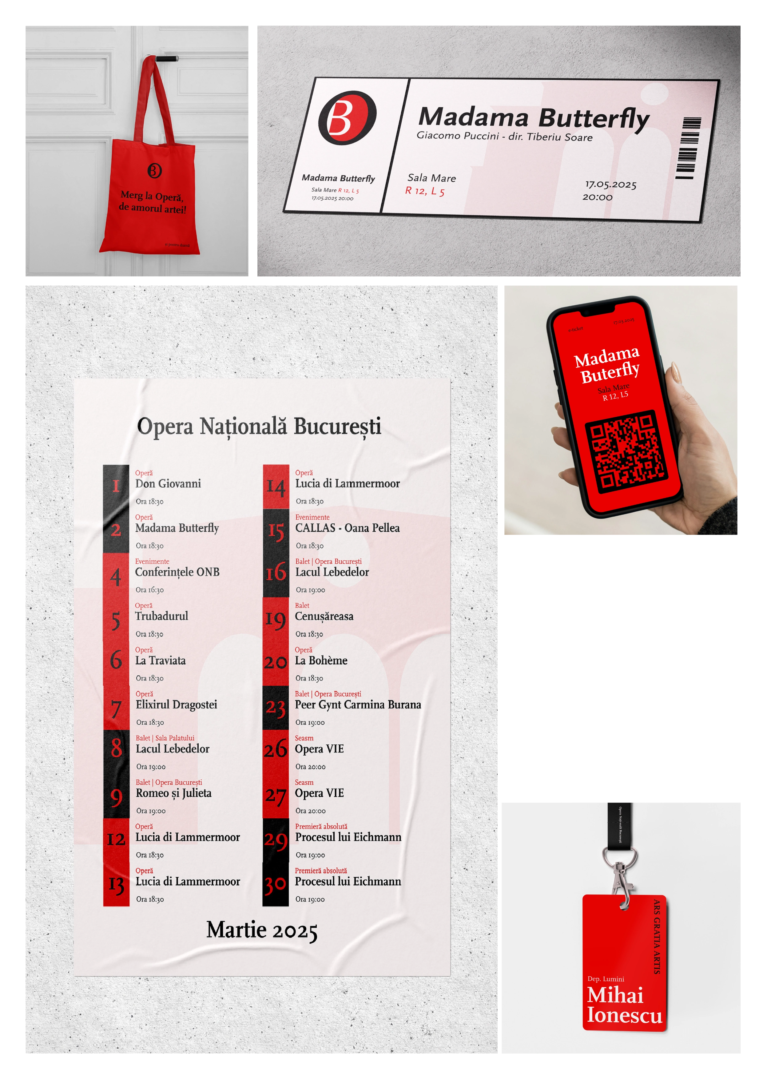
The main purpose of this rebrand was to modernise the look and feel of the National Opera House from Bucharest.
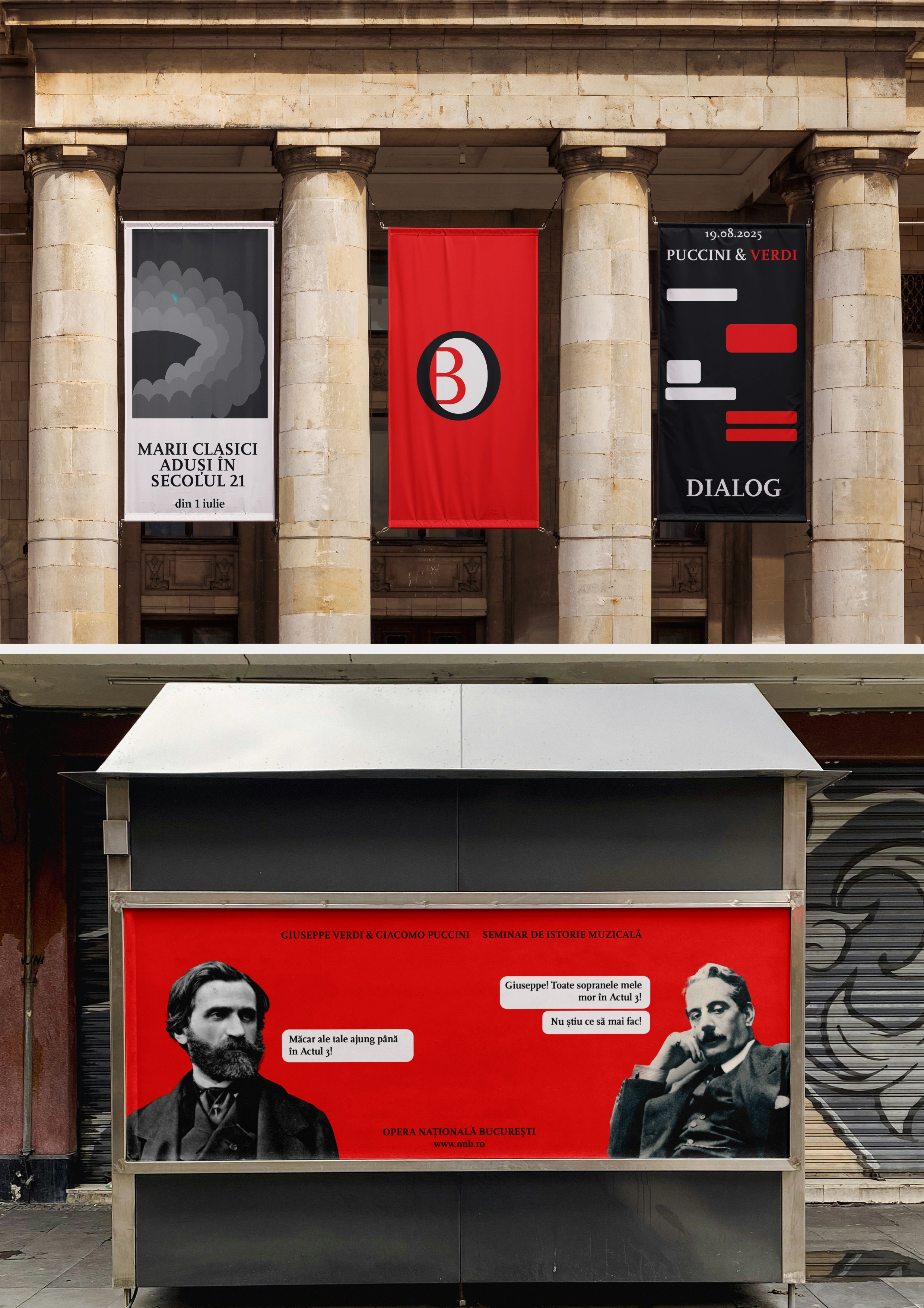
Eastern countries stil did not understand the importance of visuals, especially for cultural institutions, and they are stuck in a very old design style that does not provide them the unique angle they need.
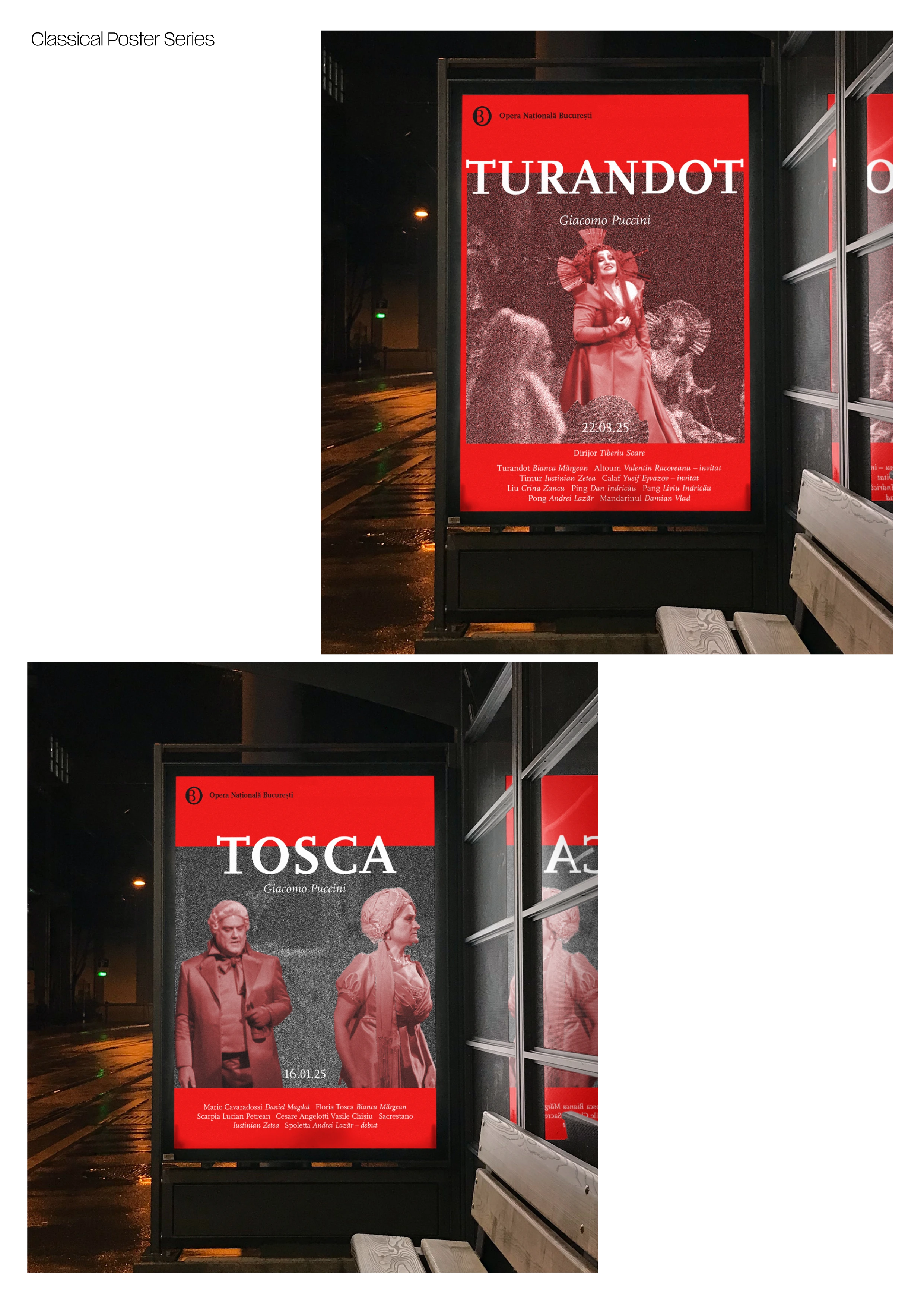
With this rebrand I tried to push the limits of the poster an Opera House could have and I tried to soften and improve the tone of voice used for the younger generation.
The ultimate goal was to bring classical and opera music closer to the younger generations by anchoring it in today's world withou loosing the tradition and meaning of art.

Like this project
Posted Feb 27, 2025
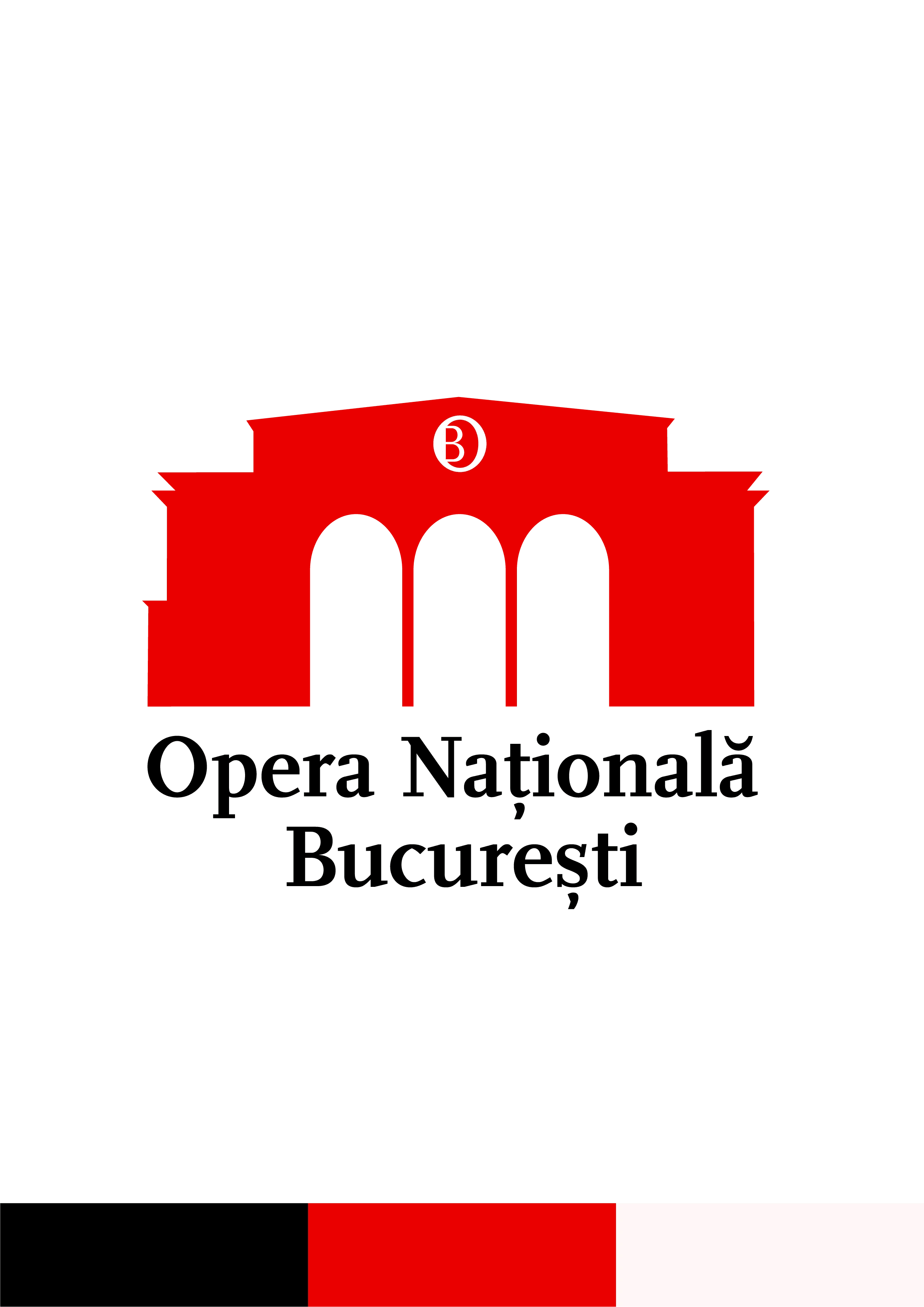
Reimagining the Opera House Bucharest logo—blending tradition with modern elegance for a timeless, iconic identity. A fresh take on a cultural landmark!