How to Create a Color Palette for Your Brand
A simple color palette is a powerful tool for creating a memorable brand 🎨
Are you overwhelmed by the thought of creating a color palette for your brand? As a designer, I’ve been there. In this post, I'll reveal how using fewer colors can help your business stand out, share real-world examples of brands that have nailed this strategy, and provide actionable steps to help you create your simple color palette.
Why less is more when it comes to color
When you have too many colors to choose from, decision-making can become a nightmare. By limiting yourself to just a few colors, you can streamline the process and create high-quality content more efficiently. Plus, a limited color palette makes it easier to maintain a consistent and professional look across all your brand materials, which is crucial for brand recognition and building trust with your audience.
Brands that have nailed simple color palettes 🔍
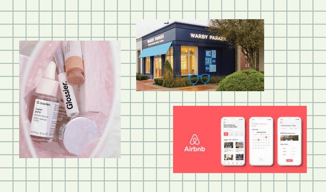
💄 Glossier: The beauty brand built a cult following with millennial pink as their dominant color, complemented by white and gray accents.
👓 Warby Parker: This eyewear company uses classic black and white with a pop of bright blue to let the unique shapes and designs of their glasses shine.
🏡 Airbnb: The travel and hospitality company uses black, white, and bright pink to draw attention to important elements on their website and app.

Follow these simple steps to create a unique color palette for your brand
Step 1: Get Emotional 😍
Before you choose your colors, think about the values and personality of your brand, and the emotions you want your audience to feel when they interact with your brand. Do you want to create a calm and soothing atmosphere, or do you want to create a bold and exciting atmosphere?
As a brand identity designer, my clients are often embarking on a new venture or reimagining an existing one. When my clients work with me, I want them to feel optimistic and encouraged. After all, they're ready to grow their brand, and I'm here to help make that happen.

Step 2: Use Color Psychology to Your Advantage 🧠
Color psychology is the study of how colors affect human behavior and emotions. By considering color psychology, you can choose colors that match the emotions you want your audience to feel.
Common color associations:
Red: excitement, passion, love
Orange: friendliness, energy, warmth
Yellow: happiness, optimism, positivity
Green: health, nature, growth
Blue: trust, peace, calm
Purple: creativity, luxury, royalty
Pink: femininity, love, compassion
Brown: reliability, warmth, comfort
Gray: professionalism, sophistication, neutrality
Black: power, sophistication, elegance
White: purity, simplicity, cleanliness
Step 3: Choose a Dominant Color
Now that you understand the emotions associated with different colors, it's time to choose a dominant color. This will be the primary color used in your branding materials, like your logo and website. Choose a color that reflects the primary emotion you want your audience to feel and that aligns with your brand values and personality.
I'm usually working with folks undergoing a transition, so I'm going with a dominant color that represents growth.

Step 4: Choose Accent Colors
To add visual interest and variety to your branding materials, choose one or two accent colors that complement your dominant color. These accent colors should be used sparingly to avoid overwhelming your audience. When selecting these colors, think about the secondary emotions you want your brand to convey and how they can be reflected through color.
For my brand, I'm using a bright yellow to create feelings of optimism, and an energizing orange to represent the friendly support that I offer my clients.

Step 5: Choose Neutral Colors
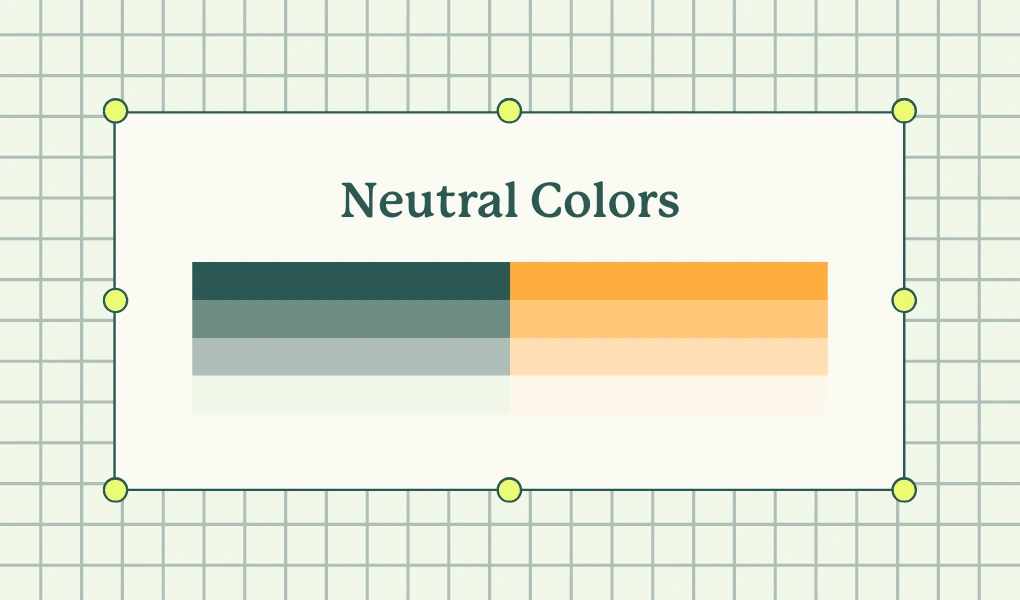
Your neutral colors will provide a backdrop for the more vibrant shades in your palette, enhancing their impact. A simple way to choose supportive neutral colors is by using shades and tints of your dominant and accent colors. This adds depth to your palette while maintaining a cohesive look. For example, if your primary color is blue, use light shades of blue for your neutral colors to create a nuanced and dynamic color palette. This approach also makes it easier to create different materials that all fit within your brand's visual identity. Check out this website to easily create shades and tints of your dominant and accent colors.

Step 6: Document Your Color Palette ✍️
Once you've finalized your color palette, it's important to document it. This means recording the hex codes or RGB values for each color so that you can easily reference them when creating marketing materials. You should also create a style guide that outlines how and where to use each color in your branding materials.
Final Thoughts 💭
By selecting a few primary colors and sticking to them consistently across all marketing materials, you can reduce the time and effort spent on color selection and avoid the temptation to procrastinate in creating new materials. By focusing on simplicity, you can create a cohesive brand that stands out in a crowded marketplace.
Need help? Let me know 👋
Like this project
Posted Mar 16, 2023
Learn how to create a simple yet powerful color palette that will make your brand stand out and be remembered.
Likes
0
Views
19


