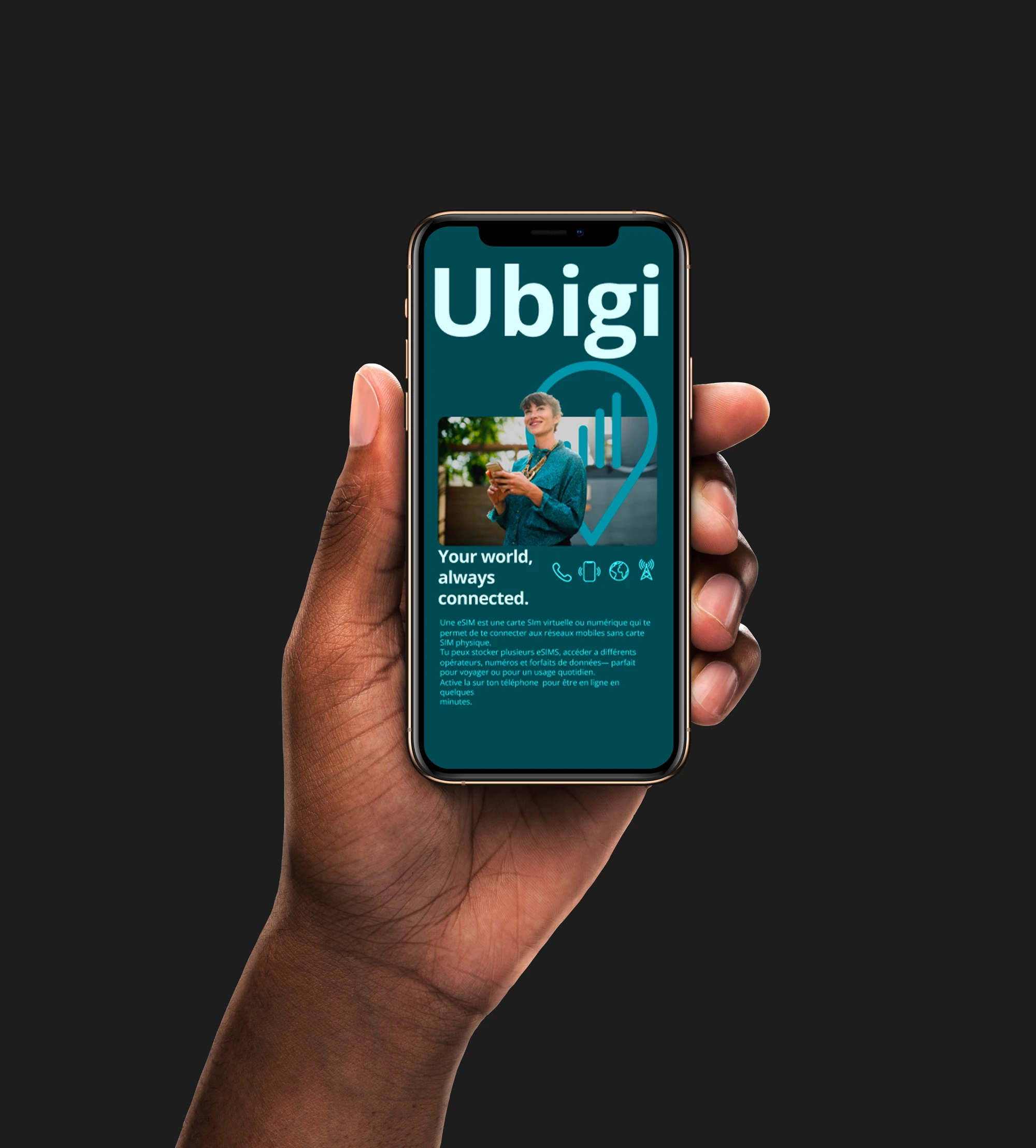
Ubigi App Redesign for Enhanced User Experience
romain martinez

The Ubigi app redesign project aimed to rethink and improve the overall user experience of an existing eSIM management app. As a frequent user of the app myself, I had insights into its usability pain points and overall experience gaps.
Picture yourself landing in a foreign country, suitcase in hand, eager to explore and ready to connect. Your phone should be your trusted travel companion, effortlessly switching to a local data plan so you can navigate, share, and stay in touch without worry.
That could have been the story. But mine was a little different.
As a frequent traveler, I relied on the Ubigi app, an eSIM service designed to simplify connectivity around the world. In theory, it promised seamless data access in just a few taps. In practice, I found myself lost in confusing flows, uncertain prompts, and inconsistent design choices that turned a simple task into a small frustration.
That experience sparked my redesign journey. I wanted to understand why such a useful service felt so hard to use and how I could help make it effortless.
To begin, I conducted a benchmark analysis of leading eSIM and connectivity apps such as Airalo, Truphone, and Holafly. The goal was to identify what made their experiences intuitive and trustworthy. Clear onboarding, transparent pricing, consistent UI elements, and reassuring feedback at every step quickly emerged as shared strengths.
Armed with those insights, I turned back to Ubigi for a deeper exploration. Through my own usage analysis, I identified key usability gaps: unclear navigation, inconsistent visual hierarchy, and a lack of user guidance during crucial actions like activation and plan management.
These findings became the foundation of my redesign. My mission was to transform the Ubigi experience into one that truly empowers travelers—intuitive, cohesive, and human-centered. A design that makes connecting abroad feel as easy as arriving.
Research & insight
The research phase focused on understanding both the competitive landscape and the user pain points that defined Ubigi’s existing experience.
Benchmark Analysis
To establish a strong foundation for the redesign, I analyzed several direct and indirect competitors in the eSIM and connectivity market. This benchmark included apps such as Airalo, Truphone, Holafly, and Nomad, evaluating each on criteria like onboarding flow, plan discovery, purchase process, and account management.
The analysis revealed a clear pattern: successful eSIM apps prioritize transparency, minimal steps to activation, and clear visual hierarchy.
User Feedback & Personal Experience
I began to think deeper: Why do people really need an eSIM app?
It’s not just about buying data. It’s about staying connected without friction. For travelers, freelancers, and digital nomads, an eSIM app represents freedom, the ability to move, explore, and communicate without worrying about physical SIM cards or hidden fees.
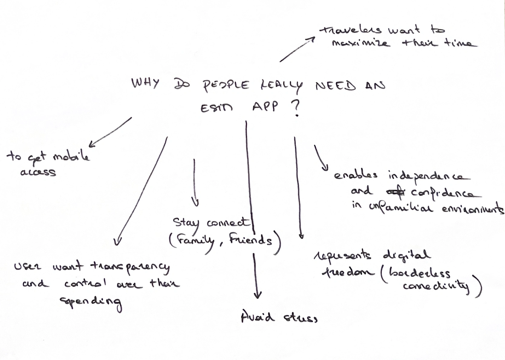
Through this simple but powerful exercise, I realized that the true purpose of an eSIM app goes far beyond data plans or technology. It’s about empowerment, trust, and ease helping users feel connected to the world with just a few taps.
Drawing on my own experience as a Ubigi user, I identified recurring frustrations that aligned with user feedback :
Complex onboarding with unclear steps for eSIM activation.
Inconsistent interface elements that disrupted the visual flow.
Limited feedback during critical actions, leaving users uncertain about progress.
Difficult navigation between data plans and settings.
These insights confirmed that usability and guidance were the primary challenges in the existing experience. The app had strong technical potential, but the design and flow did not effectively support user needs or mental models.
Problem statement
The challenge was clear: how might we redesign the Ubigi app to make managing eSIMs intuitive, fast, and trustworthy, giving users freedom, control, and peace of mind while traveling?
Travelers rely on eSIM apps to stay connected instantly, save time, and control costs while abroad. Despite its potential, the existing Ubigi app created friction rather than ease. Users faced unclear navigation, inconsistent interface patterns, and limited guidance during crucial tasks such as activation, purchasing, and managing data plans.
The current experience demanded too much effort from users, forcing them to adapt to the app rather than the app adapting to their needs. This led to frustration, wasted time, and uncertainty about cost and connectivity.
Design
With the problem clearly defined, I set out to turn insight into actionable design. The vision was to create an eSIM experience that felt effortless, delightful, and trustworthy.
I started to create a low-fidelity wireframe to focus on the flow and app hierarchy. The goal wasn't to start from scratch and redefine the wheel, but to enhance the previous app flow and bring a sip design harmony.
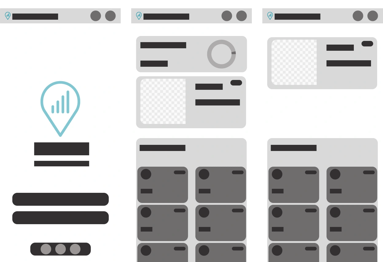
low-fidelity Wireframe
UI Design approach
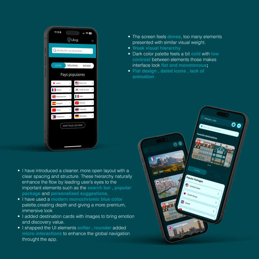
I chose a monochromatic blue palette to maintain visual cohesion throughout the interface. This approach minimizes visual clutter and distractions, allowing users to concentrate on the core functionality.
To enhance accessibility, I established a clear visual hierarchy by varying lightness and saturation within the blue palette. This technique signals importance and interactivity, while the monochromatic scheme also acts as a cognitive reducer, simplifying the user experience.
app screen
Simplified Navigation Through a Tab Bar
To reduce friction and make exploration effortless, I introduced a bottom tab bar as the main navigation system. This structure allows users to easily switch between key sections such as Home, Plans, Wallet, and Profile. The clear visual hierarchy helps users understand where they are at any moment, minimizing cognitive load.
Anchoring the Experience in the Real World
To make the interface feel more human and emotionally engaging, I incorporated real city images throughout the design. These visuals act as subtle anchors to real travel experiences, reminding users of the purpose behind the product.
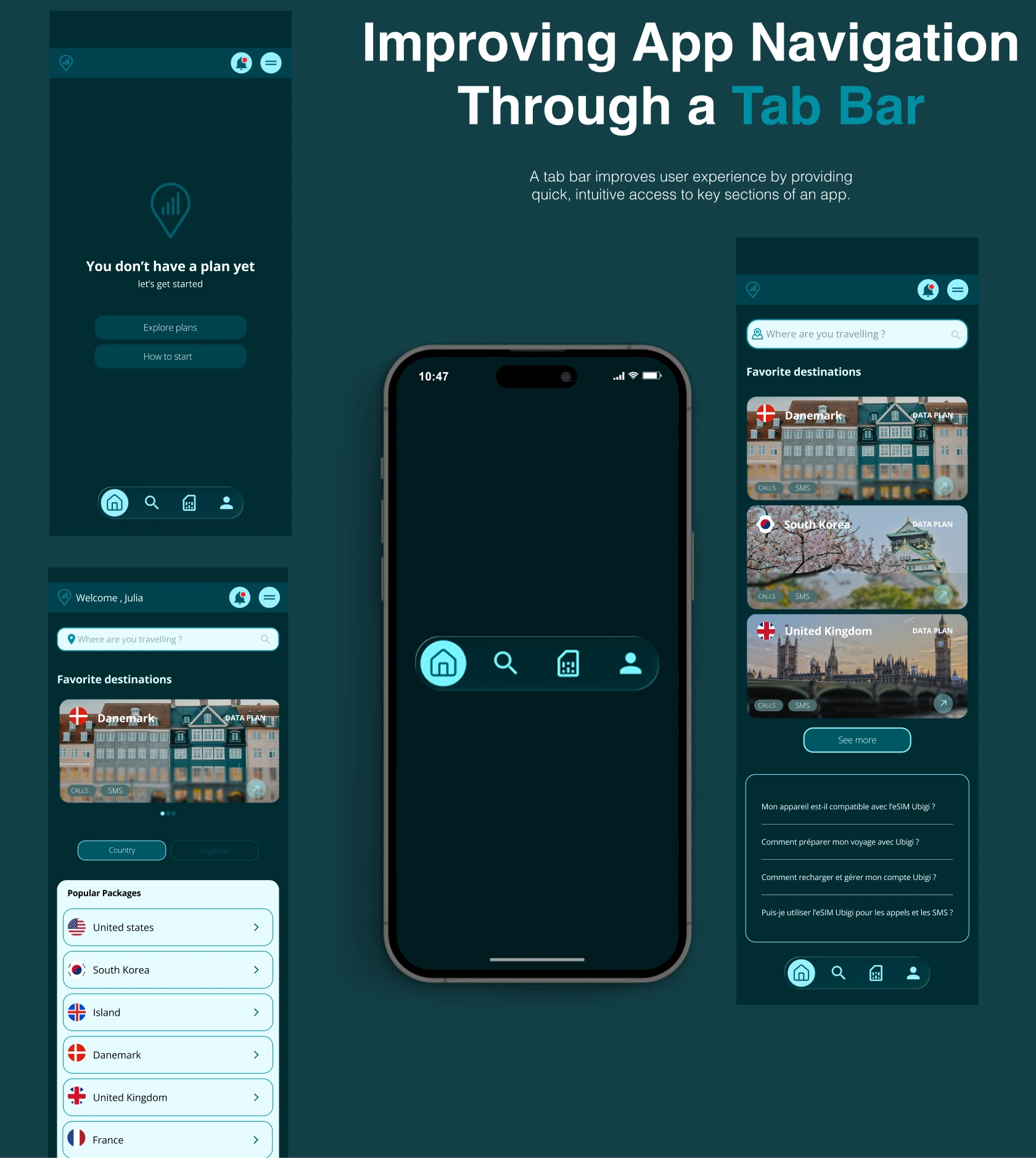
tab bar screen
A Wallet Feature to Centralize eSIMs
The idea for the Wallet feature came from observing how digital wallet apps such as Apple Wallet, Google Wallet, and Revolut manage multiple assets in one simple and intuitive space. These products have set a standard for clarity, trust, and immediacy, and I wanted to bring that same sense of organization and confidence to the Ubigi experience.
In the previous version of Ubigi, users had to jump between multiple screens to find information about their active or past data plans. This fragmentation created confusion and wasted time, especially for travelers managing several destinations or data plans.
Inspired by these peer products, I asked myself what if managing eSIMs could feel as natural as managing cards in Apple Wallet?
The redesigned Wallet feature became that solution. It provides a single, unified space where users can:
Instantly view all their active, past, and upcoming eSIMs
Access clear information on data usage, plan validity, and balance
Quickly purchase, top up, or reactivate a plan from the same interface
Studying successful wallet apps taught me valuable lessons. Familiar mental models build trust by reducing the learning curve. Centralization creates confidence by allowing users to see everything they need at a glance. Consistent visual design and clear hierarchy make it easier to scan, compare, and take action.
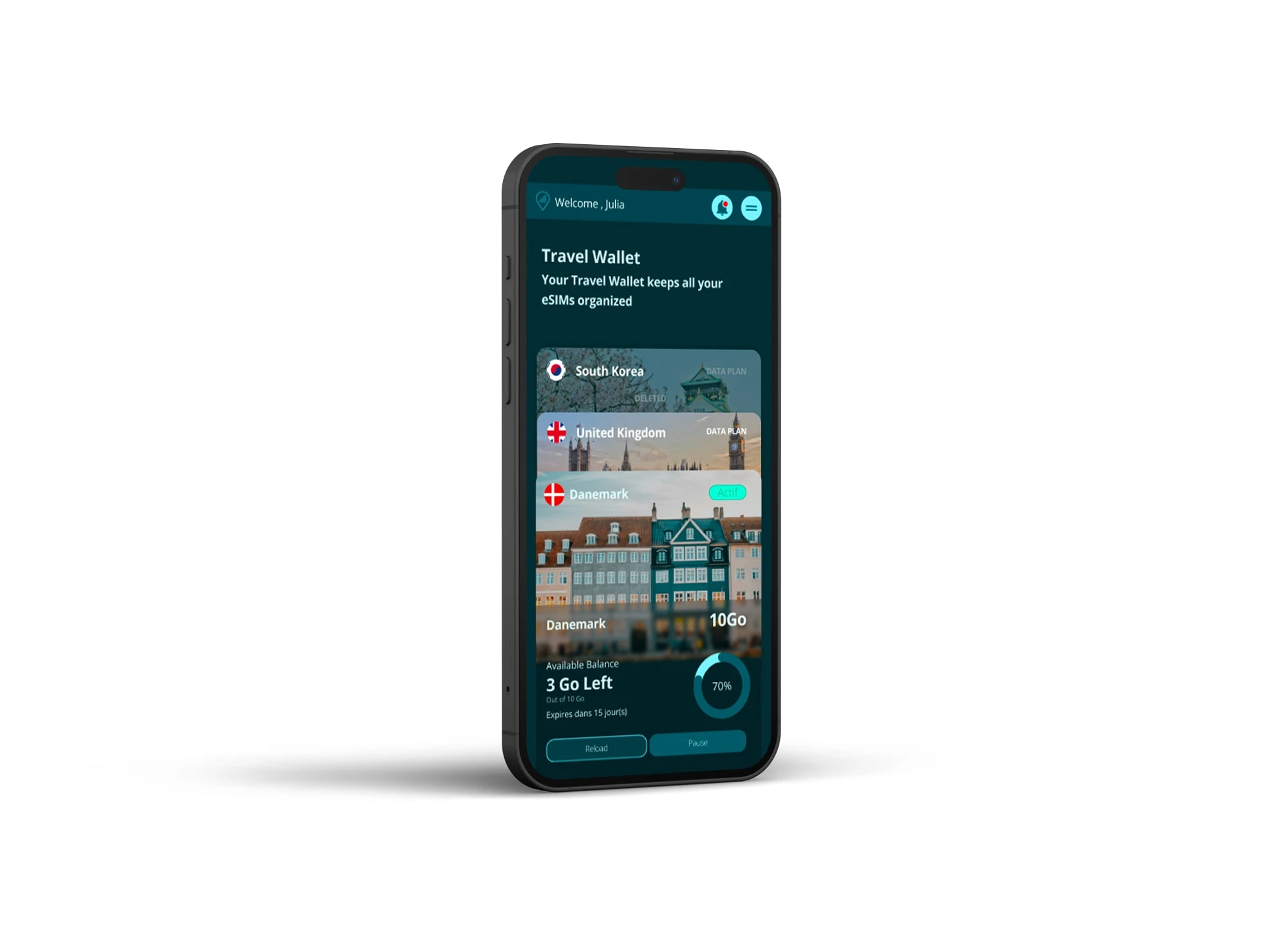
Wallet screen Ubigi redesign app
Throughout the redesign process, I learned that creating a better experience doesn’t always mean reinventing everything. The most effective solutions often come from building on familiar patterns that users already understand.Do not reshape the wheel.
Instead of introducing new or complex interaction models, I focused on using well-established design patterns already present in users’ mental models.
By aligning with what people intuitively expect, such as tab navigation, card layouts, and wallet-like organization, the experience felt instantly familiar and easy to adopt.
Conclusion and Impact
Redesigning the Ubigi app was more than a visual refresh. It was an opportunity to rethink how people connect while traveling and to transform a technically strong product into a truly human-centered experience.
Through research, benchmarking, and hands-on exploration, I identified key pain points around usability, navigation, and guidance. By applying user-centered design principles and drawing inspiration from familiar digital tools, the new interface now delivers a sense of clarity, control, and trust that aligns with what users expect from a global connectivity service.
The introduction of the Wallet feature centralized plan management and gave users the transparency they needed. The new monochromatic blue palette reinforced a sense of calm and reliability. Simplified navigation through a bottom tab bar made the app easier to explore and reduced friction across every journey.
Next Steps
The redesign laid a strong foundation for a clearer, more user-centered Ubigi experience. However, design is never truly finished, it evolves with user needs and real-world feedback.
The next phase of this project will focus on managing user testing sessions and conducting desirability testing to assess how users emotionally connect with the new interface. These sessions will help evaluate not only usability and efficiency, but also how the design feels:
Does it build trust?
Does it feel intuitive and effortless?
Does it reflect the sense of freedom and reliability users expect from Ubigi?
Gathering both qualitative and quantitative insights will guide the next iteration, ensuring that each design decision continues to be validated by real user behavior and perception.
Like this project
Posted Nov 10, 2025
Redesigned Ubigi app for better user experience and navigation.
Likes
0
Views
1


