Moveklub — Brand Identity
Dima Grey
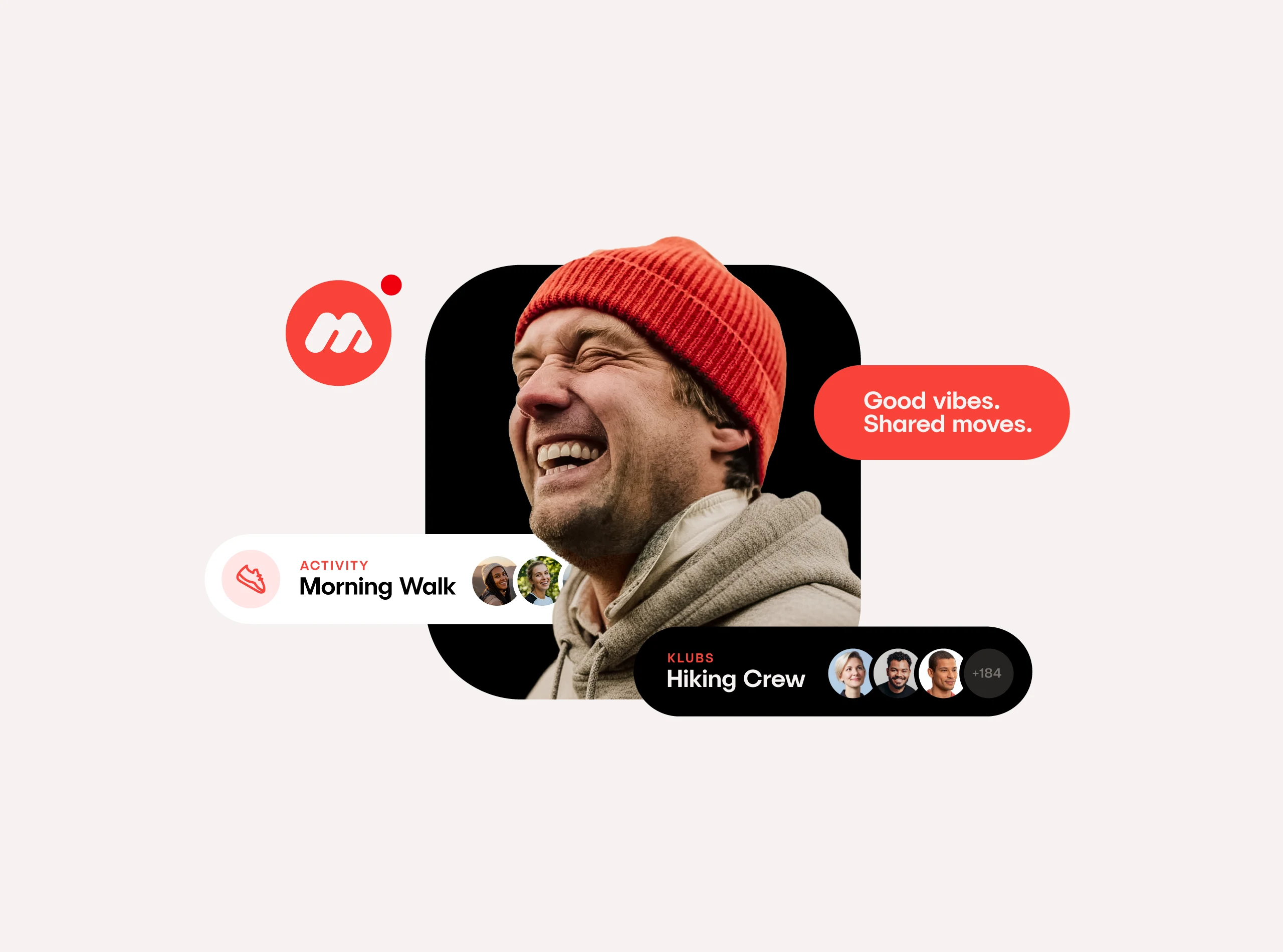
Moveklub
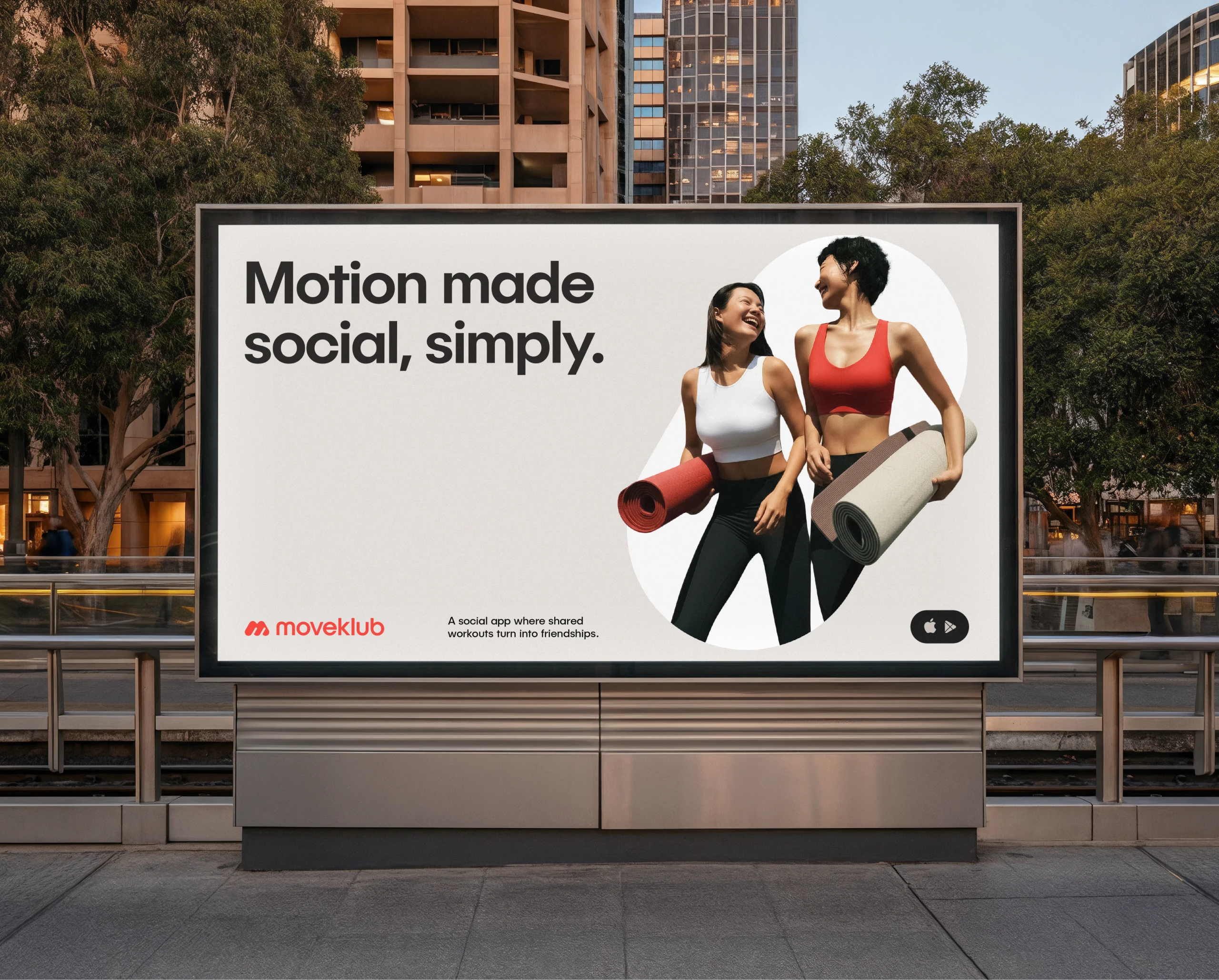
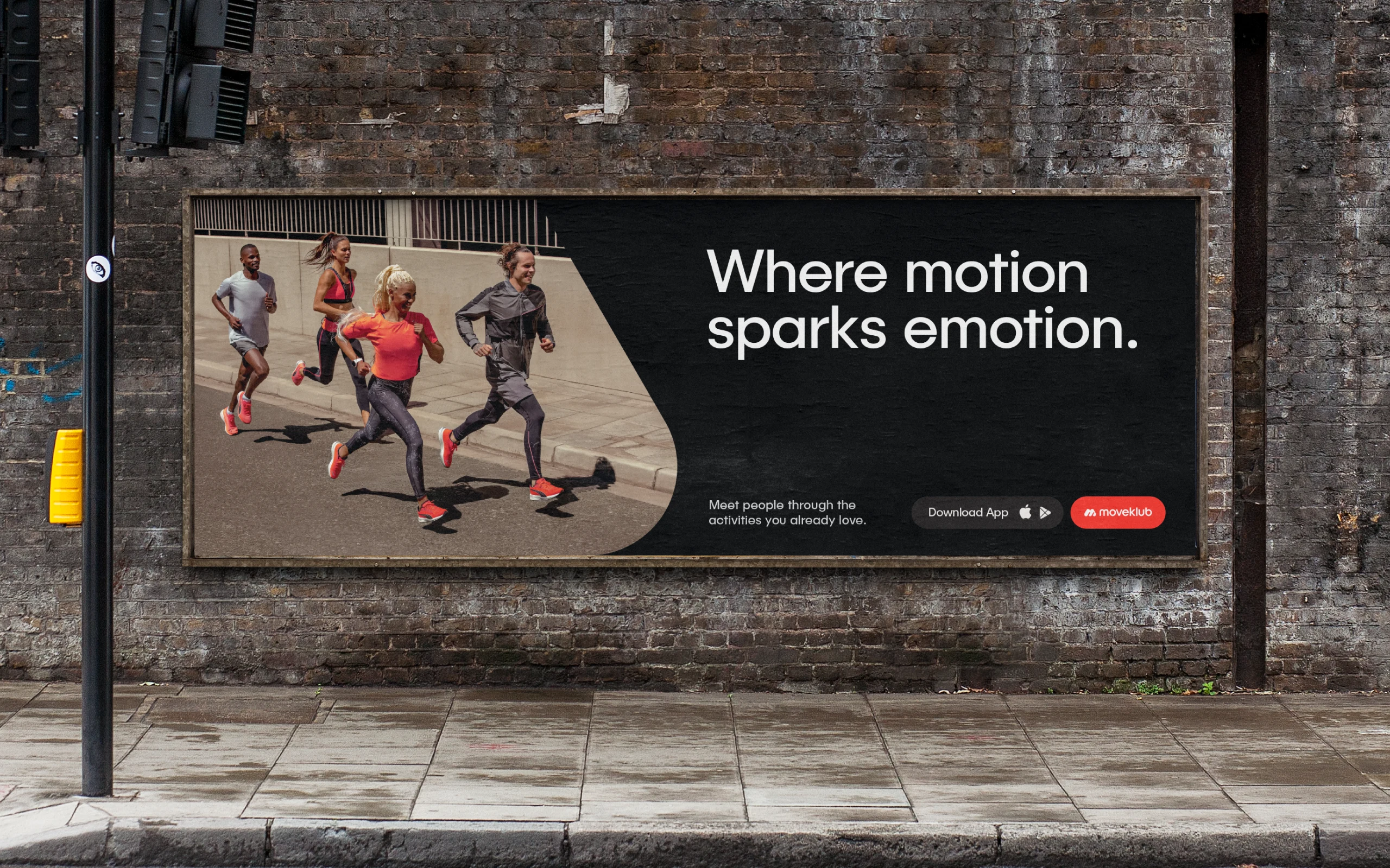
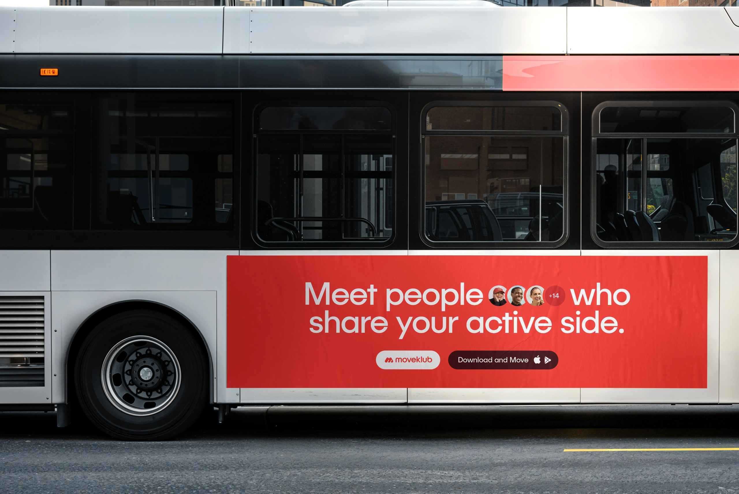
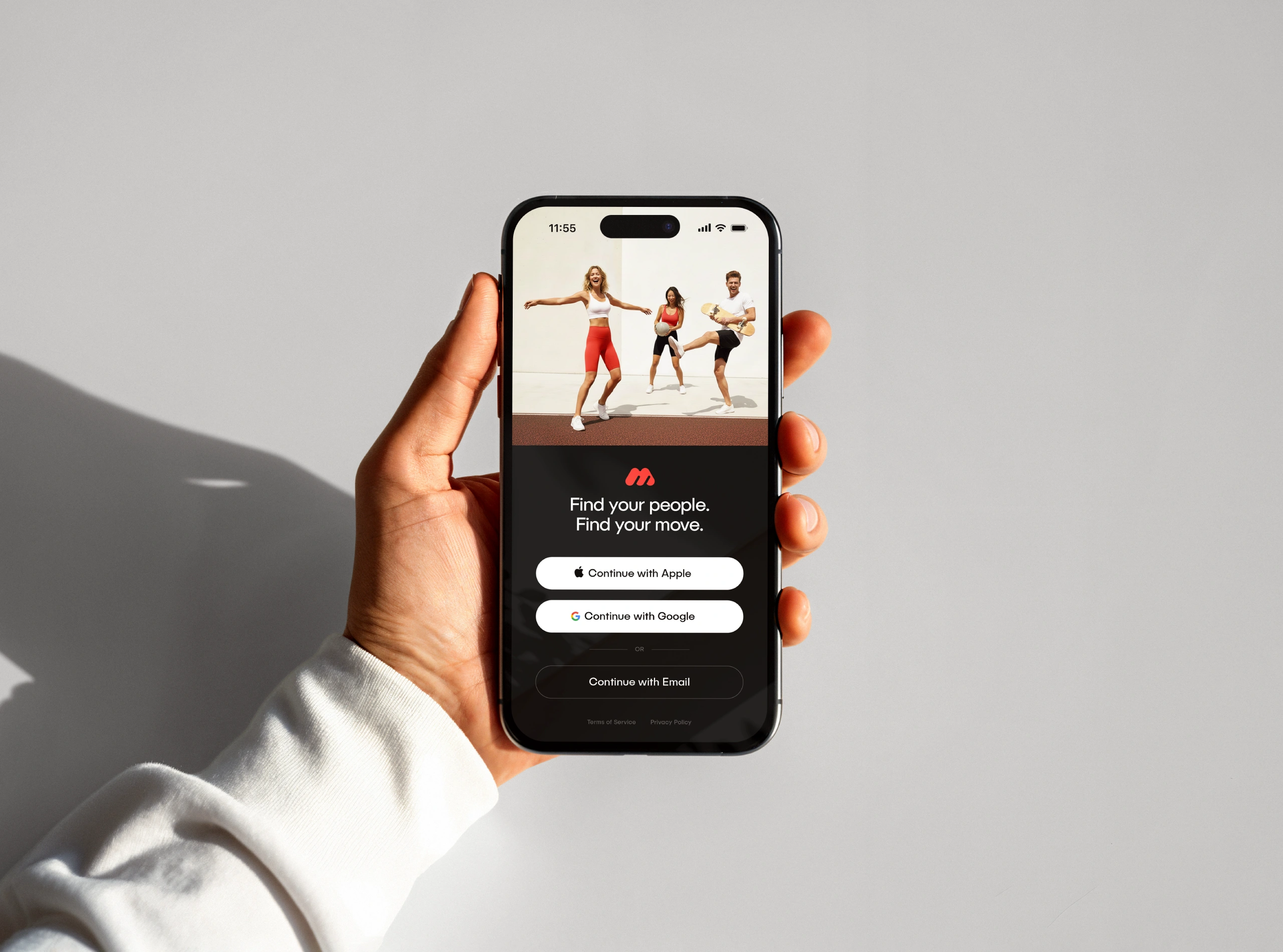
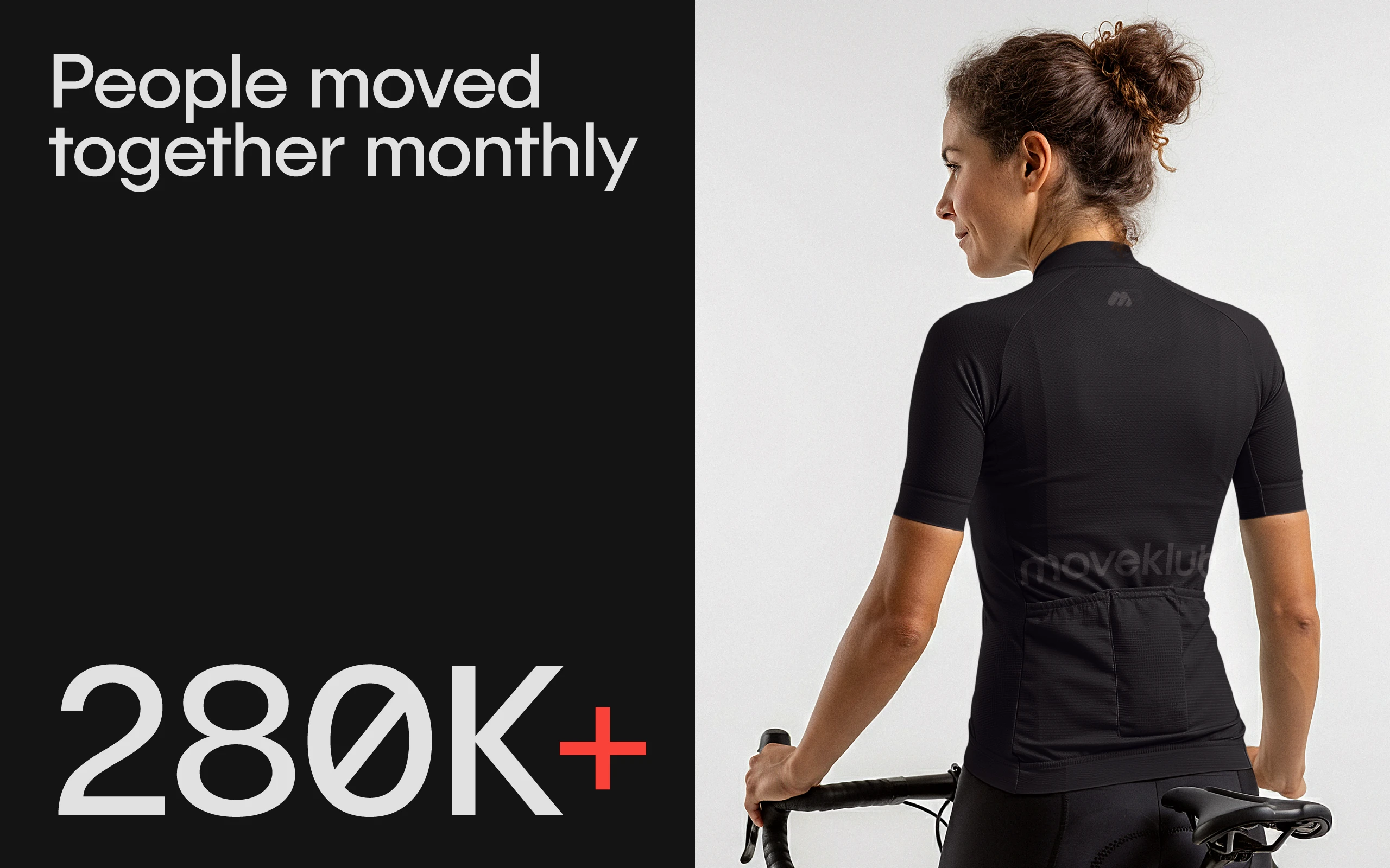
A social app for people who don’t want to move alone. It turns runs, walks, rides and stretches into reasons to meet, so being active feels more like catching up with friends.
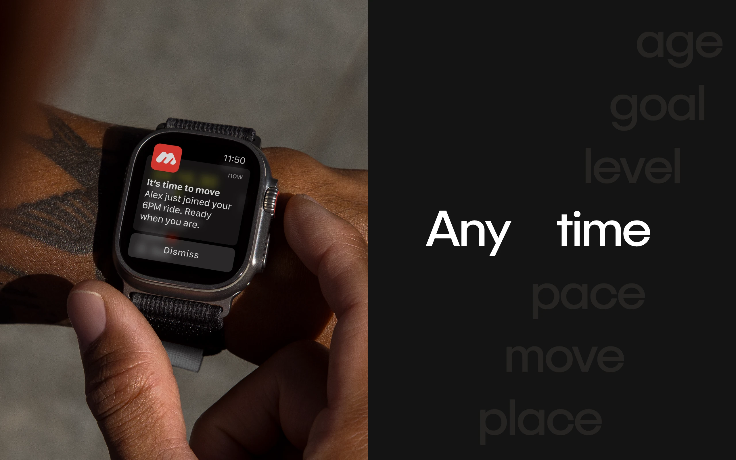
Moveklub creates small moments that make meeting people feel natural. You can drop into a light plan with a few others nearby or join bigger Klubs built around shared interests in your city. Over time, familiar faces turn into a steady rhythm, and staying active begins to feel easier and more connected.
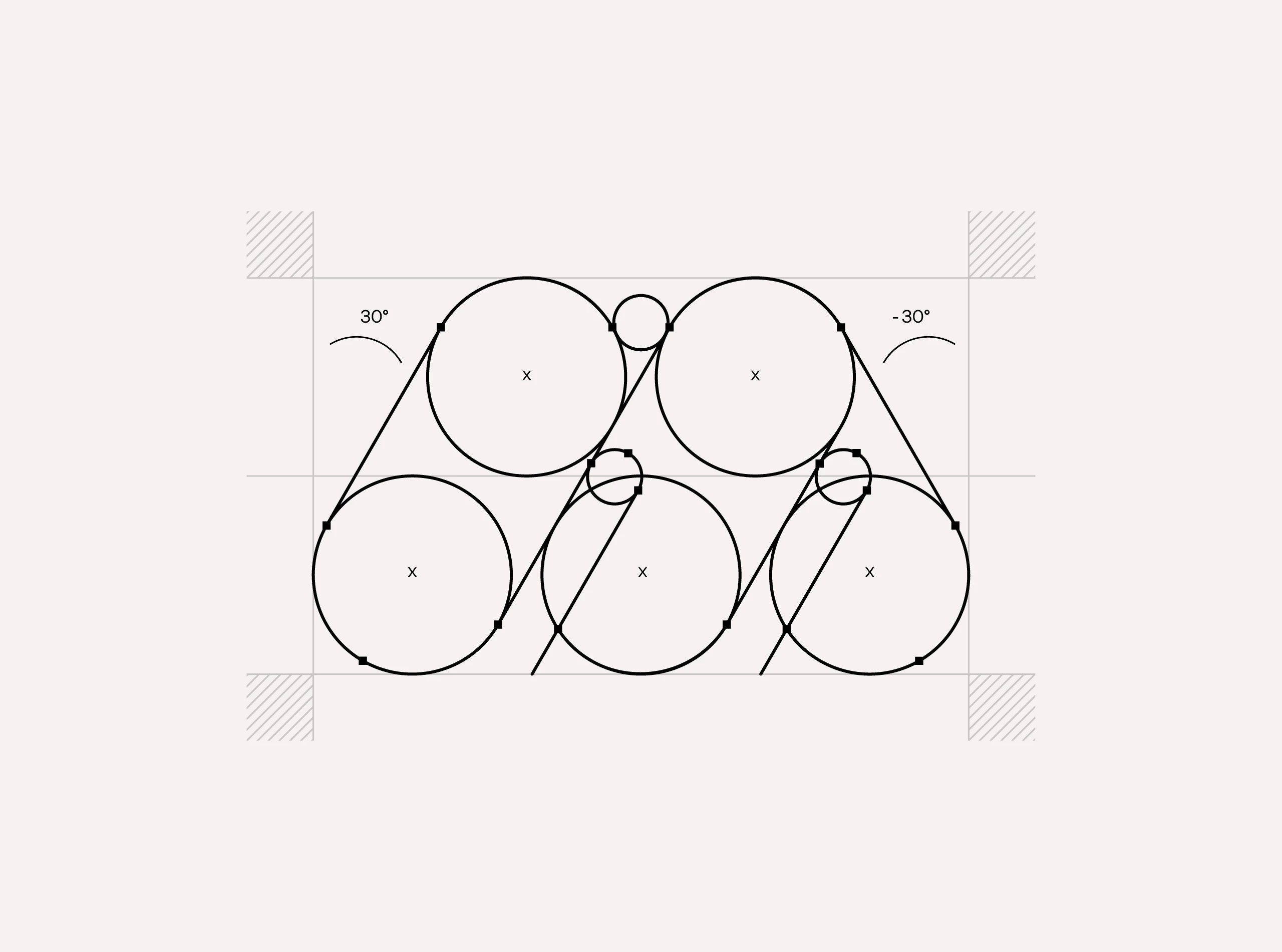
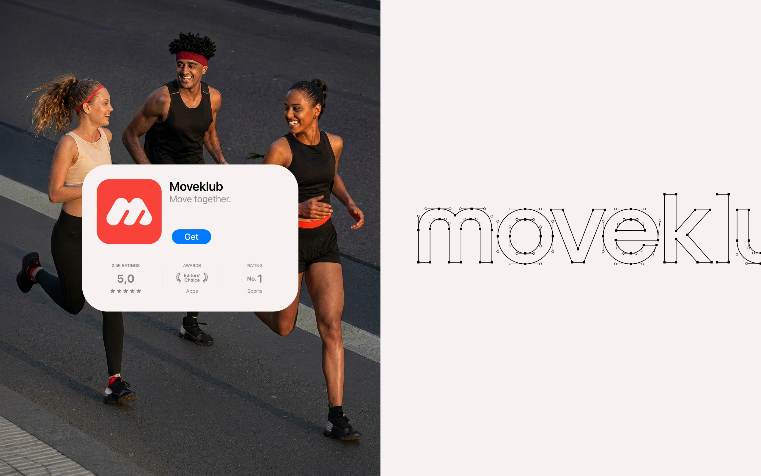
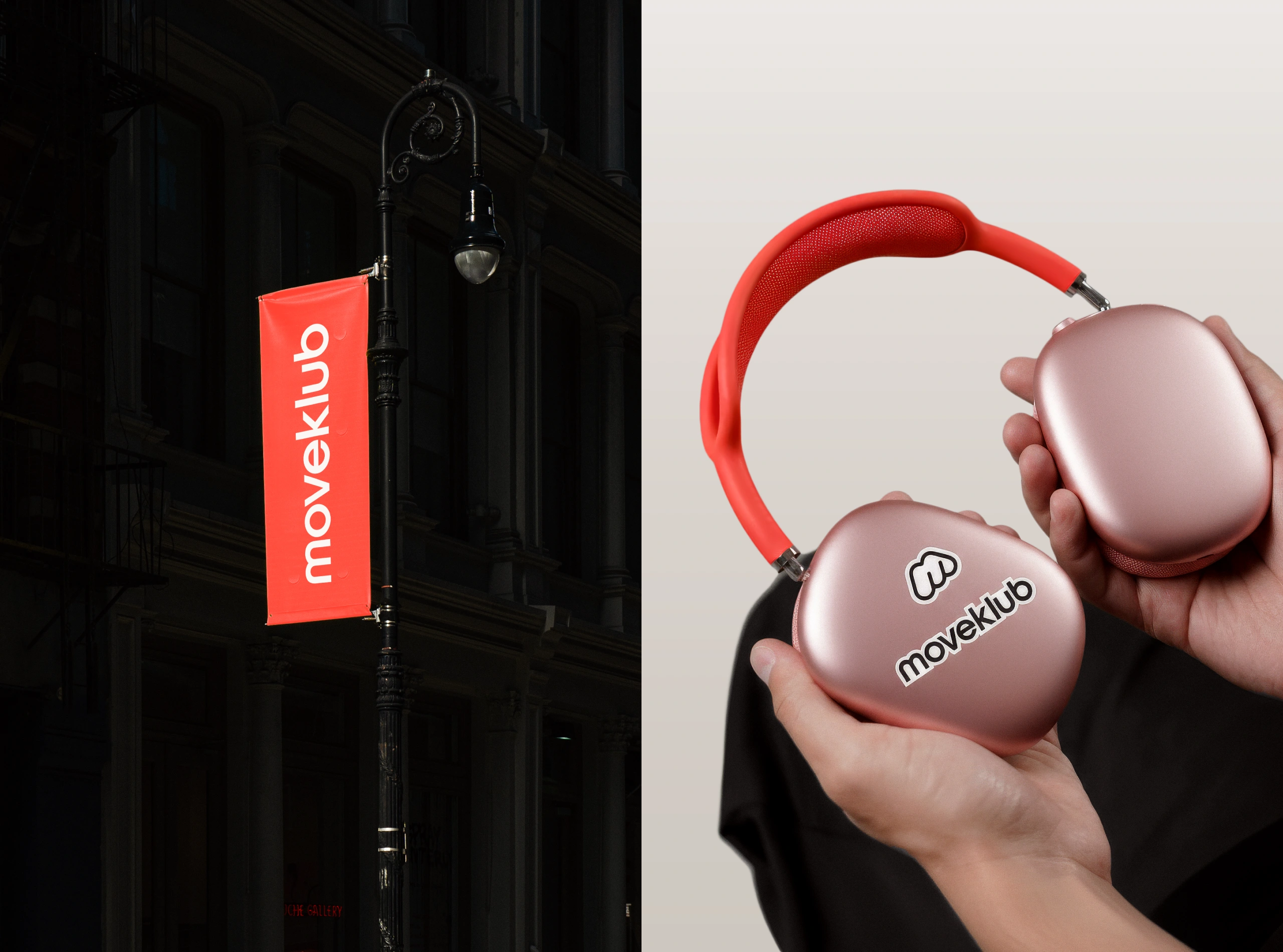
The logo carries that spirit. The forward-leaning M has the rhythm and energy of movement, while the rounded shapes keep the brand soft and welcoming. It’s simple, warm and built to feel human, just like the idea behind Moveklub.
Brand Identity
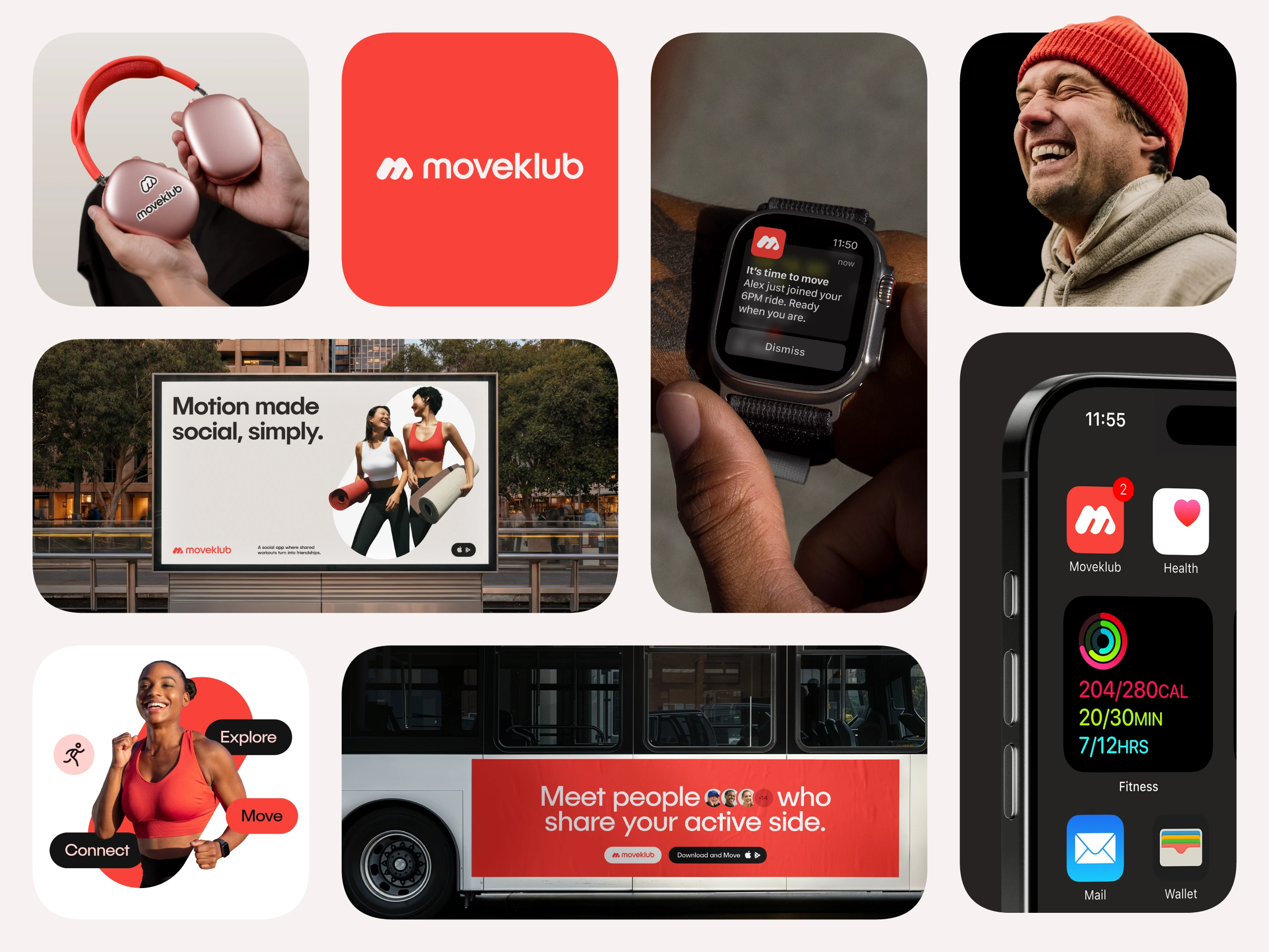
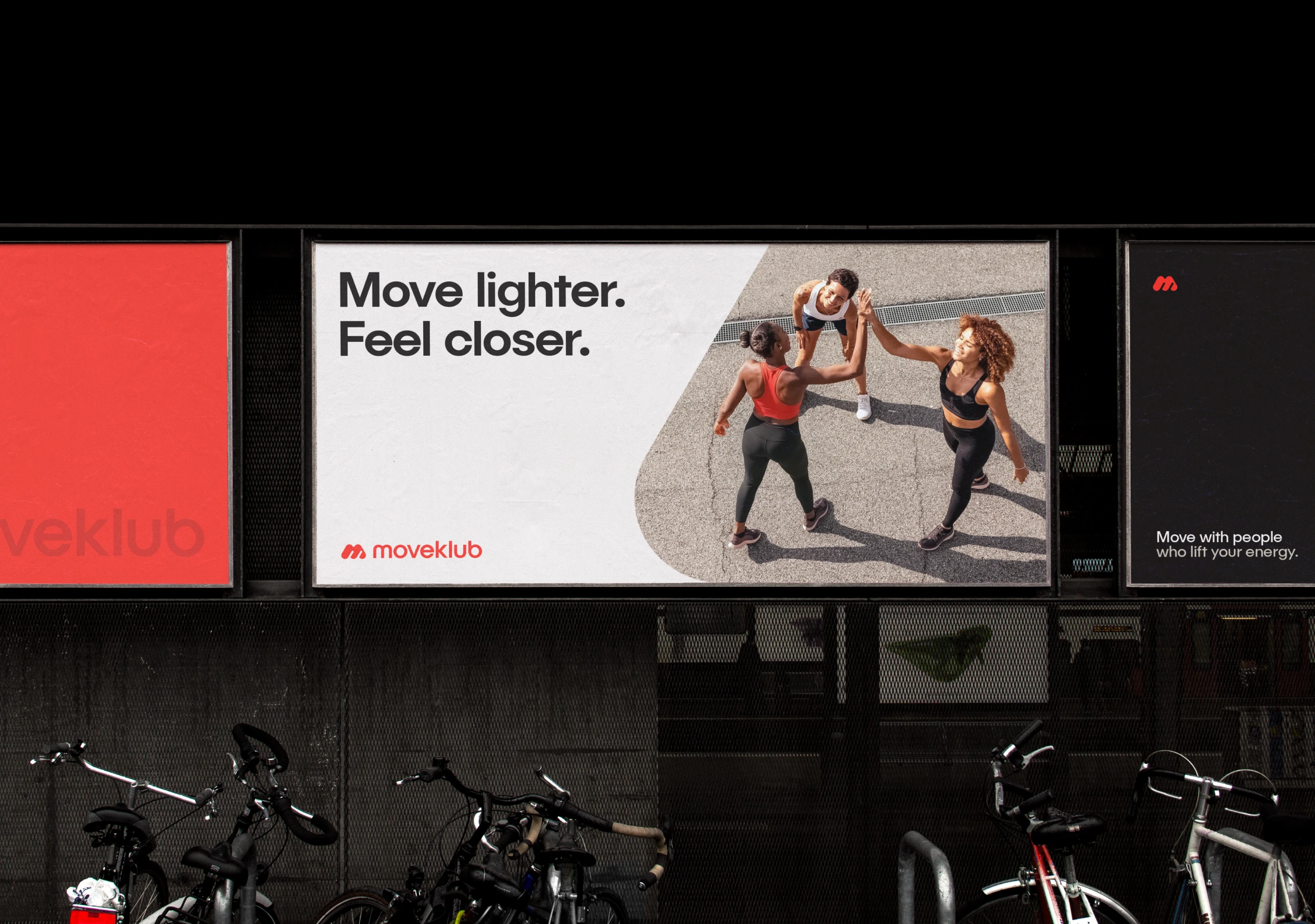
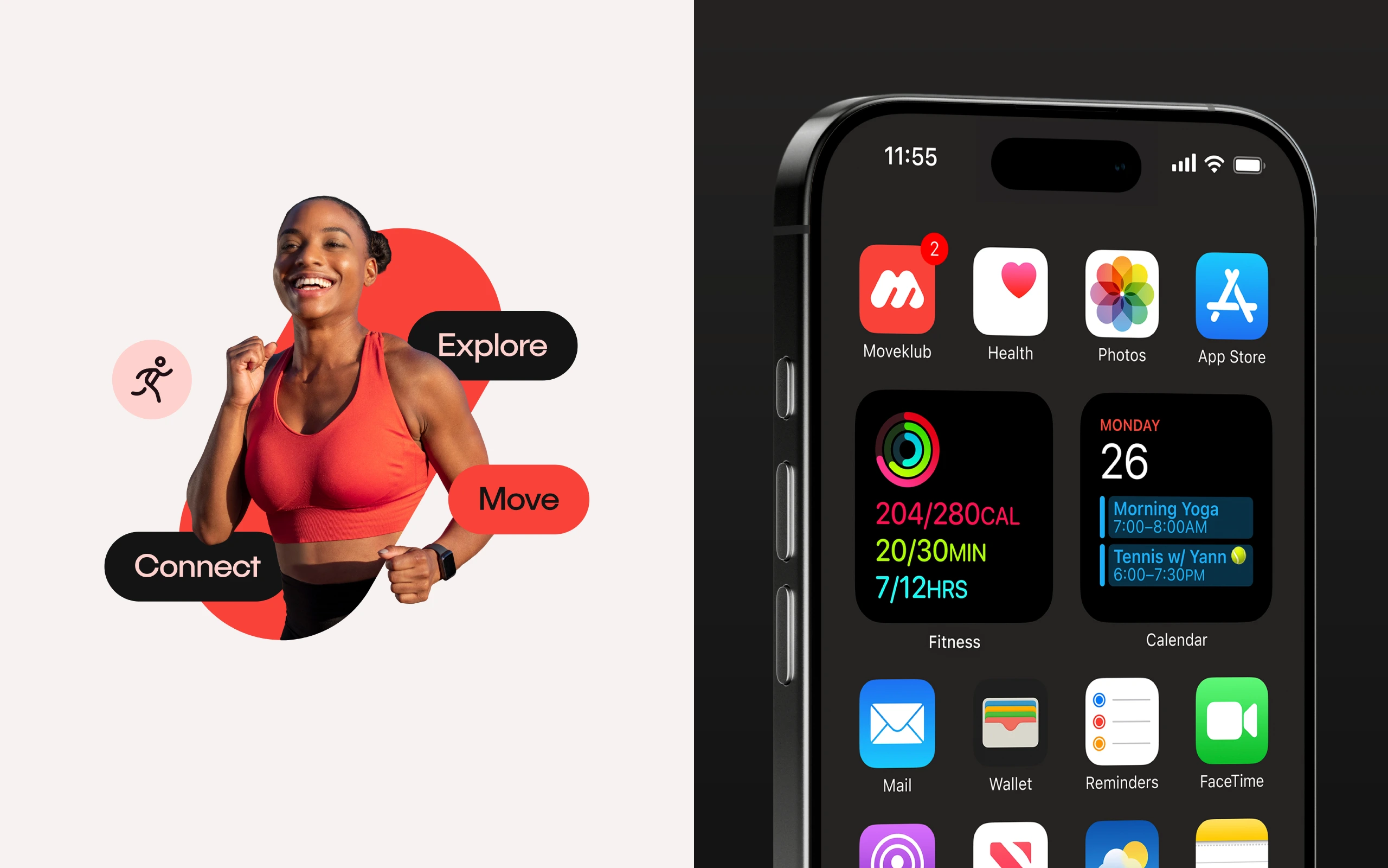
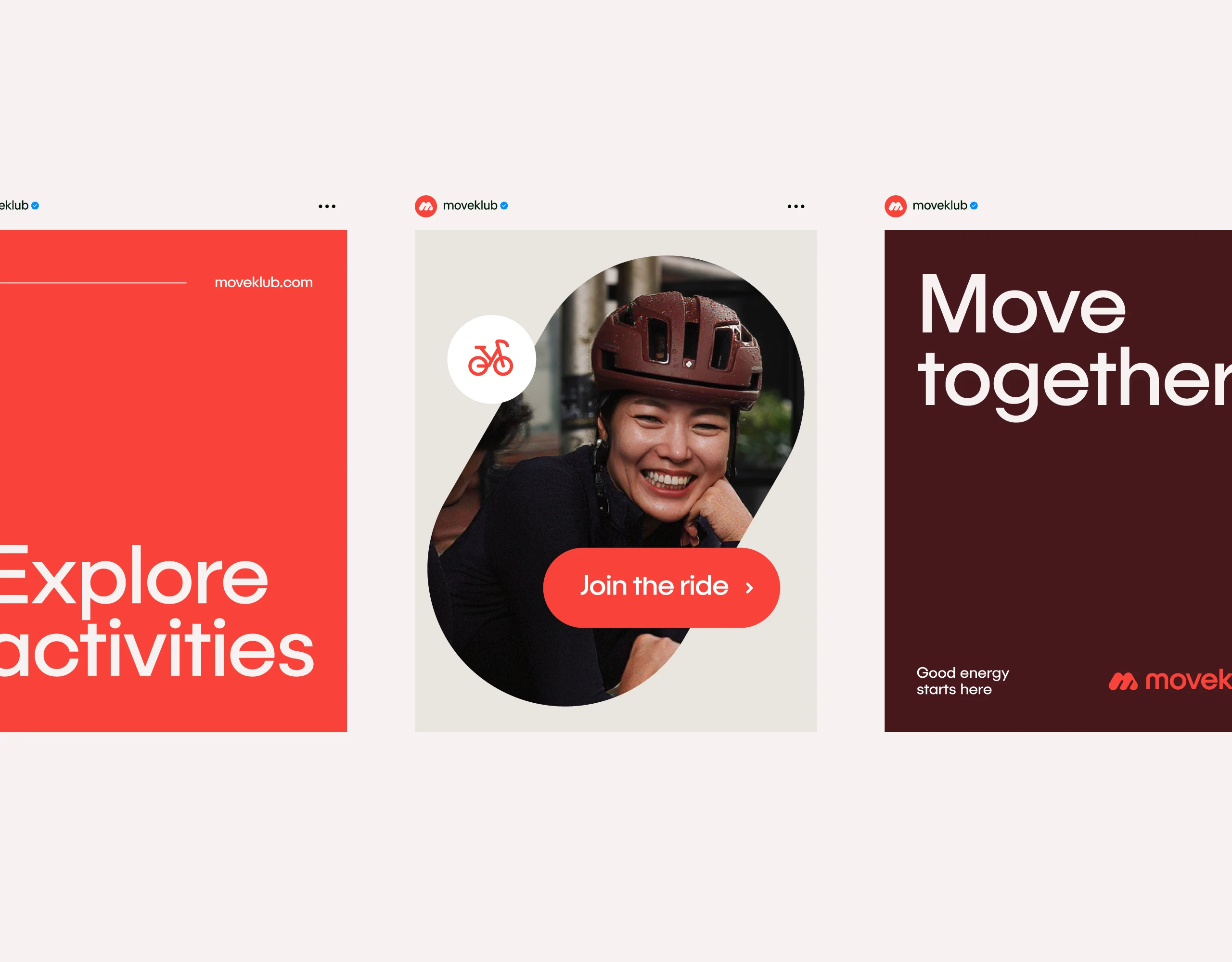
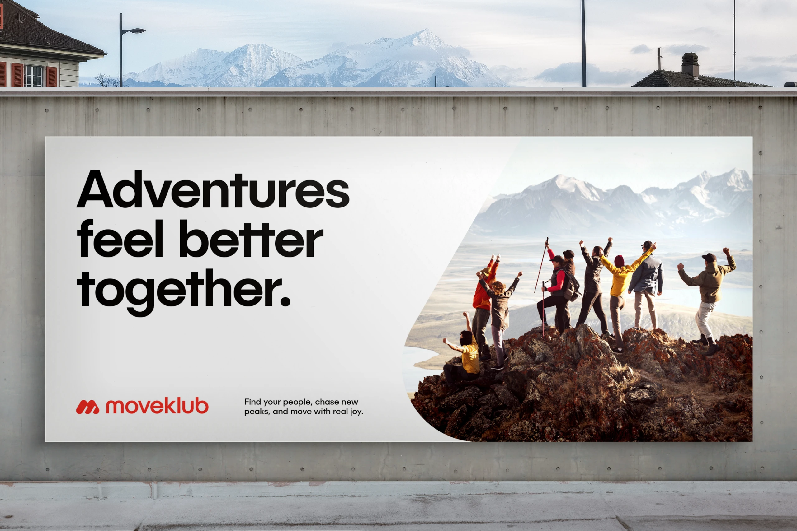
Moveklub is built to feel clear, friendly and easy to connect with. The design focuses on people and the rhythm of moving together, keeping the visuals open and calm.
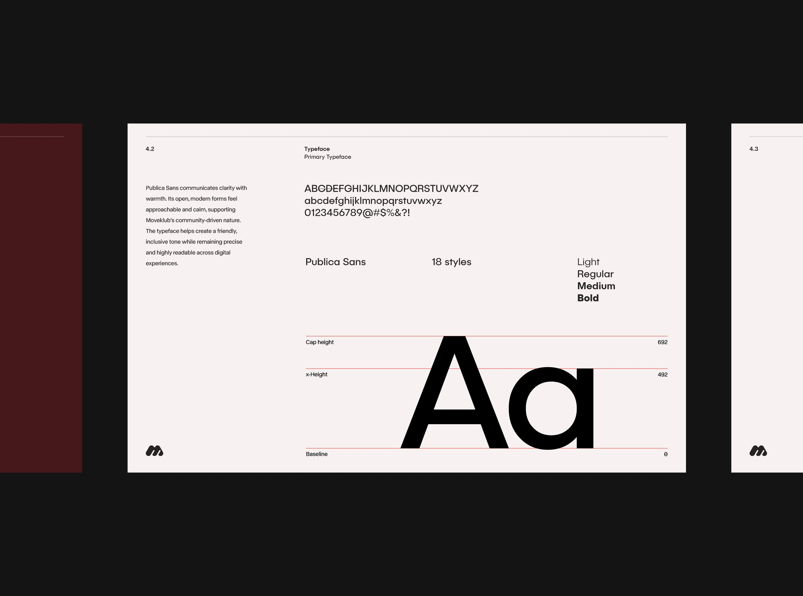
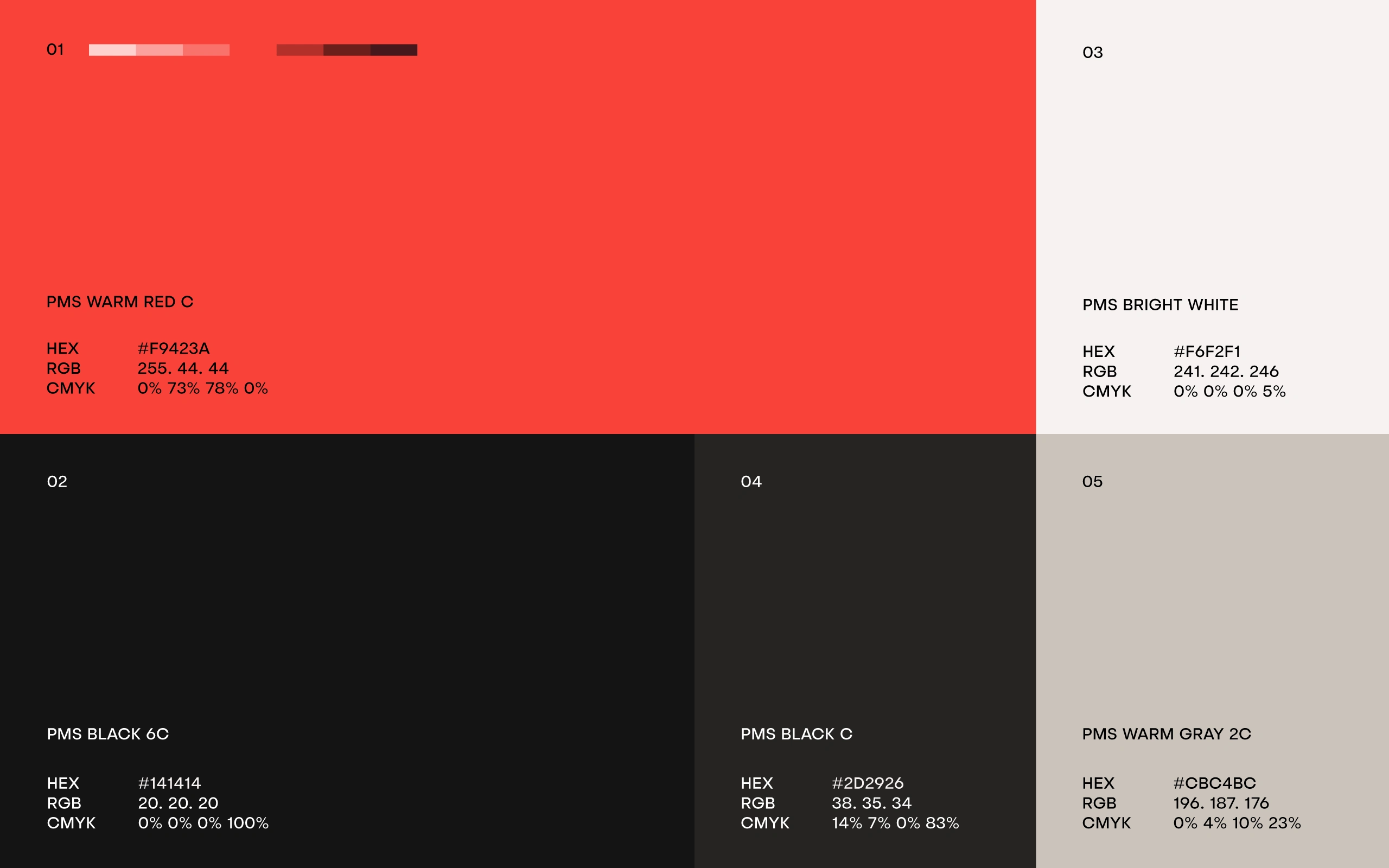
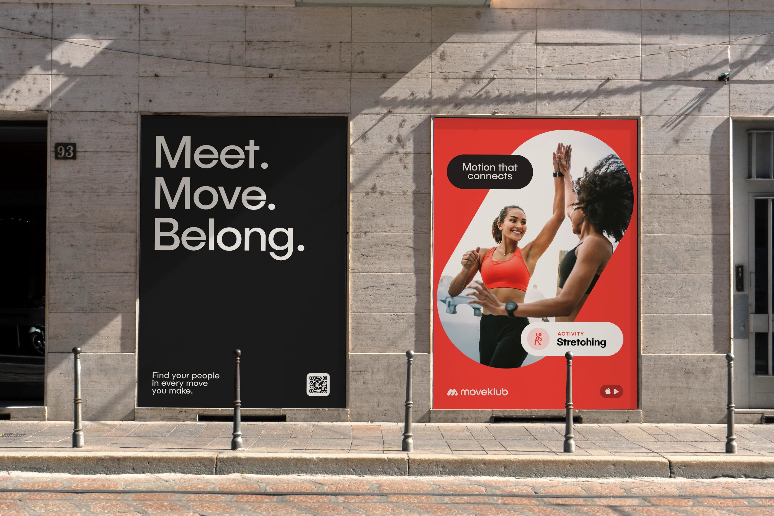
The warm red sets the tone, bringing a feeling of presence and focus. Typography adds a modern and steady voice, while the rounded forms make the system feel approachable and balanced. Together, they create a visual language that feels active without being loud. Real moments, natural movement and small interactions bring the identity to life and make it feel honest.
Everything comes together to express a simple idea. Movement feels better with people, and the identity reflects that feeling in a direct, human way.
Like this project
Posted Dec 22, 2025
Logo and visual identity for Moveklub, a social app that brings people together through movement, celebrating connection, community, and staying active.