
Your supplement can be clinically strong and still lose on the shelf.
Because customers judge the packaging before they ever read the formula.
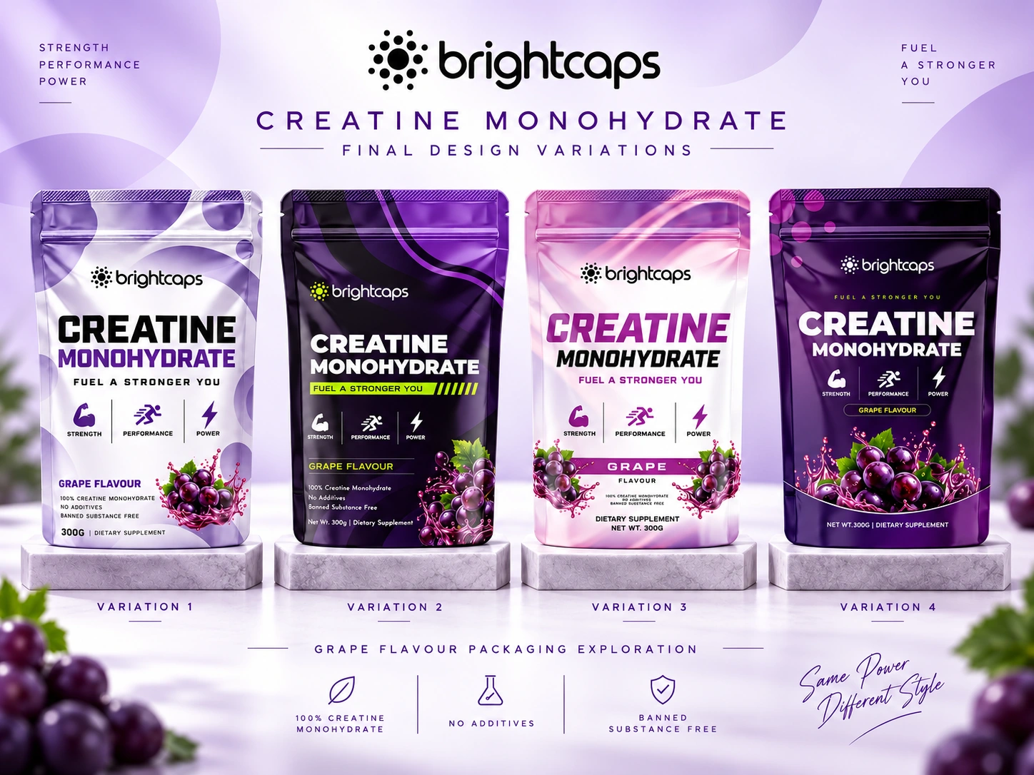
For Brightcaps Creatine Monohydrate, I explored four packaging directions built around one goal:
Make performance look premium, credible and impossible to ignore.
Each variation uses the same product, same positioning and same grape flavour, but changes the visual personality.
Clean + clinical
Dark + performance-driven
Fresh + lifestyle-focused
Bold + premium
The identity balances:
💪 Strength and performance cues
🍇 Strong flavour recognition
⚡ High shelf impact
🧪 Clear product information
🎯 Consistent Brightcaps branding
The interesting part?
There is no single “pretty” solution.
The strongest packaging is the one that matches the buyer, price point and sales channel.
So I want your vote:
Which variation would you trust most on a supplement shelf?
1, 2, 3 or 4?
Drop the number below.
And if you are building a supplement, wellness or sports nutrition brand and your product is stronger than your packaging looks, send me a message.
I design packaging that helps good products look ready to compete.
#PackagingDesign #SupplementBranding #Creatine #SportsNutrition #LabelDesign #BrandIdentity #CPGBranding #WellnessBranding #ProductPackaging #GraphicDesign
0 likes · 1 view · Oct 16, 2026
Your supplement can be clinically strong and still lose on the shelf. Because customers judge the packaging before they ever read the formula. For Brightcaps...

