Simplifying tax filing with FileSmart.Tax

Thiago Fernando


A tax-filing platform for the U.S. market, built to take on the incumbents by being radically simpler.
Role: Product Designer
Team: Po · Pm · Devs · Branding · Marketing
Timeline: 1y - 2022
Plataform: Web
( 1 )
Overview
FileSmart is an early-stage SaaS tax-filing platform for the U.S. market, getting ready for a launch and a fast scale-up. The space is owned by a handful of entrenched names with fiercely loyal customers. Out-spending or out-featuring them was never on the table.
I joined as senior product designer and owned the product design end to end: competitive benchmarking, strategic discovery, navigation flows, the design system, prototyping, developer hand-off and QA. The brief wasn't a longer feature list. It was an experience clear enough to make a smaller, newer name worth choosing.
Constraints: early-stage product · lean feature set · entrenched competitors with loyal users · a launch to design toward
( 2 )
Approach
I didn't start in Figma. I started by understanding the giants, where they win, and where they quietly make taxes harder than they need to be. That gap became the strategy. A few decisions shaped the rest.
Benchmark the giants first
With the marketing team, I went deep on the top five competitors, every flow, every feature, every fee. The pattern was consistent: the incumbents overcomplicate, freelancers most of all. We didn't try to match them feature for feature; we found the gap and built our edge there.
Make enrollment the product
The real differentiator wasn't a feature, it was friction. I designed service enrollment down to essentially one click, taking out the dead ends that used to push people to a support agent before they ever converted.
A design system for an early-stage team
A lean team about to scale needs one source of truth. I built the FileSmart design system, components and UX guidelines, plus the hand-off documentation, so engineering could ship fast and stay coherent as the product grew.
Designing for outcomes, not requests
When a requested feature didn't serve the user, I pushed back with the why. In a crowded market the restraint was the point: protecting the simplicity mattered more than padding the roadmap.
( 3 )
The work
What shipped was a reimagined FileSmart: every tax service pulled into one place, one-click enrollment, and an interface built to stay intuitive and accessible as it scales, taking out the barriers that used to cost conversions.
Live website: https://filetax.com/
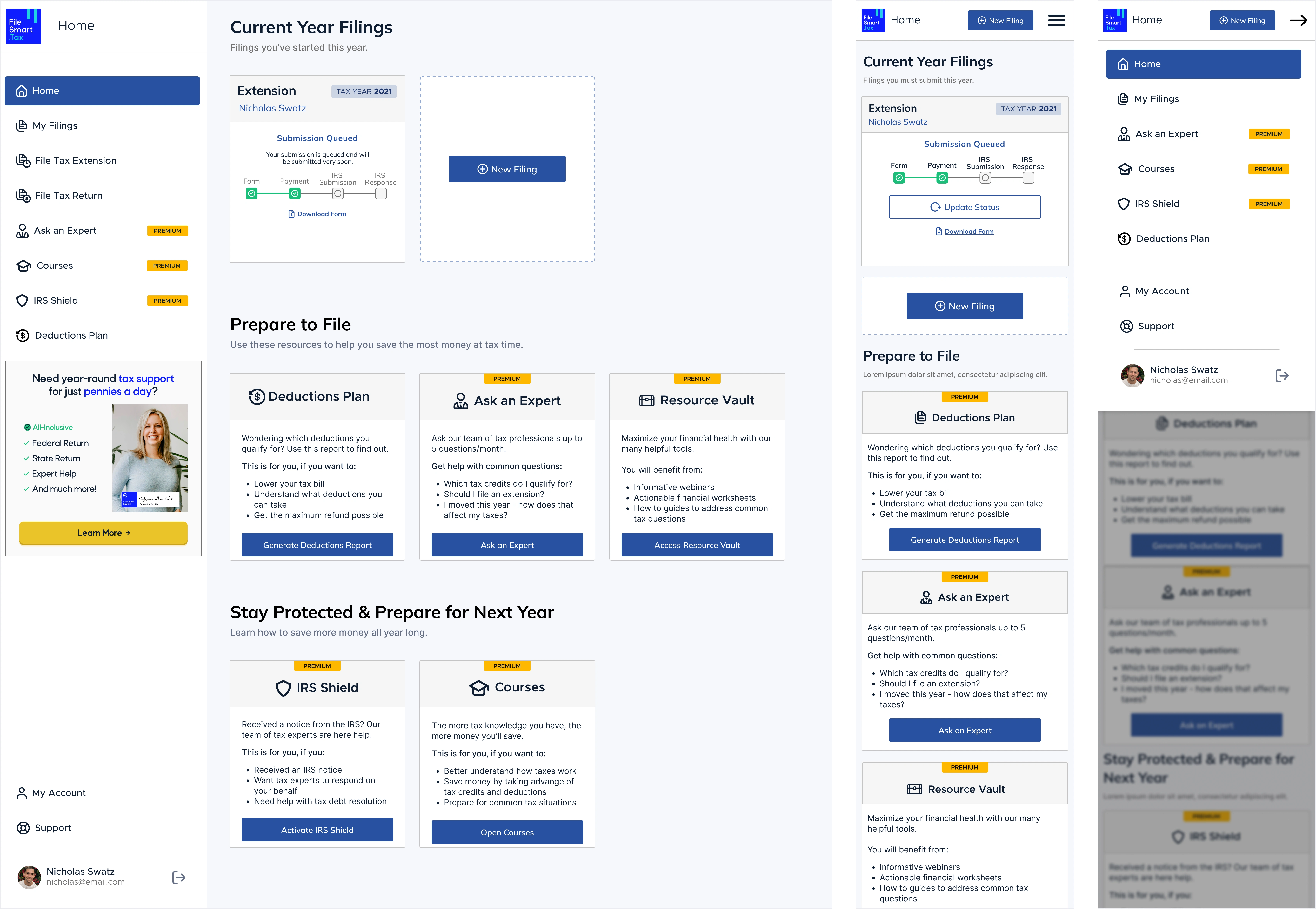
Fig. 01 · The home: Every filing in one place, web and mobile
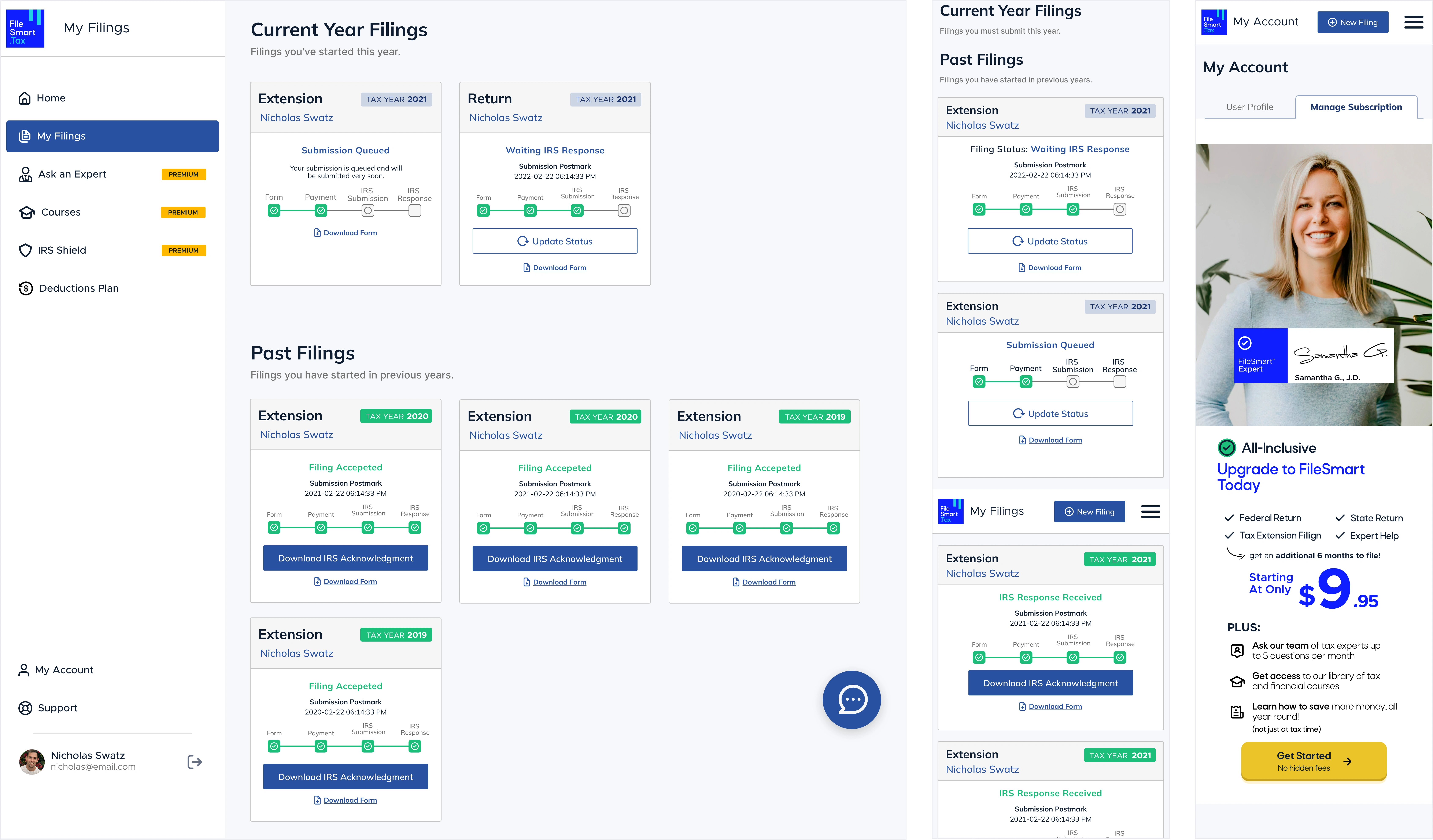
Fig. 02 · My filings & Account: every return, past and present
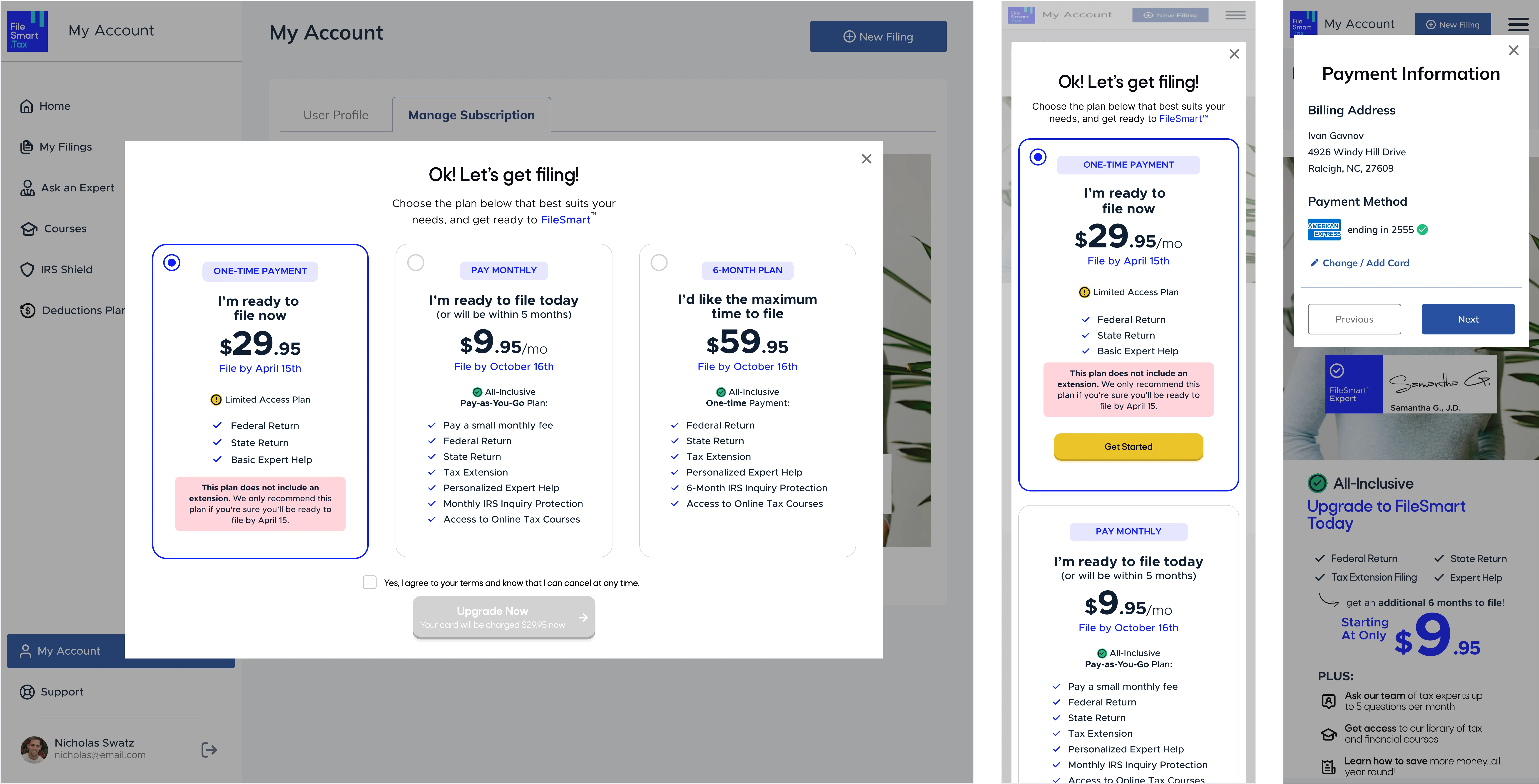
Fig. 03 · Manage Subscription and Payment Information
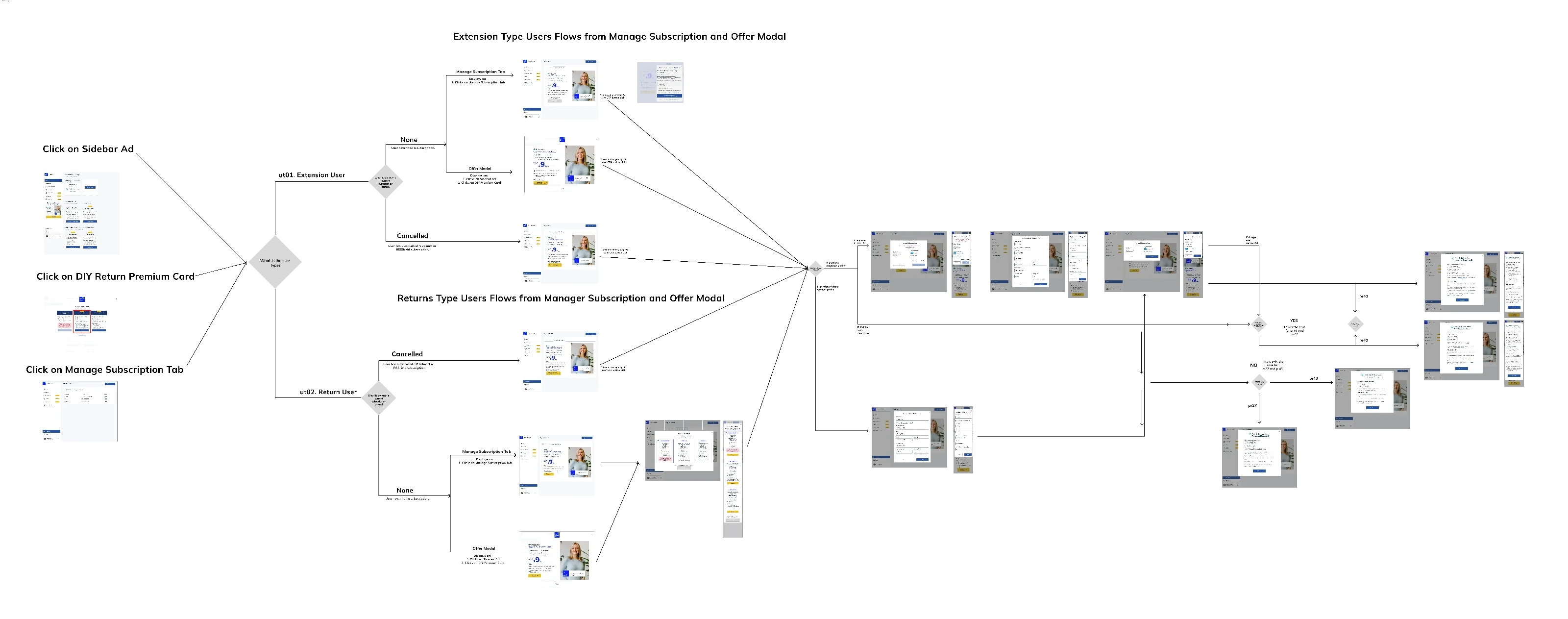
Fig. 04 · Offer flows by user type: mapping the modal into every journey
( 4 )
Outcomes
$500K first-year revenue, via the platform
5 incumbents benchmarked
1-click service enrollment
+1 follow-on project secured
Lower friction meant people could enroll and convert without ever needing a support agent. The client response was strongly positive, enough to bring me back for a follow-up, an internal-use dashboard. And, for the first time, FileSmart could genuinely compete with names that had owned the U.S. tax space for years. It's live in market today.
( 5 )
Reflections
Competitive research did more for this project than any single screen. The sharpest insight, that the incumbents overcomplicate taxes, freelancers especially, is what gave FileSmart its edge.
I learned to design for outcomes, not output. A simpler enrollment did
more for the business than any feature I could have added, and that
reframed how I prioritize.
The lesson I keep: in a crowded market, great UX isn't about pixels. It's
leverage, finding the one thing you can make dramatically easier than
everyone else.
Like this project
Posted Jul 15, 2026
Designed a SaaS tax-filing platform that generated $500K in year one by making enrollment radically simpler than the incumbents.
Likes
1
Views
8
Clients
FileSmart