NASDAQ Brazil Newsletter Redesign

Thiago Fernando


The Brazilian financial content market was already loud. Dozens of newsletters fighting for the same inbox, most of them ignored after a few editions. NASDAQ needed to enter that market with something that felt credible but not intimidating, in two languages, for an audience that was still learning to invest.
I led the work from competitive research and product analysis to the final layouts, design system, and developer handoff.
This is the story of what we built, what we couldn't change, and what I learned from both.
Client: NASDAQ (US Technology Stock Exchange)
Role: Product Designer responsible for discovery, strategic product analysis, newsletter design, Design System creation, and handoff.
Team: Design Team, Marketing Team, and Stakeholders.
Timeline: 2023
Languages: Portuguese and English
( 1 )
The challenge
Most financial newsletters in Brazil shared the same problem: they were dense, long, and written for people who already understood the market. Beginner investors, the fastest-growing segment, saw them as intimidating or irrelevant.
NASDAQ needed to keep its authority while making the newsletter feel approachable to people who were still figuring out what a stock index was. Two languages. Two audiences. One product that had to work for both.
( 2 )
Research and direction
Before opening Figma, I analyzed financial newsletters and investment platforms already operating in Brazil.
I mapped their content structure, subscription experience, visual language, and how they connected free content to paid products. I also documented common audience objections: lack of time, complex language, repetitive formats, and information overload.
One pattern kept showing up. The newsletters that performed best weren't the ones with the most information. They were the ones that made scanning easy and reading optional. That insight set the direction: mobile-first, easy to scan, flexible enough to support different content types.
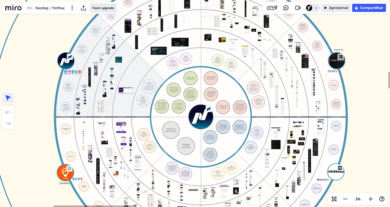
Fig. 01 Market Research
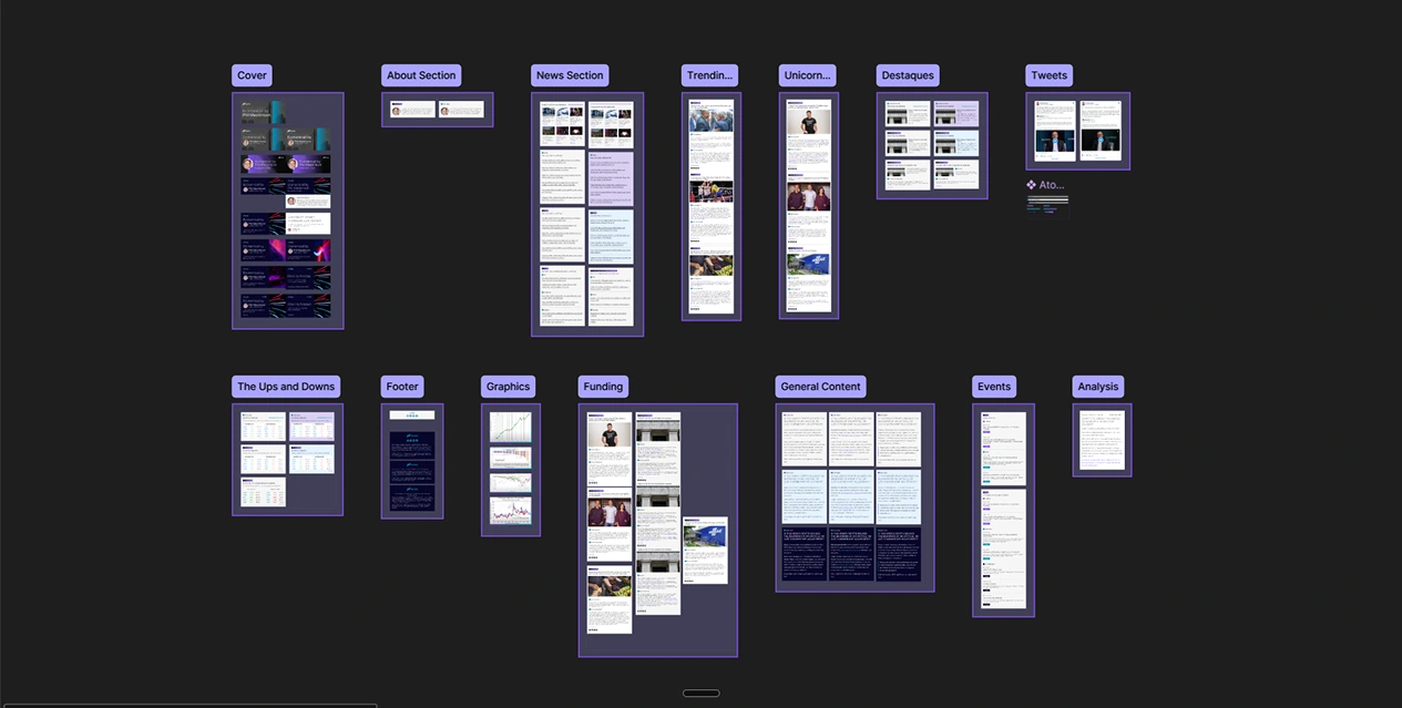
Fig. 02 Components
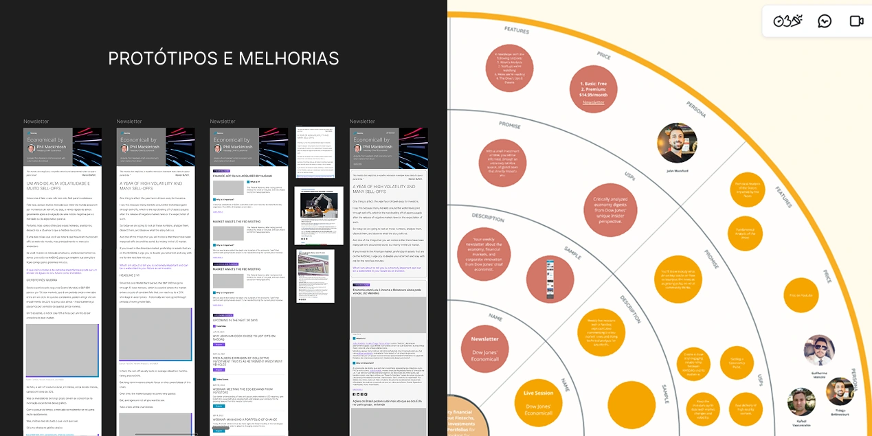
Fig. 03 Prototypes and Personas
( 3 )
The trade-off I couldn't win
The research pointed to a clear problem: the way NASDAQ's content was structured made it hard for casual readers to engage. The hierarchy buried the most accessible information under dense market analysis. I proposed restructuring the content flow to lead with what mattered to beginners and layer complexity for advanced readers.
The NASDAQ team disagreed. The existing structure was how they'd always communicated. It was familiar to their internal workflow, and changing it felt like losing their voice.
I understood the reasoning. But I also knew this was the bottleneck. The data from the competitive analysis showed that newsletters with front-loaded, scannable content had significantly better engagement. The current structure was optimized for the team producing it, not the audience reading it.
We went back and forth. In the end, the decision was to keep the existing content structure and focus the redesign on visual clarity, hierarchy within the existing format, and the system that would make production faster.
I didn't agree with the call. But I respected it. And I made sure the visual redesign squeezed every bit of readability out of the structure we had. If the content order wasn't going to change, the typography, spacing, and visual hierarchy had to work twice as hard.
That's the part of client work nobody talks about: sometimes you identify the real problem, make the case, and the answer is still no. The skill isn't just in being right. It's in making the best possible version of the path the client chose.
( 4 )
The solution
I designed the Portuguese and English layouts using clear hierarchy, summaries, and reusable content blocks. Every decision was about making the existing structure as scannable as possible without changing the content order.
The bigger deliverable was the complete newsletter design system: components, templates, spacing rules, and visual guidelines. This was the unlock. Before the system, every new edition required design involvement. After it, the marketing team only needed to focus on text and photos. Everything else was already solved.
The final structure supported content about economics, financial markets, and events in both Brazil and the United States.
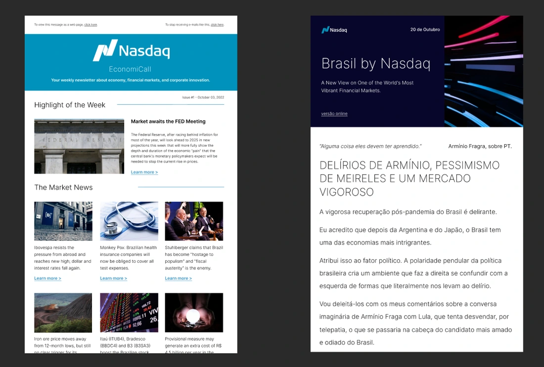
Fig 04. Before and After
( 5 )
Outcomes
The newsletter launched and became a recurring touchpoint in NASDAQ's content strategy for Brazil.
The design system changed how the marketing team worked. New editions that used to require a designer in the loop could now be produced independently. The team's feedback was strongly positive: with everything standardized, they could focus entirely on content instead of layout decisions. Production time dropped significantly.
The bilingual structure held up across editions, and the visual framework scaled without losing consistency.
( 6 )
What I learned
This project taught me something I didn't expect: how to lose a design argument well.
I identified what I believed was the core problem. I made the case with data. The client chose differently. And the product still shipped better than it was before, because I redirected the energy into what I could control.
The instinct is to feel defeated when a recommendation gets rejected. The real skill is asking: "Given this constraint, what's the best version I can build?" That reframe changed how I handle disagreements in every project since.
The other lesson was about systems thinking. A design system for a newsletter sounds small. But when it removes the designer from the production loop entirely, it compounds. Every edition after launch is faster, cheaper, and more consistent. The highest-impact work isn't always the most visible.
Like this project
Posted Jul 16, 2026
Led the redesign of NASDAQ's bilingual newsletter for the Brazilian market. Built a design system that let the marketing team ship new editions without design support, focusing only on content.