Brand Identity Design for Digestive Health Experts
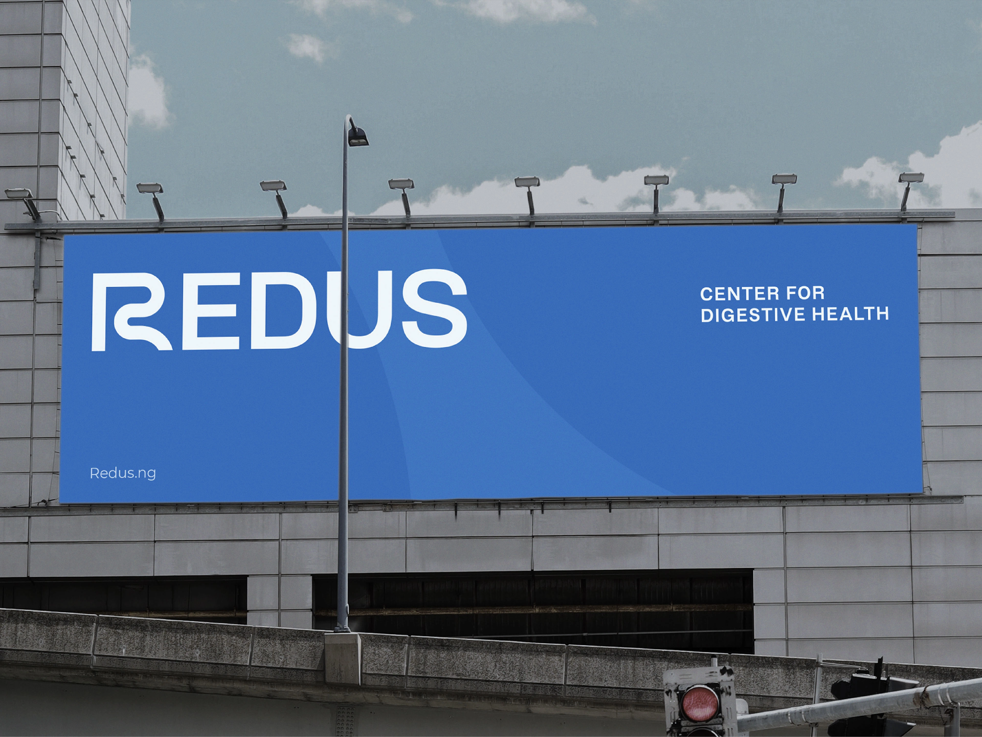
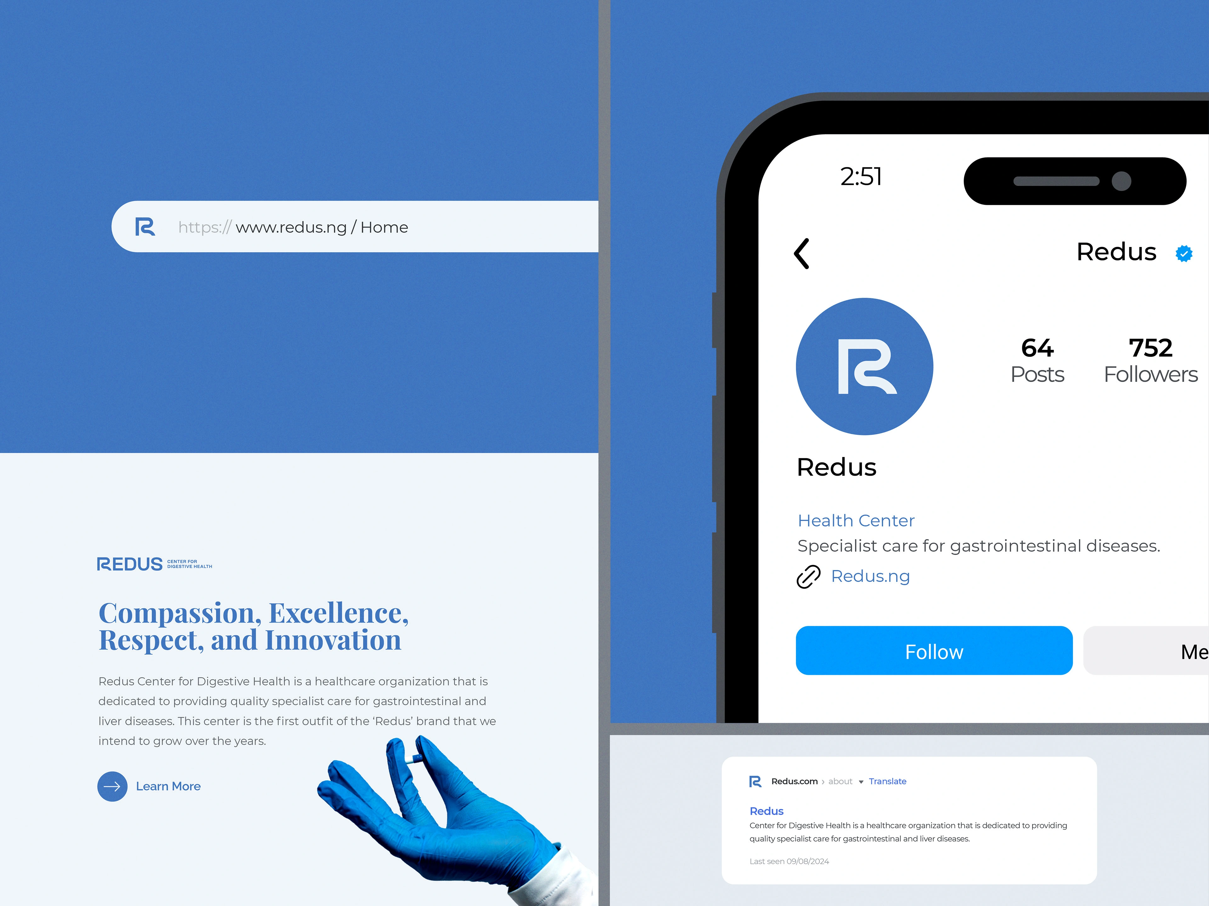
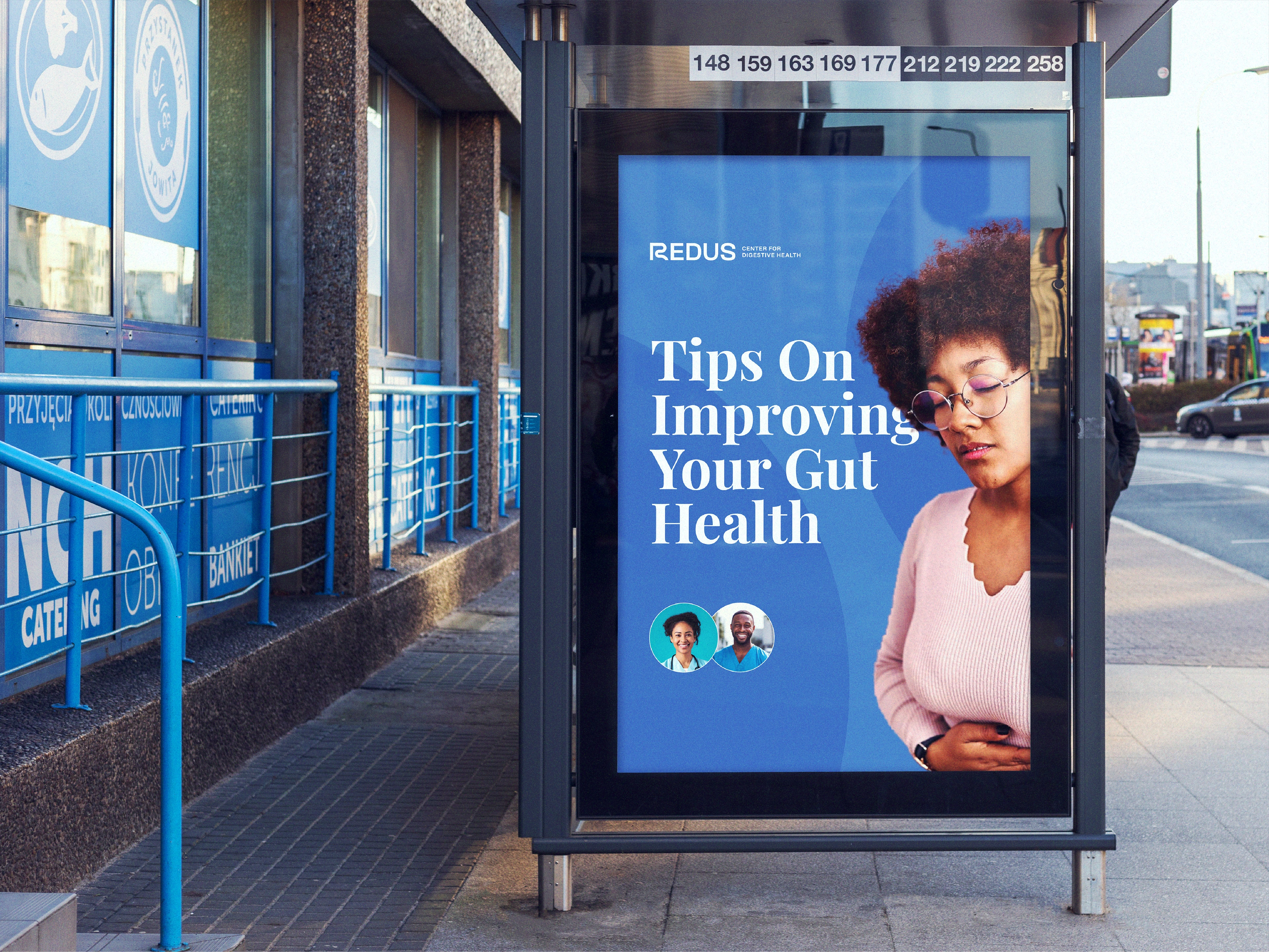
Redus Center for Digestive Health is a healthcare organization that is dedicated to providing quality specialist care for gastrointestinal and liver diseases. This center is the first outfit of the ‘Redus’ brand that they intend to grow over the years.
Promise
Redus stands as a beacon of hope for those in need of special care in gastroenterology and hepatology. Their commitment to excellence, innovation, and patient-centered treatment sets them apart from their competitors.
Challenge
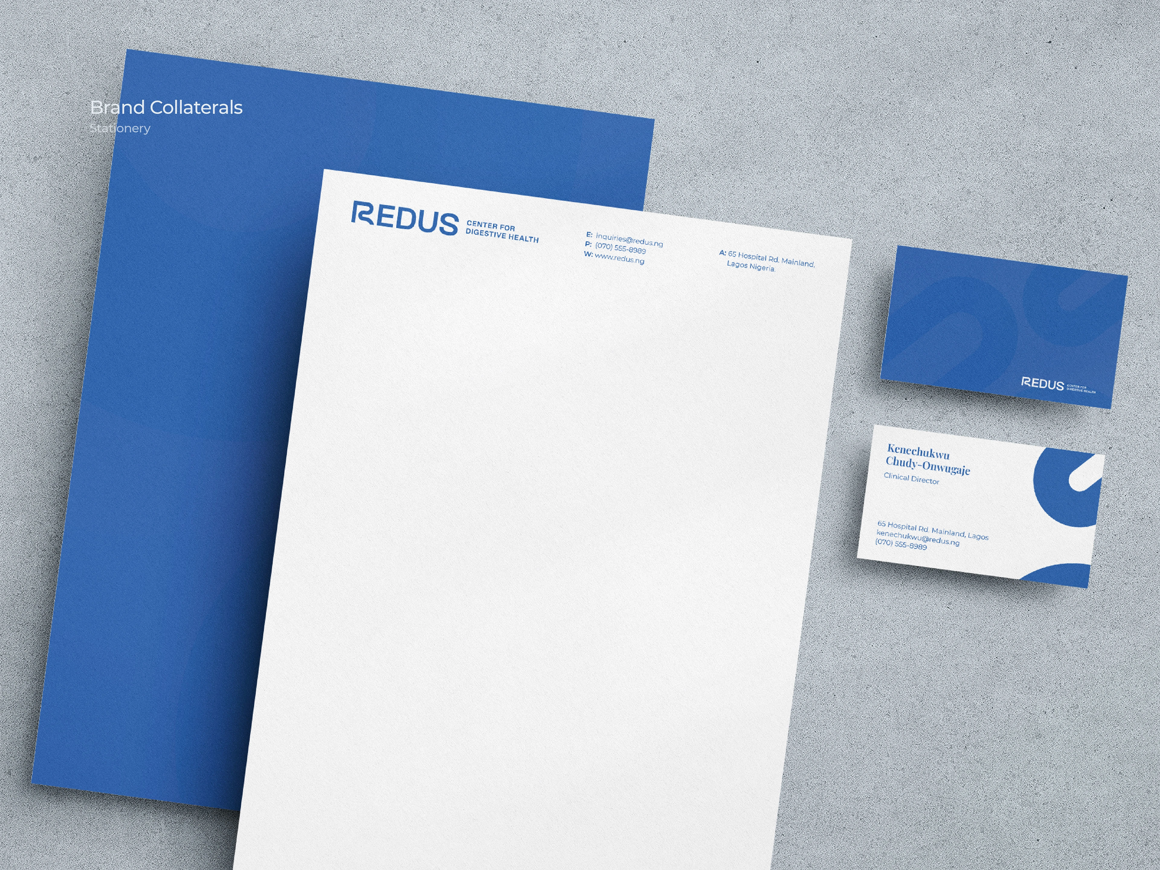
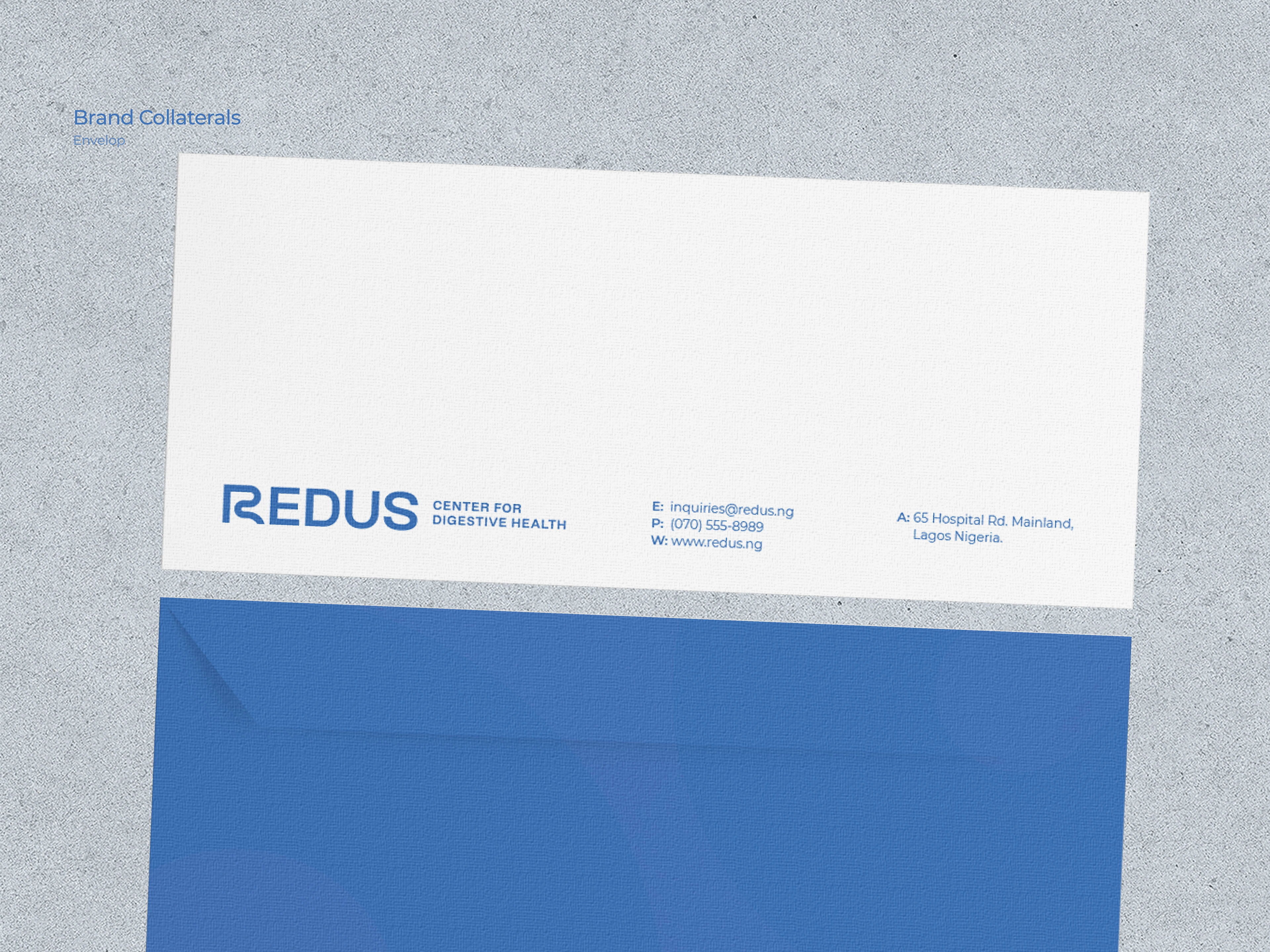
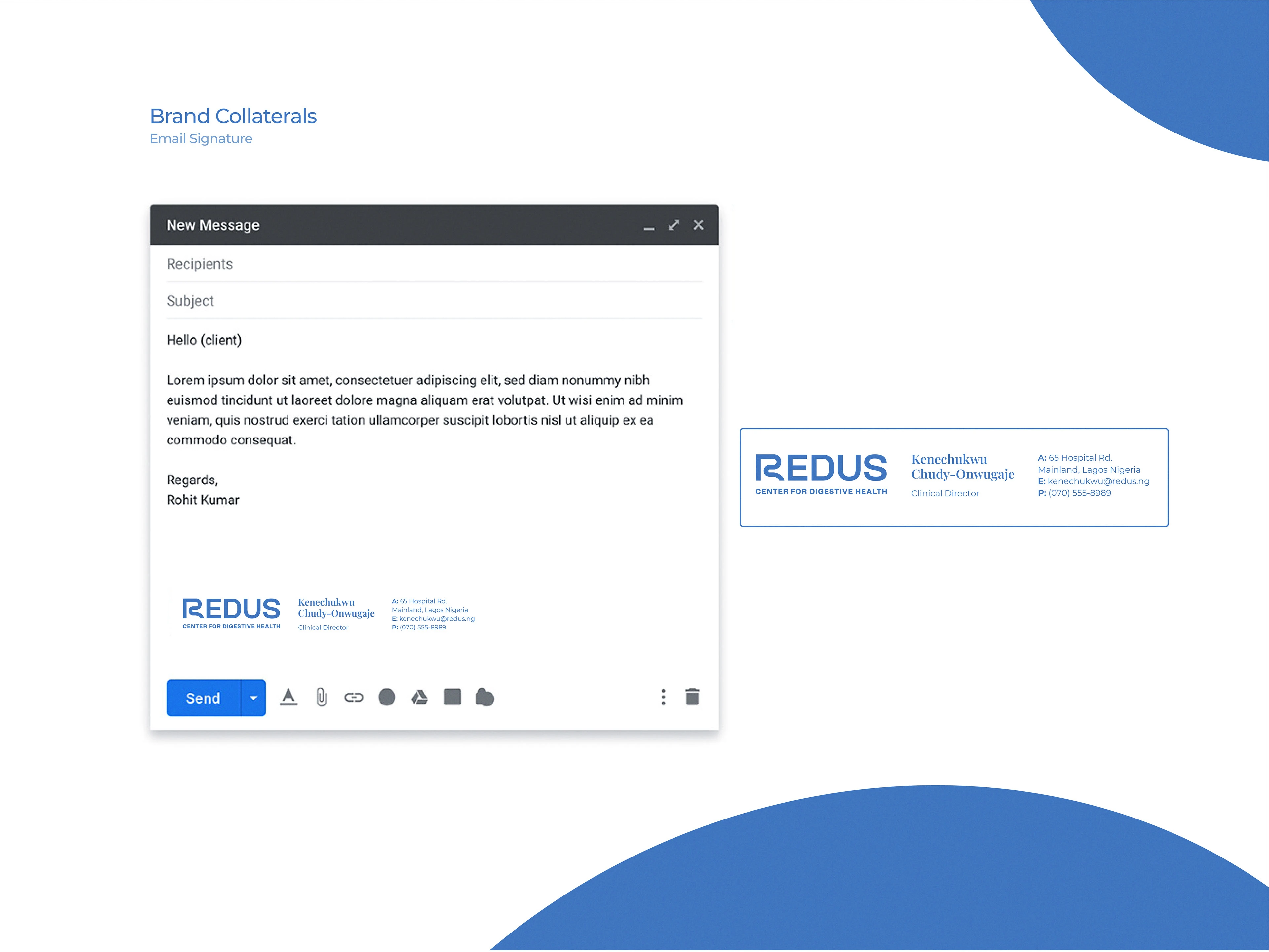
The challenge was to create a visual identity system that (1) would resonate with people with digestive problems, (2) could easily be expanded to other healthcare services as the brand grew, and (3) would reduce production costs for brand collaterals.
Solution
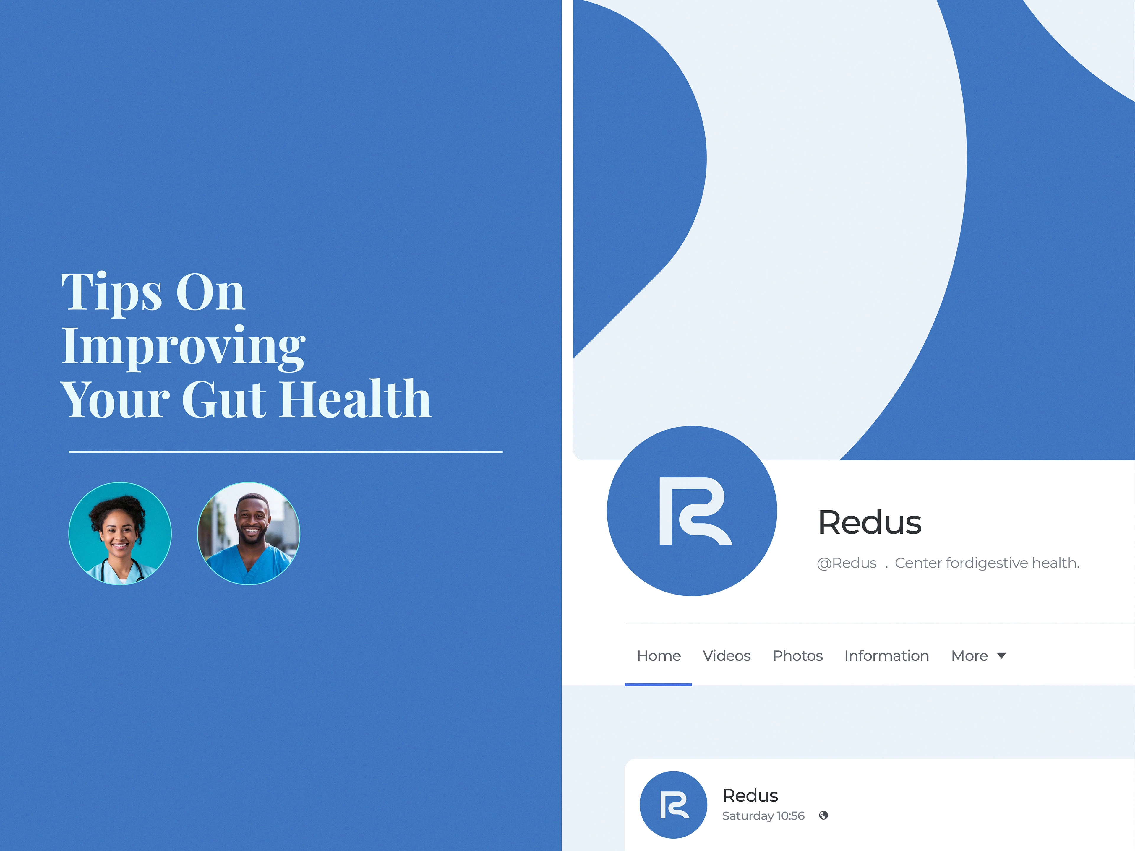
After conducting research, I proposed a visual solution of integrating the 'human gut,' a key component of the digestive system, into the letter 'R' of the Redus wordmark. This subtle yet effective design choice communicates Redus's brand specialty while allowing for future growth.
The brand color is a Redus blue with various tints and shades to reduce production costs. This combination of blues evokes a soothing atmosphere and reflects Redus's innovative approach to healthcare.





Like this project
Posted Sep 9, 2024
Redus Center for Digestive Health is a healthcare organization that is dedicated to providing quality specialist care for gastrointestinal and liver diseases.

