Digital Sanctuary Development for Strength of Eden
Megan Gianakouros
Case Study: Strength of Eden
Crafting a digital sanctuary for holistic wellness
Role: Lead Web Designer & Developer
Client: Strength of Eden (Massage Therapy & Wellness)
Platform: Wix Studio
Timeline: 2 Weeks
Live Site: https://megannicius.wixstudio.com/strength-of-eden
1. The Challenge
Strength of Eden required a digital presence that mirrored the physical experience of their service: calming, professional, and restorative. The goal was to move away from a generic booking site and create a brand-immersive experience. The client needed a platform that not only showcased their massage services but also built immediate trust with new visitors through social proof and an intuitive user flow.
2. Design Philosophy & Aesthetic
The core concept for this project was "Digital Serenity." The design needed to lower the user's heart rate the moment the page loaded.
Color Palette: I utilized a palette of warm beiges, soft creams, and earthy browns. These neutral tones evoke organic textures (sand, stone, skin) to ground the user.
Typography: A sophisticated blend of elegant serif fonts for headlines (conveying luxury) and clean sans-serifs for body text (ensuring readability).
Visual Texture: Instead of flat colors, I incorporated subtle textures—such as the shadow of swaying leaves in the Hero section and a soft, glowing gradient in the CTA section—to add depth and warmth.
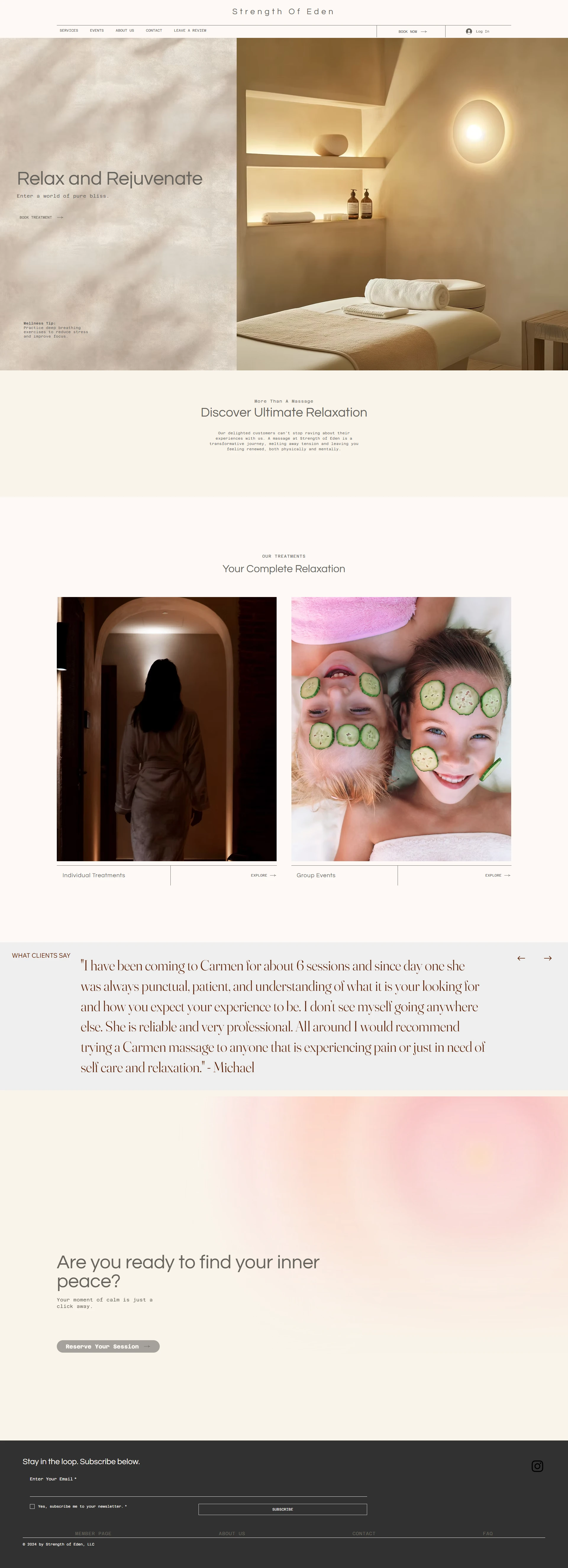
3. Key Layout Decisions (Home Page Analysis)
The Hero Section:
I opted for a split-screen layout to balance visual storytelling with clear messaging.
Left: High-impact typography ("Relax and Rejuvenate") against a textured wall background.
Right: A warm, invite-only photograph of a treatment room. This immediately answers the user's subconscious question: "What does the atmosphere feel like?"
Services & Discovery:
Mid-page, I used a clean 2-column grid to highlight specific service vibes. The imagery ranges from silhouette shots (privacy/calm) to playful wellness images (cucumber masks), suggesting a versatile range of services suitable for different needs.
Social Proof:
Trust is the currency of the wellness industry. I designed a dedicated testimonial section featuring a review from a long-term client ("Michael"). By placing this in a wide, airy container with plenty of negative space, the review feels authoritative and genuine rather than cluttered.
The "Aura" Call-to-Action:
Near the footer, I introduced a soft, pinkish-gold gradient background for the final CTA: "Are you ready to find your inner peace?" This visual shift acts as a "palate cleanser," drawing the eye to the "Reserve Your Session" button to drive conversion.
4. Technical Implementation (Wix Studio)
Building on Wix Studio allowed for advanced responsiveness and fluid design.
Responsive Fluidity: The split layouts stack seamlessly on mobile devices, ensuring the "luxury" feel isn't lost on smaller screens.
Booking Integration: I integrated a seamless booking flow, reducing the friction between browsing and scheduling an appointment.
Micro-interactions: Subtle hover effects on images and buttons were added to make the site feel alive and responsive to the user's touch.
5. The Outcome
The result is a cohesive, high-end brochure site that serves as a 24/7 receptionist for Strength of Eden. The site successfully translates the tactile relief of a massage into a visual interface.
Client Feedback: "I don't see myself going anywhere else... reliable and very professional."
Impact: established a distinct brand identity that stands out against local competitors who rely on standard templates.
Designer's Note / Pro-Tip:
For this project, I focused heavily on negative space. In web design for wellness, "empty" space isn't empty—it's breathing room for the user. By avoiding clutter, we subconsciously tell the user that the business is organized, calm, and ready to help them relax.
Like this project
Posted Feb 17, 2026
Crafting a digital sanctuary for Strength of Eden. 🌿 A high-end Wix Studio site designed to bring the serenity of massage therapy to the screen.