Website Redesign for Fitness Influencer Jessica Bickling
Megan Gianakouros
The Challenge
Context: Jessica Bickling is a fitness influencer focused on building an hourglass figure and proving that "Feminine is Strong."
The Problem: Her original site relied heavily on a dark, industrial "gym bro" aesthetic (black backgrounds, heavy contrast). While it communicated strength, it completely masked the femininity that makes her brand unique.
The Disconnect: The dark mode felt aggressive and generic to the bodybuilding industry, failing to resonate with her specific audience of women who want to be strong and feminine, not just "hardcore."
The Strategy
Core Insight: Strength doesn't have to look dark and gritty.
The Goal: Create a visual identity that balances the "grind" of weightlifting with the "grace" of femininity.
Keywords: Approachable, Editorial, Strong, Soft, Premium.
The Solution
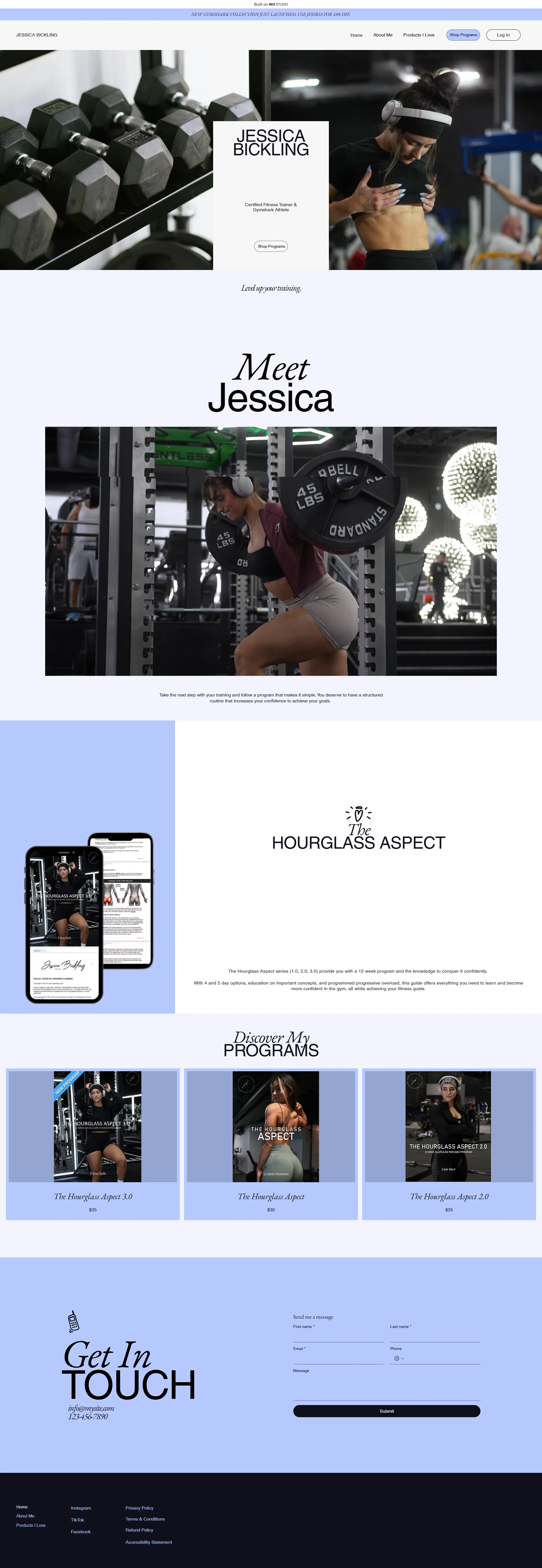
Color Palette Shift
Action: Switched from heavy Blacks/Greys to Periwinkle Blue, Crisp White, and Cool Neutrals.
Reasoning: The periwinkle blue is distinctly feminine but cool-toned enough to remain active and energetic. It differentiates her immediately from the sea of black-and-red fitness websites.
Layout & Composition
Editorial Vibe: I moved away from the standard blocky layout to an editorial style (overlapping text, generous whitespace). This elevates her programs from "gym routines" to "lifestyle investments."
The "Meet Jessica" Section: I redesigned this to be the focal point. By placing photos of her lifting heavy weights against a soft, bright background, I created a visual metaphor for her brand: Hard work in a beautiful package.
UI Polish
Cards & Products: The program cards ("The Hourglass Aspect") were given a softer, cleaner look to increase perceived value.
Footer/Contact: The "Get in Touch" section was transformed from a generic dark form to a stylish, inviting typographically driven element.
Visual Comparison
Before: Dark, enclosed, feels like a basement gym.
After: Open, airy, feels like a premium wellness studio.
The Outcome
The redesign successfully aligns the user interface with the brand's core message. It proves that a fitness site can be beautiful without sacrificing the intensity of the sport, effectively targeting women who want to sculpt their bodies with confidence.
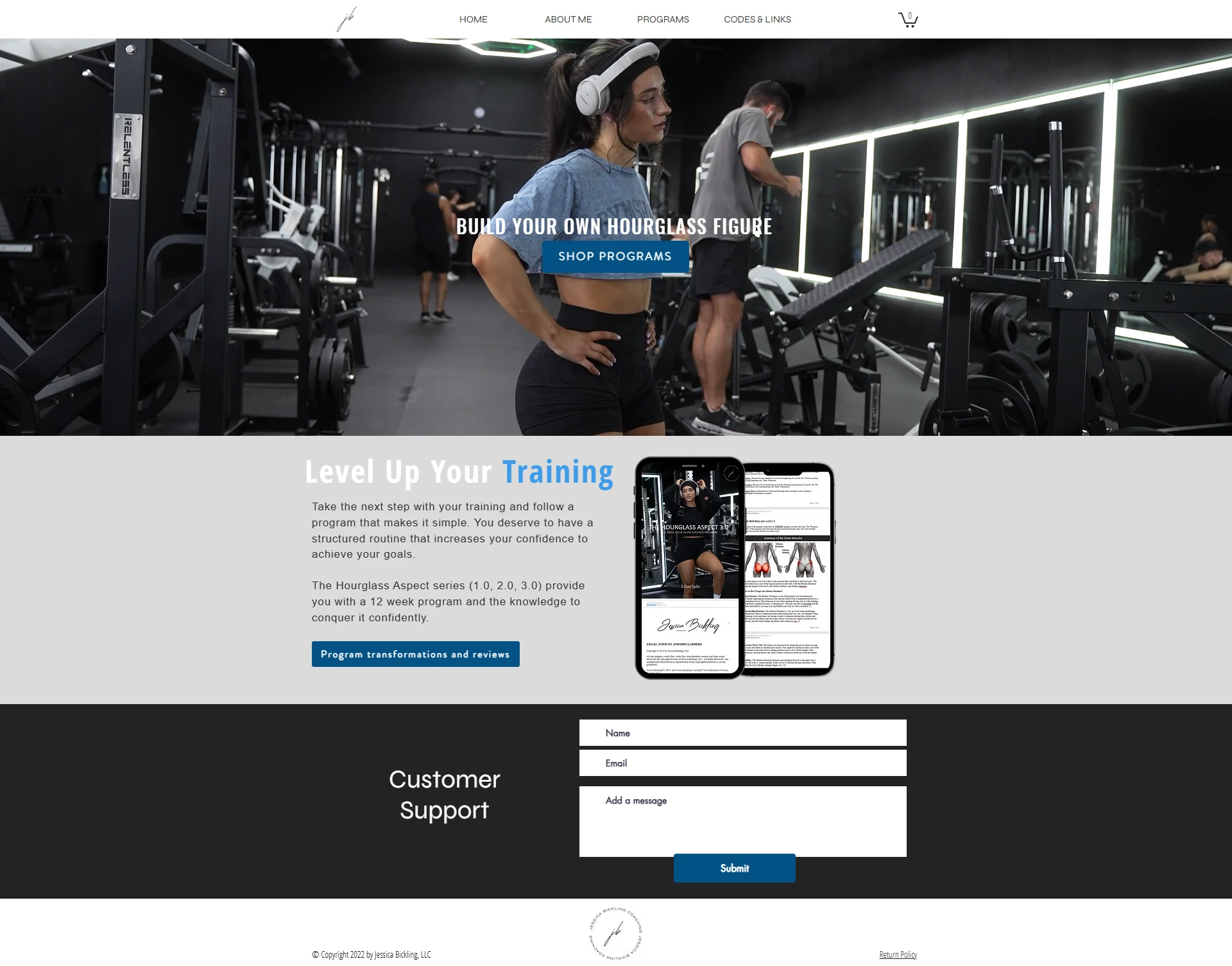
This is the original site prior to the redesign.
Like this project
Posted Feb 2, 2026
Fitness websites can be beautiful without sacrificing the intensity of the sport, effectively targeting women who want to sculpt their bodies with confidence.
Likes
1
Views
20