Purchasing Train Tickets - Redesign Project
CFR Calatori is the Romanian Railways mobile app dedicated to the users looking to purchase train tickets without having to wait in a queue. The users can purchase tickets or track their train in real time.
There is an opportunity for a redesign as the app fails in offering the users an easy and clear flow to complete their goals and has an outdated UI
🎯 Project Goal
The goal of this project is to optimise the existing flow thus helping the user complete their goals fast and with ease. Moreover, by improving the experience, the UI elements must also be taken into consideration & create a more aesthetic experience.
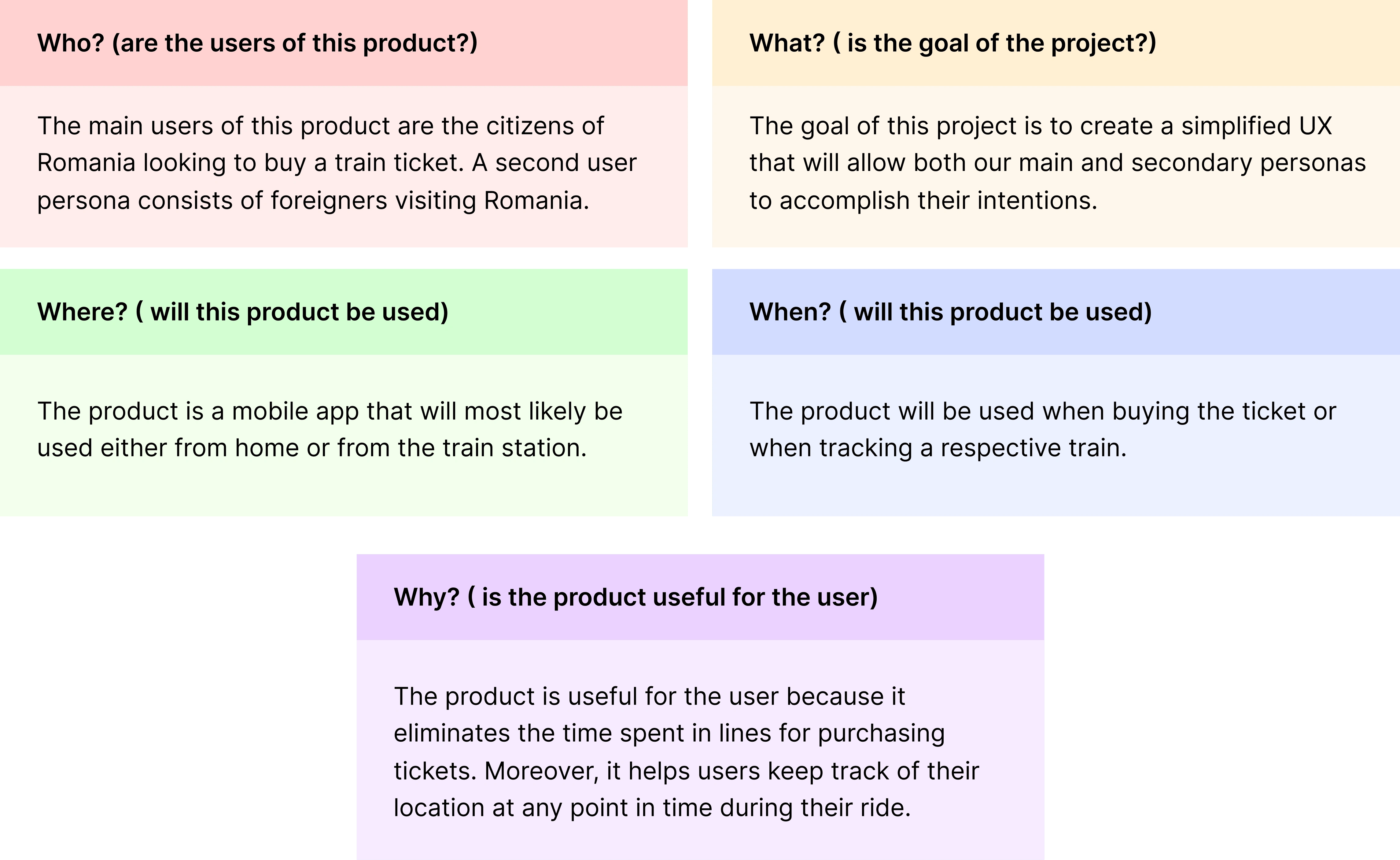
Gaining clarity of the problem - 5W Framework
In order to gain clarity about the problem I first started with the 5W Framework: Who, What, When, Where, Why. This method helped me gain perspective about the basics of the app.
Let's improve the flow
Booking a ticket
For authenticated users, booking a ticket is a 9-step journey, while for non-authenticated users, it requires 10 steps to complete the desired goal. The main problem with this flow is the fact that users have no confirmation whether there are any tickets available for the route selected or not. Only in the final steps, in the cart overview, the users can find whether there are any available seats.


Before flow VS after flow: We want to reduce the number of steps the user has to take for booking or purchasing a ticker
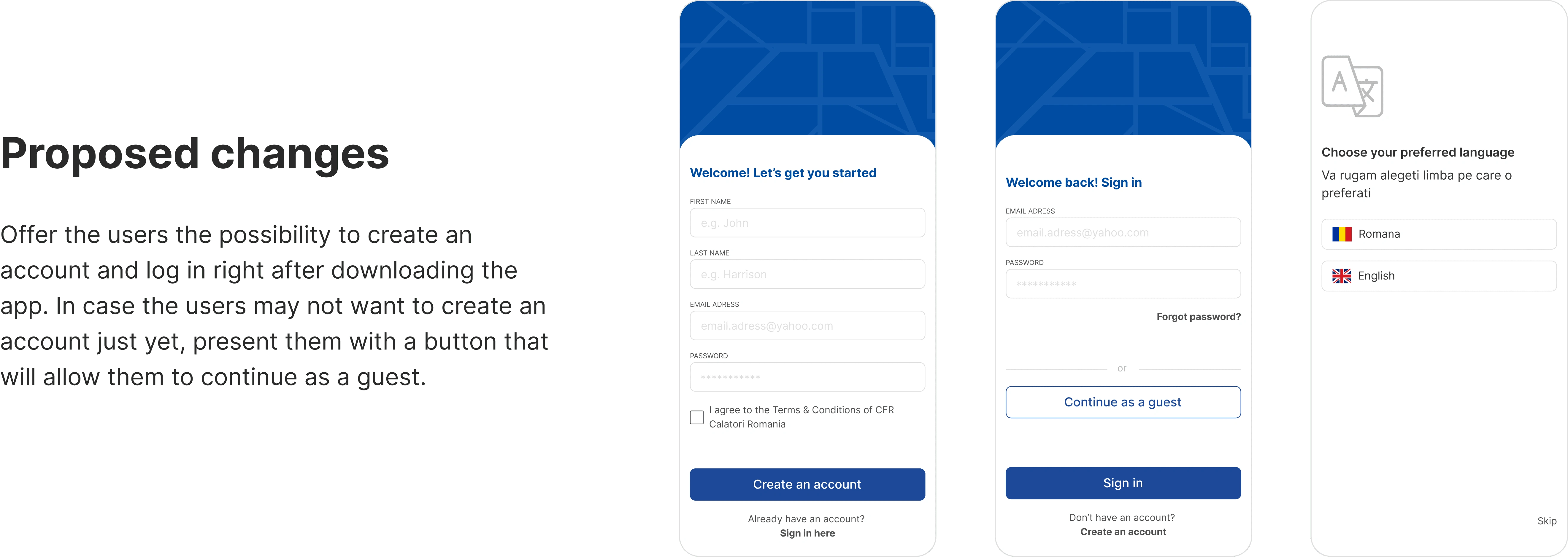
Login / Create an account flow
As soon as the user opens the app, they are directed to the home page without the option of creating an account or logging in. This can be:
Misleading: because the user will believe that having an account is not necessary only to find out later in the process that they need to log in
Disruptive: The user is fully committed to buying a ticket only to be interrupted by the fact that they have to log in.
UI Decisions
As part of this redesign project, not only the UX of the app needed some improvement but also the UI.
First of all, the first issue discussed was the overall aspect of the app that was outdated, so the first thing I did was try to make more visually appealing & up to date.
Secondly, and the most important aspect, I managed to prioritise through UI elements the important information as well as eliminate the clutter.
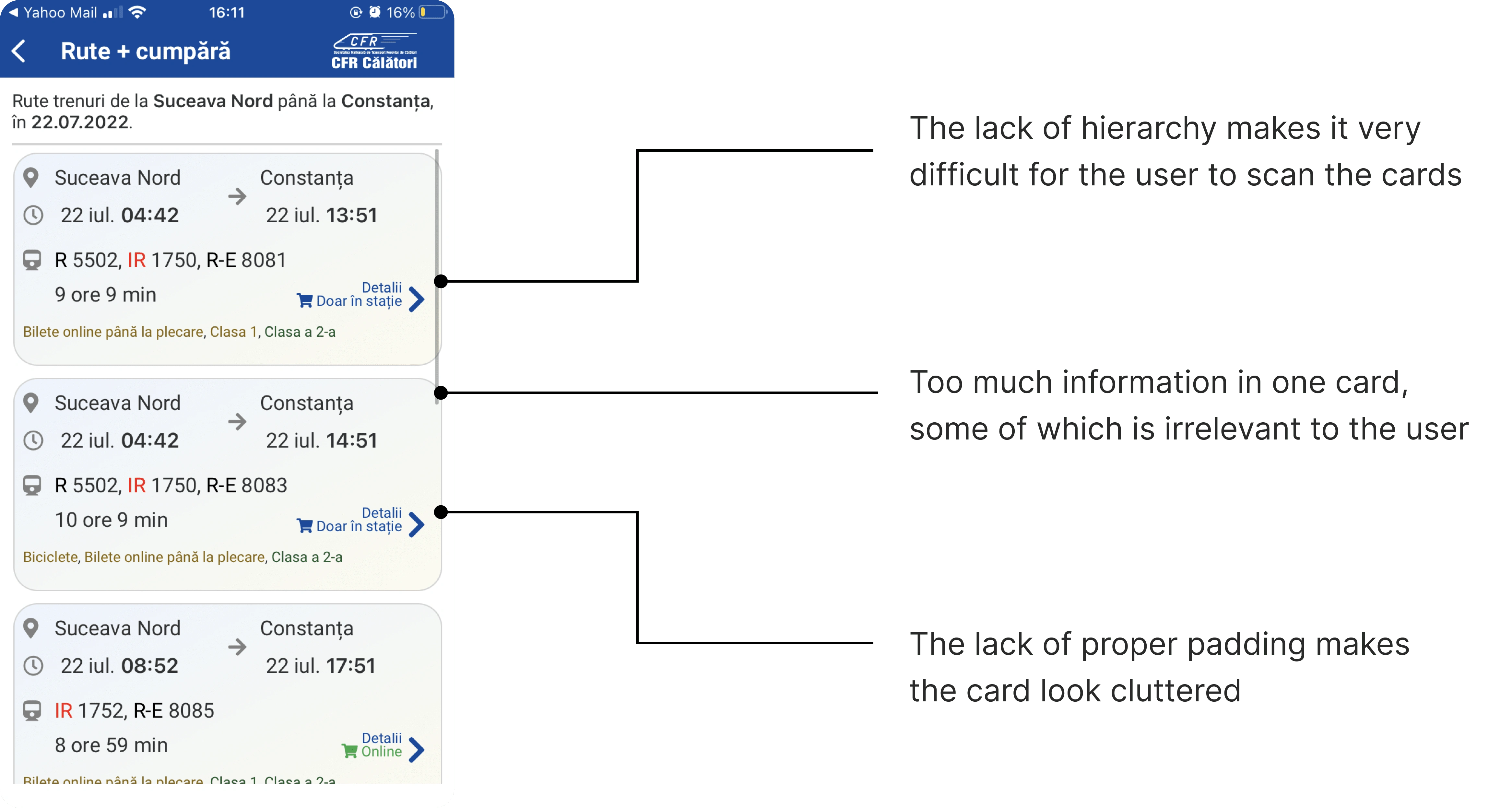
The existing page for browsing through available train routes
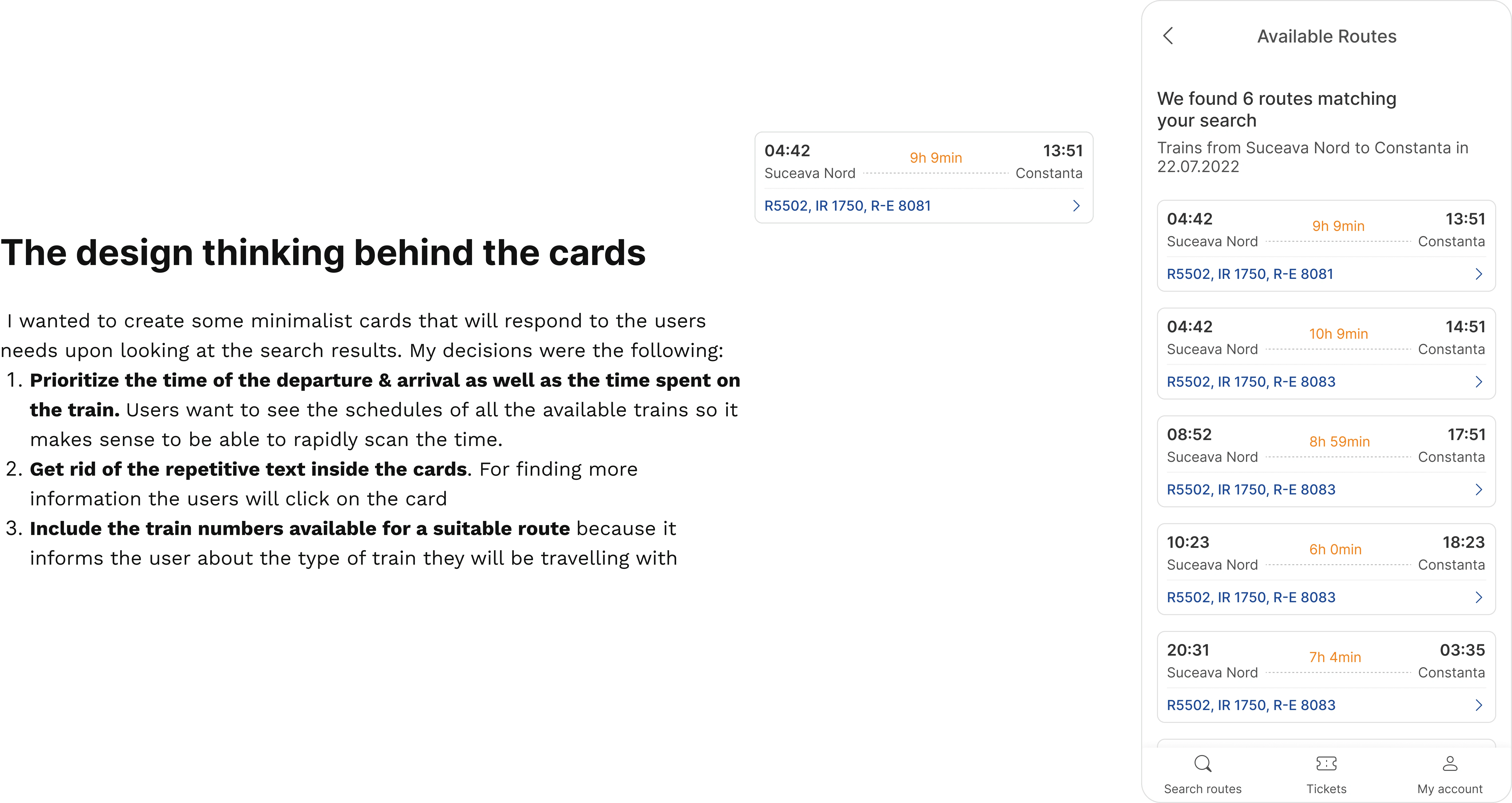
Before Vs After
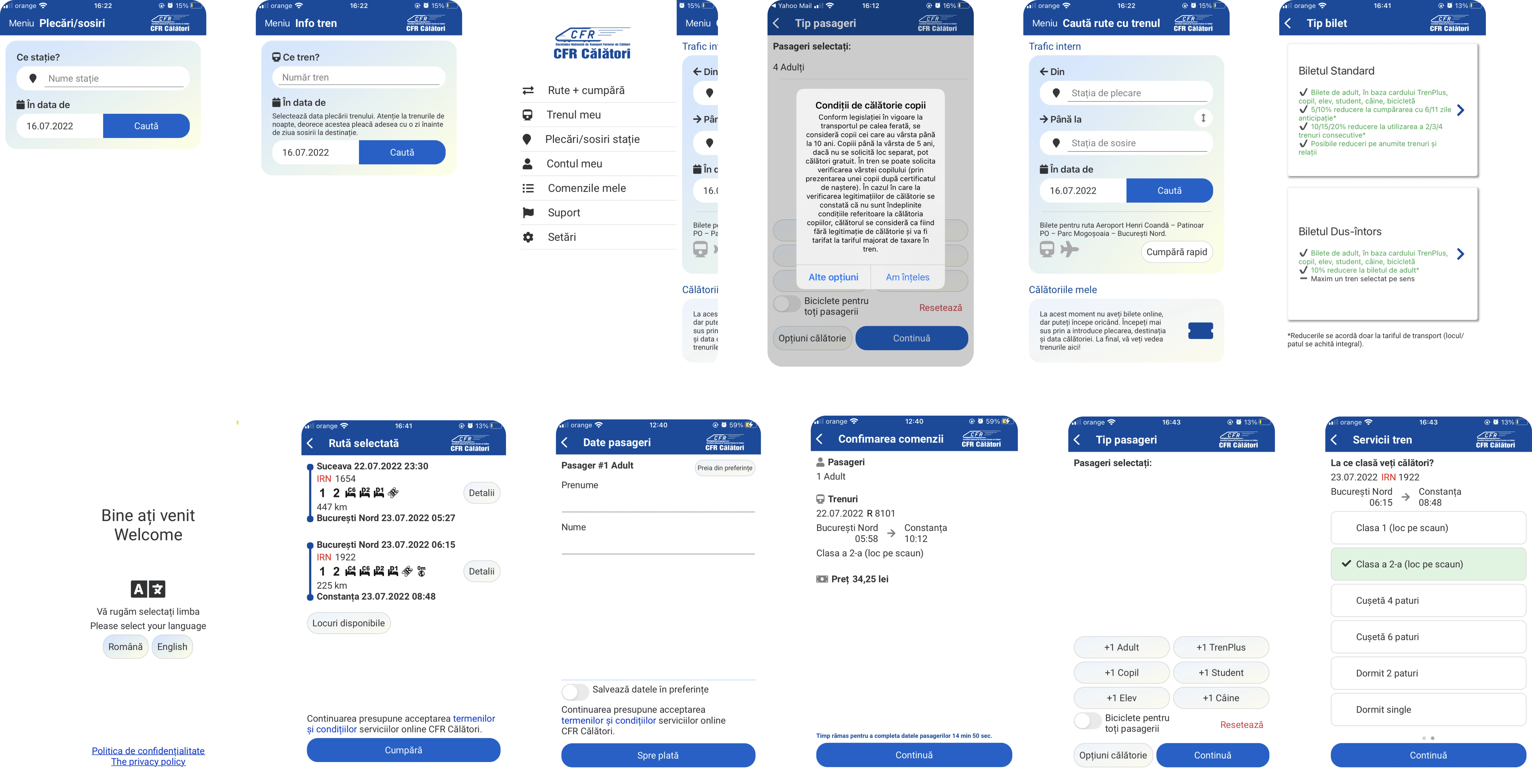
Before
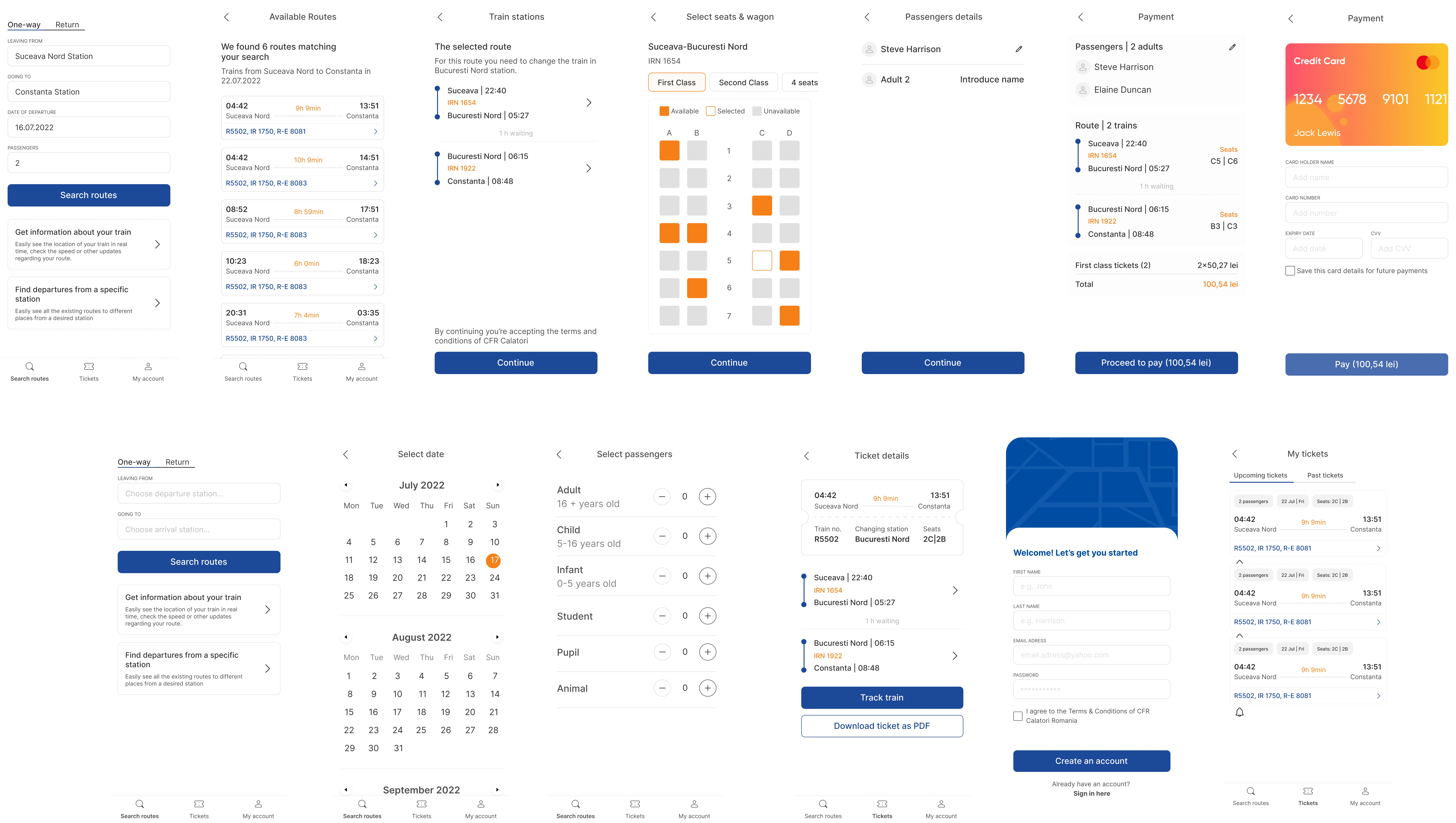
After
Thank you for reading!
Like this project
Posted Dec 7, 2023
CFR Calatori is the Romanian Railways mobile app dedicated to the users looking to purchase train tickets without having to wait in a queue.
Likes
0
Views
25

