Bicycle Shopping App UI/UX Design
DOT IT

This app is built to give users a clean and visually immersive way to shop for bicycles and cycling accessories. The focus was on keeping product browsing simple, intuitive, and enjoyable. The UI emphasizes strong product presentation, smooth navigation, and a premium, modern visual feel.
User Flow & Interaction Logic
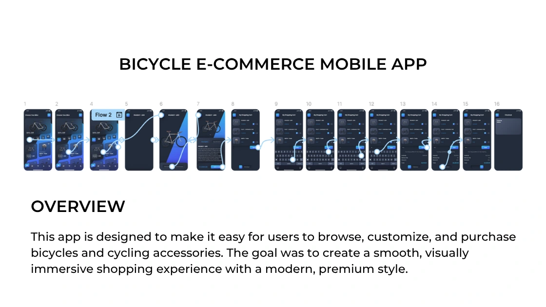
The flow is structured so users can move through the buying experience without confusion:
Browse bicycles by category
View model details
Adjust configurations and add to cart
Apply discount and checkout
The flow is intentionally minimal, helping reduce decision fatigue and allowing the product visuals to guide the experience.
Key Screens
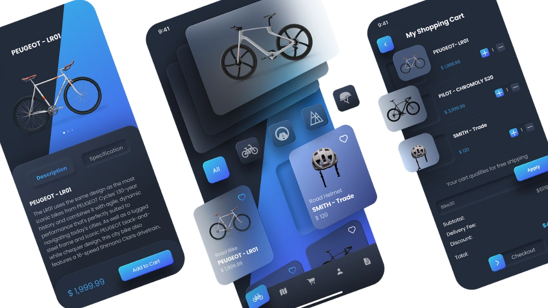
1. Product Discovery Screen
This screen allows users to scroll through bicycles easily. The cards are designed with layered shadows and gradient surfaces to create depth and highlight the bike images. Category filters are placed just above the product list for quick access, helping users find what they want without heavy navigation.
Visually driven browsing
Clear product cards
Quick-access category filters
2. Product Detail Page
Once a bike is selected, the user is guided to a clean product detail view. The design keeps the bike as the hero element, with supporting information arranged neatly below it.
Large, centered product visual
Tab layout for Description and Specifications
Easy “Add to Cart” call-to-action
The card overlay and gradient background give the product a premium, display-like feel.
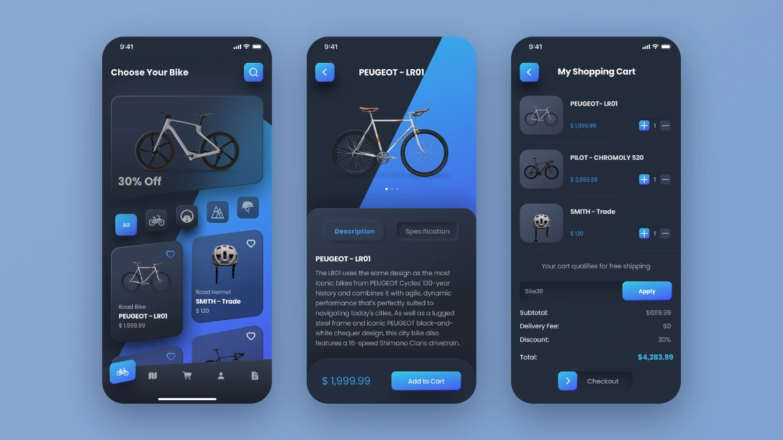
3. Shopping Cart Screen
The shopping cart interface keeps all details clear at a glance:
Product thumbnails
Price breakdown
Quantity controls
Discount code input
The goal here was clarity and checkout confidence. Users should never feel unsure about what they are buying.
Design System & Visual Language
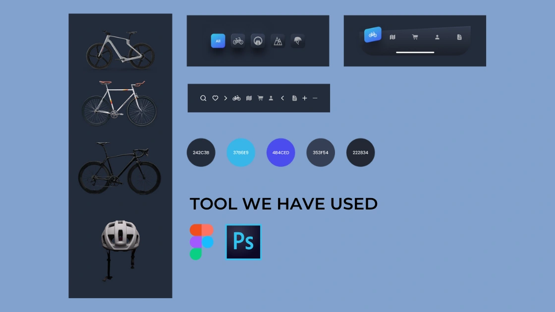
The visual identity relies on a cool-toned, dark theme combined with vibrant blues for accents. This creates a sleek, modern, and slightly futuristic feel.
Color Palette
Base dark:
#242C3BPrimary highlight:
#3786E9Secondary accent:
#4B4CEDNeutral base:
#353F54 #222834Styling Choices
Soft, three-dimensional shadows to create card elevation
Rounded shapes to maintain friendly, approachable UI
Minimal typography to keep screens clean and readable
Tools Used
Figma: UI Design & Prototyping
Photoshop: Product image cleanup and background blending
Like this project
Posted Nov 7, 2025
A sleek mobile e-commerce app for bicycles, designed with smooth navigation, bold product visuals, and a clean, immersive user experience.
Likes
1
Views
2