Portfolio UI Kit Study Case
Enzo Miyauti
The life of a designer sometimes seems, a bit repetitive. We eat, design buttons, sleep, and repeat. I was constantly asking myself how many times would I have to keep designing buttons? Well, I decided to take action and start building some internal UI Kits to accelerate this process, and this eventually turned into a sellable product. How many of us could benefit from these kinds of things? They are not the center of our design process, but they can help us a lot, as it has been helping me. Thus was born the first UI kit for my company.
Born when times were pressing
This idea of portfolio kit was born when I suddenly found myself needing an update on my own portfolio — and I thought: why not start here, getting one UI Kit out of the ground would surely help me get other kits out. Then a gigantic amount of research began on how people were putting these things out there and how I could do it as well.
At first, one could feel small when noticing the amount of great products there are out there, but there’s a gap missing when it comes to this kind of service — there’s no one on earth that can offer products like you because there’s no one like you. It’s a simple idea, but it’s a powerful one for starting the journey. I didn’t know what was ahead of me, but it was some challenging stuff.
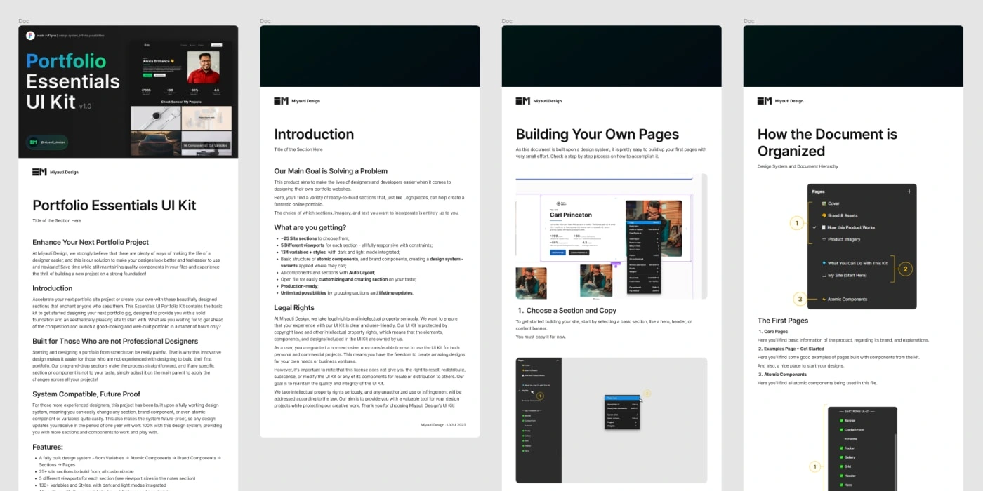
Documentation Example — One of the Challenges for This Project
What I Had to Learn to Get in the Podium
Something that life has taught me is: it’s always easier on theory, on a daily basis, there’s a lot of stuff we forget to count with. As I started designing, I noticed that there are a lot of details that compose a digital product which need to be delivered as well. If it were only for the well-built design system or even the website pages itself, something I work with daily, it would be easy. But building and writing up documentation, marketing files with showcase images, prototypes along with demonstrative images, with preparing the Figma file with a demo version, was not easy.
I had to organize my workflow to deliver everything properly in the quality we were looking for. For example, most of the documentation and showcase images can only be made after most of the document pages are done. At the end, I had to ensure as well the Figma was organized and ready to be a demo file as well. These details transformed ‘x’ hours of work in ‘2x’ — something that definitely wasn’t expected.
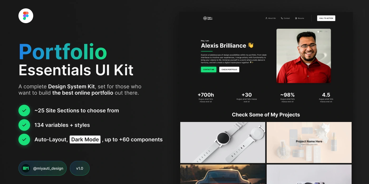
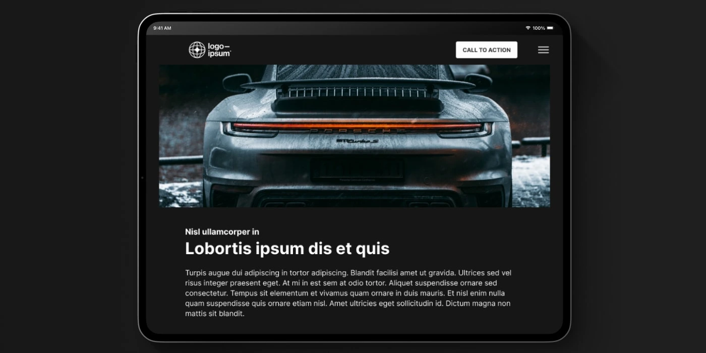
Full Cover for the Portfolio Kit
The Solution Found
But it was all worth it, as the final product has a power drag and drop structure, easy to use, and very accessible to any kind of user!
The UI Kit has a default branding kit, with blue accent colors for light mode, and green accent colors for dark mode. There are also a neutral sequence of colors, and font styles for paragraphs, titles, and special text layers (like buttons and others).
As a result, we have a product with +25 site section to choose and build from, 134 variables + styles, more than 60 components, with dark mode included and auto layout in all sections.
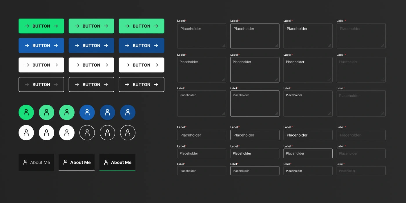
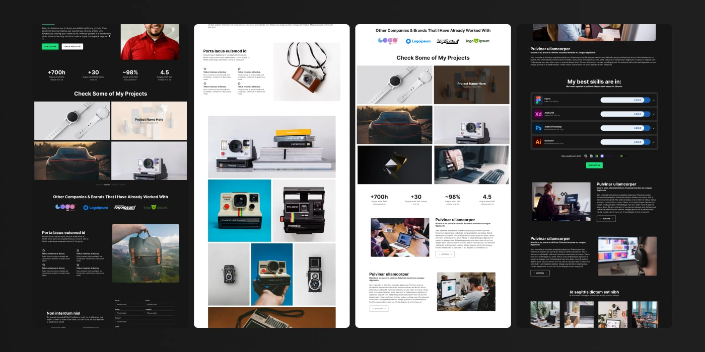
Atomic Components
The Design System
To help with the overall maintenance and scalability of the UI Kit, we had to implement a solid Design System. As for now, it is divided in 3 main categories:
Atomic Components: which are the core pieces of the site, objects used throughout all the project. Includes buttons and button icons, inputs, images, and other smaller components;
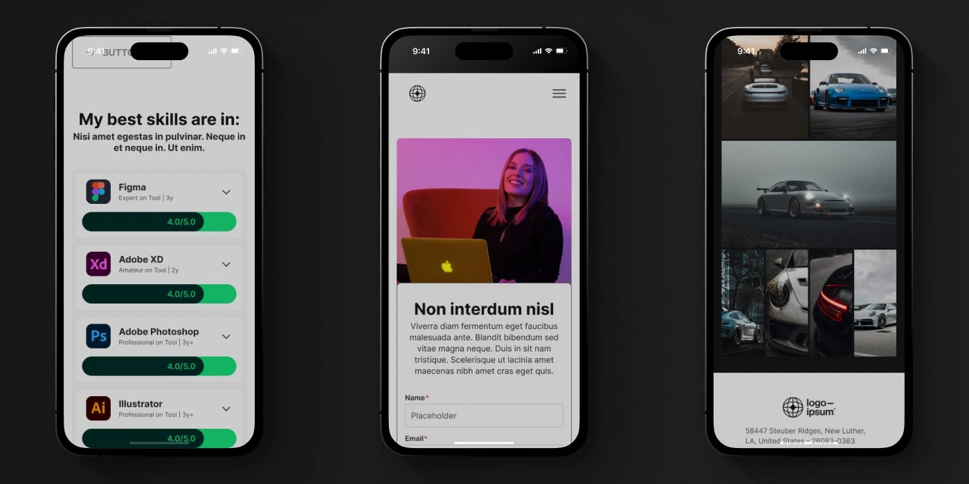
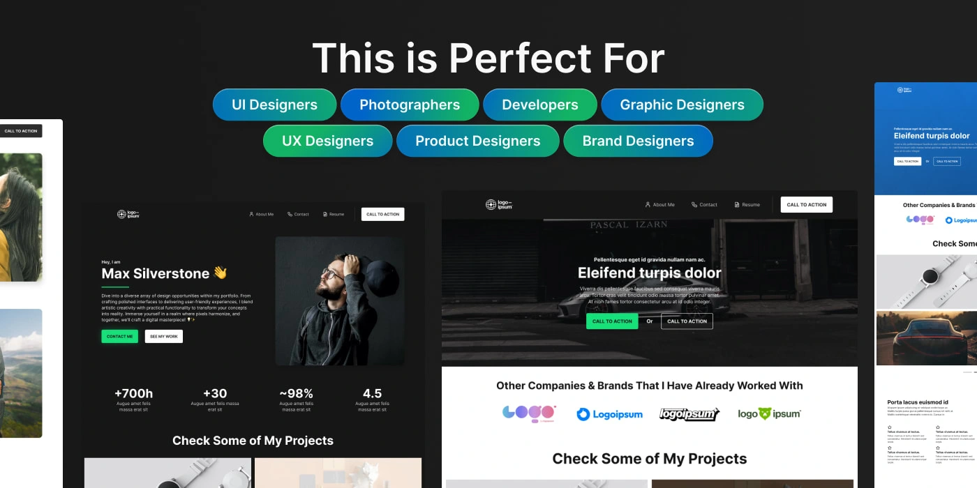
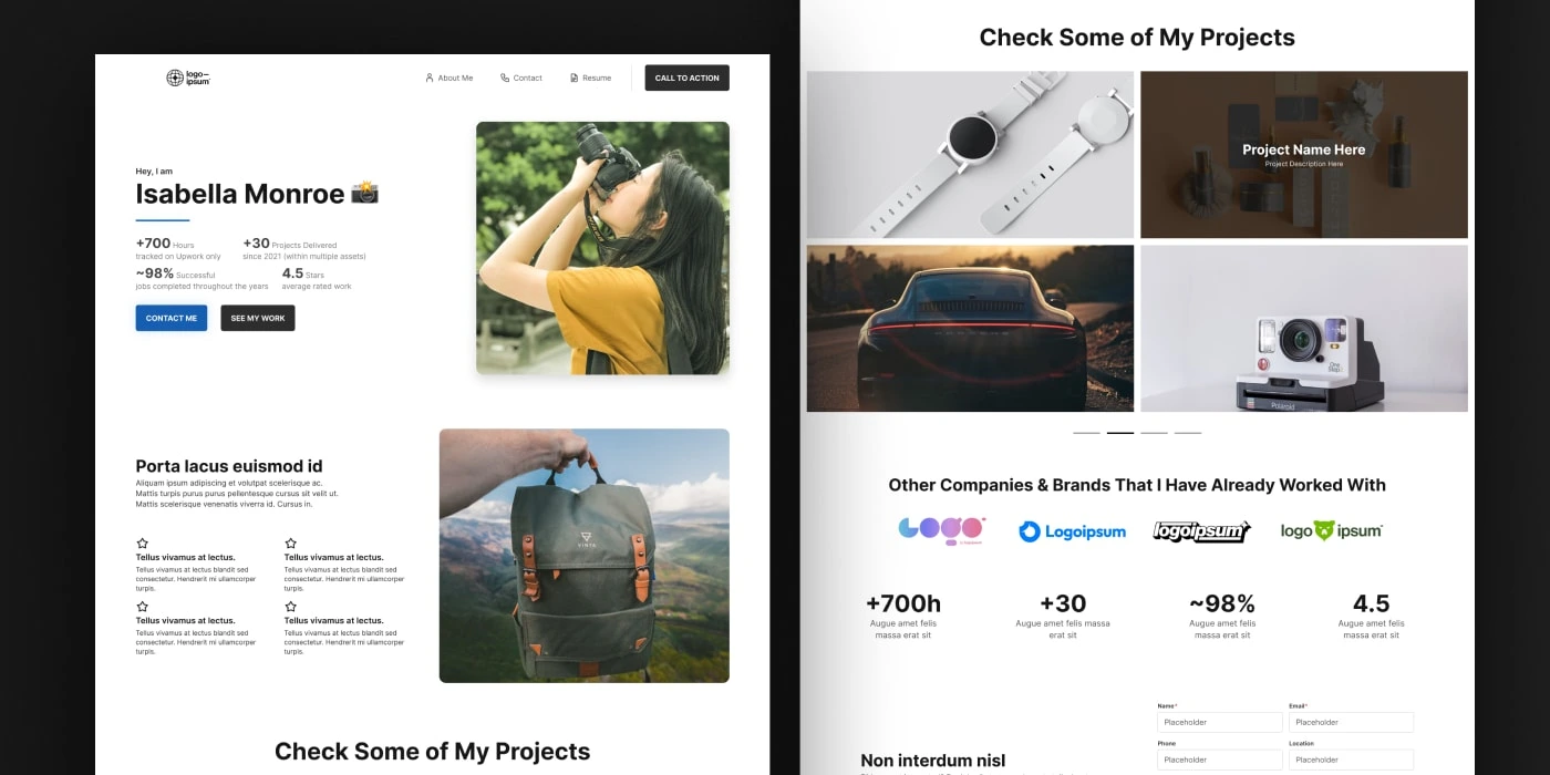
Site Components: also known as ‘Sections’, they are as the name suggest the site parts the user will use to build his portfolio. Some of them are: header and footer, hero, gallery, skills, a rich text, and so on. They were all design with a great number of variants and options inside each component, to give the final product flexibility in terms of content and structure;
For some sections, there are even up to 4 variants, creating more options for flexible content usage;
Site Pages: at last the final level of the system are the pages, as they are not used outside the project they are not components. The full pages built include: home, contact, project, and about me.
The idea for this system is to grow with time, making a huge library of components that will be available for designers to optimize and speed up their portfolio design process.
The components are also organized within different pages, so the user can easily explore them, copy, and paste them into the ‘GET STARTED’ page. He can do the same with any other components he chooses, and even with entire pages. Furthermore, he can always drag and drop from the sections he wants from the assets panel.
If there’s any section he wants differently, they are built to be easily customizable. They all have auto layout, so adding any logical buttons, images, and even more complex elements should be only a matter of dragging it inside the desired area. For more profound changes, he can go in and work directly into the atomic components.
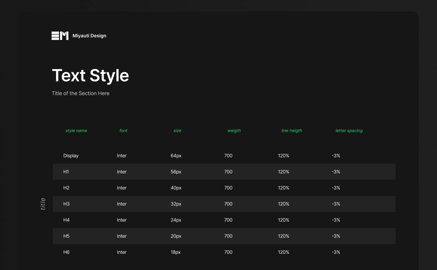
Our Text Styles
The Variable System
For ensuring a strong product, there’s a variable system implemented into the design, using the new Figma features release this year (Oct 2023). The variables are pushed from a colors variable collection, which feature a primary color, a secondary color, and a neutral pallet. They go from 20, to 800, and include the black and white as well.
From these colors, other variables are defined in a token system. They are categorized as: background, button, data-structure, footer, icon, logo, stroke and text. Inside each category there are primary, secondary, light, muted, a variable sort of colors depending on each one’s need. A cool thing is that this system ensures that text and background combinations will always meet accessibility standard.
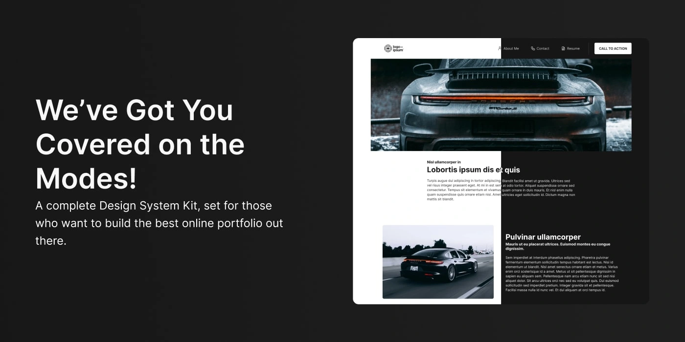
There’s also the addition of mode with this system. The project has: light and dark modes, and they can be switched for every section in the modes panel in Figma.
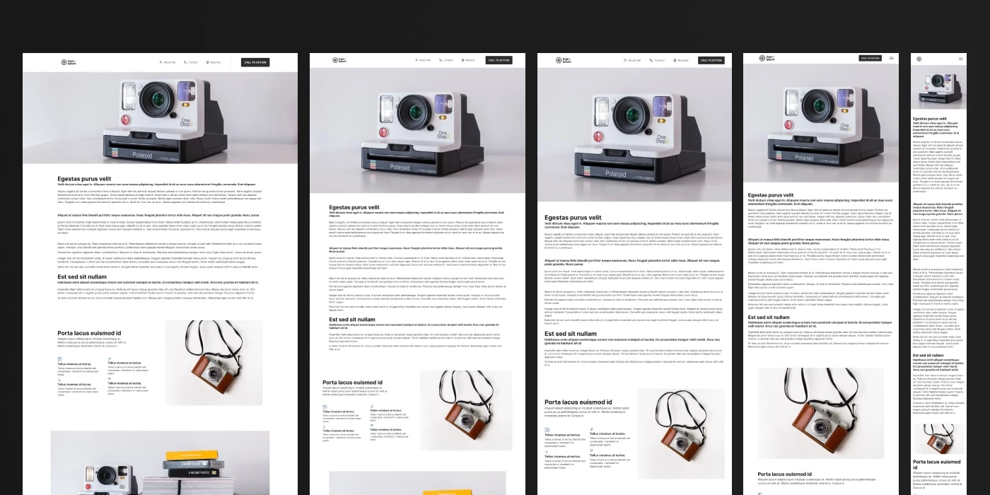
Made for 5 Different Viewports
Responsiveness
Another important thing for this project is its responsiveness. All the sections were designed to work in a range from 1920px to 290px, including here large desktop, desktops, tablet, and mobile. More specifically, the sections are divided into 5:
Viewport 1920: which goes from 1920px to 1600px
Viewport 1600: which goes from 1600px to 1440px
Viewport 1280: which goes from 1440px to 1024px
Viewport 1024: which goes from 1024px to 640px
Viewport 375: which goes from 640px to 375px
This division ensures that for every device the user decides he will build his portfolio for, there will be a responsive version for it. To make it happen, we would like to mention the importance of Auto Layout in Figma, that makes everything fall rightfully into its place with so much ease and smoothness.
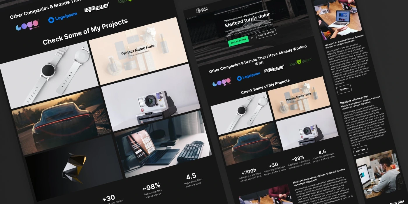
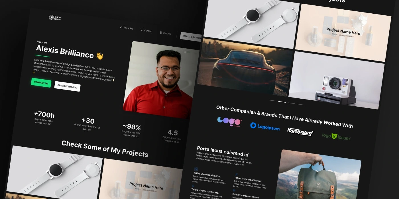
How it has turned out
To summarize and share more details of the final images, here are a collection of the best shots of this project.
Some of the Best Shots for This Project - 1
Some of the Best Shots for This Project - 2
Some of the Best Shots for This Project - 3
Some of the Best Shots for This Project - 4
Some of the Best Shots for This Project - 5
Some of the Best Shots for This Project - 6
Some of the Best Shots for This Project - 7
Some of the Best Shots for This Project - 8
In Conclusion…
At the end, we can say we learned a lot, although there’s still a lot to improve in terms of the product. One of the best decisions we made was to keep things scalable and component wise, this surely makes our work future-proof in all terms. There’ll be no difficulties in terms of adding components, documentation, and even modifying variables or styles.
For the next project like this, which we expect to be soon, there are some improvements to be applied. We’ll benefit from the fact that there are lots of elements and structures we can use and build upon, but constructing a better documentation system, and developing more section variants, are a must for our next try. A better naming convention for the variables would be a nice addiction as well.
And you, what do you think? Share your thoughts on this post to enrich our discussion! You can also always reach me at:
Want a demo of the product? Access here.
Like this project
Posted Mar 14, 2024
UI Kit study case, created internally to evaluate how much it can speed-up a design process and impact future work.
Likes
0
Views
25