SaaS Platform Design System
Anthony Chevalier
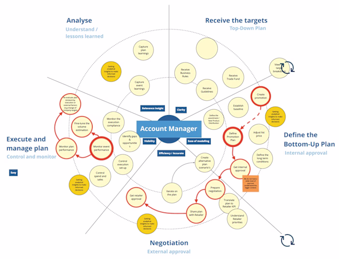
EBP operates a multi-module SaaS suite for business management where screens are dense, data-heavy, and workflow-driven. Over time, separate teams and releases had produced diverging layouts, behaviours, and visual styles. Forms, tables, filters, and state handling were inconsistent across modules, creating friction for users and rework for delivery teams. The objective was to establish a unified design system and UX foundations that would scale across products while supporting accessibility and performance constraints.
Context & challenges
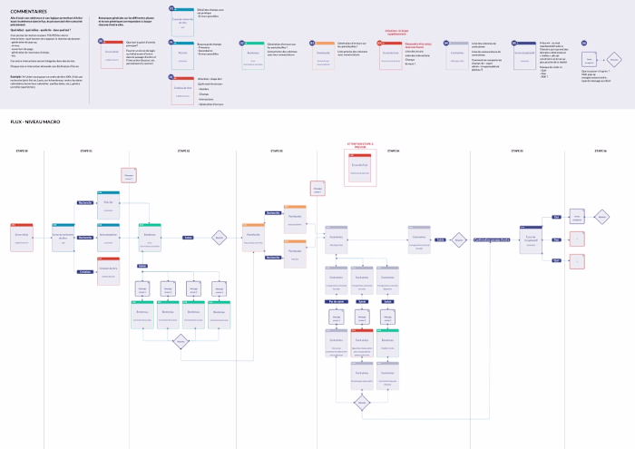
The suite combines many patterns typical of ERP/management software: long forms, complex tables, batch actions, permissions, and validation chains. Legacy screens, different front-end stacks, and parallel roadmaps made convergence difficult. The organisation needed a common language for product, design, and engineering to accelerate delivery without sacrificing quality or compliance.
What I did
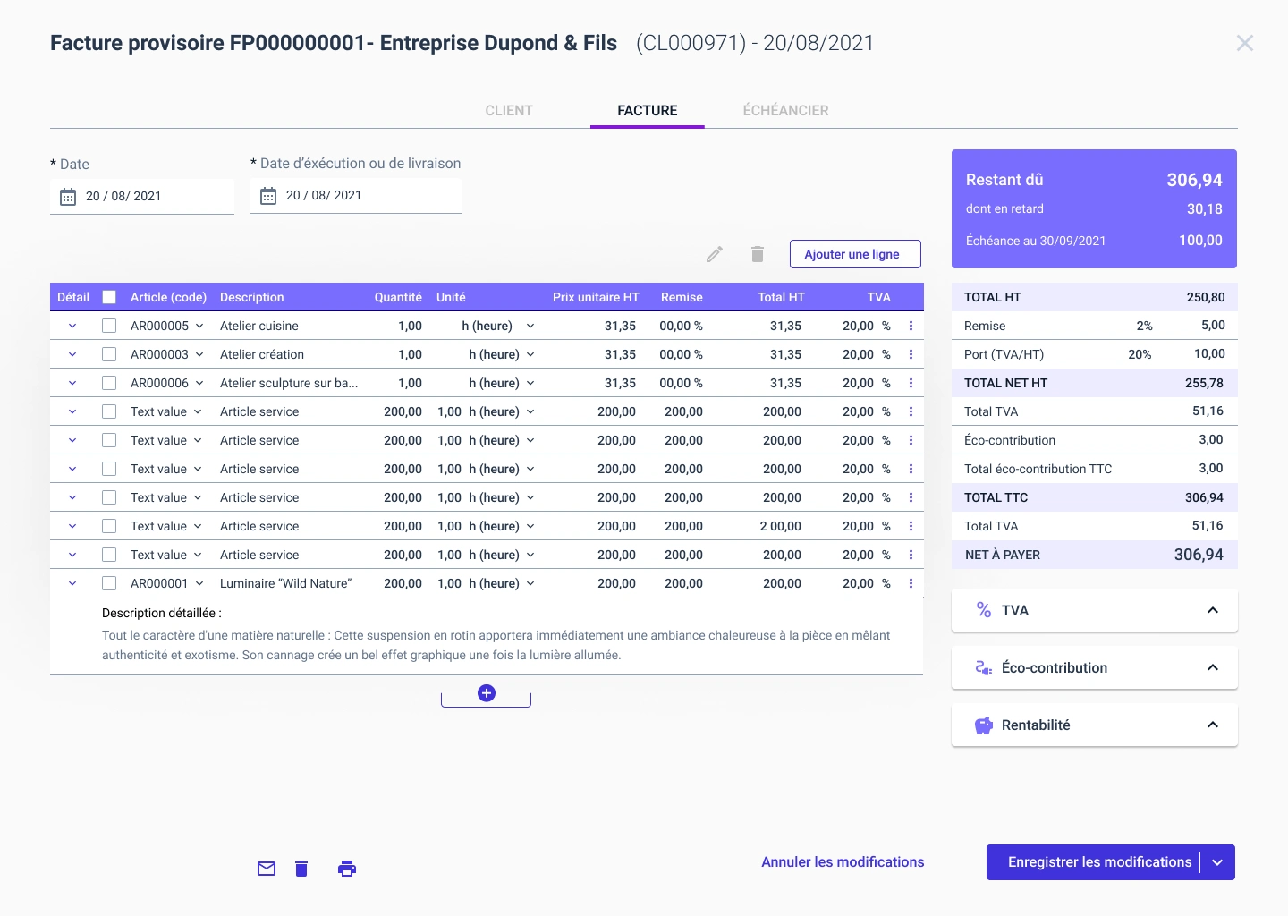
I began with a comprehensive UI inventory across representative modules to identify shared primitives and divergent patterns. From there, I defined design tokens (typography, colour, spacing, radius, elevation, motion), states (hover, focus, error, disabled), and responsive grids to standardise layout behaviour.
On interaction, I designed core patterns for tables (density, sorting, inline edit, empty/overflow states, pagination), forms (field hierarchy, validation, helper text, error recovery), navigation (global vs. local), filters and search, date & number inputs, bulk selection, and confirmation flows.
Accessibility was treated as a first-order constraint: contrast ratios, focus order, keyboard traversal, semantic grouping, error messaging and live region usage were embedded in the patterns as WCAG-aligned guidance.
To make this durable, I set up governance and contribution: decision rights, versioning, release notes, change proposals, and evidence required for new components. The system shipped with documentation, usage do’s & don’ts, example compositions, and migration guidance so teams could refactor progressively. In parallel, I partnered with engineering to align component APIs with the design intent and to avoid one-off forks.
Outcomes & value
The programme delivered a coherent visual and interaction model for the suite and a repeatable way of working: fewer ambiguities in tickets, faster hand-offs, and less rework across teams. Designers and developers onboarded more quickly thanks to standardised compositions and examples, and product managers gained clearer options when prioritising enhancements across modules. Beyond UI consistency, the design system became a delivery accelerator and a shared reference for future experimentation and analytics.
Like this project
Posted Nov 11, 2025
Led the DS creation and UX of a SaaS platform. Standardised interface logic, accessibility, and visual hierarchy: scalability, accounting, management tools.