Mia — Brand System, Product Design & Landing Page
Ines Siebrecht
Mia — Brand System, Product Design & Landing Page
Collaboration with an early-stage language learning startup
The Brief
Mia is an AI conversation partner that helps people practice real language skills without the pressure of streaks, judgment, or rigid schedules. The founder came to me with a working product but a visual identity that wasn't reflecting the warmth and approachability the product was built around.
The ask was broad: make it better. That meant starting from the ground up with brand and working outward into product and marketing.
The Approach
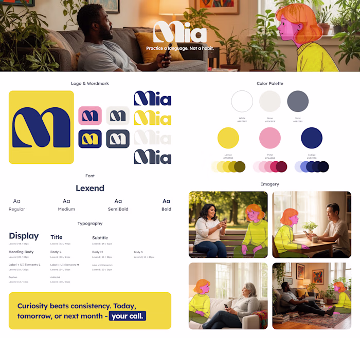
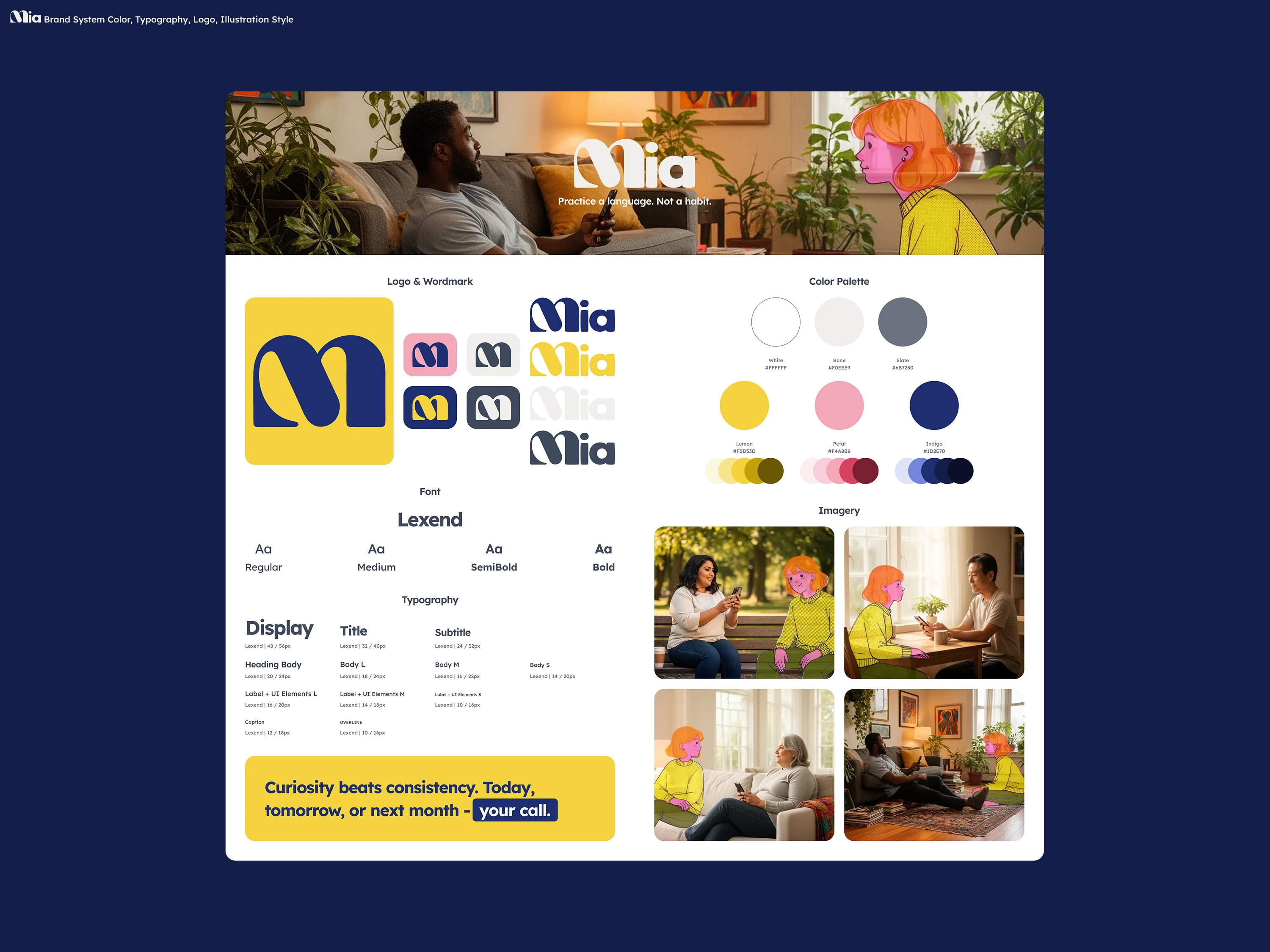
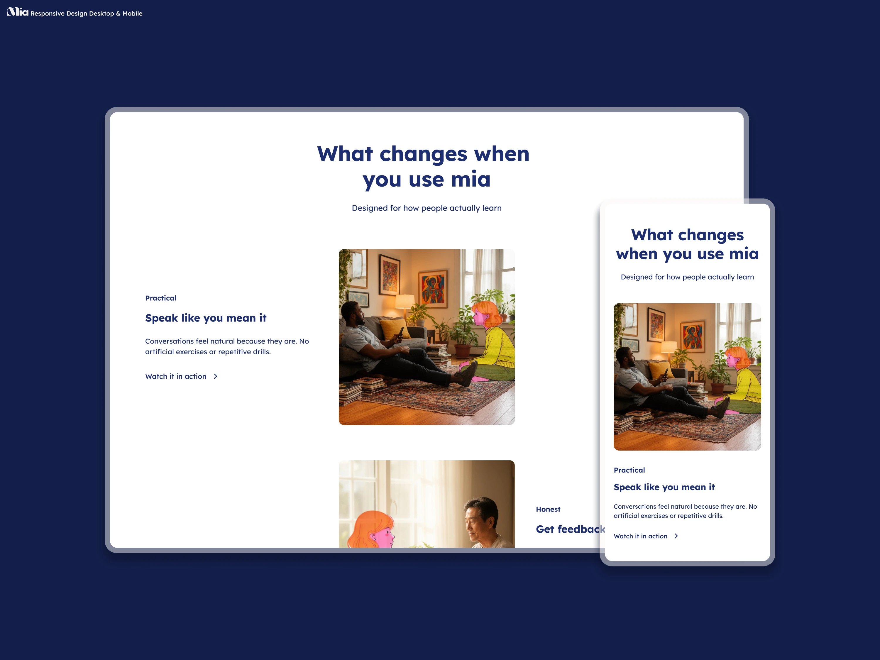
Before touching any screens I established the visual foundation. The brand needed to feel friendly and modern without tipping into edtech generic. The result was a system built around Lexend, a warm sans-serif with strong readability credentials, a palette of indigo, lemon, and petal that feels energetic but not loud, and an illustration style that puts real people in real situations alongside a recurring AI character.
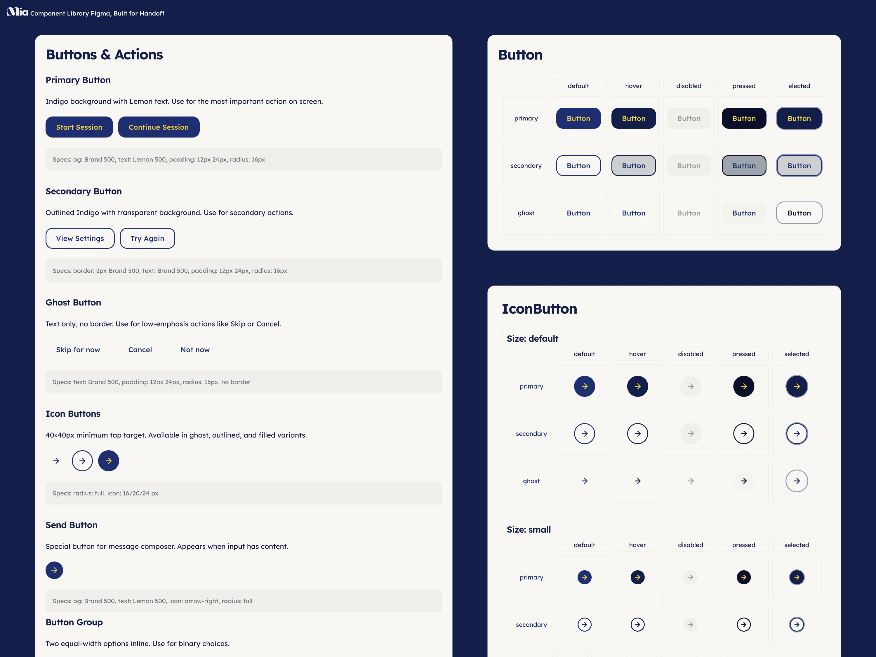
From there I built a component library in Figma that the developer could build directly from, covering typography, color tokens, interactive states, and the core UI patterns the app needed.
The Work
The project covered three connected layers:
A full brand system including logo usage, color palette, typography scale, imagery direction, and tone of voice anchors.
A component library built for handoff, used directly by the developer to implement the product in code.
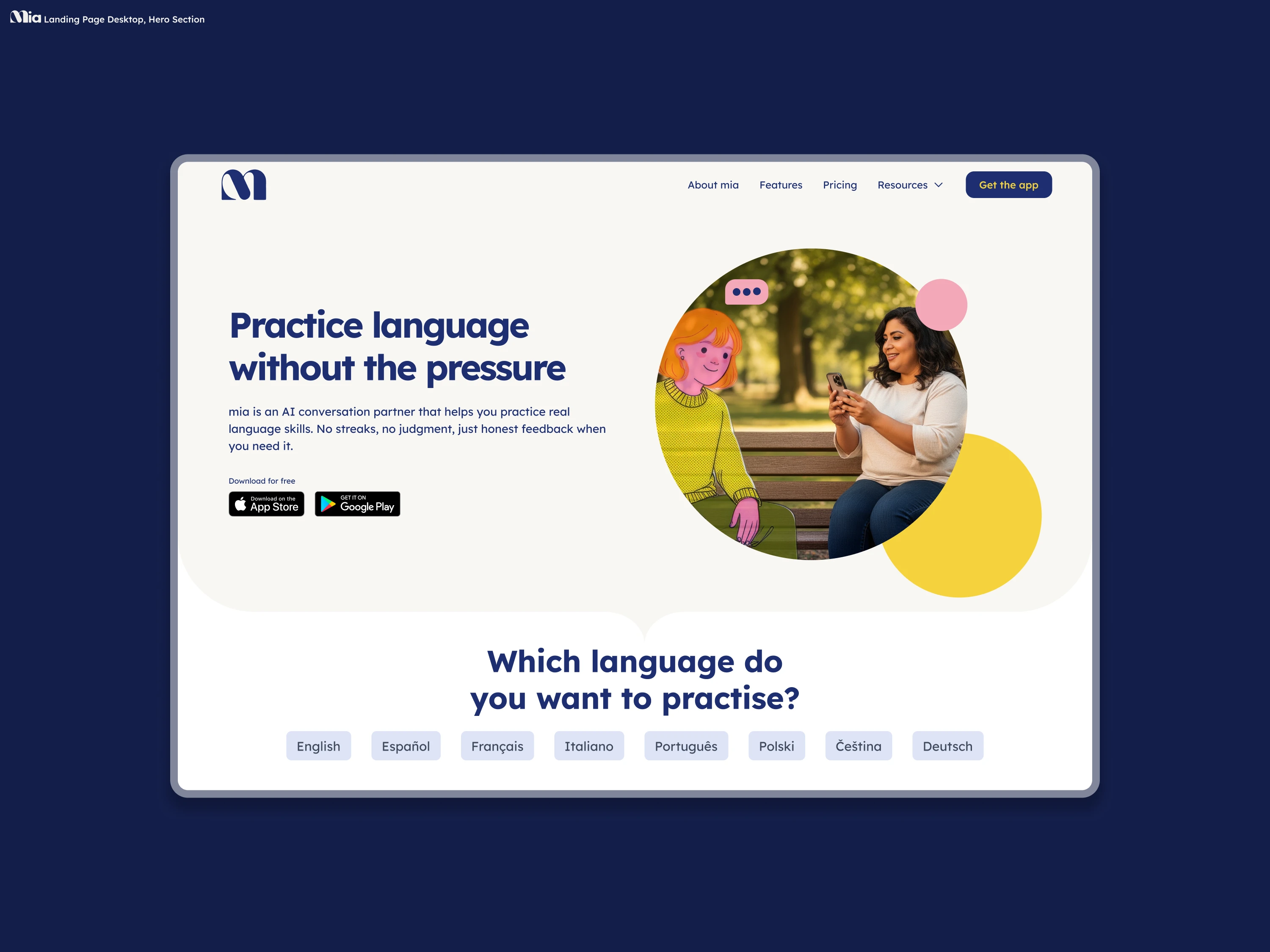
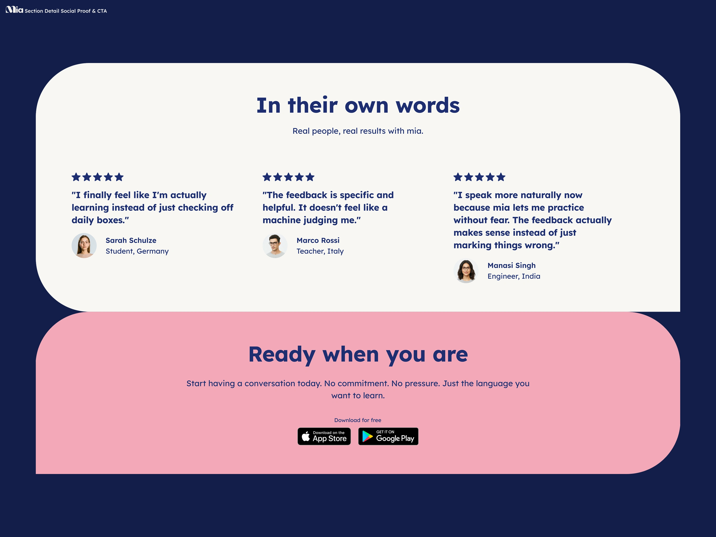
A landing page designed for conversion, desktop and mobile, with AI-directed imagery that matches the brand's warmth and positions Mia as a credible, trustworthy product ahead of its full launch.
The Result
A cohesive product identity that works across the app and marketing surface. The landing page is live at fluentwithmia.com with the full component system actively in use as the product continues to develop toward its mobile app launch.
Tools
Figma, Relume, FLORA
Skills
Product Design, Brand Design, AI Art Direction
Like this project
Posted Jun 13, 2026
Brand system, component library, and conversion-focused landing page for an AI language learning startup. Designed in Figma, built into production.