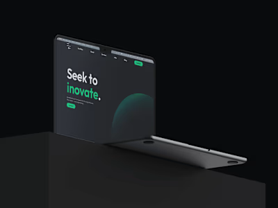
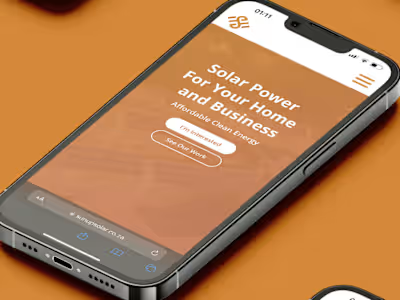
Pledger - A Fully Digitized Escrow Solution
Brief & Introduction
Pledger is a South African escrow service application, that wants to make businesses’ and clients’ experiences of working together better, through simplified and secure escrow services.
My job was to create a whole website and brand identity for this app, and I'm excited to tell you all about how I did it, step by step. This case study will document my process for creating the website design.
Design Process
Discover: Background, Target Audience, Competitors
Define: Problem Statement, Solution, Goals, User Personas
Ideate: HMW, User Flow, Sitemap
Design: Wireframes, Visual Design, Prototyping, Testing
Background
Pledger’s founder is also the CEO of a South-African solar panel installing company (SunUp Solar, I have another case study relating to their other company).
He noticed a big issue that affected not just him and his clients, but other companies in the same field too. The problem was how tricky and confusing escrow services are because of complicated contracts and a lack of trust.
So, he came up with a solution, and that's how Pledger was born. A secure, reliable and trustworthy escrow service application that would fix both contractors’ and clients’ problems, through digitized contracts and a safe way to store the funds.
Following market analysis, it seems that Pledger is a great answer to the problem. But there's still one thing missing: a way for people to learn about it and start using it.
Target Audiences
Primary:

Secondary:

Competitor Analysis
I looked at three of Pledger's biggest competitors. I mostly checked out how their websites are designed to figure out what they're doing well and where they might be going wrong. Unfortunately, I can't share any details about these companies or what I found during my research.
Problem & Solution ⇒ Project Goals
Problem: A quality and clear way for people to get introduced into the world of Pledger is needed.
Possible Solution: A website that: introduces Pledger and its benefits to its target audience; serves as a way to sign up an account and start using Pledger; serves as a way to access the web app dashboard (not part of this project); serves as a way of getting in contact with the Pledger team.
Project Goals: Design a high quality website that ticks all of the requirements above, in order to create a very strong first impression to Pledger’s potential users.
User Personas
Based off the information gathered from the discovery session, as well as through personal research, I put together two user personas that the application will be aimed at. This is a crucial step in my process, as I will know exactly who I’m designing for.
User Persona 1: Maverick Harris - CFO of Solar Installing Company
Maverick Harris is a 26 year old male resident of South Africa. He works at a Solar Installing Company as a Chief Financial Officer, commonly dealing with tedious escrow services and unsure clients.
His main goal is to provide the company with a way to optimise the traditional way of doing escrow. Therefore, making the interaction with clients easier and building more trust with them.
User Persona 2: Delphia Oakley - Freelance Web Developer
Delphia Oakley is a 35 year old female resident of South Africa. She works as a freelance web developer and makes a good living through remote work.
Recently, due to the situation in South Africa, she has been interested in getting solar panels installed for her residence and switching to completely green energy.
Her main pain point is a lack of time regarding the process, due to her time-consuming job. She is also very unsure about working with many of the solar installing companies due to a lack of trust regarding where her money is going and if her services will be provided as promised.
Conclusion: Both of the application’s main targets seek a secure and trustworthy way of doing things.
How Might We?

User Flow
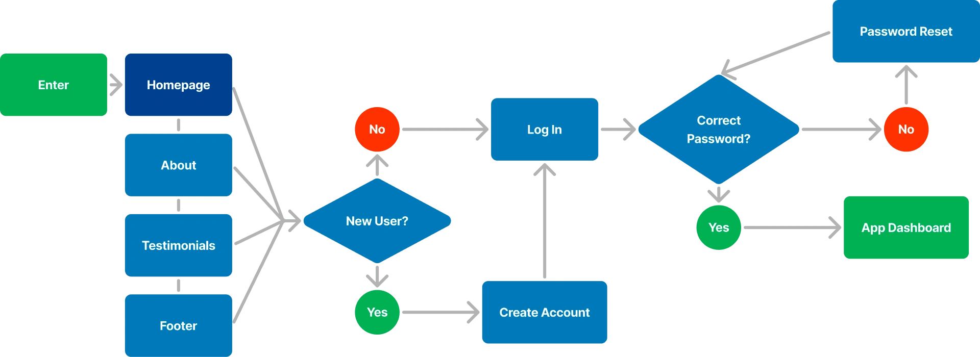
An user flow is the set of steps and path a user takes to achieve a certain goal on a website. In Pledger’s case, the end goal would be to access the app dashboard and start using Pledger.
Sitemap
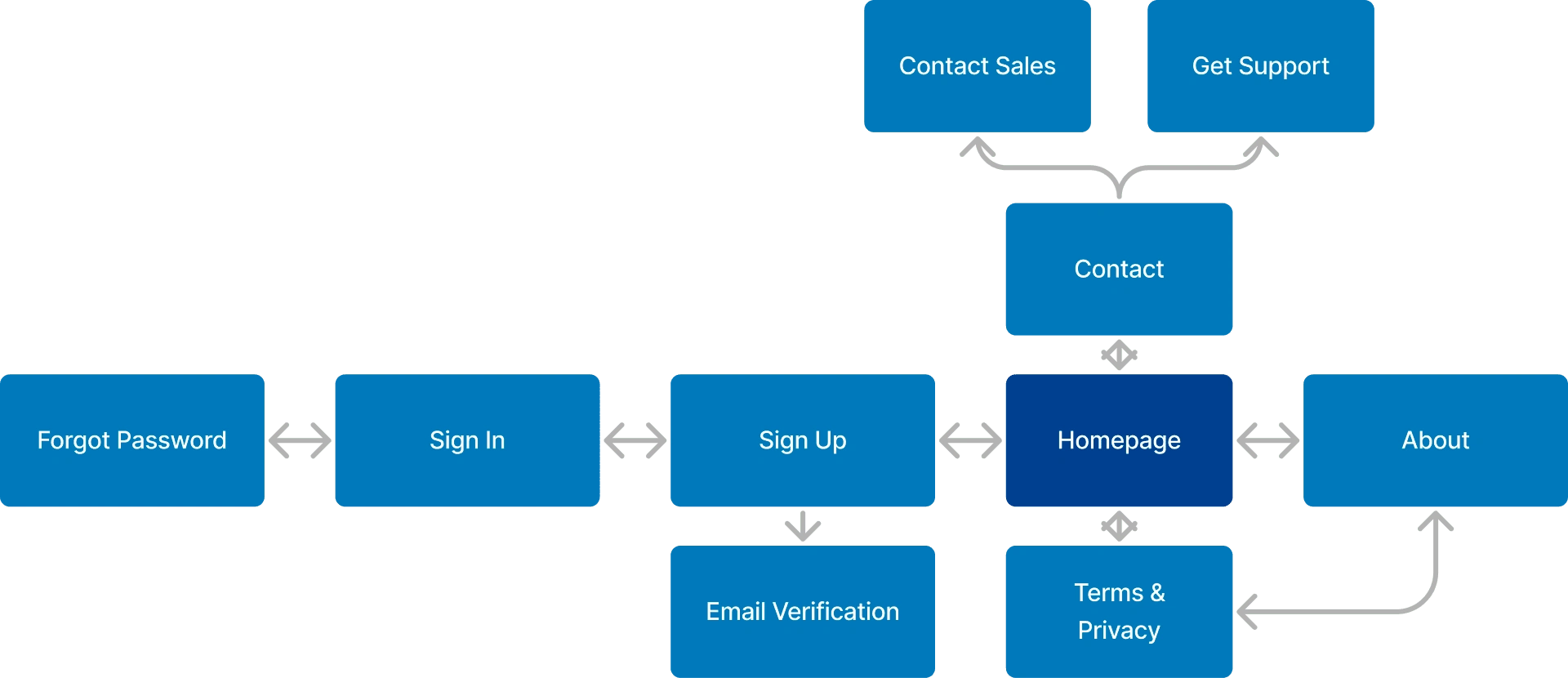
A sitemap contains information about all of the pages of the website and how navigation will be done through them. This was created based off the user flow, showcased previously.
Low-Fi Wireframes
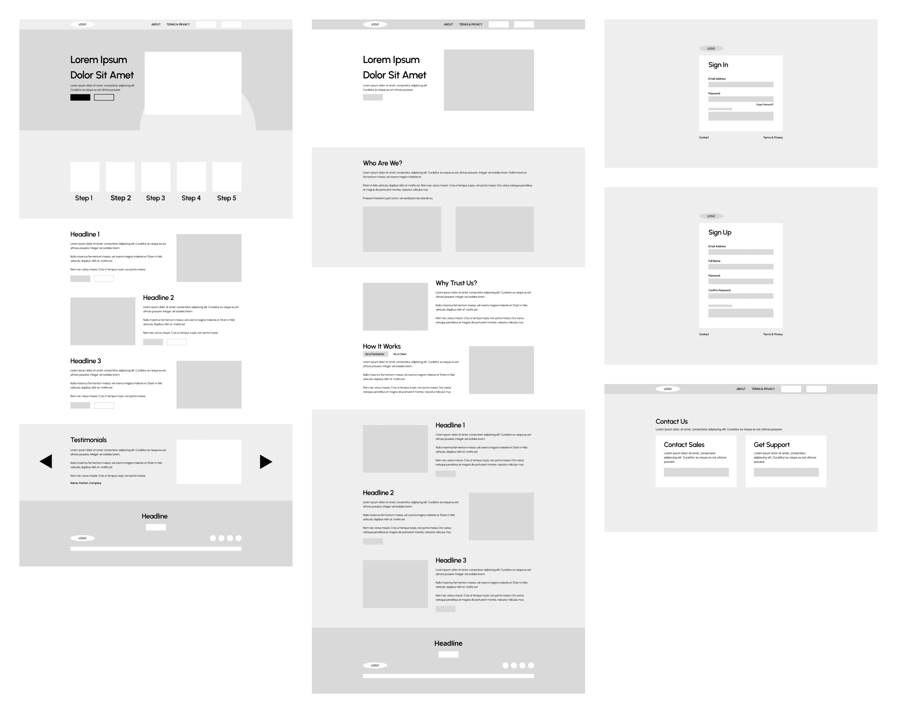
With all of the discovery, research and planning done, I could finally start designing the website. First off, I sketched out the Low-Fi wireframes in FigJam.
Mid-Fi Wireframes
Based off the sketches I made, I put together the more refined Mid-Fi Wireframes. Prioritising layout, navigation and UX principles to create an user friendly design.
Design System
I created an entire design system consisting of two main parts: the style guide and the components library.
The style guide contains rules such as colours, typography, spacing and padding.
The components library contains all of the components used on the website, such as buttons, containers, inputs and more.
The design system will help with consistency as well as make the process of building future pages easier.
Visual Design/Hi-Fi Wireframes
I refined the Mid-Fi wireframes and put together all of the components from the design system, thus creating the finished look of the website.
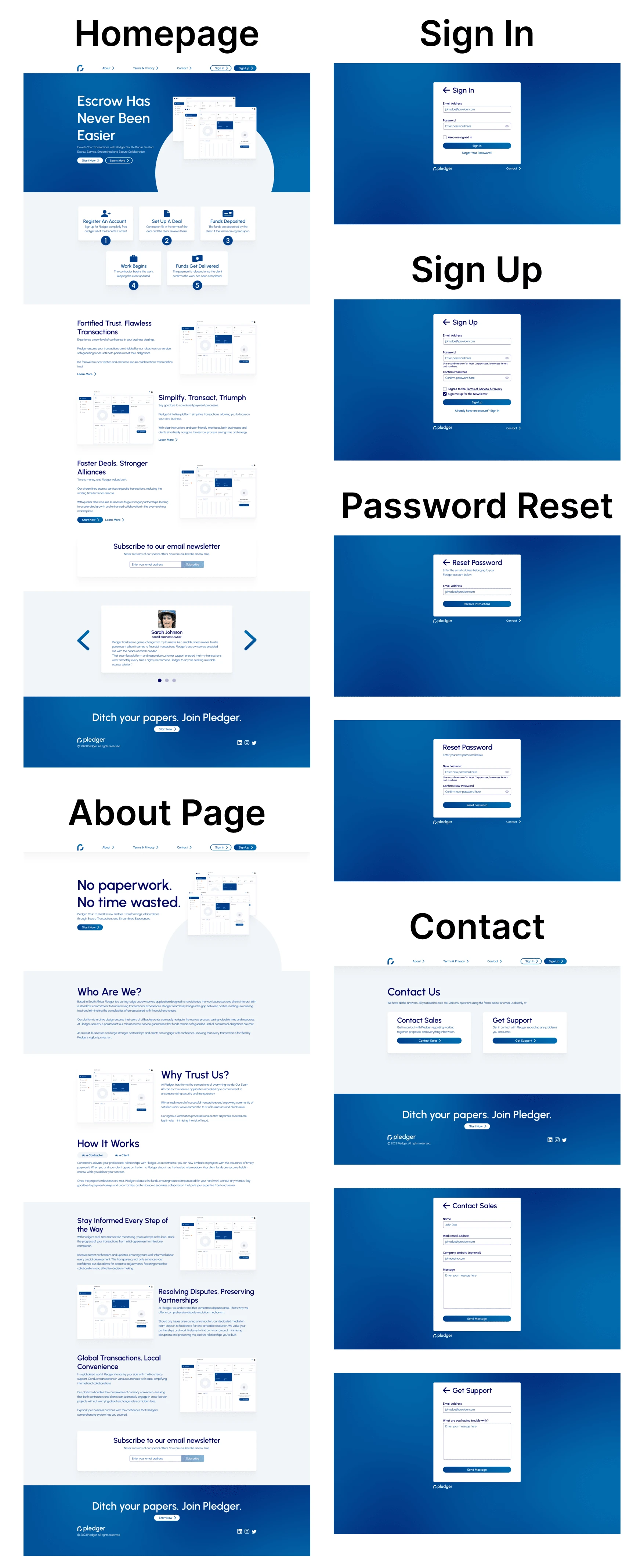
I added gentle shadows, smooth color blends, and straightforward layouts to create a neat and organized appearance, all matching the brand’s guidelines. They’re meant to create a positive first look for users, build trust and make them feel safe. The main colour, blue, does exactly this.
Responsiveness
Initially, I designed the website in a horizontal desktop layout. I did this because it gave me more space to use. Now, it was time to make this design responsive and also work in a vertical mobile layout.

Prototyping
The components were made interactive and the website was made navigable through Figma’s prototyping features. I wanted to create an easy-to-navigate website and that also contains smooth animations, making the experience more enjoyable.
The final prototype will be shown at the end once the testing feedback is implemented.
Testing
The finished prototype was sent in for testing using Maze.
10 Participants:
20-40 years old.
Not gender specific.
From South Africa.
Niche: Finance & Insurance.
Tasks
Navigate the website and get to see all of the sections and pages.
Succesfully create an account.
Successfully sign into your account.
Reset your password.
Get in contact with the Pledger team.
Sign up for Pledger’s email newsletter.
Positive Feedback
User friendly.
Easy Navigation.
Intuitive.
Clean UI.
Negative Feedback
Most users had a hard time finding out how to sign up for the email newsletter.
Most users would prefer an additional way of signing up that would be more straight forward than “Start Now”.
Implementing Feedback
Email Subscription Problem
Email marketing is a big thing at Pledger, so this was a big problem. The reason most users had a hard time finding the option to subscribe to the newsletter was because it was “hidden” in the footer, in the form of a small “Subscribe” button.
The best solution for this problem was to implement a separate section for signing up, which is present on the website’s “Home” and “About” pages.

"Sign Up" Button Problem
The solution for this problem was to implement a “Sign Up” button in the navigation bar, making it a lot easier for users to find the option to sign up.
Finishing Notes
Final Product
Conclusion
Following a 3-Week long journey of research, planning, designing and testing, I managed to fix Pledger’s main problem: the fact that they did not have a website which displayed what they offer, to who and how you can start using their application.
Following user tests and feedback, we concluded that the website designed by me is the solution to their problem.
Currently, the website is still undergoing development and it will be up as soon as possible.
What I learned
Pledger’s design system was one of the first complete design systems I worked on. I had to do a lot of research regarding design systems, looking at guides, tutorials, as well as other design systems.
I learned how to create style guides, document components, organise design systems in Figma and test design systems to see where they break.
Like this project
Posted Sep 6, 2023
Pledger is a South African escrow service provider. I was tasked with designing a complete website for their product.
Likes
0
Views
6


