Enterprise design doesn’t have to

Keitoto Studio


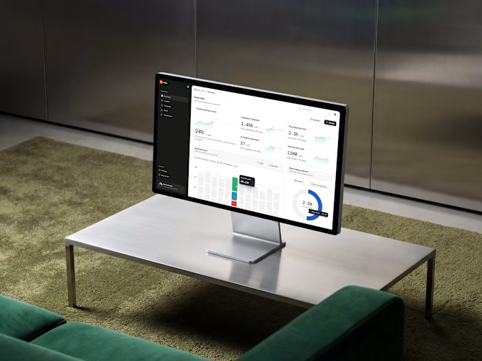
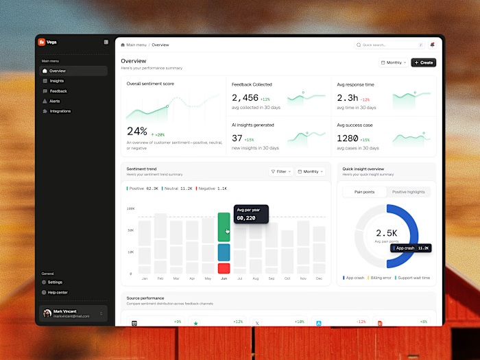
Enterprise design doesn’t have to feel clinical. It can feel like art. Here is a sneak peek into the UI components of Vega. 🛡️💡
Instead of building a massive, overwhelming dashboard grid, we focused on perfecting one isolated card at a time. By combining crisp typography, a soft neutral background, and high-contrast accents, these components pull critical errors out of the noise and turn them into clear, beautiful, and actionable data stories.
Swipe through to see the interaction states—from the AI search input bar to the color-coded metric loops.
Do you think the contrast hierarchy hits the right balance for real-world enterprise operations? 💬👇
Feedback, thoughts, and support are always appreciated. ❤️
Like this project
Posted Jul 9, 2026
Enterprise design doesn’t have to feel clinical. It can feel like art. Here is a sneak peek into the UI components of Vega. 🛡️💡 Instead of building a massi...
Likes
0
Views
11
Timeline
May 11, 2026 - May 15, 2026