Palmastic | Branding
Palmastic is an innovative startup that is revolutionizing the bioplastics industry by producing sustainable and eco-friendly materials from the waste of palm leaves. The company's unique process involves collecting and processing discarded palm leaves that are often burned or disposed of as waste in tropical regions.
Through a combination of innovative technology and sustainable practices, Palmastic is able to transform this waste into bioplastics that are biodegradable, non-toxic, and compostable. These bioplastics can be used for a wide range of applications, from packaging materials to consumer goods and even medical devices.
One of the most compelling aspects of Palmastic's approach is its commitment to sustainability. By using a waste product as the raw material for its bioplastics, the company is able to reduce the environmental impact of palm oil production while also creating a valuable new source of income for local communities.
Overall, Palmastic is a promising startup that is at the forefront of the movement of the sustainable materials. With its innovative approach and commitment to sustainability, the company has the potential to make a significant impact on the bioplastics industry and help drive positive change in the world.

The Concept
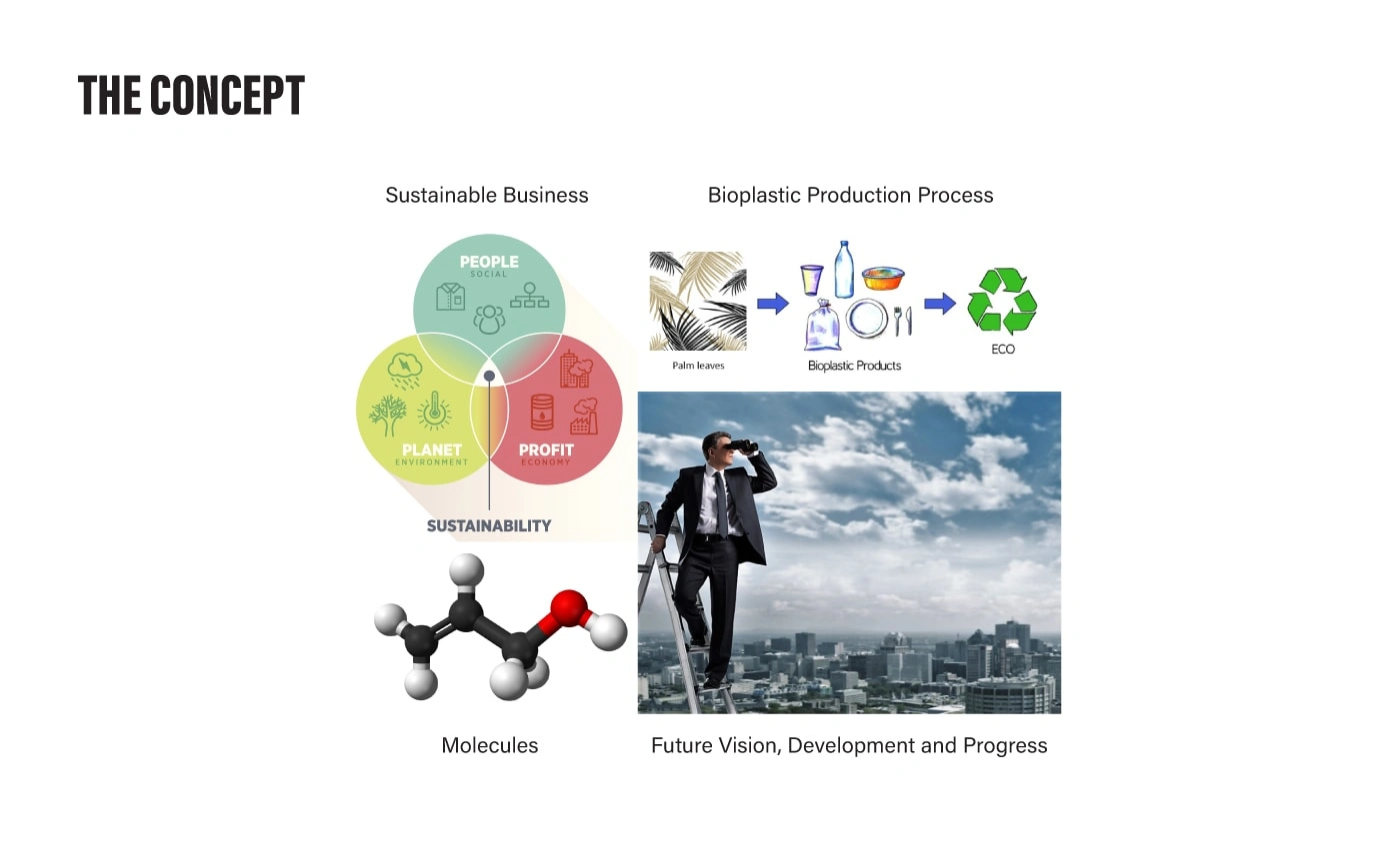
In the initial stages of developing the Palmastic logo, I explored two key concepts that were central to the brand's identity. The first concept was "Green Business", which encompassed three essential components: Planet, People, and Profit. I recognized that all three components started with the letter P, which aligned perfectly with the name of our brand. Additionally, our bioplastic production process had three steps, further emphasizing the importance of this concept to our brand.
The second concept was "Bioplastic Production", which was focused on using palm leaves as our raw material to produce sustainable and eco-friendly bioplastic products. This was crucial to our brand, as our goal is to reduce the problem of plastic waste and promote global sustainability.
As we moved forward, I began exploring the concept of molecules, which are the building blocks of all organic substances, including bioplastics. Molecules are composed of two or more atoms held together, and I recognized their potential as a graphic element that could effectively link our brand identity to our bioplastic production process.
In addition to molecules, I also wanted to convey our brand's focus on future development and progress. To achieve this, I turned to the use of arrows, which are widely recognized as a symbol of movement and dynamism. By incorporating the arrow symbol into our logo, I was able to effectively communicate our brand's vision and commitment to progress.
Overall, my exploration of these concepts enabled me to create a logo that effectively communicated the unique identity of our brand, its commitment to sustainability, and its vision for the future.


Color Palette
In determining the color palette for the Palmastic brand, we conducted extensive research into color schemes used by competitors, as well as the use of colors in sustainability and ecology. We discovered a paradoxical truth - while green is the color most commonly associated with sustainability and ecological initiatives, it is often not ecologically responsible. The manufacturing process for green-colored plastics, papers, and packaging requires toxic substances, making them unsuitable for safe recycling or composting.
Given this information, we decided to avoid using green as the primary color for our brand, despite its strong association with sustainability. Instead, we opted for a vibrant color called Chartreuse Traditional. This color is a mix of yellow and green, and while it contains some green, it reduces the overall amount of the color. We felt that Chartreuse Traditional still aligned with our brand values and visually conveyed the eco-friendly nature of our products.
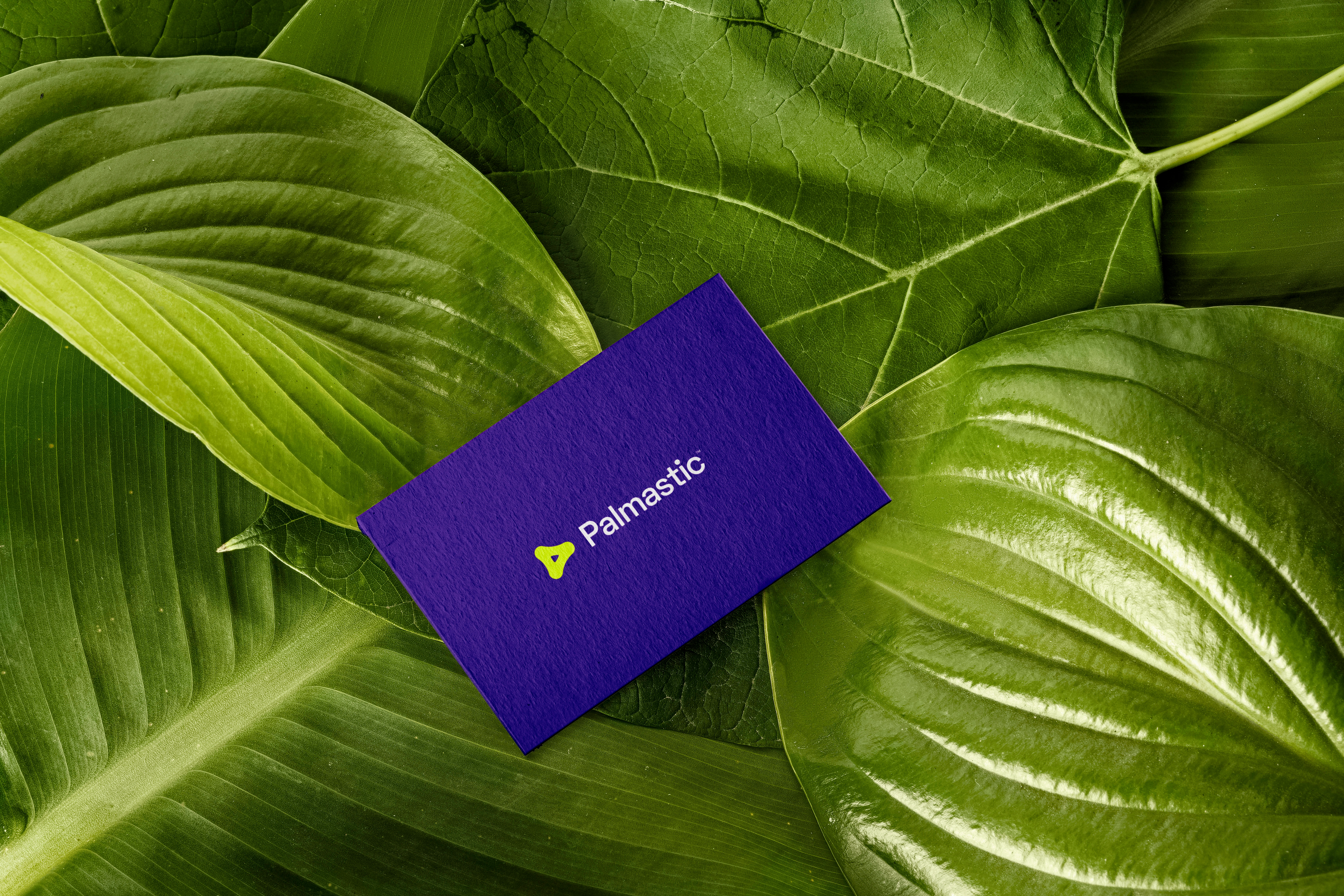
To provide a strong contrast to the Chartreuse Traditional, we selected Indigo as our secondary color. Indigo is a deep violet color that complements the vibrancy of Chartreuse Traditional and provides a sense of stability and trustworthiness.
In summary, our color palette selection process was guided by a desire to visually align with our brand values while avoiding colors that were not ecologically responsible. By selecting Chartreuse Traditional and Indigo as our primary and secondary colors, respectively, we were able to create a visually compelling brand identity that reflects our commitment to sustainability and eco-friendliness.
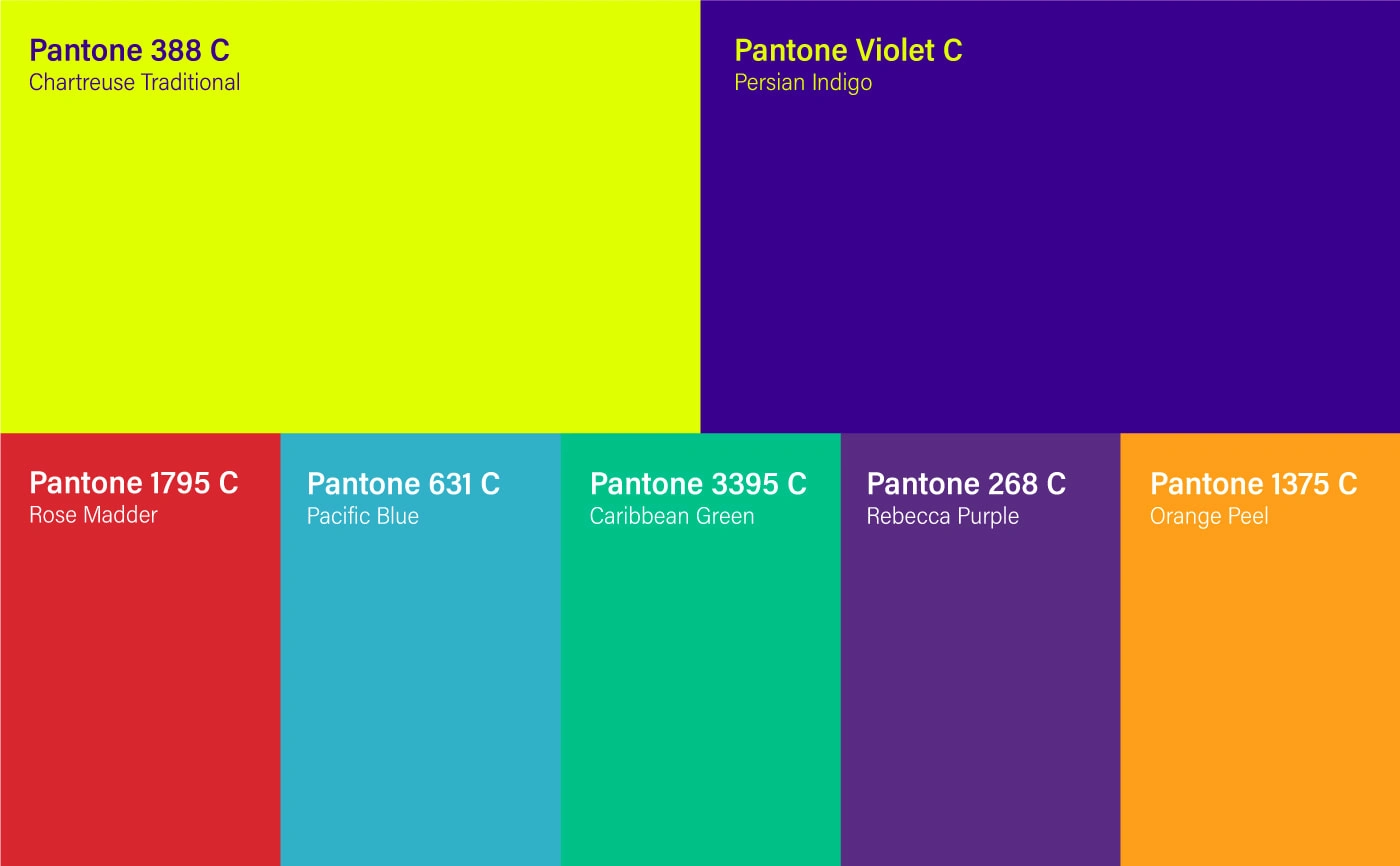
Additionally, I developed a set of five secondary colors to complement our primary colors and provide further visual interest in our brand's graphic materials. These secondary colors were chosen for their ability to create a strong contrast with our primary colors while still matching our brand's overall color palette. I believe that these secondary colors will provide ample opportunity to create cohesive, eye-catching visual materials for Palmastic across a range of media and platforms.





Like this project
Posted Feb 24, 2023
For this project I developed the brand strategy,designed the design system for Palmastic startup and created an impactful and distinctive visual identity.


