Modular Branding for Advertising Agency | Sandwich
Anita Autorino
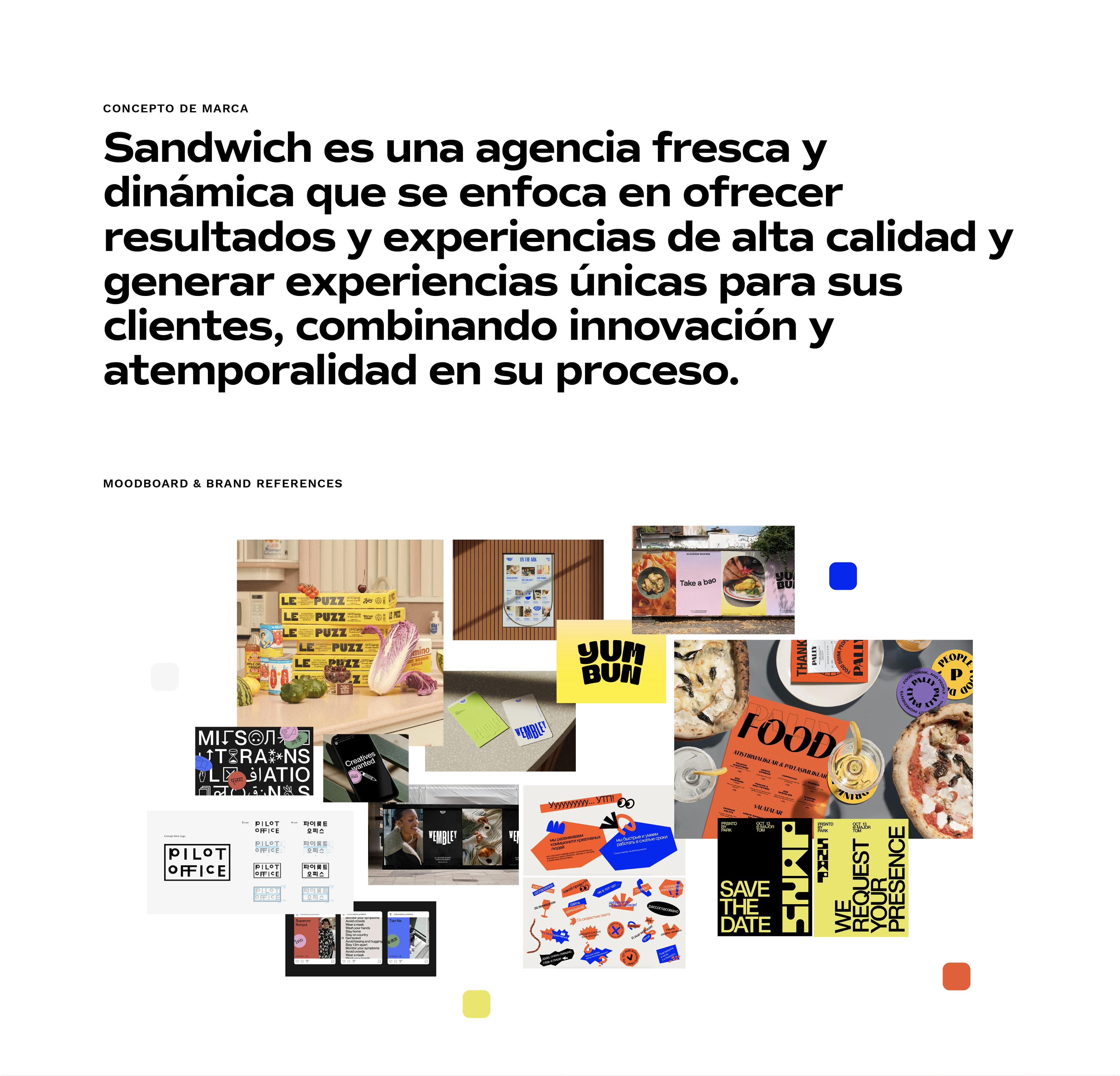
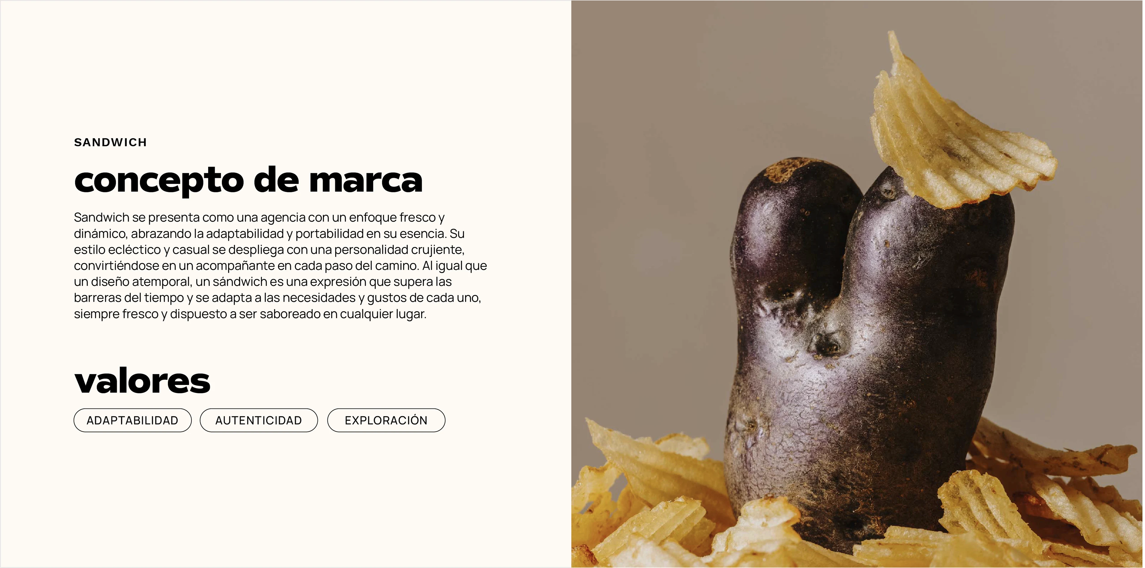
Brand Concept
Sandwich presents itself as an agency with a fresh and dynamic approach, embracing adaptability and portability in its essence. Its eclectic and casual style unfolds with a crunchy personality, becoming a companion at every step of the way. Just like a timeless design, a sandwich is an expression that overcomes the barriers of time and adapts to the needs and tastes of each person, always fresh and ready to be savored anywhere.
Values
ADAPTABILITY / AUTHENTICITY / EXPLORATION
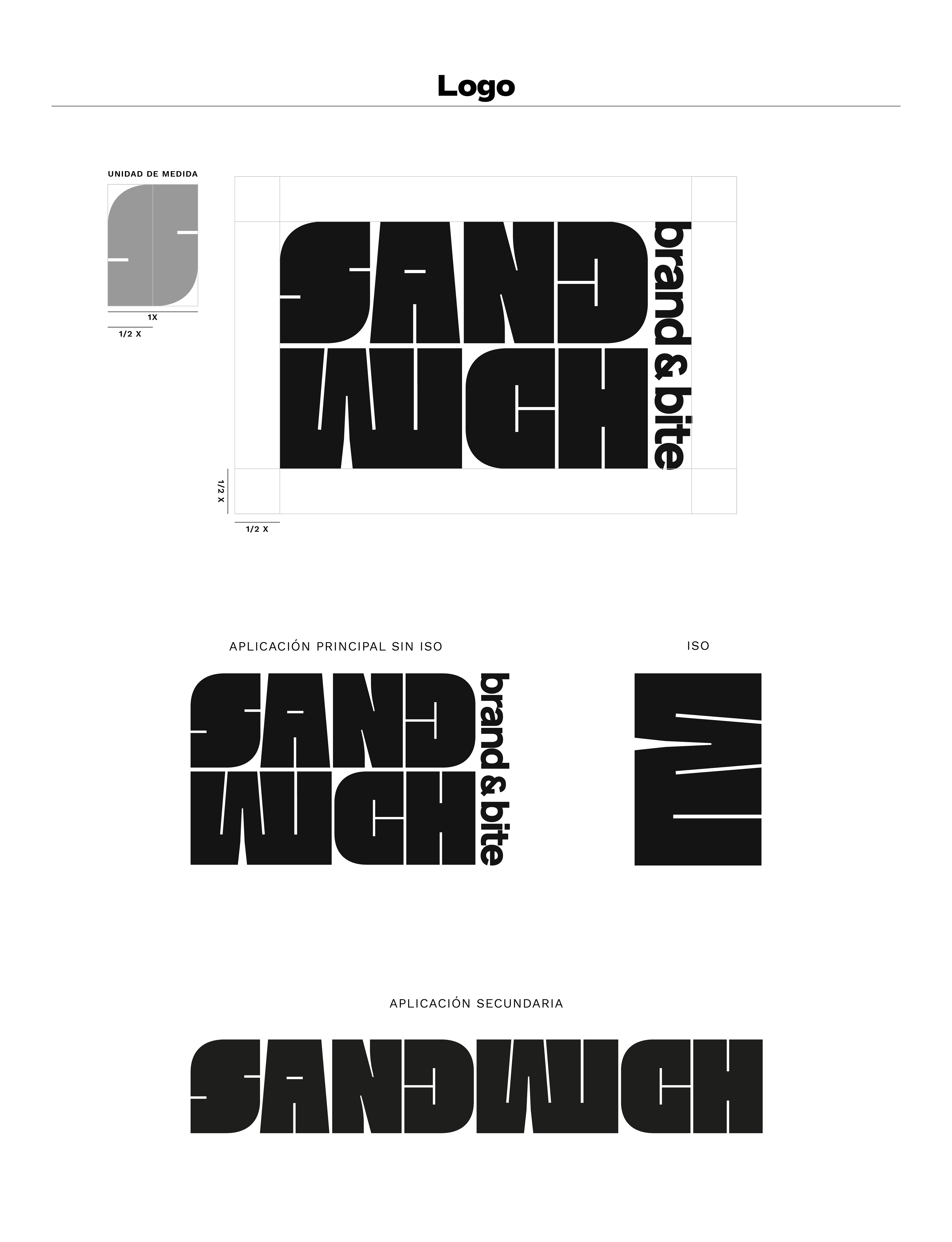
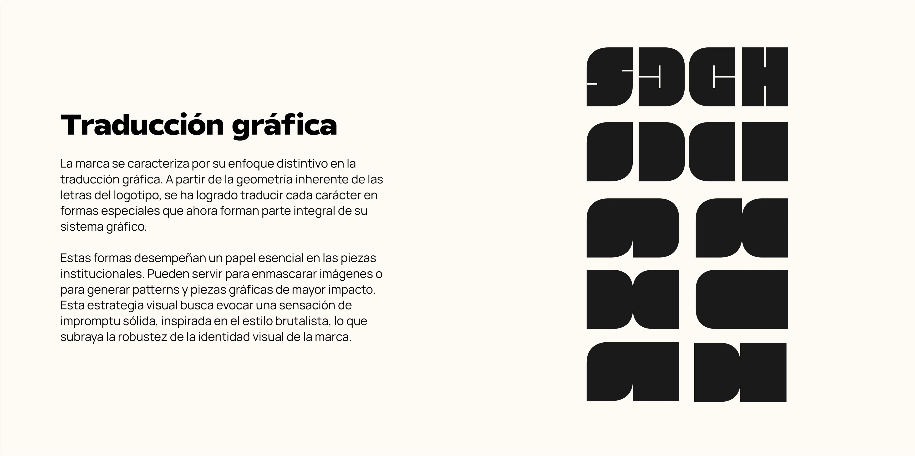
Graphic Translation
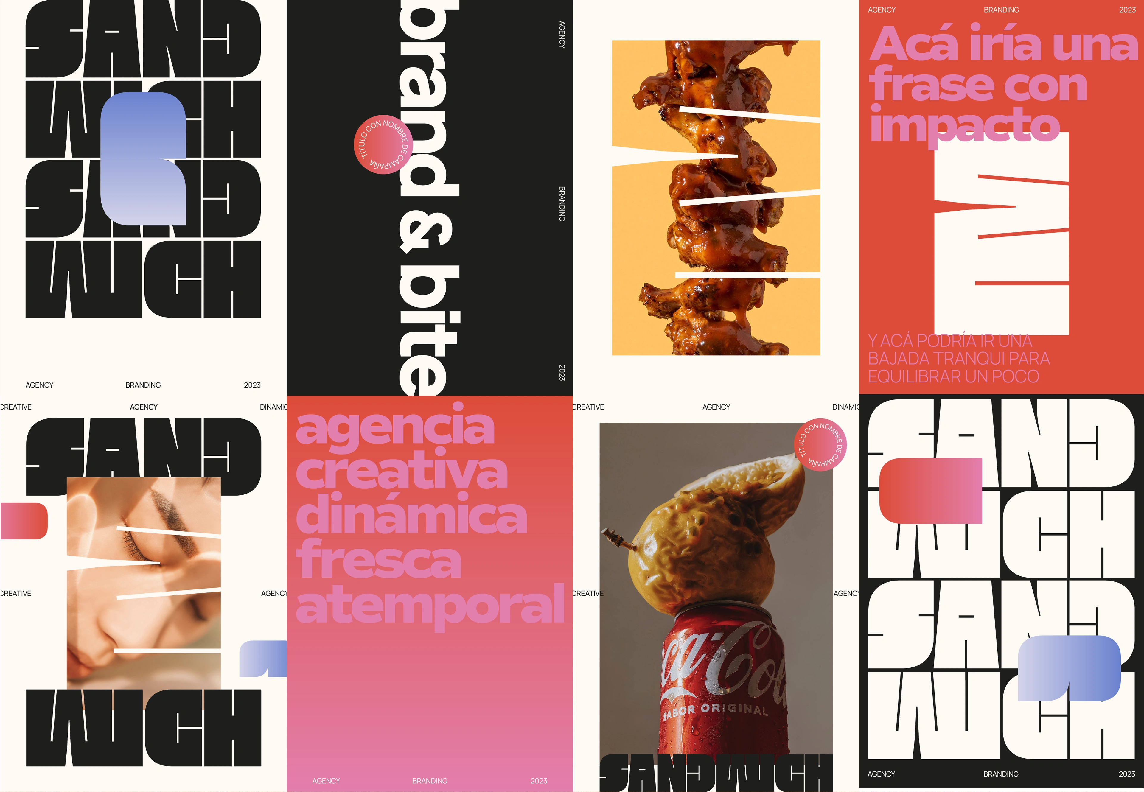
The brand is characterized by its distinctive approach to graphic translation. Based on the inherent geometry of the logo's letters, each character has been translated into special shapes that now form an integral part of its graphic system.
These shapes play an essential role in the institutional pieces. They can be used to mask images or to generate patterns and more impactful graphic pieces. This visual strategy seeks to evoke a sense of solid impromptu, inspired by the brutalist style, which underlines the robustness of the brand's visual identity.

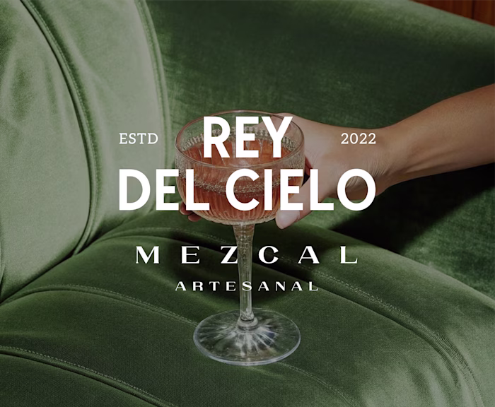
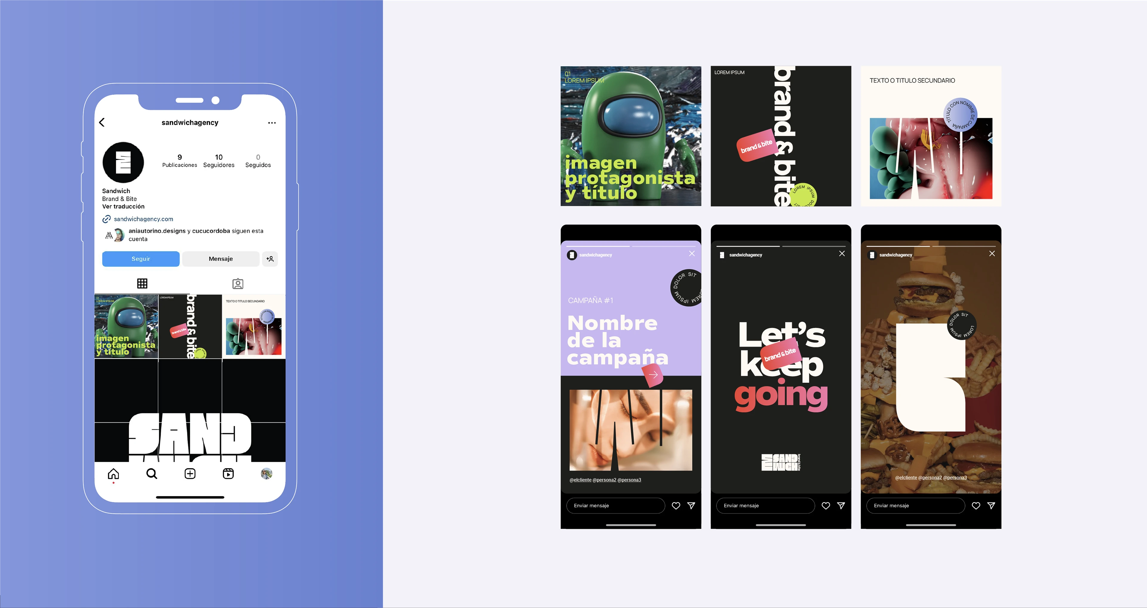
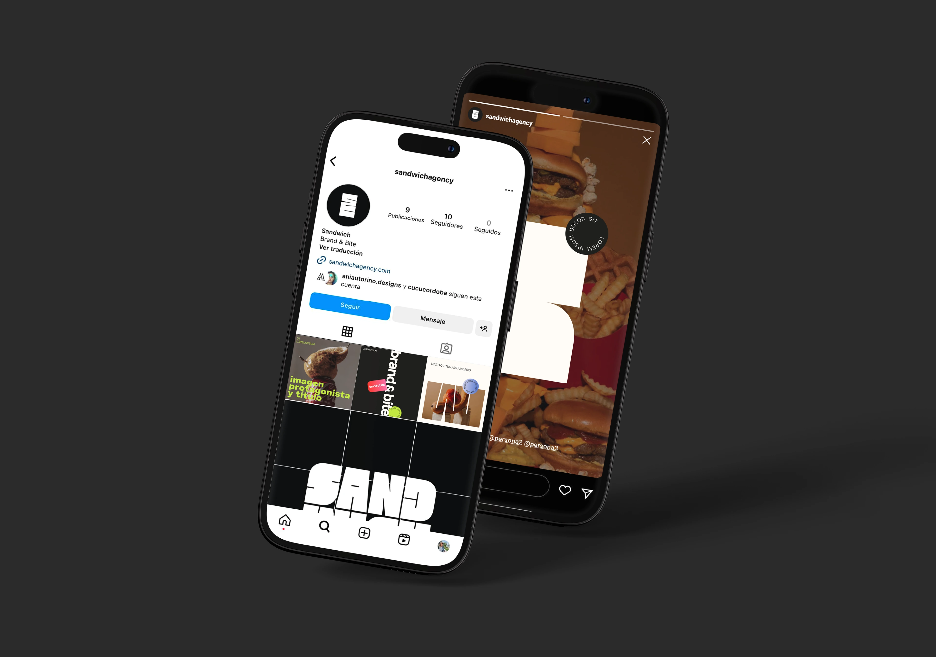
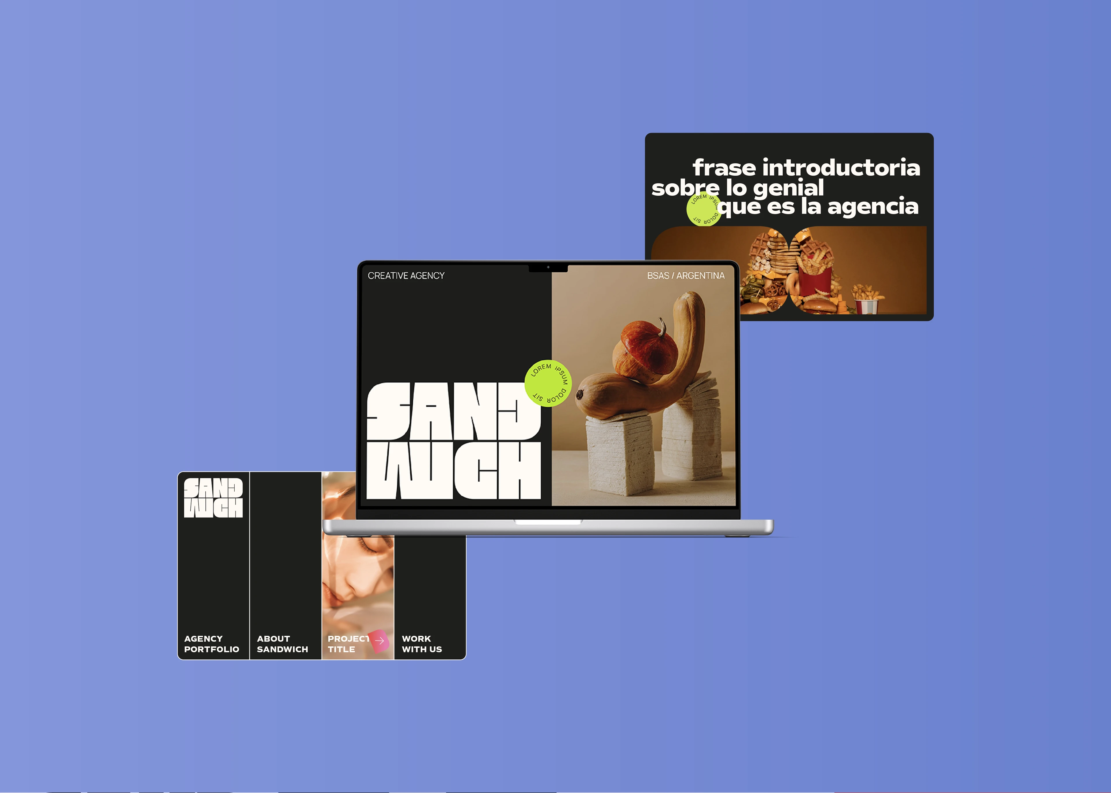
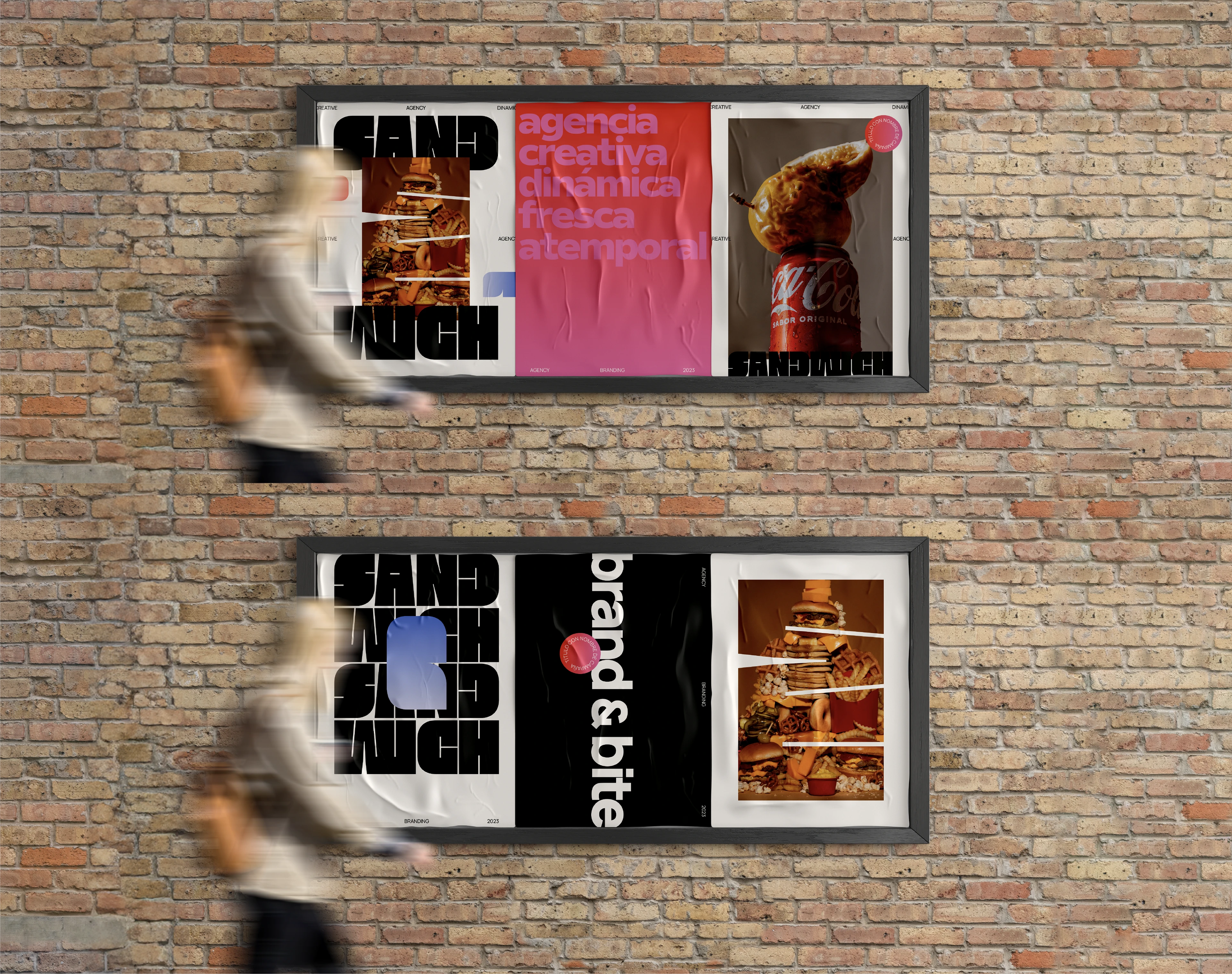
Brand Application
Brand application on digital and offline media. Sandwich agency, with its dynamic and youthful approach, values innovation and timelessness as pillars of its identity. This is reflected in the brand's presentation, both in web and print applications.
Disclaimer
Some images used in this project, specifically the food photography, are from Estudio Como and are used for illustrative purposes only.
Algunas imágenes utilizadas en este proyecto, específicamente la fotografía de alimentos, son de Estudio Como y se usan únicamente con fines ilustrativos.
Like this project
Posted Aug 18, 2025
A modular and bold brand identity for Sandwich, a fresh and dynamic advertising agency from Argentina. The visual system is flexible, dynamic and adaptable.
Likes
32
Views
285
Timeline
Sep 1, 2023 - Nov 23, 2023