Iron Coaching Fitness Landing Page | Redesign
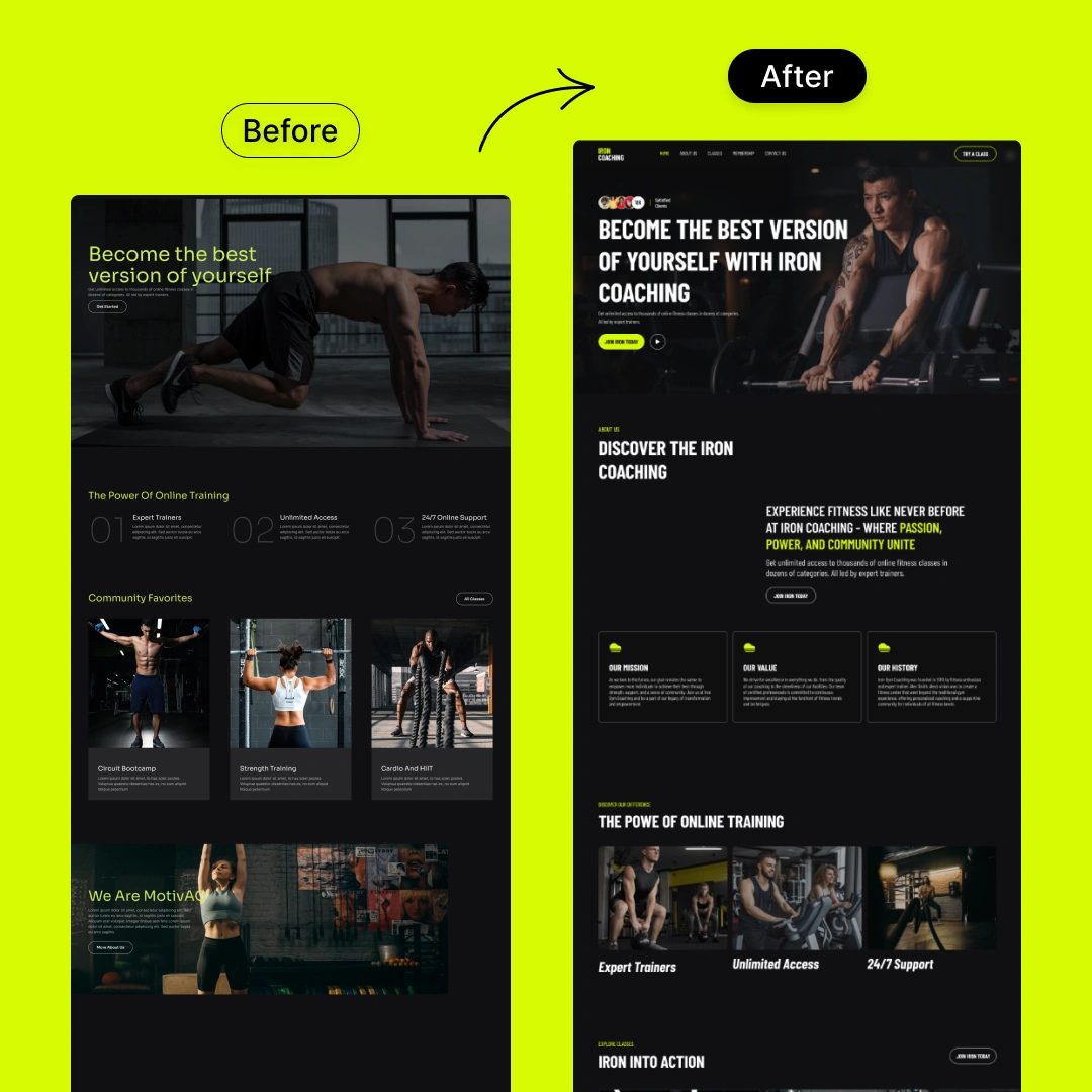
Iron Coaching – Empowering Fitness Landing Page
Project Overview
This redesign project focused on transforming Iron Coaching’s fitness platform into a bold, motivating, and high-converting digital experience. The goal was to amplify its presence in the competitive online fitness market by blending high-energy visuals with clear structure and persuasive messaging. The updated design highlights Iron Coaching’s values of strength, community, and accessibility—encouraging users to take action and become their strongest selves.
The new UI uses striking typography, energetic imagery, and a sharp layout to create an impactful and confident brand presence.
Key Challenges & Solutions
1. Lack of Visual Hierarchy in the Old Design
Challenge: The original landing page lacked a clear content structure, which affected user flow and engagement.
Solution: The redesign introduced strong headline hierarchy, highlighted CTAs, and visual anchors (like color-coded sections) to guide users and improve scannability.
2. Unclear Brand Voice
Challenge: The old version didn’t fully express the brand’s energetic and empowering tone.
Solution: The new design elevates the brand voice through powerful copywriting, strong photography, and neon accent colors that reinforce Iron Coaching’s dynamic identity.
3. Improving Conversion Paths
Challenge: Key actions like signing up or learning more about the programs were not prominent.
Solution: High-contrast CTA buttons were strategically placed above the fold and throughout the page, making the desired actions clear and accessible.
4. Modernizing the UI & UX
Challenge: The previous layout felt outdated and generic for a modern fitness brand.
Solution: The visual style was revamped with a bold, dark theme, energetic fonts, and engaging imagery, while keeping usability in focus across all screen sizes.
User Testing Feedback
User Group: Fitness enthusiasts, online coaching clients, and new visitors.
Findings:
The bolder visual identity improved brand recognition and motivation to explore further.
Improved layout and consistent button placements helped users navigate with ease.
Users appreciated the clarity around Iron Coaching’s mission, offerings, and community support.
Results & Takeaways
✅ Increased Visual Impact
The new design captures attention immediately, aligning with Iron Coaching’s bold and driven personality.
✅ Stronger Call-to-Actions
Well-placed buttons and sharper messaging drove more users to sign up and engage with coaching offerings.
✅ Clear Brand Identity
With dynamic colors, inspiring headlines, and confident visuals, the redesign established a distinct and memorable fitness brand.
✅ Improved Usability & Structure
Information is now easier to find, and the user journey flows naturally—especially on mobile where performance and interaction are seamless.

Like this project
Posted May 29, 2025
Redesigned Iron Coaching's landing page for a bold, high-converting digital experience.
Likes
0
Views
6

