Alert System Dashboard to Combat Alarm Fatigue

Spencer Grant


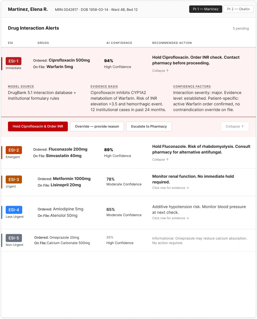
The ESI-1 alert, expanded. Round 1 design: Hold is styled primary; nothing states the AI's recommendation.
The Round 2 fix: Escalate restyled as primary, plus a stated recommendation above the button row. Testing showed this wasn't enough on its own. See Testing below for why.
A note on method: I didn't have access to real hospitalists, that's a tightly restricted clinical setting, so I built the problem from 18 peer-reviewed and expert sources instead. To test the actual design, I recruited nurses as the closest available stand-in: an initial group of five narrowed to three for round one, then three more for round two, using two standard measures, one for how easy the design felt to use (SUS) and one for how mentally taxing a task felt (NASA-TLX).
30-second summary
Every drug-interaction alert looks identical on screen, whether it's routine or life-threatening. Hospitalists override 95% of them, not carelessness, but alarm fatigue: so many alerts fire that people stop reacting to any of them. That's tied to real patient harm.
I didn't have access to real hospitalists, so I built the problem from 18 clinical sources, then tested the design across two rounds with nurses as the closest available stand-in.
A triage table using ESI, the severity scale hospitals already use, with the AI's confidence shown right next to the action, and friction that scales with risk: one click to accept, a short reasoned form to override.
Two rounds of testing are done. Every tester found the critical alert right away, in both rounds. Getting people to act on the AI's recommendation improved but didn't fully work: nobody did in round one, and moving the recommendation next to the button got one of three testers to act on it in round two. The other two missed it for two different reasons, which is the real finding.
Problem
Hospitalists handle the highest volume of daily medication orders in inpatient care, and drug-interaction alerts are supposed to catch what they miss. But every alert renders at identical visual priority: no position, size, or color signal separates a life-threatening interaction from a routine one. Volume alone isn't the failure; making everything look equally urgent trains clinicians to ignore all of it.
39-fold
antibiotic overdose in a 2015 UCSF case, after a physician and pharmacist both overrode a critical alert that "looked exactly the same" as routine ones.
216+ deaths
in the U.S. (2005–2010) tied to alarm fatigue, per a Boston Globe investigation.
187/day
alerts per patient at UCSF ICUs, almost all clinically insignificant, 2,507,822 unique alarms across five ICUs in one month.
+13% risk
per interruption during medication administration. Four interruptions doubles the rate of errors likely to cause permanent harm or death.
The Joint Commission issued an urgent alarm-safety directive in 2013 (updated 2016), naming alarm-related problems a top health-technology hazard. (The Joint Commission 2013/2016)
Solution
Three things the design needed to answer: the minimum info a hospitalist needs to triage an alert without leaving the alert view, what signal reads as "critical" before any text gets read, and when an AI confidence score actually changes behavior instead of getting overridden. The answer: a triage table with ESI severity tiers already in clinical vocabulary, AI confidence surfaced inline, and friction that scales with risk: one click to accept the recommendation, a reasoned form to override it.
A table, color as backup only
Every alert is a row: severity, drug ordered vs. drug on file, AI confidence, recommended action, all visible without expanding. Strip the color out and the ESI-1 row is still identifiable by position, height, and weight; color-only encoding fails color-deficient clinicians and is unreliable under time pressure regardless.
ESI, not an invented scale
The panel borrows the Emergency Severity Index, already in a hospitalist's vocabulary, instead of a made-up "High/Medium/Low." "ESI-1" needs zero explanation mid-shift.
Friction scales with risk
The recommended action (Hold) completes in one click. Overriding requires picking a reason from five visible radio options, not a dropdown, before Confirm enables. Dropdown reasons are too coarse; clinicians pick the fastest option, not the accurate one.
State the AI's recommendation
High-confidence AI predictions get overridden far less (1.7% vs. 99.3% at lower confidence, across 6,689 cardiovascular cases), but only when the confidence score actually connects to the recommended action, not left sitting in a separate evidence panel. Round 1 styled Escalate as secondary with nothing stated; Round 2 made it primary and added a one-line stated recommendation. See Process below for whether it worked.
Process
1. Research
Built the problem from 18 peer-reviewed and clinical sources instead of primary interviews, since practicing hospitalists weren't accessible. Synthesis produced two personas and the ESI-based severity framing the design is built around.
2. Wireframes
Sketched three low-fidelity layout directions and ran each through a 3-second test: can a clinician spot the most critical alert without reading anything? A compact triage table passed; a zone-based layout was ruled out before sketching over an empty-state problem.
3. Ideation in Stitch
Used Stitch to quickly generate and compare visual variations of the winning triage-table direction, color, spacing, type weight, before committing time to a full Figma build.
4. Figma: refinement and prototyping
Built the chosen direction into a full interactive prototype: the triage table, expandable alert rows, the explainability panel, and the action buttons. Ran it through a WCAG 2.2 AA accessibility check in Stark before testing.
5. Testing, round 1
Sent the prototype to three nurse proxy testers for an unmoderated usability test: alert triage, an escalate-or-override decision, and an override-friction task, plus two standard surveys (SUS, NASA-TLX).
6. Revision
Every tester skipped the AI's recommended action on the highest-confidence alert. Restyled Escalate as the primary button and added a one-line stated recommendation above it, instead of leaving the connection between confidence score and action implicit.
7. Testing, round 2
Sent the revised prototype to three new testers. One acted on the AI's recommendation, the other two still didn't, each for a different reason. The numbers behind both rounds are below.
Round 1 results (3 testers)
All three testers found the critical alert on their own, no prompting needed, in about two minutes on average. None of them acted on the AI's recommendation once it was on screen: two chose to override it, one chose to just hold. Two of three finished the override form; the third dropped off partway through, and a different tester dropped off at that exact same step in round two, so this looks like a real design problem, not a fluke.
Round 1 (3 testers) → Round 2 (3 testers)
Round 2 shows the fix partly worked: one of three testers acted on the AI's recommendation, up from zero in round one. The usability score held steady, 73.3 to 74.2. But the three testers got to their answers in very different ways. One looked at the screen for 11 seconds and made a single click before choosing Hold, likely too fast to have even registered the new stated recommendation. Another spent 87 seconds and made three clicks before choosing Override anyway, long enough to have read it and rejected it. The third spent over two minutes, clicked directly on "Escalate to Pharmacy," and confirmed it a second later. Three different outcomes from the same fix: didn't see it, saw it and rejected it, saw it and acted on it. The first two are different problems, and a bigger button only ever had a chance of fixing one of them. The override-form drop-off from round one also happened again, with a different tester hitting the exact same dead end, so that's now a confirmed problem, not a one-off.
What I learned
A fix that works for one person can still hide two other problems
Stating the AI's recommendation and styling it as primary got one of three Round 2 testers to act on it, up from zero in Round 1. The other two picked something else, for different reasons: one decided in 11 seconds, too fast to have read the new text at all; the other spent 87 seconds and rejected the recommendation anyway. One is a visibility problem. The other is a trust problem: no amount of styling fixes a clinician who read the AI's recommendation and chose not to act on it. A single fix that partly works can hide the fact that it's solving two different problems at once.
Recruiting is its own project risk
Getting three qualified proxy testers took months, and Round 2 alone stretched over three weeks between its first and third session. A mid-round platform switch (Maze to Useberry, after a sync bug) and a panel narrowed from five to three cost real calendar time before a single Round 1 result came in. Access to clinicians willing to test an unpaid prototype is genuinely limited, that's a project risk to plan for up front, not something extra prep time solves on its own.
Where this stands
Two rounds in, the AI-confidence fix works for some clinicians and not others, and recruiting for this panel has already taken months. Running a full third round isn't the right call. If I kept building this, I'd change what gets tested next, not just test the same fix again: stop iterating on button styling alone, since it already closed the gap for one tester but not the other two, and try a stronger intervention like an interstitial that makes a clinician actively acknowledge the AI's recommendation before choosing Hold or Override. I'd also move to a moderated session so I can tell "didn't see it" apart from "saw it and disagreed" instead of inferring it from click timestamps, and fix the override-form drop-off directly, that one's happened to two different testers at the exact same step across two rounds, which is enough to act on without more testing.
Sources
Every citation above opens the actual source in a new tab. 18 sources reviewed in total; these are the ones that directly shaped a decision on this page.
Like this project
Posted Sep 17, 2026
Designed a clinical alert dashboard to reduce dangerous AI-recommendation overrides, backed by real research and two rounds of usability testing.
Likes
0
Views
3
Timeline
Jun 8, 2026 - Aug 7, 2026