UI/UX Redesign for Letterboxd App

Spencer Grant

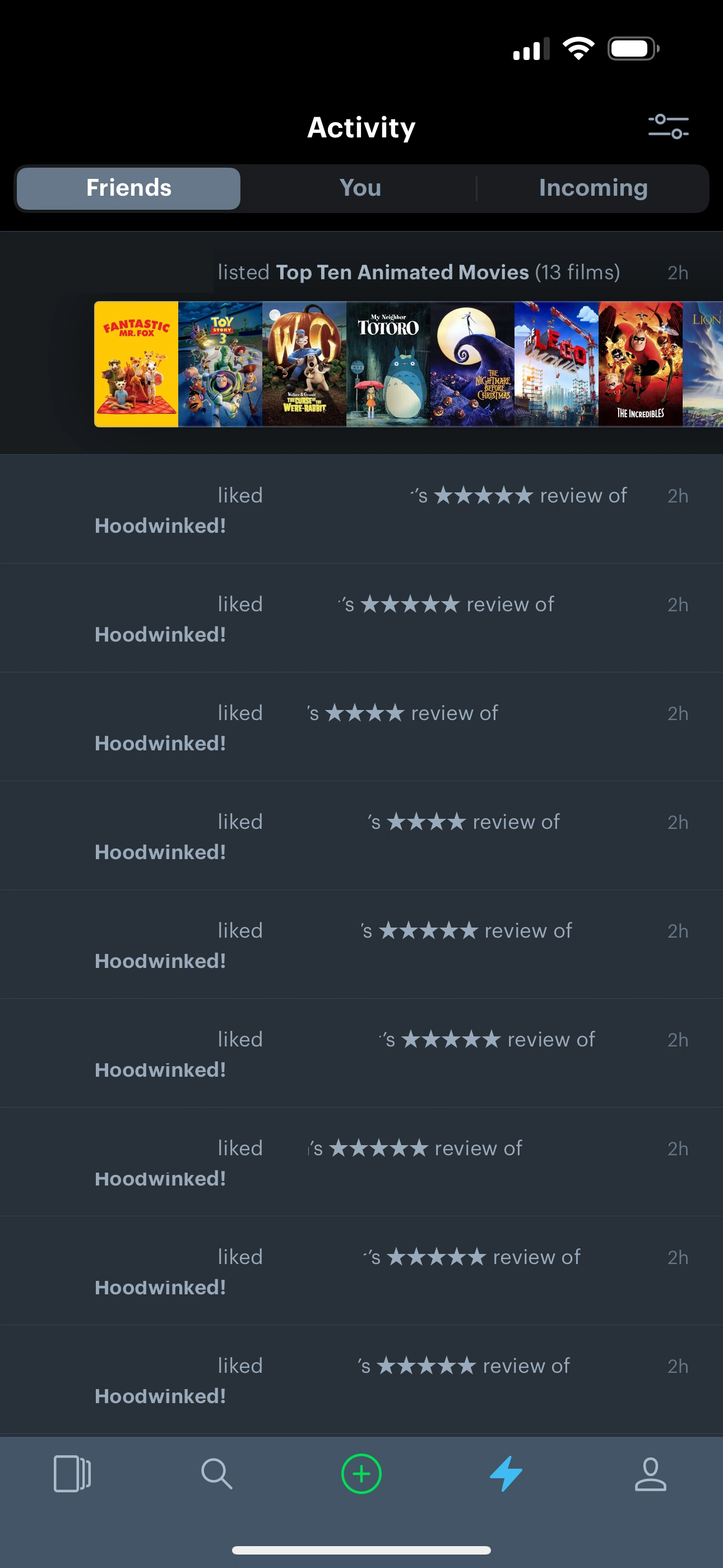
Based on 50+ mined community reviews and an audit of five competing apps, I identified three high-impact opportunities for Letterboxd's mobile app: centralize social, fix navigation consistency, and add the TV tracking users kept asking for.
Solo: competitive research, review mining, hi-fi UI
Click through the full prototype above, or open it in Figma →
30-second summary
Social features have no clear home, navigation is inconsistent, and ~30% of mined reviews asked for TV tracking that doesn't exist.
Secondary research only: 50+ community reviews mined, 5 competitor apps audited. No moderated sessions with real Letterboxd users.
Four targeted changes, not a rebuild: protect the minimalist, film-first identity that reviews name as the reason people love the app.
Concept only. Not built, not user-tested. The business case is reasoned from the research, not measured.
The problem
To find out where Letterboxd's mobile app was actually falling short, I audited five competitor apps (Trakt, IMDb, Taste, TV Time, Goodreads) and read through 50+ community reviews and forum threads looking for repeated, specific complaints rather than one-off gripes.
Social features exist but are scattered across screens with no obvious entry point.
Navigation patterns shift depending on where you are in the app, so nothing feels learnable.
of mined reviews wanted TV tracking that doesn't exist, naming Trakt and TV Time by name.
One user had already designed the fix in their head: "there should be a toggle button that switches the UI to all TV shows until you toggle it back to movies."
Two people, one app
Alex, the curator
Wants depth: award-based discovery, curated lists, critic-level detail on what he's watching.
Jasmine, the sharer
Wants connection: what her friends watched, replying to reviews, arguing about last night's episode.
Neither was served by one undifferentiated activity feed. Any fix had to work for both without turning into two separate apps.
Four moves, not a full rebuild
The minimalist, film-first identity is most of why people love this app. So the redesign stayed narrow: four targeted changes, each answering a complaint I'd actually read.
1. Give social an actual home
Friends' activity and the add-friends action move from buried in submenus to the top of a unified feed.
2. Let comments breathe
Nested replies, inline reactions, and filtering replace flat threads interrupted mid-scroll by ads.
3. Make posters work harder
Award badges and age ratings on the poster itself, so recognition happens before anyone reads a word.
4. TV, on its own terms
A toggle switches the whole UI between film and TV mode: episode reviews, season tracking, separate feeds.
From sketch to shipped-looking screens
Every screen went through three passes: low-fidelity to validate the new navigation, mid-fidelity to add real content and TV tracking, high-fidelity to lock the visual system. Dark, near-black base (
#14171C), cyan-blue accent (#00BFFA) for primary actions, an orange accent (#F27405) reserved for emphasis. Dark enough to stay out of the way of movie posters, which is really the point of a film app's UI.1. Social home
2. Comments
3. Posters
Redesign
1. Social home
2. Comments
3. Posters
Hover a screen to zoom in. Each column pairs with the matching move above.
Why this would matter to the business
No live product means no retention or revenue numbers to report, so here's the honest version: the reasoning that connects each decision to a business outcome, not a number I don't have.
Retention, against a named competitor
Almost 30% of the reviews mined were asking for TV tracking Letterboxd doesn't have, pointing users at Trakt and TV Time by name. That's not a nice-to-have, it's demand actively leaking to competitors. Capturing it inside the app is a churn-prevention move, not a feature-count move.
Engagement, from a named gap
Social features existing with "no clear home" is a discoverability problem with a direct engagement cost: a feature users can't find is a feature that doesn't drive return visits. Centralizing it targets session frequency, the metric a social layer exists to move.
Protecting what's already working
The redesign stayed to four targeted changes instead of a rebuild specifically because the minimalist, film-first identity is named as "most of why people love this app" in the same reviews. A business case for change has to survive not damaging the retention driver that's already working.
What I learned
This is built on secondary research: mined reviews and competitive audits, not moderated sessions with real Letterboxd users. That's a real limitation, and I'm not presenting it as more than it is. What it taught me was discipline: every decision here traces to a pattern that showed up repeatedly, not to my own opinion of what would be nice to have.
It also taught me restraint. It would have been easy to turn "add TV support" into an excuse to redesign half the app. Shipping three changes that answer real complaints, and leaving the rest of Letterboxd's identity alone, was harder than it sounds. Probably the most transferable skill this project gave me.
Like this project
Posted Sep 17, 2026
Redesigned Letterboxd's mobile app using 50+ mined reviews and a 5-app competitive audit: better social, navigation, and TV tracking.