“Okay?” — Designing Gentle Guidance for Frustrated Players
Project Overview
“Okay?” is a minimalist puzzle game built around silence, precision, and challenge. However, the lack of feedback created frustration loops where players quit after repeated failed attempts—before reaching the game’s deeper experience. I designed a light-touch hint system that reduces rage-quits while preserving player autonomy and the game’s quiet aesthetic.
The Challenge
Minimalist games live and die by feel. "Okay?" had the right aesthetic — but something was pushing players out before they could fall into it.
Frustration loops. Five or more failed attempts on a single level sent players toward the exit, not the next try.
No safety net. With no optional guidance, players who hit a wall had nowhere to go — and most didn't wait around to find one.
A design constraint that couldn't be ignored. Any hint system that felt instructional, loud, or visually heavy would contradict everything the game stood for. The solution had to be as quiet as the game itself.
My UX Writing Approach
Behavior-based triggering
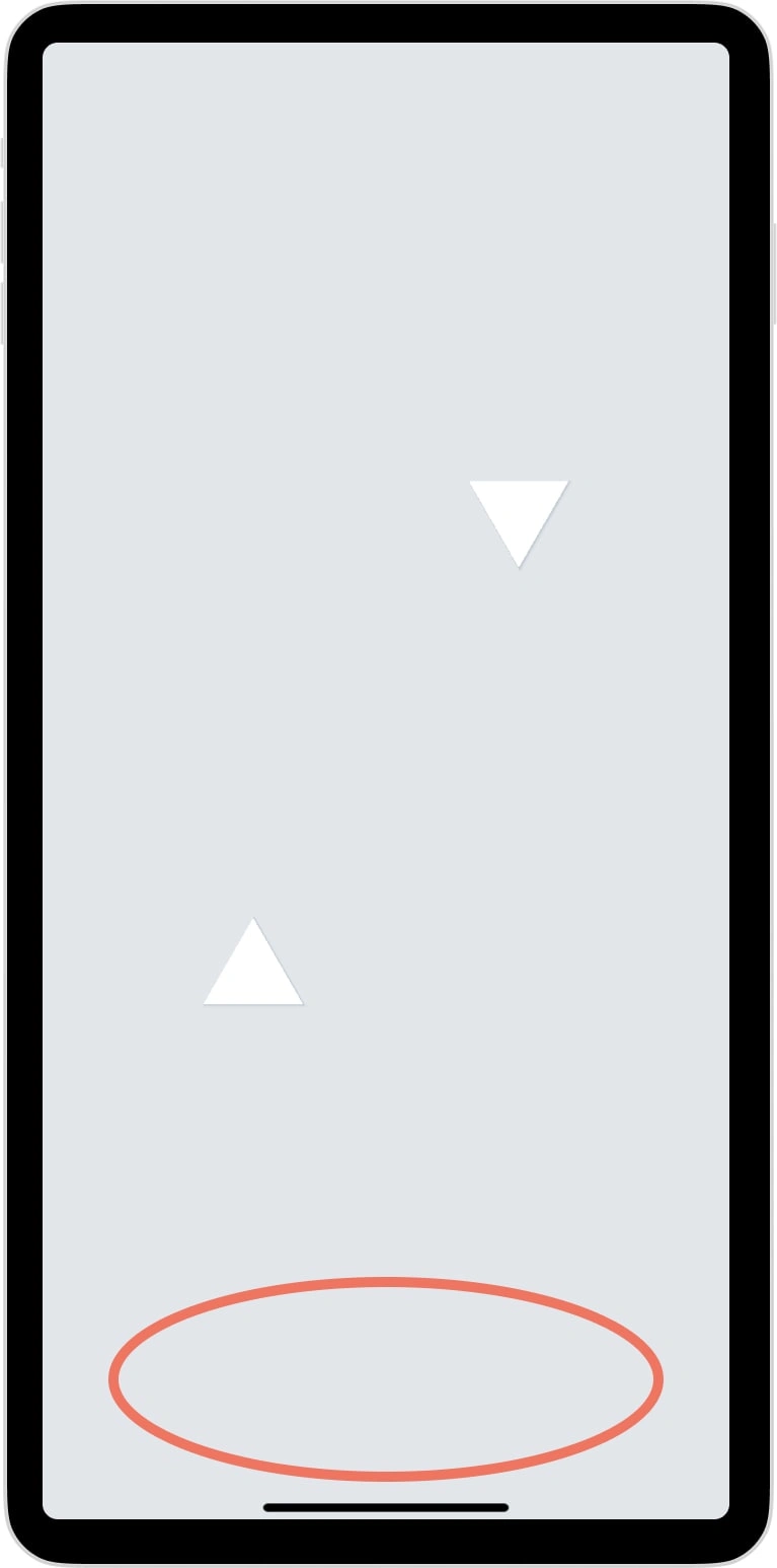
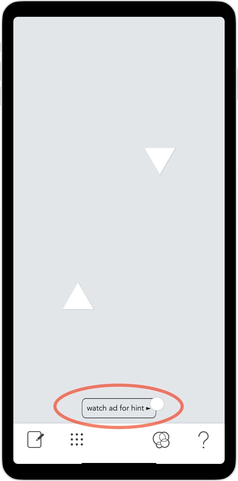
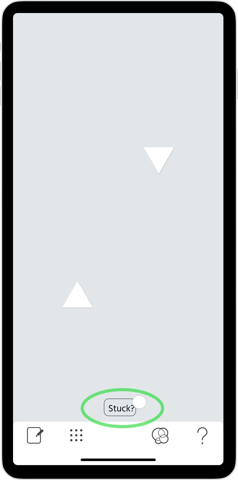
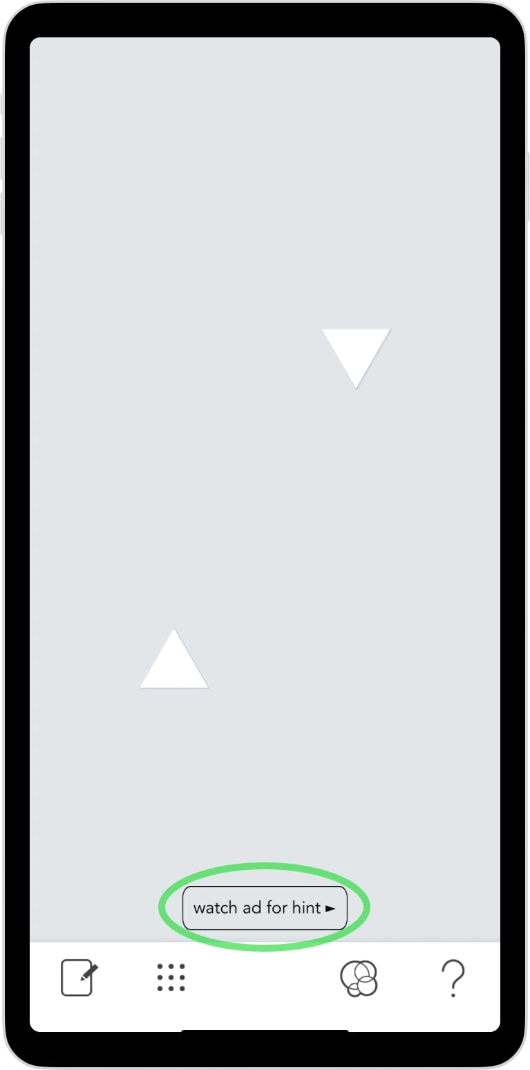
Rather than surfacing hints on a timer or at fixed checkpoints, I designed around frustration thresholds — the point where failure stops feeling like a challenge and starts feeling like a reason to leave. A 5-failure trigger surfaces a hint only when a player actually needs it, keeping the experience clean for players who don't.
Minimalist hint design
The hints themselves had to earn their place in the game's world. I designed a low-opacity, text-only overlay — no animation, no sound, no UI clutter. Players tap to dismiss; the copy disappears the moment play resumes. The goal was for hints to feel like a quiet nudge from the game, not a help menu.
Projected Outcomes
This approach models UX patterns used in retention-focused puzzle games and is designed to target:
Reduced abandonment at high-difficulty early levels
Longer time-on-level before quit events
Improved retention past Level 10 — where players typically reach emotional investment
Preserved flow and player confidence throughout
Why It Matters
UX writing in games is often treated as decoration. This project is a case for something different: writing as emotional architecture.
The right words, at the right moment, can regulate frustration, rebuild confidence, and keep a player in the experience long enough to care about it. That's not UI copy. That's retention strategy.
Reflection
I built this project after noticing a recurring gap in minimalist puzzle games: silence that alienates instead of soothing. The aesthetic was right — the emotional support wasn't there.
Designing the hint system meant asking a harder question than "what should this say?" It meant asking when — and whether it should appear at all. That constraint made the writing better.
The line I kept coming back to: a hint that preserves immersion is more valuable than a hint that's merely correct. That's the standard I tried to hold.
Like this project
Posted May 26, 2024
"Okay?" is a cool puzzle game with abstract shapes and tricky levels. We added smart hint popups to help without reducing control, ensuring a great experience.
Likes
0
Views
34
Timeline
Feb 1, 2024 - Ongoing

