Pio Pico Popup
Adrienne Anderson

Project Re-Branding
The original concept of Pio Pico Popup was to seamlessly blend the idea of the impact and history of the Transatlantic slave trade ("TAST") on foodways in the Americas.
The brand needed an embodiment of these complex concepts.
Some ideas I needed to mind map included:
It's a California-based brand;
The geographic designation of the Americas and their cultures (North, Central, South, Caribbean) in the Western Hemispher;
The geographic location of those forcibly transplanted from the Continent of Africa (primarily West Africa);
Common colors of these areas;
Contributions of food, music, culture, etc.;
Prominent figures that embody the overall brand;
The historic confluence of the Americas of Indigenous, African, and European; and
Historic impact of individuals and groups.
Being from California and having knowledge of California's history, I grappled with several prominent figures serving as a culmination of the brand's concepts.
With input by surveys, interviews, and research, I presented the perfect embodiment of the brand in Don Pío de Jesús Pico IV (May 5, 1801 – September 11, 1894): a prominent member of the original Californios in Alta, California, a ranchero, entrepreneur, and the last governor of Alta California under Mexican rule from 1845 to 1846.
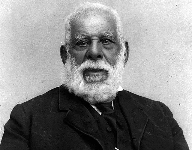
Of added value is that Don Pio was a confluence of the brand's concepts: A Californian and Mexican, a common mixture of the Americas: Spanish/European, Indigenous, and African, historically recognizable, etc.
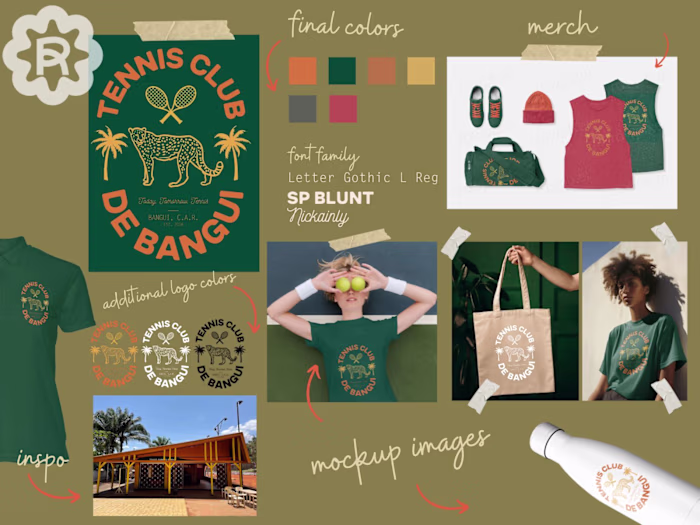
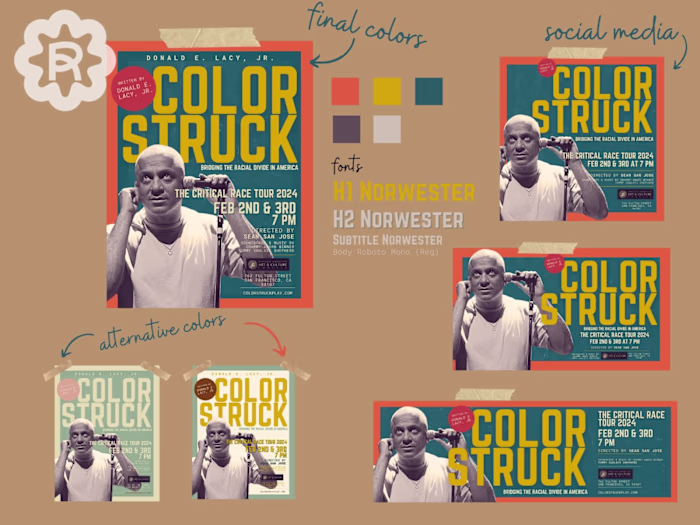
The first iteration of the brand used West African ankara textile in bright, vibrant colors common in the Americas: red, yellow, orange, blue, and white.
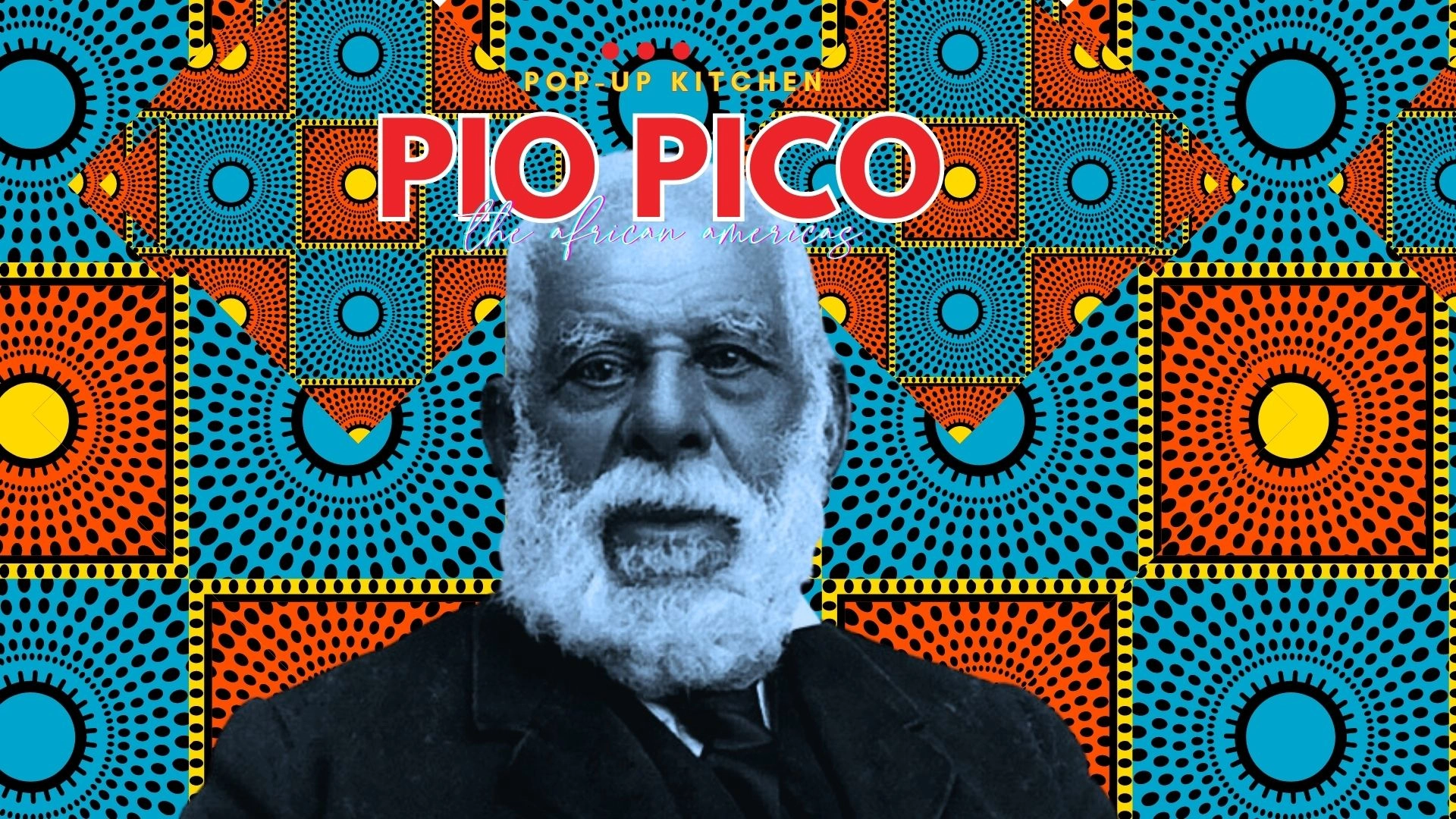
The patterns were resized and rotated to center the main text and subject, but the text and image got lost in the patterns.
One solution was to remove Don Pío himself to accentuate the text, but the inspiration of the concept got lost, especially if customers weren't familiar with Don Pío Pico. The brand would have to constantly reinforce the story of the name.
I was tasked with rebranding the popup to make it more accessible, less "formal," and adjust the subject to easily translate to merchandising and recognition without losing the underlying concept.
I researched colonial-era signage in the "old West," South and Central America, and the Caribbean.
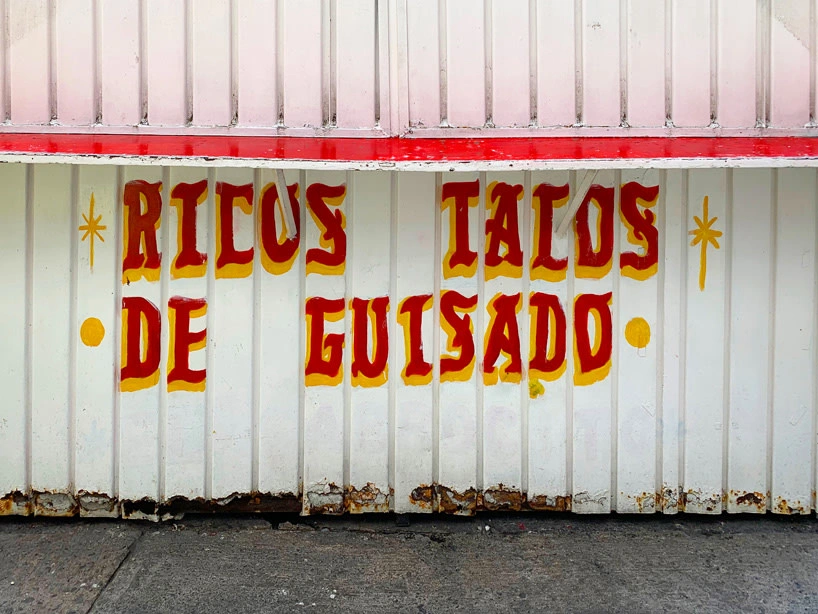
kurt hollander on mexico city's ban of all the colorful, hand-painted street stall signs, photo by Mario Pérez
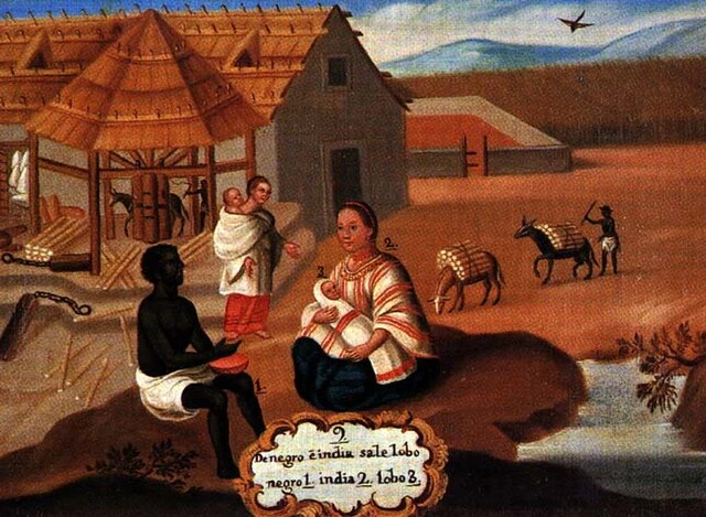
"Casta" painting of colonial Mexico to codify racial categorization and hierarchies

"David Ritchie & Son. Millers", Launceston, Tasmania (Australia)
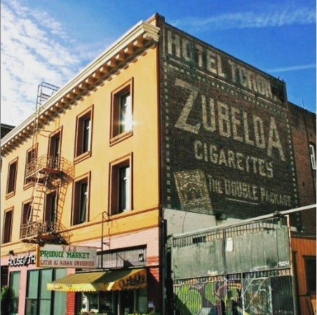
San Francisco "Ghost sign," Market Street, San Francisco
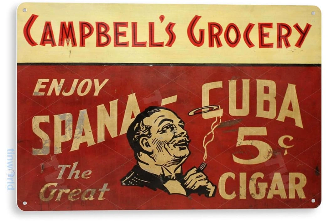
Vintage Cuban sign for Spana-Cuba Cigars
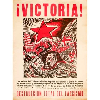
Vintage Mexican Revolution poster
All things considered, the old brand was re-worked to a vintage feel illustration with bold lines, retro lettering, and vibrant colors reminiscent of vintage signs, posters, and murals in 19th Century Americas.
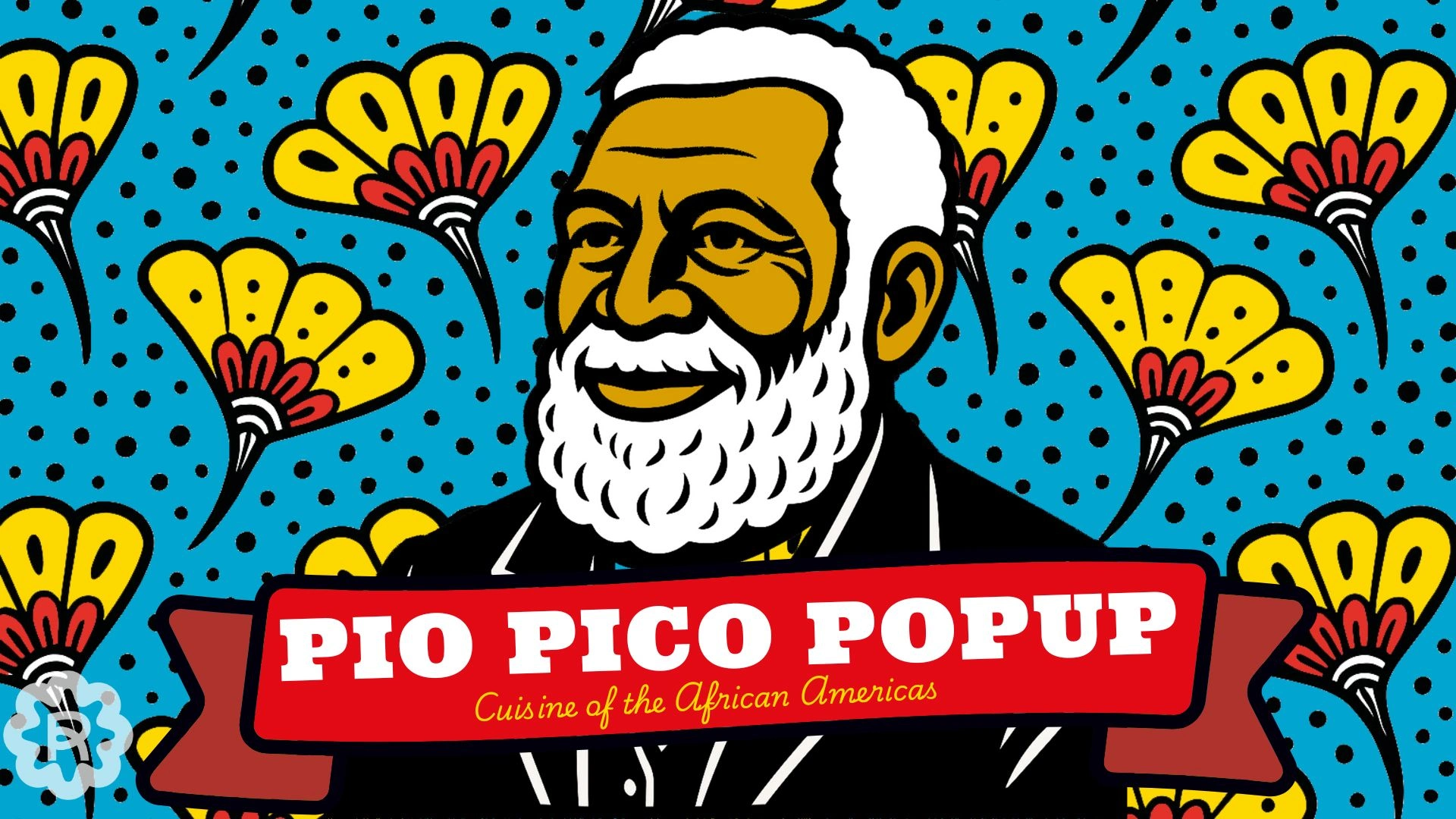
Flat imagery, bold coloring, and clean lines have re-imagined the feel of Pio Pico Popup without comprising the core brand concepts!
Like this project
Posted Jul 18, 2023
New cuisine inspired by the historic presence of Africans in North and South America.