Re-design of a newly launched warehouse management
Anush Ohanyan
01. Introduction
This realistic UX case study details the challenges, insights, and lessons learned from redesigning the warehouse management flow within a B2B e-commerce seller panel for Telcell Market.
Overview
In short, this study addresses the dissatisfaction our partners experienced with the newly launched management system and how I reimagined the solution by uniquely aligning business goals with user needs through a personalized design process.
Constraints & Adaptations
We faced the classic challenges of a low UX maturity company: limited time, budget, and access to real users. Given the limitations, I focused on maximizing the value extracted from indirect user feedback and analytical methods. The insights gained from the sales team, combined with the optimized task-flow analysis findings, provided a solid foundation upon which to base informed design decisions.
02. About the company
Telcell Market is a newly launched e-commerce marketplace that has quickly gained popularity among both sellers and buyers. Its mission is to provide a robust suite of tools that empower sellers and buyers to effortlessly navigate and thrive in the digital marketplace.
Telcell Market stands out by offering products at competitive prices, making it an attractive choice for budget-conscious buyers. It also features a robust discounting system, enhancing the value proposition for both sellers and customers. Provides an extensive suite of tools for sellers, enabling them to manage end-to-end tasks seamlessly, from inventory to sales and customer service.
03. Project background
But, everything wasn’t that good. Several months after the launch, our B2B users, as reported by the sales department, expressed their frustration. They found the warehouse scheduling and delivery attachment flows to be unclear.
Imagine creating a feature for B2B e-commerce sellers with the best intentions, only to realize that it's confusing and time-consuming for your users.
This is precisely what happened with our warehouse management flow. Initially, design decisions were made based on assumptions rather than user research, resulting in a costly launch.
04. Problem
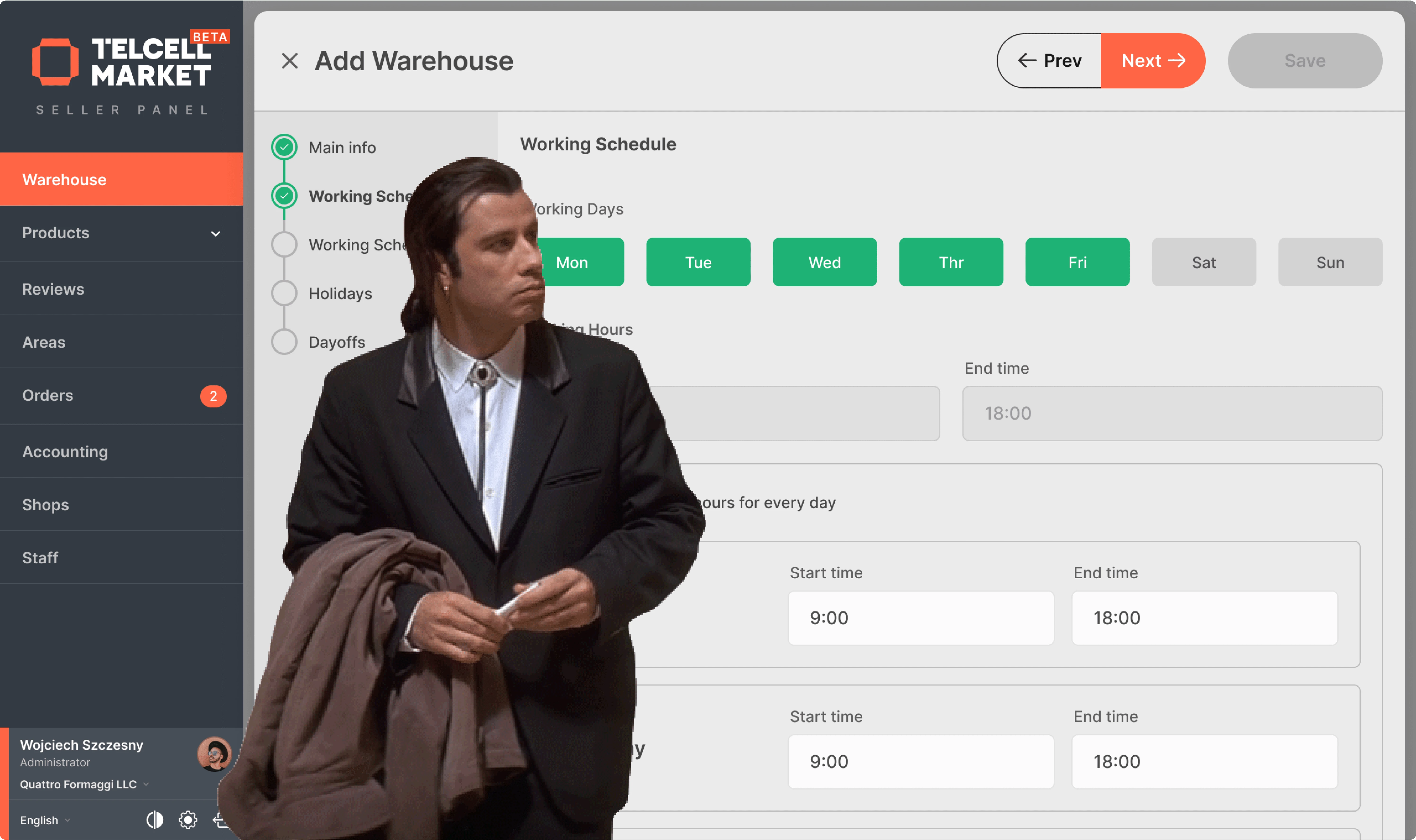
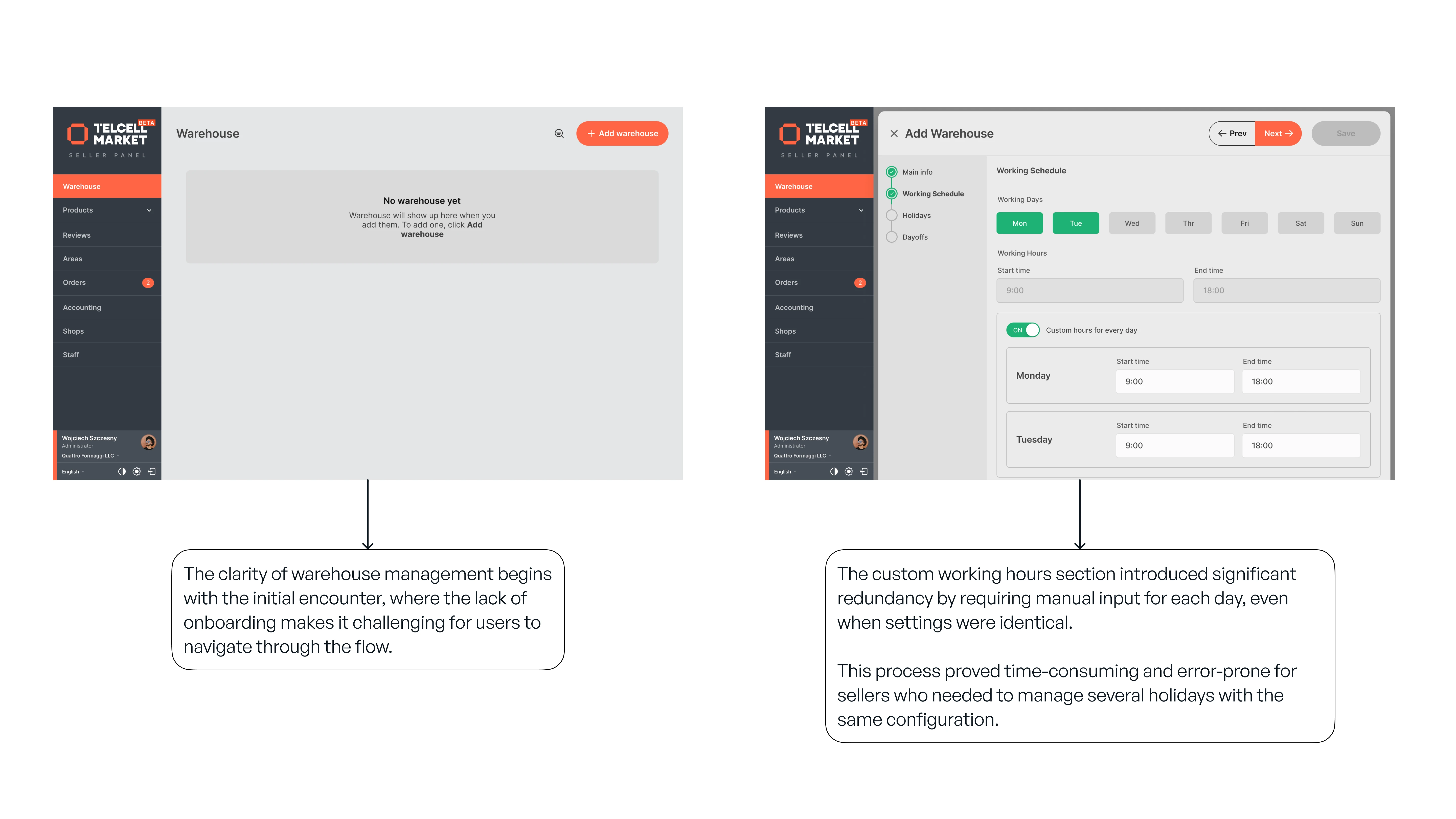
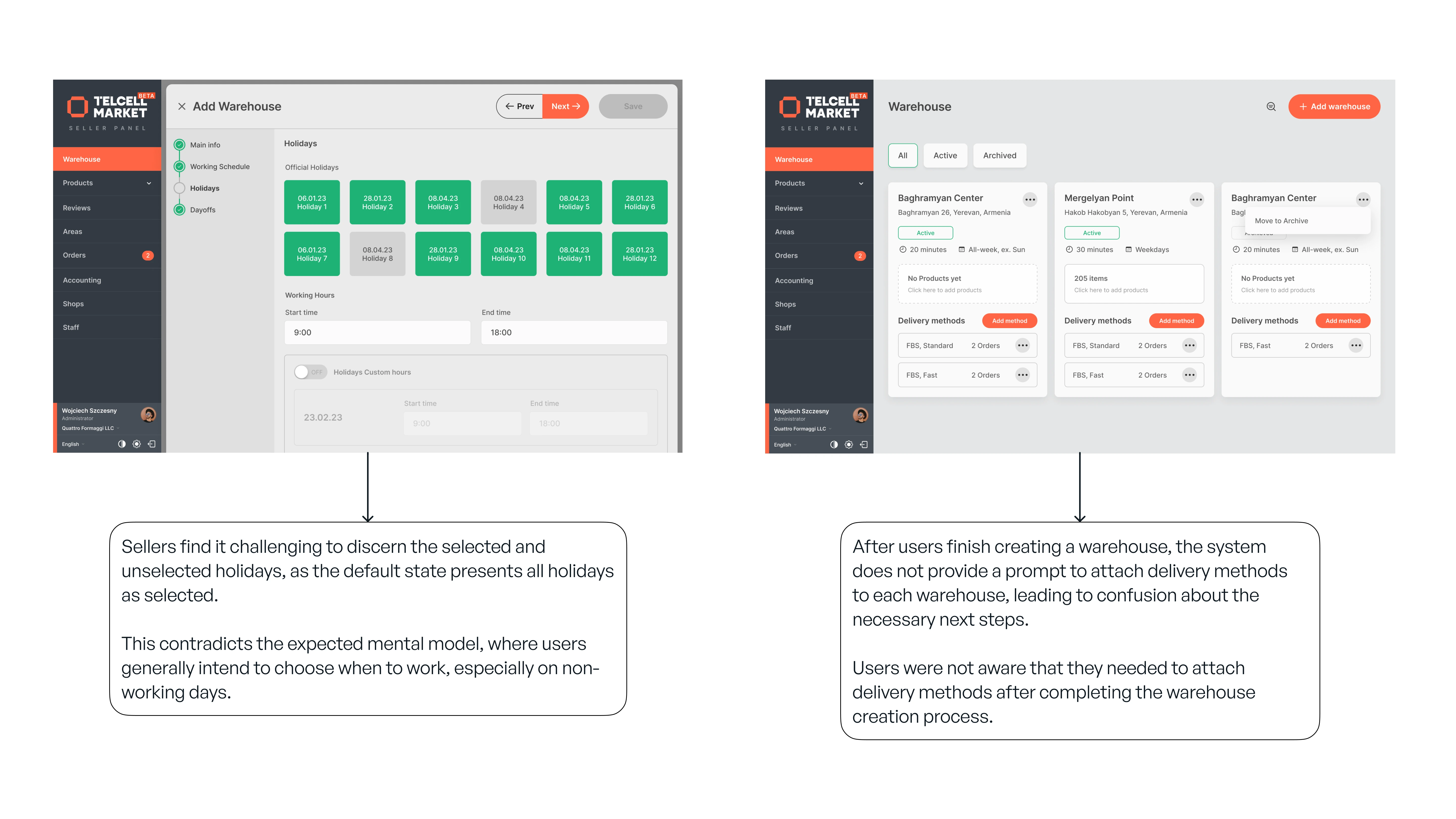
The warehouse holiday scheduling lacked clarity. Sellers couldn't intuitively create and schedule warehouses without assistance.
The current warehouse interface presents several usability challenges. Users struggle with setting up working hours and other configurations, such as distinguishing between selected and unselected holidays. This confusion hampers intuitive use and impacts the overall experience.
Additionally, after creating a warehouse, users are not guided to attach delivery methods, leaving them unsure of the next steps and adding to their frustration.
05. My approach
1. Kick off
Given the unavailability of direct access to our real users, I turned to the sales personnel who regularly interacted with sellers. Through in-depth interviews, I aimed to uncover the specific questions and frustrations expressed by our users.
This approach not only helped identify areas where the design was lacking in meeting their knowledge requirements but also revealed additional problems and issues that needed to be addressed.
2. Interviews with stakeholders
To get the bigger picture of the business perspective, including its goals, potential measurable outcomes, and urgent priorities, I engaged with business stakeholders.
Despite the tight deadline of just two days imposed by the business, I emphasized the need to address the issues thoroughly to avoid repeating past failures. Through these discussions, we aligned our goals and strategies, ensuring that both UX and business objectives were met effectively
3. UX Audit
I carefully reviewed the current design through a UX audit. This process involved identifying specific use errors and smaller usability issues that had been overlooked.
Addressing these issues contributed to improving the overall user experience and ensuring a smoother transition to the new design.
4. Optimized task flow analysis and feedback loops
To optimize the task flow, I collaborated with the Product Manager to map out distinct user tasks and potential scenarios users might encounter while trying to achieve their goals. We identified both possible and impossible cases that users may face during their journey.
This detailed task flow analysis allowed us to design a more efficient and user-friendly workflow, ensuring that users could easily navigate the system and accomplish their goals.
5. Rapid prototyping for testing
To gain deeper insights into the user experience, we conducted usability and concept studies with internal stakeholders – specialists who managed portions of the seller's management panel.
This knowledge informed an iterative design process where we created and tested three iterations, incorporating feedback and refining the solution until we reached a final design with clarity and efficiency at its core.
6. Final design
During the UI phase, I meticulously designed the interface to ensure minimal deviation from the current design. I used existing UX and interaction design patterns from our design system to maintain consistency and familiarity for users.
This approach helped streamline the design process and ensured that the new interface remained intuitive and easy to use for our users.
06. Impact
After successfully redesigning the system, which led to a significant reduction in sales department involvement and improved user satisfaction, I was proud of the positive changes my work had brought to the company.
Though my role ended as part of a broader organizational restructuring, I left knowing that the solutions I implemented continued to support both the team and the users effectively.
The experience strengthened my ability to deliver impactful, user-centered designs that align with business goals, a focus I carry into all my projects.
07. Lessons
This case study chronicles the journey of redesigned warehouse creation and scheduling flow within a B2B e-commerce management panel.
The process behind this redesign provided key insights and underscored the critical importance of user-centered design.
Neglecting user research
Neglecting user research and prioritizing assumptions over user research can lead to costly missteps and inefficiencies. Recognizing this, I ensured the final design was deeply rooted in actual user needs rather than mere assumptions.
Advocacy for iterative design
Despite the pressure from C-level executives and stakeholders to deliver quickly, I advocated for a measured approach. I took the initiative to educate them on the risks of rushing and highlighted the importance of iterative design. This approach allowed for incorporating user feedback and minimizing the risk of post-launch issues.
Thank you for reading :-)
Like this project
Posted Sep 17, 2024
This realistic UX case study details the challenges, insights, and lessons learned from redesigning the warehouse management flow within a B2B e-commerce seller
Likes
0
Views
10