Training Data Existed. Making Sense of it Didn't
Space Cowboy Design
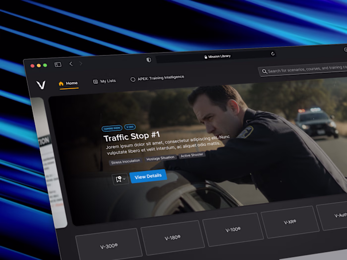
APEX: Training Intelligence
After every training session, the debrief was a guess. APEX was built to change that.
Introduction
VirTra builds law enforcement and military training simulators used by agencies across the country and around the world. VOS is their flagship product, a full-scale simulator that has been in the field for over 15 years. Every session it runs generates detailed performance data. APEX was built to make that data useful.
The Problem
VirTra's flagship simulator, VOS, captures detailed performance data from every training session. Shots fired, hits, misses, accuracy, shot split times, all of it recorded automatically. The problem was what happened after the session ended.
Instructors had no way to review that data in any meaningful way. Export options were limited, reports were basic, and the debrief relied heavily on memory and notes taken during the session. The data existed. The tools to read it didn't.
APEX was built to close that gap. A standalone analytics platform that could take everything VOS captured and turn it into something an instructor could actually use in a debrief, and something an admin could use to track ROI, trainee improvement, and training program effectiveness over time.
Every session generated data. Nobody could do anything with it.
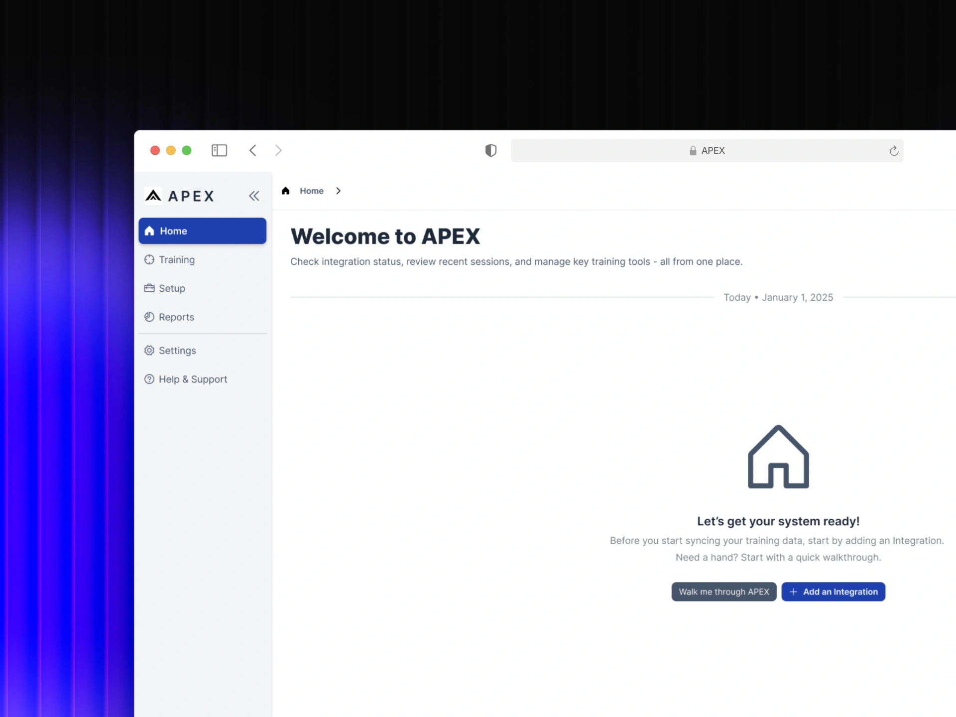
APEX home screen in its empty state, before any training data has been synced or integrations added.
My Role
I owned the design end-to-end over six months, working directly with the CTO and Head of Development to define what APEX was before a single screen existed. That meant getting alignment on scope, user types, and what the product actually needed to do before any design work began.
The work required designing for two fundamentally different users at the same time. Instructors needed a fast, focused debrief tool. Admins needed a broader view of training program performance and ROI. Same product, same data, different jobs. The design had to serve both without compromising either.
From there it was about translating raw simulation data into something immediately readable. Every visualization and layout decision was made through a single lens, could an instructor understand this in the first few seconds of a debrief, or an admin in a quick check-in?
Two users. Two completely different jobs. One product that had to serve both.
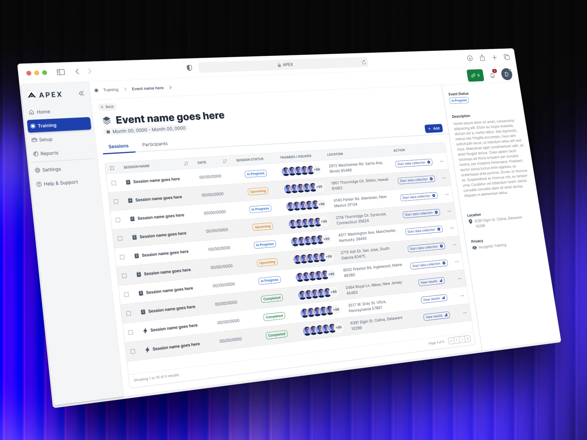
Session list nested inside an event, one level deeper in the training hierarchy.
Collaborators
APEX was a focused team working on an undefined problem. Getting it right meant staying close to the people who understood the data, the technology, and the training environment it was built to serve.
CTO
Head of Software
Subject Matter Experts (SMEs)
Instructors
Approach
Principles first
Good design doesn't start with screens. It starts with understanding the problem well enough that the right solution becomes obvious.
Order from Chaos — Two user types. Completely different needs. One product.
Before any screens were designed, the first job was mapping exactly what each user needed from the same set of data. Instructors needed fast, focused debrief tools. Admins needed program-level performance and ROI visibility. Getting that clarity upfront meant every design decision that followed had a clear reason behind it.
No Wasted Pixels — A session report can show everything. The design decision was what to show first.
Training data is dense. The temptation is to surface everything at once. Instead the report was designed around a clear hierarchy, session-wide stats at the top, individual trainee performance one level deeper. The right information at the right moment, nothing competing for attention that shouldn't be there.
Built to Last — Designed with customization in mind before customization was built.
The dashboard was scoped for v1 without customization, but the foundation was designed to support it. Different users need different information at a glance. Building that flexibility into the architecture from the start meant the product wouldn't need to be rebuilt when the time came to add it.
Earned Trust — Data only works if users trust what they're reading.
A data-heavy interface can impress or it can inform. The goal was always the latter. Every visualization choice, the Skills Web, the Speed vs Accuracy chart, the leaderboard, was made to be immediately readable by an instructor mid-debrief, not to look sophisticated on a screen.
The Solution
VOS Simulators captured everything. APEX was built to make it mean something.
The design challenge wasn't technical, the data was already there. It was about understanding what two very different users needed from the same information, and building a product that could serve both without compromise.
Live Training
When an instructor starts a session on VOS, APEX detects it automatically. The navigation updates to reflect the active training and the rest of the product stays fully usable. When the session ends, a notification confirms the report is ready.
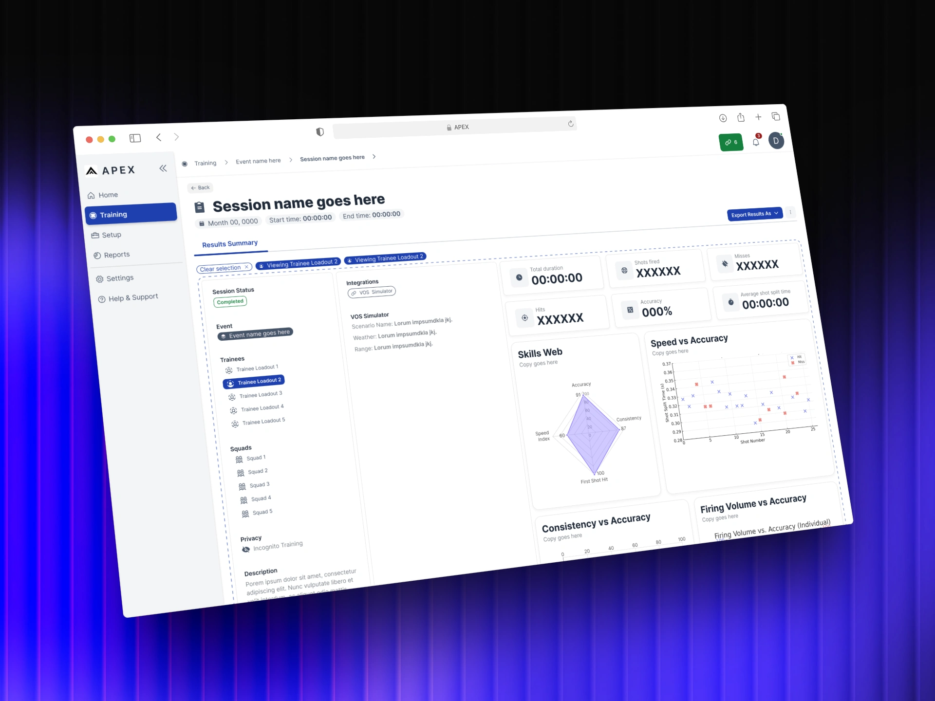
The session report surfaces session-wide stats at the top level, duration, shots fired, hits, misses, accuracy, shot split time, alongside a leaderboard ranking all participants. An instructor can read the shape of the session in seconds.
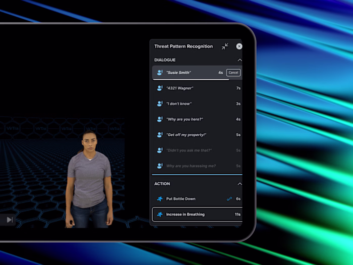
Selecting an individual trainee shifts the view. The report drills into that person's performance through a Skills Web, Speed vs Accuracy, Consistency vs Accuracy, and Firing Volume charts. The same foundation was designed with long-term trainee tracking in mind, performance summaries and improvement trends over time, not just a snapshot of a single session.
An AI insights block powered by a local LLMsits within the report at both levels. Rather than leaving interpretation to the instructor alone, it surfaces quick recommendations directly from the session data. The debrief starts with a foundation, not a blank page.
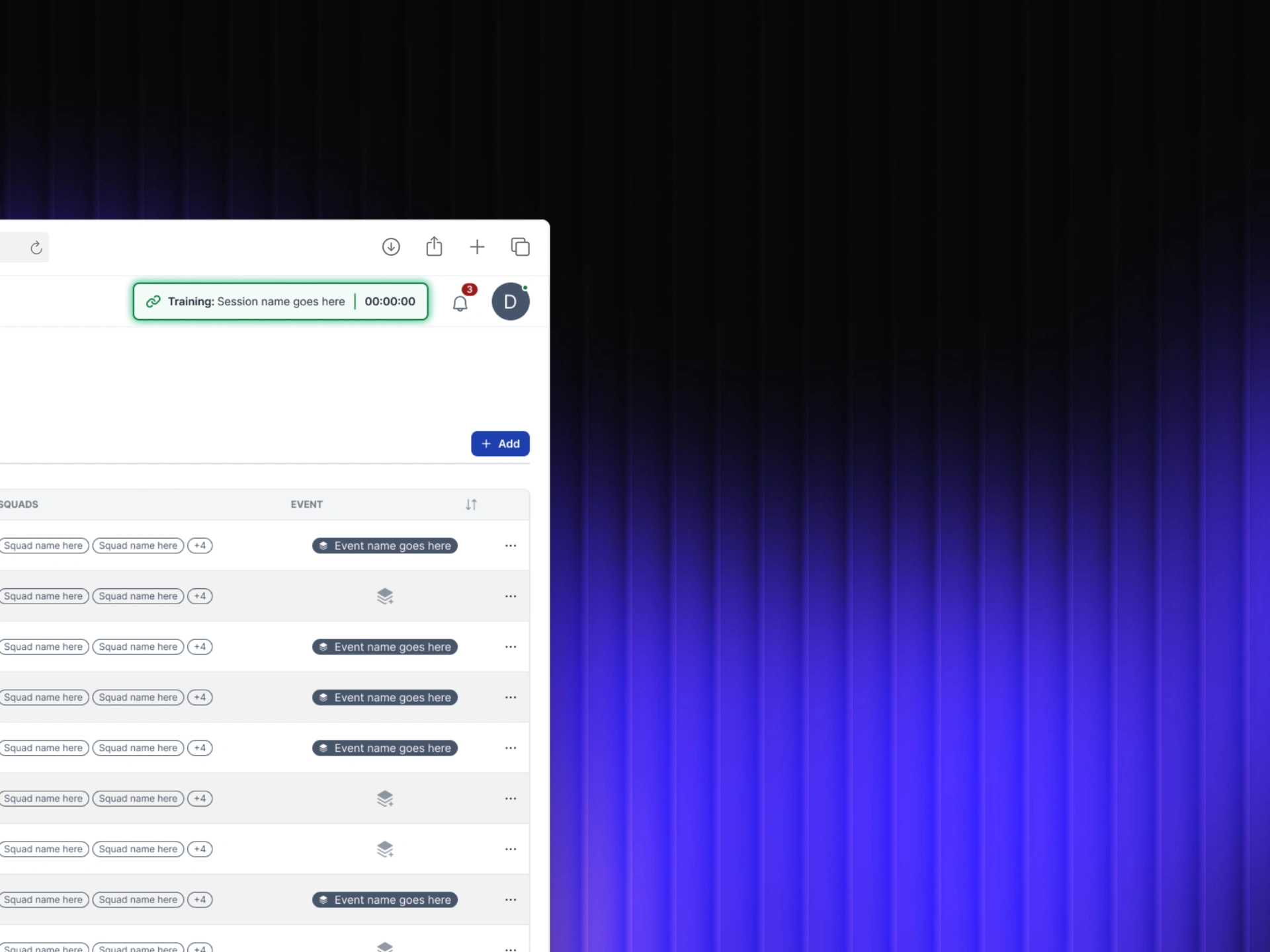
Active training indicator in the nav bar.
Planned Sessions
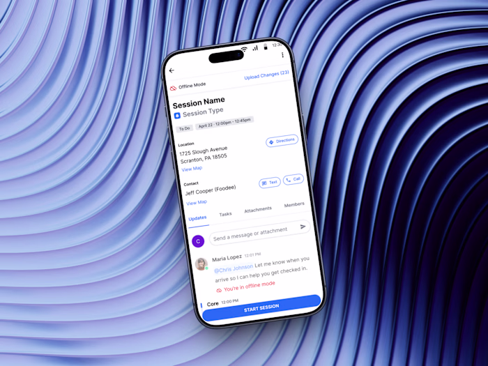
Before APEX, instructors were coordinating training across disconnected tools, calendars, spreadsheets, emails. Planned Sessions brought that workflow into one place. Scheduling a session meant setting dates, assigning trainees, designating instructors, and linking scenarios before anyone stepped into a simulator.
Once created, upcoming sessions surface in a clear list view. The full training schedule becomes visible across the team, reducing the back-and-forth of coordinating logistics manually and giving everyone the same picture of what's coming.
When a planned session runs, it connects automatically to the live training flow. The planning and the data end up in the same place.For the first time, the full training lifecycle, from scheduling to debrief, lived in a single product.
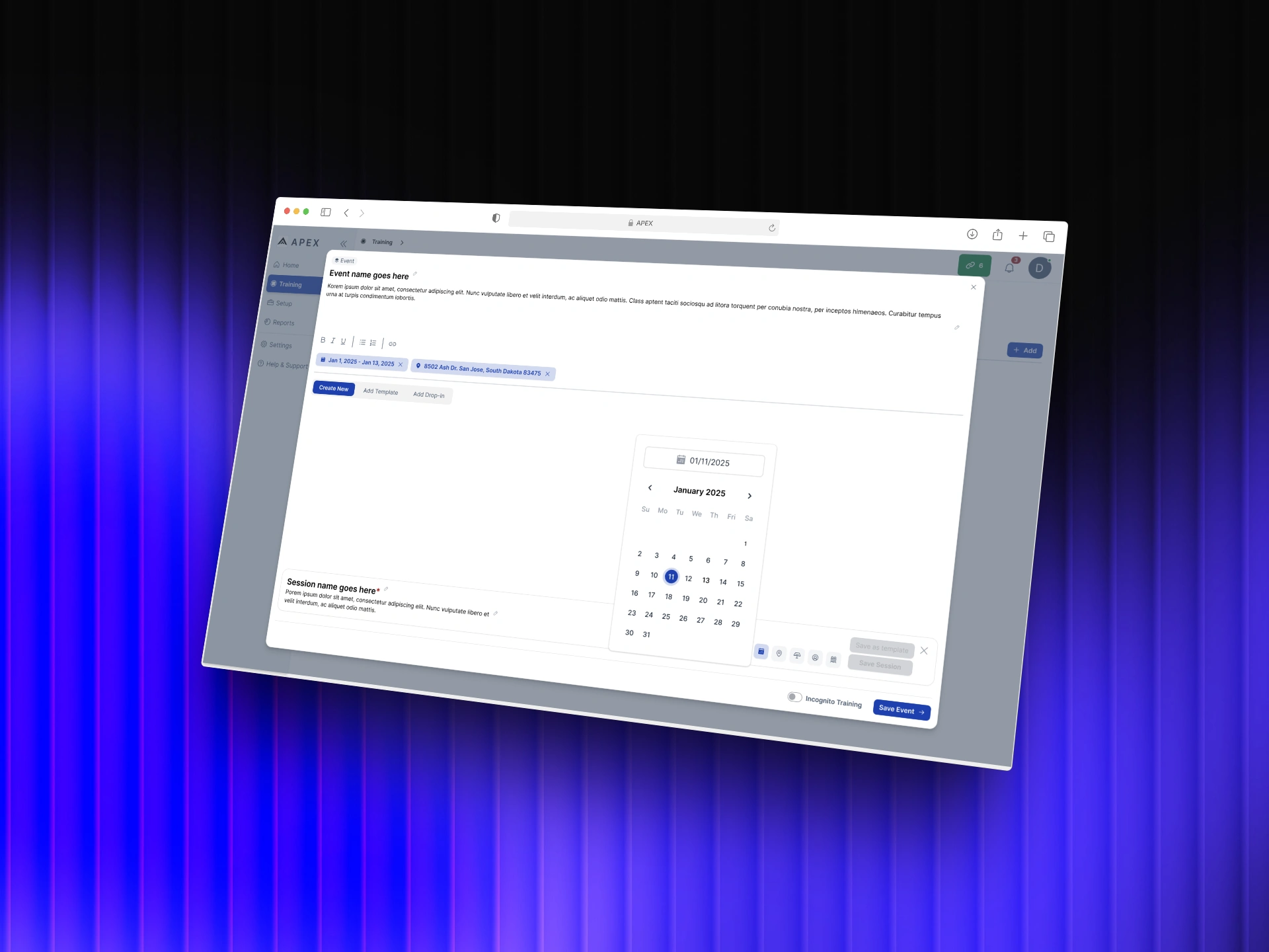
Event creation flow with date picker for scheduling training in advance.
Outcomes
APEX shipped its first version after six months of design work. Development continued well beyond the initial scope. New features were added, workflows expanded, and the product grew into something larger than v1. The foundation held up well enough to build on.
The work defined what APEX was before anyone else could. A clear information hierarchy, a two-user framework, and a data model that made training performance readable for the first time. Those decisions didn't need to be revisited when the product grew, they scaled.
The next phases, a report builder for admin ROI tracking, customizable dashboards by user type, and live session monitoring, were scoped and designed with the same foundation in mind. The product was built to get there without starting over.
Version one didn't ship everything.
It shipped the right things.
Like this project
Posted Apr 14, 2026
Instructors had simulation data but no way to act on it. I designed APEX to surface patterns, flag performance gaps, and structure every debrief.
Likes
0
Views
0
Timeline
Nov 11, 2024 - May 12, 2025
Clients
VirTra