Meterline: AI Cost Dashboard for SaaS Founders

Krishna Bhupathi


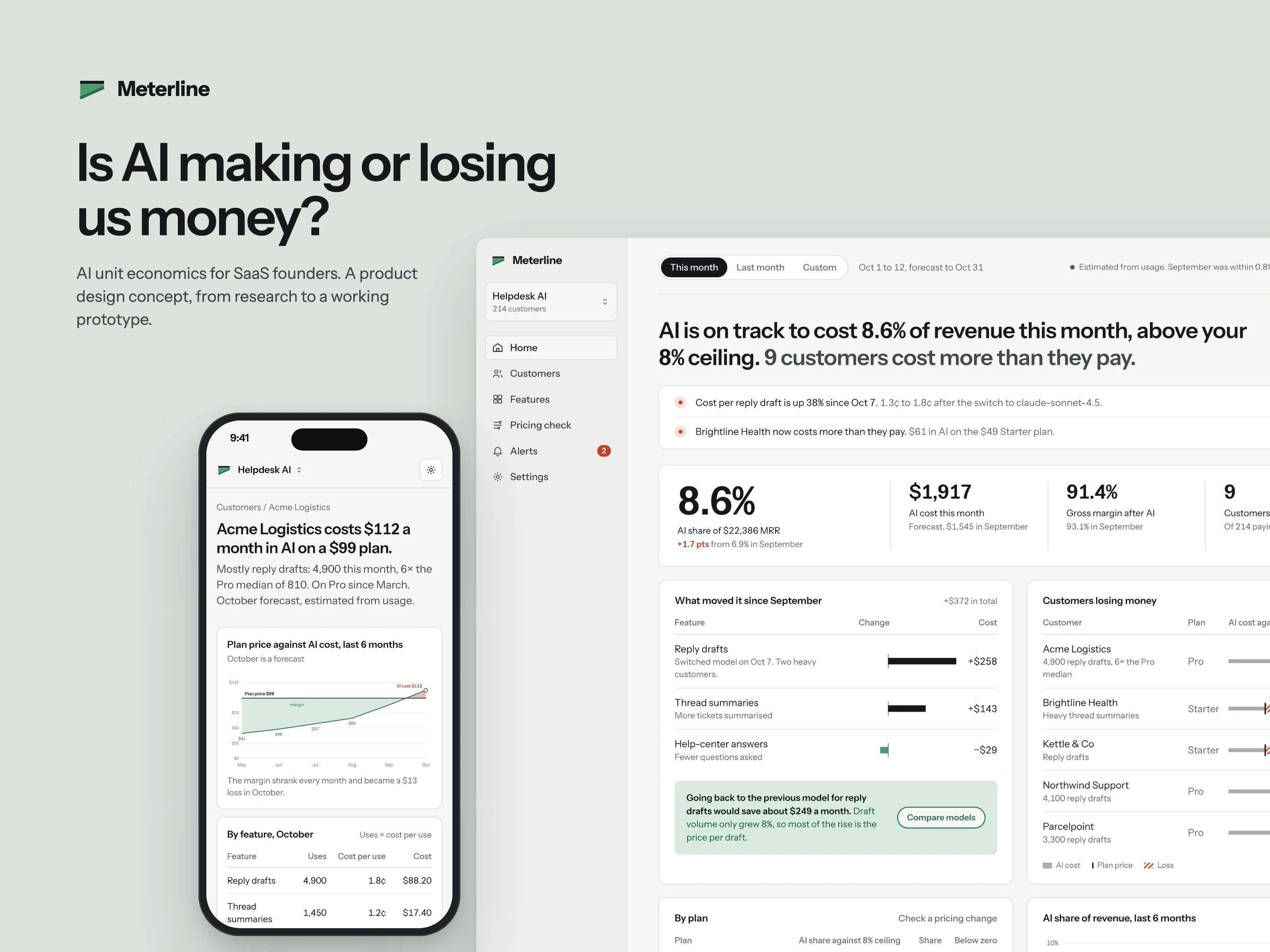
Meterline is a concept I designed from scratch: a dashboard that answers one question for SaaS founders. Is AI making or losing us money?
It's a self-initiated project with demo data. It isn't a real product or client work.
The problem
Startups are adding AI features like reply drafts and summaries. Each call costs money, but most SaaS plans charge a flat monthly price. The provider bill shows one total, so founders can't tell which feature or which customer caused it. Their heaviest users can quietly cost more than they pay.
Research
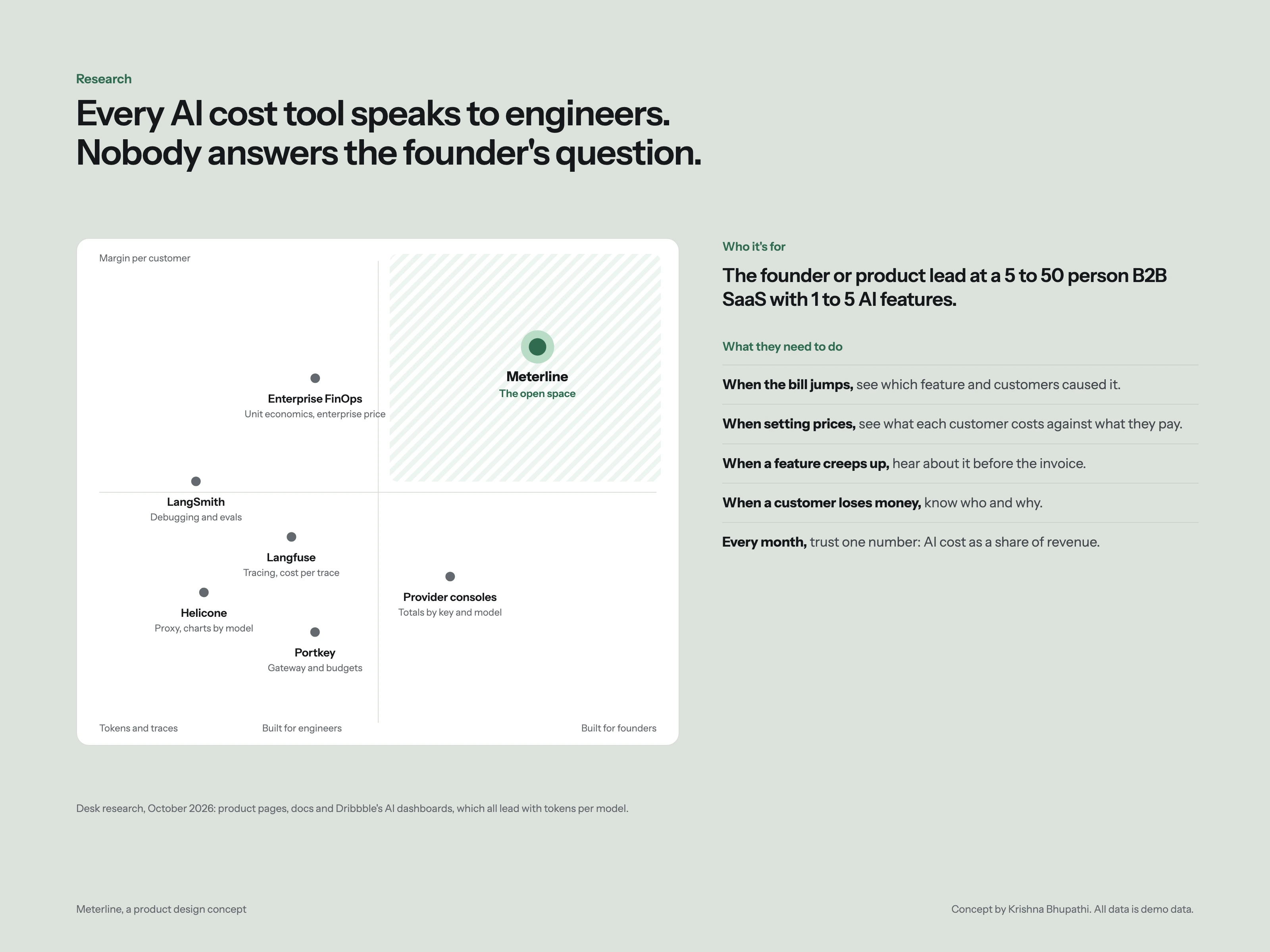
I reviewed the tools teams use today (Helicone, Langfuse, LangSmith, Portkey, the provider consoles and enterprise FinOps tools) and the AI dashboards on Dribbble. They all lead with tokens and models, built for engineers. None of them puts AI cost next to what each customer pays. That gap became the product.
Structure before style
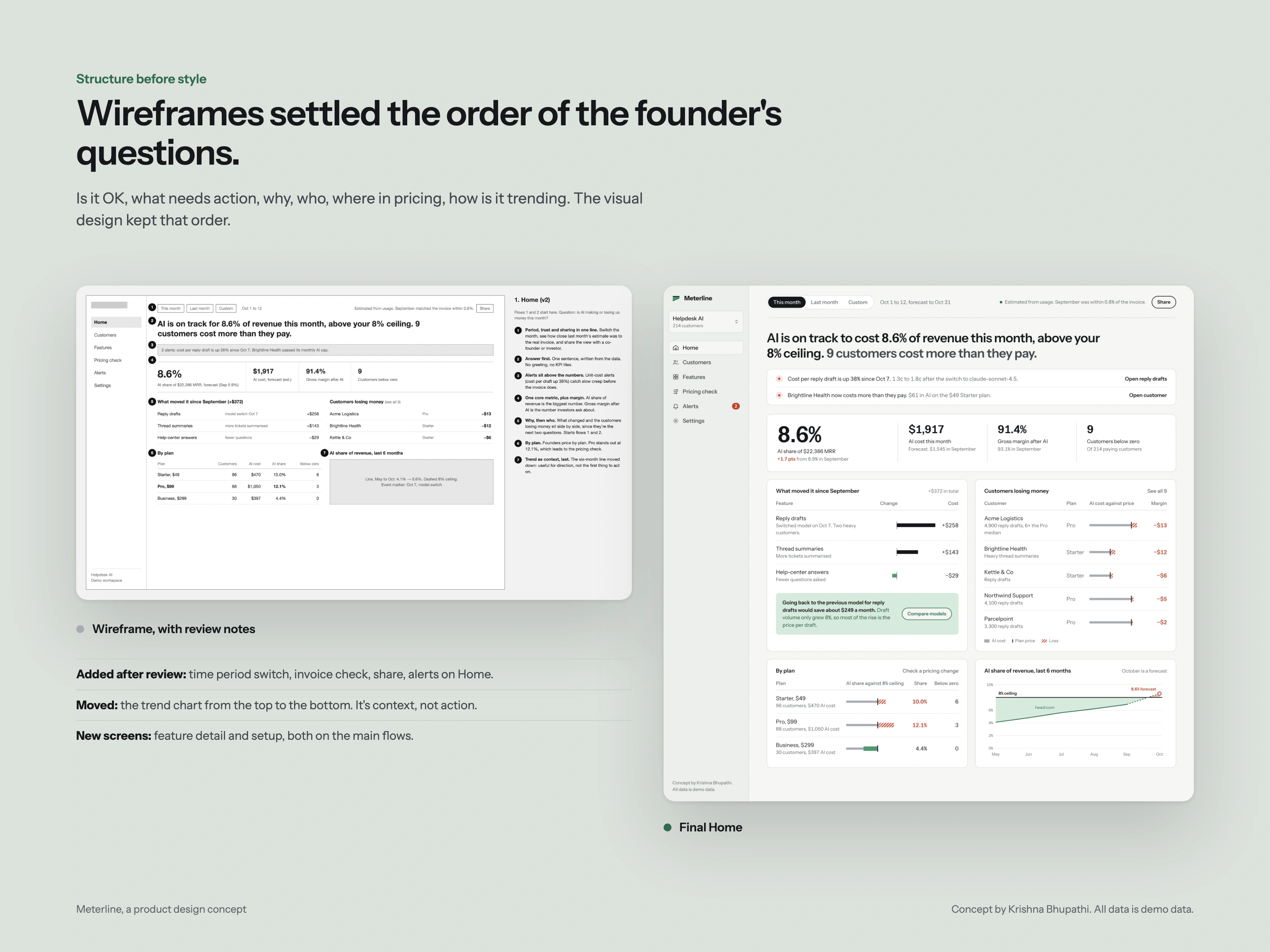
Grey wireframes came first. A review against the founder's five jobs added a time period switch, an invoice check, sharing and alerts, and moved the trend chart from the top to the bottom. Home now follows the order of the founder's questions: is it OK, what needs action, why, who, and how it's trending.
One idea: money as a shape
Price and cost are drawn as two lines. The gap between them is filled green while there's margin and hatched red once it turns into a loss. The same shape works as a small bar in every customer row, as a plan's share against the ceiling, and as a six-month chart.
Pricing check and motion
Founders can test a pricing change on real usage. Drag the included limit and everything recalculates live: the answer, the numbers, the histogram and the customers who'd pay more.
Otherwise there's one moment of motion, when a page loads: the data draws itself. Numbers count up, bars grow from zero and lines draw left to right. After that, motion only answers what the person does. Reduced motion is respected.
Every screen opens with the answer
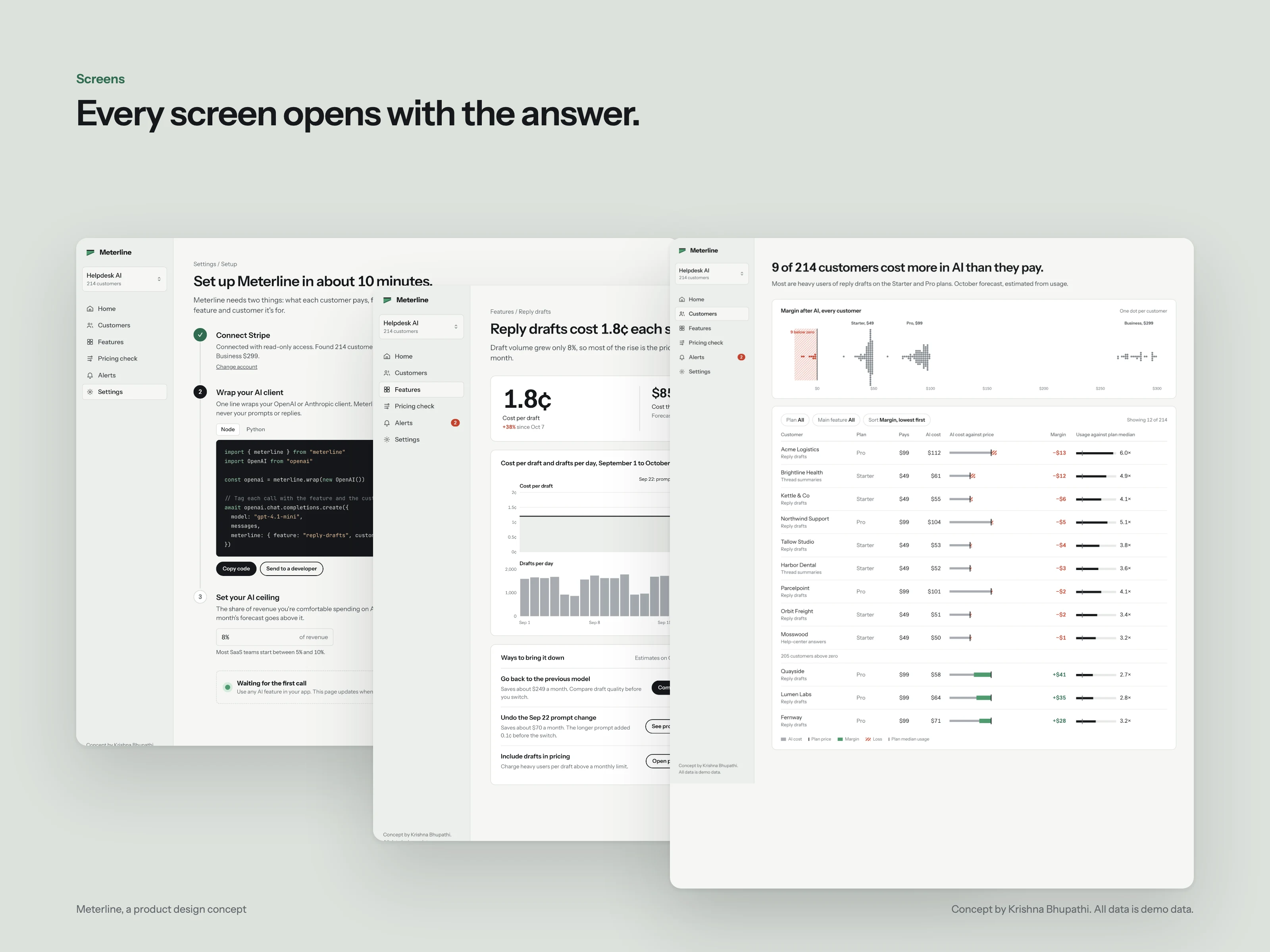
Each view starts with a sentence, like "9 of 214 customers cost more in AI than they pay," and the panels below are the evidence.
Mobile
The same screens, made responsive: a bottom tab bar, one column of panels, swipeable charts, and tables that keep the columns that matter.
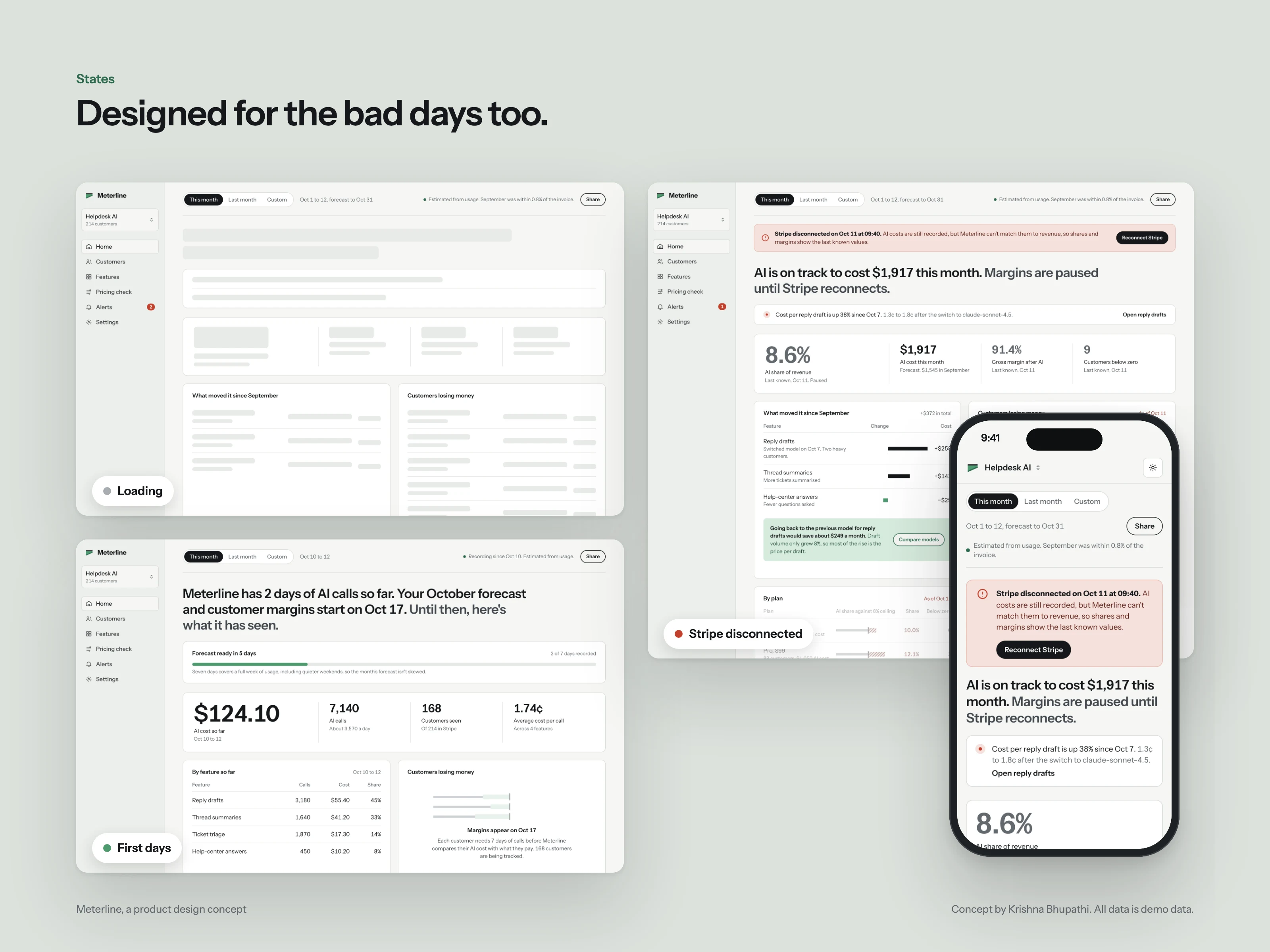
States
Loading keeps the layout still. In the first days, Home explains when the forecast arrives. If Stripe disconnects, costs stay live and revenue-based numbers are marked "last known."
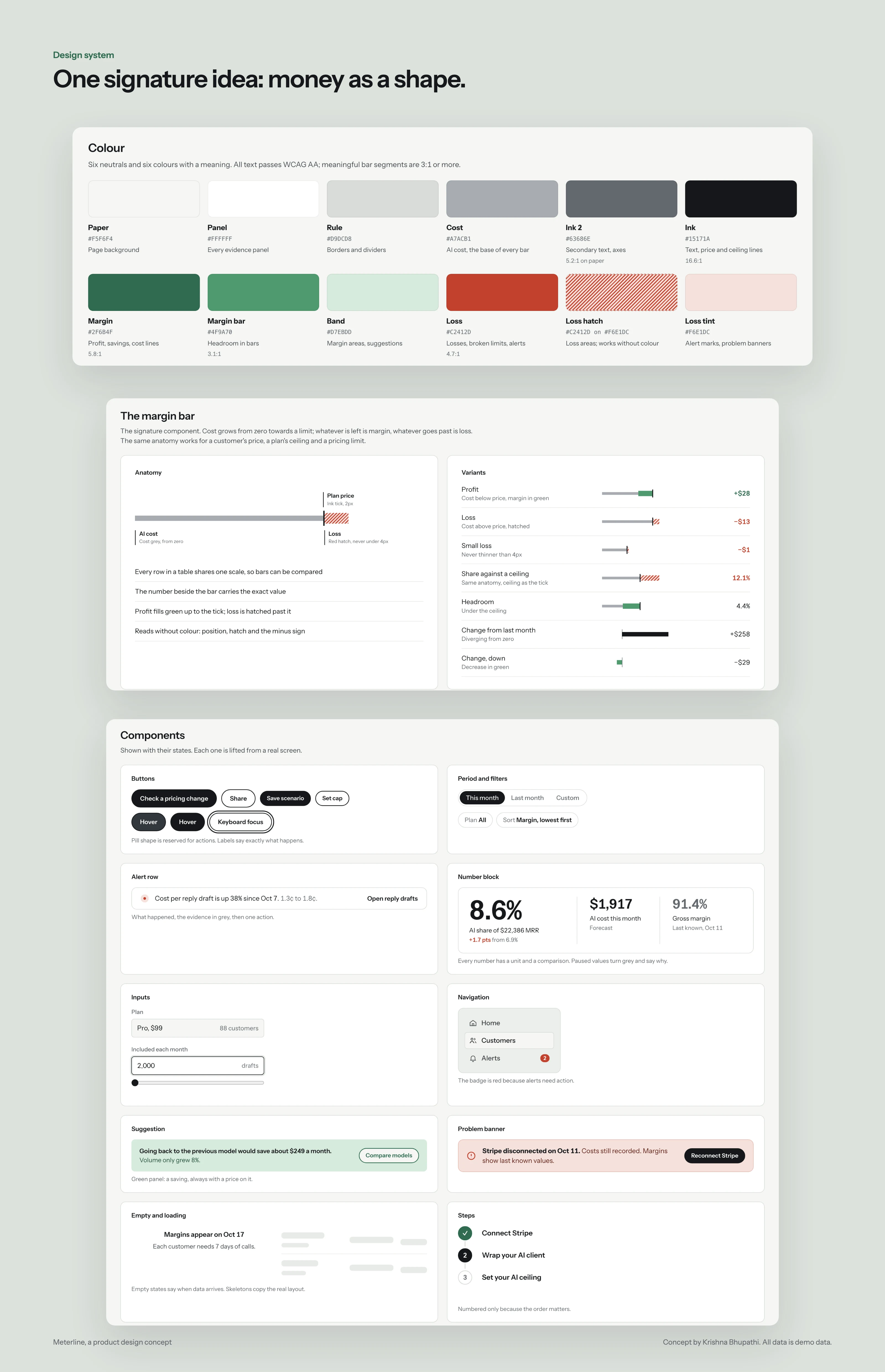
Design system
Six neutrals and six colours with one meaning each. All text passes WCAG AA, and a loss never relies on colour alone: it's red, hatched and has a minus sign.
Built as real HTML and CSS, so the prototype can be reused when a backend is added.
Like this project
Posted Oct 11, 2026
Self-initiated product design concept: research, wireframes, design system, desktop and mobile screens, states and motion for an AI cost dashboard.
Likes
0
Views
1