Mobile App Design / It Fits Us
Overview 🔎
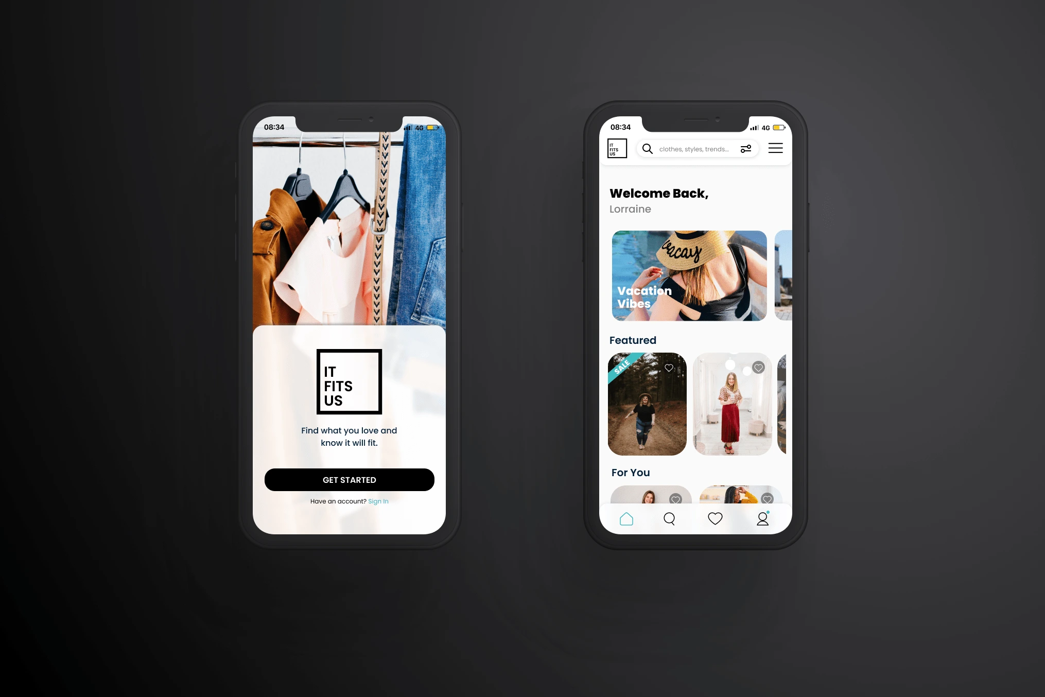
I designed a mobile app, branding, and logo for a company called It Fits Us. It Fits Us is a start-up company focusing on trying to reduce textile waste by connecting shoppers with real people that are their size that serve as models. This reduces the number of returns for online purchases and reduces the number of clothes thrown out because they were returned. For this project, I was the only designer and worked directly with the CEO.
Problem & Solution 🤝
When the CEO/Founder came to me, they had a great idea but were stuck. They needed a working prototype to get any funding or partnerships, however, they were the only employee. I hopped on board to help them get to the point where they are able to apply for funding/ grants and to show potential business partners exactly what they are creating.
Goals/Requirements:
Research the users
Create Wireframes
Design a low-fidelity prototype for testing
Design a high-fidelity clickable prototype for further testing, applying for funding, and for potential partners
Create a logo and branding consistent with the company
Process 🛣
I started off by reviewing the research on users and the problem that the CEO/Founder had already completed. I then did some competitive analysis with other companies in the same space. After getting up to speed on the company and its mission as well as its problem space, I began brainstorming layouts for the app they were setting out to develop.
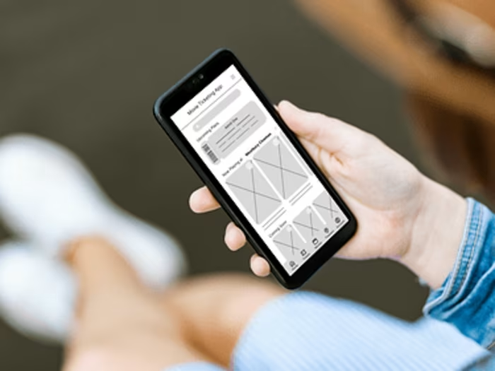
I took those ideas and began to create wireframes of the app. After establishing the necessary pages and getting an idea for the user flow, I made a low-fidelity prototype in Figma.
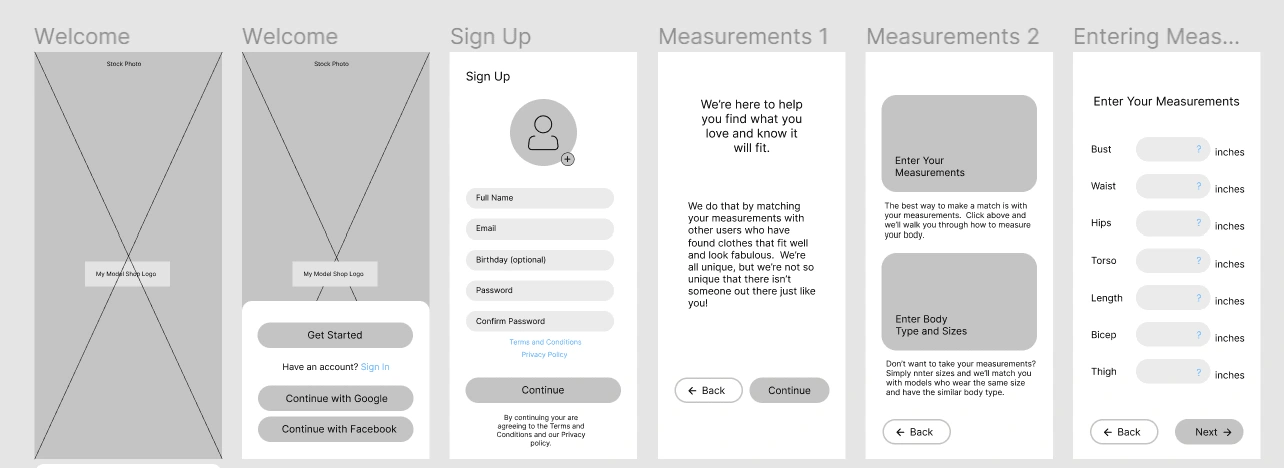
Low Fidelity Prototype in Figma showing the user sign-up flow.
This prototype was very informative in regards to establishing user flow because I was able to actually click through the screens and get feedback from potential users.
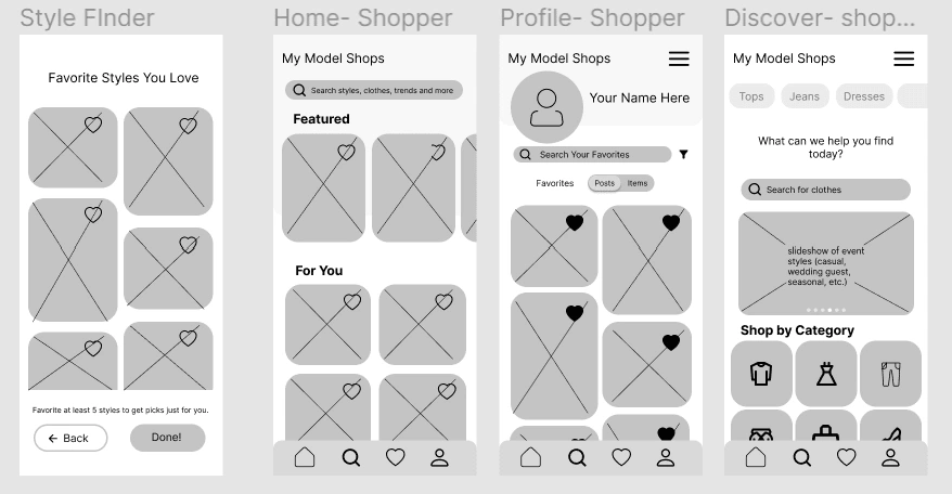
Low-fi prototype in Figma showing the app's main screens.
After iterating based on my findings from the low-fi prototype, I began designing a high-fidelity prototype also in Figma. In order to make it a cohesive experience I first created the brand guidelines and logo. The logo is shown below. I decided to make a simple, clean, black and white logo so that it wouldn't compete with users' posts or be distracting.
The high-fidelity prototype is shown below. This will be used to gather more feedback, inform potential partners and users, and to apply for funding.
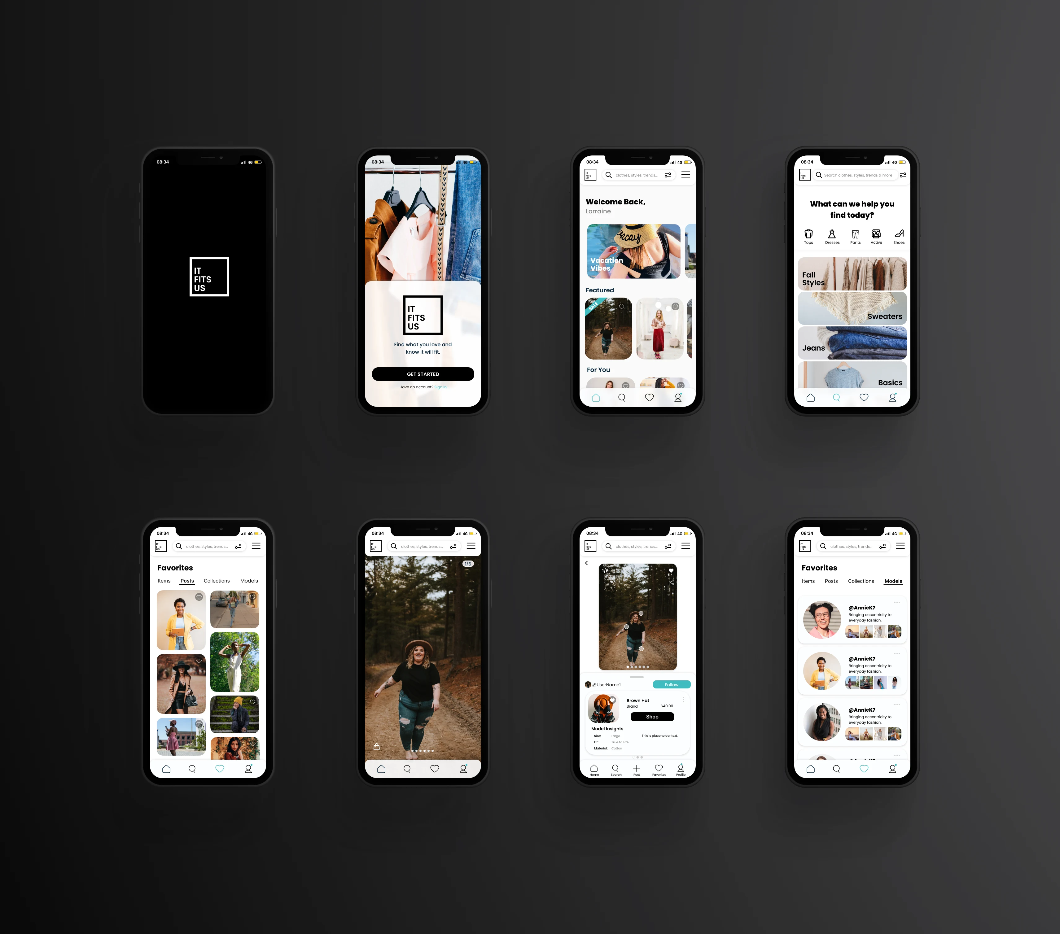
This is the high-fidelity prototype of the It Fits Us app. Pictured from top left to bottom right: start-up screen, log-in screen, home page, search page, favorite posts page, a sample post in full screen, a sample post with shopping information, and the favorite models page.
Results 🎁
It Fits Us is now in the position to conduct further user testing, or if they choose, to send the app design to a developer. The work I have done will allow the company to move forward in hopes of carrying out its mission. To see more details of this project check out my portfolio website.
Takeaways 📣
I self-taught myself Figma through this project along with using Skillshare. I learned that so many little details go into creating an app and how important they are to the user experience. Next time I would start off by creating components that would save time between iterations. I'm looking forward to designing my next app!
Like this project
Posted Jan 10, 2023
UX Design | UI Design | UX Research | Branding | Logo Design | I designed a mobile application, branding, and logo for a retail start-up company.
