Biophilic Hospital Room | Portfolio
Overview
For my senior design project, I chose to work on a passion project; the problem of the negative patient experience common at hospitals. I narrowed this problem down further to address the experience in the patient's room. The modern day hospital is cold in aesthetics, very specialized in pharmaceuticals, and not so patient friendly. Taking a human-centered design approach, I conducted interviews, prototyped solutions, held user testing, did lots of research, carried out surveys, and received feedback from my peers. All of this resulted in the design of a new inpatient room using the principles of biophilic design. This design is not only aesthetically pleasing for the patient, but the design inherently helps the patient to heal more quickly (based on a study done comparing the use of biophilic design verses without it).
The Problem
Hospitals are a stressful environment that takes a mental and physical toll on the patients who go there in hopes of getting better. This stress increases the chances of getting sick and lowers the ability of the body to heal.
The Process
For this project, I used an iterative design process called the GADIE process. GADIE stands for goals, analysis, design, implementation, and evaluation. This process is very vague and flexible, allowing me to customize it how I see fit, while still acting as a guideline. Although this website is presented linearly, each milestone I talk about (i.e. choosing a project focus, user research, prototyping, etc.) fits into the GADIE process. As you'll notice, sometimes I follow the GADIE order, and sometimes I skip steps, or go back a couple steps.
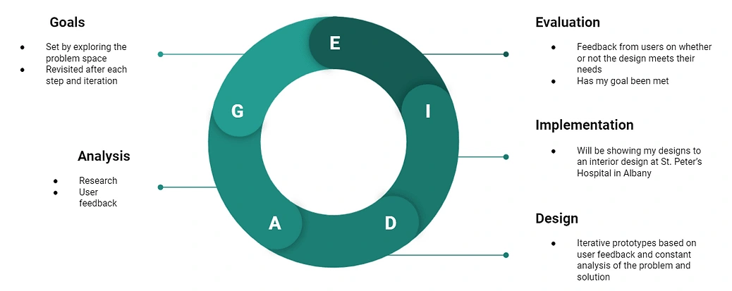
An overview of the GADIE process
Goals
Choosing a Focus
An in-class exercise to find a focus made me think about myself, my passions, skills I have or want to develop, and what I think the world needs right now. After writing all of this down I chose an topic I wanted to pursue; sustainability and the medical system. I thought about how the local community interacts with sustainability and the medical system. I came up with ideas for problems to explore on campus, in Troy (where I went to school), and on a global scale. I got a chance to talk to my class and professor about my ideas and in return I got feedback, connections, and resources to check out.

Analysis
👥 Identifying Potential Stakeholders
The next step was to identify stakeholders in the community and larger systems related to the topic of sustainability and the medical system, Some stakeholders in the community I identified included doctors, nurses, and patients. I thought about other organizations that may have an interest in the intersection of sustainability and the medical field. I thought of the Living Building Challenge, Architects, a masters program offered through my college, called Built Ecologies, as well as insurance companies, and the medical system in the US.
👀 Ethnography
Through observing nurses every month, I noticed how they always tried to decorate and make the room feel more comfortable. They tended to complain about the color of the wall or the print on the curtains. Most of all they complained about how little room the caregivers of the patient had. Not only did that make a bad experience for the guests, but for the nurses, as well, since they had to squeeze into tight spaces to get near the patient. The lack of privacy also bothered them since this particular room was laid out so the patients faced one another.
💻 Online Research
After deciding to pursue a project I am passionate about, I went to the internet to see just how big this problem was. I found people all over the world were trying to come up with solutions. A handful of hospitals have been implementing different methods to improve the patient experience. Some methods included using technology to engage with patients, others included creating more privacy and comfort for the patient, and some focused on implementing complementary forms of medicine, like acupuncture.
I also looked to other industries that are focused on user experience in a space, like hotels and spas. I honed in on aspects that would be beneficial to patients, like creating a relaxing atmosphere through various design techniques. A prominent technique that I saw over and over again throughout my research in the highest rated spas and hotels was biophilic design.
Design
Mood Board
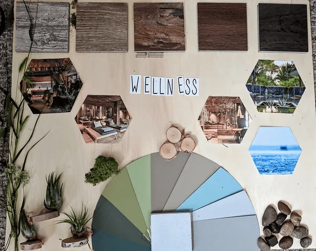
I started making a mood board to communicate the direction of my designs. I used it as a tool to get feedback quickly before moving forward with a room design. On the mood board, I incorporated a color palette inspired by nature: the dark green inspired by plants and mosses, the blue from the sky and water, the tan from wood and dirt, and finally, the gray inspired by rocks. The mood board also includes possibilities for the floor in a variety of wood stains. The decision to include wood rather than tile on the mood board was to try and incorporate natural elements wherever possible.
Prototype 1
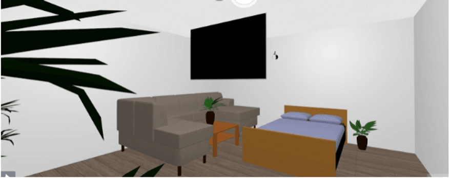
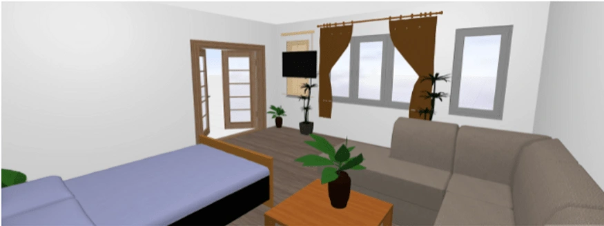
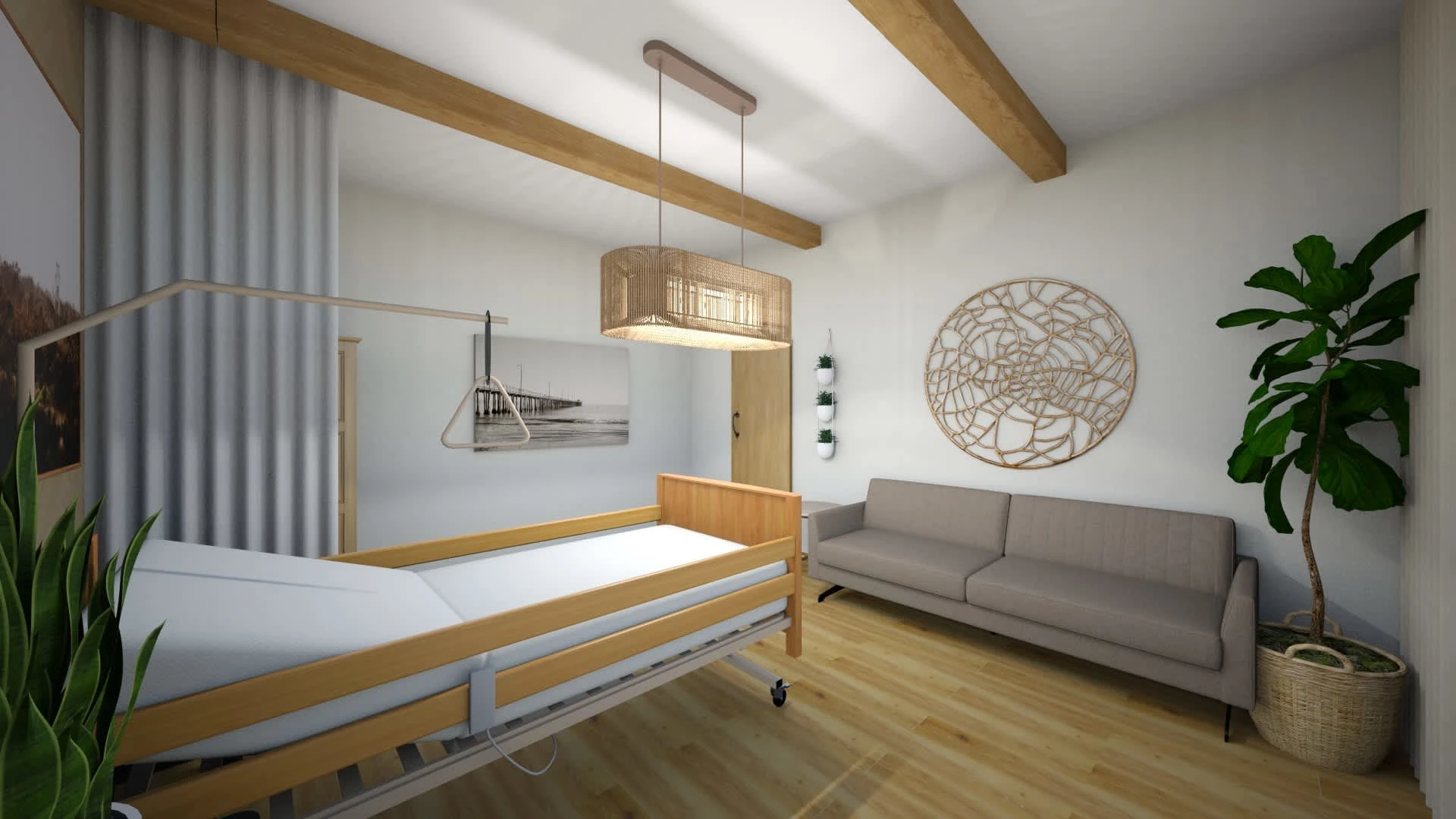
Keeping in mind my progress thus far, I moved on to create a prototype of my ideas using a free app I found online called Planner 5D. I found a lot of restrictions with this software since it did not have any medical furniture or machines that I could incorporate into my design. However, it was a good starting point for getting my ideas out there and getting feedback.
After looking back at this iteration of the design, I realized I had only made small changes compared to the hospital rooms I had been in. From the research I have done, I knew I could do better and incorporate more biophilic design to improve the patient experience. While creating this iteration I was also creating a room on another free software that has an app for users to see their creation in virtual reality. I thought VR would be a great way to test out my design and really immerse people in it. This software was also very limiting due to the lack of medical equipment and plants I wanted to incorporate.
Prototype 2
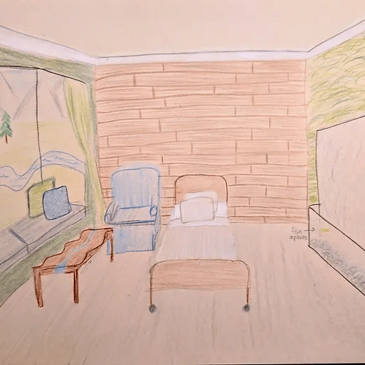
The feedback on these prototypes were similar to my own assessment; the designs looked like bedrooms. I took to paper and pencil to be able to better communicate my designs without the limits of the accessories software has to offer. Two views of my sketched-out designs are shown to the left and below. Yes I know I'm not an artist, but I use sketching as a tool to communicate my ideas and in that aspect, this sketch was successful.
Evaluation
User Testing
User testing happened iteratively throughout my design process. I would give users an open-ended question about how to improve hospitals and then share with them my thinking and progress I had made on designs. With their feedback I would then iterate my designs like I did when I got feedback from classmates, nurses, doctors, and others.
I also used my in-class presentations as a way to get some user feedback. During the presentation, I played nature sounds and diffused lavender essential oils. I also dimmed the lights so they were not so harsh. I feared this would make my classmates sleepy but the feedback contradicted this. Many classmates said it made them more focused on my presentation and they were disturbed when the sounds were shut off. They hadn’t realized how soothing it was until it was shut off. I took this as a good sign that everyone preferred the sounds, lighting, and aromatherapy, and did not want them to end.
The Final Prototype
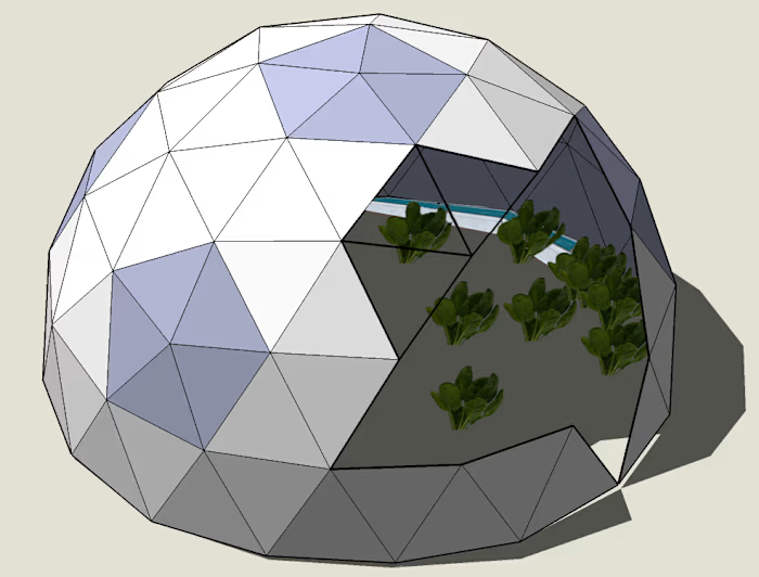
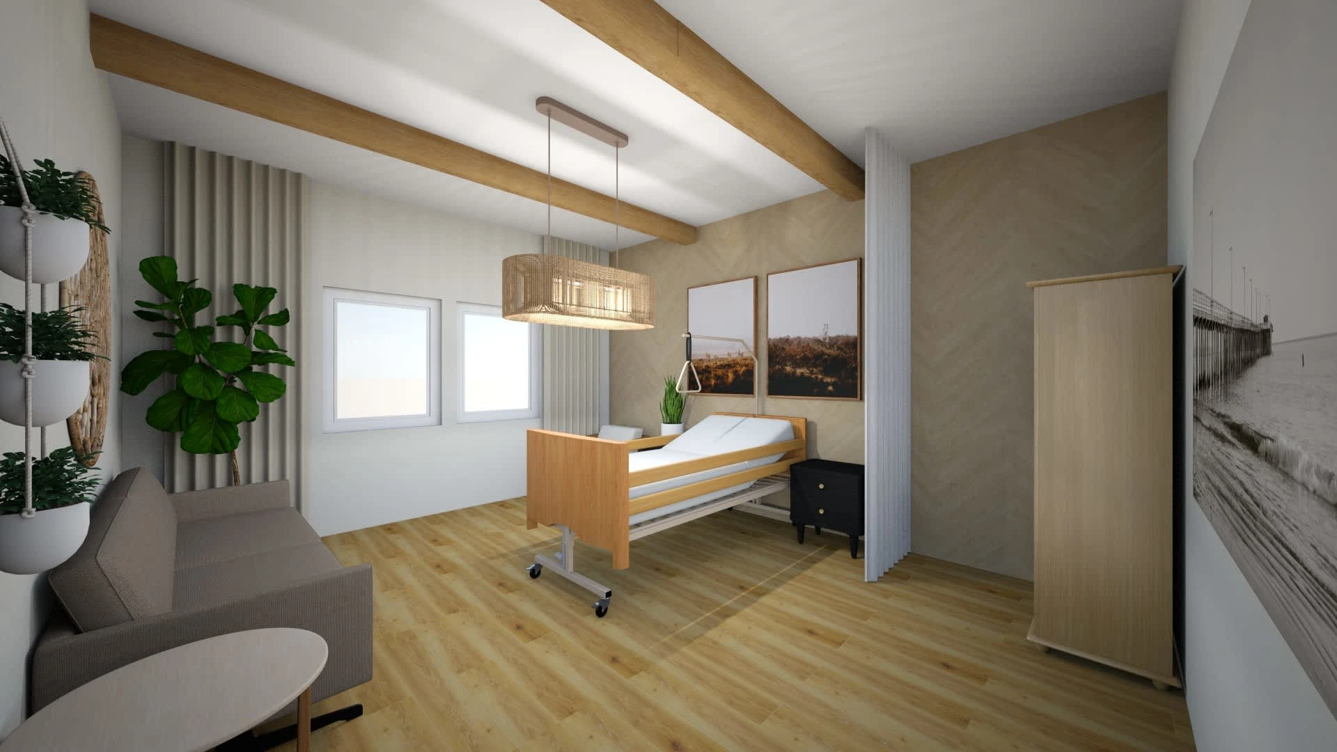
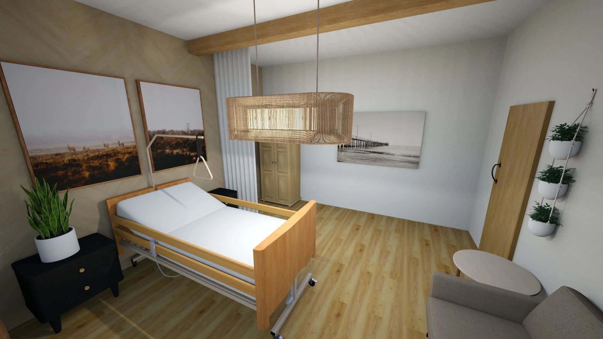
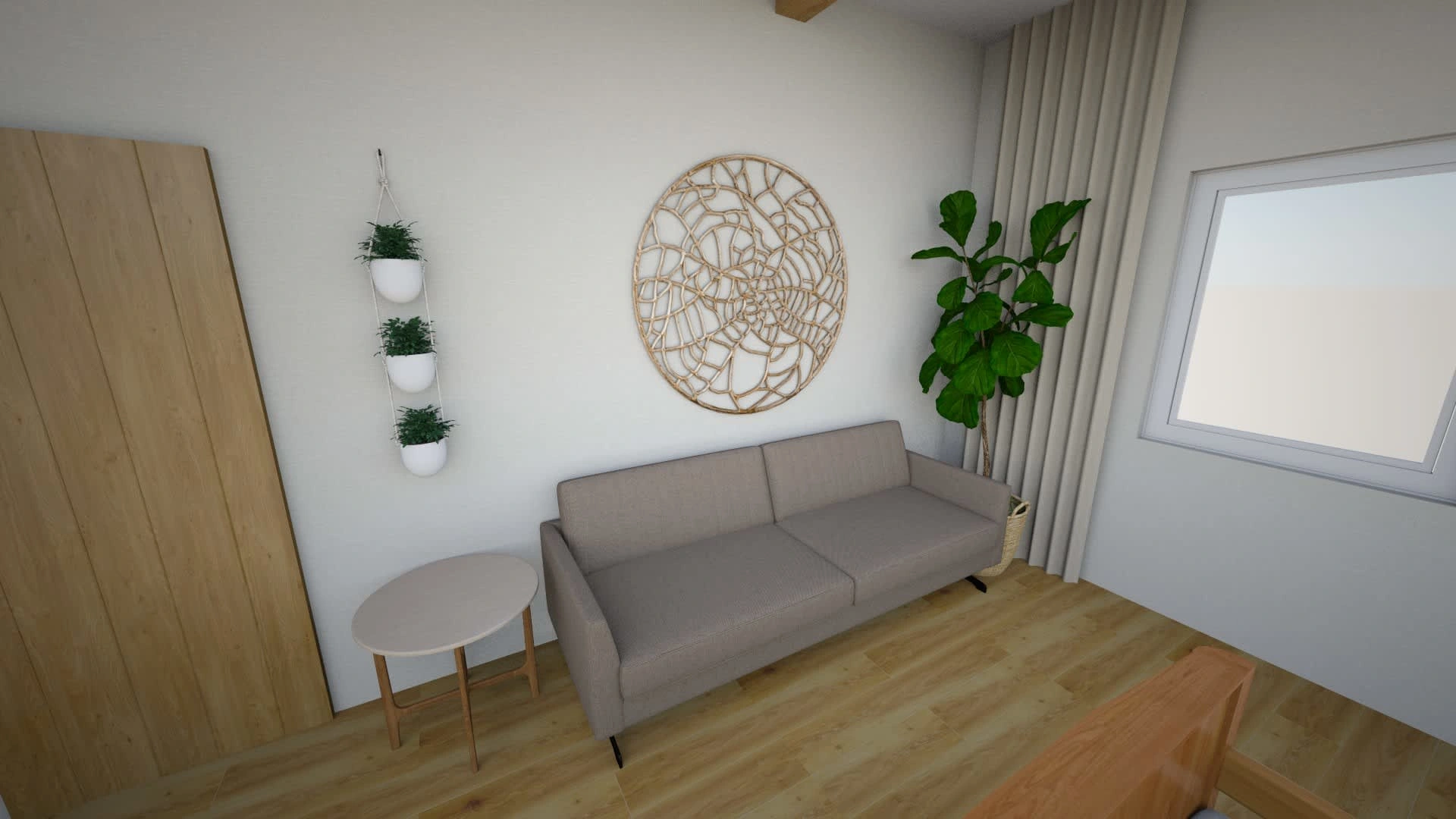
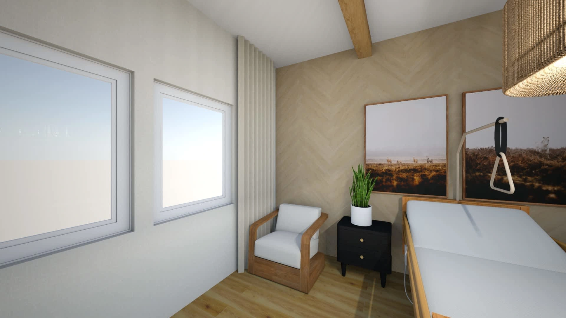
For my final prototype I designed a one-bed hospital room using biophilic design to make a better patient experience and to promote healing. I used SketchUp which allowed me to design this quickly before my deadline due to their library of pre-modeled features. Below lists the features of the room with detailed images below.
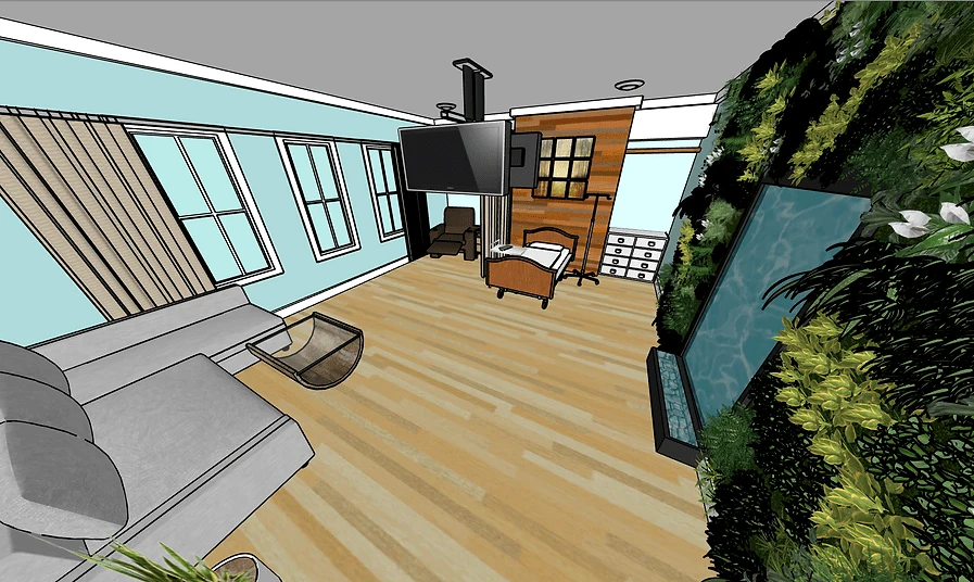
Room Features:
private room
pull-out couch for visitors
recliner with cupholders
2 televisions (for guest and patient)
tray table
night stand
dresser
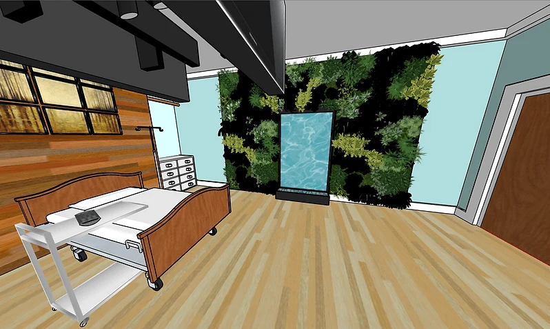
Biophilic Features:
living wall (plants)
water wall feature
wooden wall to bring in natural materials
essential oil diffuser
sound system with nature sounds (or music)
circadian lighting
views of nature or nature photography/art
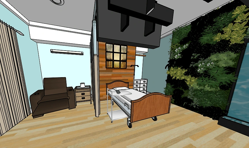
Services:
health concierge for any questions
room service for food
option for mini-fridge and microwave for food from guests
access to gym and Physical Therapist
Results
The final hospital room takes elements I have learned about through research and speaking with stakeholders, as well as user feedback, to create a room that allows for a better patient experience. The room is designed for adult use and the principles used in its design can be applied to hospitals and rehab centers throughout the country. I have designed this room using biophilia and human-centered design. Had I had enough time to do more user testing, I would compare my design to a standard hospital room through immersing users in both experiences.
To see the full process visit the link below:
Like this project
Posted Oct 12, 2021
Physical User Experience Design | I designed a biophilic hospital room as a way to help patients heal and create a better patient experience.
Likes
1
Views
62
