Movie Ticketing App
🖼️ Overview
As part of Google's UX Design Certificate Program on Coursera, I'm designing a movie ticketing app. I'm going from post-its to product and everything in between. This is a work in progress.
🔎 The Problem
Users need a better way to plan going to the movies with a group because ordering tickets through one person means not everyone gets rewards, while ordering tickets separately means users don't always get to sit with their friends.
✨ The Solution
An app that allows users to easily plan group trips to the movies which will affect busy people who value rewards by making buying group tickets more collaborative while allowing groups a better chance to sit together. I will measure effectiveness by tracking group ticket purchases and surveying users.
🎨 My Roles and Responsibilities
This is an individual project and I am the Lead UX/UI Designer and User Researcher. My responsibilities include:
User Research
Wireframing
Prototyping
User Testing
Creating User Journey Maps
Creating Personas
👤 Understanding the User
After receiving the project prompt, identifying and speaking to users was the first step in my research. For the purpose of this project we were given fictitious biographies of people to choose from to be our users. After choosing users, I determined my research goals and used them to create interview questions. For this activity I put myself in the shoes of the users assigned to me to answer the interview questions how they might. Using those interviews, I analyzed my findings to determine pain points and user groups in order to create two personas.
User Paint Points
Coordinating Schedules
Users struggle to coordinate their busy schedules with their friends. Their plans end up being last minute and they don’t always get to sit together.
One person has all the digital tickets
If someone is running late, the person who purchases the digital ticket has to come out of the movie. If that person’s phone dies, no one can get in.
Visual Impairment
Users with visual impairments aren’t able to successfully use the app. It needs to be compatible with a screen reader and follow accessibility guidelines.
Rewards for only one person
When one person buys the tickets for a group, only they get the points or rewards. This encourages users to buy their own ticket which may lead to users not sitting with their group.
Persona and Problem Statement
Using the persona below, as well as prior user research, I was able to come to the following problem statement: Dan is a hard-working college student who needs a better way to plan to go to the movies with a group because ordering tickets through one person means not everyone gets rewards while ordering tickets separately means he doesn't always get to sit with his group.
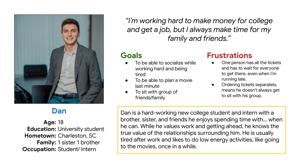
One of the personas used for the Movie Ticketing App
User Journey Map
The user journey map shows the steps the user must take to complete the task of ordering movie tickets for a group. Mapping out this process has allowed me to identify opportunities for improvement in the app I am designing. It also gives an opportunity to really empathize with the user by thinking about the emotions they may be experiencing every step of the way.
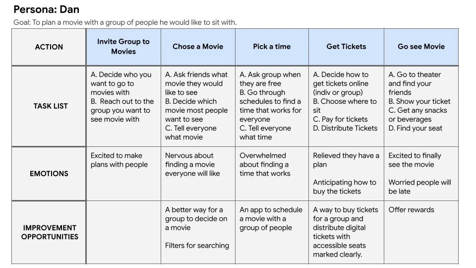
A user journey map for one of the personas.
📲 User Flow
Based on the User Journey Map, I created a user flow that went through the actions of placing a group movie ticket order on the mobile app. By visually seeing all of the steps mapped out, I am better able to understand what needs to be included in the app.
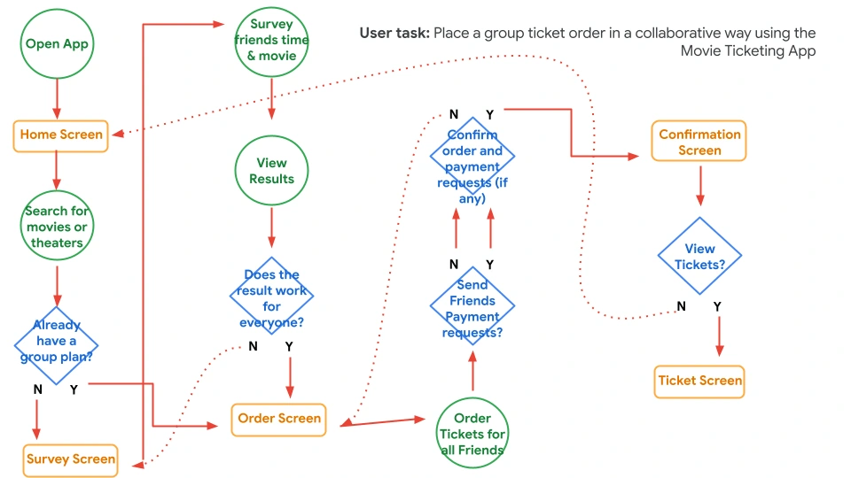
User Flow Diagram
📖 Storyboard
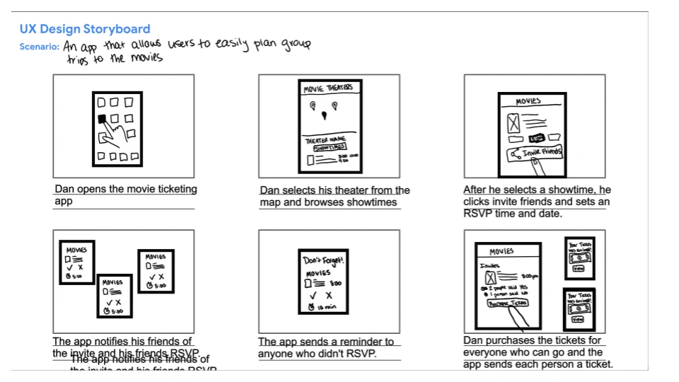
The next step was to create two storyboards, one that shows the big picture, and one that is close-up. The big picture storyboard demonstrates how the app will be used in the world. The close-up storyboard demonstrates how the app functions to solve the user's problem.
Big Picture Storyboard
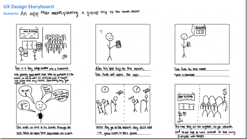
Close-Up Storyboard
✏️ Paper Wireframes
1 - Information Architecture
Before creating the wireframes, I figured out what pages I needed and what needed to be on each page to successfully meet the needs of the users. This was based on research, user interviews, the user journey map, and user flow.
2 - Wireframing Sprint
I ended up deciding I needed 4 main pages. For each main page, I set a 1-minute timer and created one variation of the page. I repeated this 5 times so I ended up with 5 variations of each page. Each time I included the components I deemed necessary when determining the information architecture.
3 - Analysis and Putting it All Together
I looked over each variation and starred any components that should be included in the next iteration. I created one more wireframe for each main page that included all the components I marked. The final paper wireframe for each main page can be seen below.
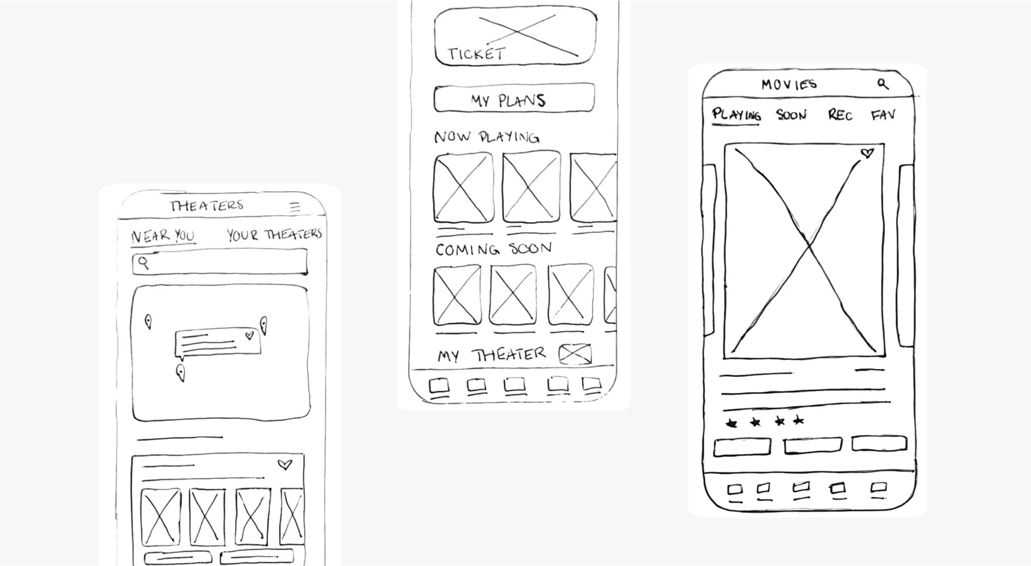
Examples of the paper wireframes I chose to move forward with.
📱 Digital Wireframes
The Main User Flow
I created digital wireframes of the main user flow. I determined this was placing a group ticket order based on my problem statement. The digital wireframes are shown below.
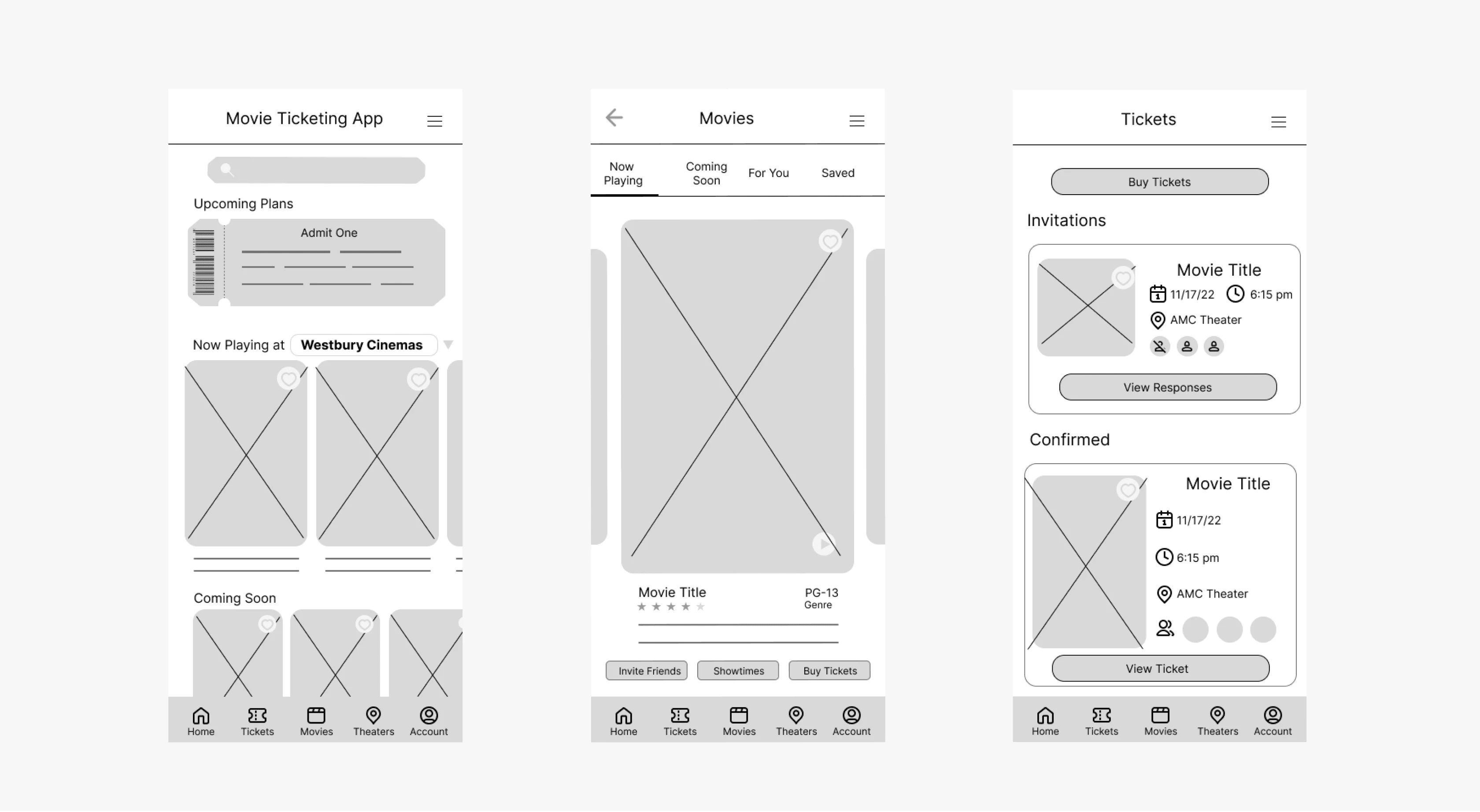
Examples of Digital Wireframes made in Figma.
🤳Low Fidelity Prototype
After creating the digital wireframes for the main user flow, I wired up a prototype for the user to be able to click through the actions. This will come in handy with user testing and gathering more specific information to improve the design of the app.
➡️ Next Steps
This app is a work in progress. I am currently working on planning a usability study. After the study, I will iterate on my design and create a high-fidelity prototype.
Like this project
Posted Aug 8, 2023
UX/UI Design | User Research | I'm in the process of a designing a movie ticketing app that addresses pain points of planning group trips to the movies.
Likes
1
Views
56
