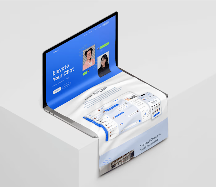
☺︎ Visit my website ☺︎
Overview
The project was designed to have a professional portfolio in which my clients and companies can view all of my works. Here, I'll give you a little explanation on what I've done to develop my portfolio. So, I invited you to visit it.
💥Have fun, the little faun will keep you company💥
Click here to visit it👇🏻
Responsive Design
It is flexible and adapts to any device, whether it's a big desktop screen, a tablet, or a tiny smartphone.
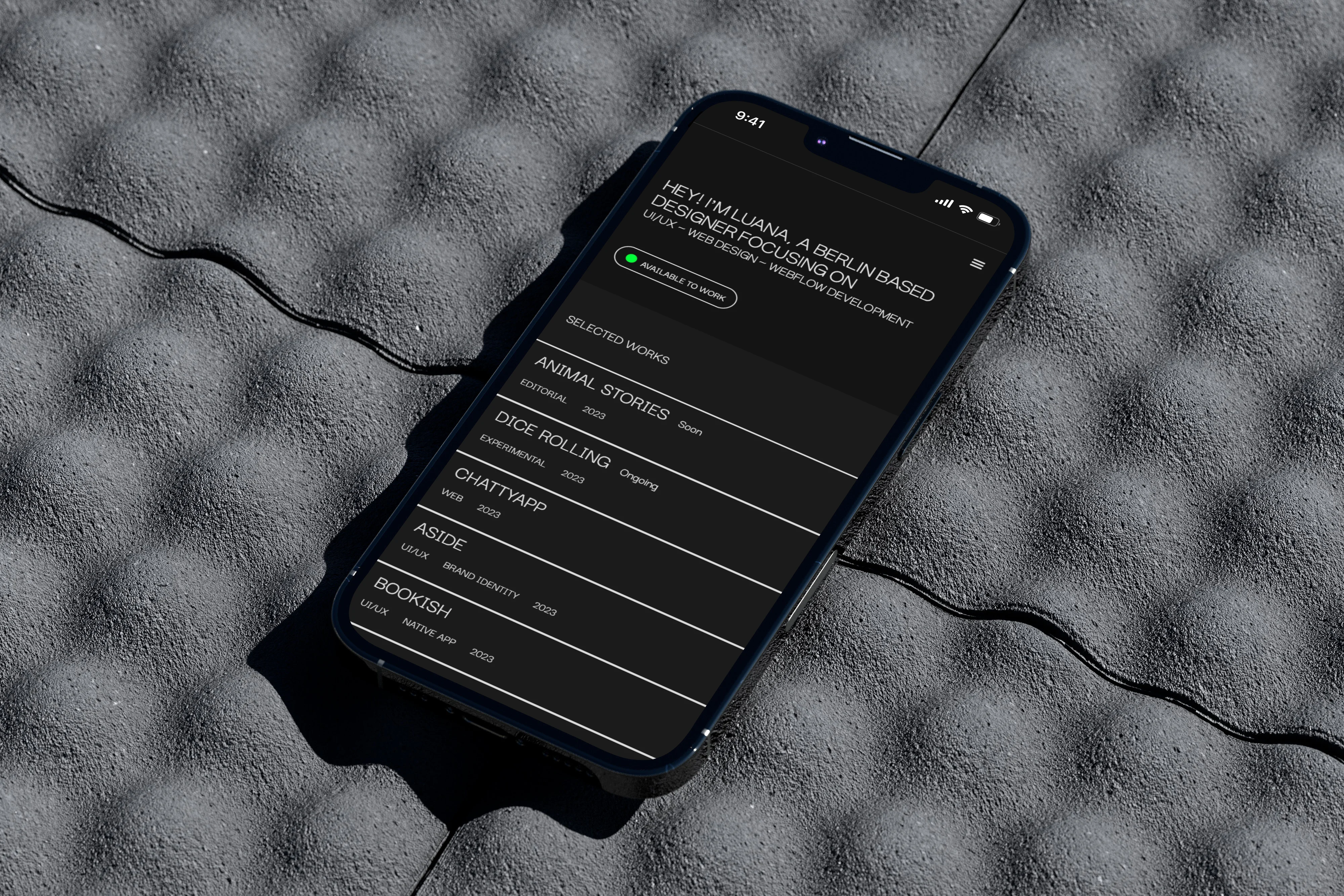
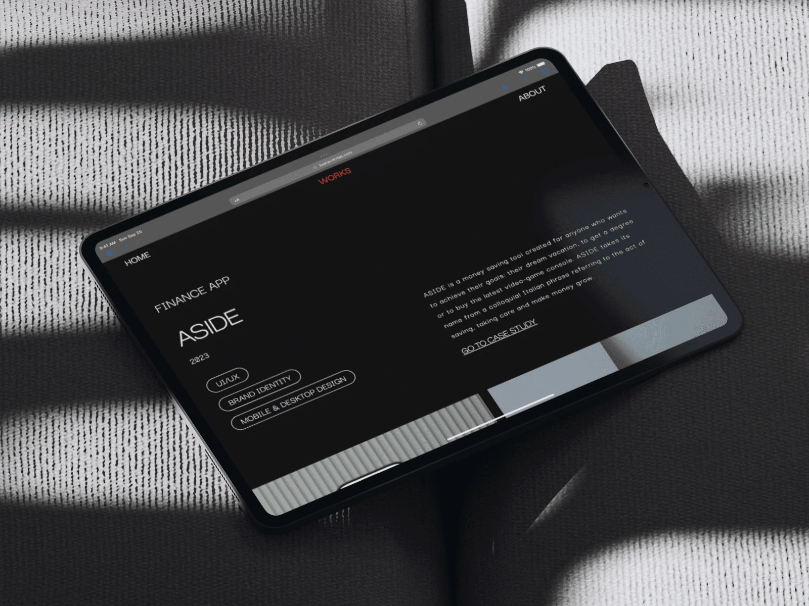
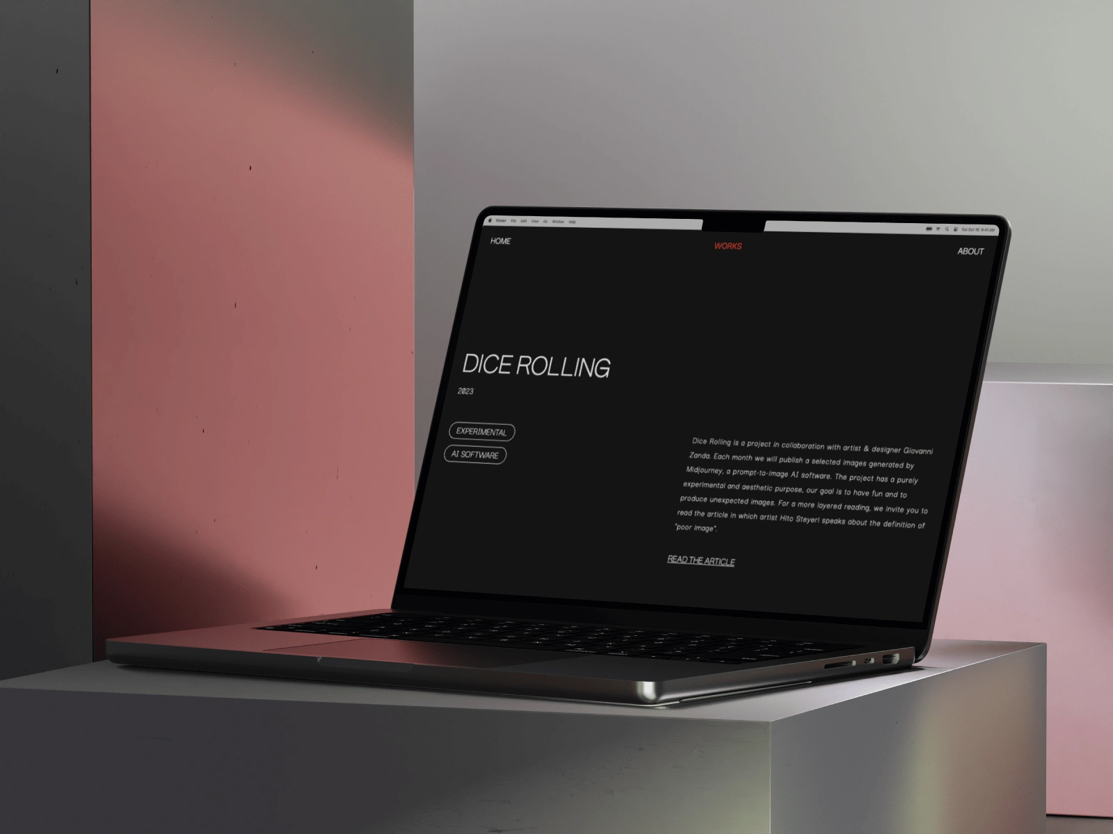
Home Page
For my portfolio I opted for a minimalistic website that was characterised by its simplicity, cleanliness, focused on typography and grid-based layouts. At the same time, I was looking for a small detail that would make a website attractive and break up the structure of it in order to make it more playful and fun.
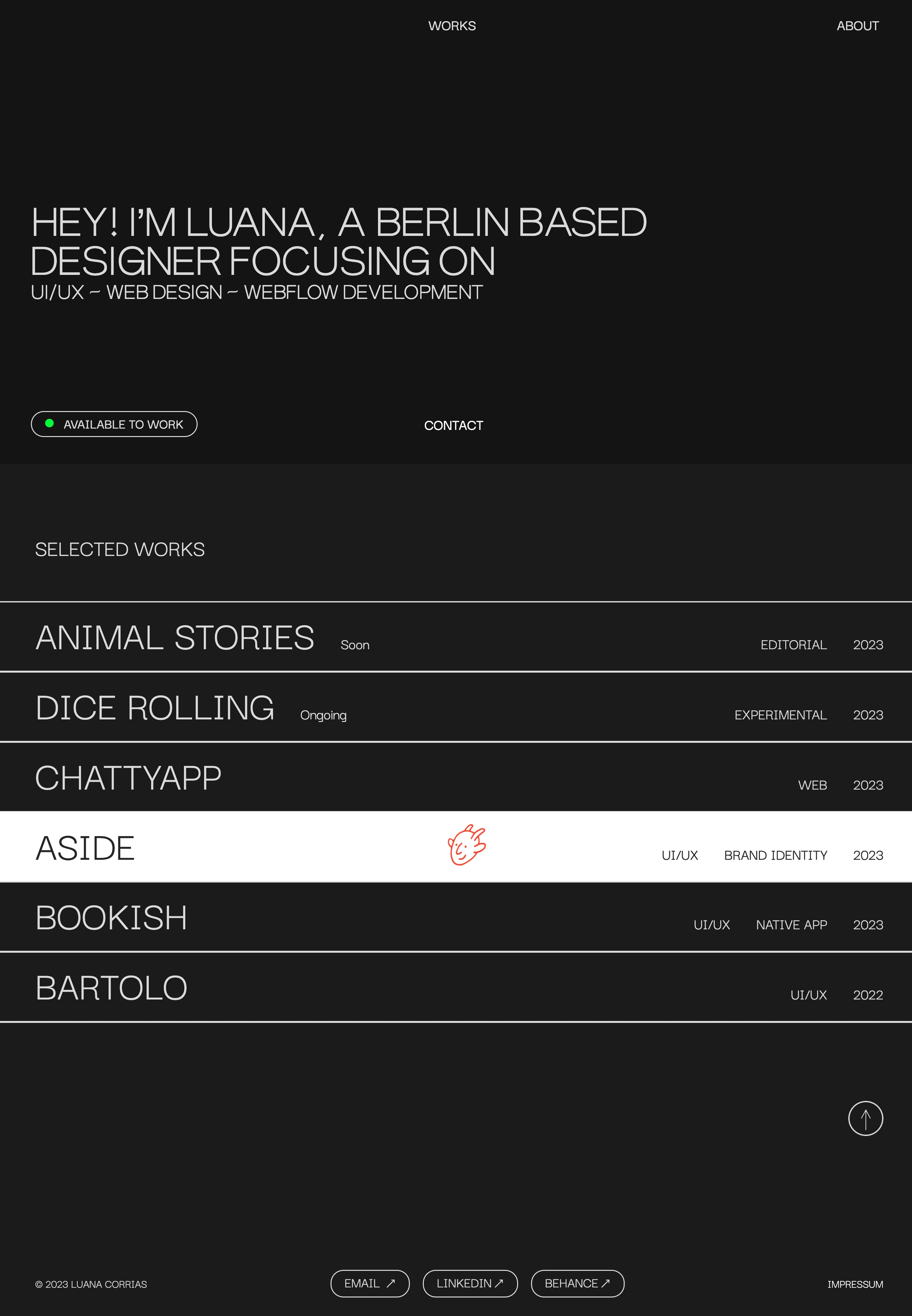
From Figma to Webflow
[Website Design + Webflow Development]
Design Phase: the project started on Figma, creating the visual elements of the website, including the buttons, color scheme, typography, graphics, imagery, and overall aesthetic.
Development Phase: The project was translated from Figma to Webflow. I also took care of the technical aspects, the custom interactions and the responsiveness design. At this stage was fundamental making sure everything works smoothly and optimise my SEO settings.
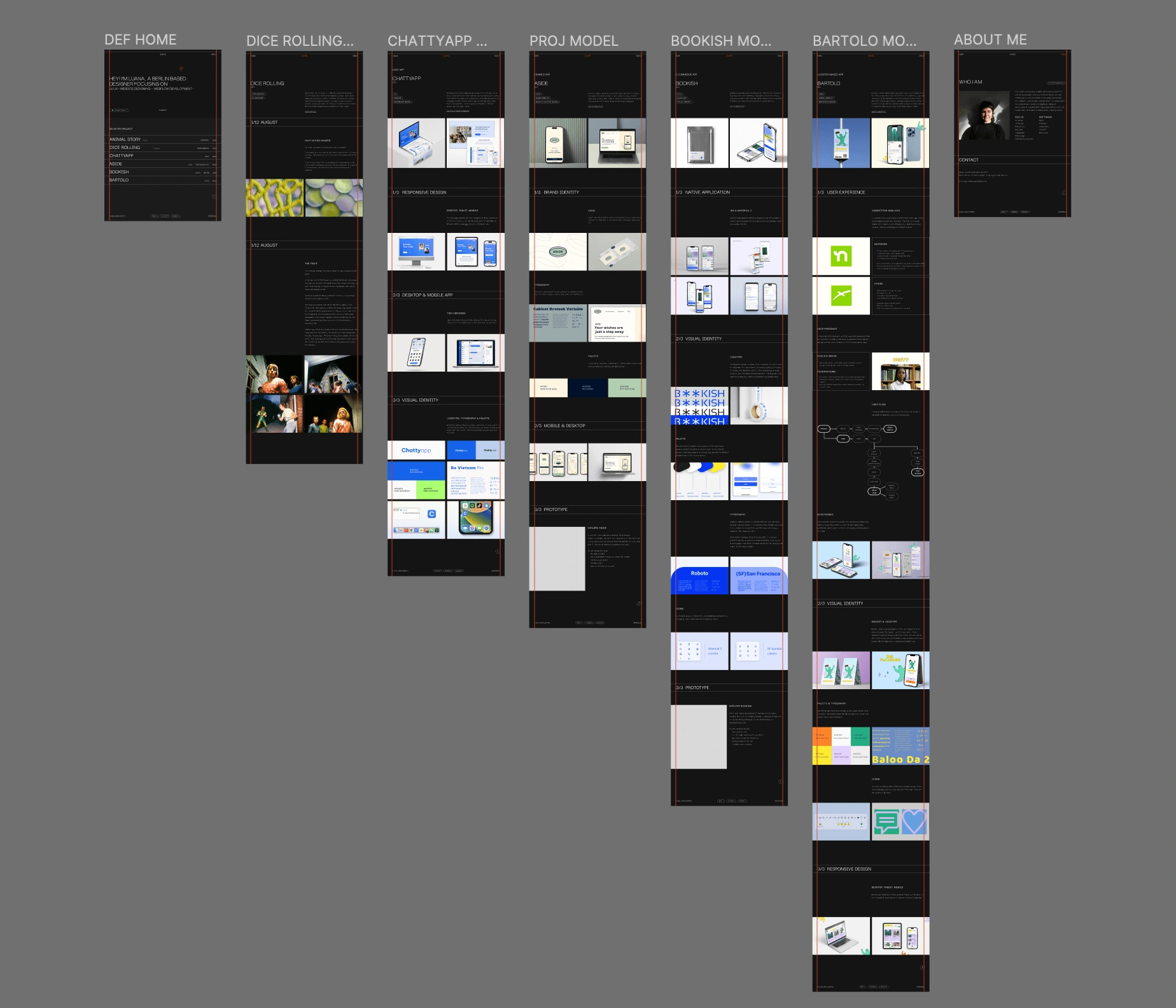
Pages view on Figma
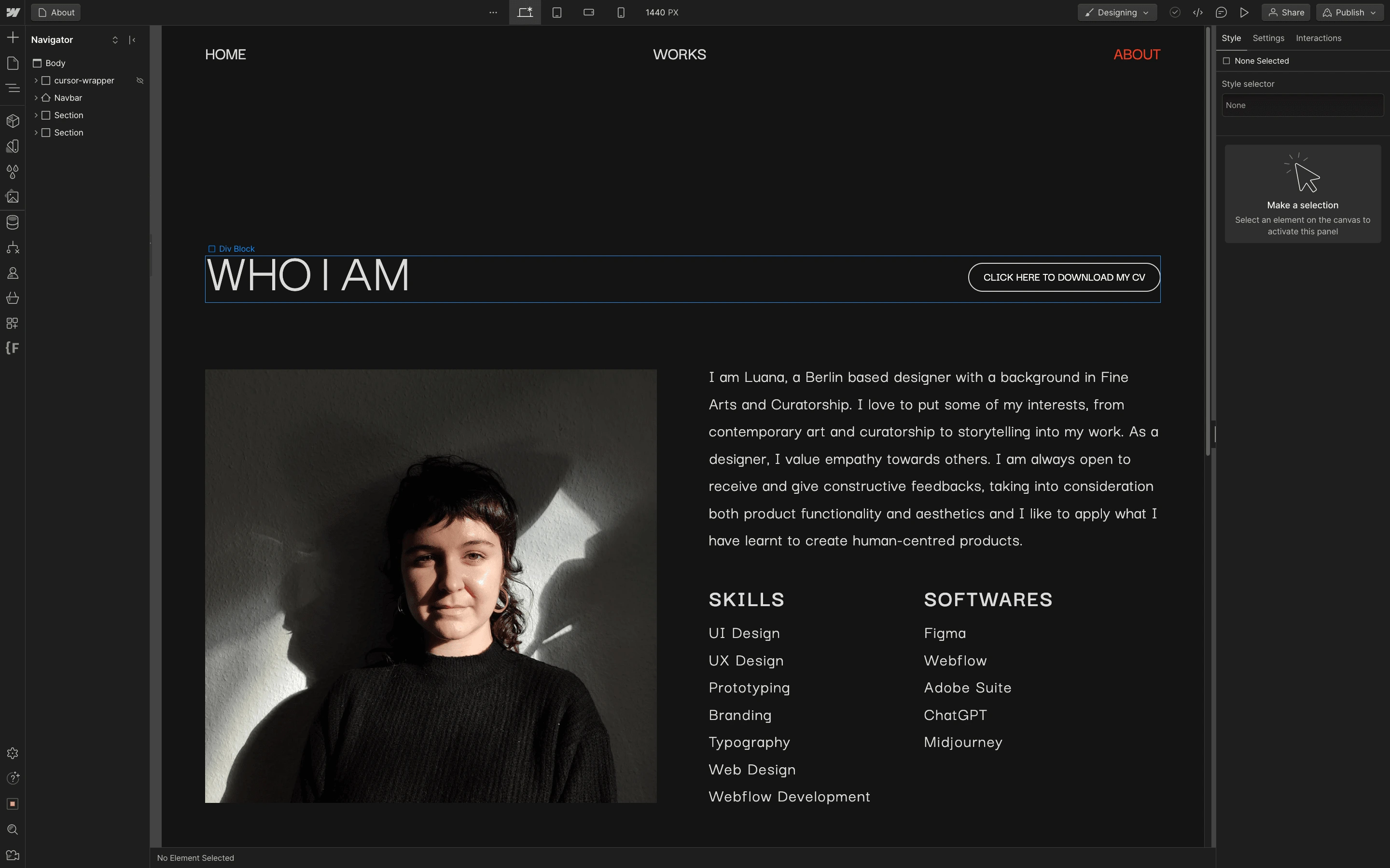
About page view on Webflow
Personalisation
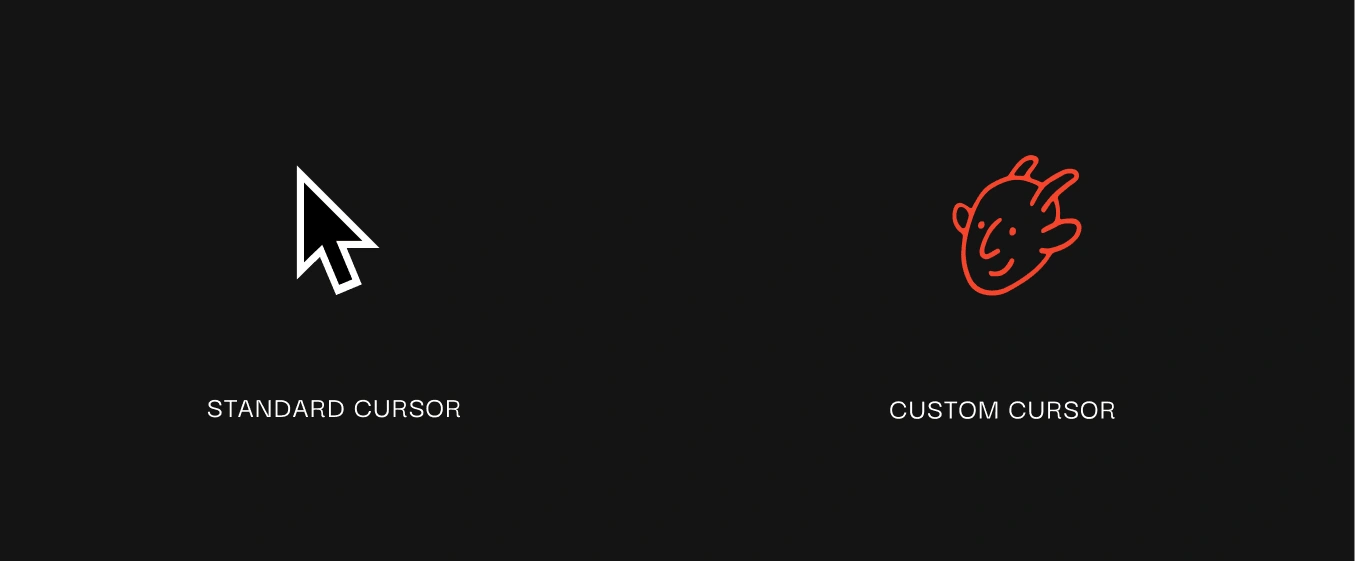
Custom cursor: the custom cursor transforms my portfolio into a playful website, making it more memorable and engaging. It's like an invitation to explore and enjoy the experience with the company of the little faun. It's not just a pointer. It's a companion with whom you can navigate through the pages and discover my projects. It adds a touch of humor and it breaks the rigid structure of the website.
Micro interaction: to offer an immediate visual feedback to users I added some micro interactions to the elements (Hover and Click state). These little touches are like a guide for the users and they contribute to make the website more interactive, user-friendly and visually engaging.
Smooth scrolling: I wanted to give to my website navigation a fluid, gradual movement and a sense of continuity. To make it more pleasing and user-centric, I embedded a smooth scrolling.
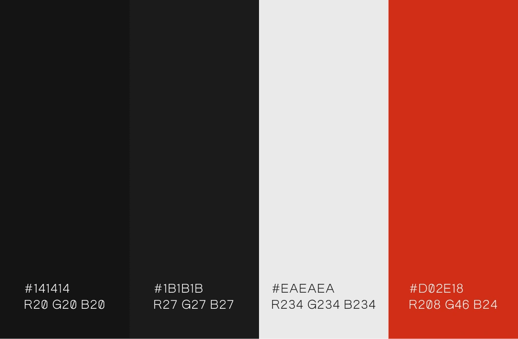
Color Palette
Black, white and red. I chose a limited colour palette, with an accent of red to create a high contrast between text and background. This simplicity helps me to draw the user's attention to the content and not distract them with other decorative elements.
TYPOGRAPHY
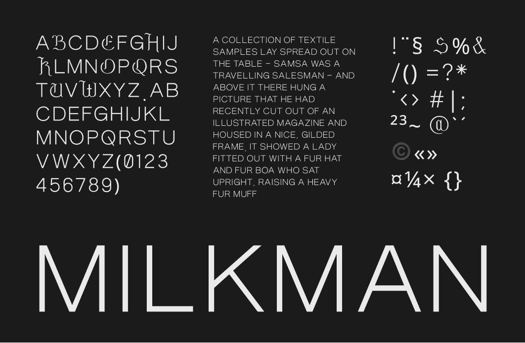
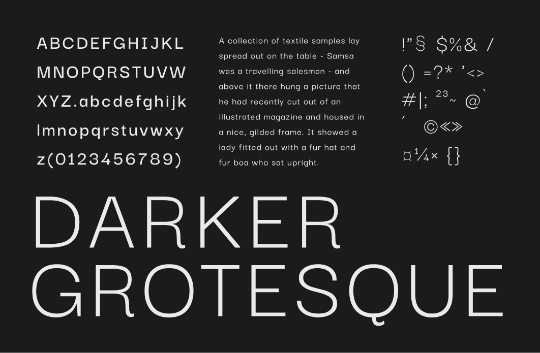
Two san serif typefaces. The design is minimalistic, with clean and direct letterforms. They convey a sense of strength, confidence, and directness.
Milkman, designed by Giulia Boggio.
Darker Grotesque, designed by Gabriel Lam & ViệtAnh Nguyễn.
Thank you for reading ☺︎

Like this project
Posted Oct 20, 2023
Website deisgn + Webflow development
Likes
0
Views
37
