Prancing Cow Brand Identity Development
Isabel Sophia Duncan
A small, independent farm trying to create hype around the quality of their dairy products faces an uphill battle. In a crowded market where most consumers buy milk interchangeably, standing out is crucial.
Their branding needed to immediately grab attention, communicate their values, and signal premium quality— all while avoiding the clichés that many small farms fall into.
Branding isn’t just about looking good—it builds trust, recognition, and loyalty. In a world of industrial dairy giants, a strong brand identity helps small farms compete on more than just price.
What We Needed to Solve:
Communicate regenerative farming values without feeling cliché.
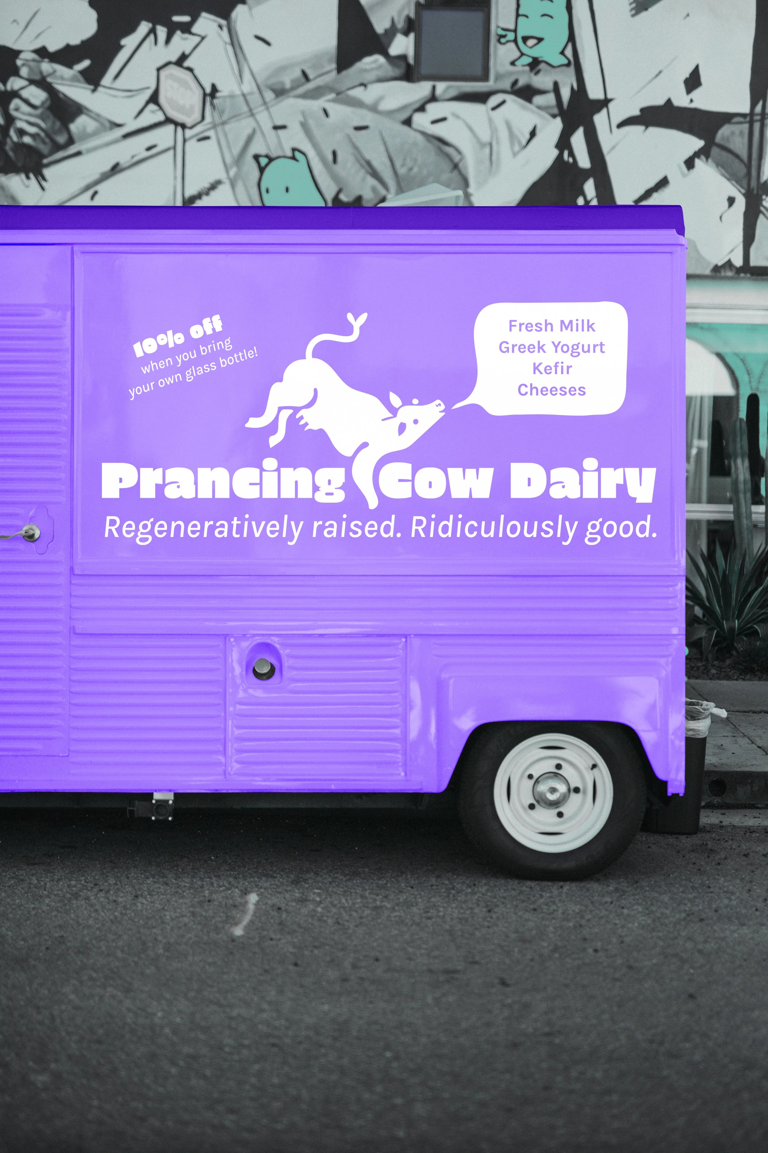
Develop a memorable & flexible identity that works across all platforms—from milk cartons to signage to social media.
Brand Strategy
We built a brand that is bright, bold, and full of personality—without sacrificing trust or quality perception. Supermarket dairy brands often feel generic, clinical, or overly traditional, so we infused Prancing Cow with bold joy and confidence.
From visuals to brand voice, every element positions them as a spirited, premium brand that proudly showcases their commitment to regenerative farming and happy, healthy cows.
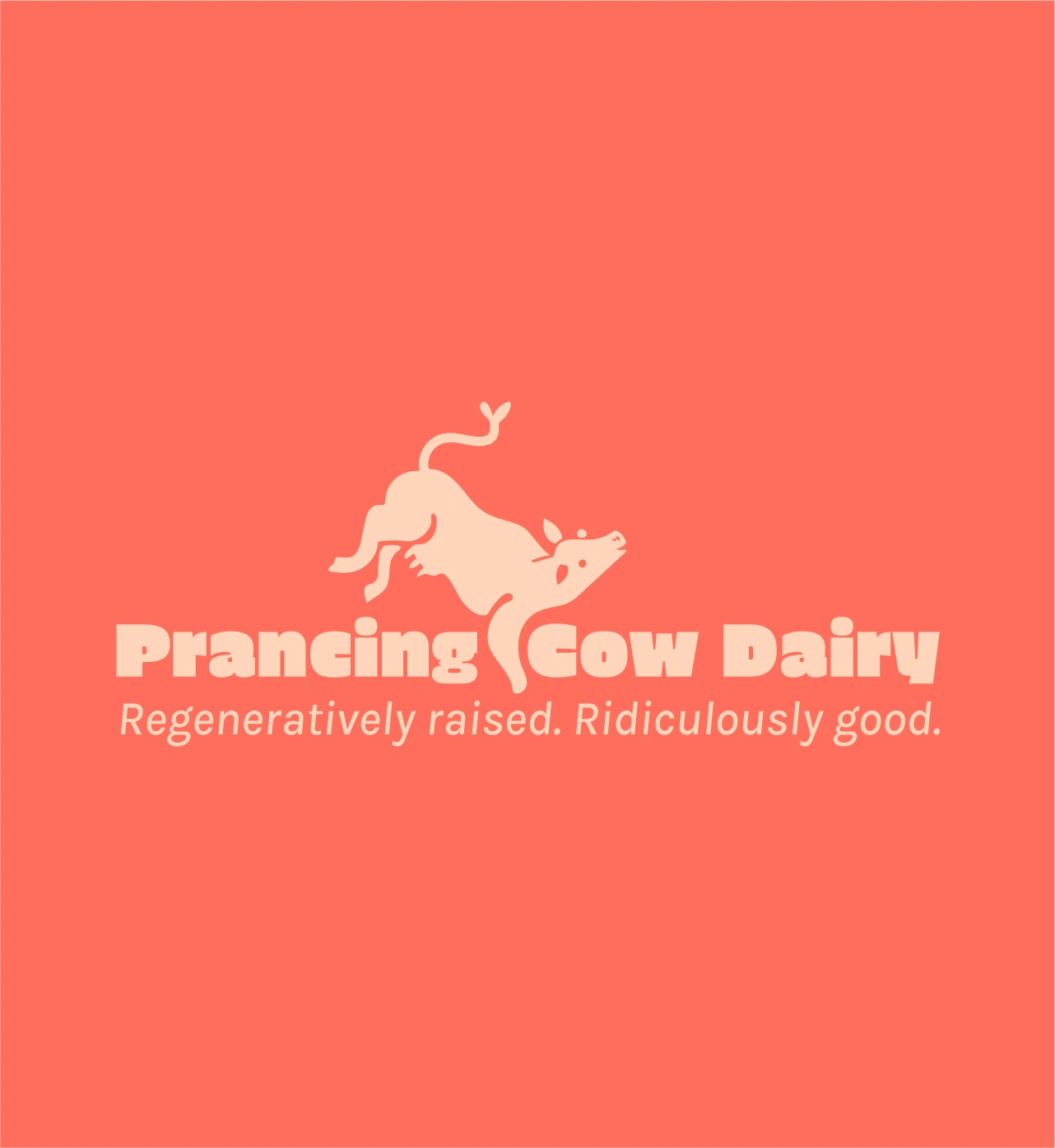
Logo Concept
The logo had to balance playfulness with clarity, ensuring it remained recognizable and legible at any size.
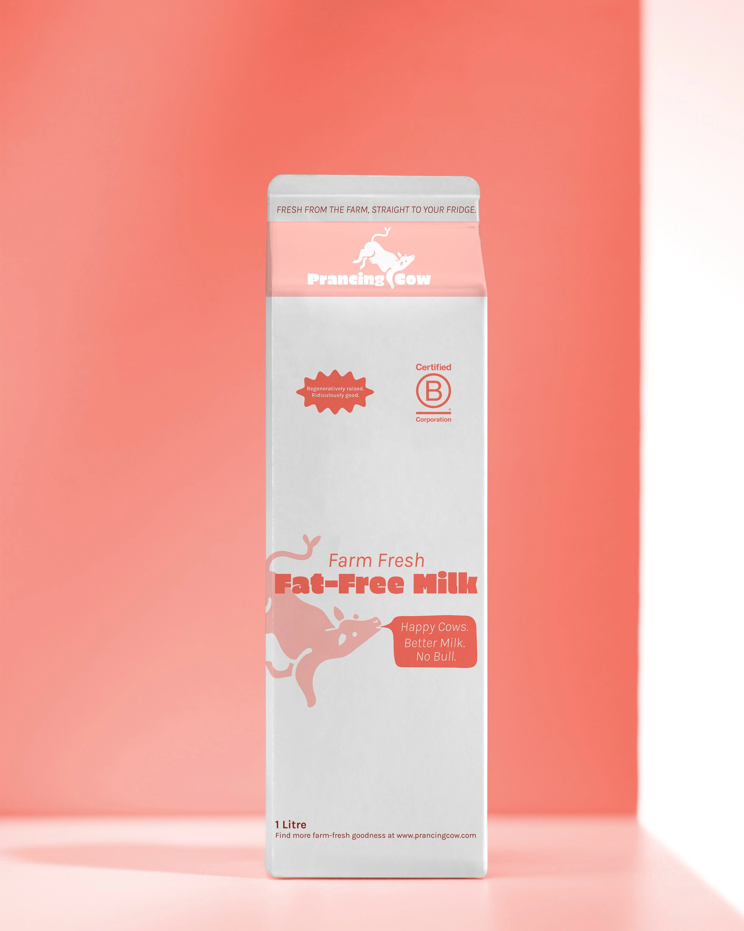
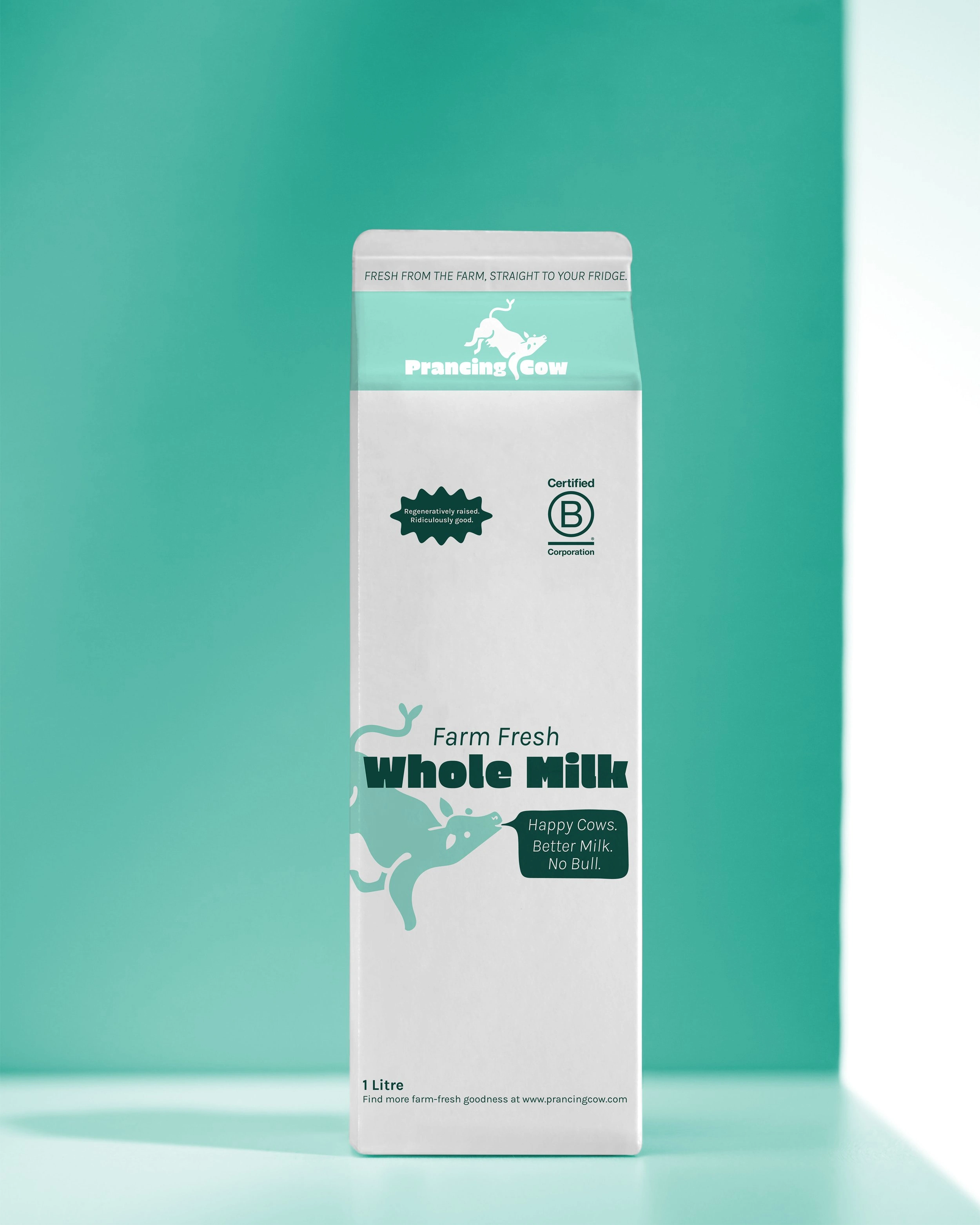
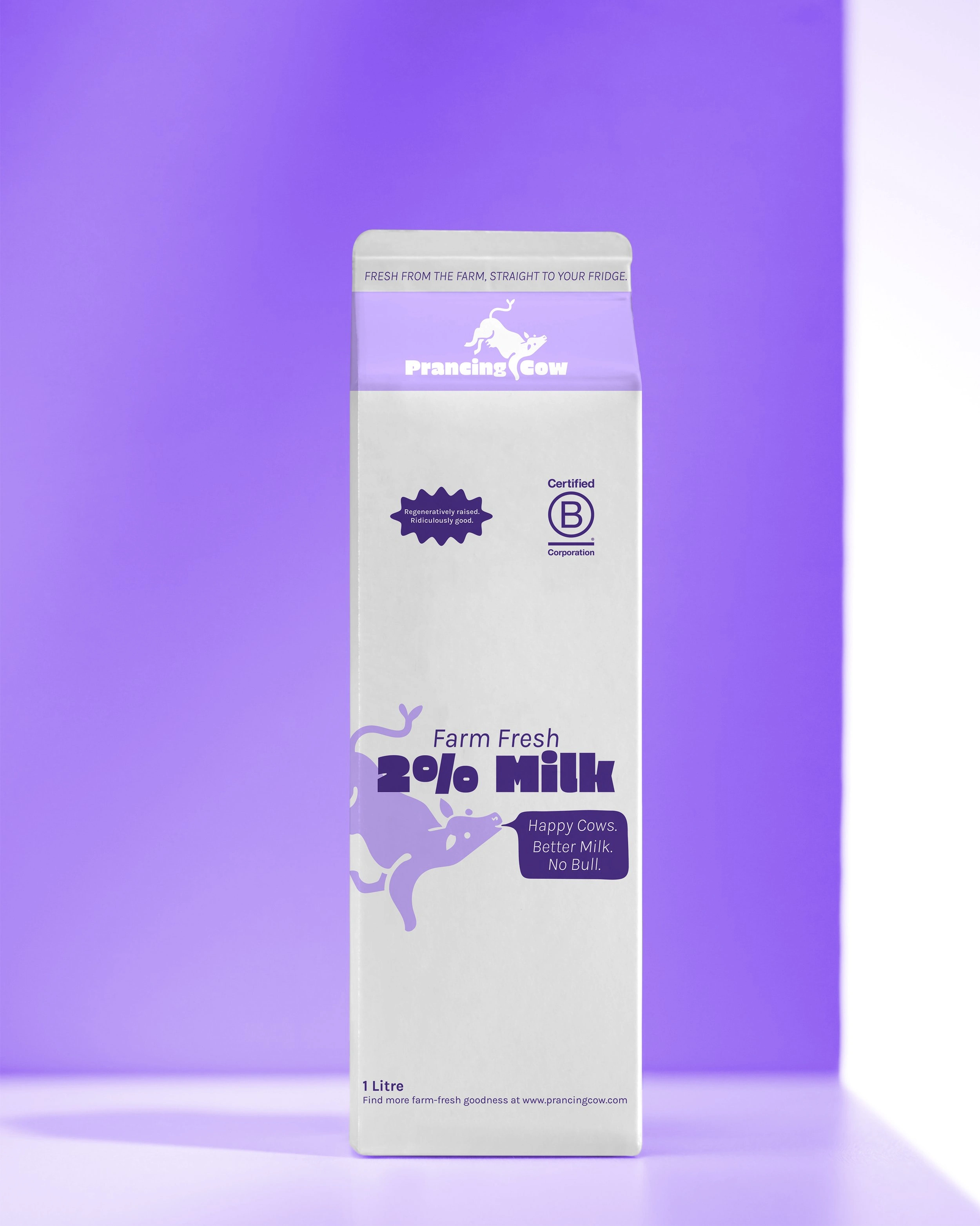
The prancing cow captures the movement & joy of a well-cared-for animal, reinforcing their animal welfare commitment.
Expressive negative space and bold shapes make the logo readable at both large and small sizes.
A head-only variation functions as a favicon and small-scale brand mark, ensuring strong visibility in all formats.
Colour & Typography
Prancing Cow’s color palette breaks away from traditional dairy branding. Instead of expected blue and white hues, we crafted a six-color system.
Primary Brand Colors: Each color pairs with a secondary shade, ensuring legibility & vibrancy.
Typography: The bold, playful Erica One font gives the brand an unmistakable voice, while Karla ensures clean readability across print and digital applications.
Guidelines for Flexibility: A structured brand guidelines system directs how colors and typography are used for maximum impact & consistency.
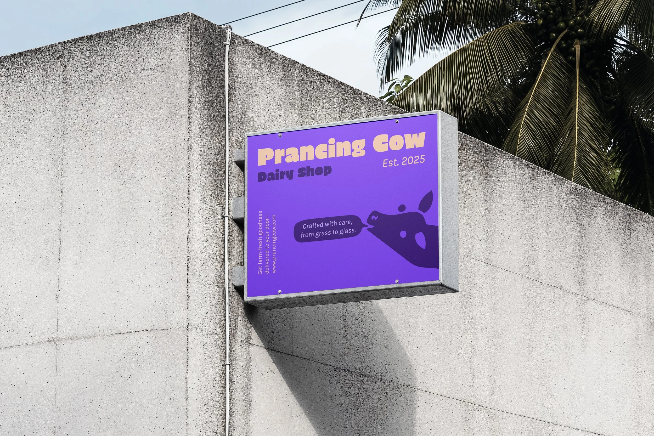
The brand in action
Prancing Cow’s new identity transforms a small, local dairy into a confident, standout brand.
This brand is about more than just milk—it’s about trust, impact, and personality. With a strategy built around bold joy, quality, and sustainable values, Prancing Cow now has a brand presence that:
Instantly grabs attention & builds recognition.
Reinforces their commitment to regenerative farming & happy cows.
Creates consistency across every touchpoint—from cartons to shop signs to social media.
Because a strong brand doesn’t just look good—it makes people remember you.
Like this project
Posted Aug 4, 2025
Developed a bold brand identity for Prancing Cow, emphasizing regenerative farming values.