Digital Transformation at Harbour Energy Indonesia
Satrio Design
About Harbour Energy
Harbour Energy is an international oil and gas company that operates several platforms for business management and compliance in the energy industry.These platforms are used for tasks such as expense reporting, risk analysis, and facility management.
Starting the Transformation Journey
When I first joined this project, Harbour Energy Indonesia had nine different web applications used across various divisions. However, a recurring issue emerged in every user conversation: inconsistent design and workflow. Each application was developed by a different vendor, resulting in a lack of uniformity in both appearance and user experience. As a result, users often felt confused and struggled to complete their tasks efficiently.
As the Project Owner and Product Designer, my role was to bring consistency in design and user experience. I needed to ensure that every application had a modern interface, an intuitive workflow, and a system that enhanced user efficiency.
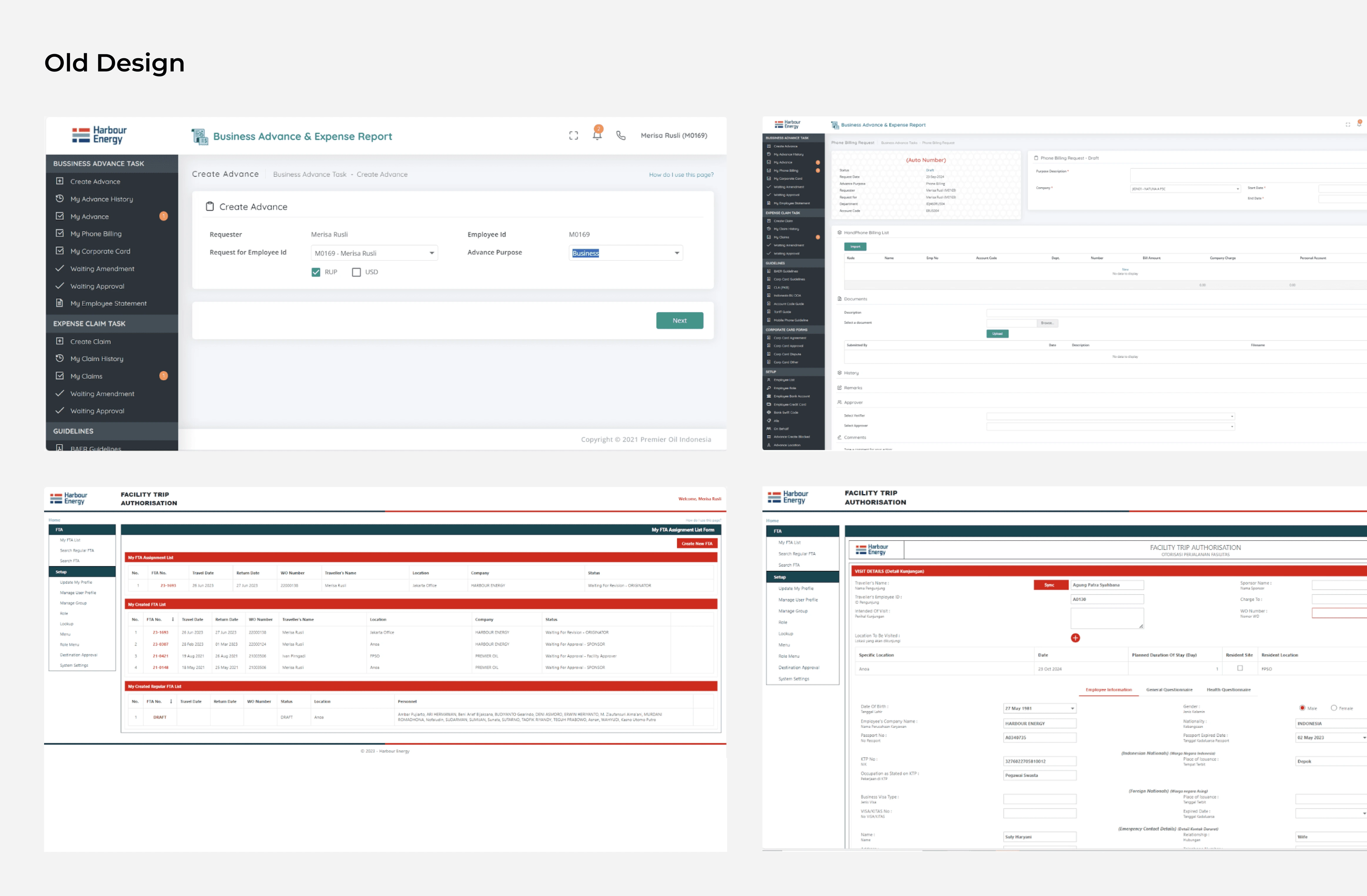
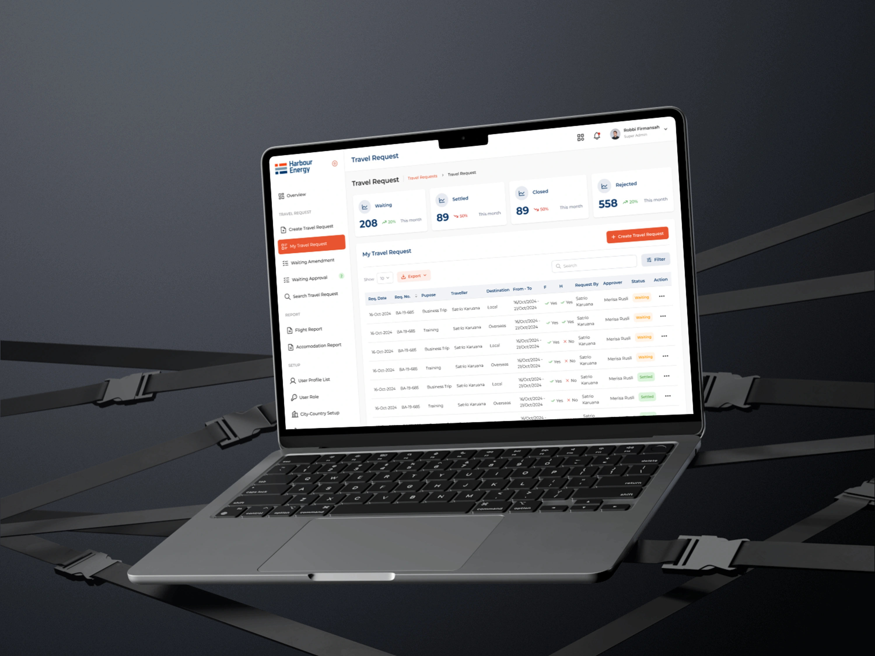
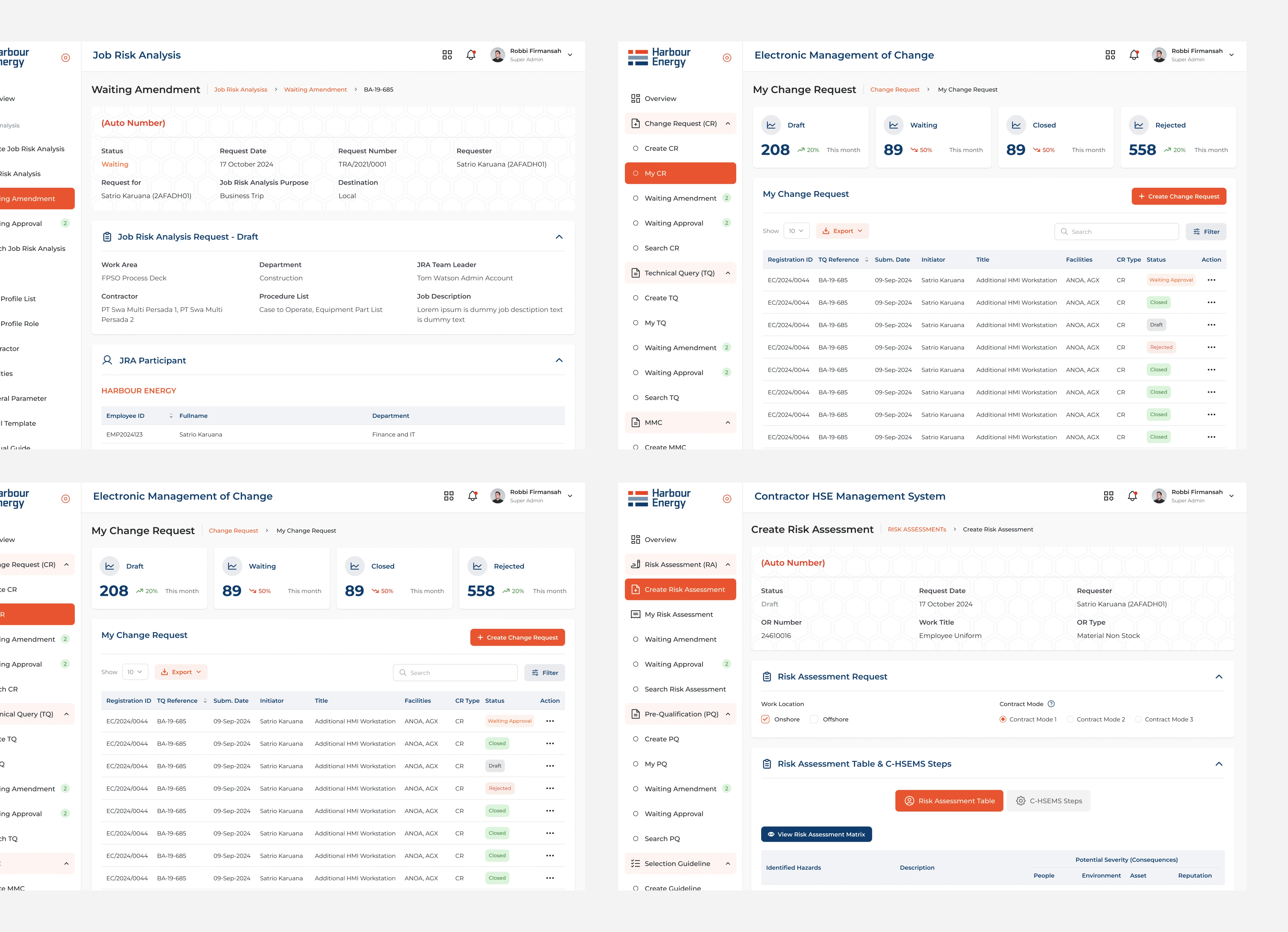
Harbour Energy's existing software
Challenges Faced
1.KEY ISSUES IDENTIFIED
Harbour Energy’s web applications had been developed by different vendors over time, leading to varying designs and inconsistent user flows. The key challenges included:
Outdated User Interface – The web applications had old, inconsistent designs that were not user-friendly.
Inconsistent User Flows – Different platforms had separate flows, causing confusion for users who had to work across multiple systems.
Inefficient Navigation – Users often struggled to find what they needed due to poor navigation structure.
Lack of Standardization – There was no overarching design system, leading to inefficiencies and design inconsistencies.
SUPPORTING DATA
30% of users reported difficulty navigating between platforms.
45% of users found the outdated design elements confusing and unappealing.
The Journey Toward a Solution
1. Understanding User Needs
The first step was to deeply understand user requirements. I conducted:
User Interviews → Engaging with users from different divisions to understand their pain points.
UX Audit → Identifying friction points in each application’s user experience.
Flow Mapping → Visualizing workflow differences and finding the best way to unify them.
The outcome? I identified common patterns that served as the foundation for a new design system. By creating a standardized system, I was able to reduce task completion time by up to 30%.
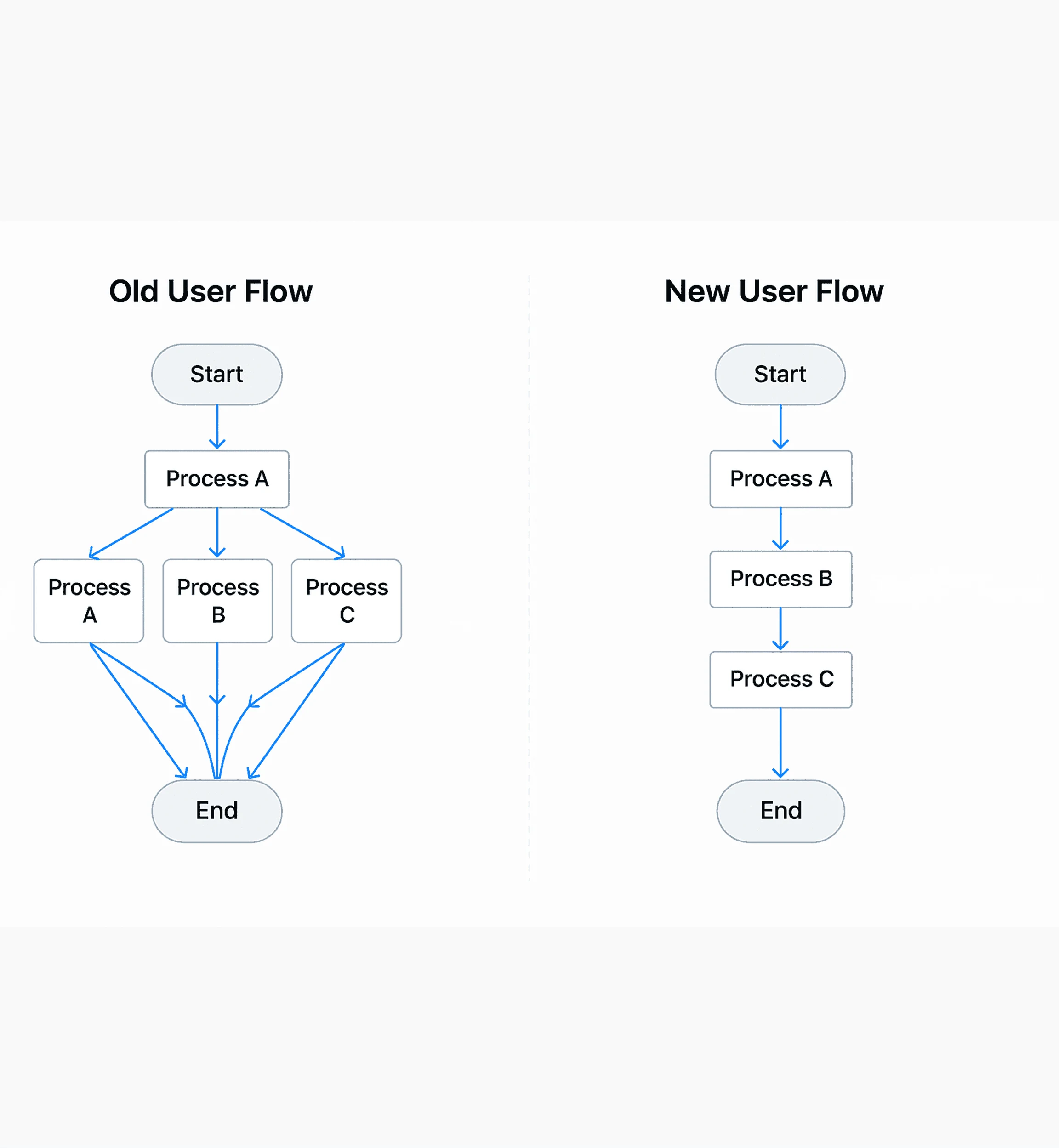
Old Flow vs New Flow
2. Establishing a Design Standard
With a clear understanding of user needs, I developed a design system as the foundation for all applications. This system included:
A Unified UI Kit → Consistent colors, typography, and design components across all apps.
Standardized Navigation → A uniform navigation structure to simplify user adaptation.
Enhanced Interactions → Modern design principles to improve usability.
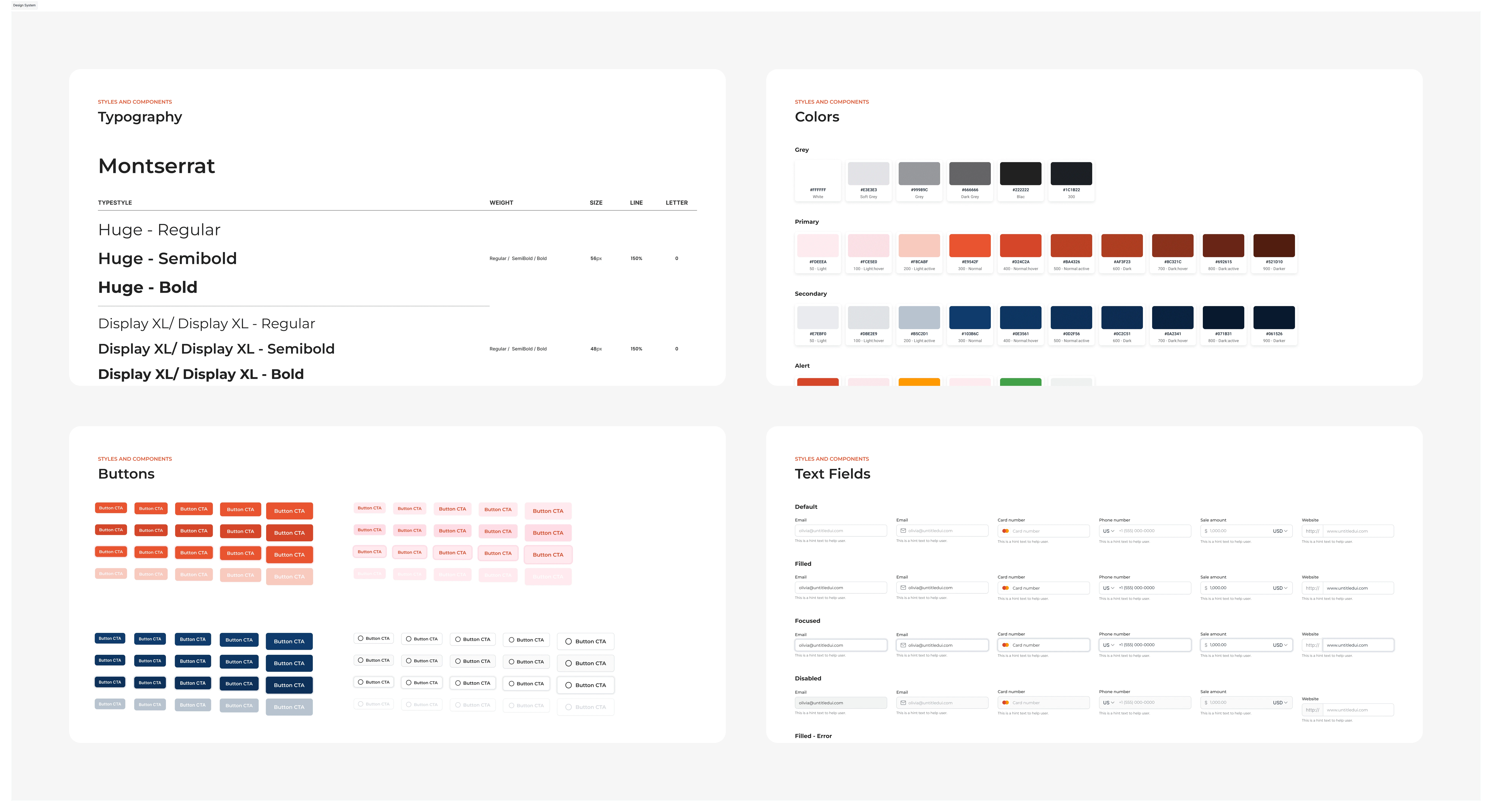
Design System
3. Working in Sprints & Collaborating with the Development Team
This transformation couldn’t happen in isolation. I collaborated closely with developers and stakeholders using an agile approach, ensuring each design iteration was reviewed and refined before implementation.
Key steps included:
Sprint-based Iterations → Breaking the project into smaller phases for rapid improvements.
Weekly Design Reviews → Keeping all stakeholders aligned on changes.
Prototype Testing → Engaging users in testing prototypes before full implementation.
Results & Impact
Significant improvements achieved after the redesign:
100% UI/UX Consistency → All applications now share a uniform look and feel.
Increased User Efficiency → Task completion time reduced by 30%.
Faster System Adoption → Users can navigate the apps intuitively without additional training.
Comprehensive Documentation → All design changes are well-documented, streamlining future development.
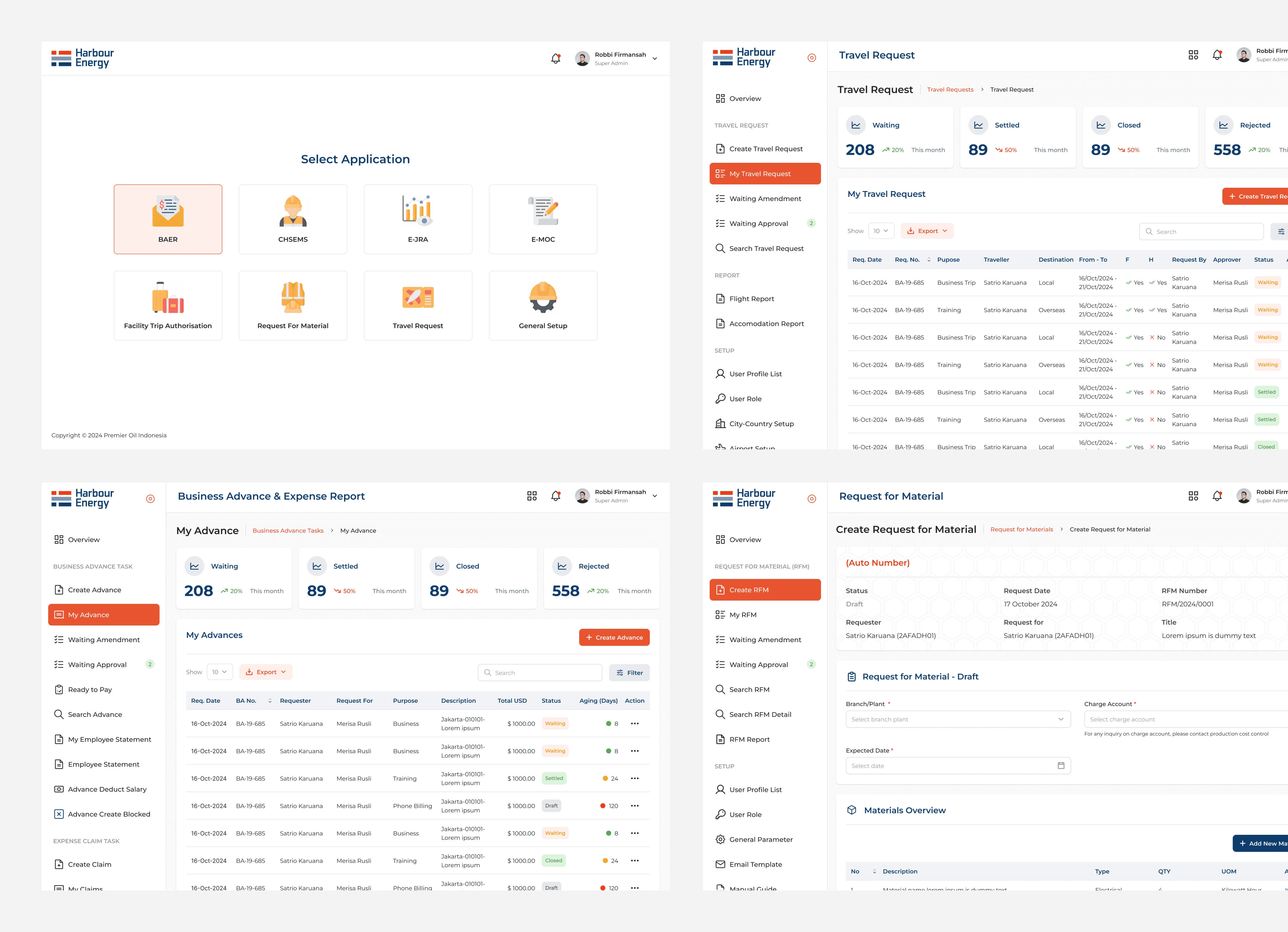
Result 1
Result 2
Lessons Learned & Next Steps
CHALLENGES ENCOUNTERED
Every large-scale project has its challenges. In this case, the biggest hurdle was managing expectations from multiple stakeholders. Each team had different requirements, and balancing these needs was crucial to ensuring an effective solution.
AREAS FOR IMPROVEMENT
A/B Testing for Optimization → Leveraging user data to continuously refine designs.
Dashboard Analytics → Providing users with insights to boost productivity.
Automation Enhancements → Adding automation features to reduce repetitive tasks.
Like this project
Posted Aug 7, 2025
Standardized Harbour Energy's web app UI/UX, boosting task completion, speeding onboarding, and earning 80% positive feedback on intuitiveness.
Likes
0
Views
2
Timeline
Jan 6, 2025 - Feb 10, 2025
Clients
Harbour Energy