a Cafe in Edinburgh

Ryhannul Jannah

We live in the era of e-commerce and digital marketing. We have even small-scale businesses going online, as the opportunities are endless. Moreover, since a huge chunk of people with internet access are switching to online shopping, large retailers are actively searching for ways to boost their profit.
According to data from the Specialty Coffee Association, there has been a substantial increase in people’s consumption patterns. A total of 5,830 percent of the rise in sales came from take-away or online purchases.
I explore a dataset from a cafe in Edinburgh to discover approaches to increase sales by examining the pattern of past orders. I will look at the Cafe’s sales performance in general, items with the best performance, along with another thing closely related to being bought both at a time; using Tableau.
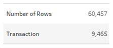
I got the dataset from Kaggle; it contains 60,457 rows of data coming from 9,465 transactions. ‘Rows of Data’ represent the sale of an item, and ‘Transactions’ represent a customer’s purchase. The data used has attributes of transactions made online, including five variable columns, i.e.:
Transaction No.: Unique identifier for every single online transaction
Items: items purchased
Datetime: date and time stamp of the transactions
Day type: categorizes whether a transaction occurs on weekends or weekdays
Daypart: part of the day when a transaction occurs (Morning describes the time of day before noon, Afternoon 12:00–17:00, Evening 17:00–21:00, and Night represents 21:00 -23:50)
Since the subject is related to Food and Beverages, I classify each transaction’s time into Mealtime than Daypart. For this reason, I added a new variable called Mealtime.
Mealtime: Breakfast in the time range 06:00–08:30, Brunch 08:31–11:30, Lunch 11:31–15:00, Supper 15:01–17:59, and Dinner 18:00–21:00.
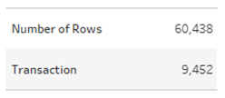
Transaction data outside Mealtime hours do not count. After being classified into Mealtime, the data diminished to 60,438 rows with 9,452 orders.
Question 1 How is the growth of transactions from time to time?
I kick this off by glimpsing at the number of transactions and items sold annually.
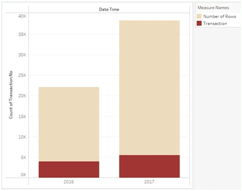
As pictured above, there was a gain in transactions from 2016 to 2017. There is a slight gain in Transaction numbers and a considerable boost in the number of Items sold. To catch more details, I stretch it into quarters to look at the transition further.
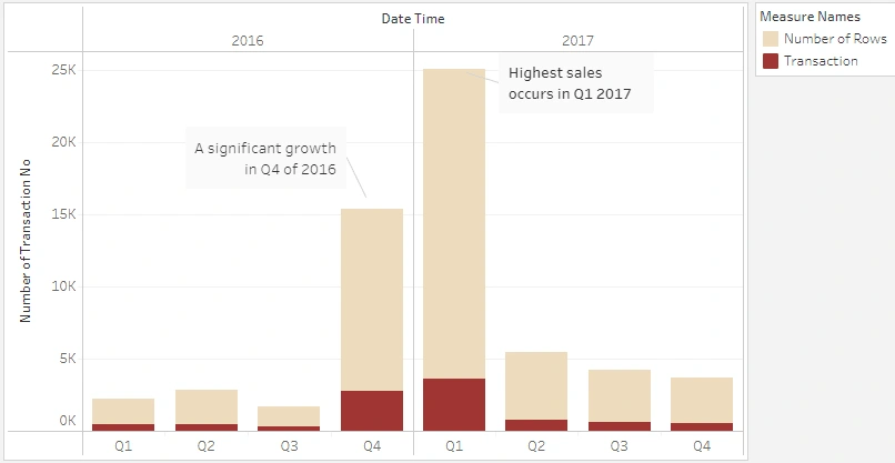
It turns out that there is a uniqueness in quarterly growth; the highest sales were in Q4 2016 to Q1 2017, even significantly dissimilar from the previous and following quarters. So, I became curious to find out about this pattern further. For that, I divided the subsequent analysis of transaction growth into 3 Quarter Groups: Q1 2016 — Q3 2016 (G1), Q4 2016 — Q1 2017 (G2), and Q2 2017 — Q4 2017 (G3).
Next, I check the number of types of items and the quantity per item on each transaction.
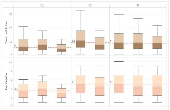
There are differences in the average number of item varieties and each item’s quantity per quarter. In line with the last chart, a significant increase portrays in G2. The average number of items purchased rose from 3–4 to 5 in G2, while at the same time, the average quantity of each item purchased also rose from 6pcs/item to 9–10pcs/item. We can also see a slight decline in quantity per item in G3. However, this decrease is somewhat too slight and fails to define the significant reduction in G2 to G3 in the previous graph.
To explain it, I tested the comparison of the number of working days between Quarter Groups.
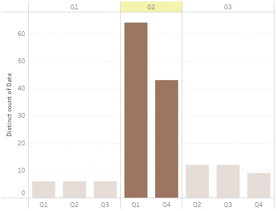
G2, which only consists of 2 quarters, has many more active days than G1 and G3, which individually contain 3 Quarters. In detail, G1 has 18 working days, G2 has 107, and G3 has 33 working days.
It makes much sense if sales per Quarter Group have such differences because the number of working days is also very different. To be a little surer, I try to see the average daily transaction per quarter. Does the small number of working days in G1 and G3 result in denser daily transactions than in G2?
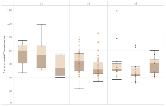
Fewer working days do not make daily transactions dense. A little dense in G1 but not so significant. It gives a much extra multiplication result with a different number of daily transactions for G2.
Finally, we can conclude that the lofty online transactions in G2 significantly differ from G1 and G3 because the number of working days is far more.
Question 2 What time do transactions mostly occur?
Since there was a disproportionate comparison of working days between quarters, I again used the whole data without paying attention to the quarter group. The following graph compares the number of online transactions on weekdays.
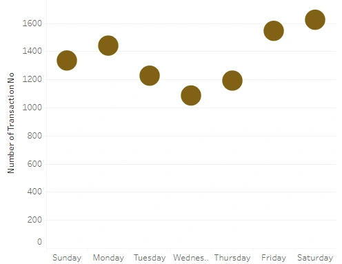
Most online transactions occur respectively on Saturday, Friday, then Monday. At which Mealtime does the Cafe have the most online transactions per day?
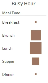
In the picture above, the size of the square represents the number of transactions. As displayed, rush hour initiates at Brunch, primes at Lunch, then reduces at Supper time. The Cafe tends to be quiet during Breakfast and Dinner hours.
Question 3 Is there any correlation between the purchase of two particular items?
Before heading there, I first listed the top 10 best-selling items.
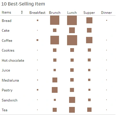
The top 10 best-selling items throughout the day are surprisingly almost entirely identical, except Cake for Dinner time. Overall, Coffee is the best-selling drink, while there is bread for food. Is there a strong correlation between Coffee and Bread?
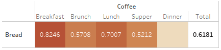
There is a correlation between the purchase of Coffee and Bread, but generally, it is not that strong. After breaking it down into Mealtime, now it revealed that the two are most tightly correlated at breakfast time; the number shows that 80% of customers tend to buy coffee and bread side by side at that time. What are two other items (food-beverage) that are most strongly correlated?
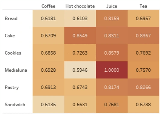
Here computed: two items always bought side by side are Juice-Medialuna; Coffee has the tightest correlation with Medialuna (compared to other best-selling food, but still not a strong one), Hot Chocolate is strongly correlated with Cake, and Tea mostly paired with Cake or Pastry. Note that these are general conclusions of correlations between best sellers without minding the Mealtime.
CONCLUSION
The highest sales during the two years of sales were in Q4 2016 to Q1 2017, significantly distinguishable from the previous and following quarters. The rationale is that the number of working days is far more.
The most engaged online transactions are respectively on Friday, then Saturday, then Monday, with busy hours beginning at Brunch and peaking at Lunch, declining at Supper.
Customers always buy Juice and Medialuna as a pair. In addition, Coffee (as the #1 Best-Seller) also has the most correlation with Medialuna, but not strongly.
Up onto here, it looks like this Cafe could try to:
Make product bundling: Juice-Medialuna (the most correlated item) and Coffee-Bread for Breakfast time (two items with the highest number of sales, tightly correlated at Breakfast)
Make Bundling for Coffee with Medialuna or Cookies, following up the significant number of Coffee purchasing.
Undertake operational days consistently, at least from Friday to Monday.
Cut the number of employees at Supper-Dinner; it has to be different from Breakfast-Lunch to streamline expenses on employee salaries.
Thank you for reading it down to the end! ❤
Please kindly check the dashboard I made about this Explanatory Data Analysis at Dashboard A Cafe in Edinburgh. Any suggestions to improve the quality of this analysis are very welcome :)
Like this project
Posted Sep 30, 2024
People tend to buy coffee paired with bread for breakfast. How did I discover that?
Likes
0
Views
0