Stormi & co. Brand Identity & Packaging

Gülfem Soral


Stormi & co.
Brand identity, packaging, and social media system for a shared world for pets and their people.
Stormi & co. brings human and pet products together under one visual language. I built a warm, premium identity system designed to stay consistent from packaging and unboxing details to social media content.
Project scope
Role: Art Direction, Brand Design, Packaging Design
Deliverables: Identity system, packaging, hand-drawn illustrations, social media Story templates, gift card, and design documentation.
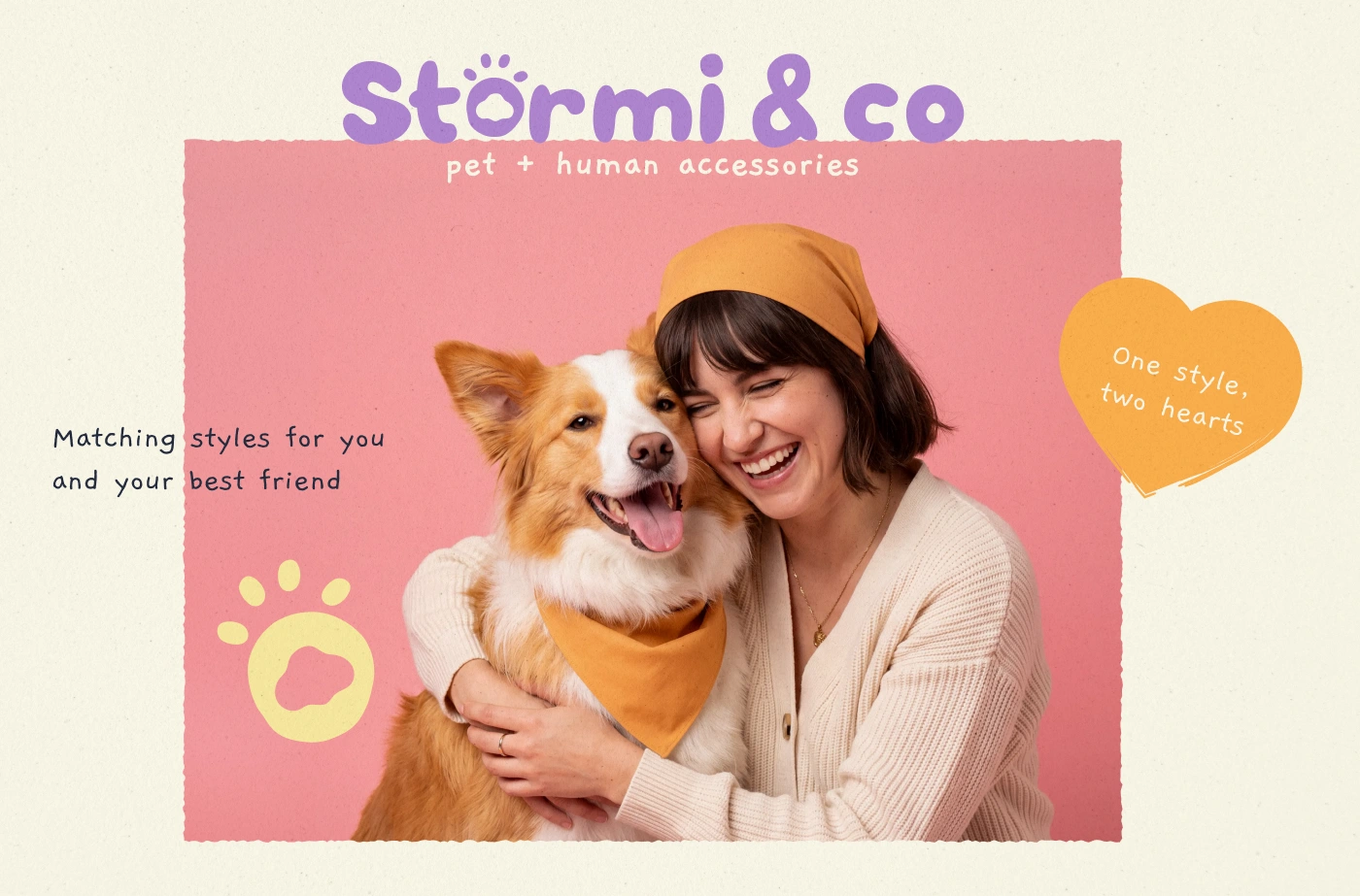
Cover — I drew a rounded wordmark and swapped the umlaut for a paw print.
The brand system
The identity starts with a paw-shaped logomark and a primary wordmark. A script variation adds expression on materials and surfaces where the brand needs a more tactile, handmade feel.
The 6-color palette has a defined role across the system. Orange, coral, and yellow bring energy to campaigns, Stories, and packaging. Lavender, cream, and navy create calmer moments for product imagery, boxes, and gift cards.
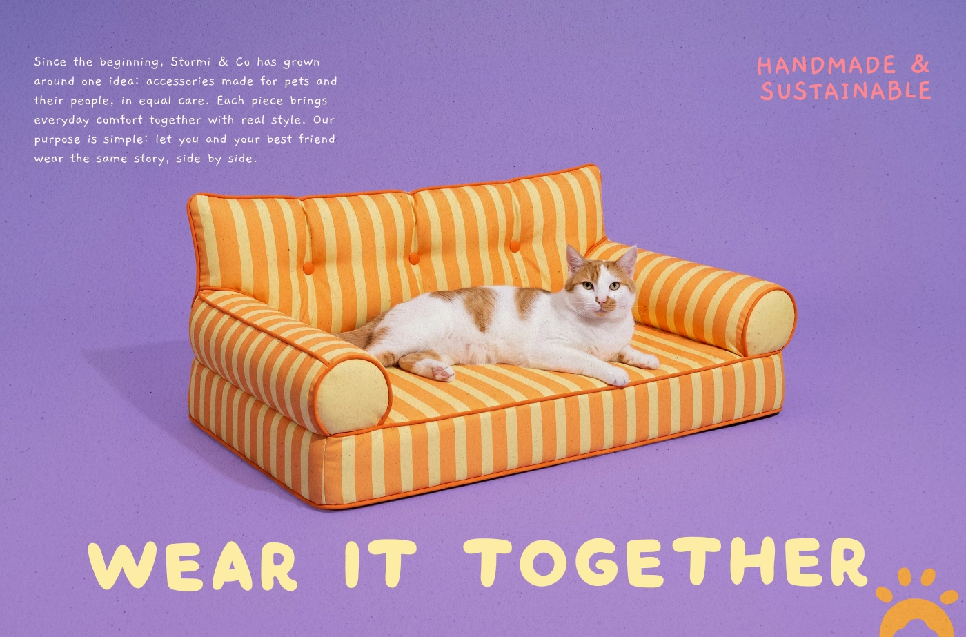
Brand story — I kept the copy small and left the photography to carry the page.
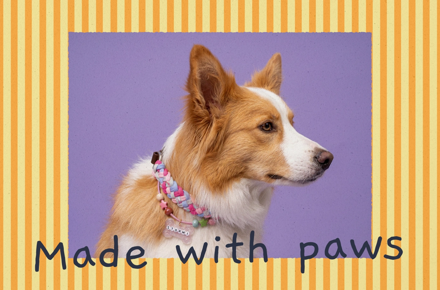
Made with paws — I framed the page in the stripe pattern and let the headline break out of it.
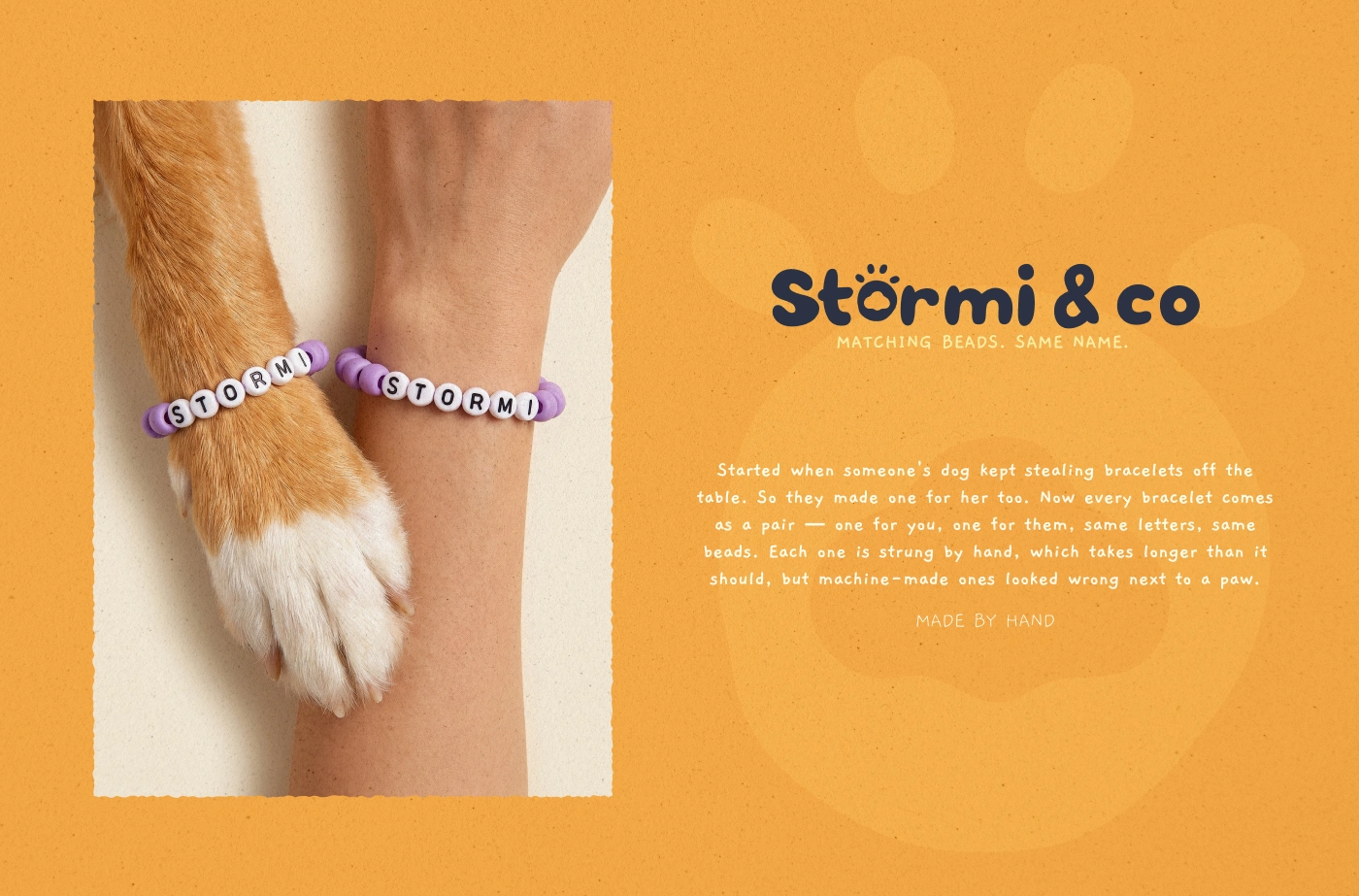
The bracelet story — I added an oversized paw watermark to give the flat orange field depth.
Packaging and unboxing
The packaging was designed as a complete experience, not a collection of separate pieces. Boxes, shipping tape, stickers, and gift cards share the same visual rules, so the brand stays recognizable at every physical touchpoint.
I hand-drew the sticker illustrations to give the system a more personal character and support the handmade quality of the brand.
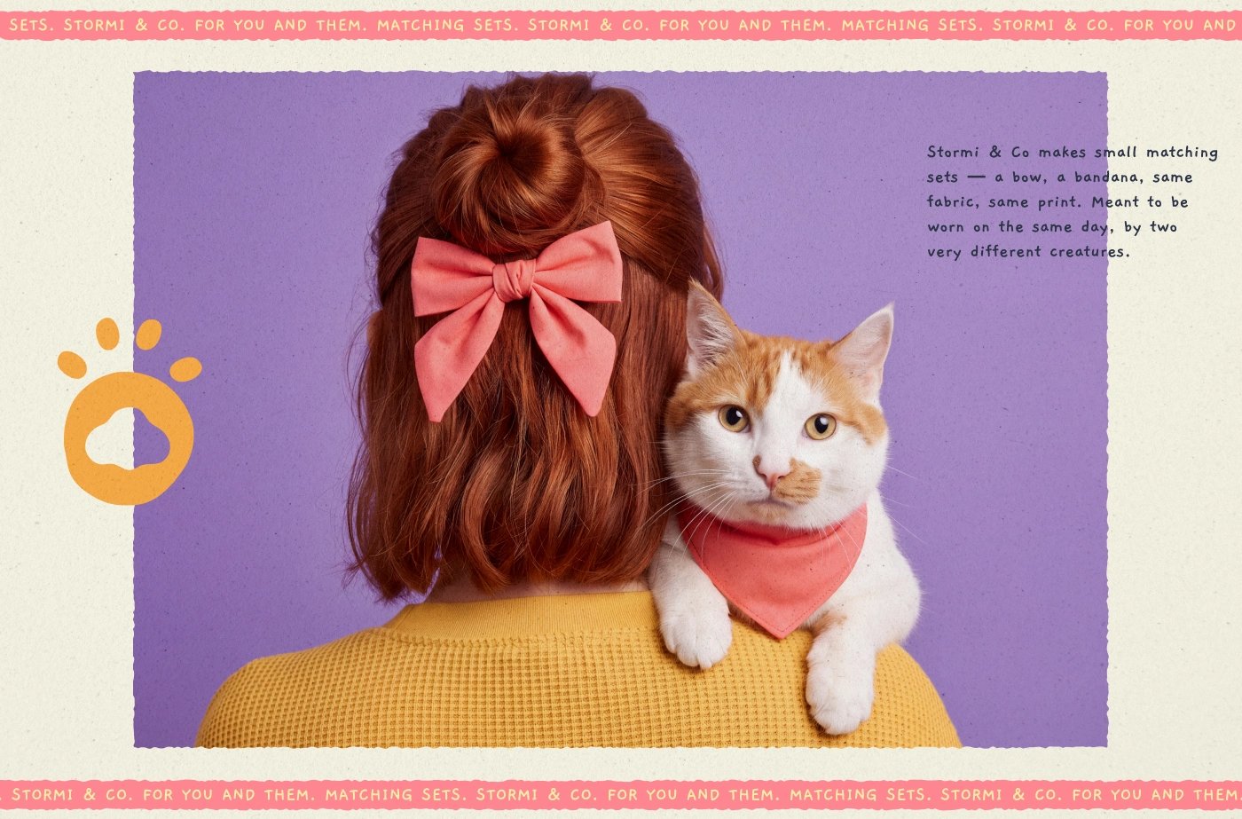
Matching sets — I ran marquee bands top and bottom for a sticker-sheet rhythm.
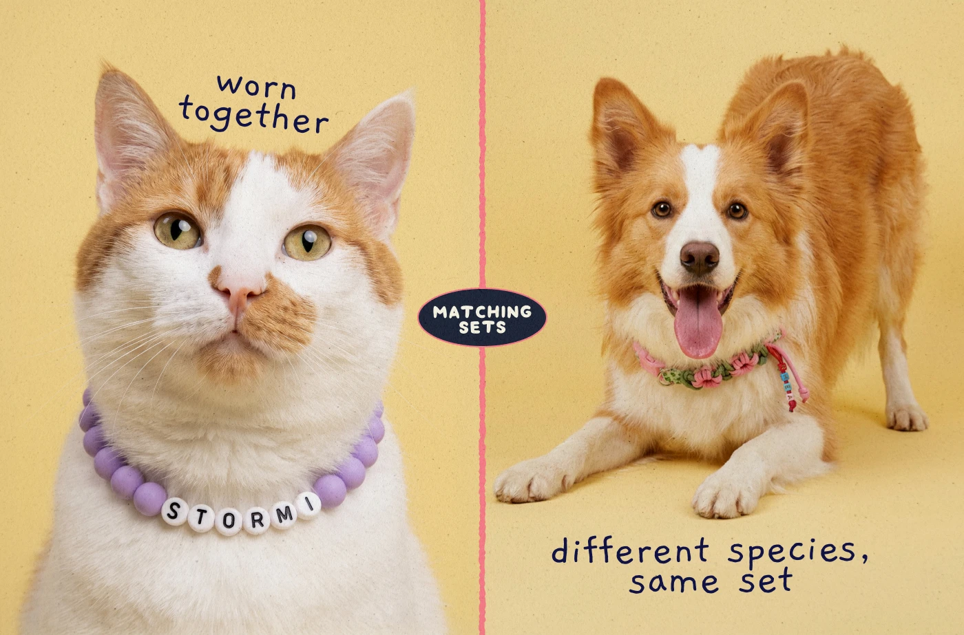
Different species, same set — I split the page with a hand-drawn seam and joined it with a badge.
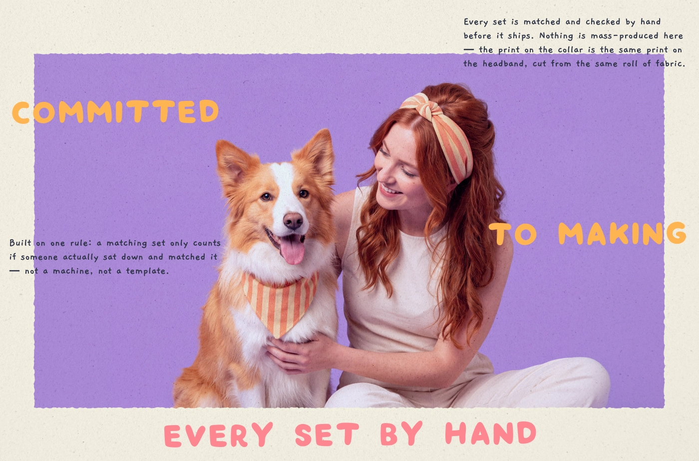
Made by hand — I broke the headline into three parts so it unfolds as you scroll.
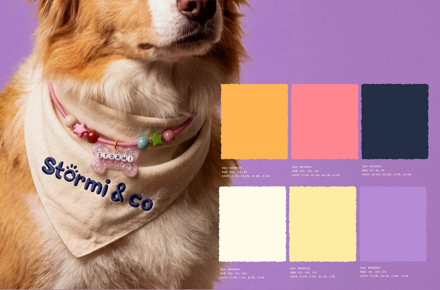
Colour palette — I anchored the palette on lavender and torn every swatch edge by hand.
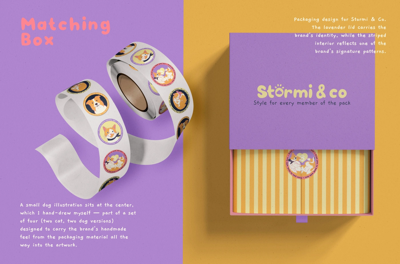
Matching Box — I hand-drew four illustrations so the packaging artwork came from the same hand.
Designed to flex across touchpoints
The system uses 2 logo treatments intentionally: the primary wordmark anchors core brand moments, while the script logo brings warmth to selected materials. The same visual logic carries through the social templates, packaging, and printed pieces, allowing varied assets to feel like part of one world.
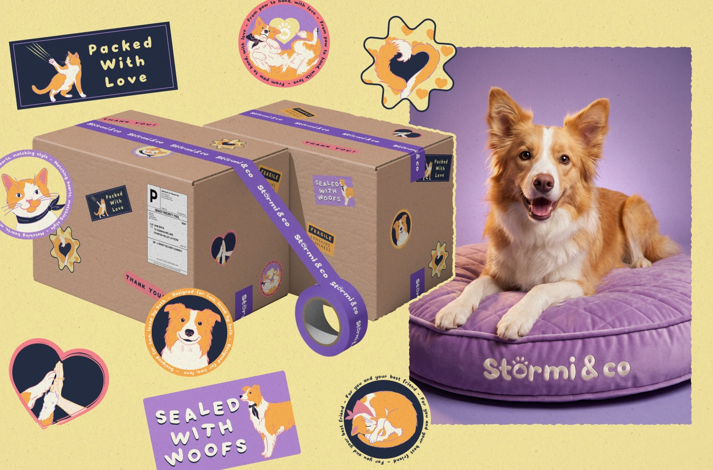
Packaging system — I stretched the identity across tape, labels, stickers and an embroidered bed.
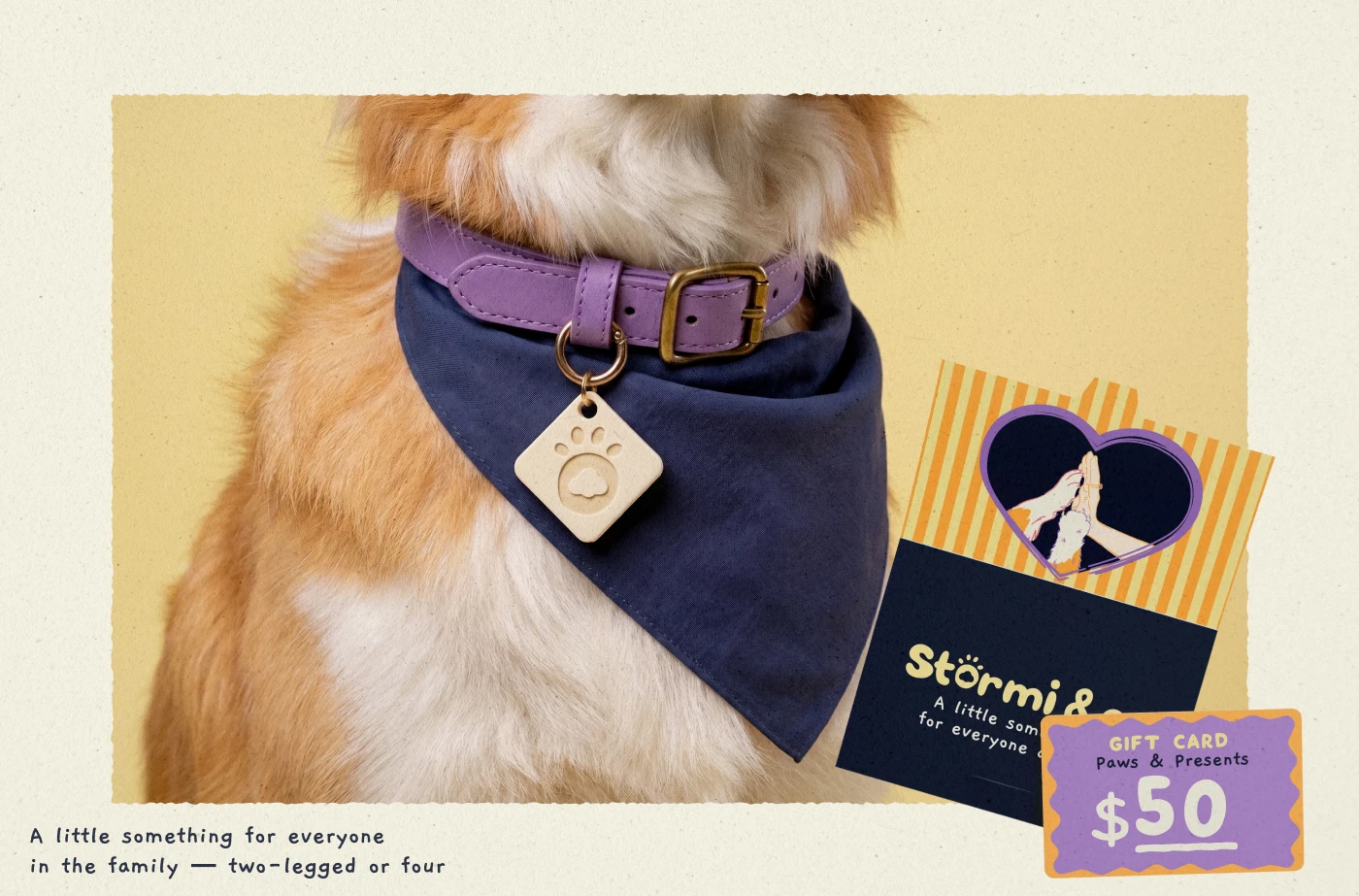
Accessories & gift card — I carried the stripe and heart illustration onto the retail pieces.
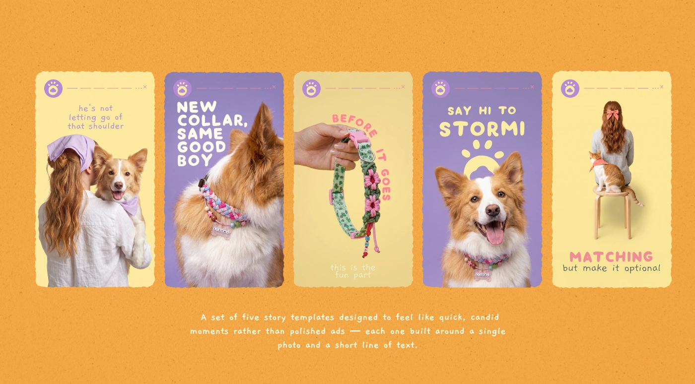
Story templates — I built five templates around one photo and one line each.
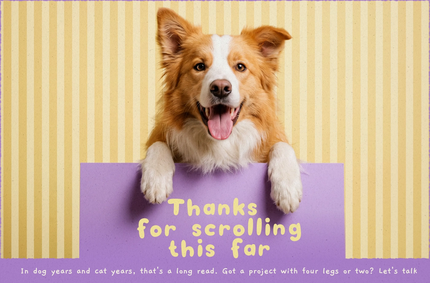
Closing — I ended on the brand's humour instead of a credits page.
Deliverables
Primary wordmark and material-specific script logo variation
Packaging system for boxes, shipping boxes, tape, and sticker sets
Hand-drawn illustrations
Social media Story template system across 5 formats
Gift card design
Color palette and design system documentation
Stormi & co. is built as one cohesive visual world: playful enough for pet products, considered enough to feel at home in a premium lifestyle setting.
Like this project
Posted Aug 31, 2026
Stormi & co. brings pet and human products into one warm, premium brand world. I created the identity, packaging, hand-drawn illustration system, gift card, and social media templates, with clear rules that keep every physical and digital touchpoint connected.