
About the Brand
Angel Wing Chocolate is a celebration of softness, imagination, and premium indulgence. Designed for those who seek comfort in life's little sweet moments, Angel Wing reimagines the chocolate bar as a small piece of a dreamlike world. Each variant pairs fine chocolate with an unexpected surprise — cotton candy and pistachio cream — offering an experience that is nostalgic and tender, both on the palate and at heart.
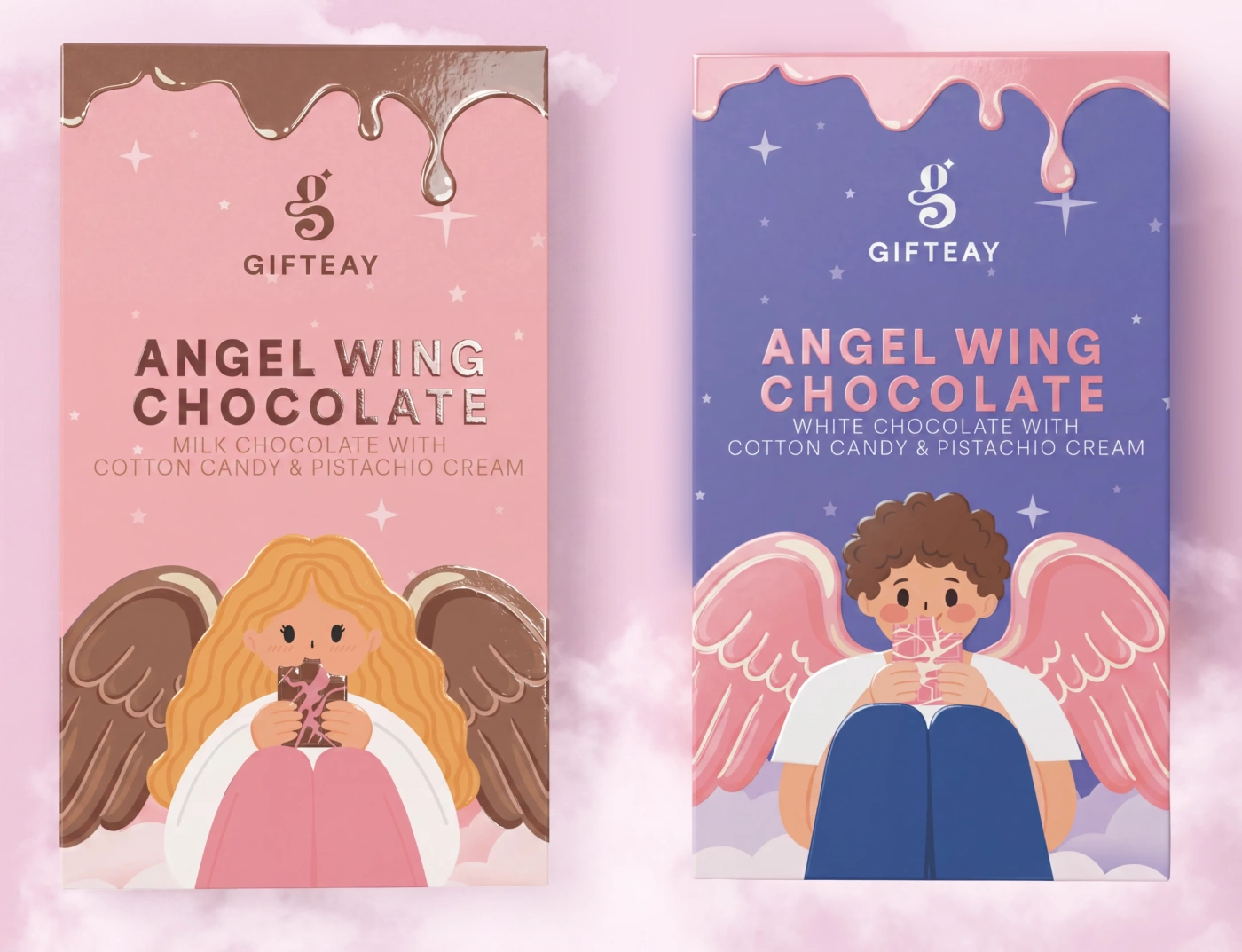
Angel Wing Packaging
Angel Wing Animation
The Task
To develop a visual identity and packaging that captures a soft, dreamy, and heavenly aesthetic while still reading as premium and standing out on the shelf. To build a consistent system that distinguishes the two chocolate variants (milk and white) while keeping them within the same brand family.
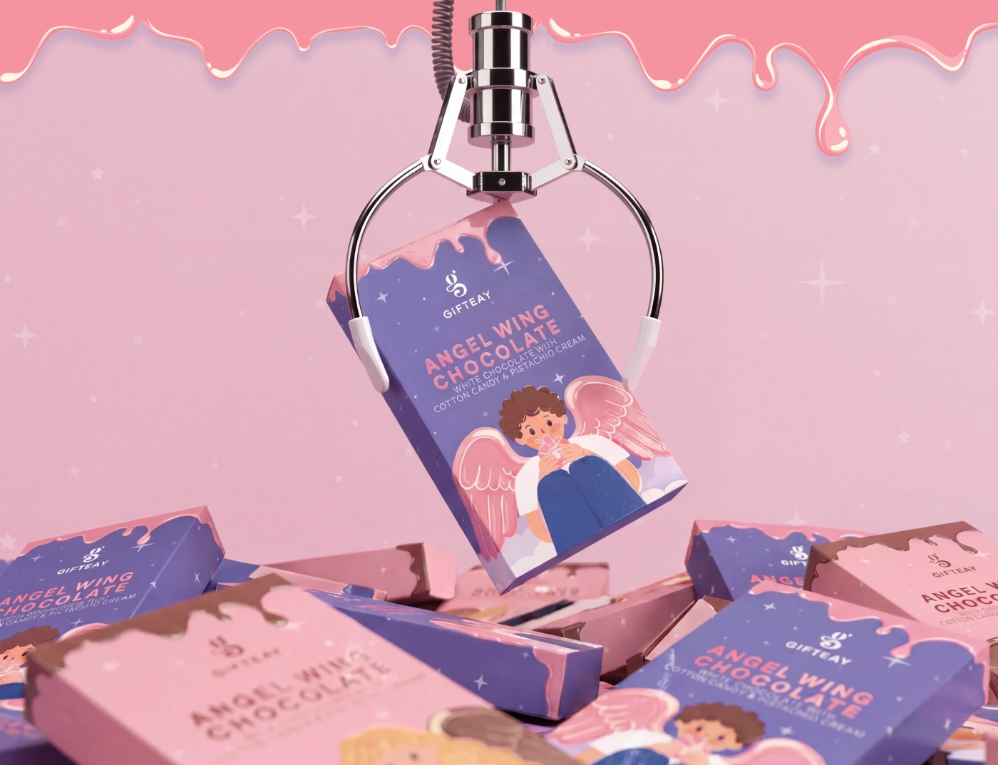
Packaging Detail
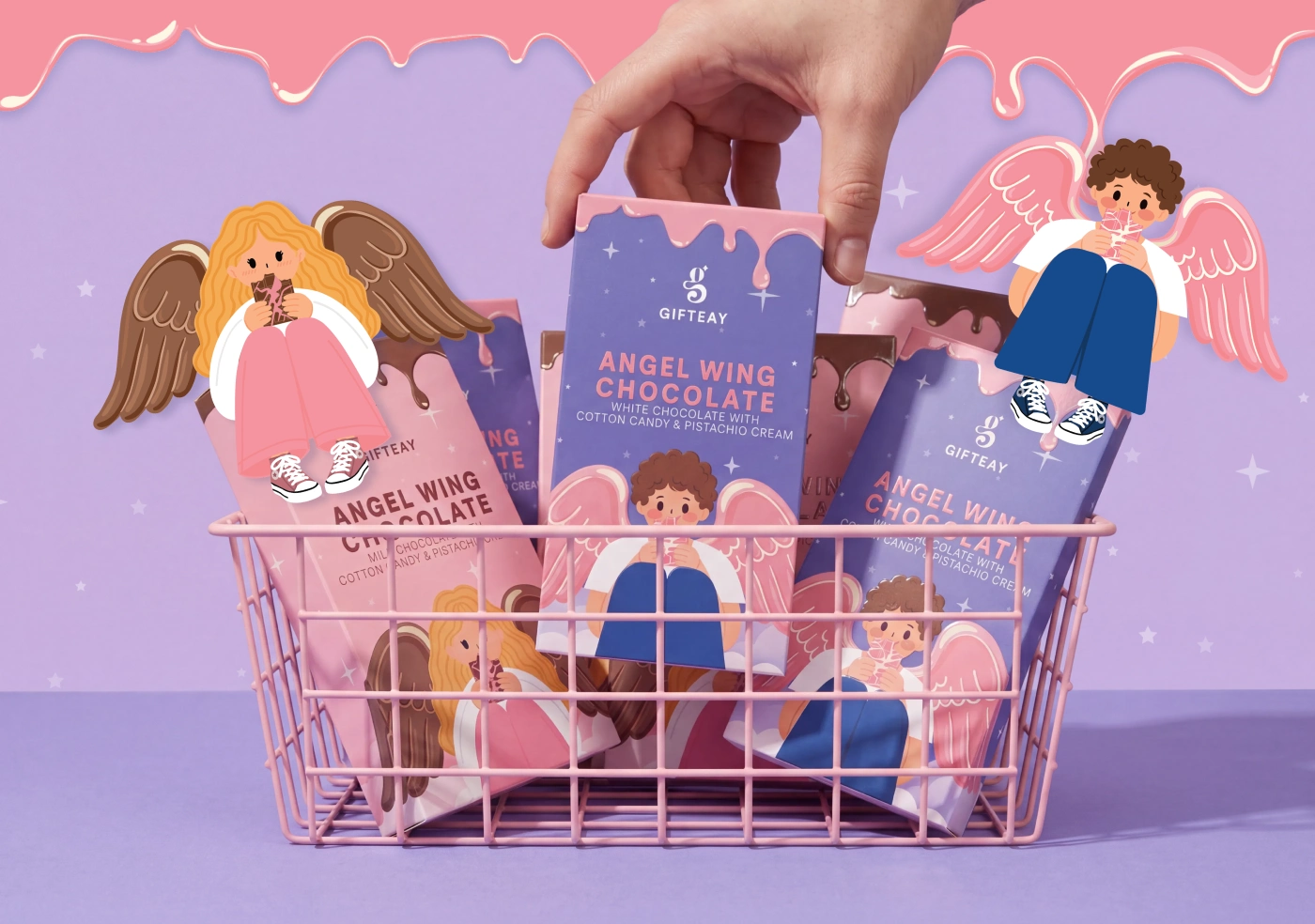
Brand System
The Solution
The design centers on two hand-drawn angel characters — one for milk chocolate, one for white — each resting on a cloud in their own sweet world. A dusk palette of rosé and periwinkle sets the variants apart while keeping them in one family, and a glossy melted-chocolate drip, scattered with delicate stars, crowns each box.
The elegant "g" monogram and refined typography anchor the system, while a spot-UV finish makes the drip, title, and logo catch the light against the matte carton — eye-catching on the shelf and tactile in the hand.
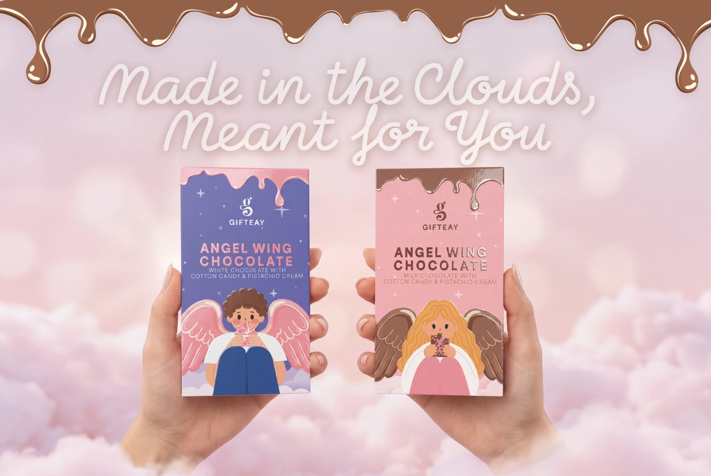
Landing Page

Visual Identity

Brand Collateral
More Than a Flavor
More than a flavor, Angel Wing is a feeling of lightness and quiet joy — soft visuals paired with a hidden cotton candy (pişmaniye) filling, revealed at the very first bite.

Hands breaking chocolate
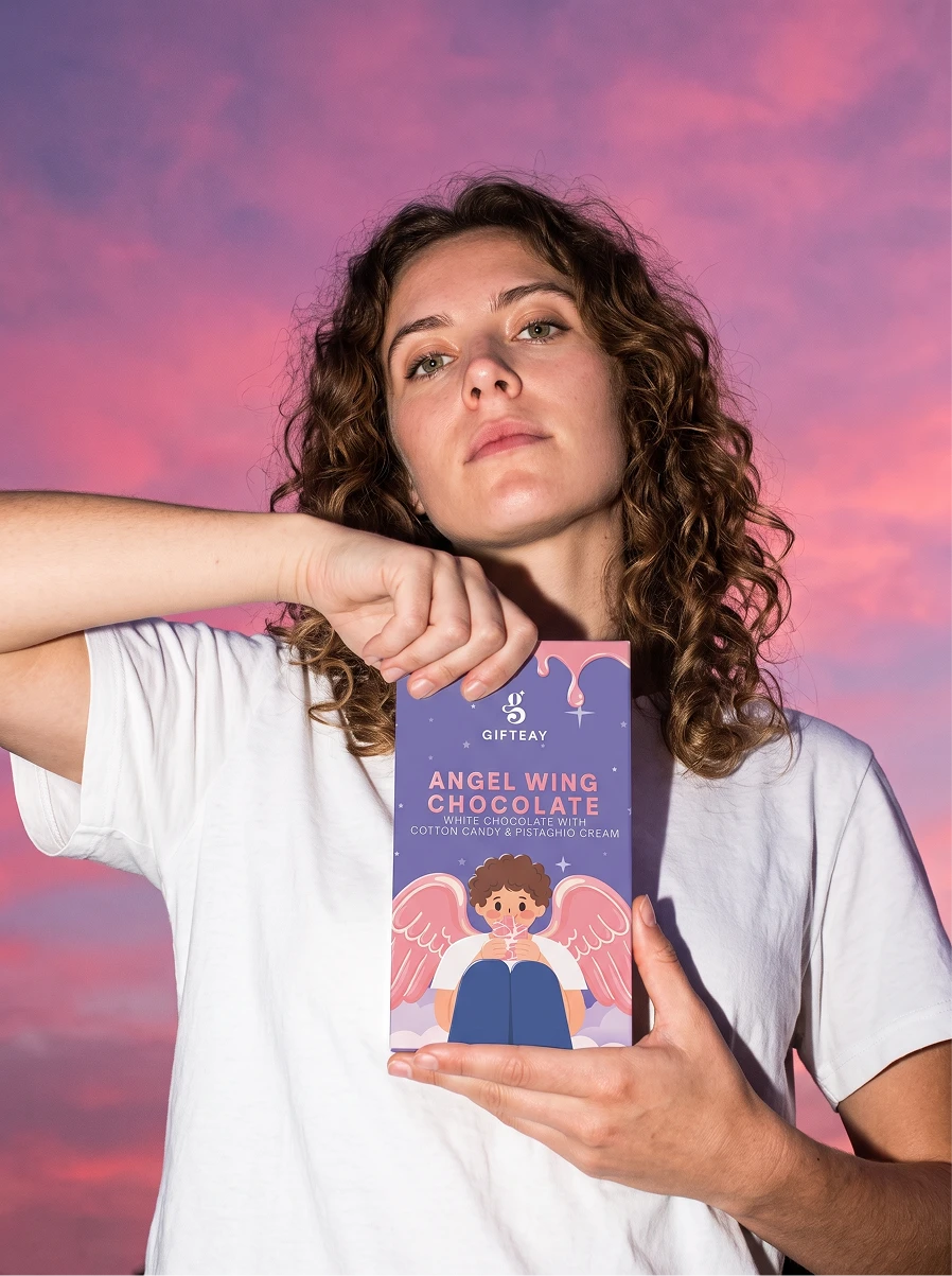
Woman holding chocolate box
6 likes · 28 views · Jul 18, 2026
Visual identity and packaging design for Angel Wing Chocolate — a premium chocolate brand built around softness, imagination, and quiet indulgence.


