Off Shot Agency — Corporate Brand Identity

Gülfem Soral


Project Overview
Off Shot is a creative agency that needed a brand identity reflecting their modern, dynamic, and innovative spirit. The goal was to create a visual system that feels youthful and forward-thinking while maintaining a premium, professional presence.
Design Approach
I built the identity around a bold contrast between deep black and electric ultra violet, sharpened with a jolt of neon lime. This combination delivers energy and confidence without losing a premium, editorial feel.
The typography and layout choices reinforce the modern character of the brand, keeping things clean and confident across every touchpoint.
Color Palette
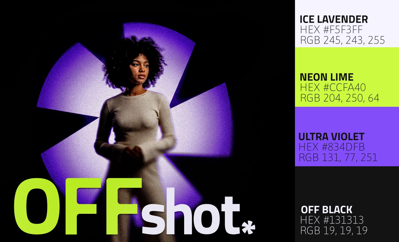
The palette leans into contrast: Ice Lavender softens the edges, Neon Lime injects energy, and Ultra Violet anchors the system with depth. Together they capture Off Shot's balance of premium polish and youthful confidence — sharp enough to stand out, refined enough to stay credible. Bold, condensed typography carries that same tension, giving every headline weight without sacrificing clarity.
Brand Collateral
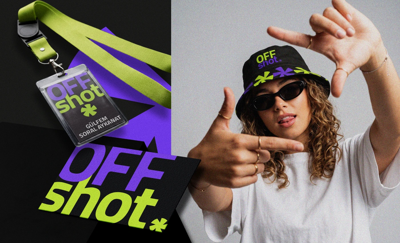
Beyond the core identity, the aperture mark extends naturally into physical touchpoints — from the business card and lanyard badge to branded merchandise like the bucket hat. Each application stays true to the same high-contrast palette and bold wordmark, keeping Off Shot instantly recognizable whether on screen or in hand.
Logo Mark
Inspired by a camera's aperture blades, the logo mark captures the exact moment before a shutter closes — a nod to Off Shot's roots in photography and content creation. The asymmetric blade rotation gives the mark a sense of motion and spontaneity, while the sharp geometry keeps it clean and confident at any scale.
Website Design
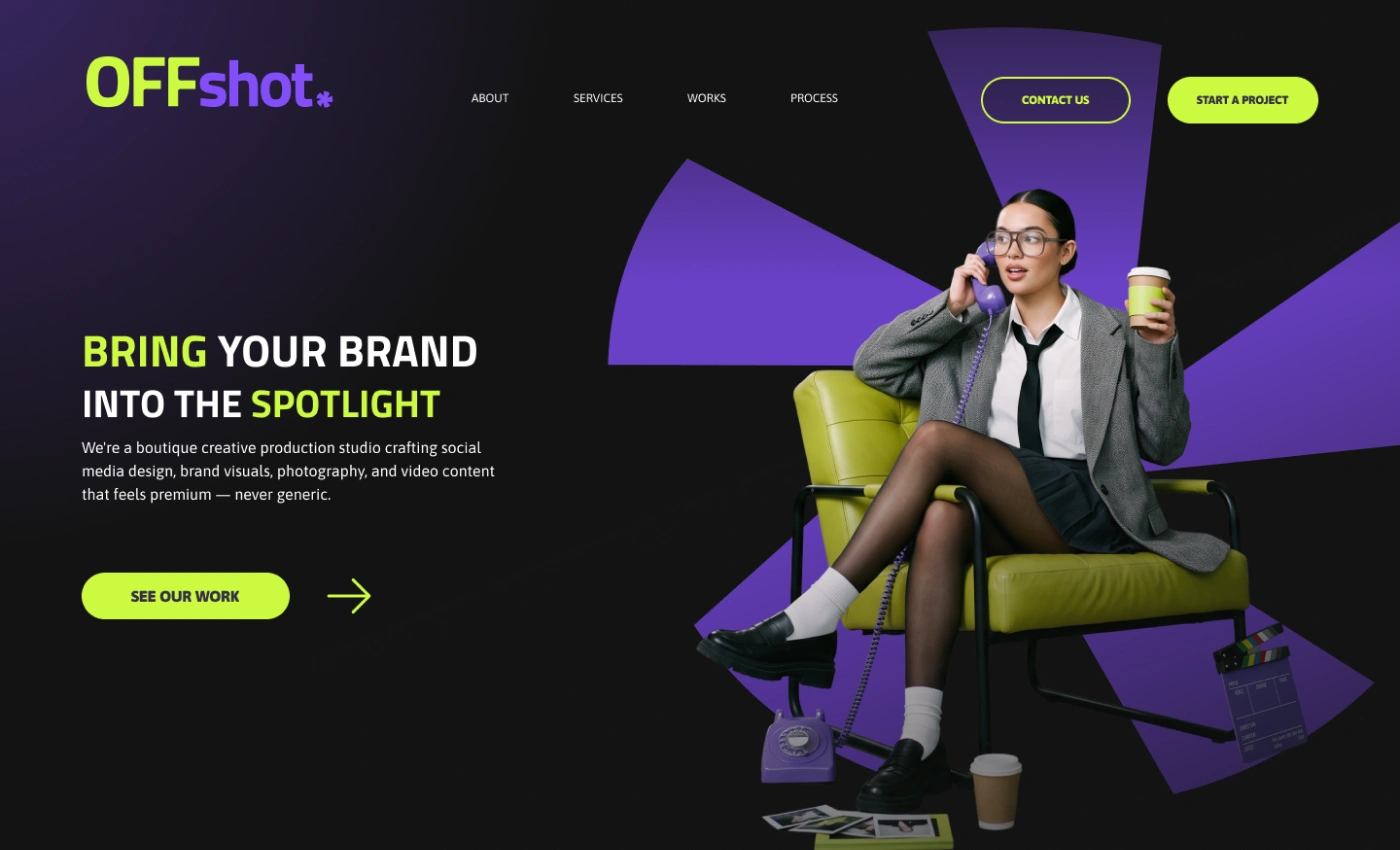
The homepage sets the tone immediately — a high-contrast black background punctuated by ultra violet aperture bursts, echoing the logo mark's photographic DNA. Bold, oversized typography and a single confident CTA ("See Our Work") keep the focus on Off Shot's portfolio, while the neon lime accents guide the eye without overwhelming the layout. Every section was designed to feel like flipping through a contact sheet — cinematic, editorial, and unmistakably premium.
Responsive Mockups
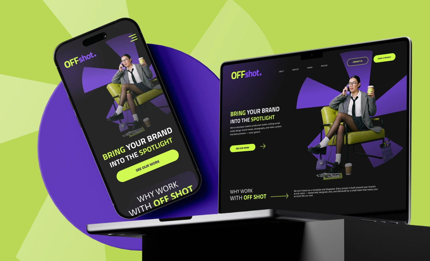
The identity was built to hold up at every screen size — from the full-width desktop hero to the compact mobile scroll. Typography scales without losing its punch, the aperture graphic reflows to fit tighter frames, and the neon lime CTA stays thumb-friendly on mobile while remaining a clear focal point on desktop. The result is a system that feels intentional on any device, not just resized.
Deliverables
Logo mark design and animations
Brand color palette and typography guidelines
Business card, lanyard badge, and merchandise design (brand collateral)
Website design
Every piece was designed to work as a cohesive system, ensuring Off Shot's identity stays consistent across all platforms and materials.
Like this project
Posted Jul 17, 2026
Brand identity for Off Shot, a creative agency — aperture-inspired logo, bold visual system, responsive website, and full brand collateral.
Likes
3
Views
20