Strategic Brand Identity for a B2B tech startup
Sammy Prince
Strategic Brand identity for a B2B Tech Startup
Built for scale, designed to evolve
Solara is redefining how businesses use AI turning complex data into clear, connected intelligence.
With a product built around light, connection, and growth, the brand needed to communicate clarity, confidence, and movement all while staying scalable across data-heavy systems, digital platforms, and enterprise interfaces.
This wasn’t about showing technology for technology’s sake.
It was about creating a visual system that feels alive spreading like light, structured like code, and flexible enough to adapt as Solara expands.
The result is a minimal, intelligent identity system built from radiating circles, photography custom typography, and a palette inspired by the sun.
Every element works together to reflect Solara’s core idea:
AI that illuminates.
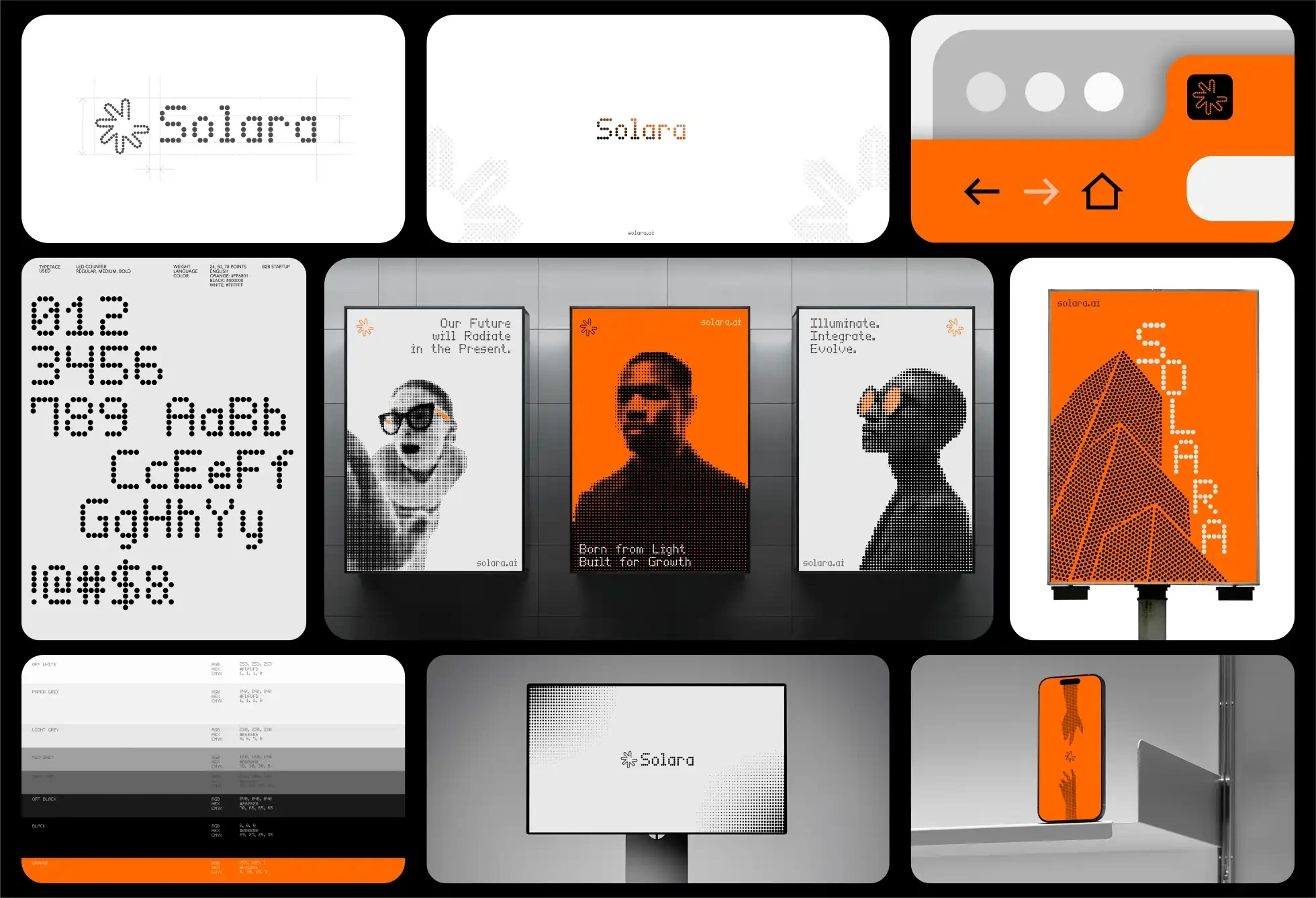
The system at a glance
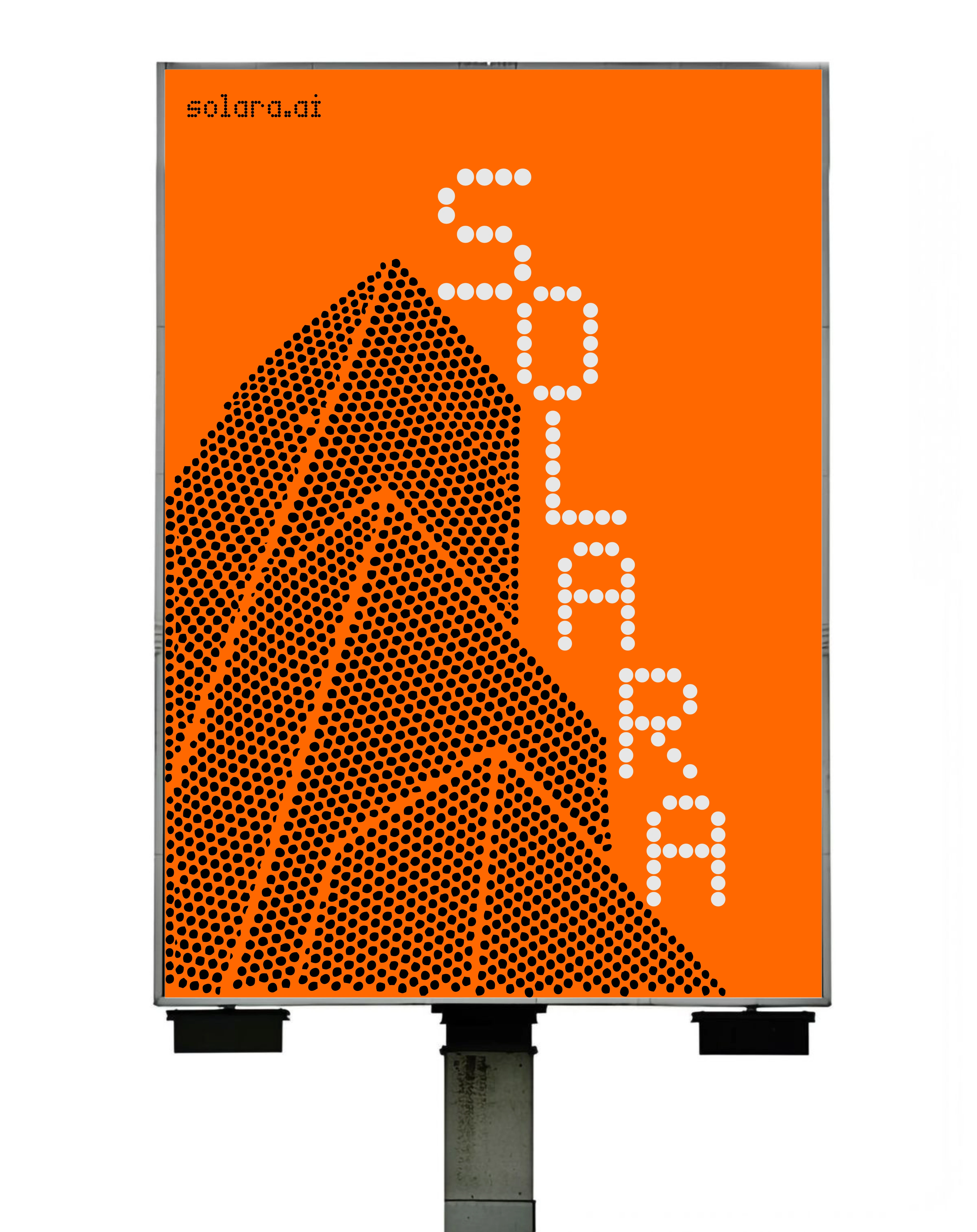
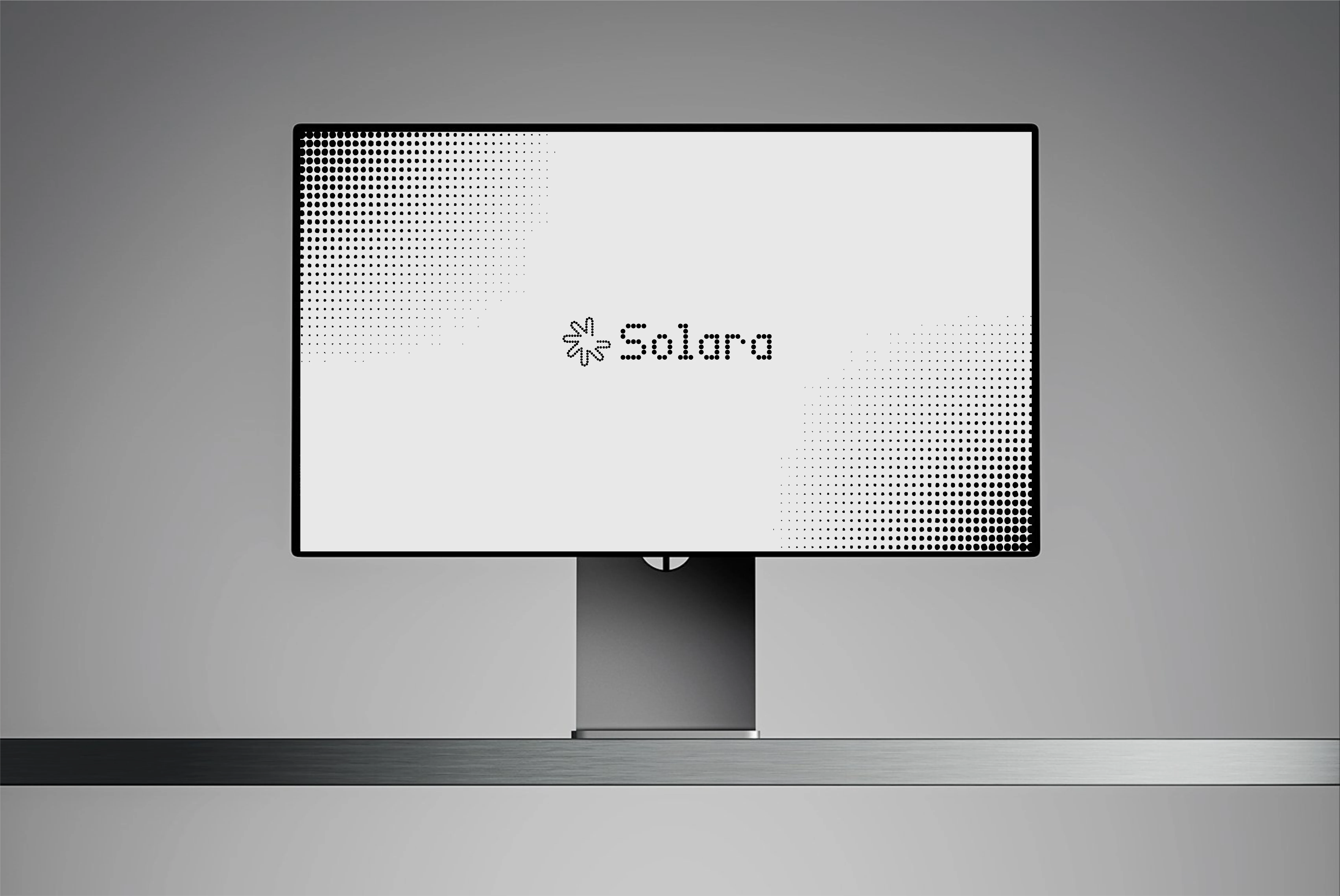
Visual direction was rooted in light, rhythm, and modular expansion a system built to feel alive within dark, digital environments. The identity combines a clean dark mode foundation with radiant gradients and circular motion graphics that reflect the idea of spreading intelligence outward.
A restrained palette of deep charcoal and solar orange anchors the brand, balanced with soft white glows and subtle transitions that echo light dispersing through space. The result feels technical yet warm precision with personality.
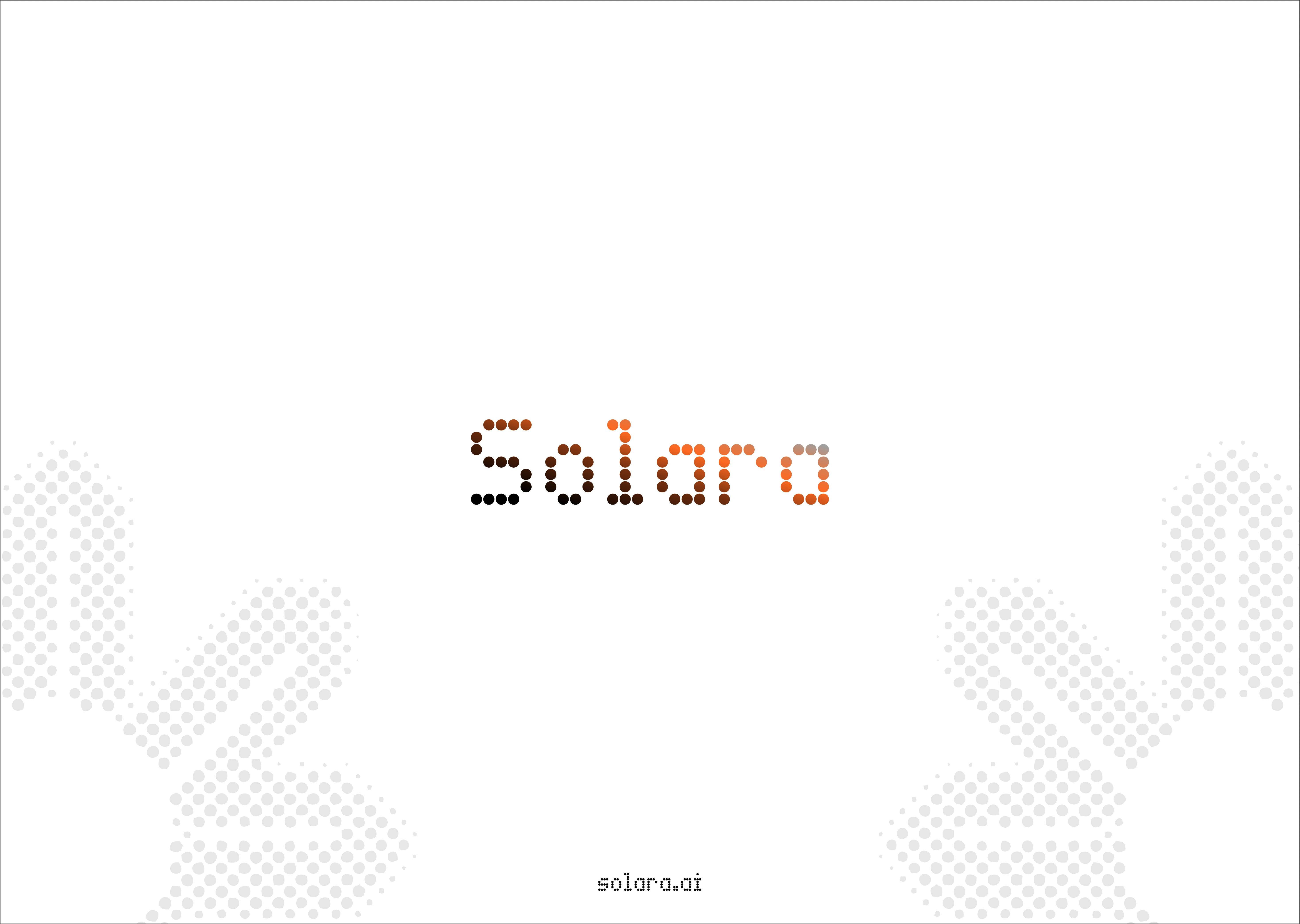
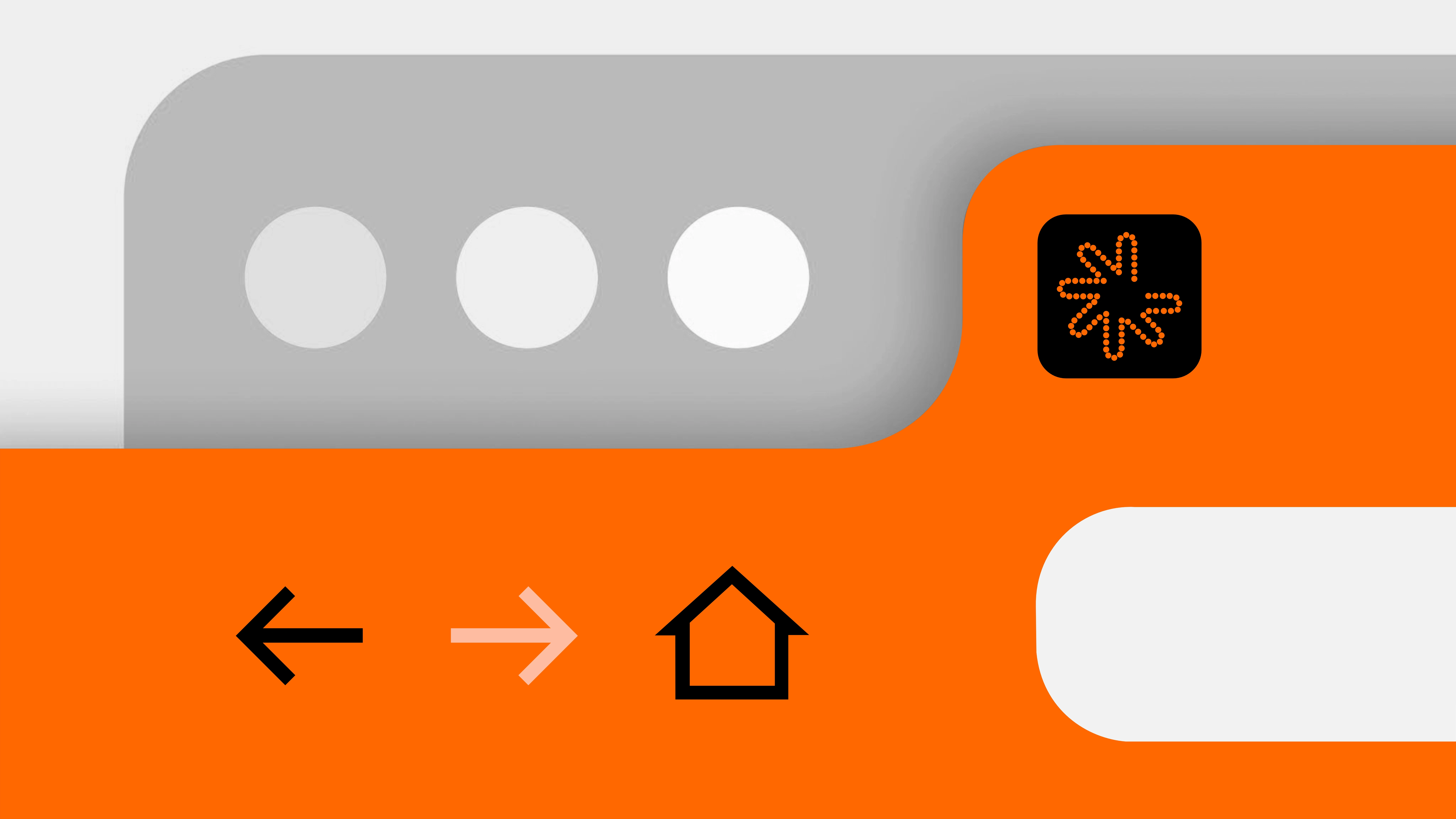
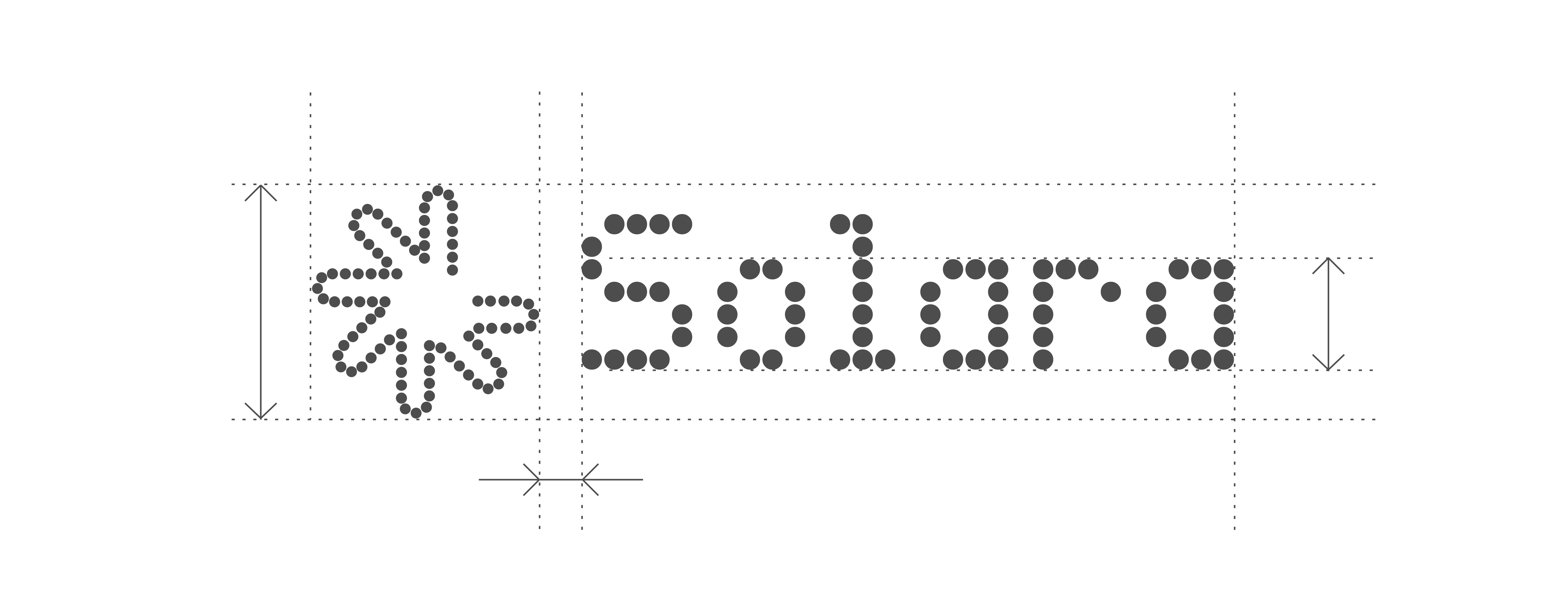
The logo suite includes both wordmark and icon variations, designed with scalability and motion in mind. The mark expands in perfect symmetry, referencing solar patterns, data flow, and continuous evolution. It works seamlessly across dashboards, app icons, and product animations.
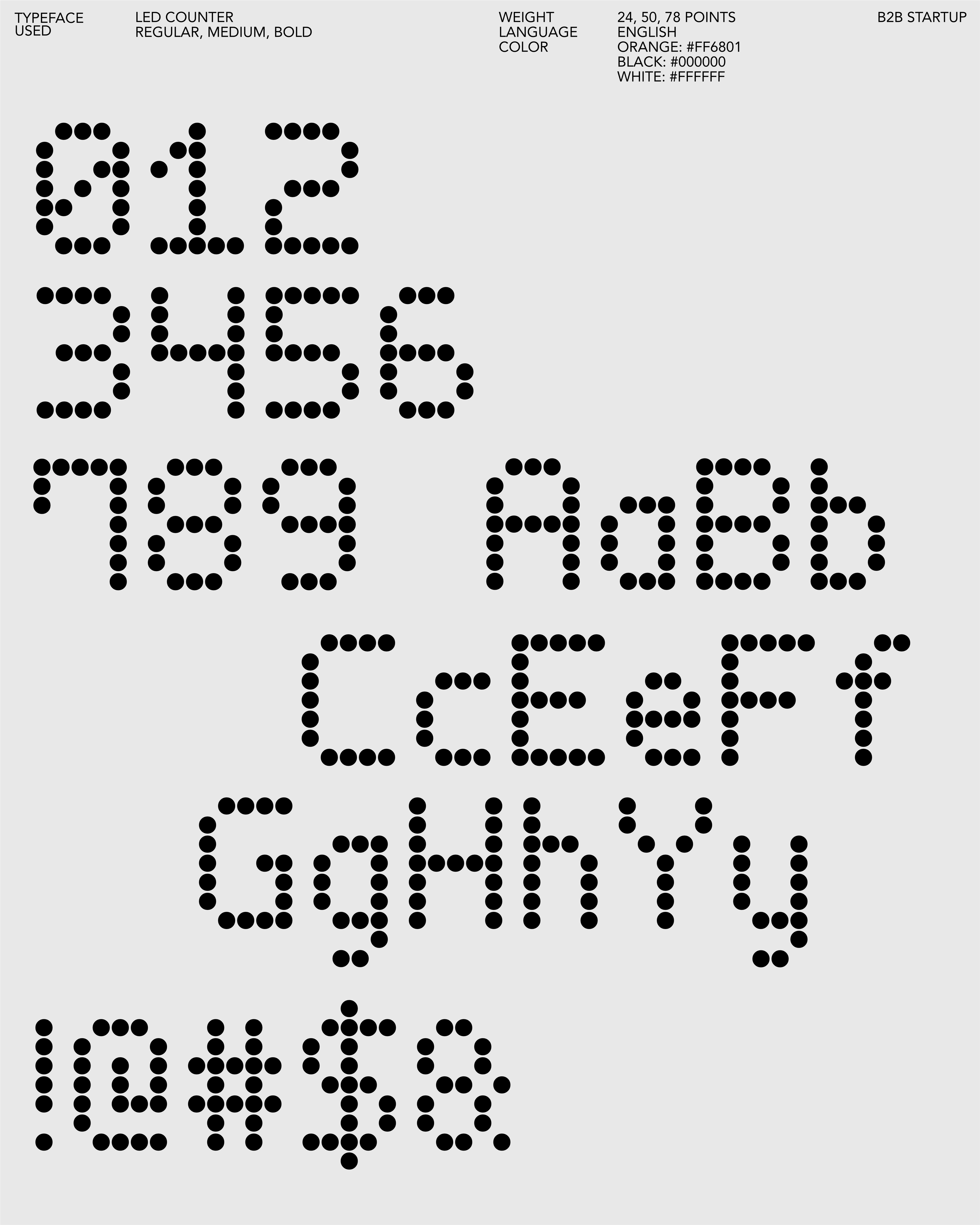
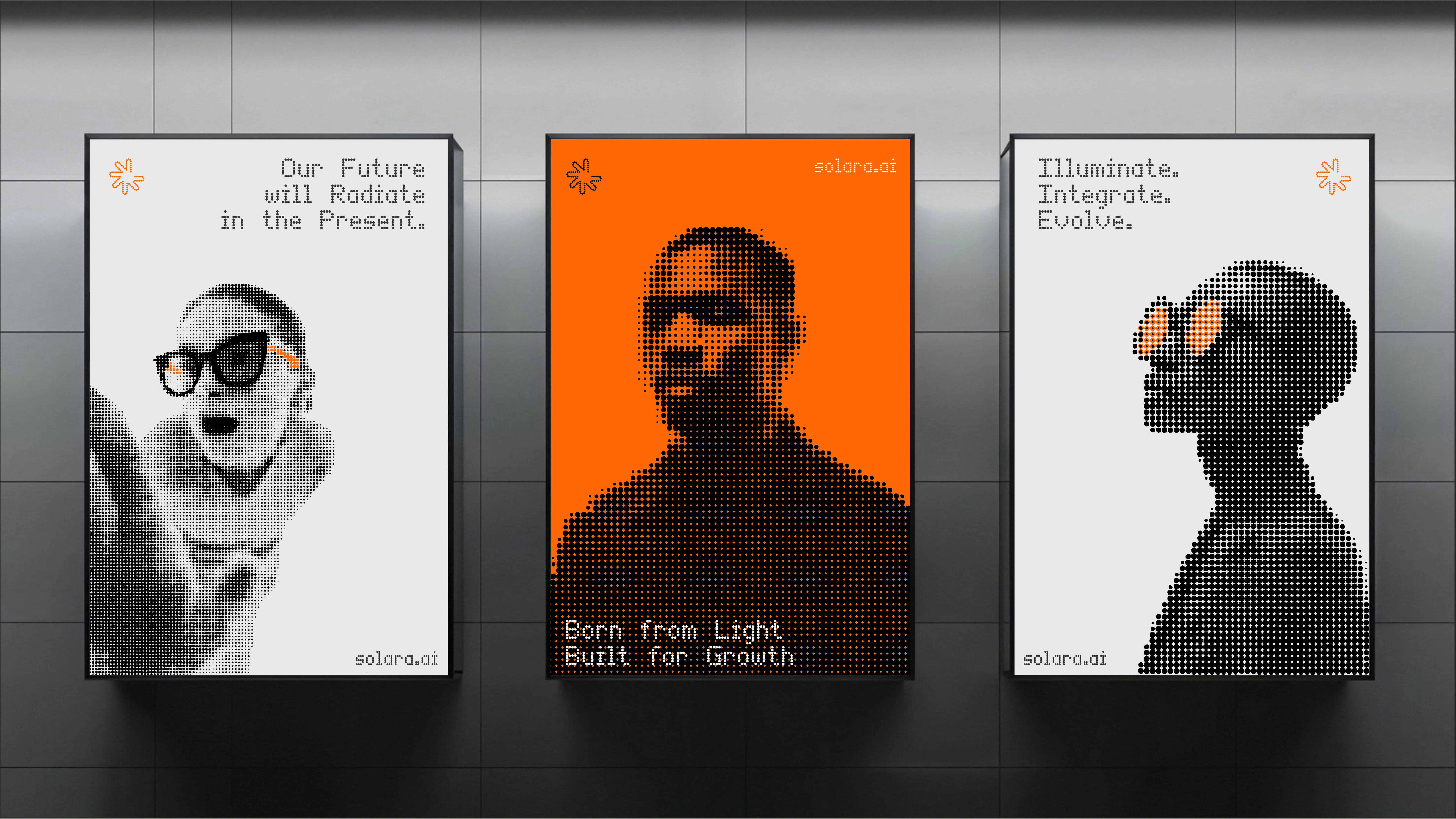
Typography follows a UI-first approach, led by the custom Led counter typeface a grid-based, monoline system built specifically for clarity in digital environments. Rounded terminals and geometric spacing echo the logo’s rhythm, ensuring the brand voice feels human, structured, and intelligent.
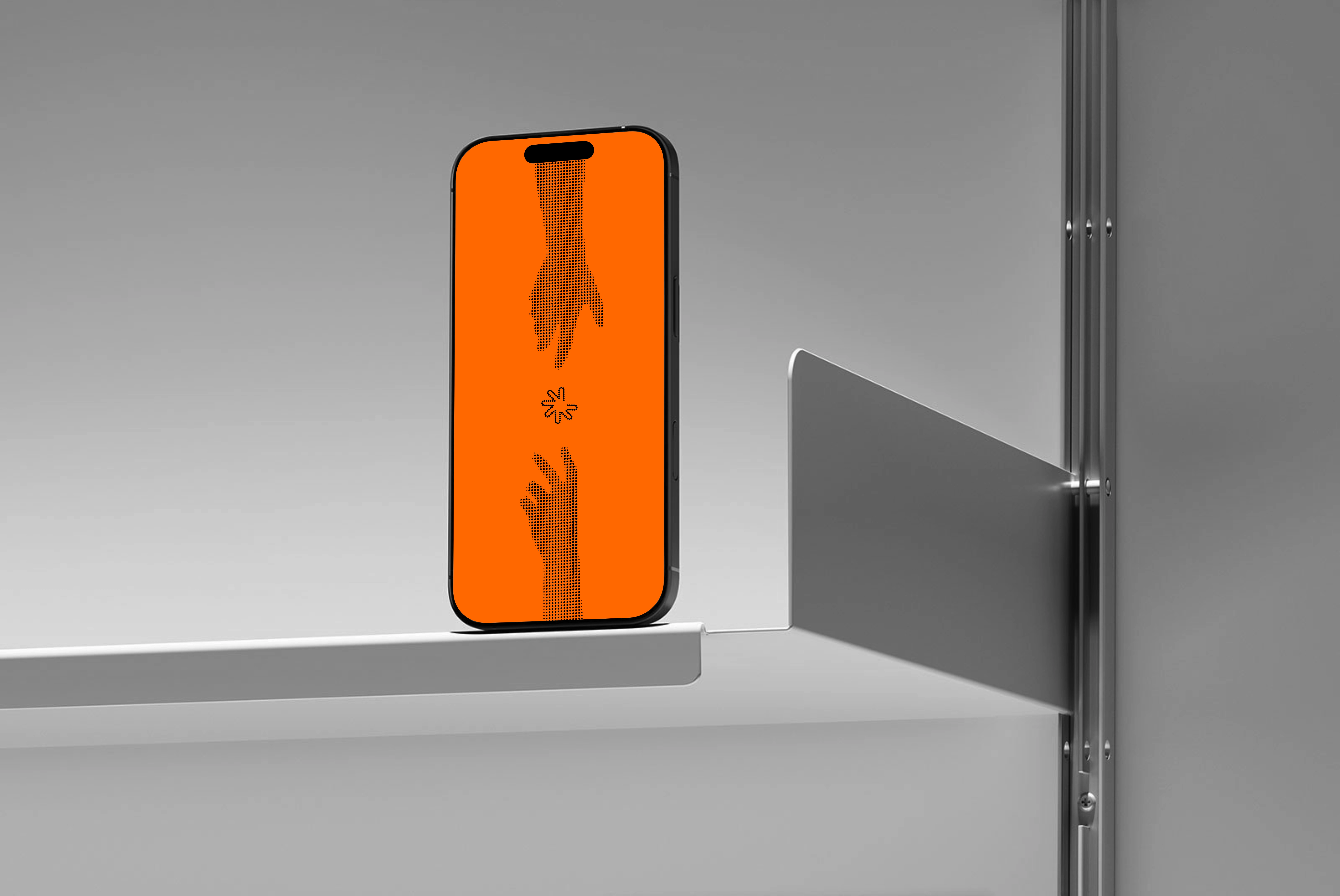
Photography takes on a distinct dotted treatment, visualizing data as light in motion. Portraits and objects are reimagined through a pattern of fine, circular gradients merging people and technology into a single visual field. The dotted style reinforces Solara’s core concept of connection and expansion, creating visual continuity across every brand touchpoint.
Tone of voice was crafted to match: intelligent, calm, and confident.
Direct without being cold. Technical without losing warmth.
A brand that doesn’t shout innovation, it radiates it.
Delivered
→ A complete brand identity system
→ Logo suite, complete with framework for sub-brands (Solvart™ and Raysart™)
→ Typography, color, and gradient systems for digital and print
→ Brand tone of voice and messaging principles
→ A comprehensive brand manual, complete with brand-in-use visualisations deck
→ Ongoing design support for smooth brand launch
The result
Solara launched with a clean, modern identity that helps it stand out in the fast-moving AI space.
The brand was created quickly but built to last now used across presentations, Social media, product demos, and digital platforms with ease.
The flexible design system and dotted visuals the brand very unique and also makes it simple to adapt across screens, motion, and print.
Everything works together to show what Solara stands for clarity, connection, and intelligent growth.
Today, Solara has a strong visual foundation that will keep growing as the company evolves.
Like this project
Posted Nov 4, 2025
Developed a scalable brand identity for Solara, a B2B tech startup, emphasizing clarity and intelligent growth.
Likes
0
Views
3
Timeline
Oct 5, 2025 - Oct 11, 2025