Focus & Screen Time Mobile App | Digital Wellness

Dmitriy H.

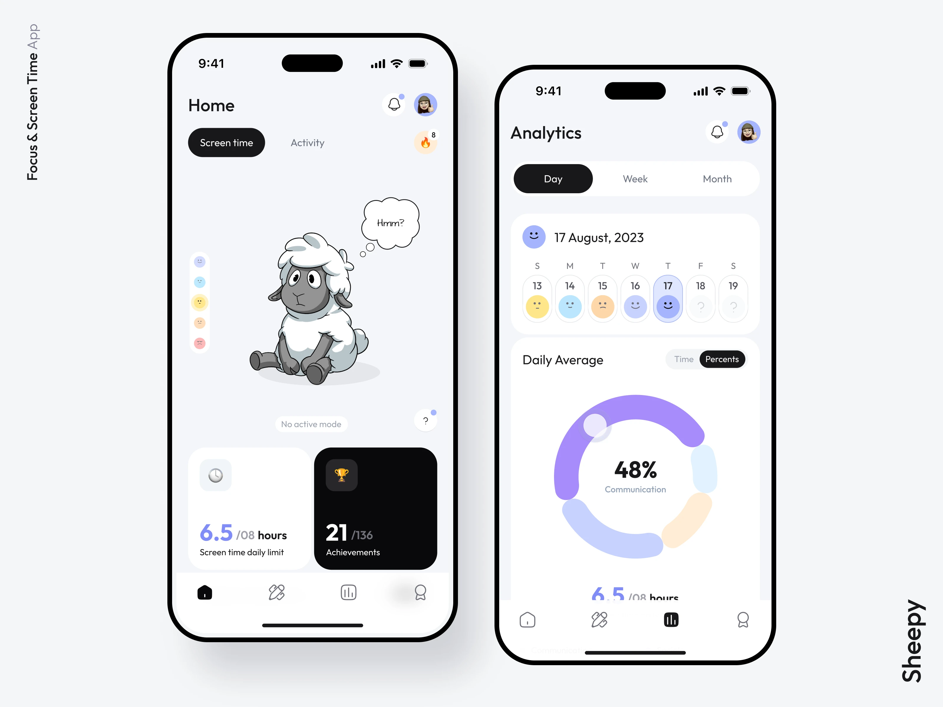
Sheepy is a digital wellness app that combines screen-time tools, personal insights, and a virtual sheep whose wellbeing reflects the user’s habits. I designed the mobile experience from early flows to final UI, then carried its visual identity into the website and store materials.
The starting point
Knowing how much time you spend on your phone does not necessarily help you change it. Sheepy’s idea was to make progress visible and give people practical ways to act on it, without turning digital wellbeing into a punishment.
The product needed to connect several experiences: understanding current habits, granting Screen Time access, setting up focus tools, reviewing progress, and returning each day. My role covered the full app experience and its visual direction, as well as the website design.
Wireframes & user experience
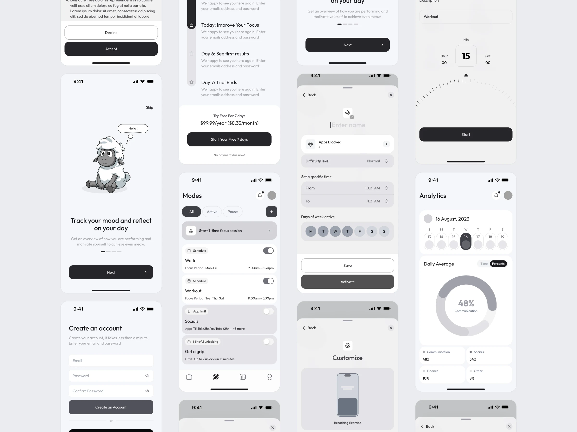
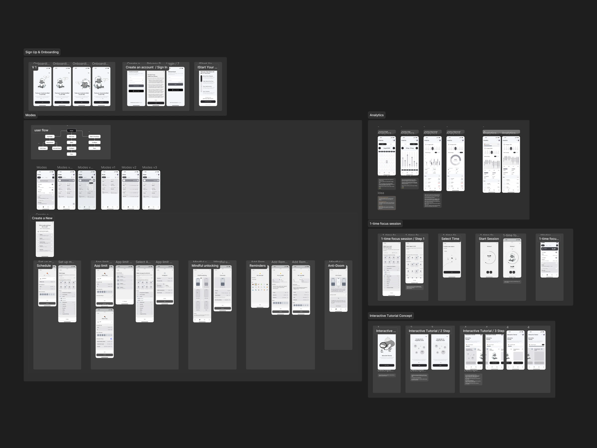
I mapped the journeys before refining the visual design: sign-up and onboarding, creating modes, starting a one-time focus session, reviewing analytics, and learning through tutorials. Multiple wireframe iterations helped me work through the order of steps, navigation between features, and the information each screen needed to show.
This was especially useful for the modes. Their settings differ, but creating, configuring, and activating one should still feel like a familiar process.
Onboarding & paywall
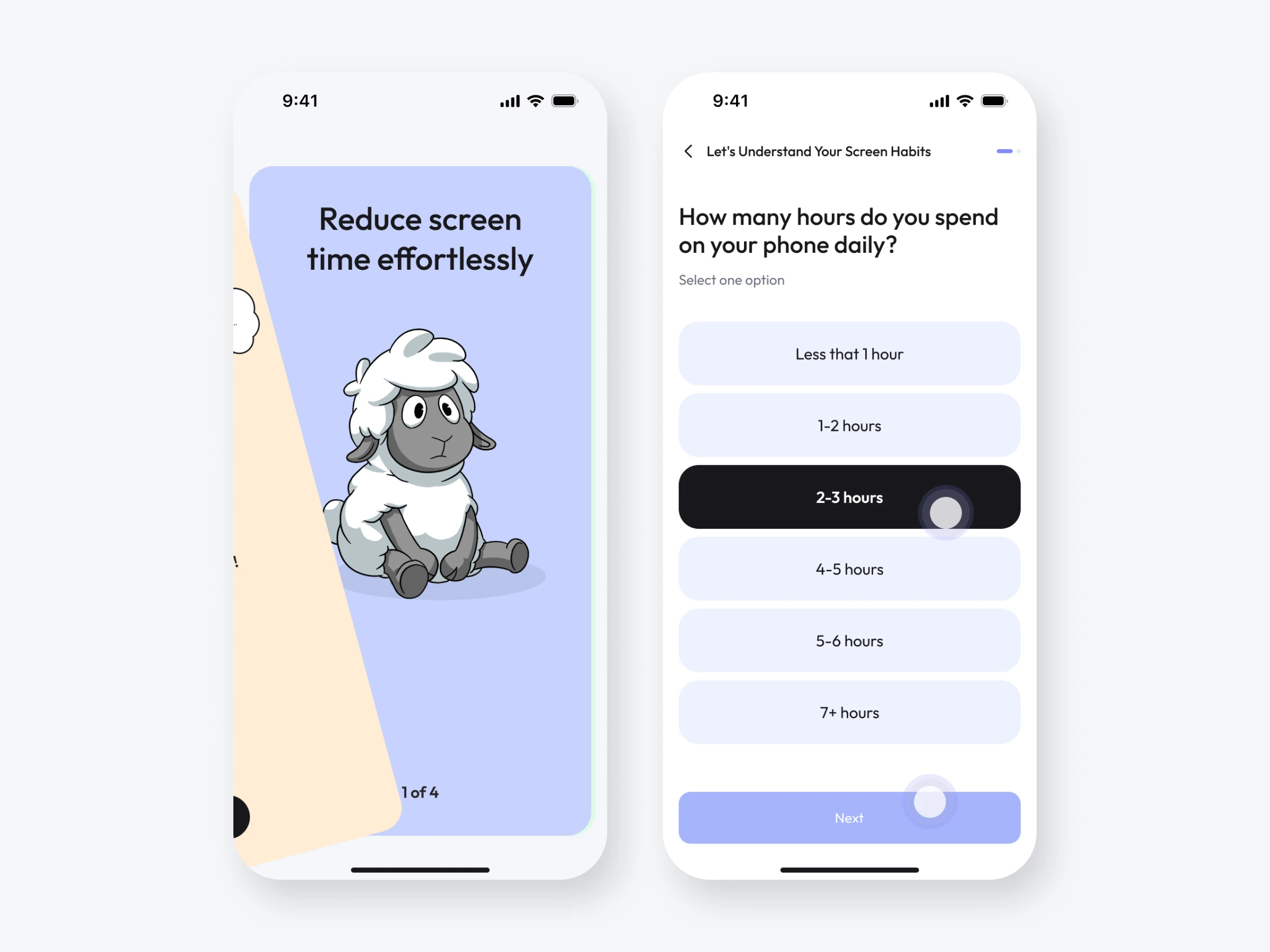
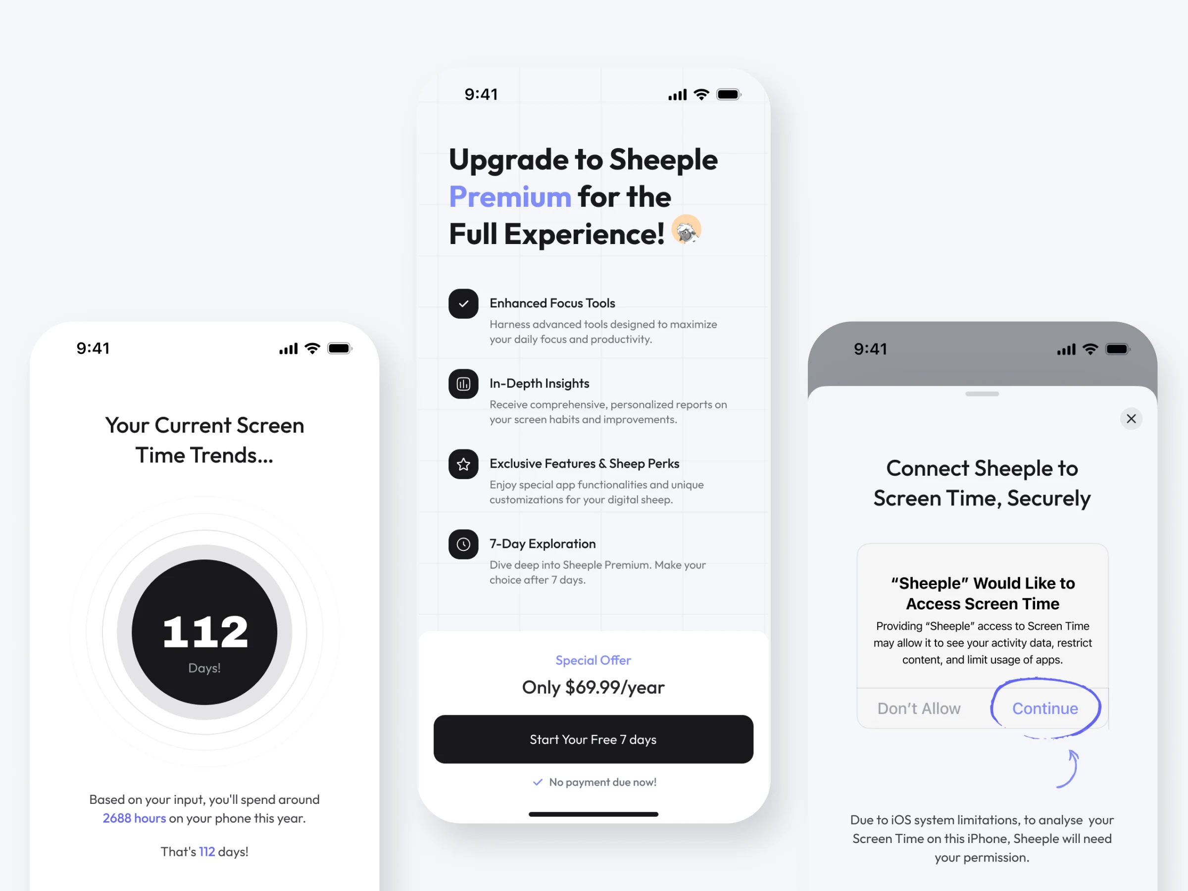
The onboarding begins with a simple introduction to Sheepy and a few questions about the user’s screen habits. A personalized estimate translates daily phone use into an annual total, making the reason to change more tangible before introducing the premium offer.
The flow then explains the value of the subscription and the trial. Screen Time permission has its own explanation, so users can understand why the app needs access before responding to the iOS prompt.
Home & navigation
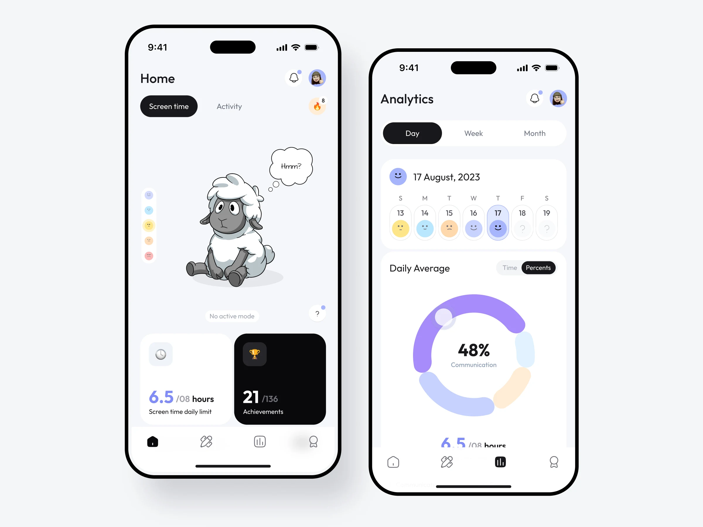
Home is designed for a quick daily check-in. The sheep sits at the centre of the experience, while screen-time progress, activity, and achievements provide a readable snapshot of the day.
The bottom navigation keeps the app’s main purposes separate: the daily overview, focus modes, analytics, and rewards. Users can see how they are doing, then move directly to the tool or detail they need.
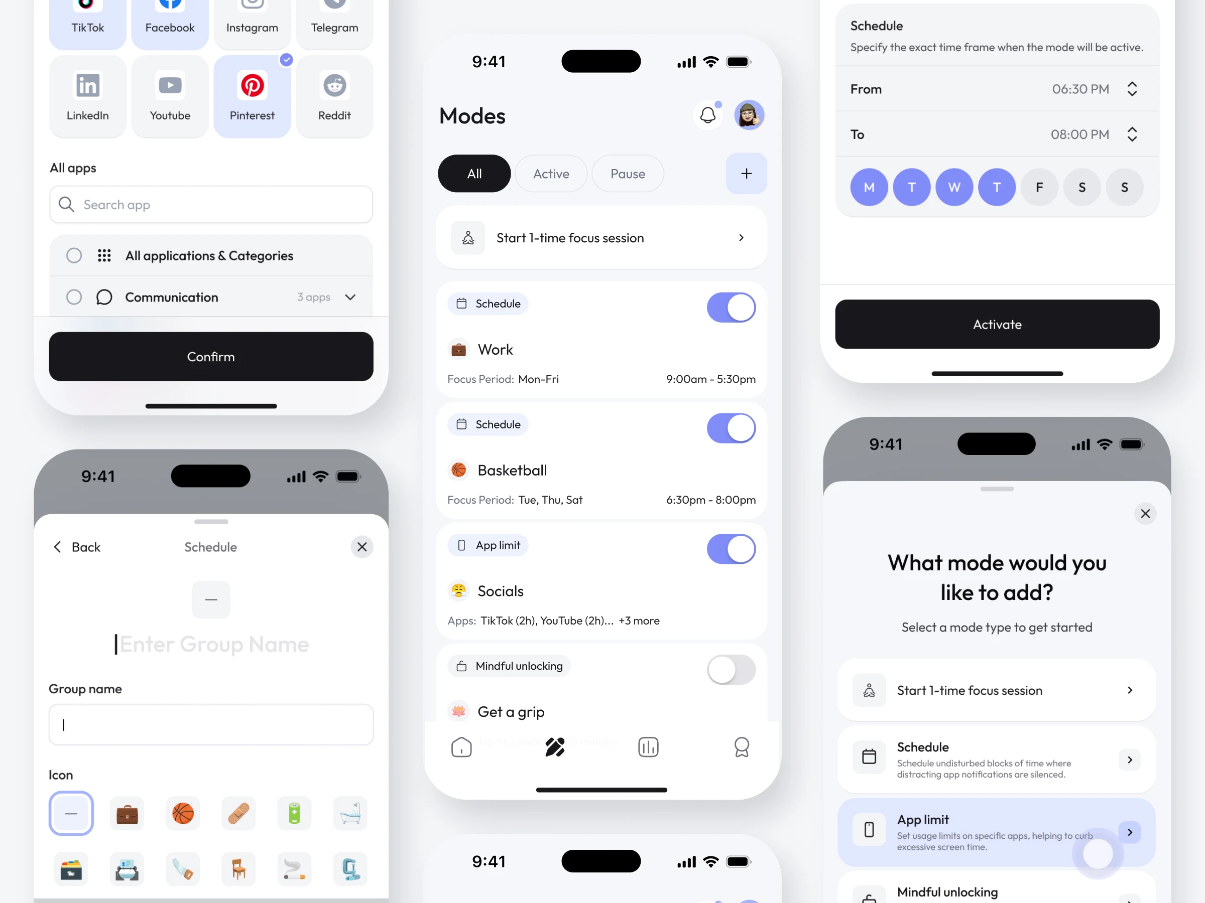
Modes
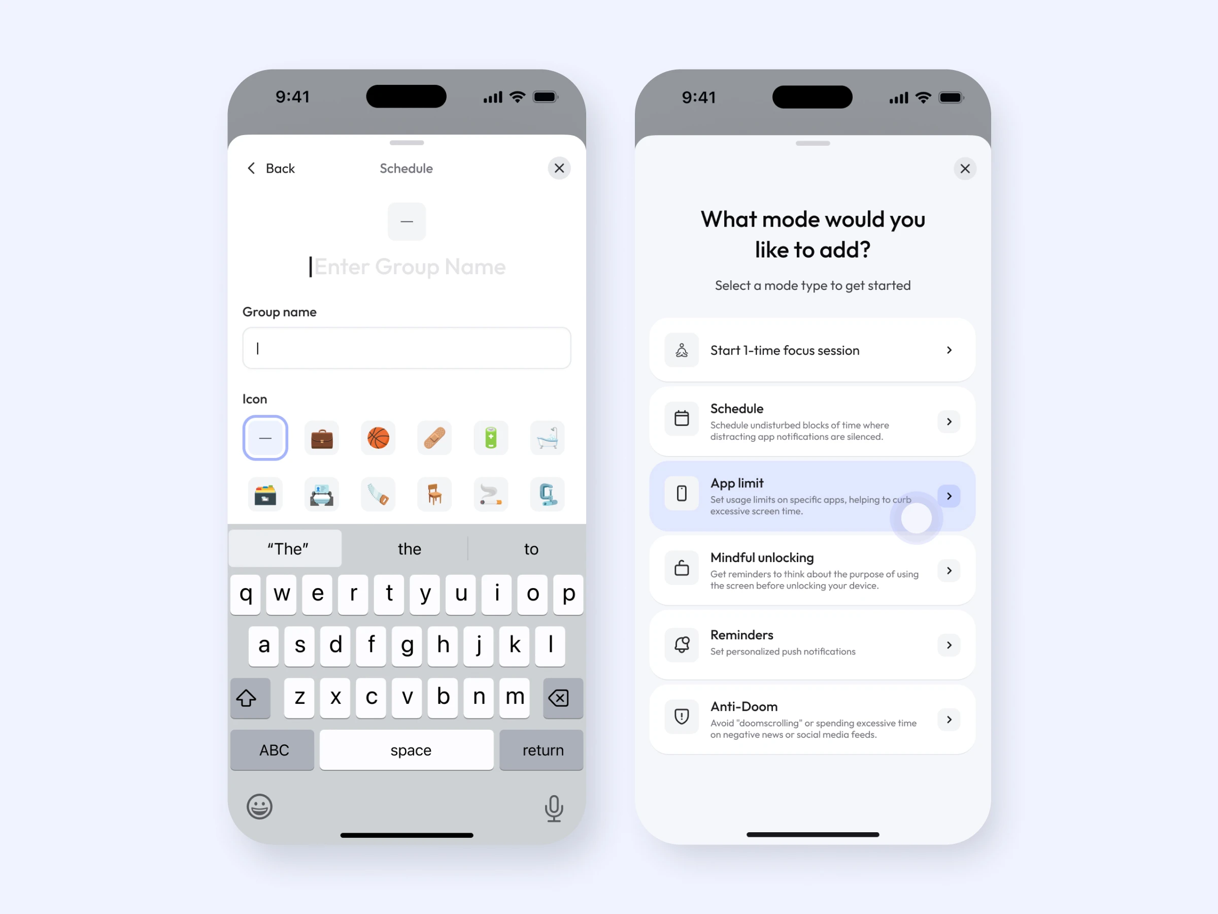
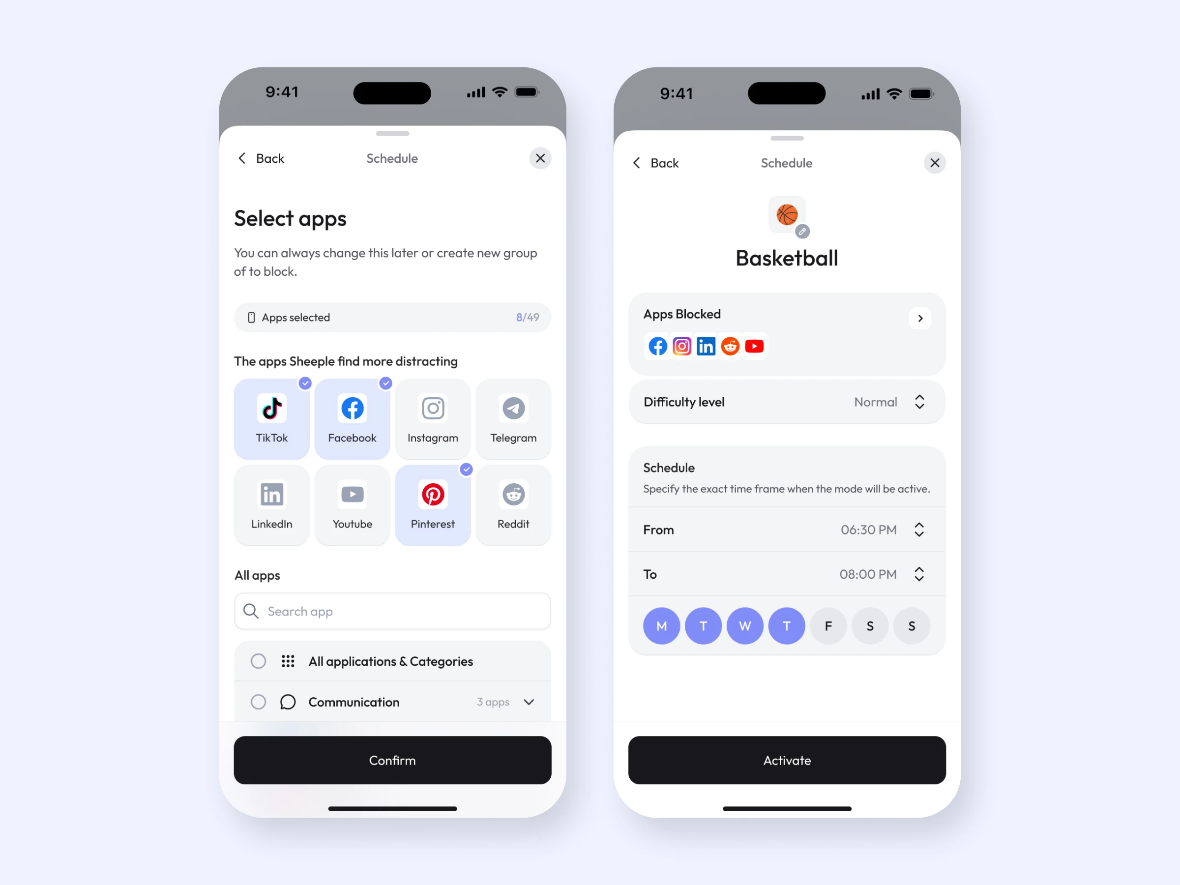
Different situations call for different levels of control. I designed flows for one-time focus sessions, scheduled periods, app limits, mindful unlocking, reminders, and Anti-Doom.
A shared mode structure makes the options easier to learn, while each setup presents the controls relevant to that goal. Users can select apps or categories, set times and days, adjust difficulty where needed, and see which modes are active or paused.
Analytics
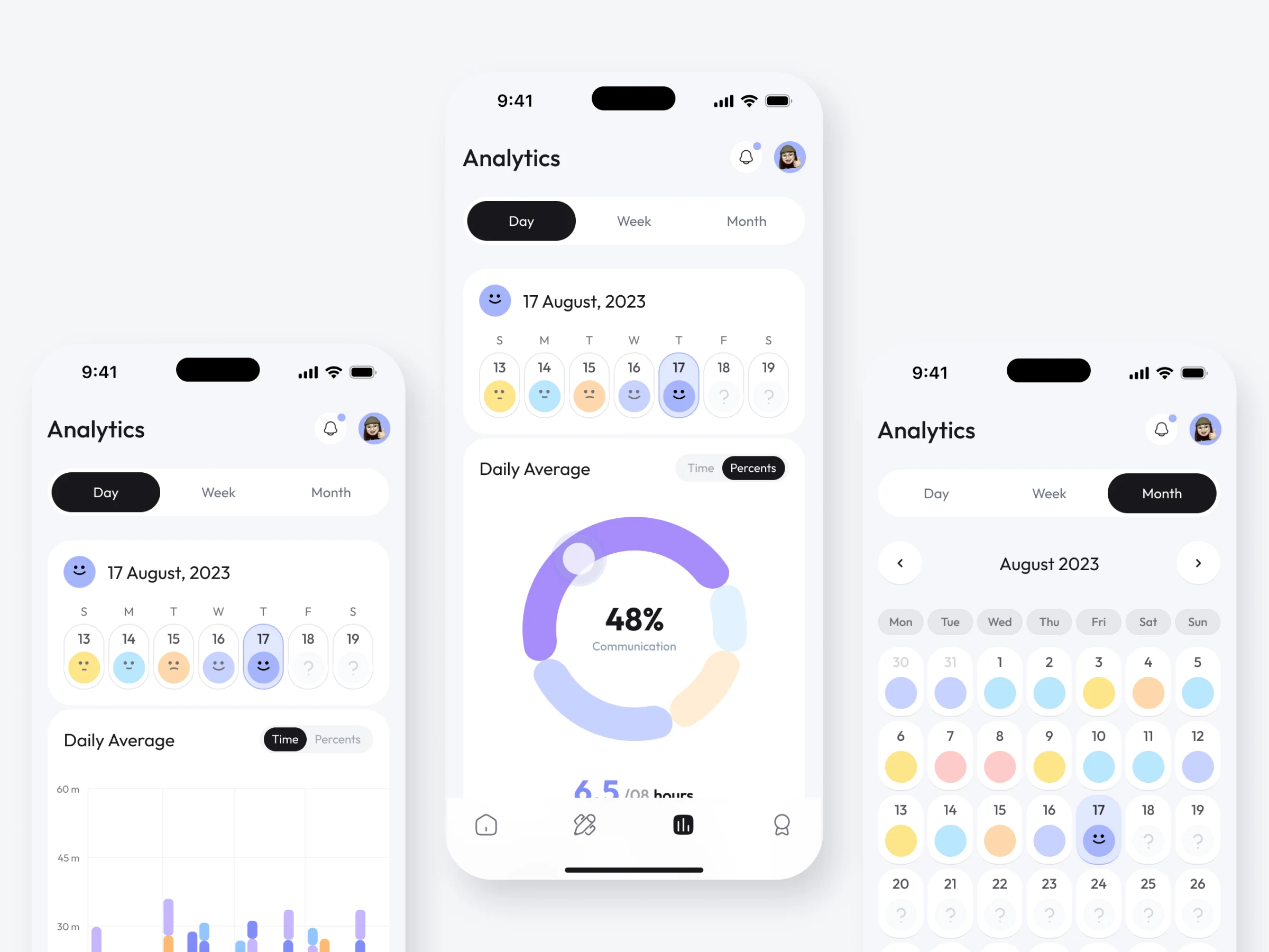
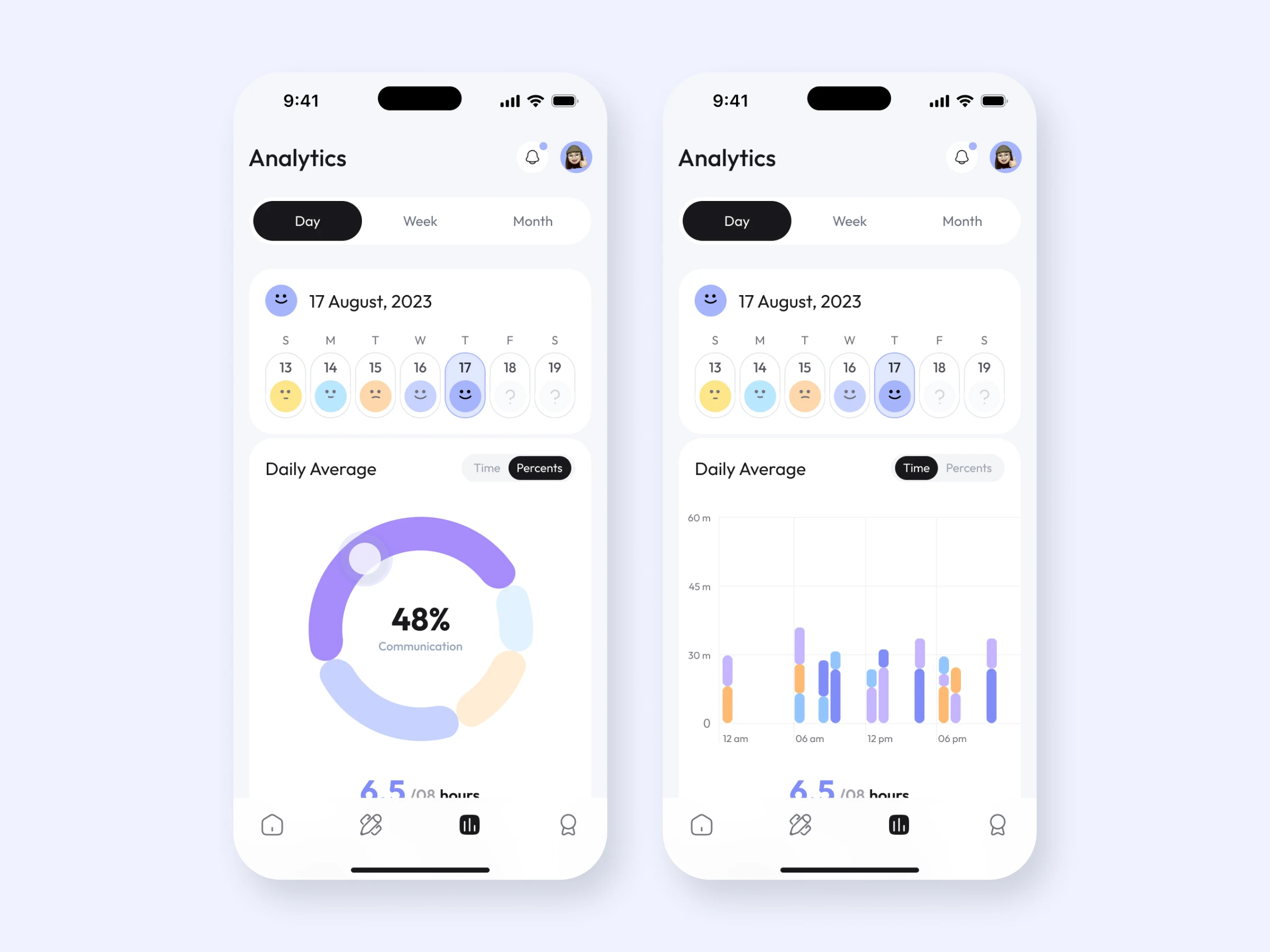
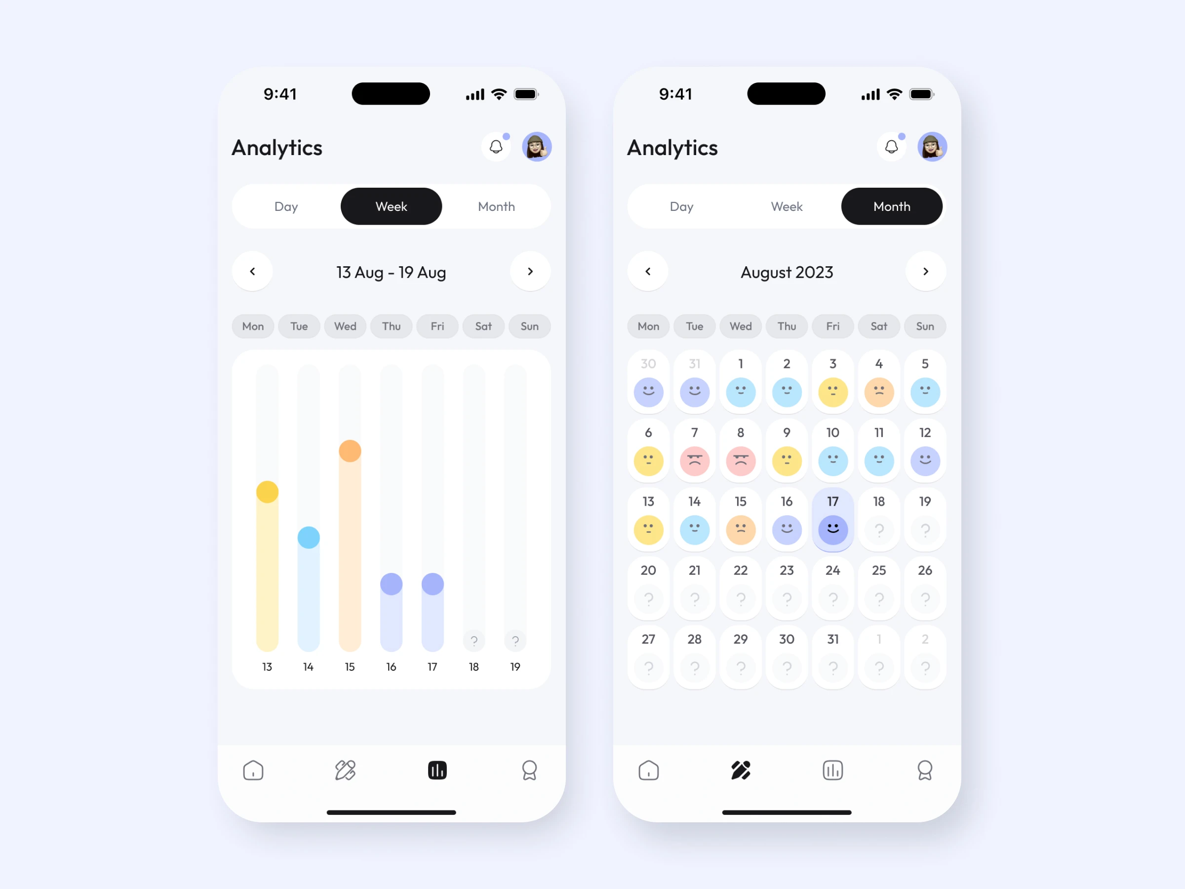
The analytics experience helps users look beyond a single screen-time number. Day, week, and month views show usage at different scales, while mood indicators add a personal record alongside the data.
I explored charts for time of use and category share, with a switch between time and percentage views. The aim was to make patterns easy to spot and give users enough context to decide what they might change.
Quests & gamification
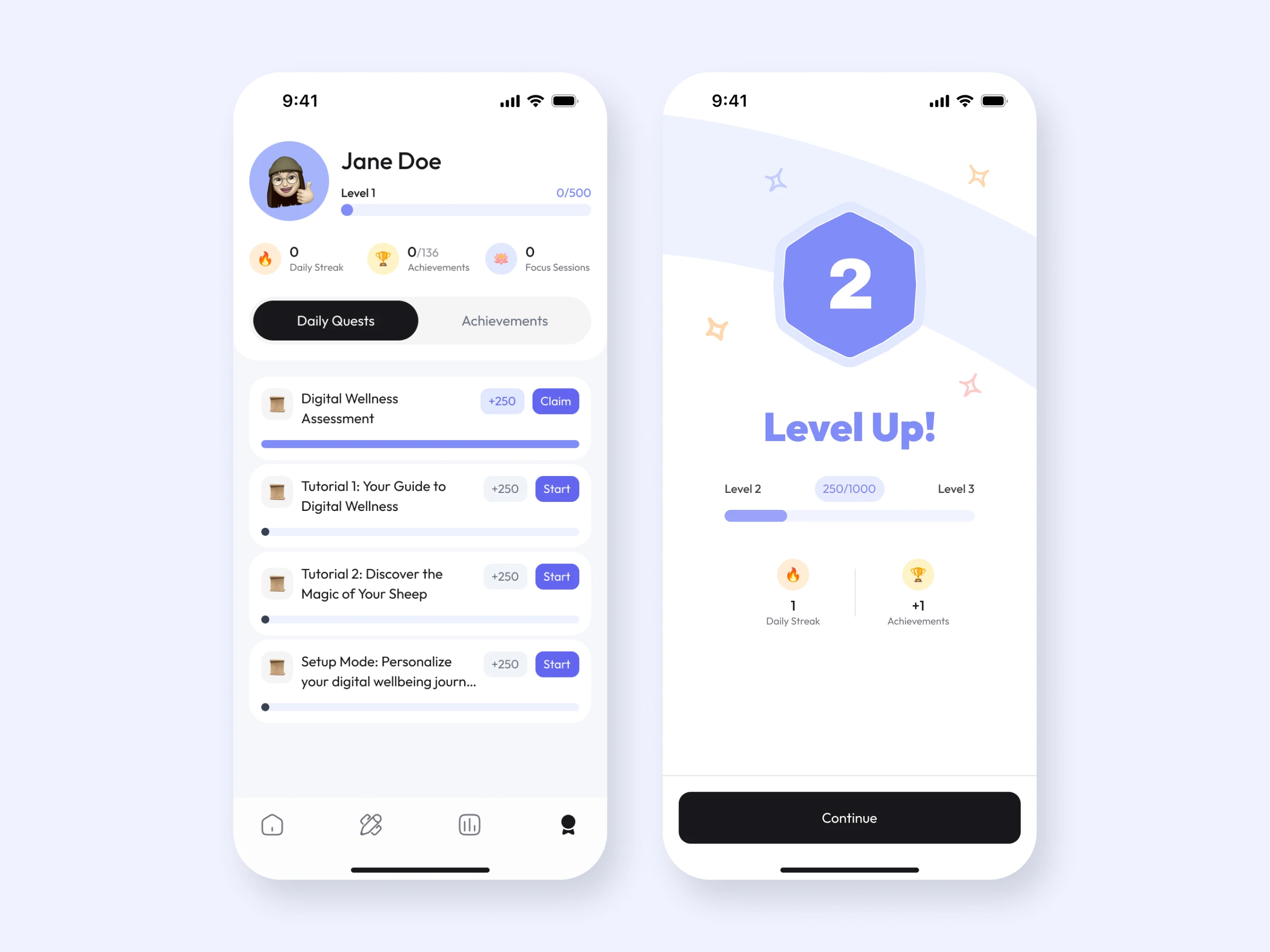
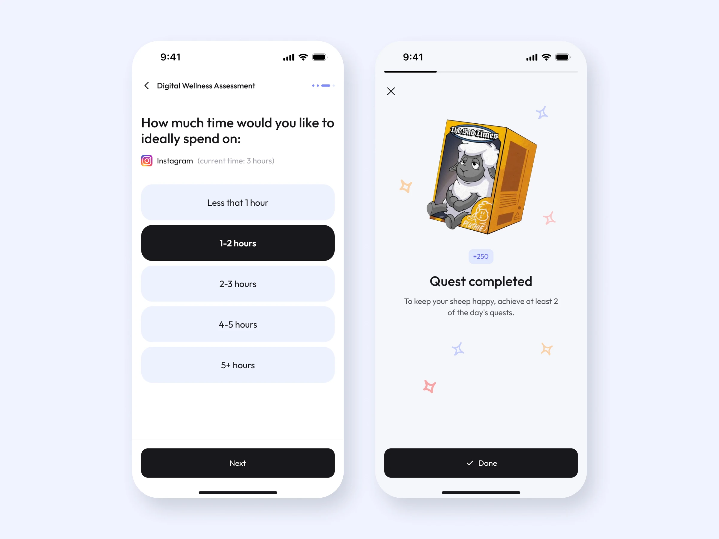
Sheepy uses quests to turn good intentions into small actions. A digital wellness assessment, guided tutorials, daily quests, achievements, streaks, and levels give users several ways to start and recognize progress.
The reward screens make completion feel satisfying, while the sheep brings warmth to a subject that can otherwise feel judgmental. Gamification supports the habit-building loop; the focus tools remain useful on their own.
Profile & settings
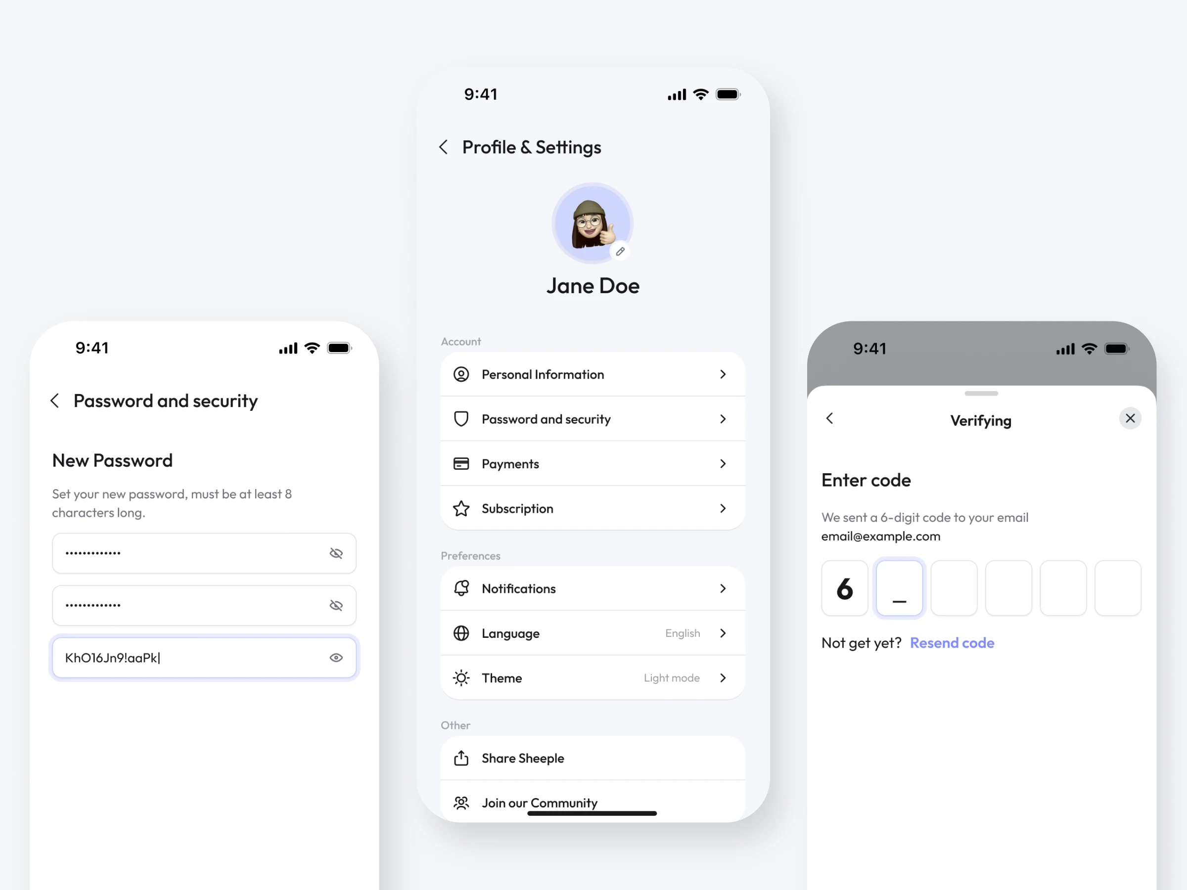
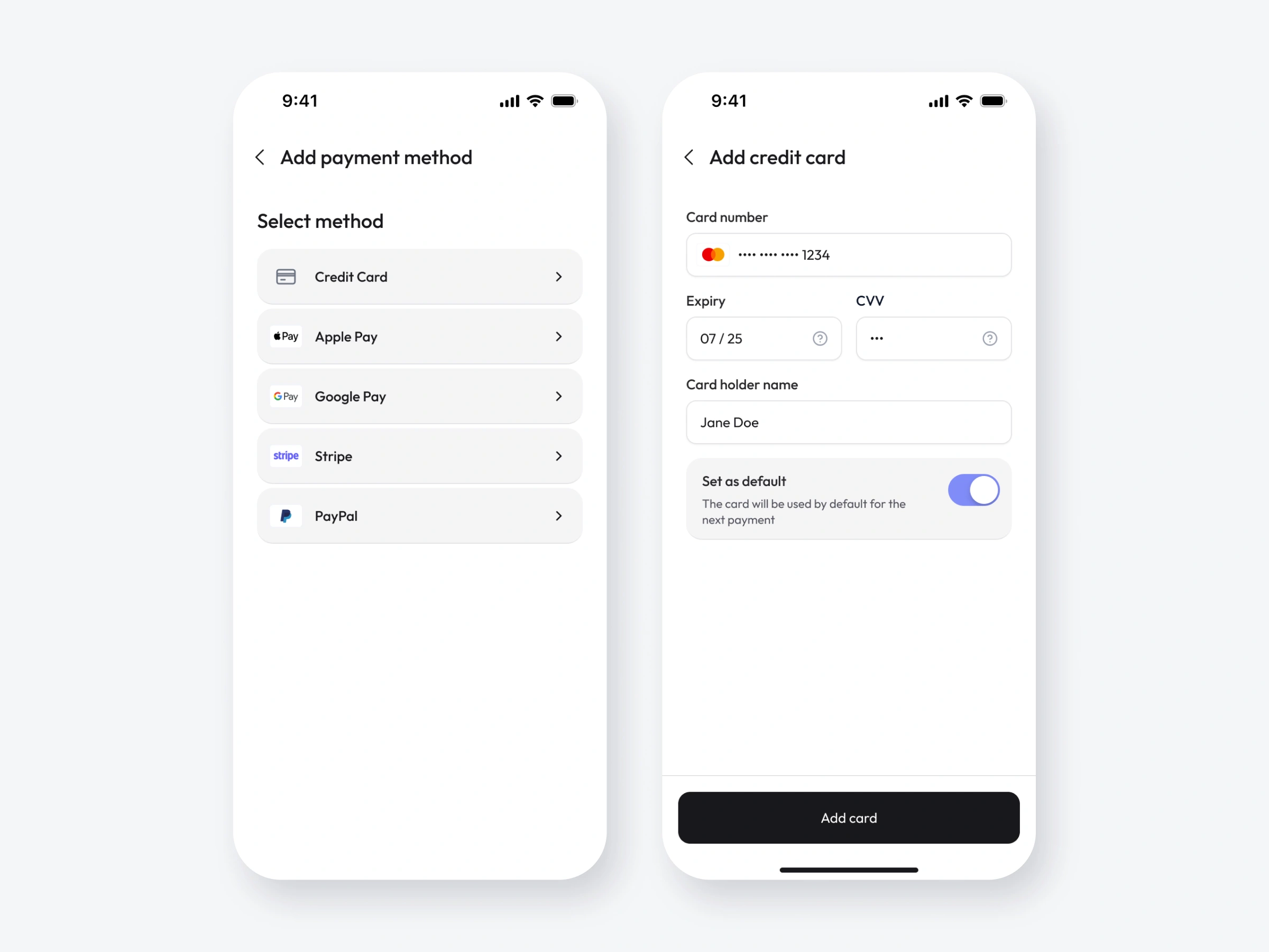
The profile brings account details, security, subscription, payments, notifications, language, and appearance into one predictable structure. I also designed supporting flows such as email verification, password changes, and adding a payment method.
These less visible screens matter to the overall experience: people need to be able to manage their account and subscription as confidently as they use the app’s main features.
Visual style & design system
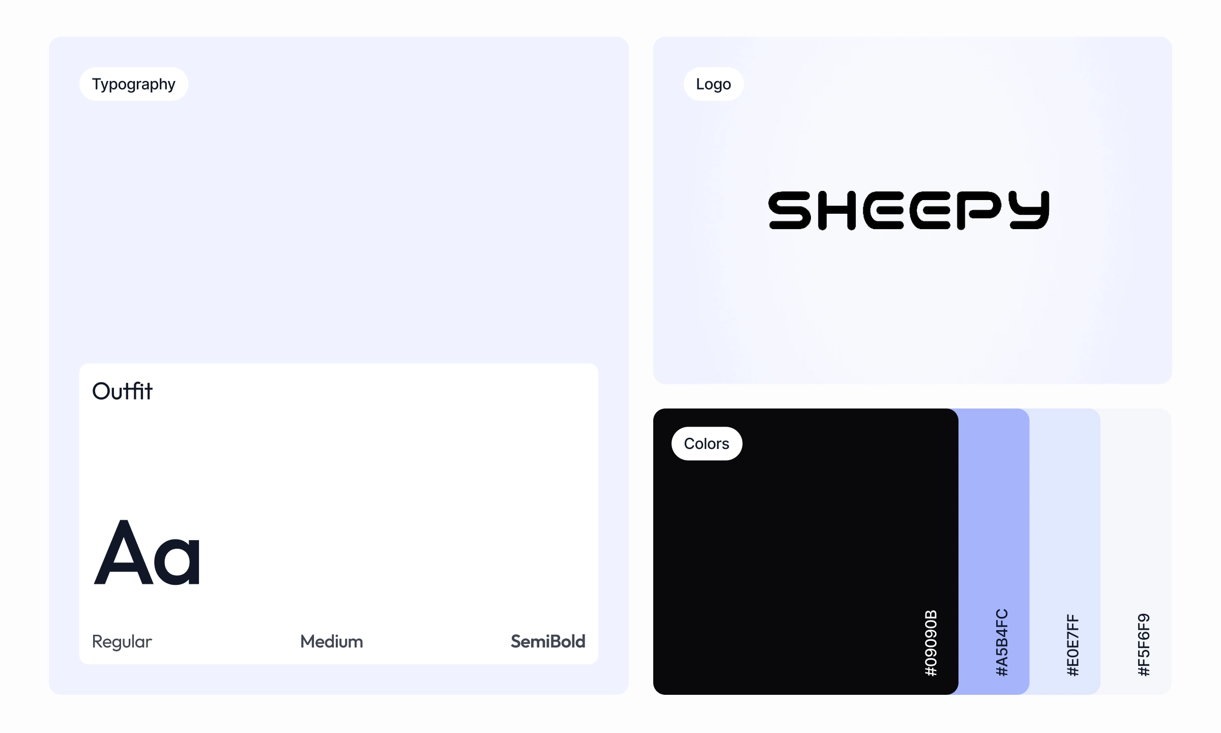
I developed a visual language that balances a friendly character with a clean, functional interface. The Sheepy wordmark, Outfit typography, soft lavender palette, and dark primary actions give the product a recognizable look without overwhelming its data and controls.
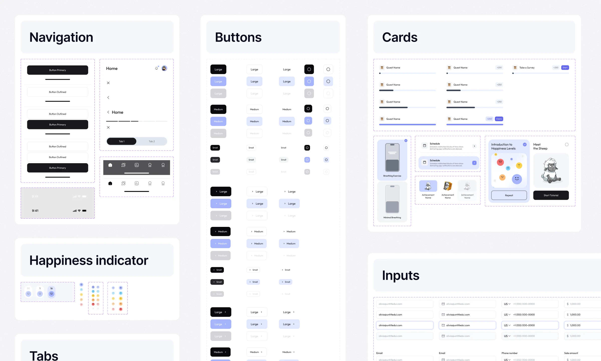
A reusable system covers navigation, buttons, inputs, cards, tabs, and happiness indicators, including their different states. It keeps the app consistent across onboarding, focus tools, analytics, rewards, and account flows.
Store screenshots
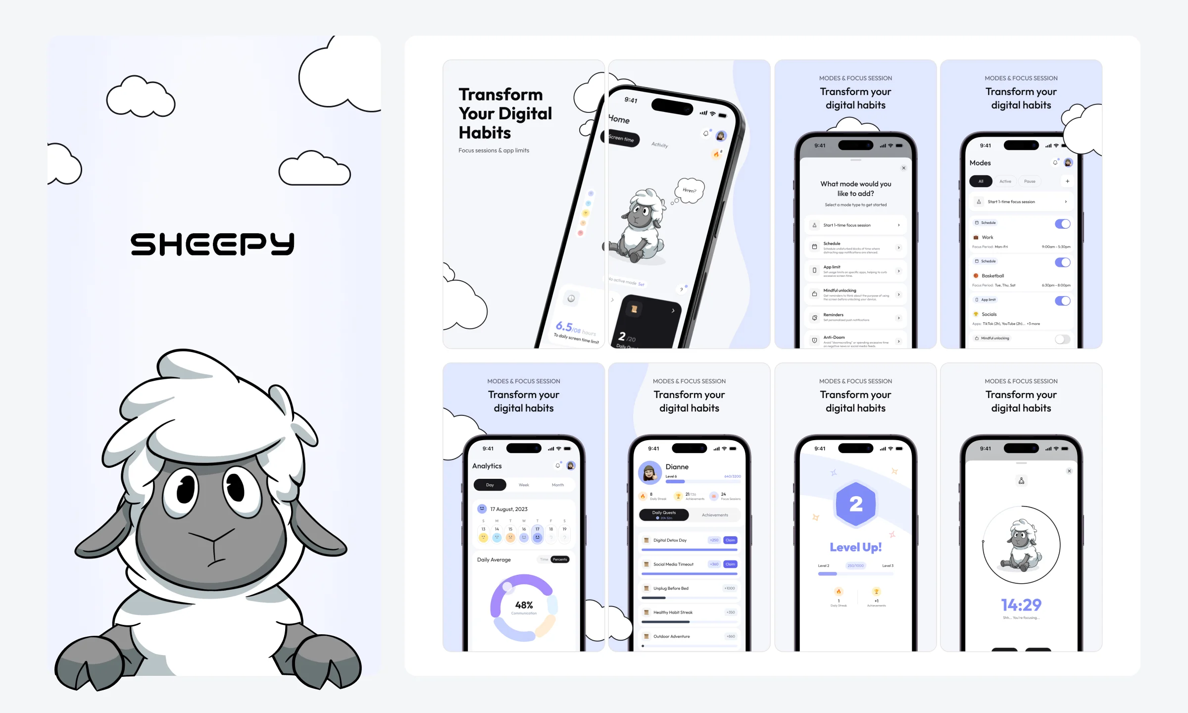
Designed screenshot sets for the App Store and Google Play to communicate the app quickly in a storefront format. The sequence highlights the promise of healthier screen habits, then shows the product behind it: the sheep, focus modes, progress tracking, and rewards.
Like this project
Posted Jul 16, 2026
Designed the UX & UI for the Sheepy app - a digital wellness app that helps users reduce screen time through personalized modes and progress tracking.