Medical Studying Mobile App | AI Flash Cards & Quizzes Maker

Dmitriy H.


Role: Product Designer · Sole designer
Scope: Product UX/UI, app structure, learning flows, AI patient interaction, visual language, and components
Team: The founder and a small team of developers
Memrizz is an AI-powered platform for medical students. It automatically creates flashcards from study material and lets students practise in realistic patient-conversation simulations. I designed the iOS app from the first concept to its App Store release.
The starting point
The team began with a product idea and the core AI capabilities, but not yet a cohesive app experience. My task was to connect uploading study material, creating lessons, flashcards, and quizzes into one clear process.
Medical material is extensive, so students needed to start quickly, see what was already prepared, and return to studying without searching for their place again. I worked with the founder and a small team of developers on the learning flows, app structure, interface, visual language, and components. The AI patient direction belongs to the wider product scope; this case follows the study flows in the app.
Wireframes & structure
Before the visual design, I used wireframes to define the structure of the screens and the order of actions. They covered the path from the lesson list and a lesson’s units to flashcards, Wrong and Correct answers, and completion, as well as multiple-choice questions.
At this stage the aim was to settle what each screen needed to show and how a student moves between the study modes.
Creating a lesson
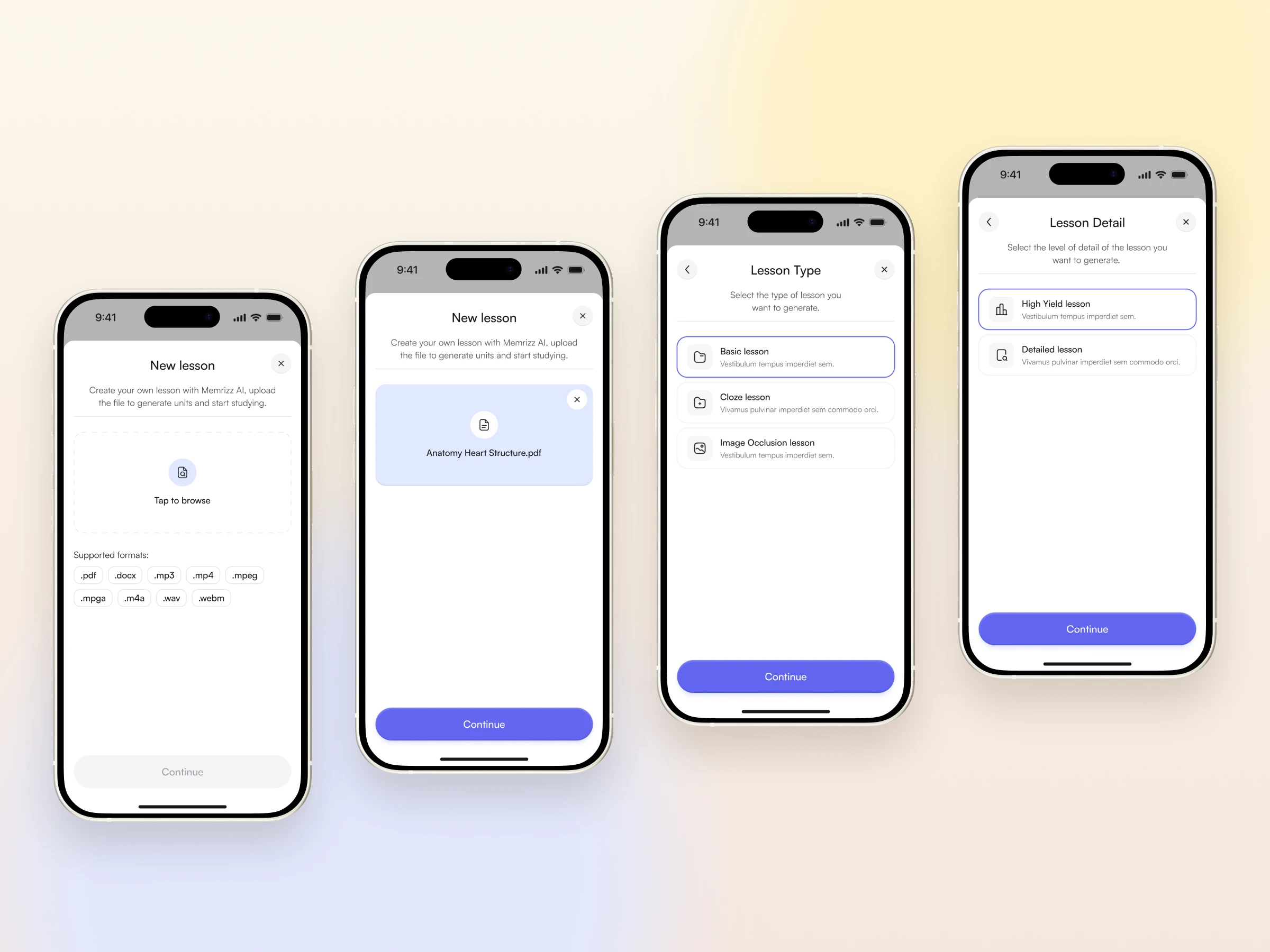
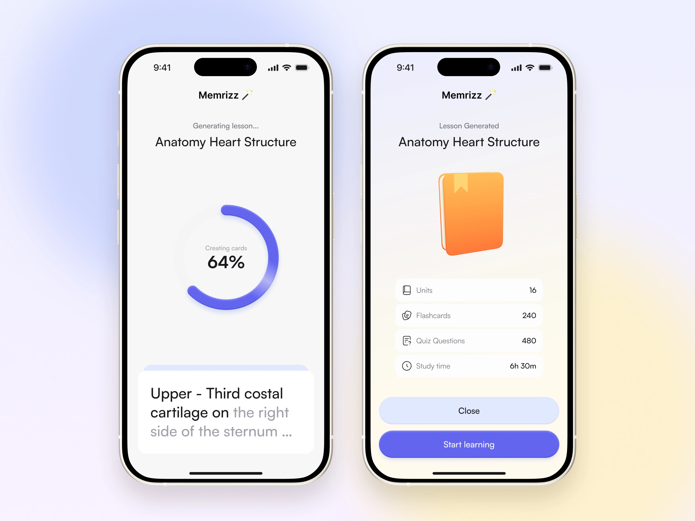
Generating a lesson from a document is a complex action, so I turned it into a guided process. The student chooses the material first, then the card format and the depth of coverage, and only then starts generation. Splitting the setup into steps keeps all the settings from appearing at once.
While the lesson is generated, the screen shows the progress of processing the material. When it is ready, the student gets an overview of what was created: units, flashcards, and quiz questions.
Lessons and learning material
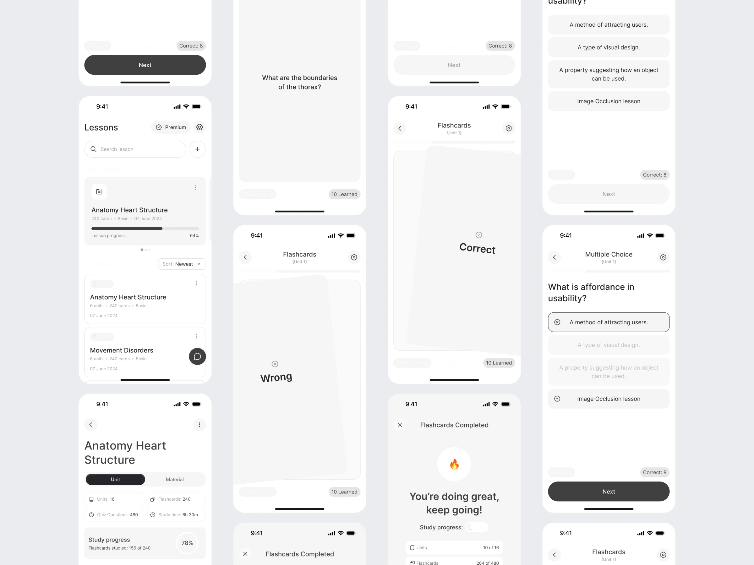
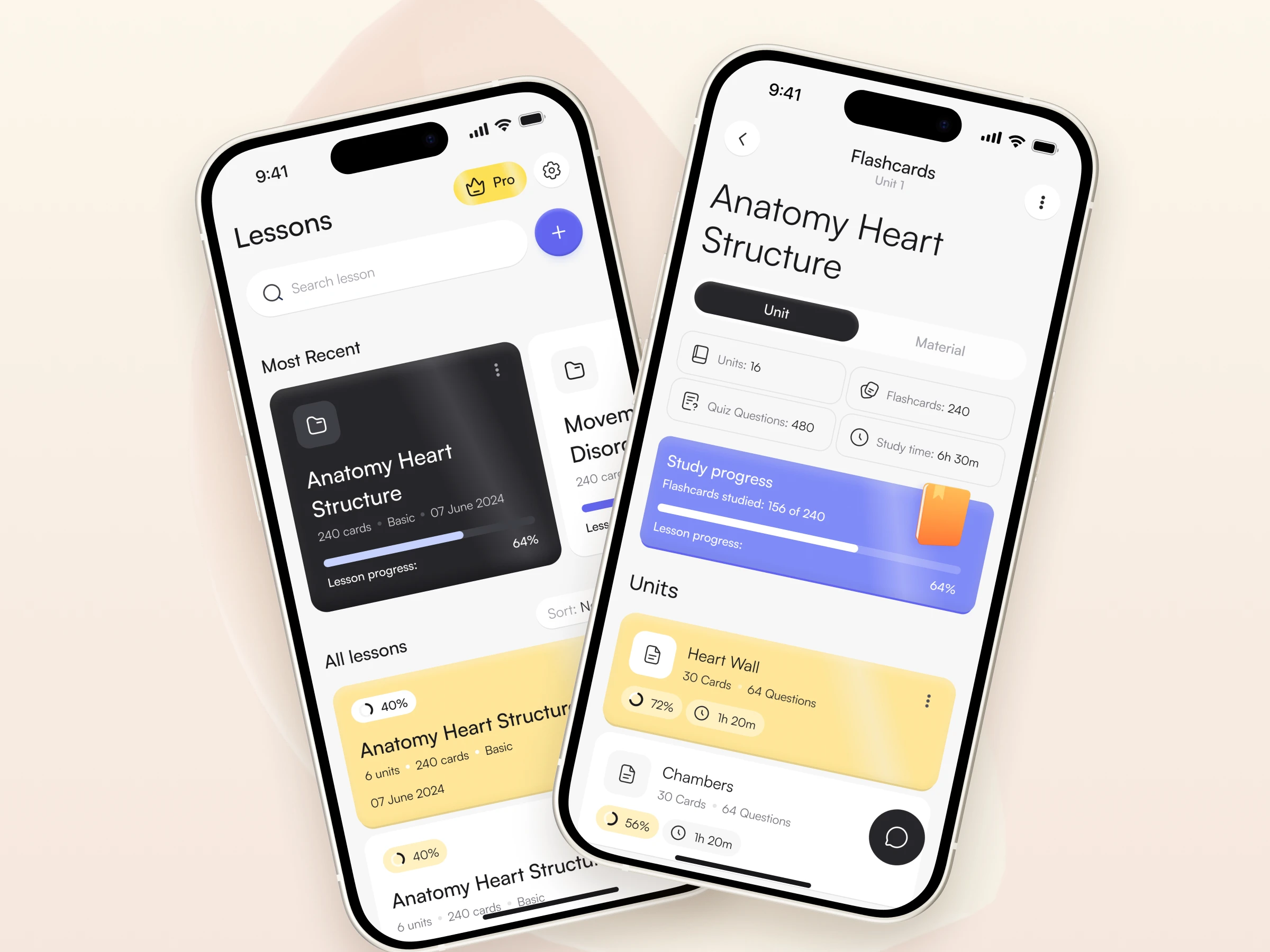
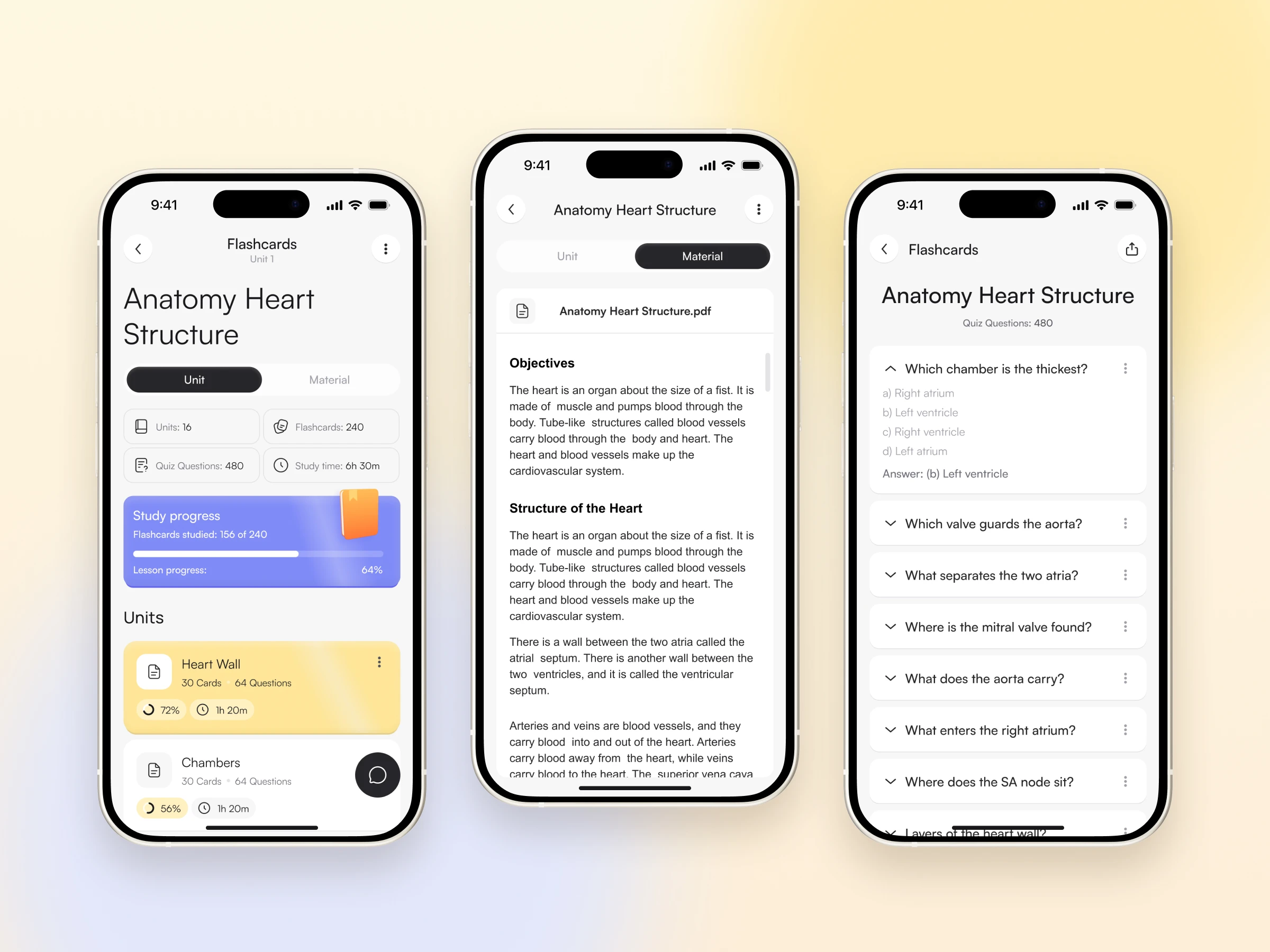
Students return to the same lessons again and again, so the lesson list is built for coming back without searching. Each lesson opens into a Unit view that shows its structure and the progress for each part.
Material holds the document the lesson was created from, and the question list leads into practice. I kept the structure of the learning and its source separate but inside one lesson, so a student can check the document and then continue with cards or a quiz in the same context.
Flashcards
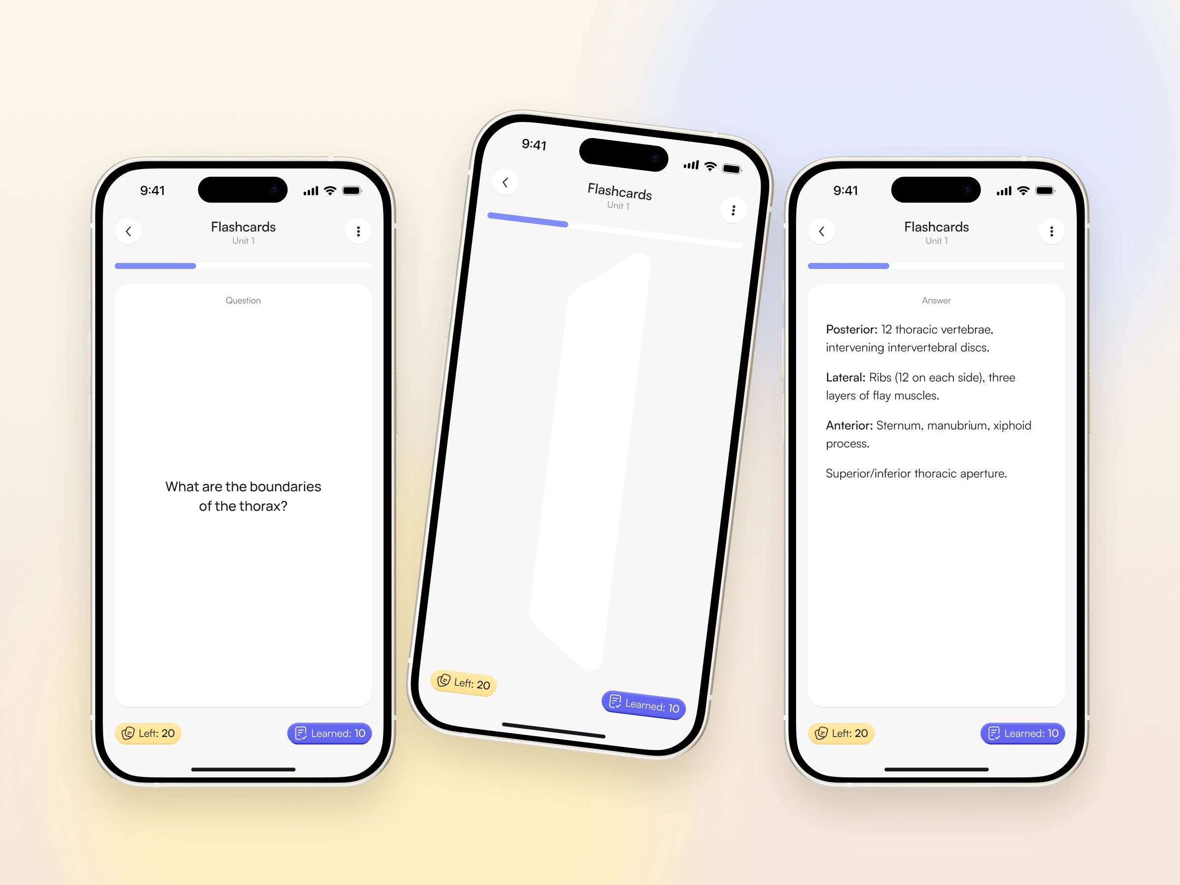
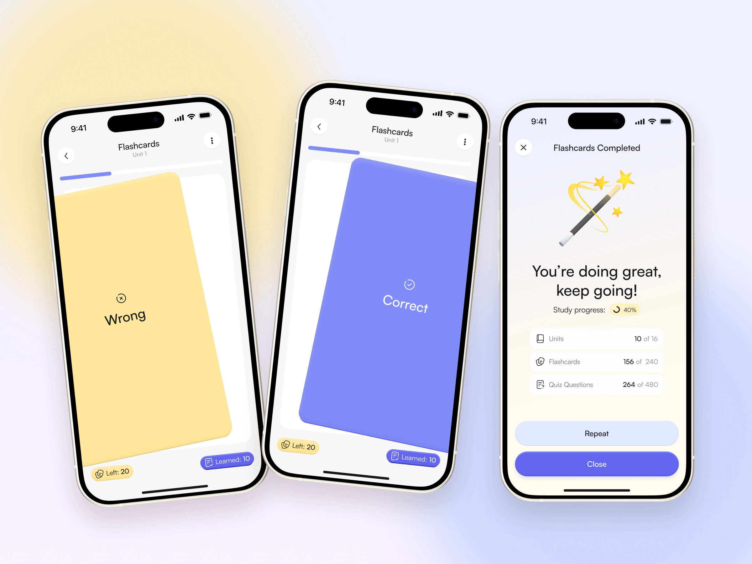
Reviewing cards is a short, repeated cycle, so I kept it free of extra transitions. The student reads the question, taps to flip the card, reads the answer, and marks whether they recalled it: a swipe left is Wrong, a swipe right is Correct.
Colour and a text label work together, so the result reads at a glance. Wrong marks the card for further review while the current session continues.
Quizzes, progress, and completion
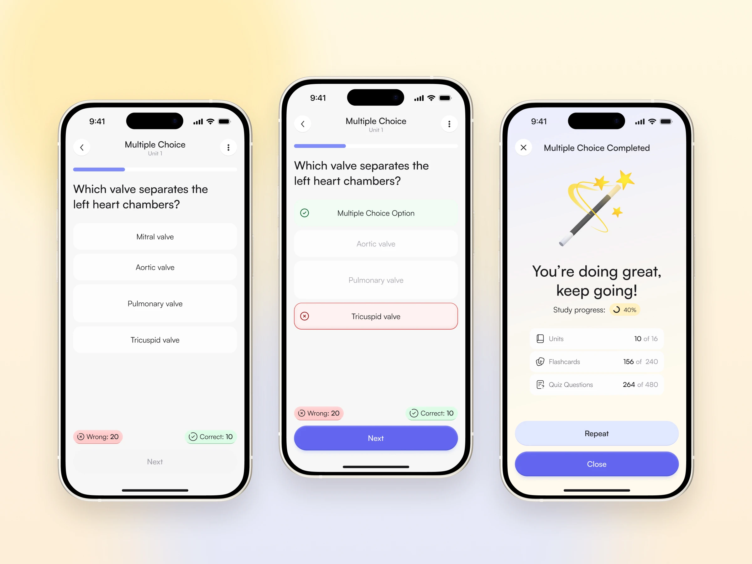
In a quiz, the student chooses an answer and gets feedback immediately. Correct and incorrect choices are clearly distinct, while the question stays on screen so the feedback keeps its context. The completion screen closes the session by showing progress and offering two next steps: repeat the exercise or return to the lesson.
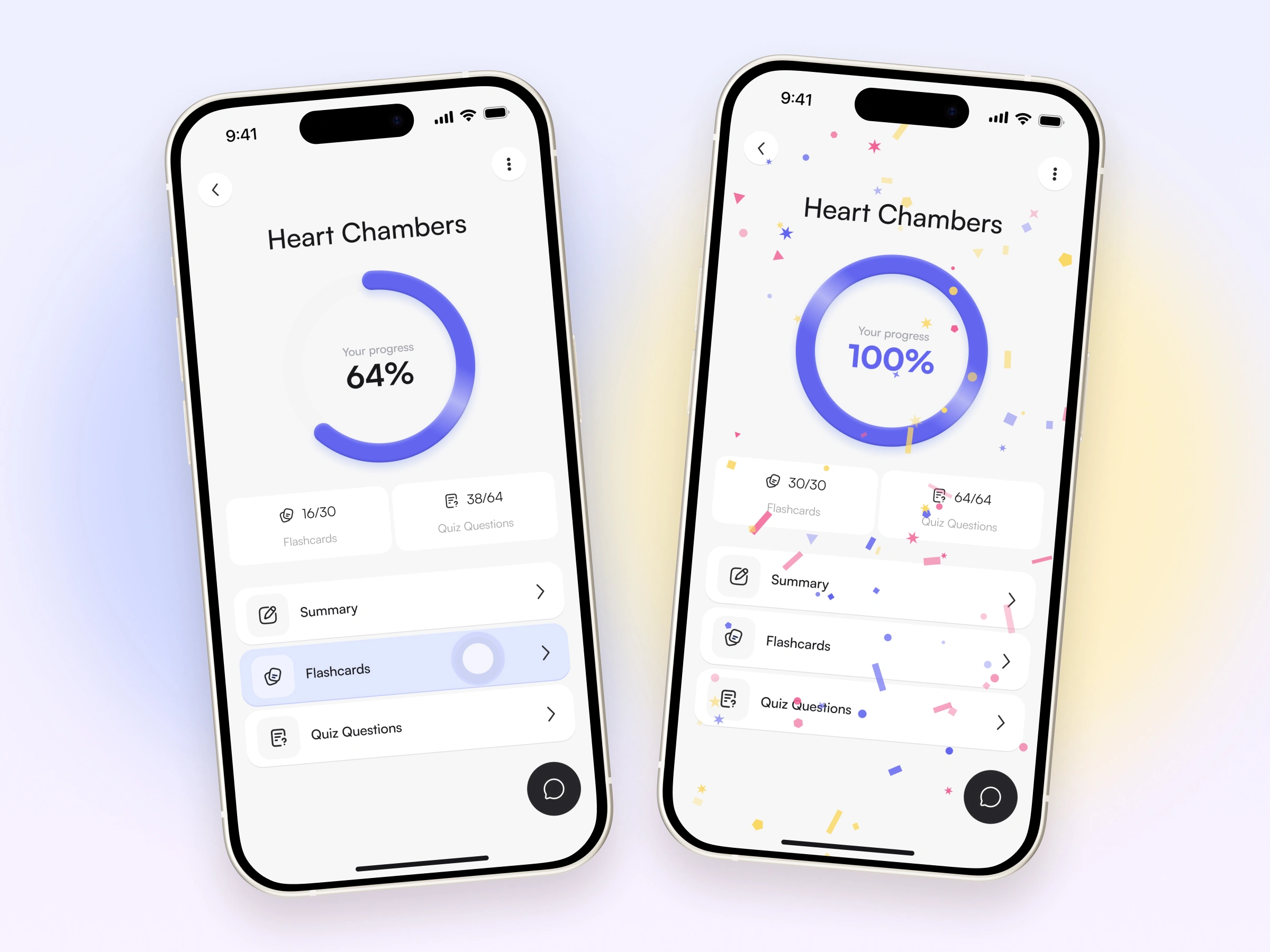
Progress is part of the same learning path rather than a separate rewards system. An intermediate state shows how far the student has come, and reaching 100% is marked with a celebration, so the app acknowledges finished work and gives a sense of a completed stage.
Subscription
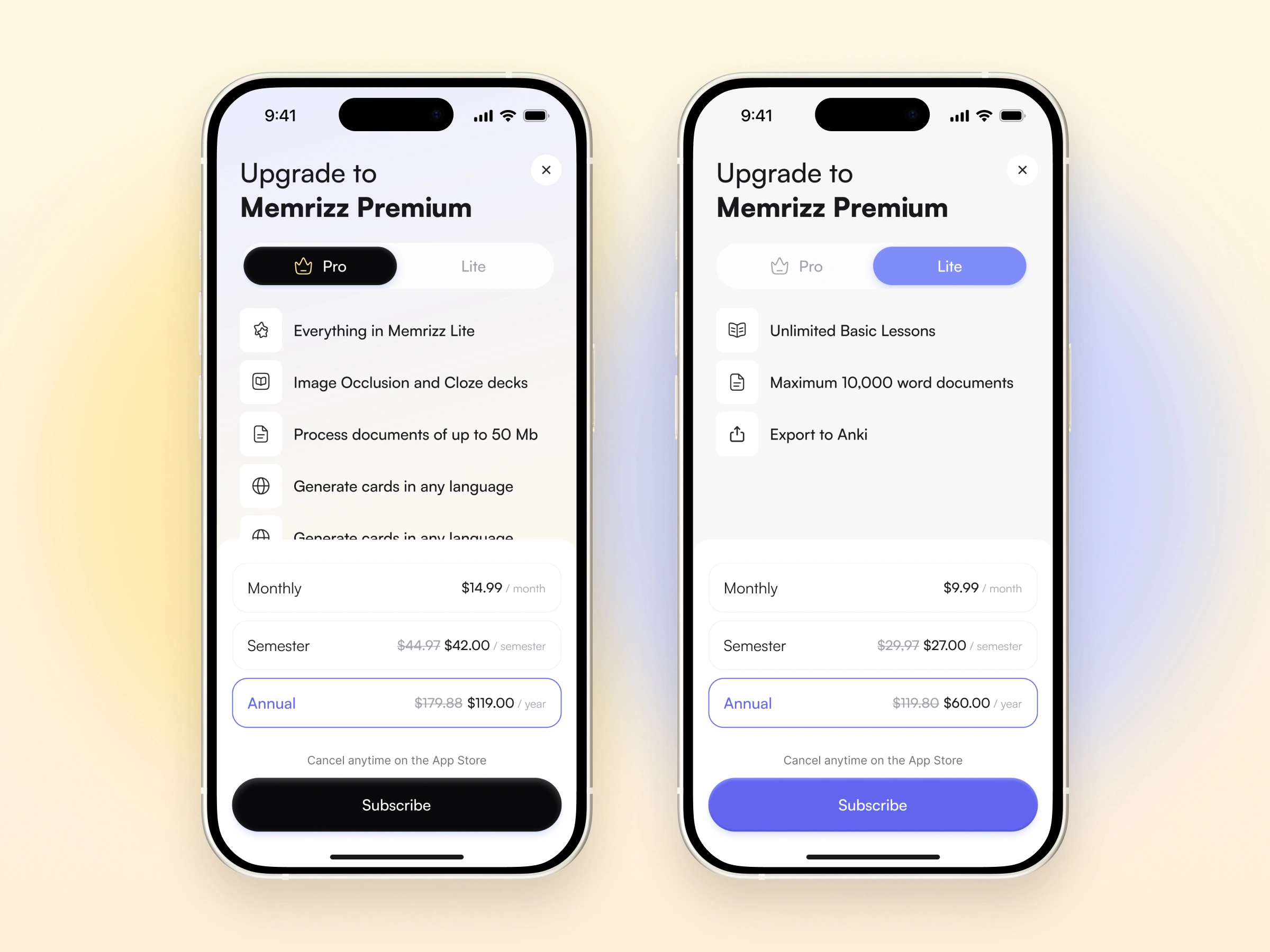
The subscription screen had to let people compare two offers on a small screen without losing hierarchy. I designed the whole screen: the Lite and Pro switch, the presentation of features, the choice of billing period, the price display, and the main action.
The switch leaves room for the content of the selected plan, and different accents help tell the plans apart while their structure stays the same.
Visual language & design system
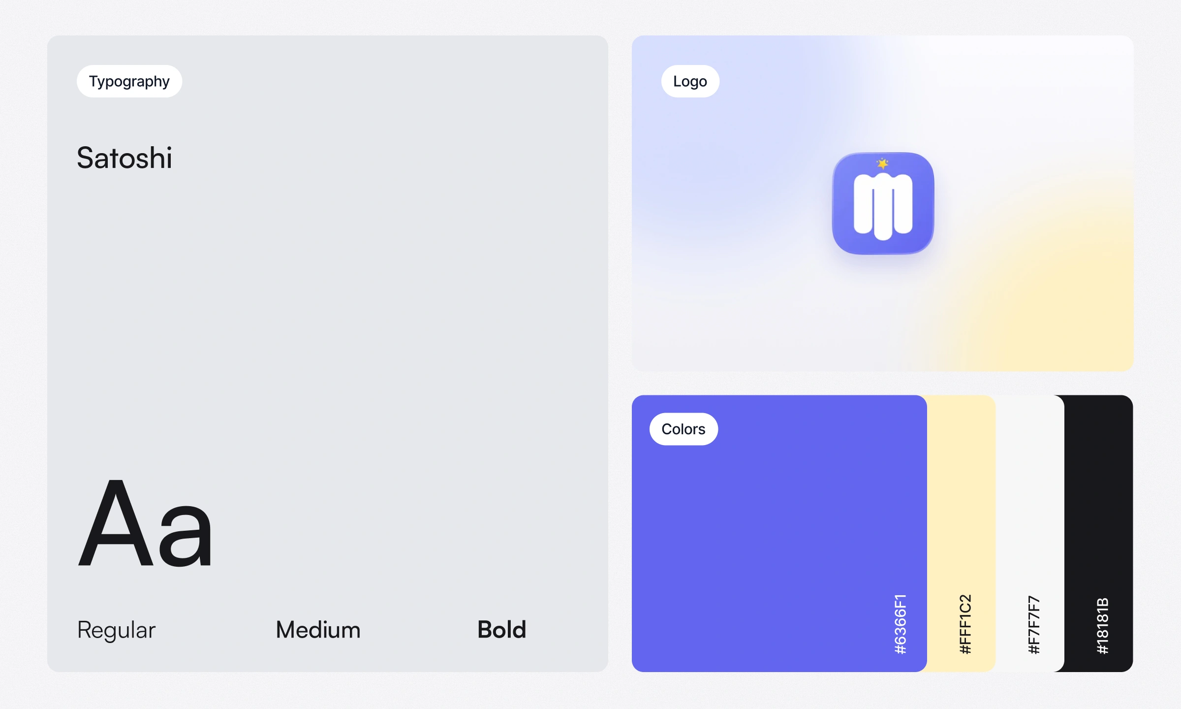
The app brings several study modes together, so the visual language had to make them feel like one product. I defined a calm light base, a clear hierarchy, and a recognizable indigo accent with a soft yellow highlight, set in Satoshi, the typeface used in the product. I also designed the app icon.
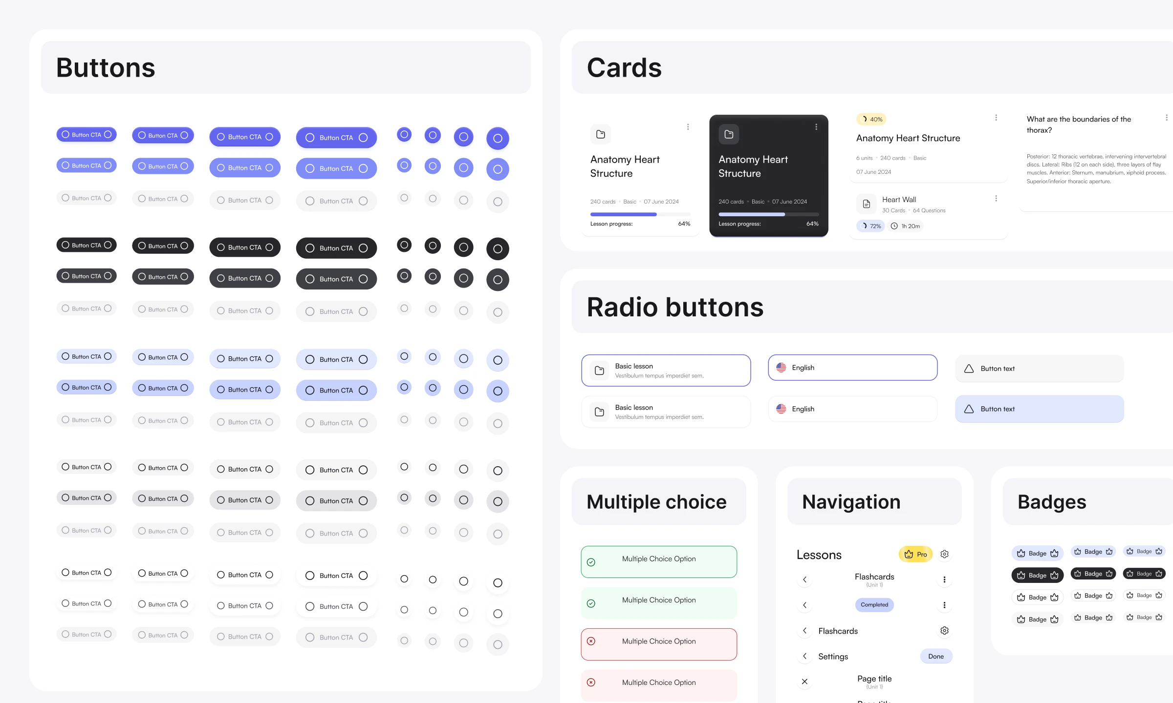
I built a component system for the main flows: buttons, inputs and selection elements, cards, navigation, badges, and feedback states. It connects lesson creation, flashcards, quizzes, progress, and subscription, keeps shared patterns consistent across screens, and gives the interface a base to grow from. The components were used when preparing the design for development.
Outcomes
Memrizz is released and available on the App Store. The product is used by more than 80,000 students, and its partnerships include Harvard University, UBC, Berkeley, McGill, NYU, VCU, and other universities.
My contribution was designing the product from concept to release: the main study flows, the interface, and the shared visual language. The scale of use and the partnerships belong to the product and the wider team; this case shows the design work behind the app.
Like this project
Posted Jul 16, 2026
Memrizz is an AI‑powered app for Flash Cards & Quizzes. It is actively used by 80,000+ students, accelerating their education.
Likes
0
Views
7