SeemaS - Fintech AI Platform Website Design & Build

Dmitriy H.


Website strategy, visual design, motion, and a responsive Framer experience for a platform offering multiple AI products for finance, valuation, and transfer pricing professionals.
The approach
Understanding the audience
SeemaS brings AI into valuation, transfer pricing, and international tax workflows. The website needed to explain a technically complex platform and its individual products to CFOs and consulting professionals, connecting their capabilities with everyday work.
I worked with domain experts and the product team to define the content and structure, contribute to the copy, and develop the navigation.
Building the story
I shaped the sitemap and page narrative around the audience’s priorities: understanding the platform, exploring the relevant products, evaluating its expertise, and seeing how it supports analysis and reporting.
With multiple products to present, I designed navigation that connected the platform overview with individual product pages. Reusable page templates provided a consistent structure, while unique content explained each product’s purpose, capabilities, and value.
AI-assisted prototyping
I used Claude and a library of reusable skills to create early prototypes for team review. This made the proposed structure, optimized content, and navigation tangible early in the process, giving us a shared starting point for refinement.
From visual direction to Framer
I developed the visual style, custom hero and section graphics, 3D visuals, and motion. I then built a fully functional Framer preview with working navigation, scroll animations, a CMS-powered blog, and responsive layouts.
The website
A platform with several AI products, explained through live product views, custom graphics, and a blog the team can maintain.
Research and audience
I researched the market, the product, and the questions prospective buyers would bring to the site. From that work, I developed a user persona to guide the information hierarchy: what visitors needed to understand first, where they needed more detail, and what would give them enough confidence to request a demo.
Worked with the product team to shape the messaging and distribute it across the website. The structure introduces SeemaS as a platform, then gives each product space to explain its purpose and capabilities. Clear routes between those pages and Book a Demo help visitors explore the offering without losing the next step.
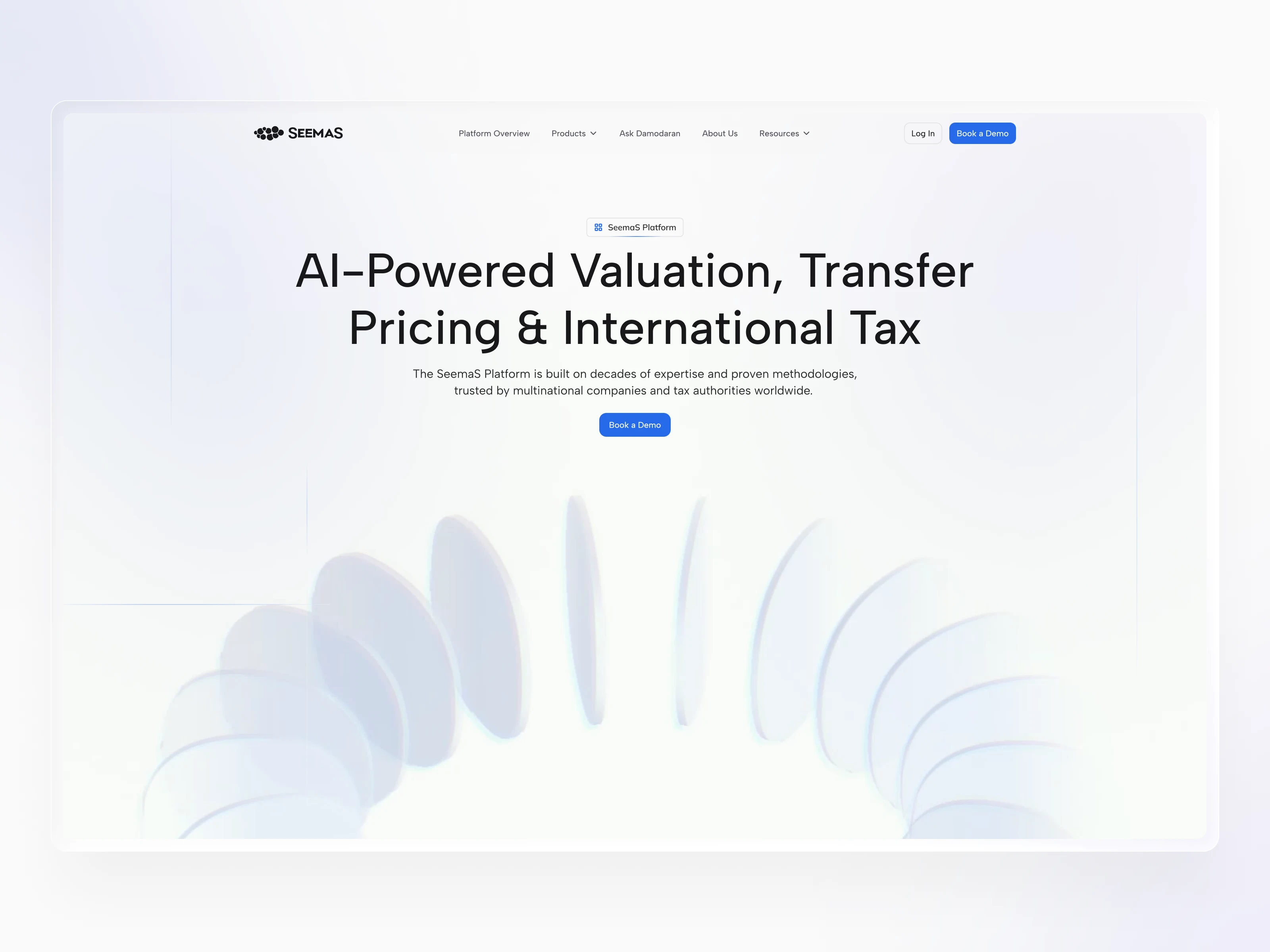
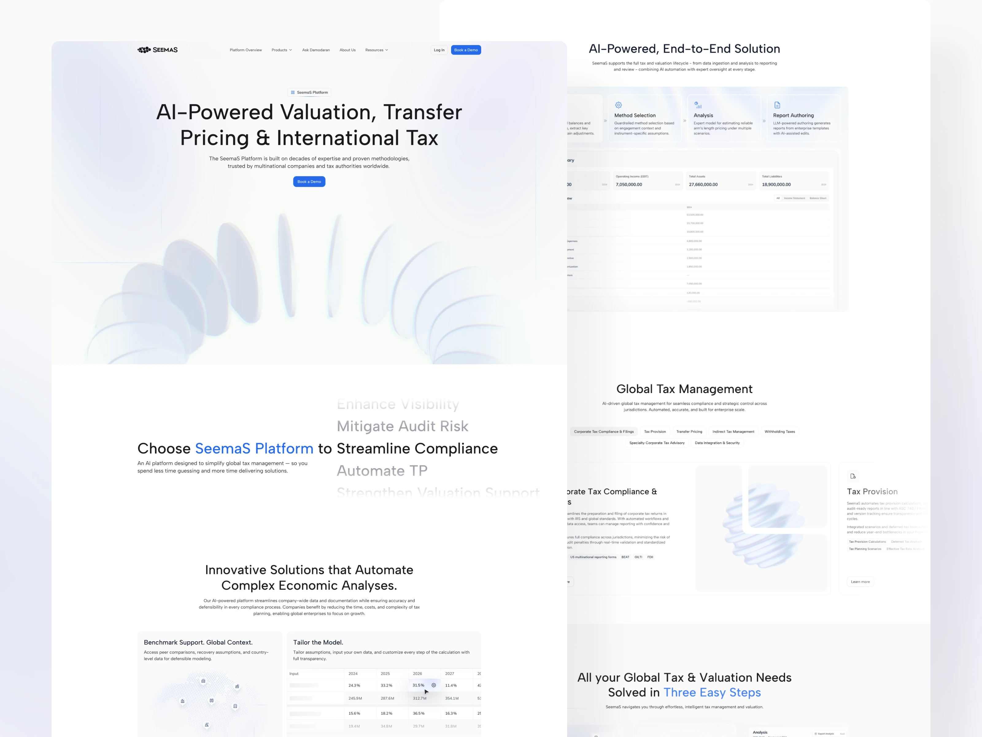
Showing the platform in action
Tabbed animated demonstrations walk visitors through data intake, method selection, analysis, and report authoring. Each stage pairs a short explanation with a relevant product view, making the workflow easier to follow.
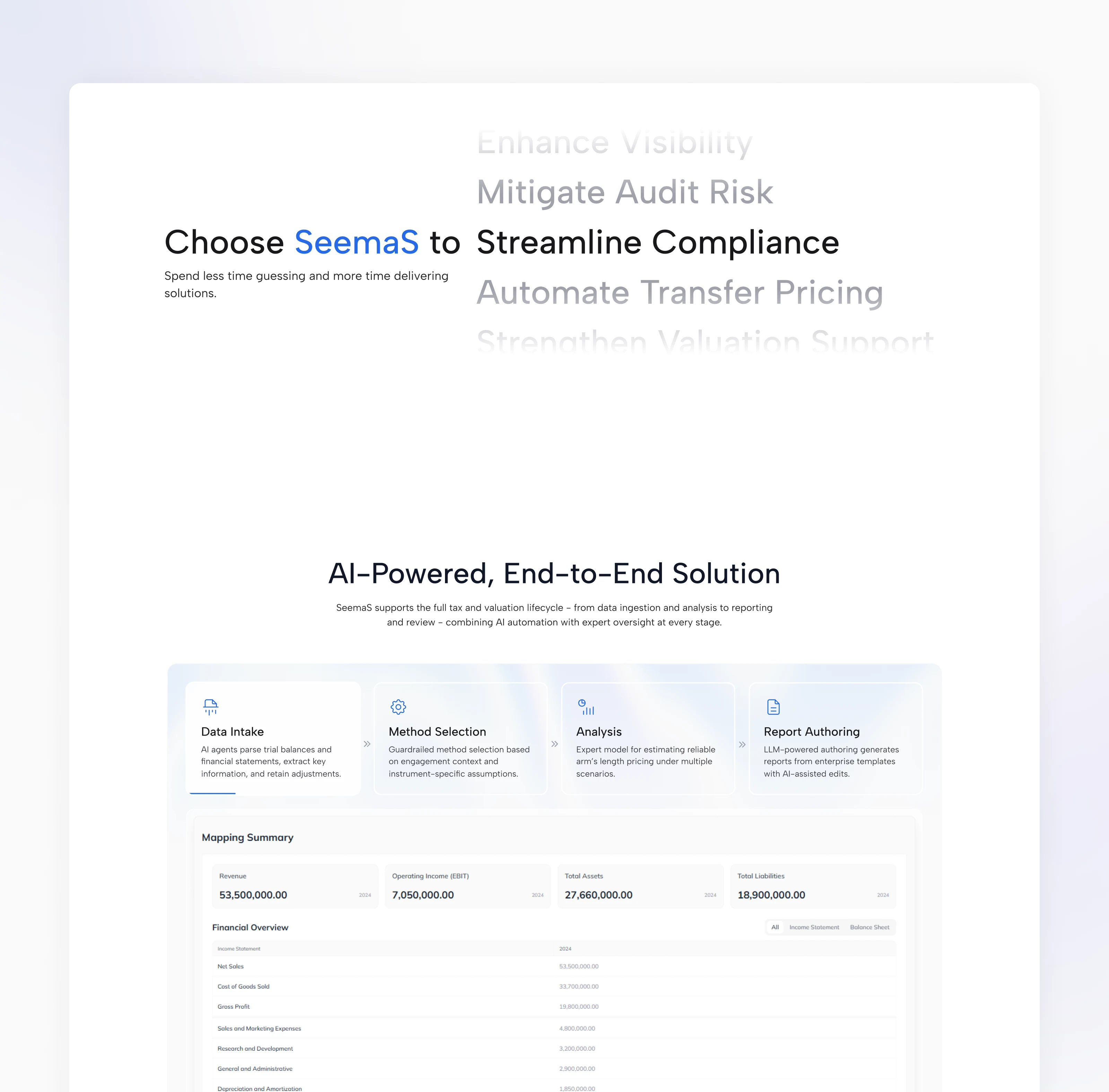
Visual direction, motion, and 3D
I developed a visual style that could make a technical, data-heavy product feel clear and credible. Custom motion and 3D elements gave the site a distinct identity and helped present the platform beyond static interface screenshots. I carried that direction across the product pages so the site felt like one connected story.
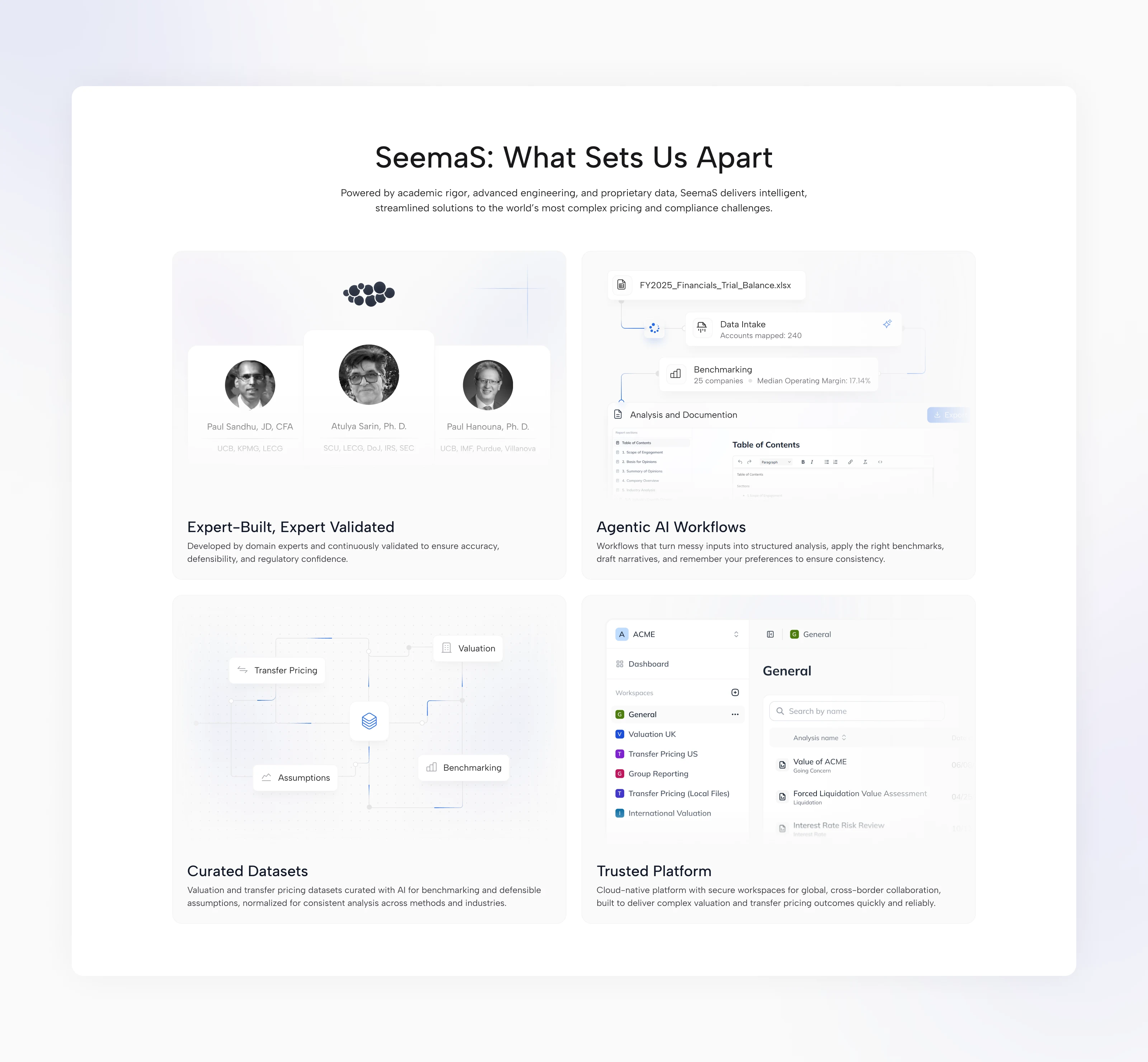
Making the differences visible
A bento section brings together SeemaS’s domain expertise, AI workflows, curated datasets, and collaborative workspaces. I created custom graphics for each card, combining interface details and visual explanations into a consistent presentation.
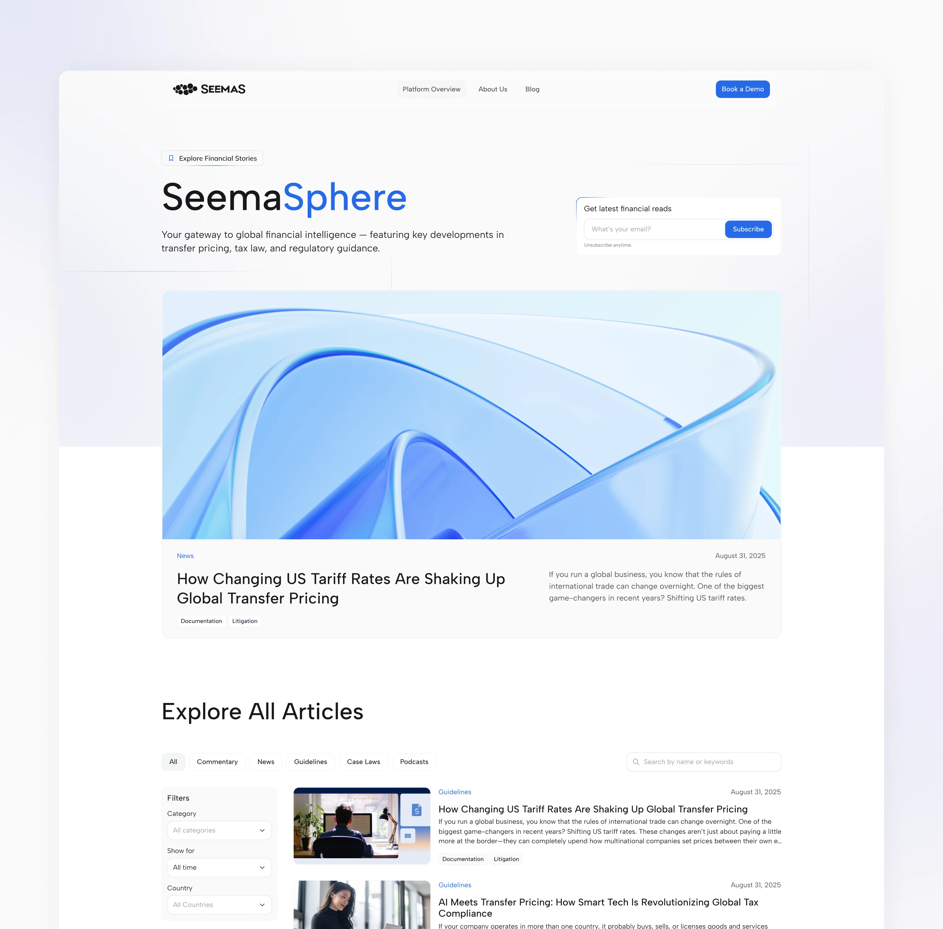
A blog supported by an editorial workflow
I built SeemaSphere as a functional CMS blog with search, categories, and filters for exploring specialist content, completed in Framer.
Also wrote a custom Claude skill and developed a workflow for the transfer pricing expert responsible for articles. It automated cover generation in the brand’s visual style, populated CMS fields, and helped prepare content, giving the expert a repeatable process for maintaining the blog.
The website in motion
Scroll animations, section transitions, and animated graphics establish a rhythm across the website. I used motion to introduce ideas progressively and connect product demonstrations with the surrounding narrative.
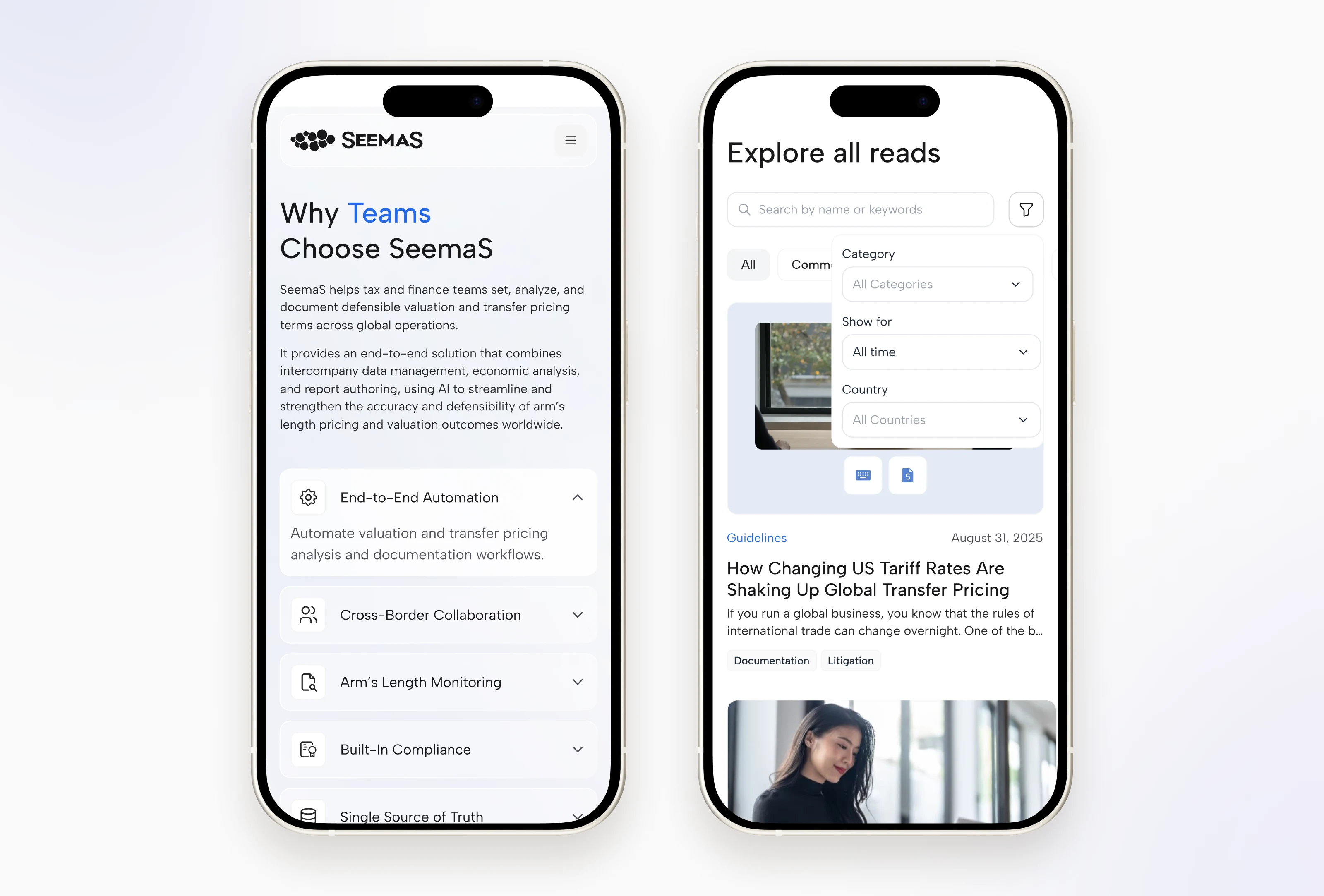
Responsive by design
The entire website was adapted for mobile and tablet breakpoints, ensuring a consistent and convenient experience across all screen sizes.
Design Style & System
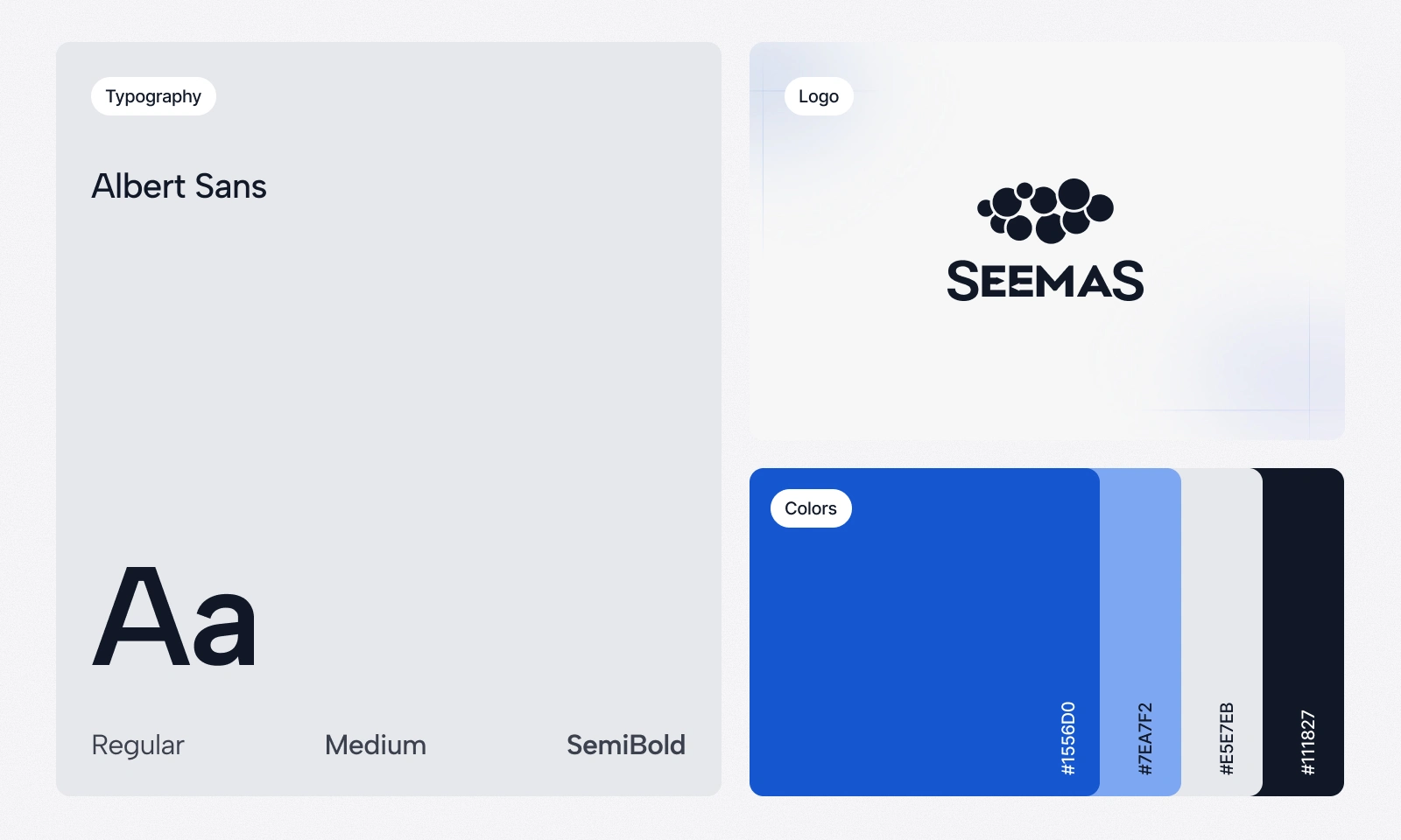
Albert Sans, a blue-led palette, cool neutrals, and generous spacing form the website’s visual foundation. Product graphics and 3D imagery extend that language across marketing pages and editorial content.
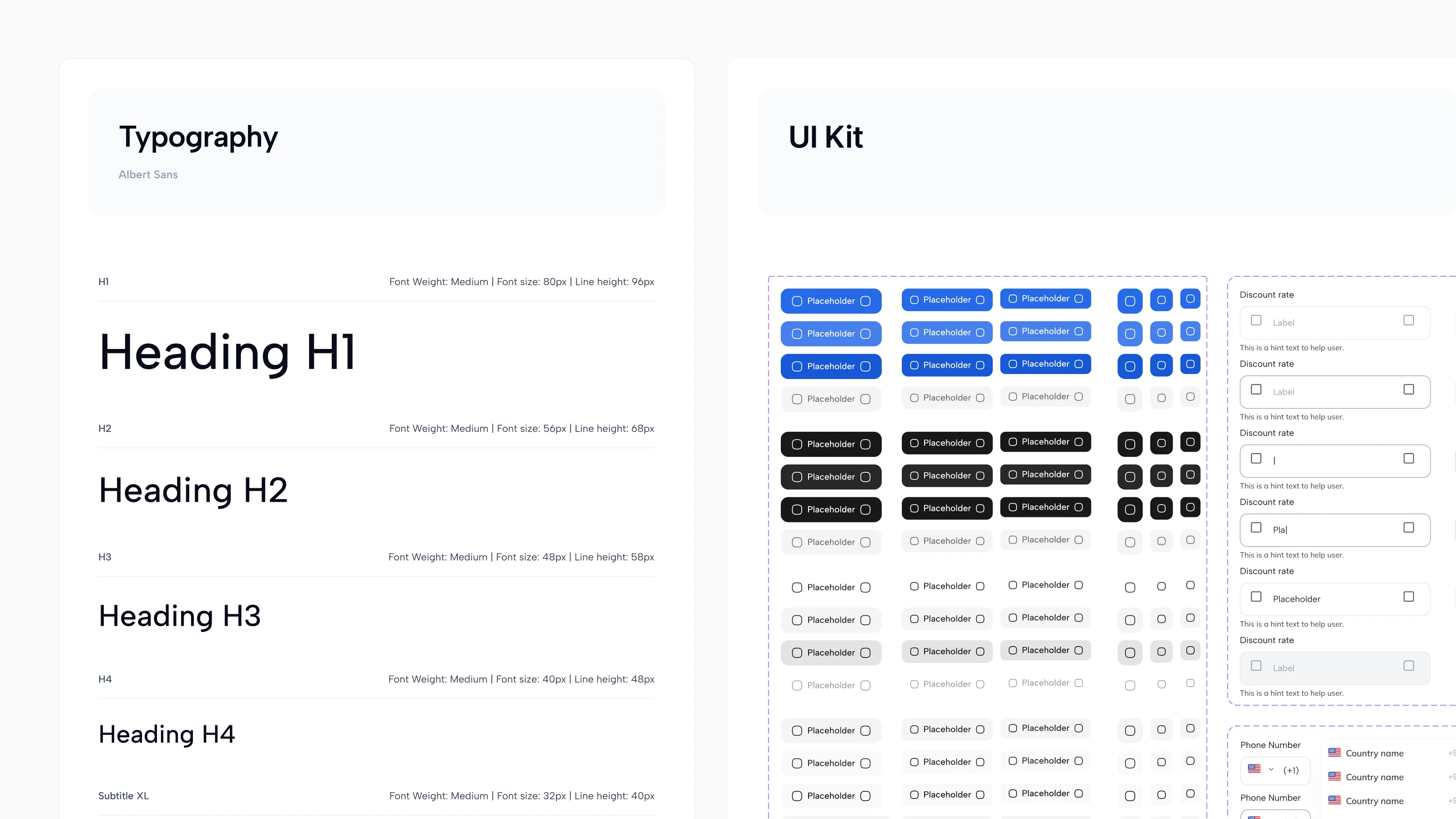
I organized the typography, reusable components, and interaction states into a documented UI kit. It gave the Framer build and the engineering team’s native development a consistent reference - I also conducted QA and a foundation for future pages and content updates.
Outcomes
The website launched successfully, bringing SeemaS’s products, platform demonstrations, and expert content into one consistent experience. Reusable product pages and a CMS-powered blog gave the team a foundation for expanding the site and keeping its content current.
Through close collaboration with the development team, I helped optimize the website’s performance, refine the implementation, and verify responsive layouts and motion during QA.
Following launch, new demo sessions with clients were scheduled to present the platform and discuss how it could support their work.
Like this project
Posted Oct 6, 2026
Website strategy, design, motion, and a responsive Framer build for a platform offering multiple AI products for tax and valuation professionals.