
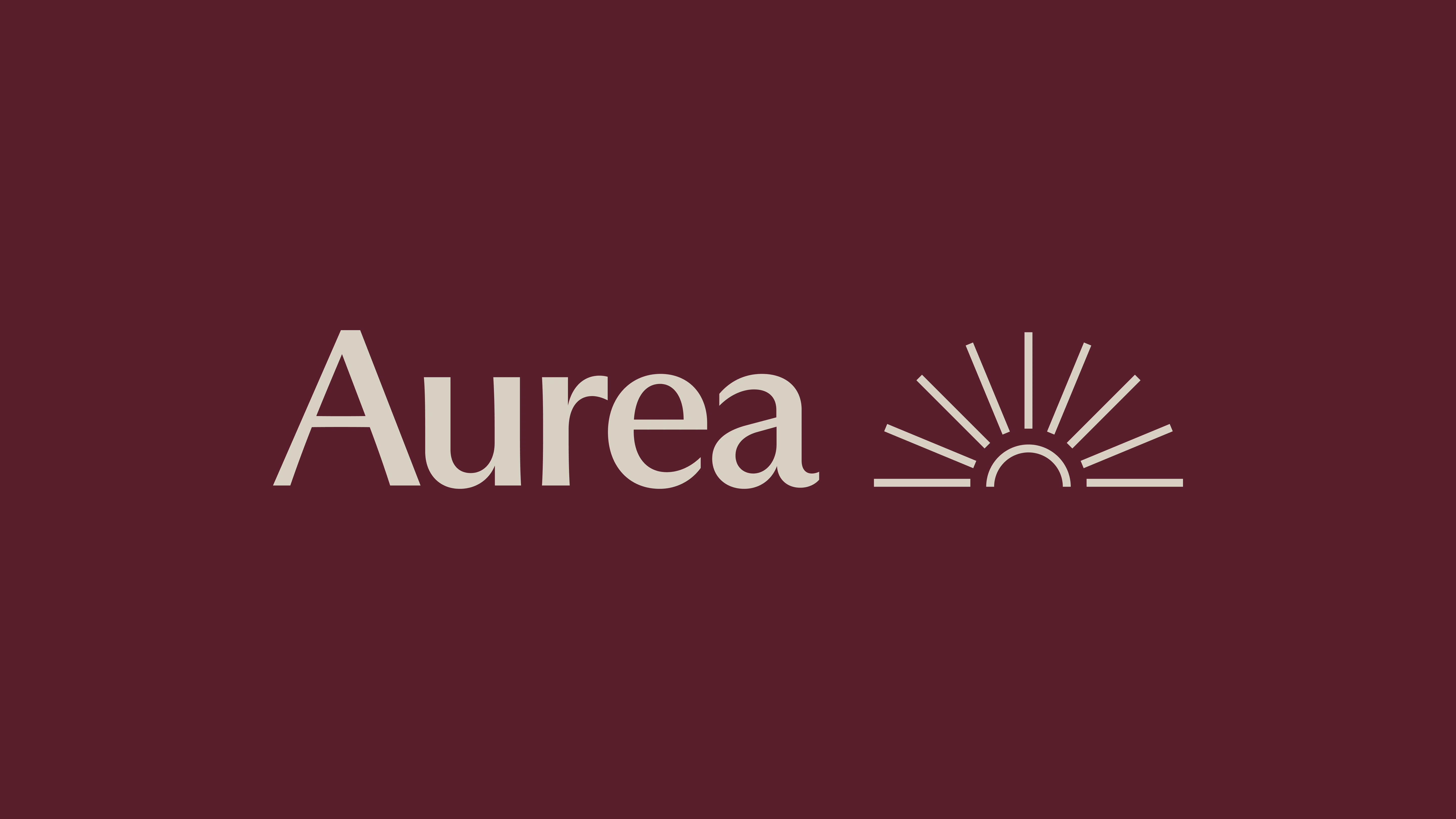
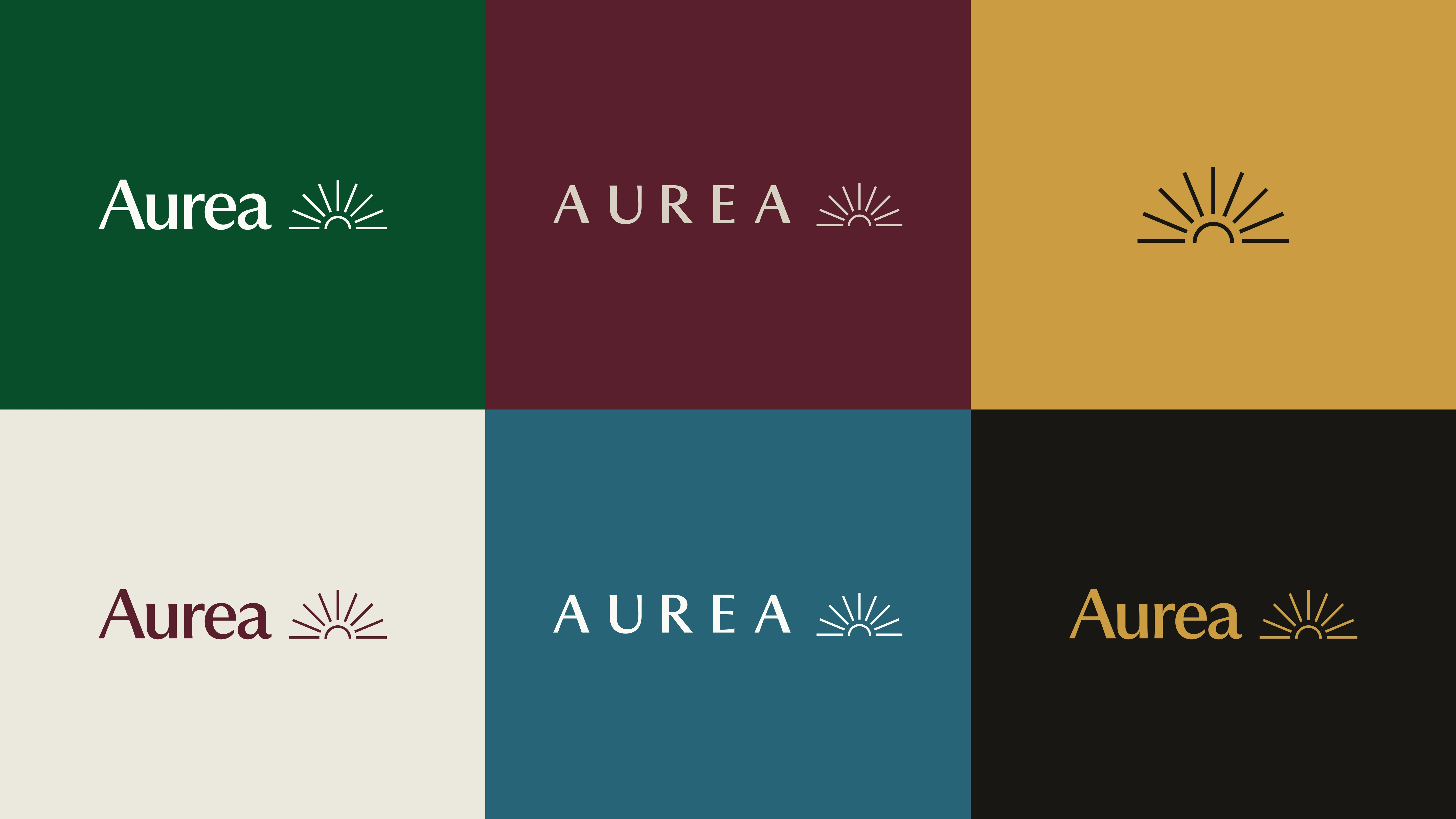
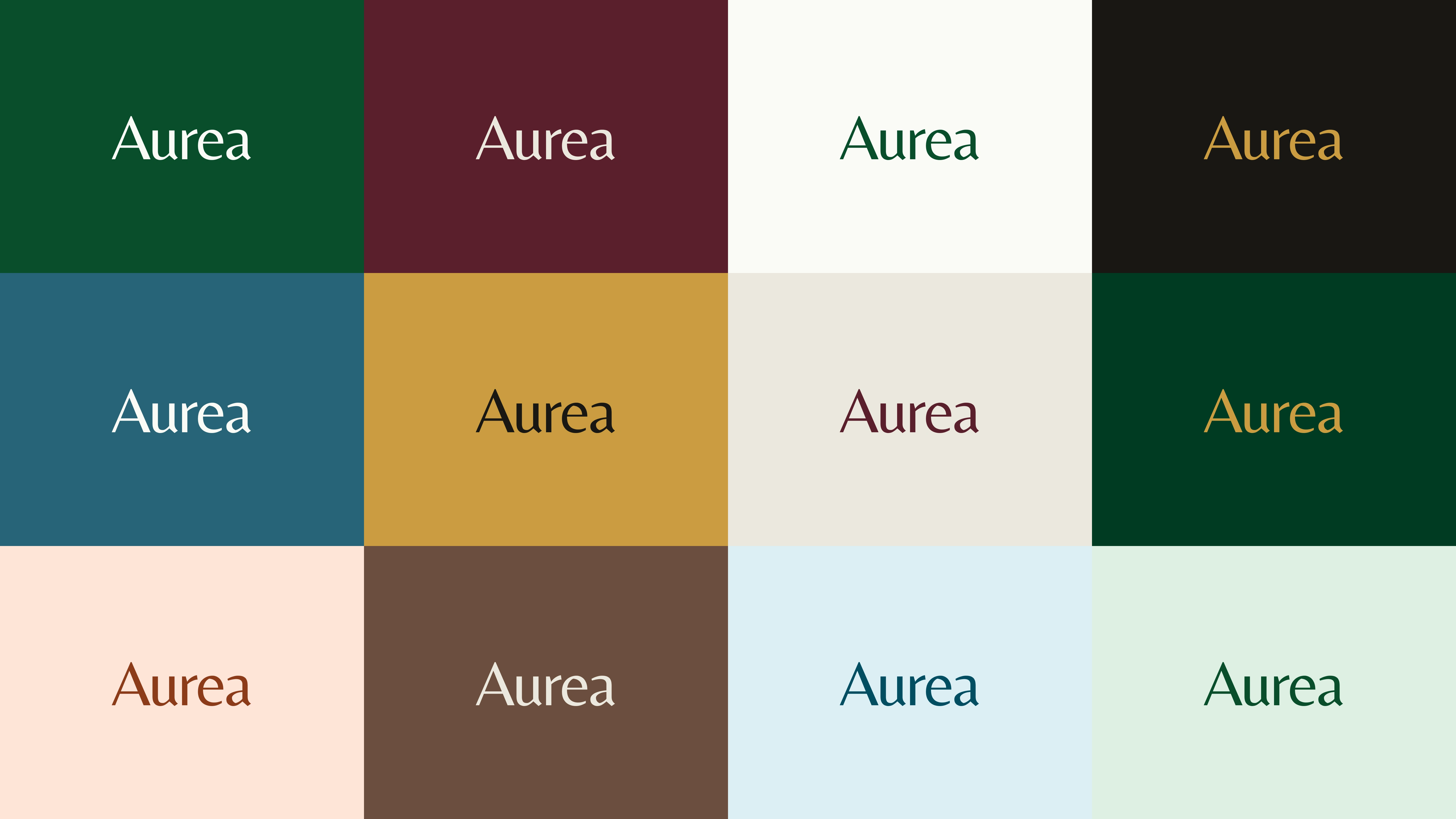
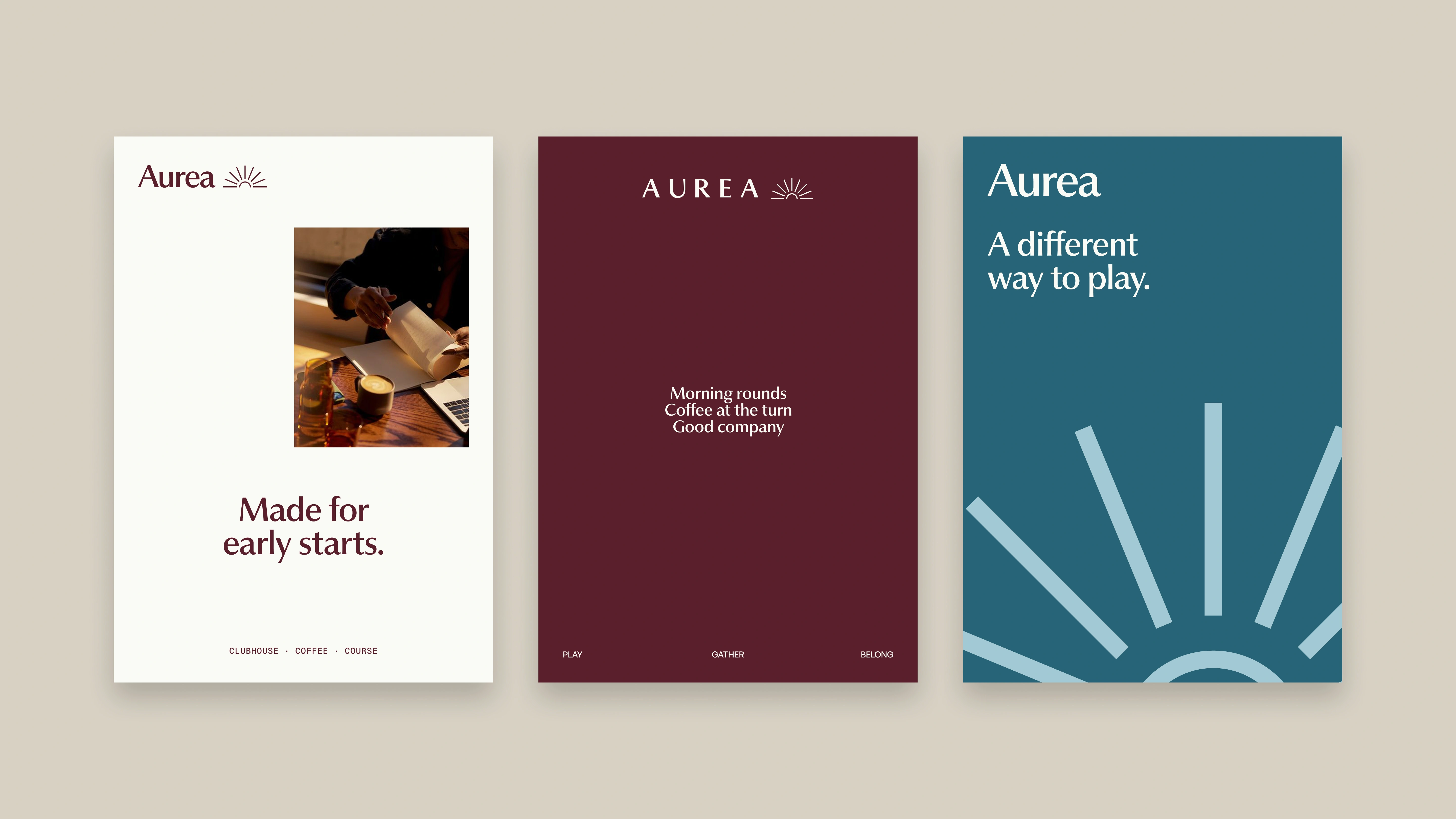
A sun rising over the horizon captures the feeling of the first tee at first light. Nine fine rays and a simple horizon keep the mark light and balanced, while the two wordmark styles give Aurea an everyday warmth and a more considered, ceremonial side.

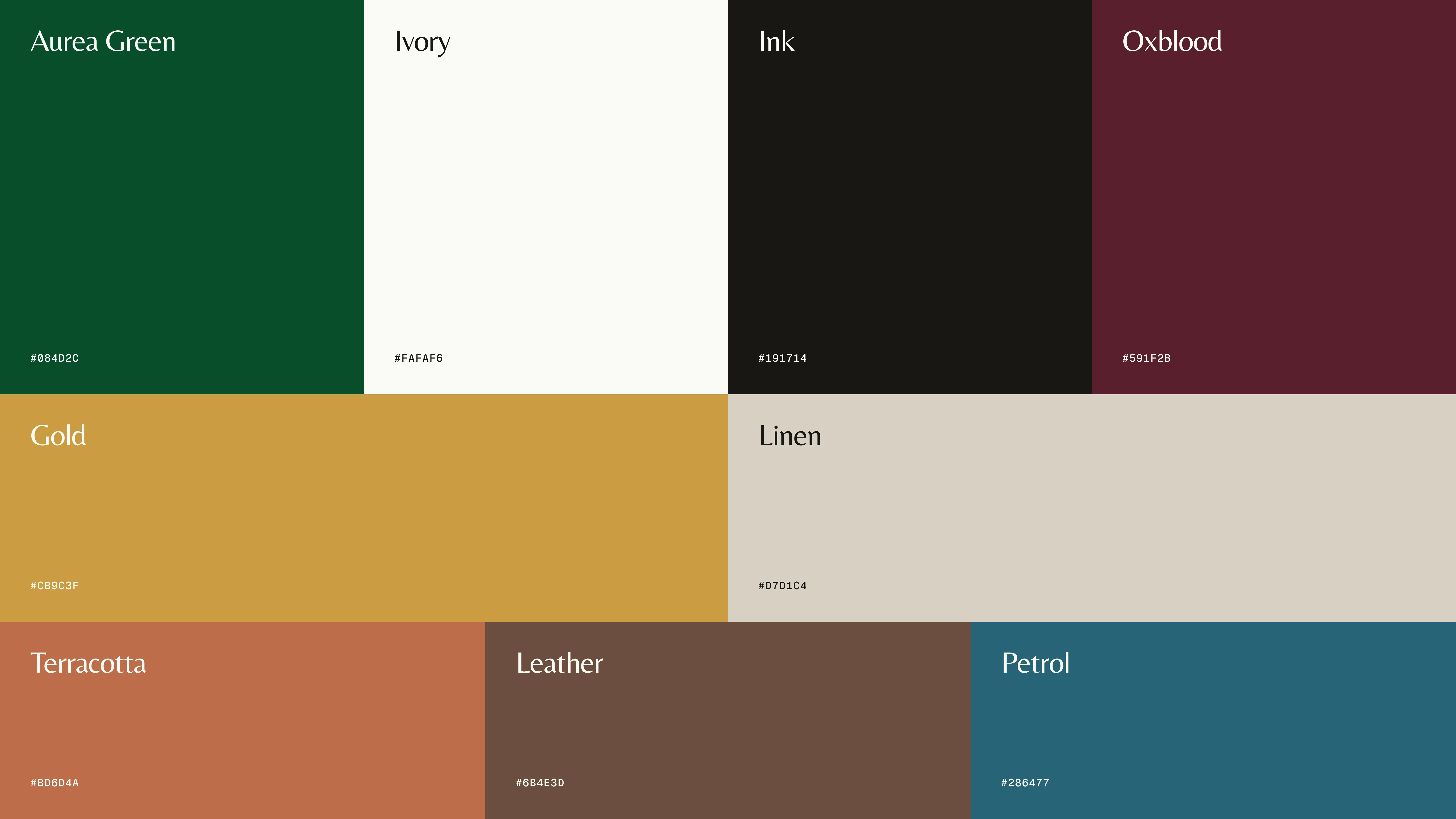
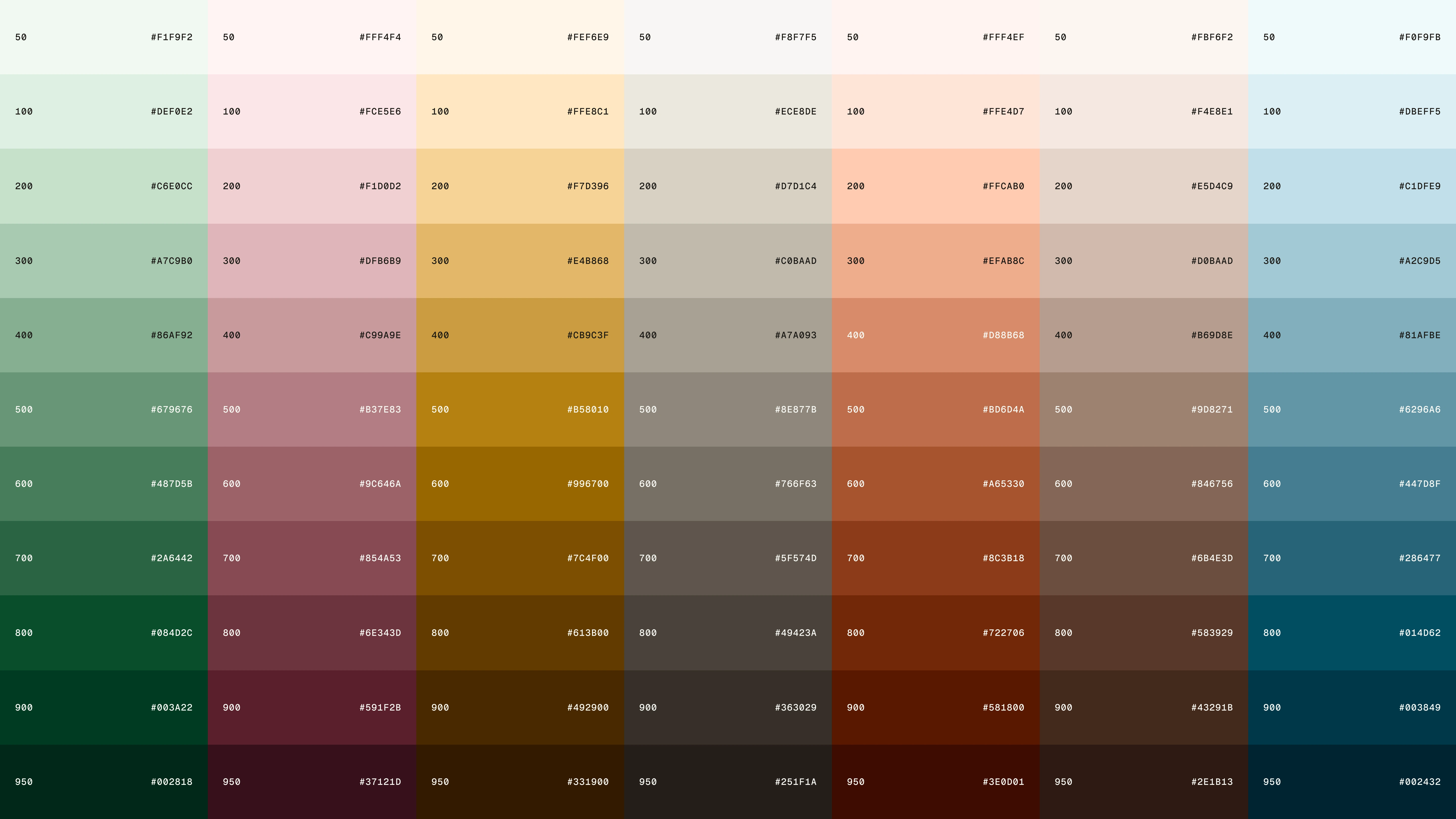
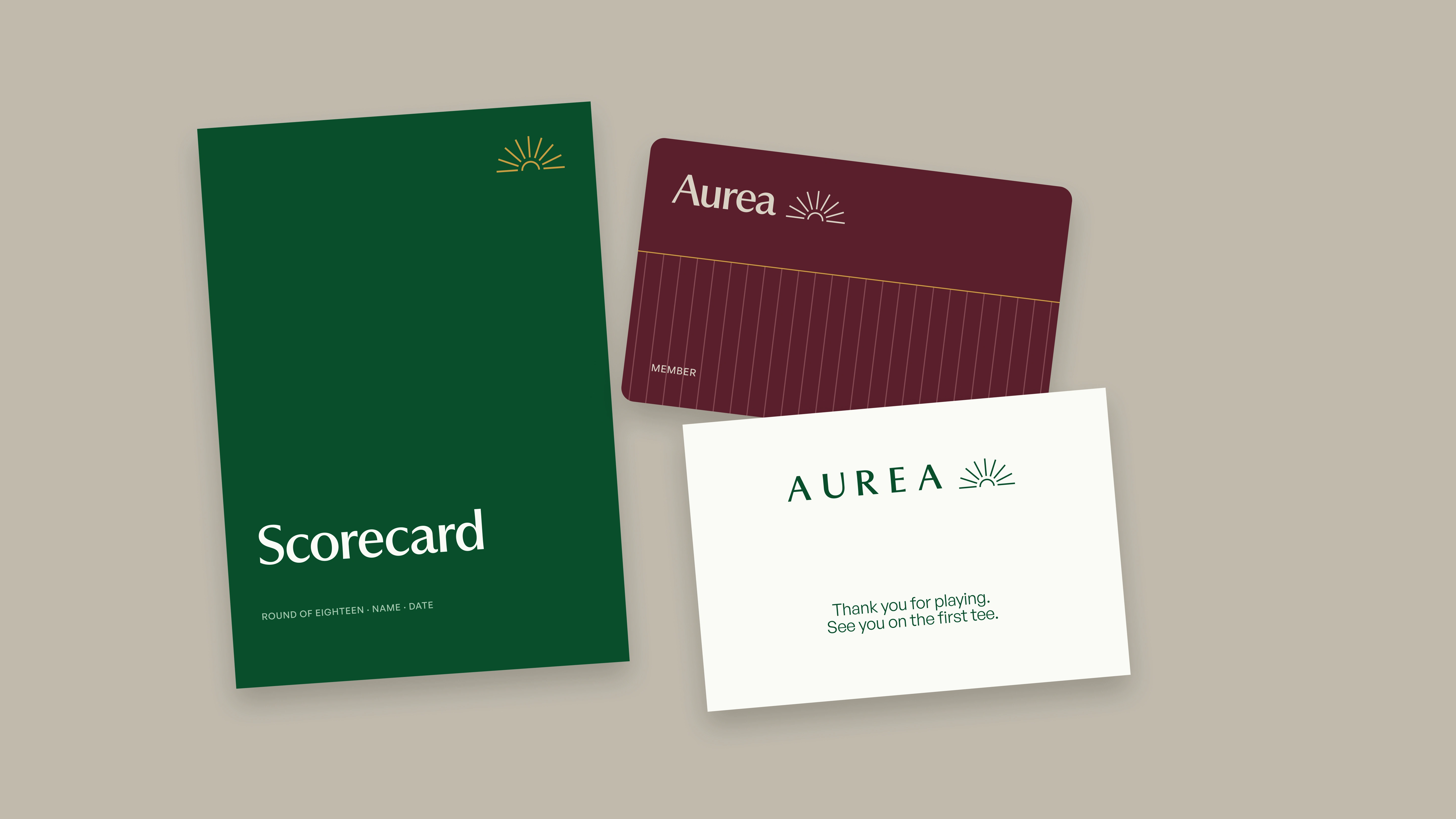
Green gives Aurea its connection to the course, while oxblood brings in a sense of heritage and warmth. Ivory and ink keep the system clear, and gold adds a quiet note of occasion. Supporting tones drawn from the clubhouse and late-afternoon light give the palette room to move.
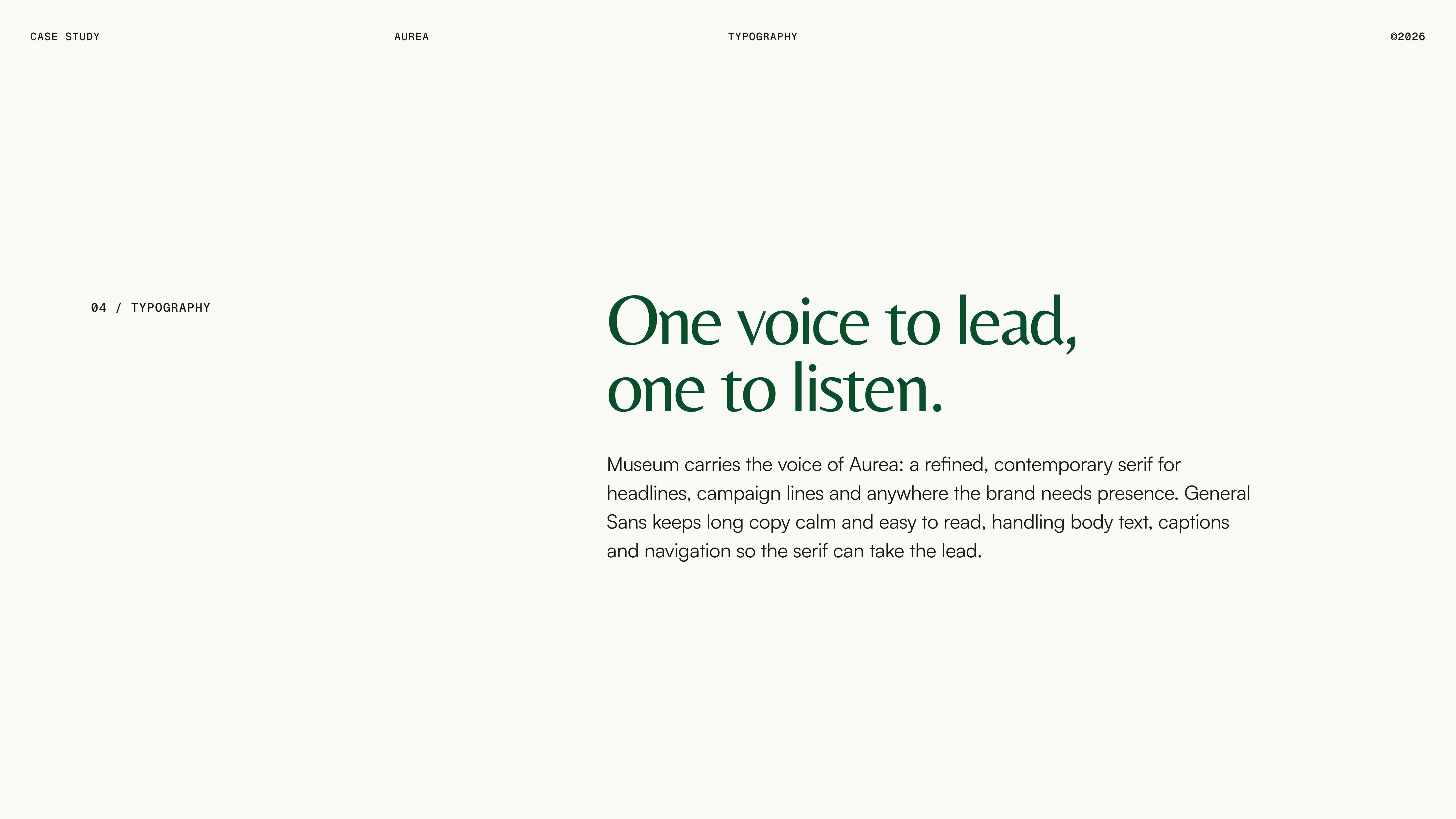
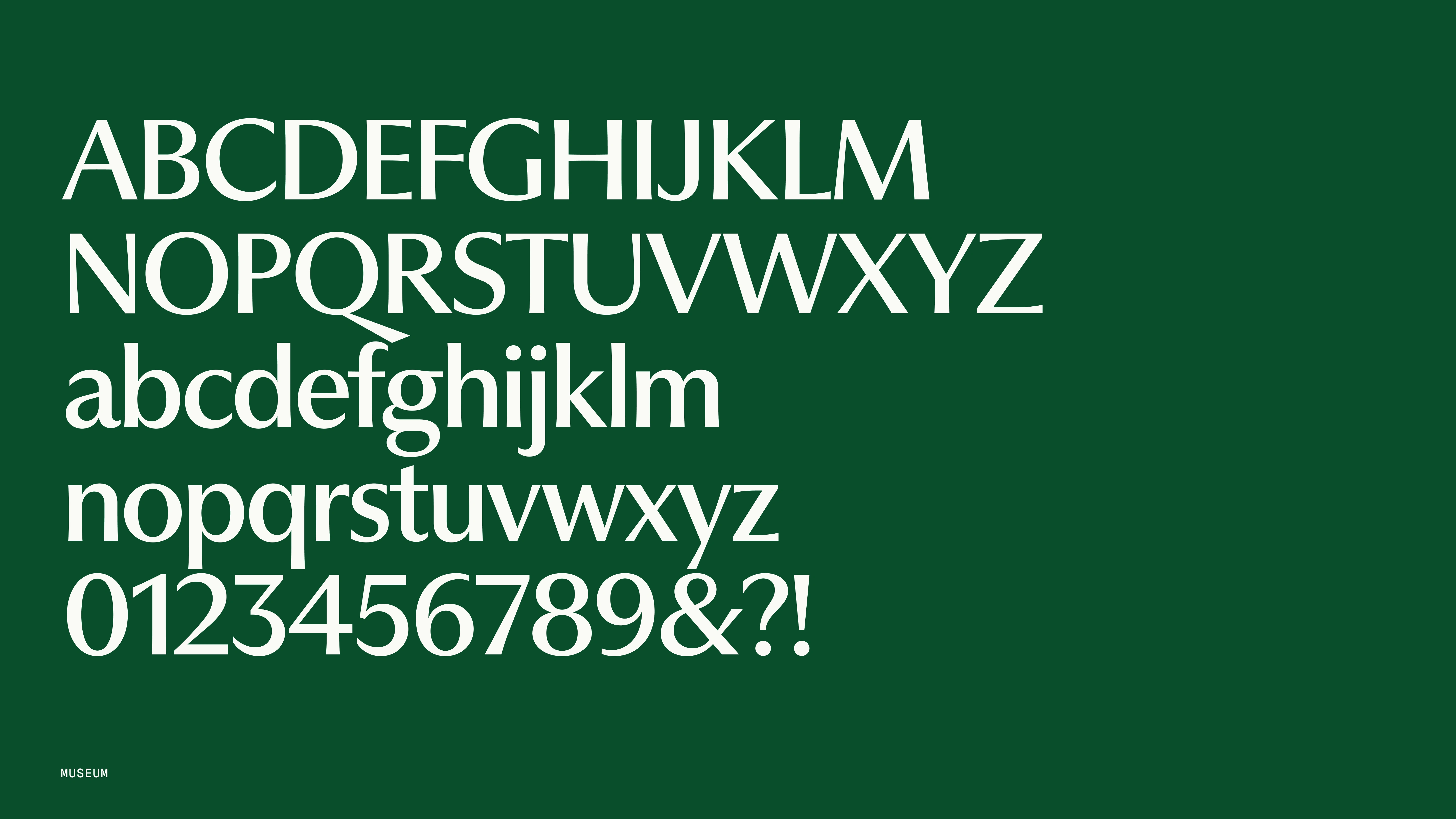
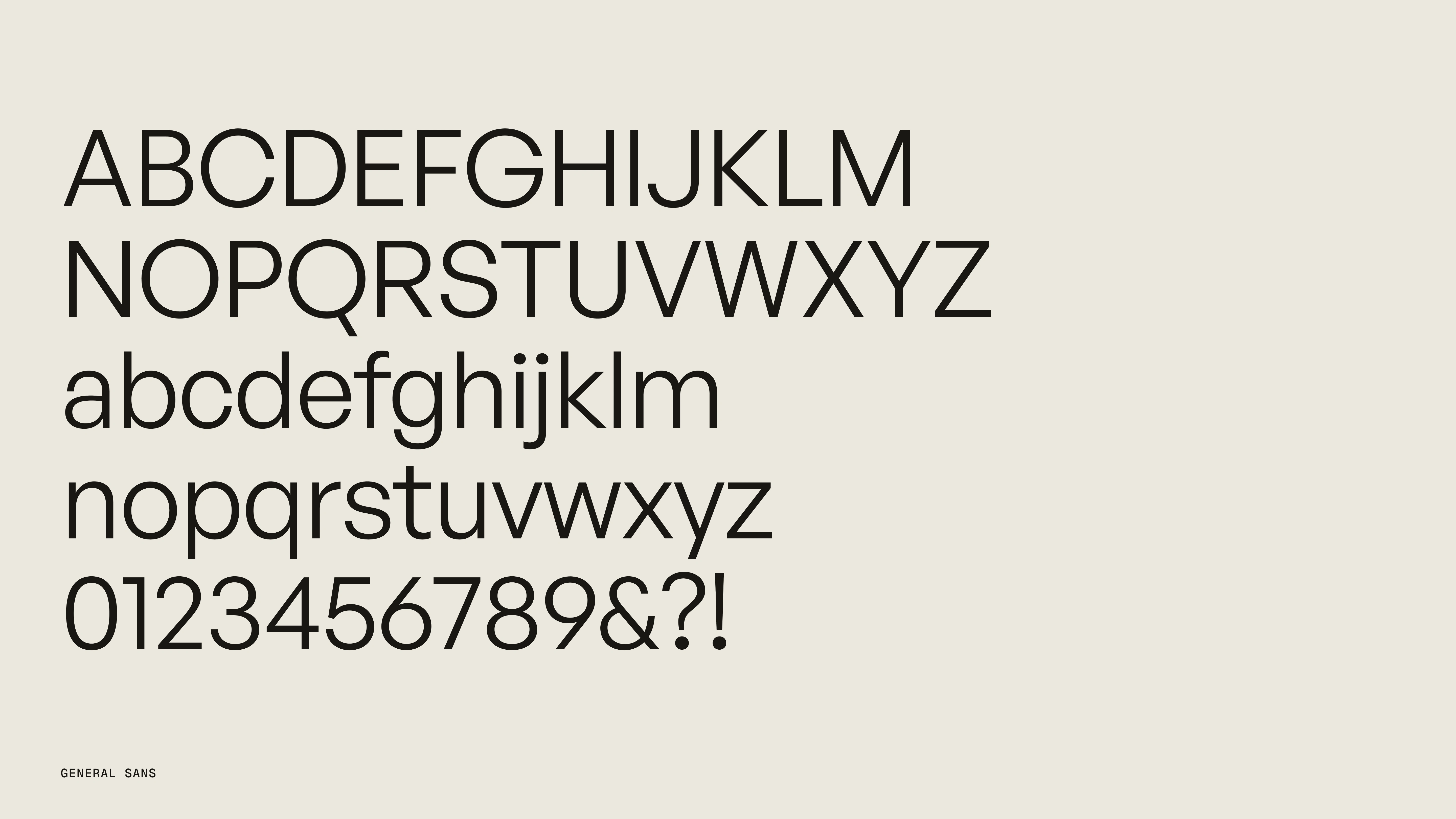
PP Museum brings an editorial, quietly refined character to headlines and the wordmark. Paired with the cleaner, more neutral General Sans for body copy and everyday interface, the contrast gives Aurea personality without sacrificing clarity or ease of use.
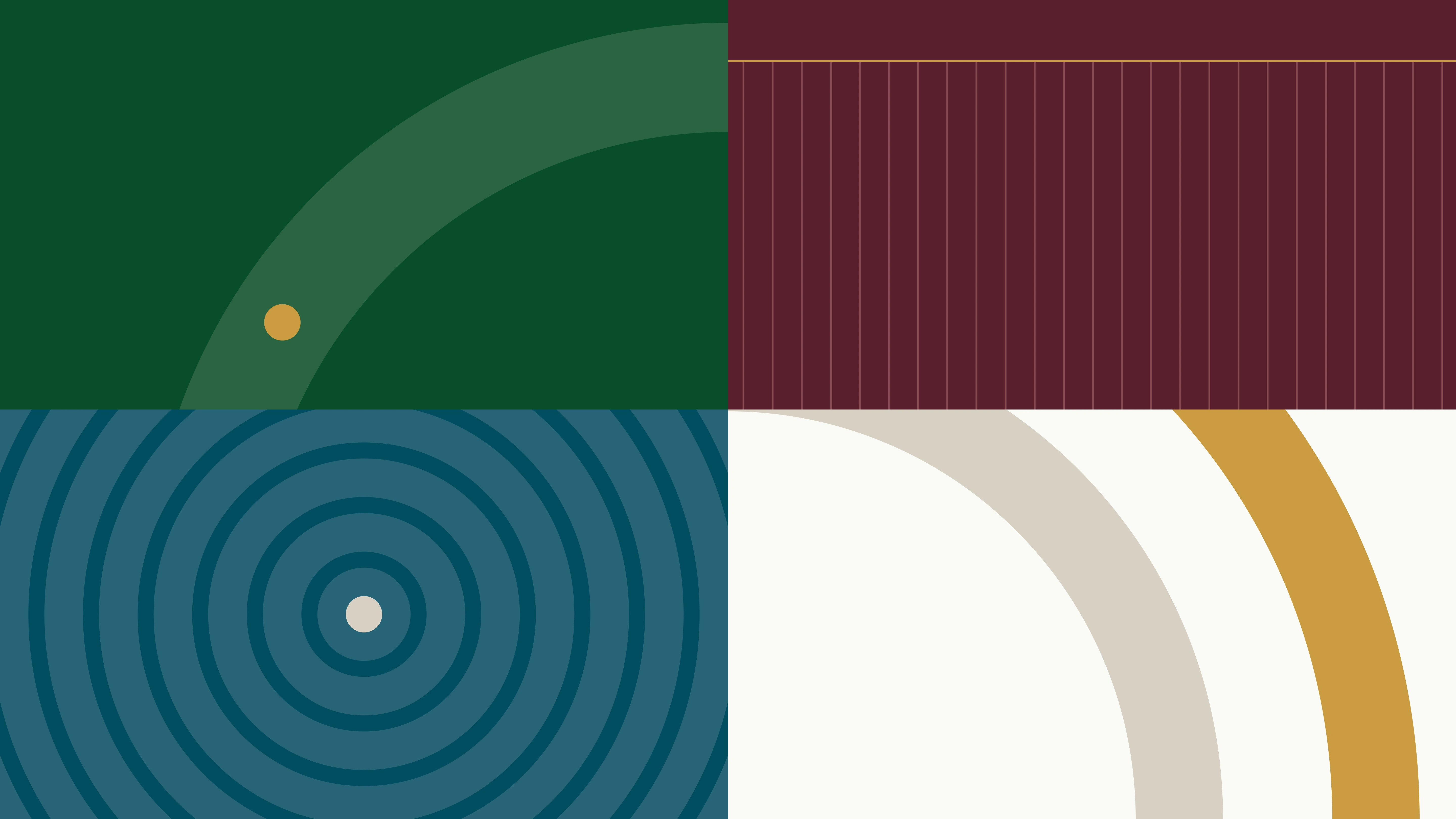
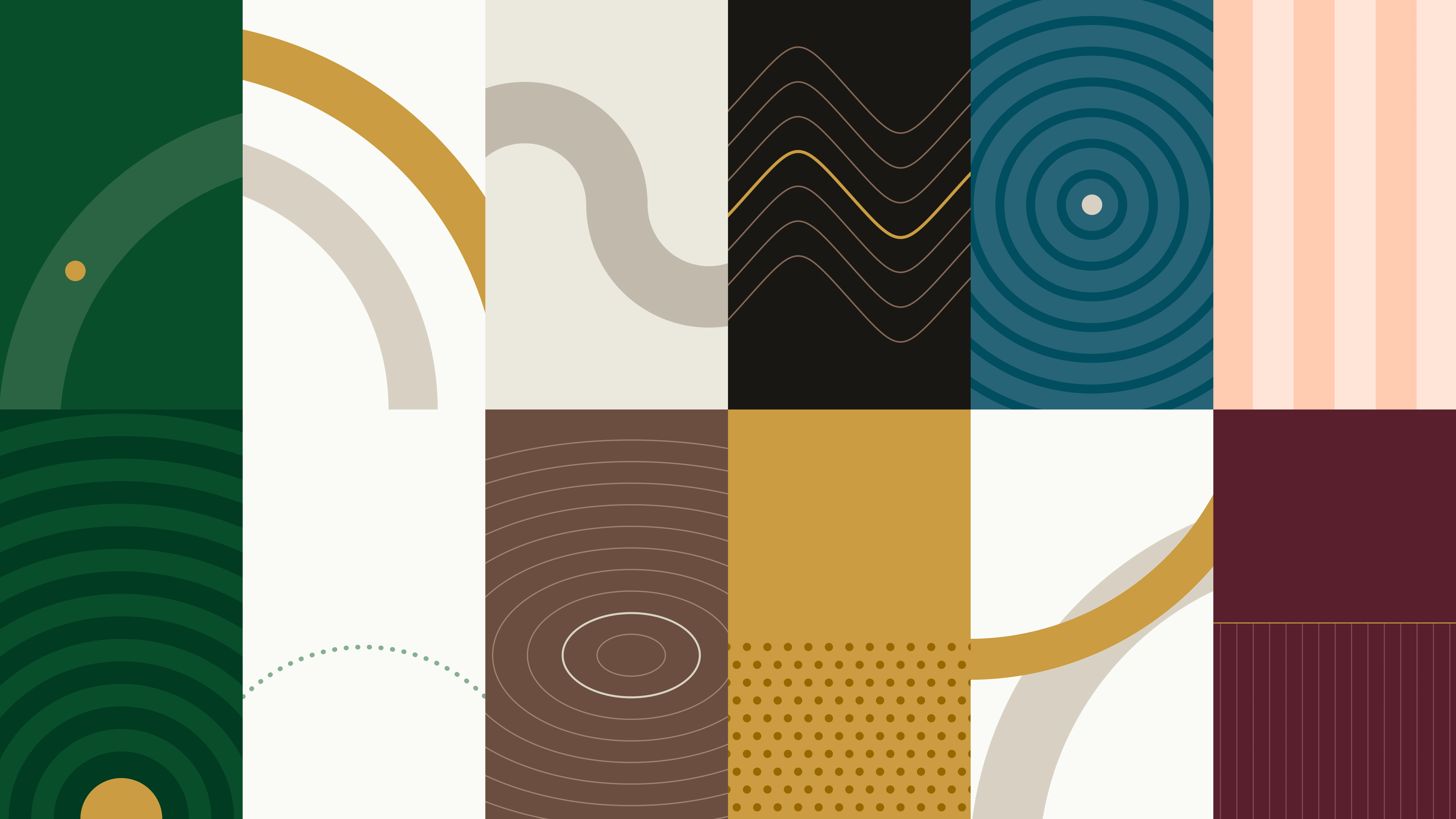
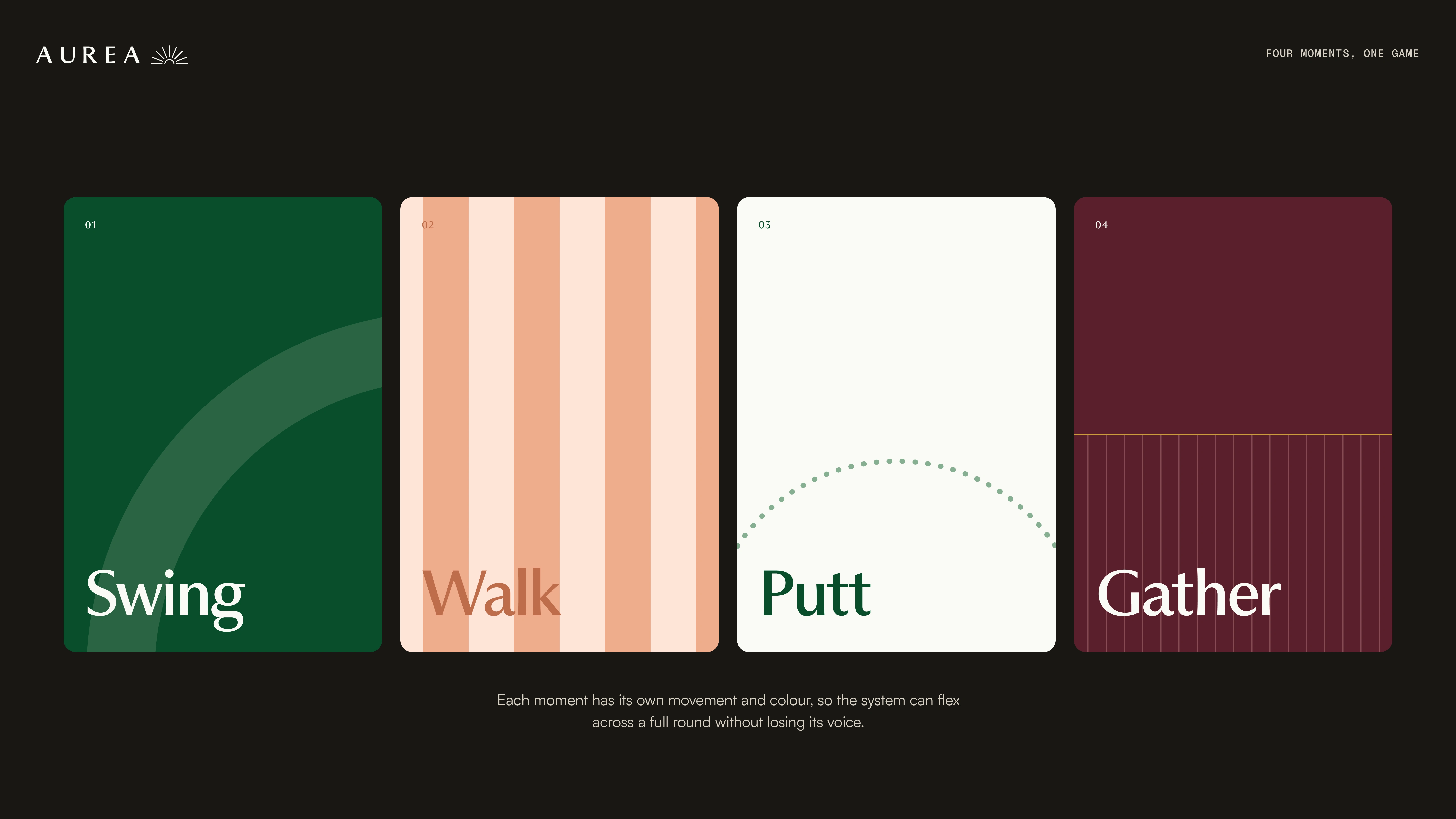
The graphic language takes cues from the game itself: the arc of a swing, the line of a fairway and the ripple of a ball landing on the green. These simple movements add texture and a sense of place, creating a flexible visual system that works alongside the logo and photography.


0 likes · 0 views · Nov 8, 2026
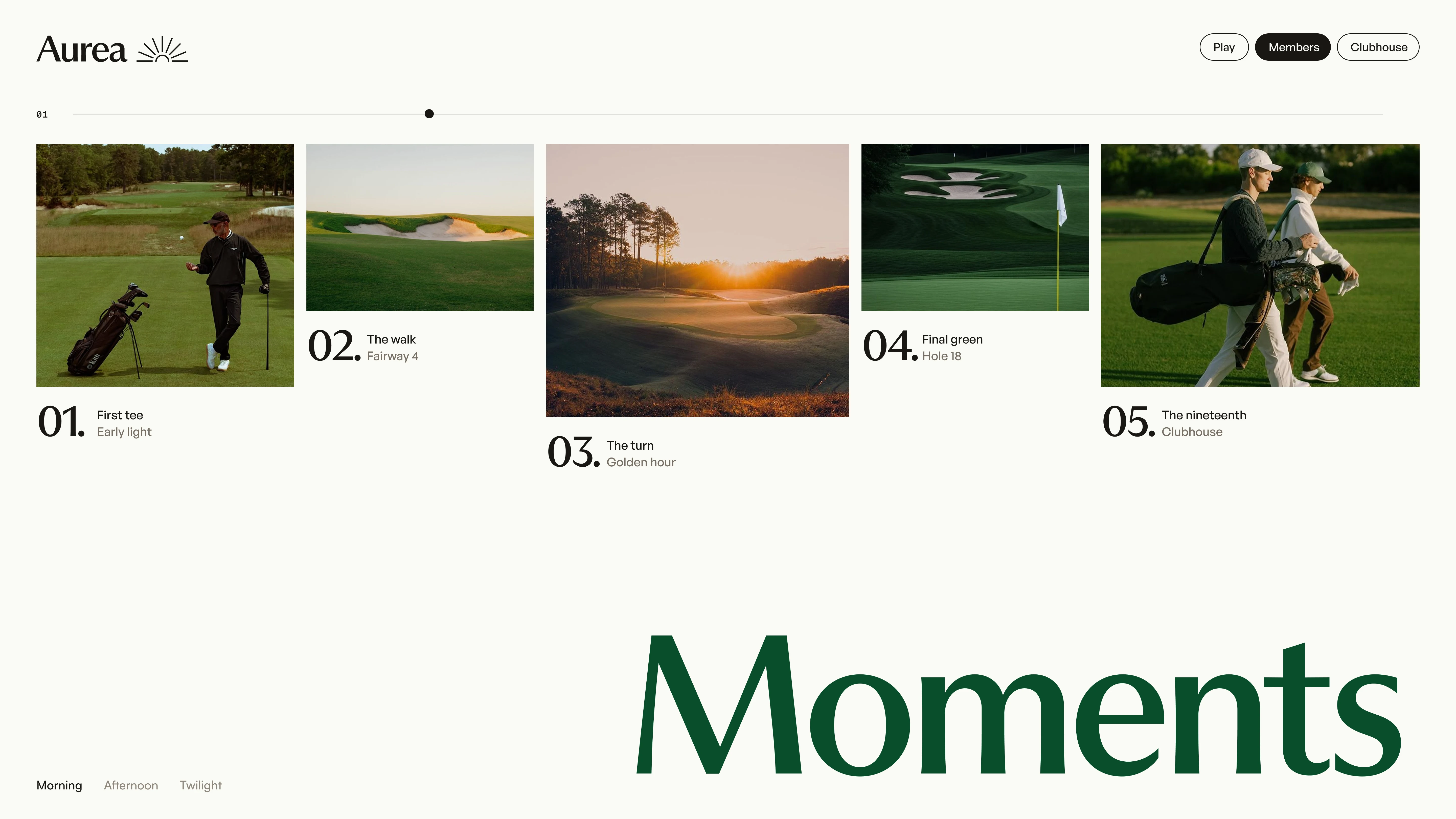
A contemporary golf identity built around the moments beyond the game, bringing together heritage, warmth and a more welcoming club culture.
Timeline
Oct 15, 2026 - Nov 8, 2026

