Lycka: Jewelry House E-Commerce and Brand

Ella Sh.


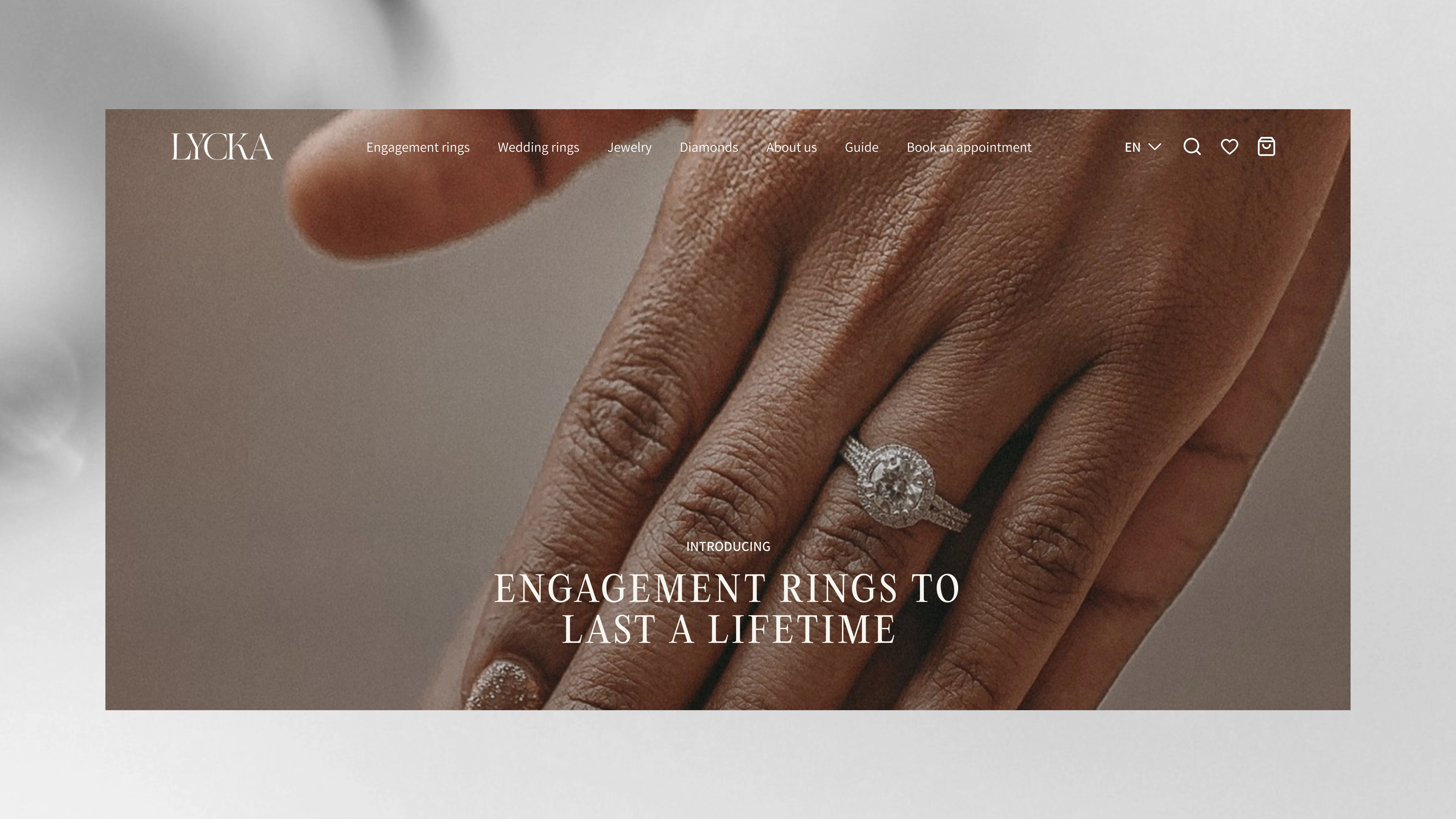
Lycka has been passing diamonds, and the values behind them, from one generation to the next. The brief for their Shopify store carried a specific weight: build something modern without erasing what makes the brand what it is.
The result reads less like a store and more like a considered conversation with a jeweler. Calm, unhurried, built around trust. Buying an engagement ring is not a transactional decision and the interface should not treat it like one.
No visual pressure, deliberately. No bold effects, no urgency cues, no elements competing for attention. The layout is clean and airy with a typographic rhythm that gives people space to think. Product photography sits inside the interface rather than fighting it, so the jewelry speaks without the design shouting over it.
UX mapped around confidence, not conversion pressure. Visitors move through catalog, product detail, and selection without feeling lost or pushed. Information is clear and logically sequenced. The interface never asks for a decision before someone is ready to make one, which in this category is the whole game.
Colour stays soft and restrained throughout. Warm enough to feel personal, refined enough to signal quality. Nothing harsh, nothing decorative for its own sake.
Lycka now has a digital presence that holds the heritage without putting it on display. The story is there, told quietly and told right.
Timeline: 3 weeks. Year: 2024. I led store design and brand direction.
Like this project
Posted Aug 28, 2026
Shopify store for a generational diamond house, designed around confidence rather than conversion pressure.