Uber Ride Analysis
Shana Nasrin
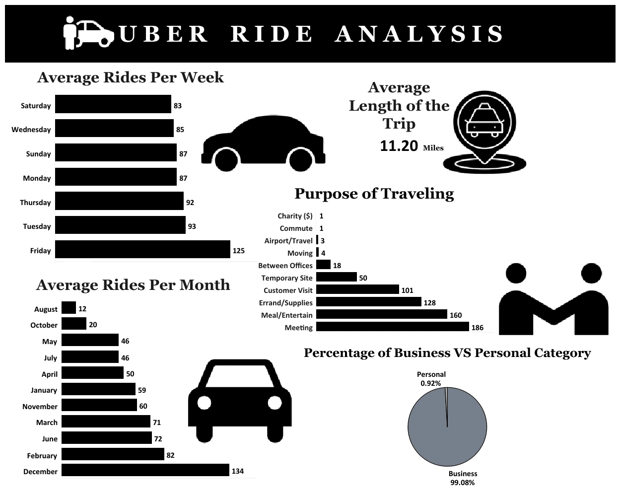
I delve into an analysis of Uber ride data to extract actionable insights for both riders and the company. The dataset, sourced from Kaggle, includes details such as ride start and end times, categories (business or personal), and locations. I utilized Excel for data cleaning, ensuring accuracy by handling missing values and correcting inconsistencies. Subsequently, I employed Tableau to create visualizations that reveal patterns in ride usage. The analysis indicates that Fridays experience the highest average number of rides, suggesting increased demand as the weekend approaches. Conversely, Saturdays have the lowest average, possibly due to reduced business travel. This project underscores my proficiency in Excel and Tableau, demonstrating my ability to transform raw data into meaningful insights that can inform strategic decisions.
Here is the complete tutorial of this project: Uber Ride Analysis
Like this project
Posted Dec 31, 2024
Analyzed Uber ride data using Excel and Tableau, uncovering trends like peak rides on Fridays, showcasing skills in cleaning, analysis, and visualization.
Likes
0
Views
5