Maungaji Apps Order Flow
About This Project...
The main product of Maungaji is the Maungaji application. In this application, the user can check out the order of the Qur’an teacher, monitor learning progress, read the Qur'an, read Iqra ', or as simple as check the Hijriyah calendar.
Every few weeks, Maungaji holds a study together with the Qur'an teachers. Now there was one session where in that session the Qur'an teachers conveyed their complaints and confusion regarding the Maungaji application. Not infrequently they are also the mouthpiece of the complaints experienced by their students.
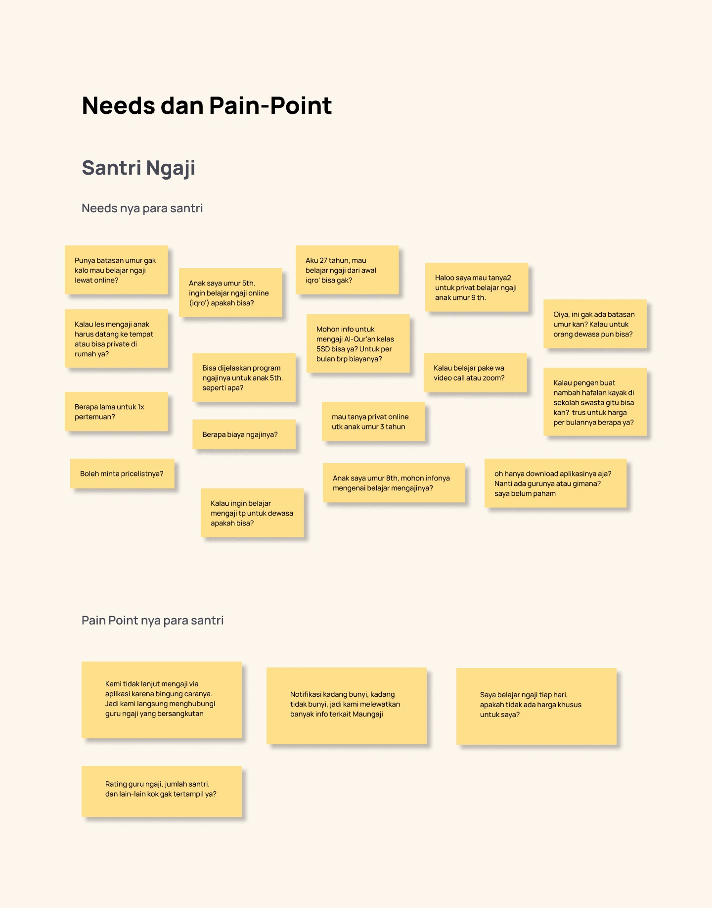
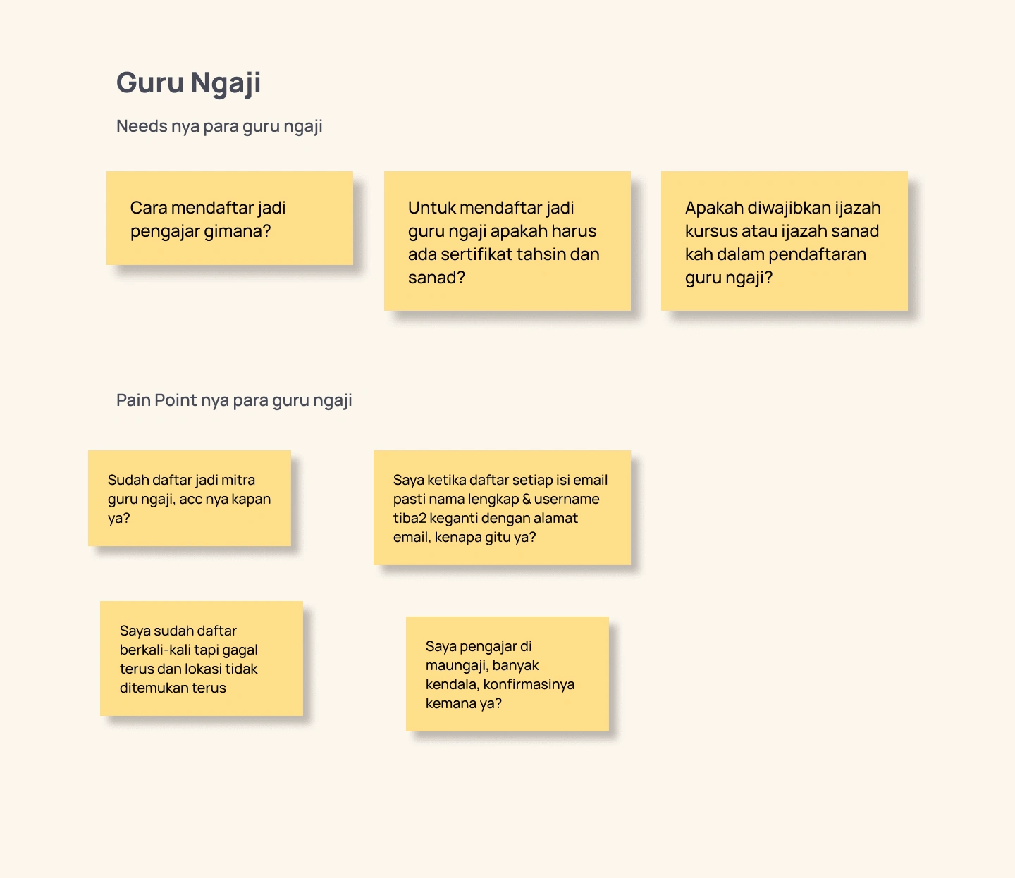
This is a kind of user empathy for us, coupled with the questions and complaints of students submitted through the Maungaji admin. I had time to write down a list of questions that were more directed to their needs and pain points.
Needs dan Pain-Point User...
Needs and pain points are collected both from the santri side as users of the Maungaji application, as well as from the Qur’an teacher's side as users of the Maungaji Partner application.
Problems..
From the needs and pain points collected, it can be summarized into several main points as follows:
1) The user does not know the minimum/maximum age requirement to be able to register for the Qur’an at Maungaji
2) Users want to know what learning packages are available at Maungaji
3) Users are confused about how to use the Qur’anic apps but like to study with their Qur’an teacher, so they learn to teach the Qur’an outside the Maungaji app
4) Users want to know the rating and info of the Qur’an teacher before they choose
5) Users experience problems when registering
6) Users are confused about where to access if they experience many problems in the application
Due to limited time and resources, it was decided in this project to focus on solving problems numbers 2, 3, and 4.
Roles...
Roles : UI/UX Designer
Team : Maungaji
Year : 2021
Qur’an Teacher Order Flow
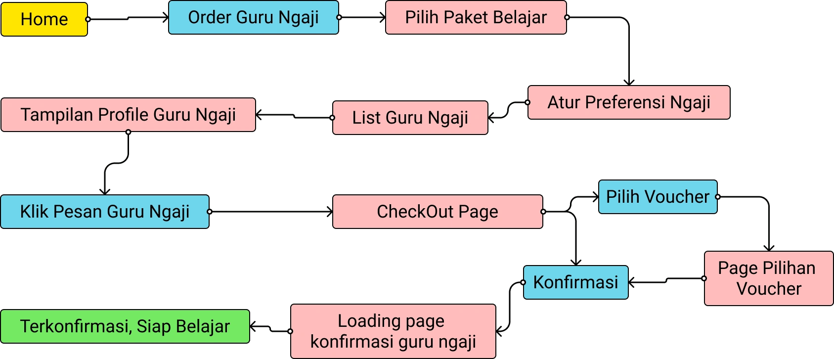
Old Design
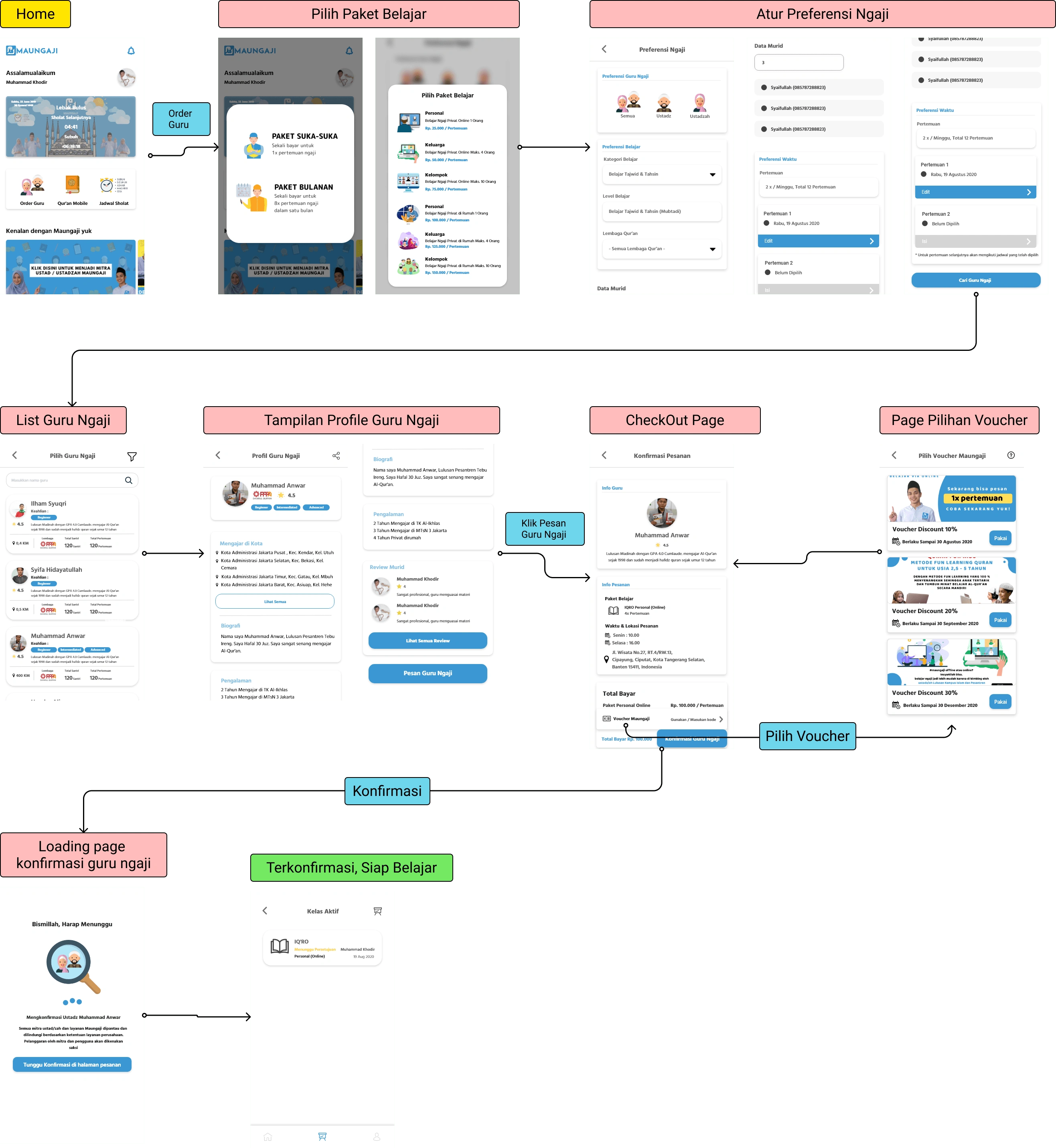
Wireframing
I use Figma as a wireframing tool while ensuring good navigation between pages during the checkout order process.
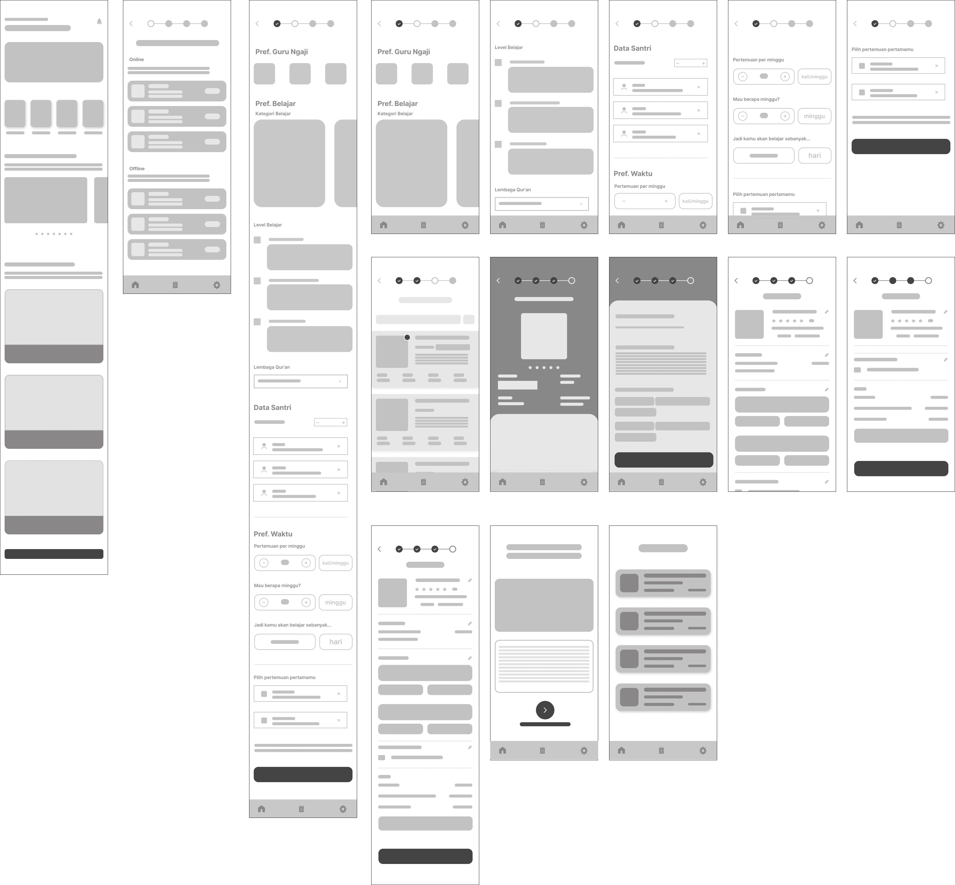
New Design
As discussed in the Problems section, the focus of this project is on resolving user pain points:
1) Information on what study packages are available at Maungaji
2) Confusion using apps, so it's more convenient to make transactions for teachers of the Qur’an outside the apps
3) Rating info and bio of the Qur’an teacher that helps to choose the right one for prospective students.
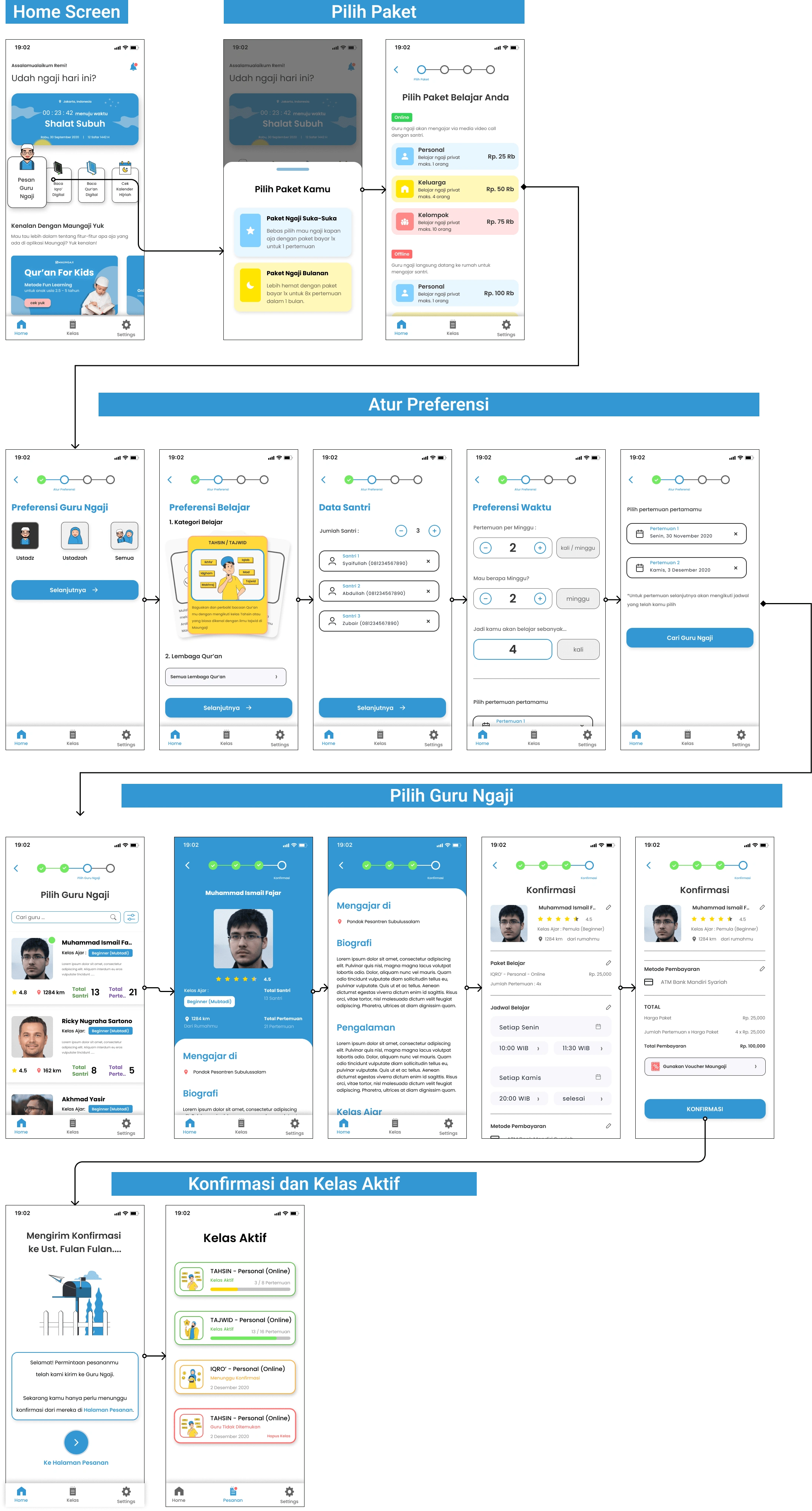
New Design > Home Screen
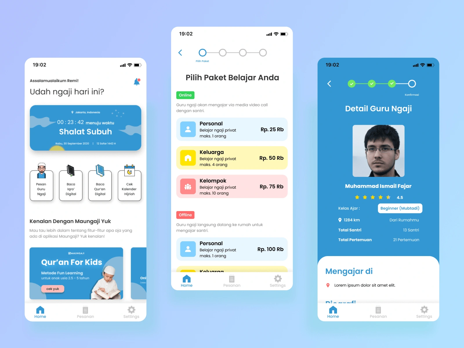
On the home screen, there are 4 sections, namely: 1) Prayer Times Markers, 2) Main Button, 3) Introduction to the Maungaji feature, and 4) Articles.
There are four main button options to choose from 1) Find a Qur’an teacher, 2) Read Iqra', 3) Read the Qur'an, and 4) Check the Hijriyah Calendar.
New Design > Home Screen > Dynamic Prayer Times
New Design > Order Flow > Choose Learning Package
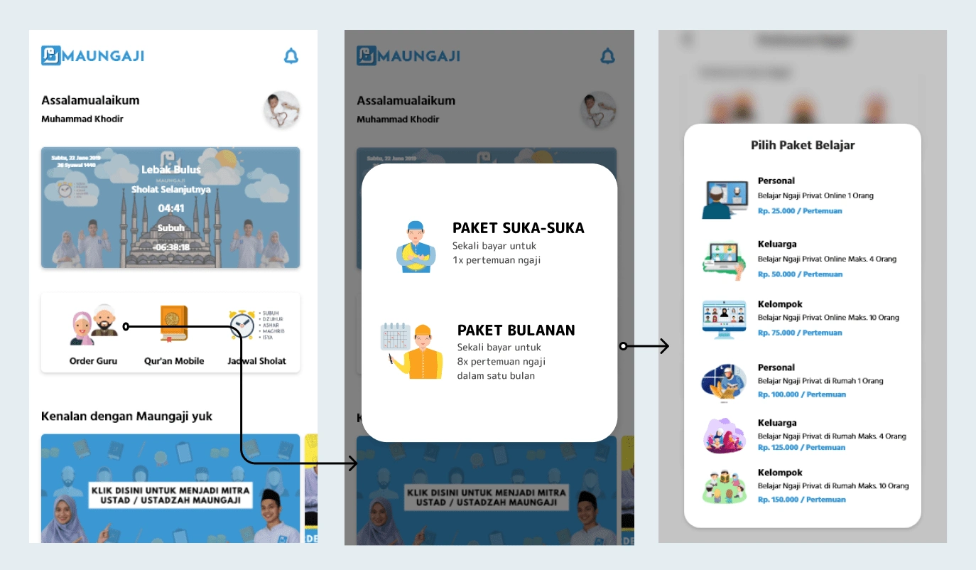
Desain lama Pilih Paket
The first step when you want to order a Qur’an teacher is to press the "Pesan Guru Ngaji" on the Homescreen.
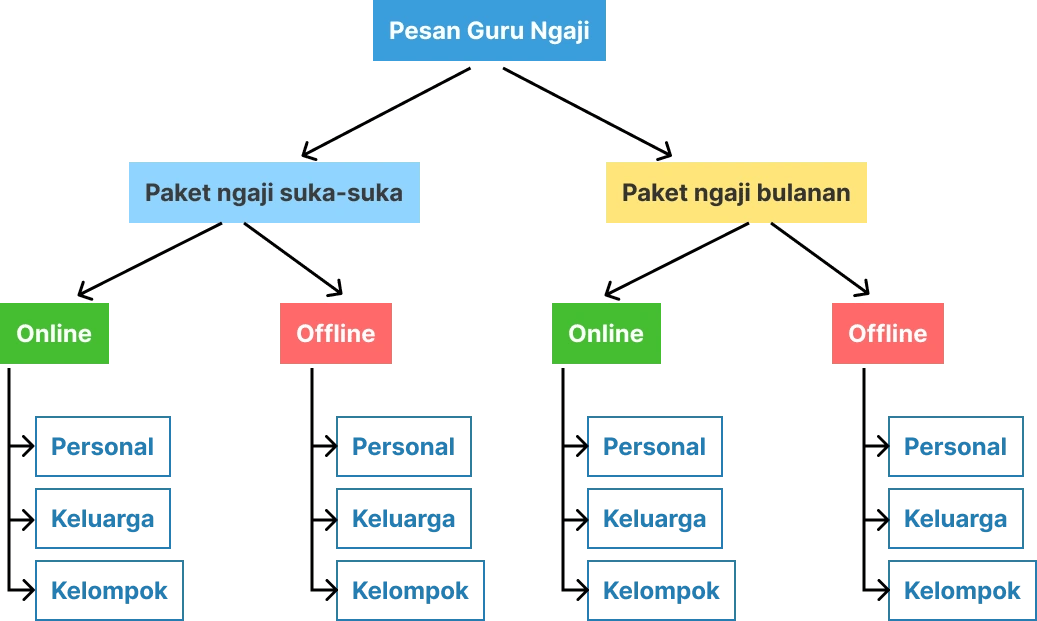
For ordering the learning package, there are several choices that are influenced by:
1. Payment method
2. Study Schedule
3. The number of students (santri)
4. Place (Online or Offline at home)
The problem that is trying to be solved from the old design is in the section on choosing learning packages, where eachpersonal,family, andgrouppackage appears twice on the same screen.
This can cause user confusion between online and offline packages. And also the cognitive load experienced by the user because there is no space or visual grouping of different packages.
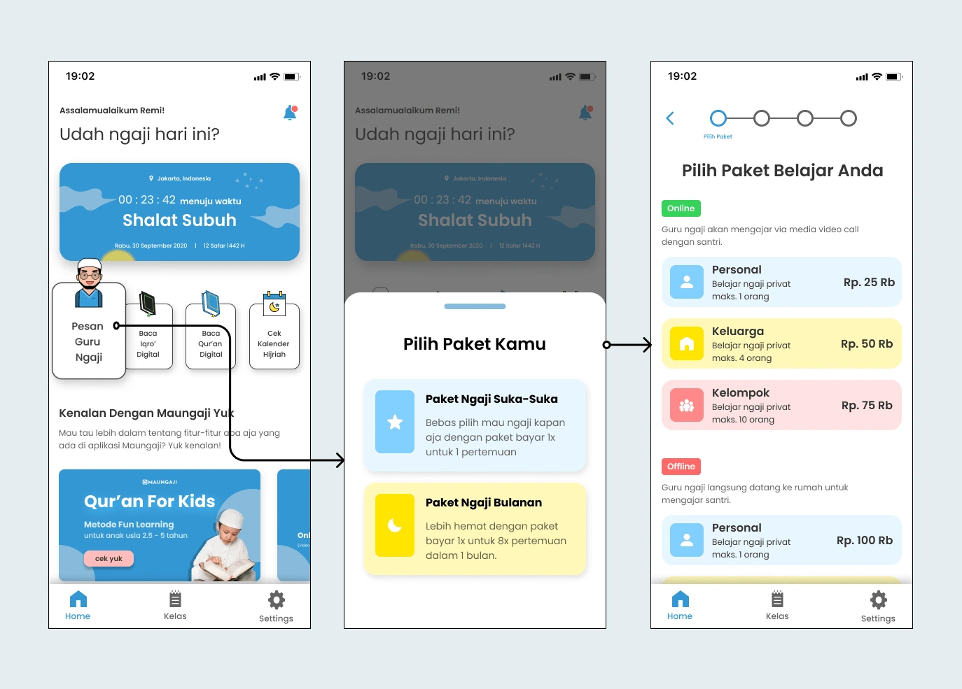
Desain Baru Pilih Paket
New Design > Order Flow > Set Preferences
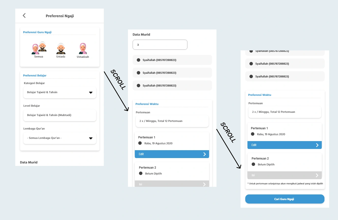
Desain Lama Atur Preferensi
On the Set Preferences screen, there are too many options and settings for the user to make at the same time. So that the cognitive load appears and also causes confusion.
For that, I divide this screen into four parts. The trade-off is, of course, from a technical point of view, it will increase interaction because the number of screens will increase, but from a user perspective, the steps are shorter and easier.

Here is the result of the design:
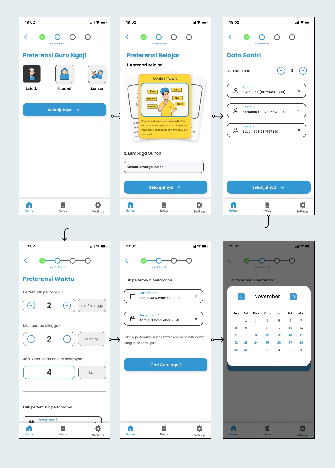
New Design > Order Flow > Choose Qur’an Teacher
In the Select Guru Ngaji card section I did some design exploration to solve the problem:
Inconsistent copywriting
The font size is too small, making it difficult to read
The layout of the elements inside the card
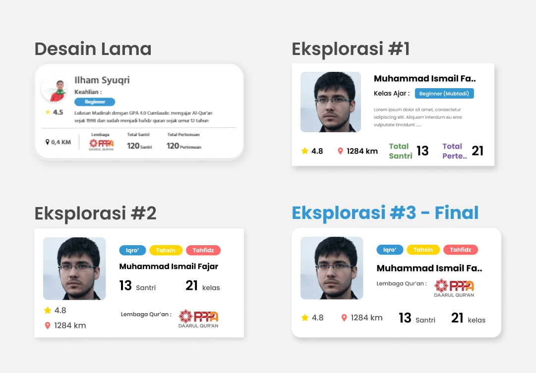
Challenges and Next Improvement...
🛠 Not yet a priority to enter the development stage.
🗣 Usability testing has not been carried out to measure whether the confusion of the students and the Qur’an teacher can be resolved.
✂️ I think this check-out stage can still be shortened the number of forms per step, thereby reducing the user's cognitive load
Like this project
Posted Dec 4, 2021

